Digital Societies and Social Technologies Summer Institute, UMCP

Doctoral students, postdocs and established researchers working in the intersection of technology and social systems might consider applying to the 2013 Digital Societies and Social Technologies Summer Institute, 7/28 to 8/1 at the University of Maryland College Park.
"MOOCs, Education and learning; personal health and well-being; open innovation, eScience, and citizen science; co-production, open source, and new forms of work; cultural heritage and information access; energy management and climate change; civic hacking, engagement and government; disaster response; cybersecurity and privacy – these are just a few problem domains where effective design and robust understanding of complex sociotechnical systems is critical. To meet these challenges a trans-disciplinary community of scholars has come together from fields as wide ranging as CSCW, HCI, social computing, organization studies, information visualization, social informatics, sociology, information systems, medical informatics, computer science, ICT for development, education, learning science, journalism, and political science."
Lodging, meals, and other onsite costs will be covered for all Summer Institute participants. Applications are due by April 5.
]]>
Doctoral students, postdocs and established researchers working in the intersection of technology and social systems might consider applying to the 2013 Digital Societies and Social Technologies...
http://www.csee.umbc.edu/2013/03/digital-societies-and-social-technologies-summer-institute-umcp/?utm_source=rss&utm_medium=rss&utm_campaign=digital-societies-and-social-technologies-summer-institute-umcp
https://my3.my.umbc.edu/api/v0/pixel/news/42636/guest@my.umbc.edu/5e9943091ce3d94087e301df876d300d/api/pixel
fyi
graduate
Computer Science and Electrical Engineering
https://my3.my.umbc.edu/groups/csee
https://assets3-my.umbc.edu/system/shared/avatars/groups/000/000/099/d117dca133c64bf78a4b7696dd007189/xsmall.png?1314043393
https://assets1-my.umbc.edu/system/shared/avatars/groups/000/000/099/d117dca133c64bf78a4b7696dd007189/original.png?1314043393
https://assets1-my.umbc.edu/system/shared/avatars/groups/000/000/099/d117dca133c64bf78a4b7696dd007189/xxlarge.png?1314043393
https://assets4-my.umbc.edu/system/shared/avatars/groups/000/000/099/d117dca133c64bf78a4b7696dd007189/xlarge.png?1314043393
https://assets3-my.umbc.edu/system/shared/avatars/groups/000/000/099/d117dca133c64bf78a4b7696dd007189/large.png?1314043393
https://assets1-my.umbc.edu/system/shared/avatars/groups/000/000/099/d117dca133c64bf78a4b7696dd007189/medium.png?1314043393
https://assets2-my.umbc.edu/system/shared/avatars/groups/000/000/099/d117dca133c64bf78a4b7696dd007189/small.png?1314043393
https://assets3-my.umbc.edu/system/shared/avatars/groups/000/000/099/d117dca133c64bf78a4b7696dd007189/xsmall.png?1314043393
https://assets3-my.umbc.edu/system/shared/avatars/groups/000/000/099/d117dca133c64bf78a4b7696dd007189/xxsmall.png?1314043393
Computer Science and Electrical Engineering
0
0
true
Mon, 18 Mar 2013 10:29:27 -0400
Writing Your Own jQuery Plugins
jQuery is great. It’s cross-browser, easy to learn, and makes adding interactivity to your website a breeze. It also comes with plenty of plugins to do almost whatever you need it to do.
But what if you can’t find just the right plugin to suit your needs? Or you’re just looking to keep your project DRY by combining some oft-used functionality into one nice, neat package? The solution might be to roll your own plugin to meet exactly your needs.
Writing your own jQuery plugin isn’t as hard as it might seem at first. This tutorial will go through the process of writing a simple plugin, adding some options, and even perform a callback.
Setting Up
We’ll start with the old chesnut of programming tutorials, a “Hello, World!” plugin. Before we can do anything, we need to establish our file and link it to our HTML document. First, we’ll create our plugin file and put it in the “js” directory of our website. It’s traditional to start our filename with “jquery,” followed by the actual plugin name, so we’ll call this “jquery.hello-world.js”.
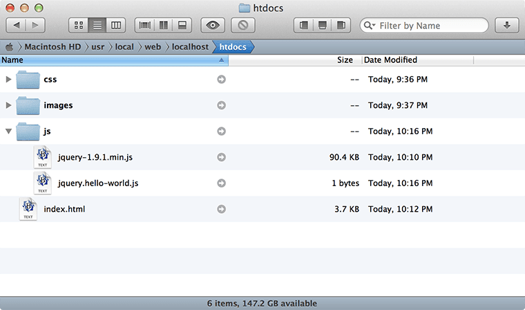
Our “Hello, World!” plugin, snuggly next to our jQuery core file.
Next, we’ll need to make sure our plugin file, as well as it’s jQuery core big brother, are linked in our HTML file, so place the following two lines at the bottom of your HTML document, just before the closing </body> tag:
<script src="js/jquery-1.9.1.min.js"></script>
    <script src="js/jquery.hello-world.js"></script>
The jQuery Plugin Structure
jQuery comes with all the necessary hooks to build your plugin file easily. But we still want to be mindful of good JavaScript practices, and make sure we keep everything inside a local scope. We’ll start with the very basic shell of a traditional jQuery plugin:
(function($) {

        $.fn.helloWorld = function() {

            // Future home of "Hello, World!"

        }

    }(jQuery));
Let’s take a quick moment to understand what’s going on. By including everything in the (function() {}) self-enclosed JavaScript pattern, we’re making sure that all the variables in our plugin will stay safely outside of the global namespace. We don’t want to cause any collisions with any other JavaScript used on the page, after all.
The other thing you might notice is that we’re defining our plugin as if jQuery was in it’s “no-conflict” mode. Again, we’re seeking to avoid colliding with other JavaScript on the page, and thus we want to make sure that our plugin isn’t reliant on the default $, which could be used by another library.
Finally, $.fn is jQuery’s way of allowing you to define your plugin, which we’ve named helloWorld. With all of our pieces in place, let’s actually do something!
Making Our Plugin Do Something
For our plugin, we’re going to do something pretty silly, but also simple enough for our demonstration purposes, and that is to change all the text for the acted upon elements with (what else?) the text “Hello, World!”.
(function($) {

        $.fn.helloWorld = function() {

            this.each( function() {
                $(this).text("Hello, World!");
            });

        }

    }(jQuery));
When we’re invoking the plugin by attaching it to a jQuery selector, the object we’re acting upon is already a jQuery object, so we don’t need to wrap it in the $(this) structure you’re used to. However, once we start looping through each instance of the matching selector, we use the $(this) structure as we would any time we ran our selectors through $.each().
Suppose we wanted to change the text of all of our <h2> headers on the following page:
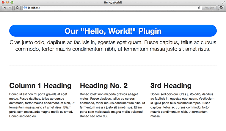
Our web page, ripe for the text swapping via jQuery.
We would invoke the plugin as you’re already familiar, like so:
<script>
    $(document).ready( function() {
        $('h2').helloWorld();
    });
    </script>
To yield this:
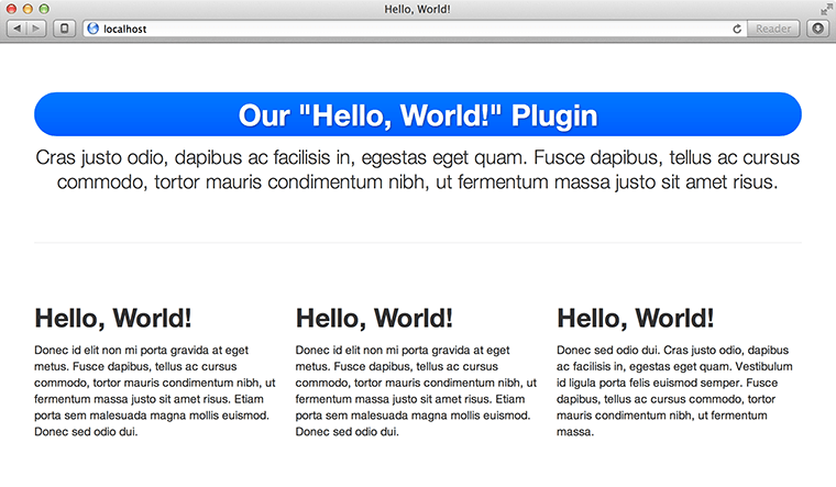
Seems silly, I know, but we’ve now replaced all the <h2> headers with “Hello, World!”
We’re not quite done yet. While our plugin technically works, it’s living in its own little isolated world. That is, if you try and chain another jQuery action onto it, nothing’s going to happen because our plugin has led to a dead end. To fix this, be sure to return the results of the plugin as it loops through the DOM elements:
(function($) {

        $.fn.helloWorld = function() {

            return this.each( function() {
                $(this).text("Hello, World!");
            });

        }

    }(jQuery));
And congratulations! You’ve just written you’re first jQuery plugin!
But Wait, There’s More!
Now that you’re all happy that you’ve built your jQuery plugin, your boss comes back and says that they need to be able to translate the site into Spanish. Uh oh, what do we do now?
Well, we could start by just adding an argument. Let’s take our plugin above, and instead of hard-coding the text into the plugin, we can replace it with a variable and pass that along when we invoke the plugin.
(function($) {

        $.fn.helloWorld = function( customText ) {

            return this.each( function() {
                $(this).text( customText );
            });

        }

    }(jQuery));
There, now we can pass any text we’d like to our plugin. Our offices in Madrid have given us the Spanish translation we need, which we now use as the parameter of our plugin:
<script>
    $(document).ready( function() {
        $('h2').helloWorld('¡Hola, mundo!');
    });
    </script>
Our web page now looks like this:
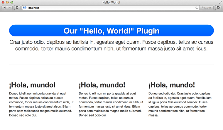
Our plugin, with “Hello, World!” translated into Spanish.
Complete Customization FTW
But already we’re a little nervous. What if no text was passed when we called the plugin? As it’s written, the plugin would simply blank out the text of our matched elements, and we probably don’t want that. Also, our boss has already come back to us once asking to make a variable. What if he wants more customization options? Simply adding options ad infinitum isn’t going to work in the long term. A more future-proof solution is the options object.
We already know that the specific text needs to be customizable. Now our boss is asking that the text color and font style be customizable as well. (Yes, I know these are simple options to chain onto our selector via built-in jQuery functions, but go with me here.) Let’s add an options object to our plugin, along with some sensible defaults using the $.extend method:
(function($) {

        $.fn.helloWorld = function( options ) {

            // Establish our default settings
            var settings = $.extend({
                text         : 'Hello, World!',
                color        : null,
                fontStyle    : null
            }, options);

            return this.each( function() {
                // We'll get back to this in a moment
            });

        }

    }(jQuery));
Now we have a settings object that, when the plugin is invoked devoid of any parameters, will use what we’ve established as the default text. We also have two other properties of our settings object, “color” and “fontStyle”, that have no default beyond null. For this plugin, we don’t need to establish any color or font style beyond what is laid out in our CSS, but they’re there for the overriding if we want. We just have to make use of them:
return this.each( function() {
        $(this).text( settings.text );

        if ( settings.color ) {
            $(this).css( 'color', settings.color );
        }

        if ( settings.fontStyle ) {
            $(this).css( 'font-style', settings.fontStyle );
        }
    });
Since the purpose of this plugin is to replace text, it makes sense to always replace the text with whatever is provided, which is why it also makes sense to provide a default value so that something appears if the plugin is invoked without any options. But the color and font style options are tested for and only acted upon if they are provided.
Our boss has come back and says now they’re going to translate the site into French, and beyond that they want the text to be blue and italic. Fortunately, our plugin can now handle all these requests:
$('h2').helloWorld({
        text        : 'Salut, le monde!',
        color       : '#005dff',
        fontStyle   : 'italic'
    });
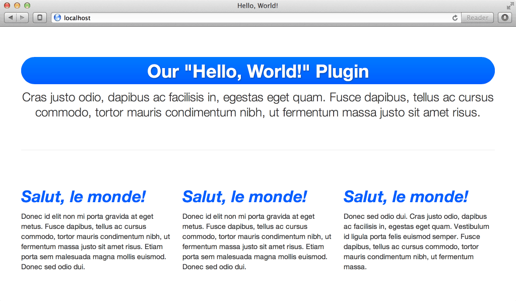
With several options available to us, our plugin can now speak French, and even change the appearance of the text.
Et voilà! We now have a plugin with a number of possible objects, and the ability to easily add more (or subtract what’s there) in the future without impacting legacy users of the plugin. Hooray for maintainability!
But our boss has come back with yet another request: once the plugin has completed whatever task it was called to do, it should sound an alert informing us of that fact. For this, we have two options: either quit because our boss has obviously never heard of a requirements document, or go the less drastic route and give our plugin the ability to handle callbacks.
Callbacks are options to JavaScript functions that are themselves JavaScript functions. They’re also not unique to jQuery. Again, it may seem like it would be a complicated thing to do, but actually it’s quite simple.
All we need is to establish one more variable in our options object:
// Establish our default settings
    var settings = $.extend({
        text         : 'Hello, World!',
        color        : null,
        fontStyle    : null,
        complete     : null
    }, options);
Now we have a “complete” variable to perform an action when, well, our plugin completes its action. To invoke it, we’ll want to make sure that what we’re given is actually a function. Fortunately, jQuery helps us with this with the $.isFunction test:
return this.each( function() {
        // Our plugin so far

        if ( $.isFunction( settings.complete ) ) {
            settings.complete.call( this );
        }
    });
On the invocation side, our code becomes:
$('h2').helloWorld({
        text        : 'Salut, le monde!',
        color       : '#005dff',
        fontStyle   : 'italic',
        complete    : function() { alert( 'Done!' ) }
    });
And as a result, we see our callback as our plugin is executed:
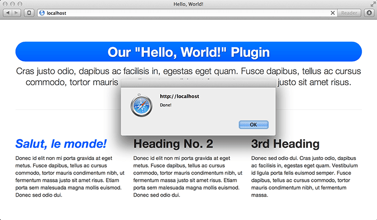
Our plugin now displays an alert every time it executes, thanks to our callback.
Conclusion
Custom jQuery plugins are a great option when you know you’re going to be doing a lot of the same things over and over in your JavaScript. By writing your own jQuery plugin, you’re both keeping your code DRY and your global namespace nice and clean.
If you’d like to play around with the code from this example, you can grab it from my GitHub.
The post Writing Your Own jQuery Plugins appeared first on Treehouse Blog.
]]>
jQuery is great. It’s cross-browser, easy to learn, and makes adding interactivity to your website a breeze. It also comes with plenty of plugins to do almost whatever you need it to do. But...
http://feedproxy.google.com/~r/teamtreehouse/~3/UdMS0Tsyxiw/writing-your-own-jquery-plugins
https://my3.my.umbc.edu/api/v0/pixel/news/26176/guest@my.umbc.edu/aeb71140ef1f97670db347042915f481/api/pixel
android
css
design
development
html
ios
javascript
jquery
jquery-plugins-tutorial
jquery-tutorials
learn-to-code
responsive
web
Web Developer - Build Group
https://my3.my.umbc.edu/groups/retired-583
https://assets3-my.umbc.edu/system/shared/avatars/groups/000/000/583/fc60f5d7abc2e080599bb6dc465db54d/xsmall.png?1363101197
https://assets4-my.umbc.edu/system/shared/avatars/groups/000/000/583/fc60f5d7abc2e080599bb6dc465db54d/original.jpg?1363101197
https://assets4-my.umbc.edu/system/shared/avatars/groups/000/000/583/fc60f5d7abc2e080599bb6dc465db54d/xxlarge.png?1363101197
https://assets4-my.umbc.edu/system/shared/avatars/groups/000/000/583/fc60f5d7abc2e080599bb6dc465db54d/xlarge.png?1363101197
https://assets3-my.umbc.edu/system/shared/avatars/groups/000/000/583/fc60f5d7abc2e080599bb6dc465db54d/large.png?1363101197
https://assets3-my.umbc.edu/system/shared/avatars/groups/000/000/583/fc60f5d7abc2e080599bb6dc465db54d/medium.png?1363101197
https://assets4-my.umbc.edu/system/shared/avatars/groups/000/000/583/fc60f5d7abc2e080599bb6dc465db54d/small.png?1363101197
https://assets3-my.umbc.edu/system/shared/avatars/groups/000/000/583/fc60f5d7abc2e080599bb6dc465db54d/xsmall.png?1363101197
https://assets4-my.umbc.edu/system/shared/avatars/groups/000/000/583/fc60f5d7abc2e080599bb6dc465db54d/xxsmall.png?1363101197
Web Developer - Build Group
0
0
true
Mon, 18 Mar 2013 09:30:39 -0400
Mon, 18 Mar 2013 09:30:39 -0400
How can I find primary sources?
]]>
Page edited by Janet Hack Answer Primary sources are original accounts of historical events. Primary sources may include diaries,...
https://wiki.umbc.edu/pages/viewpage.action?pageId=31196778
https://my3.my.umbc.edu/api/v0/pixel/news/26165/guest@my.umbc.edu/743267cbd00fa7195e180b4dd6b23734/api/pixel
faq
primary-resources
research
UMBC FAQ
https://my3.my.umbc.edu/groups/retired-428
https://assets4-my.umbc.edu/images/avatars/group/1/xsmall.png?1785165141
https://assets4-my.umbc.edu/images/avatars/group/1/original.png?1785165141
https://assets3-my.umbc.edu/images/avatars/group/1/xxlarge.png?1785165141
https://assets1-my.umbc.edu/images/avatars/group/1/xlarge.png?1785165141
https://assets3-my.umbc.edu/images/avatars/group/1/large.png?1785165141
https://assets1-my.umbc.edu/images/avatars/group/1/medium.png?1785165141
https://assets4-my.umbc.edu/images/avatars/group/1/small.png?1785165141
https://assets4-my.umbc.edu/images/avatars/group/1/xsmall.png?1785165141
https://assets1-my.umbc.edu/images/avatars/group/1/xxsmall.png?1785165141
UMBC FAQ
0
0
true
Mon, 18 Mar 2013 09:23:07 -0400
Where is the Writing Center?
]]>
Page edited by Janet Hack Answer The Writing Center is located on the first floor of the library, past the Technology Support...
https://wiki.umbc.edu/pages/viewpage.action?pageId=31197546
https://my3.my.umbc.edu/api/v0/pixel/news/26166/guest@my.umbc.edu/ffafb0269320215419efb17e293a7eb5/api/pixel
faq
study
writing-center
UMBC FAQ
https://my3.my.umbc.edu/groups/retired-428
https://assets4-my.umbc.edu/images/avatars/group/1/xsmall.png?1785165141
https://assets4-my.umbc.edu/images/avatars/group/1/original.png?1785165141
https://assets3-my.umbc.edu/images/avatars/group/1/xxlarge.png?1785165141
https://assets1-my.umbc.edu/images/avatars/group/1/xlarge.png?1785165141
https://assets3-my.umbc.edu/images/avatars/group/1/large.png?1785165141
https://assets1-my.umbc.edu/images/avatars/group/1/medium.png?1785165141
https://assets4-my.umbc.edu/images/avatars/group/1/small.png?1785165141
https://assets4-my.umbc.edu/images/avatars/group/1/xsmall.png?1785165141
https://assets1-my.umbc.edu/images/avatars/group/1/xxsmall.png?1785165141
UMBC FAQ
1
1
true
Mon, 18 Mar 2013 09:18:16 -0400
Responsively Retrofitting An Existing Site With RWD Retrofit
Since the introduction of the iPhone in 2007, touchscreen mobile devices have exploded in popularity. They have introduced new problems, new solutions, new interactions, new ways of thinking and, of course, new costs to our clients.
The most important question on everyone’s mind — clients and developers alike — is, “How can we provide a great Web experience to our users on mobile?”
It All Started With iPhone
The mobile Web was rarely considered before the iPhone (mostly because mobile browsers were so bad). But after the phone’s release, clients jumped on the bandwagon and were clamouring for “mobile-friendly” websites so that they didn’t appear to be behind the times. However, mobile-specific — or, worse, iPhone-only — websites also introduced new issues and frustrations for users, often “breaking” the Web with broken links, infinite redirects and missing content.
Fast forward three years, when we find Ethan Marcotte writing about his revolutionary principle of “responsive Web design” (RWD), which changed the Web — and the way Web developers think — forever.
We’ve told our clients about all of the benefits of RWD and about why they shouldn’t build a separate mobile website. The world should have lived happily ever after. But clients who had already spent thousands of dollars on a fixed-width desktop website were less than pleased.

Can your clients afford a mobile-first responsive build? (Image Source)
Then, around the time that Marcotte’s article was published, the iPad was released. Clients who had already gone down the path of a separate mobile website then wanted their iPad users to get their current desktop website. So, we did it — with user-agent sniffing, once again straying further from the RWD methodology, even though we knew we shouldn’t.
Our fear of not being future-friendly was further exposed when Android tablets hit the market. Because there is no single unique identifier in their user agents to identify them as tablets, all Android devices, regardless of size, are generally served mobile websites, which, from the forums I frequent, frustrates most users. There are some services for detecting Android tablets, as outlined in “Server-Side Device Detection: History, Benefits and How-To,” however, as an Android user, I regularly see more mobile than desktop websites.
In fact, the issue got so bad that in Android 4.0 (Ice Cream Sandwich), Google added a “Request desktop site” option to its browser. But depending on how a website’s detection is written, it doesn’t always work, and you still have to suffer the pain of loading the mobile website first.
So, we have a few issues:
- Clients with an existing “desktop” website can’t afford to rebuild from scratch using a responsive methodology.
- They still need a more optimized experience for mobile devices.
- Rightly or wrongly, they still want tablets to load their desktop website.
What’s The Solution?
RWD Retrofit is a small, vanilla JavaScript “plugin” that gives developers the option to allow an existing “desktop” website to coexist with a new responsive version, with minimal modification to the original website.
It implements dynamic viewport switching to ensure that the correct version of the website is shown according to the viewport’s width (both on loading and on resizing or orientation change), and it provides an object that contains the media queries required for responding to the breakpoints with JavaScript.
I wrote it at Izilla, which helps clients to address the issues mentioned above, and I have already used it in a number of projects.
Although I’m obviously biased, I think it’s a great technique to help you quickly and efficiently improve a client’s mobile presence in a cost-effective way.
Keep in mind that RWD Retrofit isn’t a magic bullet that will instantly transform your website into a responsive website out of the box. You still need to build the responsive version.
Is It The Only Solution?
Absolutely not. Developers have three other options available to them: a dedicated mobile website, a desktop-down responsive reskinning, and a complete rebuild with mobile-first responsiveness.
Let’s look quickly at the pros and cons of each, and of RWD Retrofit.
A Dedicated Mobile Website
Pros:
- Because it’s completely separate from the existing website, you essentially have a blank canvas to work on — dealing with a legacy code base is not really an issue.
- Supporting fewer devices results in a more focused, streamlined implementation, because the “minimum requirements” of the website are easier to define and develop for.
- By analyzing your users’ habits and data, you’re better able to target the user’s intent and context.
- The cost to develop is reasonable.
Cons:
- A separate code base could result in more expensive maintenance and content costs.
- Supporting a subset of devices is not future-friendly.
- User-agent detection is fragile because it can, and will, be spoofed.
- Be wary of assumptions of user intent based on device alone. A lot of “mobile” usage is done at home.
- There is the possibility of broken links and missing content for existing desktop pages that don’t exist on the mobile website.
Dedicated mobile websites are suitable for when content parity is not an issue, or you’re absolutely certain of the user’s goals on mobile, or the client wants a more app-like experience. I have used them successfully for targeted micro-sites that are separate from the main website.
A Desktop-Down Responsive Reskinning
Pros:
- Uses your existing code base, making for more efficient maintenance and content updates.
- Supports a wide variety of devices based on screen size.
Cons:
- It might not suit your existing code base. Success relies largely on using CSS3 to style, so adapting old websites that primarily use fixed-width CSS background images for presentation might be difficult.
- Performance overhead and inefficiencies are incurred from existing redundant code on breakpoints that don’t match.
- Requires extensive retesting of a previously functional desktop website.
- Cost to develop is moderate to high, depending on the code base.
This approach is better suited to simple websites that already use modern Web standards as their underlying technology. Marcotte used this approach in his Responsive Web Design book, but that was before “mobile first” became the favored approach.
A Mobile-First, Responsive Rebuild
Pros:
- A completely fresh, considered, optimized and progressively enhanced code base.
- A consistent, seamless experience for all users.
- Supports the widest variety of devices based on screen size and features, including large desktops and TVs.
- You’re future-friendly!
- Your work will hopefully be shared and admired in social media.
Cons:
- Planning, prototyping, development and testing could require substantial effort.
- The cost to develop is very high.
This will hopefully become the de facto standard for all new projects and redesigns. If approached correctly, your website should support as many different kinds of devices as possible for the foreseeable future, including Android-powered, Internet-enabled refrige-toasters.
RWD Retrofit
Pros:
- Uses your existing code base, making for more efficient maintenance and content updates.
- A completely separate style sheet ensures that the retrofit will not interfere with existing desktop styles.
- Minimal overhead or changes to existing website.
- Supports a wide variety of devices based on screen size.
- The cost to develop is reasonable.
Cons:
- The existing markup might not be flexible or optimized enough to be repurposed for small screens.
- Depending on how far the retrofit is taken, the transition from the largest responsive breakpoint to the desktop breakpoint could potentially be disjointed for users, but that would only really affect users who resize their browser’s window.
- On mobile devices, the desktop version might not initially be zoomed out fully on load or on rotation.
A retrofit is a good compromise of ideas and techniques, taking the best bits from the various other solutions to provide a cost-effective solution to your existing clients.
Which Is The Best Solution?
The “best” depends on the context and budget. Obviously, the best solution you could give to your clients would be a complete mobile-first responsive build. That would provide the optimal experience for users, using a single code base that’s cost-effective to maintain. I absolutely urge you to recommend this approach if feasible.
However, many of my clients can’t afford to do this, and because their websites predate the use of CSS3 for things such as rounded corners and gradients, the “best” solution for them is to use RWD Retrofit.
RWD Retrofit is also useful for both clients and developers who are in a transitional phase to responsiveness. If your client wants to rebuild using the mobile-first philosophy but can’t afford to just yet, push to retrofit their website. Generally speaking, having some kind of mobile optimization is better than nothing. Also, remember that practice makes perfect. Attempting a small-scale responsive website first will equip you with the skills needed for when you come to do the “real” thing.
How Does RWD Retrofit Work?
Here goes:
- When the page starts to load, the script checks to see whether the user is on a mobile device that supports touch events.
- If they are, it checks whether you’ve set to override the desktop breakpoint on mobile, and then changes the breakpoint accordingly.
- It then checks to see whether you’ve set the viewport width for the desktop version to be anything other than the default of 980 pixels, and sets that accordingly. The article “Viewport Meta Tag For Non-Responsive Design” explains why you may want to do this.
- A function is called that compares the width of the document to the desktop media query, and if it’s equal or larger, it alters the viewport to the desktop one.
- This same function is called on a resize or orientation change (depending on what the device supports) to see whether it needs to switch over to the mobile viewport, and vice versa.
- Finally, it returns the responsive and desktop media queries in a JavaScript object for you to test against in other scripts, so that:
- you don’t have to write your media queries in both the markup and JavaScript;
- if you did override the desktop breakpoint on mobile devices, you’ll always have the correct media query.
At its core, RWD Retrofit should be thought of as a technique, not a solution. If you don’t plan to change the breakpoint that the desktop website is served at on mobile, or you don’t plan to change the desktop viewport’s width when it is served, or you don’t mind duplicating media queries in your JavaScript, then the RWD Retrofit JavaScript itself isn’t required. The technique will still work, allowing you to achieve similar results.
Implementing RWD Retrofit
Below is the process I use to retrofit a website.
Initial Set-Up
- Open the index (i.e. main) page, which has your global
<head> section.
- Add
<meta name="viewport" content="width=device-width, initial-scale=1" />
as one of the first children of <head>.
- Find the link to the current desktop style sheet, and change its media attribute to
media="all and (min-width: Xpx)", where X is the current width of the desktop website, which will result in something like this:
<link href="/css/desktop.css" rel="stylesheet" media="all and (min-width: 980px)" />
If you currently have multiple style sheets at runtime, I strongly recommend that you combine and minify them into one to improve performance.
- Go through your JavaScript functions and, for the time being, comment out any that won’t apply to the responsive version of the website. (Again, if you currently have multiple JavaScript files at runtime, I strongly recommend that you combine and minify them into one to improve performance — excluding any jQuery, which is best served from a CDN.)
- Create a new responsive style sheet, and link to it with a
max-width media query that is 1 pixel less than the desktop one, like so:
<link href="/css/rwd.css" rel="stylesheet" media="all and (max-width: 979px)" />
If you now open this in a Web browser with a narrow window, you’ll have an unstyled document — the clean slate that we want.
Creating the Responsive Version
Building a responsive style sheet is a massive topic on its own, and because a lot of good resources are already online, I’ll just provide some pointers.
- Begin with a mobile-first philosophy. Resize your browser window to a “mobile” size. I actually prefer to go smaller than the standard 320 pixels because feature phones are often forgotten. To help with this, Firefox introduced a pretty cool Responsive Design View mode in version 15. Or you can use the Web Developer Toolbar extension, available for both Firefox and Chrome.
- Although undertaking a truly mobile-first responsive rebuild wouldn’t be a best practice, elements in your markup may be suitable for the original desktop website but need to be hidden on smaller screens. Use an accessible method to do this. Chris Coyier rounds up approaches to doing this.
- As you develop and write the CSS, increase your browser’s width to see how the new responsive layout reacts and adapts as you approach the desktop’s breakpoint. If you need to insert more media queries, do it directly in the responsive style sheet to keep them nicely contained. (To help you obtain the viewport’s current width to use as a new breakpoint, I’ve written Viewport Genie, which is available as both a bookmarklet and a tiny JavaScript include. You can also use Firefox’s Responsive Design View mode.)
- When you’re happy with the basic styling on desktop browsers, start testing some real devices. Things will need adjusting, and issues will arise that don’t appear on the desktop. (Both Safari on iOS and Chrome on Android allow you to use remote debugging from your browser to preview your website on the device. Alternatively, you could use Adobe’s Edge Inspect, which is available for both iOS and Android, or Viljami Salminen’s Remote Preview.)
Implementing RWD Retrofit
Now it’s time to drop in the RWD Retrofit JavaScript and its dependencies.
- Download the minified RWD Retrofit from GitHub, and reference it immediately below your style sheets.
- Optionally, download a custom build of Modernizr and include that underneath RWD Retrofit. At a minimum, I recommend that your build contain Modernizr.load and Add CSS Classes. You may also want to include other feature tests depending on how you plan to style the responsive version. If your markup doesn’t use any of the HTML5 layout elements, then you won’t need html5shiv. (I recommend combining the two JavaScripts above into one
base.min.js resource.)
- Download the minified version of the matchMedia polyfill from my fork on GitHub, and include it before your other custom JavaScripts, which should hopefully be immediately before the closing
</body> tag to prevent rendering blocking. (The matchMedia polyfill is required for older browsers that don’t support this API natively.)
- Download the minified version of Enquire.js, and reference it beneath the matchMedia polyfill. (Enquire.js is a lightweight pure JavaScript library for responding to CSS media queries.)
- Give your desktop style sheet’s
<link> a class of "rwdretrofit-desktop".
- Give your responsive style sheet’s
<link> a class of "rwdretrofit-mobile".
- Add an optional
data-breakpoint-width="X" attribute to the desktop style sheet’s <link>, where X is the pixel width of the desktop breakpoint on mobile devices (for example, 768 for iPads and other large tablets).
- Add an optional
data-viewport-width="X" attribute to the desktop style sheet’s <link>, where X is the pixel width that the desktop viewport will be set to on mobile devices.
- Add an optional
data-debug="true" attribute to the desktop style sheet’s <link>, which forces desktop and non-touch-enabled browsers to use RWD Retrofit. (If you’ve specified a custom data-breakpoint-width, ensure that you remove the data-debug attribute before going live, or else your desktop breakpoint will trigger at the wrong size on desktops.)
If you’ve added the optional data- attributes, you will now be able to test these breakpoint and viewport changes on mobile devices, or by setting your browser to emulate touch events. At the time of writing, Chrome is the only browser able to do this through its Developer Tools (in Settings → Overrides).
Because I don’t serve the responsive version to users of IE 8 and below, I also reference the desktop style sheet in a conditional comment beneath the others, like so:
    <!--[if lt IE 9 ]>
       <link href="/css/desktop.css" rel="stylesheet" type="text/css" media="all" />
    <![endif]-->
If you wanted these users to have a responsive experience, you should be able to use Scott Jehl’s Respond.js media query polyfill instead, although I haven’t tested it.
Modifying Your JavaScript Functions
No doubt, you will have JavaScript functions that should be fired on the desktop version but not on mobile — such as a lightbox script (for example, Jack Moore’s ColorBox).
Keep in mind that there is no one process to achieve this (because everybody writes their JavaScript functions differently), however, here’s how I’d modify a lightbox function:
- First, let’s assume that we have one JavaScript file named
main.js, in which everything is wrapped in a function that executes when the DOM is fully loaded, whereupon we call ColorBox on all links with a class of lightbox, like so:
    $(document).ready(function() {
       // Call ColorBox on appropriate links
       $('a.lightbox').colorbox();
    });
- Because the lightbox function can now be called multiple times, let’s instead create a variable that stores the lightbox links for counting and improved performance (because jQuery won’t need to query the DOM each time):
var $lightboxLinks = $('a.lightbox');
- We now need to convert the call to ColorBox into a function, so that we can use it whenever the desktop media query is matched. I prefer to create them as methods of a literal object:
    var lightbox = {
       initialize: function() {
          // If the number of links to be ColorBox'd is greater than 0
          if ($lightboxLinks.length > 0) {
             $lightboxLinks.colorbox();
          }
       },
    };
- We also need to remove any ColorBox’d links for when our responsive retrofit media query is matched. So, we create a function to do that after our
initialize method:
    destroy: function() {
          // Remove all traces of ColorBox
          $.colorbox.remove();
          // Remove the click event handlers that ColorBox added
          $lightboxLinks.off('click');
       }
- Now, we need to add in the conditional tests by using the two media-query objects that RWD Retrofit exposes (
rwdRetrofit.desktop and rwdRetrofit.mobile) and Enquire.js:
    // If rwdRetrofit is loaded
    if (rwdRetrofit) {
       // Use enquire.js to test the media queries
       // Test for the desktop media query
       enquire.register(rwdRetrofit.desktop, {
          // If it matches
          match: function() {
             lightbox.initialize();
          },
          // If it doesn't
          unmatch: function() {
             lightbox.destroy();
          }
       // Immediately start testing for the media queries
       }).listen();
    }
(I could have just as easily tested for rwdRetrofit.mobile and reversed the match and unmatch functions, but logically that wouldn’t make as much sense.)
And that’s as simple as it can be to modify existing JavaScripts to work “responsively.” You just need to follow a similar pattern, creating initialize() and destroy() functions for other code that should be selectively used or that should behave differently depending on the media query matched.
But let’s take it further. Because ColorBox isn’t used in our responsive version, we’re punishing our “mobile” users by making them download the script. So, we can use Modernizr’s asynchronous, conditional resource loader to load it only when the desktop breakpoint is matched.
- Modify the
lightbox.initialize() function to conditionally load the ColorBox script:
    initialize: function() {
       // If the number of links to be ColorBox'd is greater than 0
       if ($lightboxLinks.length > 0) {
          Modernizr.load({
             // Load the minified ColorBox script
             load: '/js/jquery.colorbox-min.js',
             // When it's loaded, apply ColorBox to the links.
             // This will also be triggered if the script has previously been loaded
             complete: function() {
                $lightboxLinks.colorbox();
             }
          });
       }
    }
- Modify the
lightbox.destroy() function to first check whether ColorBox has loaded:
    destroy: function() {
       if (typeof($.colorbox) != 'undefined') {
          // Remove all traces of ColorBox
          $.colorbox.remove();
          // Remove the click event handlers that ColorBox added
          $lightboxLinks.off('click');
       }
    }
Putting it all together will give you this:
    $(document).ready(function() {
       var $lightboxLinks = $('a.lightbox');

       var lightbox = {
          initialize: function() {
             // If the number of links to be ColorBox'd is greater than 0
             if ($lightboxLinks.length > 0) {
                Modernizr.load({
                   // Load the minified ColorBox script
                   load: '/js/jquery.colorbox-min.js',
                   // When it's loaded, apply ColorBox to the links
                   // This will also be triggered if the script has previously been loaded
                   complete: function() {
                      $lightboxLinks.colorbox();
                   }
                });
             }
          },
          destroy: function() {
             if (typeof($.colorbox) != 'undefined') {
                // Remove all traces of ColorBox
                $.colorbox.remove();
                // Remove the click event handlers that ColorBox added
                $lightboxLinks.off('click');
             }
          }
       };

       // If rwdRetrofit is loaded
       if (rwdRetrofit) {
          // Use enquire.js to test the media queries
          // Test for the desktop media query
          enquire.register(rwdRetrofit.desktop, {
             // If it matches
             match: function() {
                lightbox.initialize();
             },
             // If it doesn't
             unmatch: function() {
                lightbox.destroy();
             }
          // Immediately start testing for the media queries
          }).listen();
       }
    });
Because modifying the DOM when breakpoints match comes with a performance hit, if an initialize() function creates elements in the DOM that should be removed in the other “version” of the website, you could just hide it in the appropriate style sheet instead, which adds slightly extra bloat to your CSS, but would be more performant and better on the device’s battery, for example.
I’ve created a one-page demo website, and the code for it is on GitHub, too.
The demo goes further than the example above, by adding extra selective JavaScript functions, such as a toggle navigation on small screens and an accessible carousel and tabs.
In Conclusion
If you can’t convince your clients to start from scratch with a mobile-first philosophy, I hope this gives you the knowledge, impetus and tools that you need to retrofit their websites!
(al)
© Matt Stow for Smashing Magazine, 2013.
]]>
Since the introduction of the iPhone in 2007, touchscreen mobile devices have exploded in popularity. They have introduced new problems, new solutions, new interactions, new ways of...
http://www.smashingmagazine.com/2013/03/18/responsively-retrofitting-an-existing-site-with-rwd-retrofit/
https://my3.my.umbc.edu/api/v0/pixel/news/26161/guest@my.umbc.edu/ce785639a4c69ec68f6ee42d53a27167/api/pixel
css
design
development
html
javascript
mobile
mysql
php
sql
web
Web Developer - Build Group
https://my3.my.umbc.edu/groups/retired-583
https://assets3-my.umbc.edu/system/shared/avatars/groups/000/000/583/fc60f5d7abc2e080599bb6dc465db54d/xsmall.png?1363101197
https://assets4-my.umbc.edu/system/shared/avatars/groups/000/000/583/fc60f5d7abc2e080599bb6dc465db54d/original.jpg?1363101197
https://assets4-my.umbc.edu/system/shared/avatars/groups/000/000/583/fc60f5d7abc2e080599bb6dc465db54d/xxlarge.png?1363101197
https://assets4-my.umbc.edu/system/shared/avatars/groups/000/000/583/fc60f5d7abc2e080599bb6dc465db54d/xlarge.png?1363101197
https://assets3-my.umbc.edu/system/shared/avatars/groups/000/000/583/fc60f5d7abc2e080599bb6dc465db54d/large.png?1363101197
https://assets3-my.umbc.edu/system/shared/avatars/groups/000/000/583/fc60f5d7abc2e080599bb6dc465db54d/medium.png?1363101197
https://assets4-my.umbc.edu/system/shared/avatars/groups/000/000/583/fc60f5d7abc2e080599bb6dc465db54d/small.png?1363101197
https://assets3-my.umbc.edu/system/shared/avatars/groups/000/000/583/fc60f5d7abc2e080599bb6dc465db54d/xsmall.png?1363101197
https://assets4-my.umbc.edu/system/shared/avatars/groups/000/000/583/fc60f5d7abc2e080599bb6dc465db54d/xxsmall.png?1363101197
Web Developer - Build Group
0
0
true
Mon, 18 Mar 2013 09:12:20 -0400
Tim Berners-Lee, Marc Andreessen, Vinton Cerf, Robert Kahn, and Louis Pouzin Awarded 2013 Queen Elizabeth Prize for Engineering
 The Royal Academy of Engineering announced today that Tim Berners-Lee,
Marc Andreessen,
Vinton Cerf, Robert Kahn, and Louis Pouzin are
the recipients of the new Queen
Elizabeth Prize for Engineering, which recognizes "outstanding
advances in engineering that have changed the world and benefited
humanity." The award is shared by Berners-Lee for his invention of the
Web, Andreessen for his work on the Mosaic browser, and Pouzin, Cerf, and Kahn for their pioneering work on fundamental Internet protocols.
The Royal Academy of Engineering announced today that Tim Berners-Lee,
Marc Andreessen,
Vinton Cerf, Robert Kahn, and Louis Pouzin are
the recipients of the new Queen
Elizabeth Prize for Engineering, which recognizes "outstanding
advances in engineering that have changed the world and benefited
humanity." The award is shared by Berners-Lee for his invention of the
Web, Andreessen for his work on the Mosaic browser, and Pouzin, Cerf, and Kahn for their pioneering work on fundamental Internet protocols.
"The prize recognises what has been a roller-coaster ride of wonderful international collaboration," said Berners-Lee. "Bob and Vint’s work on building the internet was re-enforced by Louis’ work on datagrams and that enabled me to invent the Web. Marc’s determined and perceptive work built on these platforms a product which became widely deployed across nations and computing platforms. I am honoured to receive this accolade and humbled to share it with them. I want the Web to inspire and empower new generations of engineers --boys and, especially, girls-- who will build, in turn, their own platforms, to improve our global society. I hope the message behind this award, along with the work we are doing with the World Wide Web Foundation and W3C, will assist in achieving the vision of a web that is open, accessible and of value to all."
Learn more about how the Web is expanding into a full-fledged
programming environment for rich applications, documents, and data:
the Open Web Platform.
]]>
The Royal Academy of Engineering announced today that Tim Berners-Lee, Marc Andreessen, Vinton Cerf, Robert Kahn, and Louis Pouzin are the recipients of the new Queen Elizabeth Prize for...
http://www.w3.org/News/2013.html#entry-9763
https://my3.my.umbc.edu/api/v0/pixel/news/26173/guest@my.umbc.edu/e023c08cc346c02478b6cfa29581a7d8/api/pixel
home-page-stories
html
top-story
w3
Web Developer - Build Group
https://my3.my.umbc.edu/groups/retired-583
https://assets3-my.umbc.edu/system/shared/avatars/groups/000/000/583/fc60f5d7abc2e080599bb6dc465db54d/xsmall.png?1363101197
https://assets4-my.umbc.edu/system/shared/avatars/groups/000/000/583/fc60f5d7abc2e080599bb6dc465db54d/original.jpg?1363101197
https://assets4-my.umbc.edu/system/shared/avatars/groups/000/000/583/fc60f5d7abc2e080599bb6dc465db54d/xxlarge.png?1363101197
https://assets4-my.umbc.edu/system/shared/avatars/groups/000/000/583/fc60f5d7abc2e080599bb6dc465db54d/xlarge.png?1363101197
https://assets3-my.umbc.edu/system/shared/avatars/groups/000/000/583/fc60f5d7abc2e080599bb6dc465db54d/large.png?1363101197
https://assets3-my.umbc.edu/system/shared/avatars/groups/000/000/583/fc60f5d7abc2e080599bb6dc465db54d/medium.png?1363101197
https://assets4-my.umbc.edu/system/shared/avatars/groups/000/000/583/fc60f5d7abc2e080599bb6dc465db54d/small.png?1363101197
https://assets3-my.umbc.edu/system/shared/avatars/groups/000/000/583/fc60f5d7abc2e080599bb6dc465db54d/xsmall.png?1363101197
https://assets4-my.umbc.edu/system/shared/avatars/groups/000/000/583/fc60f5d7abc2e080599bb6dc465db54d/xxsmall.png?1363101197
Web Developer - Build Group
0
0
true
Mon, 18 Mar 2013 08:26:09 -0400
30 favourite web design podcasts
2013 has seen the launch of a slew of interesting new web design podcasts. We asked some leading web designers and developers to tell us about their favourites
 ]]>
2013 has seen the launch of a slew of interesting new web design podcasts. We asked some leading web designers and developers to tell us about their favourites
http://feedproxy.google.com/~r/net/topstories/~3/wpGGaWtc36c/story01.htm
https://my3.my.umbc.edu/api/v0/pixel/news/26159/guest@my.umbc.edu/29b40885c1bbe388c7aa867c07f3cacc/api/pixel
css
development
html
javascript
mysql
net
php
sql
web
Web Developer - Build Group
https://my3.my.umbc.edu/groups/retired-583
https://assets3-my.umbc.edu/system/shared/avatars/groups/000/000/583/fc60f5d7abc2e080599bb6dc465db54d/xsmall.png?1363101197
https://assets4-my.umbc.edu/system/shared/avatars/groups/000/000/583/fc60f5d7abc2e080599bb6dc465db54d/original.jpg?1363101197
https://assets4-my.umbc.edu/system/shared/avatars/groups/000/000/583/fc60f5d7abc2e080599bb6dc465db54d/xxlarge.png?1363101197
https://assets4-my.umbc.edu/system/shared/avatars/groups/000/000/583/fc60f5d7abc2e080599bb6dc465db54d/xlarge.png?1363101197
https://assets3-my.umbc.edu/system/shared/avatars/groups/000/000/583/fc60f5d7abc2e080599bb6dc465db54d/large.png?1363101197
https://assets3-my.umbc.edu/system/shared/avatars/groups/000/000/583/fc60f5d7abc2e080599bb6dc465db54d/medium.png?1363101197
https://assets4-my.umbc.edu/system/shared/avatars/groups/000/000/583/fc60f5d7abc2e080599bb6dc465db54d/small.png?1363101197
https://assets3-my.umbc.edu/system/shared/avatars/groups/000/000/583/fc60f5d7abc2e080599bb6dc465db54d/xsmall.png?1363101197
https://assets4-my.umbc.edu/system/shared/avatars/groups/000/000/583/fc60f5d7abc2e080599bb6dc465db54d/xxsmall.png?1363101197
Web Developer - Build Group
0
0
true
Mon, 18 Mar 2013 06:30:38 -0400
10 Startup Events and News to Watch This Week
Twitter turns 7, Facebook to launch hashtags, Penn State wants you to startup, Rio heats up as the Global Entrepreneurship Congress rolls into town, mapping out success with a business plan, Vengo founders share their journey, AT&T offers up a new BlackBerry… this week’s notable news and startup events for young treps.
]]>
Twitter turns 7, Facebook to launch hashtags, Penn State wants you to startup, Rio heats up as the Global Entrepreneurship Congress rolls into town, mapping out success with a business plan, Vengo...
http://feedproxy.google.com/~r/YoungentrepreneurcomBlog/~3/9jtPZoiwp0Q/
https://my3.my.umbc.edu/api/v0/pixel/news/26154/guest@my.umbc.edu/1a53ce9b5fbc4af9adf893b6cafd8ce5/api/pixel
apps
business-plans
conferences
entrepreneurship
jack-dorsey
networking-events
new-york-city
startup-news
tech-startups
twitter
Alex. Brown Center for Entrepreneurship
https://my3.my.umbc.edu/groups/entrepreneurship
https://assets2-my.umbc.edu/system/shared/avatars/groups/000/000/092/53c03b106bdc6e19e4bf0a41b5a37add/xsmall.png?1771000363
https://assets3-my.umbc.edu/system/shared/avatars/groups/000/000/092/53c03b106bdc6e19e4bf0a41b5a37add/original.jpg?1771000363
https://assets2-my.umbc.edu/system/shared/avatars/groups/000/000/092/53c03b106bdc6e19e4bf0a41b5a37add/xxlarge.png?1771000363
https://assets1-my.umbc.edu/system/shared/avatars/groups/000/000/092/53c03b106bdc6e19e4bf0a41b5a37add/xlarge.png?1771000363
https://assets4-my.umbc.edu/system/shared/avatars/groups/000/000/092/53c03b106bdc6e19e4bf0a41b5a37add/large.png?1771000363
https://assets1-my.umbc.edu/system/shared/avatars/groups/000/000/092/53c03b106bdc6e19e4bf0a41b5a37add/medium.png?1771000363
https://assets3-my.umbc.edu/system/shared/avatars/groups/000/000/092/53c03b106bdc6e19e4bf0a41b5a37add/small.png?1771000363
https://assets2-my.umbc.edu/system/shared/avatars/groups/000/000/092/53c03b106bdc6e19e4bf0a41b5a37add/xsmall.png?1771000363
https://assets3-my.umbc.edu/system/shared/avatars/groups/000/000/092/53c03b106bdc6e19e4bf0a41b5a37add/xxsmall.png?1771000363
The Alex. Brown Center for Entrepreneurship
0
0
true
Mon, 18 Mar 2013 06:00:29 -0400
Mon, 18 Mar 2013 06:00:29 -0400
Not Your Traditional Incubator: Rokk3r Labs, a Hybrid Investor-Accelerator
Miami-based venture creates fast time-to-market recipe
]]>
2013 has seen the launch of a slew of interesting new web design podcasts. We asked some leading web designers and developers to tell us about their favourites
http://feedproxy.google.com/~r/net/topstories/~3/wpGGaWtc36c/story01.htm
https://my3.my.umbc.edu/api/v0/pixel/news/26159/guest@my.umbc.edu/29b40885c1bbe388c7aa867c07f3cacc/api/pixel
css
development
html
javascript
mysql
net
php
sql
web
Web Developer - Build Group
https://my3.my.umbc.edu/groups/retired-583
https://assets3-my.umbc.edu/system/shared/avatars/groups/000/000/583/fc60f5d7abc2e080599bb6dc465db54d/xsmall.png?1363101197
https://assets4-my.umbc.edu/system/shared/avatars/groups/000/000/583/fc60f5d7abc2e080599bb6dc465db54d/original.jpg?1363101197
https://assets4-my.umbc.edu/system/shared/avatars/groups/000/000/583/fc60f5d7abc2e080599bb6dc465db54d/xxlarge.png?1363101197
https://assets4-my.umbc.edu/system/shared/avatars/groups/000/000/583/fc60f5d7abc2e080599bb6dc465db54d/xlarge.png?1363101197
https://assets3-my.umbc.edu/system/shared/avatars/groups/000/000/583/fc60f5d7abc2e080599bb6dc465db54d/large.png?1363101197
https://assets3-my.umbc.edu/system/shared/avatars/groups/000/000/583/fc60f5d7abc2e080599bb6dc465db54d/medium.png?1363101197
https://assets4-my.umbc.edu/system/shared/avatars/groups/000/000/583/fc60f5d7abc2e080599bb6dc465db54d/small.png?1363101197
https://assets3-my.umbc.edu/system/shared/avatars/groups/000/000/583/fc60f5d7abc2e080599bb6dc465db54d/xsmall.png?1363101197
https://assets4-my.umbc.edu/system/shared/avatars/groups/000/000/583/fc60f5d7abc2e080599bb6dc465db54d/xxsmall.png?1363101197
Web Developer - Build Group
0
0
true
Mon, 18 Mar 2013 06:30:38 -0400
10 Startup Events and News to Watch This Week
Twitter turns 7, Facebook to launch hashtags, Penn State wants you to startup, Rio heats up as the Global Entrepreneurship Congress rolls into town, mapping out success with a business plan, Vengo founders share their journey, AT&T offers up a new BlackBerry… this week’s notable news and startup events for young treps.
]]>
Twitter turns 7, Facebook to launch hashtags, Penn State wants you to startup, Rio heats up as the Global Entrepreneurship Congress rolls into town, mapping out success with a business plan, Vengo...
http://feedproxy.google.com/~r/YoungentrepreneurcomBlog/~3/9jtPZoiwp0Q/
https://my3.my.umbc.edu/api/v0/pixel/news/26154/guest@my.umbc.edu/1a53ce9b5fbc4af9adf893b6cafd8ce5/api/pixel
apps
business-plans
conferences
entrepreneurship
jack-dorsey
networking-events
new-york-city
startup-news
tech-startups
twitter
Alex. Brown Center for Entrepreneurship
https://my3.my.umbc.edu/groups/entrepreneurship
https://assets2-my.umbc.edu/system/shared/avatars/groups/000/000/092/53c03b106bdc6e19e4bf0a41b5a37add/xsmall.png?1771000363
https://assets3-my.umbc.edu/system/shared/avatars/groups/000/000/092/53c03b106bdc6e19e4bf0a41b5a37add/original.jpg?1771000363
https://assets2-my.umbc.edu/system/shared/avatars/groups/000/000/092/53c03b106bdc6e19e4bf0a41b5a37add/xxlarge.png?1771000363
https://assets1-my.umbc.edu/system/shared/avatars/groups/000/000/092/53c03b106bdc6e19e4bf0a41b5a37add/xlarge.png?1771000363
https://assets4-my.umbc.edu/system/shared/avatars/groups/000/000/092/53c03b106bdc6e19e4bf0a41b5a37add/large.png?1771000363
https://assets1-my.umbc.edu/system/shared/avatars/groups/000/000/092/53c03b106bdc6e19e4bf0a41b5a37add/medium.png?1771000363
https://assets3-my.umbc.edu/system/shared/avatars/groups/000/000/092/53c03b106bdc6e19e4bf0a41b5a37add/small.png?1771000363
https://assets2-my.umbc.edu/system/shared/avatars/groups/000/000/092/53c03b106bdc6e19e4bf0a41b5a37add/xsmall.png?1771000363
https://assets3-my.umbc.edu/system/shared/avatars/groups/000/000/092/53c03b106bdc6e19e4bf0a41b5a37add/xxsmall.png?1771000363
The Alex. Brown Center for Entrepreneurship
0
0
true
Mon, 18 Mar 2013 06:00:29 -0400
Mon, 18 Mar 2013 06:00:29 -0400
Not Your Traditional Incubator: Rokk3r Labs, a Hybrid Investor-Accelerator
Miami-based venture creates fast time-to-market recipe
 ]]>
Miami-based venture creates fast time-to-market recipe
http://feedproxy.google.com/~r/entrepreneur/startingabusiness/~3/zAclCVBNQHw/story01.htm
https://my3.my.umbc.edu/api/v0/pixel/news/26157/guest@my.umbc.edu/46fff4fa9d9c4fb003f631a4418da20c/api/pixel
Alex. Brown Center for Entrepreneurship
https://my3.my.umbc.edu/groups/entrepreneurship
https://assets2-my.umbc.edu/system/shared/avatars/groups/000/000/092/53c03b106bdc6e19e4bf0a41b5a37add/xsmall.png?1771000363
https://assets3-my.umbc.edu/system/shared/avatars/groups/000/000/092/53c03b106bdc6e19e4bf0a41b5a37add/original.jpg?1771000363
https://assets2-my.umbc.edu/system/shared/avatars/groups/000/000/092/53c03b106bdc6e19e4bf0a41b5a37add/xxlarge.png?1771000363
https://assets1-my.umbc.edu/system/shared/avatars/groups/000/000/092/53c03b106bdc6e19e4bf0a41b5a37add/xlarge.png?1771000363
https://assets4-my.umbc.edu/system/shared/avatars/groups/000/000/092/53c03b106bdc6e19e4bf0a41b5a37add/large.png?1771000363
https://assets1-my.umbc.edu/system/shared/avatars/groups/000/000/092/53c03b106bdc6e19e4bf0a41b5a37add/medium.png?1771000363
https://assets3-my.umbc.edu/system/shared/avatars/groups/000/000/092/53c03b106bdc6e19e4bf0a41b5a37add/small.png?1771000363
https://assets2-my.umbc.edu/system/shared/avatars/groups/000/000/092/53c03b106bdc6e19e4bf0a41b5a37add/xsmall.png?1771000363
https://assets3-my.umbc.edu/system/shared/avatars/groups/000/000/092/53c03b106bdc6e19e4bf0a41b5a37add/xxsmall.png?1771000363
The Alex. Brown Center for Entrepreneurship
0
0
true
Mon, 18 Mar 2013 06:00:00 -0400
Fresh Harvest Internship w/the Franciscan Center of Balto.
Track the Impact of Community Supported Agriculture (CSA)
]]>
Miami-based venture creates fast time-to-market recipe
http://feedproxy.google.com/~r/entrepreneur/startingabusiness/~3/zAclCVBNQHw/story01.htm
https://my3.my.umbc.edu/api/v0/pixel/news/26157/guest@my.umbc.edu/46fff4fa9d9c4fb003f631a4418da20c/api/pixel
Alex. Brown Center for Entrepreneurship
https://my3.my.umbc.edu/groups/entrepreneurship
https://assets2-my.umbc.edu/system/shared/avatars/groups/000/000/092/53c03b106bdc6e19e4bf0a41b5a37add/xsmall.png?1771000363
https://assets3-my.umbc.edu/system/shared/avatars/groups/000/000/092/53c03b106bdc6e19e4bf0a41b5a37add/original.jpg?1771000363
https://assets2-my.umbc.edu/system/shared/avatars/groups/000/000/092/53c03b106bdc6e19e4bf0a41b5a37add/xxlarge.png?1771000363
https://assets1-my.umbc.edu/system/shared/avatars/groups/000/000/092/53c03b106bdc6e19e4bf0a41b5a37add/xlarge.png?1771000363
https://assets4-my.umbc.edu/system/shared/avatars/groups/000/000/092/53c03b106bdc6e19e4bf0a41b5a37add/large.png?1771000363
https://assets1-my.umbc.edu/system/shared/avatars/groups/000/000/092/53c03b106bdc6e19e4bf0a41b5a37add/medium.png?1771000363
https://assets3-my.umbc.edu/system/shared/avatars/groups/000/000/092/53c03b106bdc6e19e4bf0a41b5a37add/small.png?1771000363
https://assets2-my.umbc.edu/system/shared/avatars/groups/000/000/092/53c03b106bdc6e19e4bf0a41b5a37add/xsmall.png?1771000363
https://assets3-my.umbc.edu/system/shared/avatars/groups/000/000/092/53c03b106bdc6e19e4bf0a41b5a37add/xxsmall.png?1771000363
The Alex. Brown Center for Entrepreneurship
0
0
true
Mon, 18 Mar 2013 06:00:00 -0400
Fresh Harvest Internship w/the Franciscan Center of Balto.
Track the Impact of Community Supported Agriculture (CSA)
Summer/Fall
Internship at the Franciscan Center of Baltimore
Track the Impact of
Community Supported Agriculture (CSA) Shares on Economically Disadvantaged
Populations at the Franciscan Center
The Franciscan Center is a nonprofit organization dedicated
to providing emergency assistance and
supportive outreach to persons who are economically disadvantaged in an effort
to assist them in realizing their self-worth and dignity as people of God.
The Franciscan
Center is looking for a volunteer intern to assist with a CSA project in
collaboration with the United Way of Central Maryland, University of Maryland
Extension, and JHU’s Center for a Livable Future that focuses on the
correlation between economically disadvantaged people and their desire for a
healthier lifestyle. The intern will interview, track, and instruct participants
who receive weekly CSA “shares” of fresh produce throughout the duration of the
growing season (May through November 2013). The intern will provide
administrative assistance to the Project Coordinator. Through weekly
questionnaires, the student will collect data and measure the progress of every
participant.
This internship requires a commitment of six to ten hours per week
beginning in May and continuing through the summer semester with the
possibility of extending through the fall semester. Interest in social services
and/or healthy food initiatives required.
When applying, include a copy of your resume, cover letter and available times to discuss the
project. Contact Christian Metzger at info@franciscancenterbaltimore.org
to apply with “Fresh Harvest Internship”
and your name in the subject line.
]]>
Summer/Fall Internship at the Franciscan Center of Baltimore Track the Impact of Community Supported Agriculture (CSA) Shares on Economically Disadvantaged Populations at the Franciscan...
https://my3.my.umbc.edu/api/v0/pixel/news/26152/guest@my.umbc.edu/079fab542ec185af6e729d7458129863/api/pixel
The Shriver Center
https://my3.my.umbc.edu/groups/shriver
https://assets2-my.umbc.edu/system/shared/avatars/groups/000/000/008/0bfad113286cf6b1bc6dedbdbfc7e5ef/xsmall.png?1441293069
https://assets1-my.umbc.edu/system/shared/avatars/groups/000/000/008/0bfad113286cf6b1bc6dedbdbfc7e5ef/original.jpg?1441293069
https://assets3-my.umbc.edu/system/shared/avatars/groups/000/000/008/0bfad113286cf6b1bc6dedbdbfc7e5ef/xxlarge.png?1441293069
https://assets2-my.umbc.edu/system/shared/avatars/groups/000/000/008/0bfad113286cf6b1bc6dedbdbfc7e5ef/xlarge.png?1441293069
https://assets1-my.umbc.edu/system/shared/avatars/groups/000/000/008/0bfad113286cf6b1bc6dedbdbfc7e5ef/large.png?1441293069
https://assets1-my.umbc.edu/system/shared/avatars/groups/000/000/008/0bfad113286cf6b1bc6dedbdbfc7e5ef/medium.png?1441293069
https://assets4-my.umbc.edu/system/shared/avatars/groups/000/000/008/0bfad113286cf6b1bc6dedbdbfc7e5ef/small.png?1441293069
https://assets2-my.umbc.edu/system/shared/avatars/groups/000/000/008/0bfad113286cf6b1bc6dedbdbfc7e5ef/xsmall.png?1441293069
https://assets3-my.umbc.edu/system/shared/avatars/groups/000/000/008/0bfad113286cf6b1bc6dedbdbfc7e5ef/xxsmall.png?1441293069
Shriver Center:Intern, Co-op, Research & Service-Learning
https://assets3-my.umbc.edu/system/shared/thumbnails/news/000/026/152/b8df2222fc55ee587a2efd7b5577d91b/xxlarge.jpg?1363600496
https://assets2-my.umbc.edu/system/shared/thumbnails/news/000/026/152/b8df2222fc55ee587a2efd7b5577d91b/xlarge.jpg?1363600496
https://assets3-my.umbc.edu/system/shared/thumbnails/news/000/026/152/b8df2222fc55ee587a2efd7b5577d91b/large.jpg?1363600496
https://assets3-my.umbc.edu/system/shared/thumbnails/news/000/026/152/b8df2222fc55ee587a2efd7b5577d91b/medium.jpg?1363600496
https://assets3-my.umbc.edu/system/shared/thumbnails/news/000/026/152/b8df2222fc55ee587a2efd7b5577d91b/small.jpg?1363600496
https://assets3-my.umbc.edu/system/shared/thumbnails/news/000/026/152/b8df2222fc55ee587a2efd7b5577d91b/xsmall.jpg?1363600496
https://assets2-my.umbc.edu/system/shared/thumbnails/news/000/026/152/b8df2222fc55ee587a2efd7b5577d91b/xxsmall.jpg?1363600496
1
0
true
Mon, 18 Mar 2013 05:55:12 -0400