<?xml version="1.0"?>
<News hasArchived="true" page="9005" pageCount="10793" pageSize="10" timestamp="Sat, 05 Sep 2026 12:48:41 -0400" url="https://my3.my.umbc.edu/posts.xml?mode=activity&amp;page=9005&amp;range=30">
<NewsItem contentIssues="true" id="26686" important="false" status="posted" url="https://my3.my.umbc.edu/posts/26686">
<Title>Sustainability Film Screening (3/27) &amp; Transit Forum (3/29)</Title>
<Body>
<![CDATA[
    <div class="html-content">
    <h5>by Jessica Sadler</h5>
    <div><br></div>
    <div>
    <span>Two upcoming events will challenge us to think more deeply and creatively about tackling climate change and reducing UMBC's carbon footprint. </span><span>Both events will be “waste-free,” meaning that food will be served with plates, cups, napkins and utensils that are 100% compostable... <a href="http://umbcbreakingground.wordpress.com/2013/03/25/event-sustainability-film-screening-327-and-transit-forum-329/" rel="nofollow external" class="bo">(continue reading)</a></span>
    </div>
    </div>
]]>
</Body>
<Summary>by Jessica Sadler     Two upcoming events will challenge us to think more deeply and creatively about tackling climate change and reducing UMBC's carbon footprint. Both events will be...</Summary>
<Website>http://umbcbreakingground.wordpress.com/2013/03/25/event-sustainability-film-screening-327-and-transit-forum-329/</Website>
<TrackingUrl>https://my3.my.umbc.edu/api/v0/pixel/news/26686/guest@my.umbc.edu/b4b9a9120ca38cf9c01aa8428bedb26d/api/pixel</TrackingUrl>
<Group token="bg">UMBC BreakingGround</Group>
<GroupUrl>https://my3.my.umbc.edu/groups/bg</GroupUrl>
<AvatarUrl>https://assets3-my.umbc.edu/system/shared/avatars/groups/000/000/493/e0dc61eceffa1a7dff9d396b4b7c5011/xsmall.png?1360169927</AvatarUrl>
<AvatarUrl size="original">https://assets2-my.umbc.edu/system/shared/avatars/groups/000/000/493/e0dc61eceffa1a7dff9d396b4b7c5011/original.png?1360169927</AvatarUrl>
<AvatarUrl size="xxlarge">https://assets3-my.umbc.edu/system/shared/avatars/groups/000/000/493/e0dc61eceffa1a7dff9d396b4b7c5011/xxlarge.png?1360169927</AvatarUrl>
<AvatarUrl size="xlarge">https://assets1-my.umbc.edu/system/shared/avatars/groups/000/000/493/e0dc61eceffa1a7dff9d396b4b7c5011/xlarge.png?1360169927</AvatarUrl>
<AvatarUrl size="large">https://assets4-my.umbc.edu/system/shared/avatars/groups/000/000/493/e0dc61eceffa1a7dff9d396b4b7c5011/large.png?1360169927</AvatarUrl>
<AvatarUrl size="medium">https://assets2-my.umbc.edu/system/shared/avatars/groups/000/000/493/e0dc61eceffa1a7dff9d396b4b7c5011/medium.png?1360169927</AvatarUrl>
<AvatarUrl size="small">https://assets4-my.umbc.edu/system/shared/avatars/groups/000/000/493/e0dc61eceffa1a7dff9d396b4b7c5011/small.png?1360169927</AvatarUrl>
<AvatarUrl size="xsmall">https://assets3-my.umbc.edu/system/shared/avatars/groups/000/000/493/e0dc61eceffa1a7dff9d396b4b7c5011/xsmall.png?1360169927</AvatarUrl>
<AvatarUrl size="xxsmall">https://assets4-my.umbc.edu/system/shared/avatars/groups/000/000/493/e0dc61eceffa1a7dff9d396b4b7c5011/xxsmall.png?1360169927</AvatarUrl>
<Sponsor>UMBC BreakingGround</Sponsor>
<ThumbnailUrl size="xxlarge">https://assets2-my.umbc.edu/system/shared/thumbnails/news/000/026/686/45d95af3e246cc5a1514a05b6c5a172a/xxlarge.jpg?1364222687</ThumbnailUrl>
<ThumbnailUrl size="xlarge">https://assets4-my.umbc.edu/system/shared/thumbnails/news/000/026/686/45d95af3e246cc5a1514a05b6c5a172a/xlarge.jpg?1364222687</ThumbnailUrl>
<ThumbnailUrl size="large">https://assets4-my.umbc.edu/system/shared/thumbnails/news/000/026/686/45d95af3e246cc5a1514a05b6c5a172a/large.jpg?1364222687</ThumbnailUrl>
<ThumbnailUrl size="medium">https://assets3-my.umbc.edu/system/shared/thumbnails/news/000/026/686/45d95af3e246cc5a1514a05b6c5a172a/medium.jpg?1364222687</ThumbnailUrl>
<ThumbnailUrl size="small">https://assets1-my.umbc.edu/system/shared/thumbnails/news/000/026/686/45d95af3e246cc5a1514a05b6c5a172a/small.jpg?1364222687</ThumbnailUrl>
<ThumbnailUrl size="xsmall">https://assets3-my.umbc.edu/system/shared/thumbnails/news/000/026/686/45d95af3e246cc5a1514a05b6c5a172a/xsmall.jpg?1364222687</ThumbnailUrl>
<ThumbnailUrl size="xxsmall">https://assets2-my.umbc.edu/system/shared/thumbnails/news/000/026/686/45d95af3e246cc5a1514a05b6c5a172a/xxsmall.jpg?1364222687</ThumbnailUrl>
<PawCount>3</PawCount>
<CommentCount>0</CommentCount>
<CommentsAllowed>true</CommentsAllowed>
<PostedAt>Mon, 25 Mar 2013 10:47:05 -0400</PostedAt>
</NewsItem>

<NewsItem contentIssues="true" id="26680" important="false" status="posted" url="https://my3.my.umbc.edu/posts/26680">
<Title>Your Fees, Your Programs &amp; Services, Your Voice</Title>
<Body>
<![CDATA[
    <div class="html-content">
    <div>
    <span>by David Hoffman</span>
    </div>
    <div>
    <span><br></span>
    </div>
    <div>
    <span>Fees--and fee increases--are a fact of life in college. Programs and services cost money, and there is always an aging piece of equipment to replace or an adaptation required to meet shifting needs. Fortunately, thanks in part to good work by student leaders and members of the campus administration, at least we can talk about fees and their uses, and think together about UMBC's priorities.</span>
    </div>
    <div>
    <span><br></span>
    </div>
    <span>Earlier this year UMBC <a href="http://umbcbreakingground.wordpress.com/2013/03/12/a-more-open-fee-setting-process/" rel="nofollow external" class="bo">created a new Student Fee Advisory Board</a> in response to a University System of Maryland initiative championed by senior Collin Wojeciechowski. This week, the Student Fee Advisory Board will join SGA in hosting two community forums about UMBC's mandatory fees. Participants will be able to review requests from campus departments and organizations for increases to these fees for the coming academic year, hear about their budgets and plans (<em>preview the <a href="http://umbc.edu/thecommons/CommonsFee.pdf" rel="nofollow external" class="bo">Commons Fee</a> and <a href="http://umbc.edu/thecommons/TransitFee.pdf" rel="nofollow external" class="bo">Transit Fee</a> presentations</em>), ask questions and make suggestions.</span><br>
    <div>
    <span><br></span>
    </div>
    <div>
    <span>The forums will take place Wednesday (March 27th) and Friday (March 29th) during the free hour (noon - 1:00 p.m.), in the Student Organizations Space on The Commons' 2nd floor. Come join the discussion.</span>
    </div>
    <div>
    <span><br></span>
    </div>
    <div>
    <span><em><a href="http://cocreateumbc.blogspot.com/" rel="nofollow external" class="bo">Co-Create UMBC</a> is a blog for and about UMBC, written by David Hoffman and Craig Berger from the Office of Student Life. Join the <a href="http://my.umbc.edu/groups/co-create" rel="nofollow external" class="bo">Co-Create UMBC group</a> on MyUMBC. Like <a href="https://www.facebook.com/cocreateumbc" rel="nofollow external" class="bo">Co-Create UMBC on Facebook</a>. And follow <a href="https://twitter.com/CoCreateUMBC" rel="nofollow external" class="bo">David</a> and <a href="https://twitter.com/CraigBerger" rel="nofollow external" class="bo">Craig</a> on Twitter.</em><span> </span></span>
    </div>
    </div>
]]>
</Body>
<Summary>by David Hoffman         Fees--and fee increases--are a fact of life in college. Programs and services cost money, and there is always an aging piece of equipment to replace or an adaptation...</Summary>
<Website>http://cocreateumbc.blogspot.com/2013/03/your-fees-your-programs-services-your.html</Website>
<TrackingUrl>https://my3.my.umbc.edu/api/v0/pixel/news/26680/guest@my.umbc.edu/61d1367bdc1d5055fab6b95a208e3e5a/api/pixel</TrackingUrl>
<Tag>fees</Tag>
<Tag>student-fee-advisory-board</Tag>
<Group token="co-create">Co-Create UMBC</Group>
<GroupUrl>https://my3.my.umbc.edu/groups/co-create</GroupUrl>
<AvatarUrl>https://assets4-my.umbc.edu/system/shared/avatars/groups/000/000/002/5b8f025dafb56cb8d3088b7259aadcfb/xsmall.png?1499890363</AvatarUrl>
<AvatarUrl size="original">https://assets2-my.umbc.edu/system/shared/avatars/groups/000/000/002/5b8f025dafb56cb8d3088b7259aadcfb/original.jpg?1499890363</AvatarUrl>
<AvatarUrl size="xxlarge">https://assets1-my.umbc.edu/system/shared/avatars/groups/000/000/002/5b8f025dafb56cb8d3088b7259aadcfb/xxlarge.png?1499890363</AvatarUrl>
<AvatarUrl size="xlarge">https://assets4-my.umbc.edu/system/shared/avatars/groups/000/000/002/5b8f025dafb56cb8d3088b7259aadcfb/xlarge.png?1499890363</AvatarUrl>
<AvatarUrl size="large">https://assets1-my.umbc.edu/system/shared/avatars/groups/000/000/002/5b8f025dafb56cb8d3088b7259aadcfb/large.png?1499890363</AvatarUrl>
<AvatarUrl size="medium">https://assets1-my.umbc.edu/system/shared/avatars/groups/000/000/002/5b8f025dafb56cb8d3088b7259aadcfb/medium.png?1499890363</AvatarUrl>
<AvatarUrl size="small">https://assets2-my.umbc.edu/system/shared/avatars/groups/000/000/002/5b8f025dafb56cb8d3088b7259aadcfb/small.png?1499890363</AvatarUrl>
<AvatarUrl size="xsmall">https://assets4-my.umbc.edu/system/shared/avatars/groups/000/000/002/5b8f025dafb56cb8d3088b7259aadcfb/xsmall.png?1499890363</AvatarUrl>
<AvatarUrl size="xxsmall">https://assets1-my.umbc.edu/system/shared/avatars/groups/000/000/002/5b8f025dafb56cb8d3088b7259aadcfb/xxsmall.png?1499890363</AvatarUrl>
<Sponsor>Co-Create UMBC</Sponsor>
<PawCount>13</PawCount>
<CommentCount>0</CommentCount>
<CommentsAllowed>true</CommentsAllowed>
<PostedAt>Mon, 25 Mar 2013 09:41:00 -0400</PostedAt>
</NewsItem>

<NewsItem contentIssues="true" id="26681" important="false" status="posted" url="https://my3.my.umbc.edu/posts/26681">
<Title>Design Patterns: C-Swipe: An Ergonomic Solution To Navigation Fragmentation On Android</Title>
<Body>
<![CDATA[
    <div class="html-content">
    <table width="650">
    <tbody>
    <tr>
    <td>
    <div>
    <img src="http://statisches.auslieferung.commindo-media-ressourcen.de/advertisement.gif" alt="" style="max-width: 100%; height: auto;"><br><a href="http://auslieferung.commindo-media-ressourcen.de/random.php?mode=target&amp;collection=smashing-rss&amp;position=1" rel="nofollow external" class="bo"><img src="http://auslieferung.commindo-media-ressourcen.de/random.php?mode=image&amp;collection=smashing-rss&amp;position=1" alt="" style="max-width: 100%; height: auto;"></a> <a href="http://auslieferung.commindo-media-ressourcen.de/random.php?mode=target&amp;collection=smashing-rss&amp;position=2" rel="nofollow external" class="bo"><img src="http://auslieferung.commindo-media-ressourcen.de/random.php?mode=image&amp;collection=smashing-rss&amp;position=2" alt="" style="max-width: 100%; height: auto;"></a> <a href="http://auslieferung.commindo-media-ressourcen.de/random.php?mode=target&amp;collection=smashing-rss&amp;position=3" rel="nofollow external" class="bo"><img src="http://auslieferung.commindo-media-ressourcen.de/random.php?mode=image&amp;collection=smashing-rss&amp;position=3" alt="" style="max-width: 100%; height: auto;"></a>
    </div>
    </td>
    </tr>
    </tbody>
    </table>
    <p>There are <a href="http://opensignal.com/reports/fragmentation.php" rel="nofollow external" class="bo">3,997 different Android devices</a>. Your navigation should work with all of them. C-Swipe can help: It is an <strong>alternative navigation pattern</strong> for tablets and mobile devices that is novel, ergonomic and localized.</p>
    <p>This article provides a detailed walk-through of the design and code and provides a downloadable mini-app so that you can try out C-Swipe to see whether it’s right for your app.</p>
    <h3>Size, Complexity Increasing</h3>
    <p>The number of touch devices is increasing, with new devices and features being introduced daily. If we look at recent Windows OS developments, one clear trend is that <strong>touch devices are getting larger</strong>. Already, the lineup includes 12-, 15- and 21-inch touchscreens and touch-friendly applications are becoming more complex and full-featured, now including standard Microsoft Office apps optimized for touch. And if the latest 12.85-inch <a href="http://www.google.com/intl/en/chrome/devices/chromebook-pixel/" rel="nofollow external" class="bo">Chromebook Pixel</a> with its 2560 × 1700 touchscreen display is any indication, Google is likewise serious about integrating touch into larger hardware for serious computing.</p>
    <p>It’s only a matter of time before Android OS is forced to catch up; however, scaling the current Android 4.x action bar scheme may not be realistic or ergonomically desirable for all applications or device types.</p>
    <p>I’m proposing <strong>C-Swipe</strong> as an alternative navigation pattern, based on the natural ergonomics of the human hand. C-Swipe can be used to bring up a contextual menu anywhere on the touchscreen by swiping the thumb in a natural semicircular arc along the surface. This gesture is roughly in a shape of the letter C when executed with the right hand — hence, the name of the pattern (the gesture is called a “reverse C” when executed with the left hand).</p>
    <h3>Content Is King</h3>
    <p>Imagine the entire surface of a mobile or tablet touch device being devoted to content. To use the functionality or navigation, the user would swipe the screen with their thumb in a natural semicircle gesture anywhere on the device. They could make this touch gesture while holding the device comfortably and securely with two hands, while the device is flat on the table, while reading in bed, or in any position and orientation they choose. That’s because all they need to do is <strong>swipe the screen with their thumb</strong>.</p>
    <p>The swipe of the thumb causes a semicircular contextual menu to display. When the menu comes up, the most commonly used function is on top, near the final position of the thumb. Icons and text for the menu are positioned where they will not be blocked by the thumb. The user taps the item they want, and once the action is performed or the screen is tapped anywhere outside the menu, the menu would disappear.</p>
    <h3>Easy To See, Yet Hard To Reach</h3>
    <p>Flipboard is an elegant app that has gained legions of loyal fans through its gorgeous UI and effective use of content as navigation. Yet, on Flipboard’s detail pages, some options — “Back,” “Favorite” and “Like” — are located in the top action bar:</p>
    <p><a href="http://media.smashingmagazine.com/wp-content/uploads/2013/02/Figure11.png" rel="nofollow external" class="bo"><img src="http://media.smashingmagazine.com/wp-content/uploads/2013/03/Figure11-500.png" alt="Flipboard app for Android 4." width="500" height="403" style="max-width: 100%; height: auto;"></a><br><em><strong>Fig. 1</strong>: The Flipboard app for Android 4 places action buttons in the top action bar. <a href="http://media.smashingmagazine.com/wp-content/uploads/2013/02/Figure11.png" rel="nofollow external" class="bo">Larger view</a>.</em></p>
    <p>The top action bar is a popular location for navigation and functionality in Android 4 and is recommended in Android 4’s design guidelines. The top bar facilitates the discovery of functions: it presents them for easy viewing at the top of the device, where they would never be covered by the user’s hands.</p>
    <p>Yet placing the actions at the top of the screen is a double-edged sword: reaching the top bar on many devices is difficult. Even on small mobile devices, reaching the top bar <strong>requires awkward juggling</strong>. Larger devices, such as the popular Galaxy Note, require full use of the second hand to tap the buttons, making both multitasking and relaxed casual use more difficult.</p>
    <p>The action bar also takes up important space at the top of the screen. The visible functions serve as an effective learning aid while the user is learning the app. Unfortunately, as soon as the user learns the functions, the bar’s visibility becomes a distraction, taking up precious space in the most visually active place on the screen.</p>
    <h3>Navigation Anywhere</h3>
    <p>What if there was a way to <strong>devote 100% of the screen to content</strong>, while allowing the user to effortlessly call up a functional menu from anywhere on the device, wherever their hand is, and provide direct access to all options without any awkward gestures or juggling? That is exactly what C-Swipe does:</p>
    <p><a href="http://media.smashingmagazine.com/wp-content/uploads/2013/02/Figure2.png" rel="nofollow external" class="bo"><img src="http://media.smashingmagazine.com/wp-content/uploads/2013/03/Figure2-500.png" alt="Swipe-and-release gesture in Flipboard app." width="500" height="428" style="max-width: 100%; height: auto;"></a><br><em><strong>Fig. 2</strong>: In this redesign of the Flipboard app, the user makes a swipe-and-release gesture to bring up the locally accessible contextual navigation. <a href="http://media.smashingmagazine.com/wp-content/uploads/2013/02/Figure2.png" rel="nofollow external" class="bo">Larger view</a>.</em></p>
    <p>A semicircular swipe with a thumb anywhere on the screen brings up a hidden menu containing the same items as located in the top action bar. Once the menu is open, tapping the desired item with the same thumb is easy.</p>
    <h3>Two Menu Designs</h3>
    <p>A C-Swipe gesture can be made in two different but important ways: as a <strong>swipe and release</strong> or as a <strong>swipe only</strong>. In each case, the menu would look different. Pick the one that is right for your app. The swipe-and-release design puts the icons inside the menu tiles, as seen in figure 2 above.</p>
    <p>The user would swipe the surface with a semi-circular gesture and then release their thumb from the surface of the device. The release is crucial here because otherwise the thumb would cover most of the menu items, making usage awkward.</p>
    <p>The second type is swipe only, shown in figure 3 below. The system recognizes the same swipe gesture, but this time the menu is painted while the thumb is still pressed to the surface of the device. Because the thumb is covering the menu options (by design), the items must appear outside of the menu to be visible.</p>
    <p><a href="http://media.smashingmagazine.com/wp-content/uploads/2013/02/Figure3.png" rel="nofollow external" class="bo"><img src="http://media.smashingmagazine.com/wp-content/uploads/2013/03/Figure3-500.png" alt="Swipe-only implementation of C-Swipe." width="500" height="431" style="max-width: 100%; height: auto;"></a><br><em><strong>Fig. 3</strong>: The swipe-only implementation of C-Swipe puts the icons outside of the menu. <a href="http://media.smashingmagazine.com/wp-content/uploads/2013/02/Figure3.png" rel="nofollow external" class="bo">Larger view</a>.</em></p>
    <p>Which interaction should you choose?</p>
    <p>With swipe only, the thumb maintains contact with the device, activating the menu immediately. This makes navigation efficient: there is literally <strong>no wasted motion</strong>. However, many testers have preferred the Spartan design that positions icons inside the menu. Try both and decide for yourself, using the enclosed downloadable mini-app. The app features a mixture of the two modes: it uses the swipe-and-release gesture, but positions the icons outside of the menu bar so that you can see how it looks.</p>
    <p><strong>Note:</strong> Keep in mind that the swipe motion to call up the menu in the demo mini-app requires you to draw a fairly small semi-circle, probably smaller than you’d expect. I wanted this basic demo to work on all devices, small and large, in a wide variety of touchscreen form factors and resolutions (we are hoping to cover all 3,997). Another reason is the anatomy of the human hand: it is much less awkward for a person with large hands to make a small semi-circle gesture with their thumb than for a person with small hands to make a large gesture.</p>
    <h3>Complete Action Bar Replacement</h3>
    <p>C-Swipe is basically a complete replacement of the current action bar menu in Android, so you can use it anywhere you might currently use the action bar. As I describe in my upcoming book, <a href="http://www.amazon.com/gp/product/1118394151/" rel="nofollow external" class="bo"><em>Android Design Patterns: Interaction Solutions for Developers</em></a>, particularly good candidates for the C-Swipe pattern today are experiences that call for a lights-out mode, with hidden Swiss Army knife-style navigation, such as for reading and browsing a magazine.</p>
    <p>Another important point is that <strong>C-Swipe is almost infinitely extensible</strong>: It can be used to add more menu functions than can be seen on the screen, plus two or three levels of menus on top of the existing first-level menu scheme. To access overflow menu functions, the semi-circle inside the circular menu can be enabled as a separate button. As shown in figure 4 below, tapping that button spins the circle around, bringing up the overflow functions; tapping it again returns the menu to the original view. This allows the user to comfortably access 8 to 12 top-level functions.</p>
    <p><a href="http://media.smashingmagazine.com/wp-content/uploads/2013/02/Figure4.png" rel="nofollow external" class="bo"><img src="http://media.smashingmagazine.com/wp-content/uploads/2013/03/Figure4-500.png" alt="Accessing the C-Swipe overflow menu." width="500" height="437" style="max-width: 100%; height: auto;"></a><br><em><strong>Fig. 4</strong>: Accessing the C-Swipe overflow menu by tapping the central button. <a href="http://media.smashingmagazine.com/wp-content/uploads/2013/02/Figure4.png" rel="nofollow external" class="bo">Larger view</a>.</em></p>
    <p>To add submenus, consider exploring both swipe-and-release and swipe only:</p>
    <p><a href="http://media.smashingmagazine.com/wp-content/uploads/2013/02/Figure5.png" rel="nofollow external" class="bo"><img src="http://media.smashingmagazine.com/wp-content/uploads/2013/03/Figure5-500.png" alt="Two ways to access the C-Swipe submenu." width="500" height="582" style="max-width: 100%; height: auto;"></a><br>
    <em><strong>Fig. 5</strong>: Two ways to access the C-Swipe submenu. <a href="http://media.smashingmagazine.com/wp-content/uploads/2013/02/Figure5.png" rel="nofollow external" class="bo">Larger view</a>.</em></p>
    <p>The top row shows swipe-and-release; tapping the “favorite” function in the open C-Swipe menu brings up a circular selection of stars. The user has to release their thumb from the screen to see the functions available in the submenu, and then tap the option they desire.</p>
    <p><strong>Swipe-and-hold</strong> (shown in the bottom row) works similarly; the user swipes and keeps their thumb on the screen. Upon sliding their thumb to the desired function (for example, “favorite”), the user would release their thumb from the screen. Then, the main menu would be replaced with the submenu.</p>
    <p>The point is that the C-Swipe theme has many variations, and the submenu does not need to be semi-circular. It could be a long list of text and/or icons or a dedicated lightbox, as long as it comes up near where the main C-Swipe menu was invoked.</p>
    <h3>Why Use C-Swipe?</h3>
    <p>C-swipe has a number of important benefits:</p>
    <ul>
    <li>
    <strong>Facilitates immersive experiences</strong><br>
    This highly immersive pattern keeps functionality hidden until needed. It opens up 100% of the screen on any of Android’s 3,997 device types to immersive experiences such as shopping, reading, movie viewing and virtual reality.</li>
    <li>
    <strong>Minimizes arm strain</strong><br>
    C-Swipe is particularly suitable for large touch devices, such as the upcoming 15-, 17- and 21-inch touch tablets. Reaching the top or bottom action bars in Android 4’s existing navigation scheme would require large arm gestures, quickly leading to arm fatigue. By contrast, the C-Swipe menu appears wherever the hand is positioned on the screen and does not require large arm movements.</li>
    <li>
    <strong>Obeys Fitts’ Law</strong><br>
    Fitts’ Law stipulates that the speed and ease of tapping a button correlates to the size of the target and the distance to it. Thus, tapping a small button on a large tablet is painfully slow and awkward. C-Swipe is unique because it creates navigation anywhere on the screen, and the menu always shows up exactly where the hand is positioned, so the movement needed to select an item is minimal. As a result, movements are more precise and natural.</li>
    <li>
    <strong>Triggered uniquely</strong><br>
    C-Swipe uses a gesture that (as of the time of writing) is not used for anything else. Thus, it is not likely to be triggered accidentally, and closing it is as easy as tapping anywhere on the screen outside of the menu.</li>
    </ul>
    <p>Note that the gesture is a “reverse C” when executed with the left hand. The enclosed source code and mini-app will work with either hand doing the gesture.</p>
    <h3>Other Applications</h3>
    <p>C-Swipe does not need to be activated near the edge. When the user tilts a large touchscreen in order to use it comfortably while standing, the C-Swipe navigation can be opened anywhere by making a semicircular swipe with the thumb. Usually, the user would first need to touch the screen with one of the other fingers, such as the index finger, to support the compact gesture.</p>
    <p>C-Swipe is unique because it comes with its own “natural” animated transition. The menu simply spins out in a semicircular path, following the movement of the thumb as closely as possible.</p>
    <h3>Caution</h3>
    <p>C-Swipe is <strong>not easily discoverable</strong>. But its discoverability can be aided with an animated watermark or another gentle tutorial pattern. Stating something like, “Swipe with your thumb anywhere on the screen,” or animating a watermark several times in different places on the screen can help users discover the gesture:</p>
    <p><a href="http://media.smashingmagazine.com/wp-content/uploads/2013/02/Figure6.png" rel="nofollow external" class="bo"><img src="http://media.smashingmagazine.com/wp-content/uploads/2013/03/Figure6-500.png" alt="Introducing C-Swipe with an animated watermark pattern." width="500" height="214" style="max-width: 100%; height: auto;"></a><br>
    <em><strong>Fig. 6</strong>: Introducing C-Swipe with an animated watermark pattern. <a href="http://media.smashingmagazine.com/wp-content/uploads/2013/02/Figure6.png" rel="nofollow external" class="bo">Larger view</a>.</em></p>
    <p>Upon being discovered, the watermark can be permanently removed. C-Swipe is quickly learned, because it is familiar and convenient for the hand and thumb.</p>
    <p>Some people believe that the drawback of a C swipe is that it is ergonomically complex and does not translate into anything “real” (like a scroll or a pan). Other designers prefer the larger gestures of Windows’ modern UI, where the entire arm transverses the screen from left to right and top to bottom. Still other designers prefer an alternative for large displays: a special multitouch gesture — for example, a five-finger tap or five-finger pinch.</p>
    <p>I disagree.</p>
    <p>While each of these alternatives to C-Swipe holds a great deal of promise, I find C-Swipe to be the most natural, authentic and economical of touch movements. It is also natural, almost like the user is scratching or grabbing to “dig” into the content on the screen. The swipe can be performed <strong>effortlessly with one hand</strong>, with the device in almost any position, during almost any typical activity on a mobile device. Much testing with a broad range of people is needed to confirm this.</p>
    <p>However, one thing is clear: regardless of the gesture, being able to call up a contextual menu locally on demand is the right model for all kinds of touch devices — so my biggest caution would be not to ignore this important trend.</p>
    <h3>Source Code Explained</h3>
    <p>As you can imagine, this function is fairly complex, so this is just a cursory overview, highlighting the main points as you explore the enclosed <a href="http://media.smashingmagazine.com/wp-content/uploads/2013/02/CSwipeDemo2.zip" rel="nofollow external" class="bo">source code</a> (ZIP).</p>
    <p><strong>In order to build the app</strong>, you have to first record the custom C-Swipe gesture using the GestureBuilder delivered with the Android SDK. You can read about this detailed procedure in “<a href="http://www.hascode.com/2010/05/creating-a-simple-gesture-app-with-android/" rel="nofollow external" class="bo">Creating a Simple Gesture App With Android</a>” by Micha Kops.</p>
    <p>Then, in your <code>CSwipeActivity</code> class, you will need to load the custom C-Swipe gesture from the library:</p>
    <pre><code>&#x000A;    // Load gestures library&#x000A;            mGestureLib = GestureLibraries.fromRawResource(this, R.raw.gestures_cswipe);&#x000A;            if (!mGestureLib.load()) {&#x000A;                // Show toast if gestures library could not be loaded&#x000A;                Toast.makeText(this, R.string.KMsgErrLoadingGestures, Toast.LENGTH_SHORT).show();&#x000A;            }&#x000A;    </code></pre>
    <p>Next, set up a listener to monitor for when the desired gesture is performed.</p>
    <pre><code>&#x000A;    // Register gestures listener&#x000A;            mGestureOverlayView.addOnGesturePerformedListener(new GestureOverlayView.OnGesturePerformedListener() {&#x000A;                @Override&#x000A;                public void onGesturePerformed(GestureOverlayView gestureOverlayView, Gesture gesture) {&#x000A;                    onGesture(gestureOverlayView, gesture);&#x000A;                }&#x000A;            });&#x000A;    </code></pre>
    <p>When any gesture is performed, you can check whether it matches the C-Swipe gesture using the <code>onGesture()</code> method. We can check whether the gesture performed by the user matches C-Swipe by seeing whether its prediction score is higher than some predetermined value. In this simple demo, we’ve set a middle-of-the-road value of <code>3D</code>. Experiment to find the right value. If it is too low, then simple swipes will trigger the function accidentally; if the threshold is too high, then activating the gesture will be too difficult. When the right gesture is detected, the app inflates the special circular menu and populates it with the predefined items.</p>
    <pre><code>&#x000A;    if (prediction.score &gt; 3D) {&#x000A;                    // Switch content from gesture overlay view to original content view&#x000A;                    mGestureOverlayView.removeView(mContentView);&#x000A;                    setContentView(mContentView);&#x000A;    // Inflate the CSwipe control view&#x000A;                    final View cSwipePopupContentView = getLayoutInflater().inflate(R.layout.view_cswipe, null);&#x000A;                    mCSwipe = (CSwipe) cSwipePopupContentView.findViewById(R.id.cswipe);&#x000A;    </code></pre>
    <p>In our demo mini-app, <strong>two kinds of C-Swipes are possible</strong>: left and right orientation. This is checked by the following code, which then sets the orientation for the menu anchor.</p>
    <pre><code>&#x000A;    // Check the orientation of the CSwipe control based on the selected gesture prediction&#x000A;                    final String predictionName = prediction.name;&#x000A;                    CSwipe.Anchor cSwipeAnchor = CSwipe.Anchor.RIGHT;&#x000A;                    if (predictionName.equals(GESTURE_CSWIPE_LEFT_MARGIN)) { cSwipeAnchor = CSwipe.Anchor.LEFT; }&#x000A;                    else if (predictionName.equals(GESTURE_CSWIPE_RIGHT_MARGIN)) { cSwipeAnchor = CSwipe.Anchor.RIGHT; }&#x000A;    &#x000A;                    // Set the CSwipe control anchor according to the selected gesture prediction&#x000A;                    mCSwipe.setAnchor(cSwipeAnchor);&#x000A;    </code></pre>
    <p>Set the menu as close as possible to the gesture anchor in order to maintain the illusion of a seamless menu launching directly from the gesture-bounding rectangle.</p>
    <pre><code>&#x000A;    // Show the CSwipe control popup window as close as possible to the gesture bounding rectangle&#x000A;                    final RectF gestureBoundingRect = gesture.getBoundingBox();&#x000A;                    mCSwipePopupWindow.showAtLocation(mContentView, Gravity.NO_GRAVITY, (int) gestureBoundingRect.left, (int) gestureBoundingRect.top);&#x000A;    </code></pre>
    <p>To launch the distinctive semi-circular menu defined by the outer and inner radius, instantiate the <code>CSwipe</code> class. You can find the complete <code>CSwipe.java</code> code in the <code>Widget</code> folder.</p>
    <pre><code>&#x000A;    public CSwipe(Context context, AttributeSet attrs, int defStyle) {&#x000A;            super(context, attrs, defStyle);&#x000A;    &#x000A;            final TypedArray attributes = context.obtainStyledAttributes(attrs, R.styleable.CSwipe);&#x000A;    &#x000A;            mInnerArcRadius = attributes.getDimensionPixelSize(R.styleable.CSwipe_innerArcRadius,&#x000A;                    (int) TypedValue.applyDimension(TypedValue.COMPLEX_UNIT_DIP, DEFAULT_INNER_RADIUS_DP, getResources().getDisplayMetrics()));&#x000A;            mOuterArcRadius = attributes.getDimensionPixelSize(R.styleable.CSwipe_outerArcRadius,&#x000A;                    (int) TypedValue.applyDimension(TypedValue.COMPLEX_UNIT_DIP, DEFAULT_OUTER_RADIUS_DP, getResources().getDisplayMetrics()));&#x000A;    </code></pre>
    <h3>Summary</h3>
    <p>I will leave it to you, readers, to polish the code for various enhancements: to improve the response time; to create a slick “swing out” opening transition; to tune the gesture threshold; and even to customize the gesture-detection algorithm over time to “learn,” thus ensuring the best fit for the device type and the owner’s hand size. For now, this demo app should give a good feel for the potential of C-Swipe navigation.</p>
    <p>Read about how to install the mini-app on your device in the “Try It Out” section of my previous article on Smashing Magazine, “<a href="http://mobile.smashingmagazine.com/2013/02/01/android-carousel-design-pattern/" rel="nofollow external" class="bo">A Definitive Guide to the Android Carousel Design Pattern</a>.”</p>
    <p>This code is provided free of charge and distributed under the <a href="http://www.gnu.org/licenses/gpl.html" rel="nofollow external" class="bo">GNU General Public License v3</a>. See the <code>README_LICENSE</code> file for details. <a href="http://media.smashingmagazine.com/wp-content/uploads/2013/02/CSwipeDemo2.zip" rel="nofollow external" class="bo">Download the demo mini-app and source code</a> (ZIP).</p>
    <p>Enjoy — and be sure to let me know what you think in the comments below.</p>
    <p><em>(al)</em></p>
    <hr>
    <p><small>© Greg Nudelman for <a href="http://www.smashingmagazine.com" rel="nofollow external" class="bo">Smashing Magazine</a>, 2013.</small></p>
    </div>
]]>
</Body>
<Summary>        There are 3,997 different Android devices. Your navigation should work with all of them. C-Swipe can help: It is an alternative navigation pattern for tablets and mobile devices that is...</Summary>
<Website>http://www.smashingmagazine.com/2013/03/25/navigation-fragmentation-on-android/</Website>
<TrackingUrl>https://my3.my.umbc.edu/api/v0/pixel/news/26681/guest@my.umbc.edu/aca51d880535ca44e81161d3a073d842/api/pixel</TrackingUrl>
<Tag>css</Tag>
<Tag>design</Tag>
<Tag>development</Tag>
<Tag>html</Tag>
<Tag>javascript</Tag>
<Tag>mobile</Tag>
<Tag>mysql</Tag>
<Tag>php</Tag>
<Tag>sql</Tag>
<Tag>web</Tag>
<Group token="retired-583">Web Developer - Build Group</Group>
<GroupUrl>https://my3.my.umbc.edu/groups/retired-583</GroupUrl>
<AvatarUrl>https://assets3-my.umbc.edu/system/shared/avatars/groups/000/000/583/fc60f5d7abc2e080599bb6dc465db54d/xsmall.png?1363101197</AvatarUrl>
<AvatarUrl size="original">https://assets4-my.umbc.edu/system/shared/avatars/groups/000/000/583/fc60f5d7abc2e080599bb6dc465db54d/original.jpg?1363101197</AvatarUrl>
<AvatarUrl size="xxlarge">https://assets4-my.umbc.edu/system/shared/avatars/groups/000/000/583/fc60f5d7abc2e080599bb6dc465db54d/xxlarge.png?1363101197</AvatarUrl>
<AvatarUrl size="xlarge">https://assets4-my.umbc.edu/system/shared/avatars/groups/000/000/583/fc60f5d7abc2e080599bb6dc465db54d/xlarge.png?1363101197</AvatarUrl>
<AvatarUrl size="large">https://assets3-my.umbc.edu/system/shared/avatars/groups/000/000/583/fc60f5d7abc2e080599bb6dc465db54d/large.png?1363101197</AvatarUrl>
<AvatarUrl size="medium">https://assets3-my.umbc.edu/system/shared/avatars/groups/000/000/583/fc60f5d7abc2e080599bb6dc465db54d/medium.png?1363101197</AvatarUrl>
<AvatarUrl size="small">https://assets4-my.umbc.edu/system/shared/avatars/groups/000/000/583/fc60f5d7abc2e080599bb6dc465db54d/small.png?1363101197</AvatarUrl>
<AvatarUrl size="xsmall">https://assets3-my.umbc.edu/system/shared/avatars/groups/000/000/583/fc60f5d7abc2e080599bb6dc465db54d/xsmall.png?1363101197</AvatarUrl>
<AvatarUrl size="xxsmall">https://assets4-my.umbc.edu/system/shared/avatars/groups/000/000/583/fc60f5d7abc2e080599bb6dc465db54d/xxsmall.png?1363101197</AvatarUrl>
<Sponsor>Web Developer - Build Group</Sponsor>
<PawCount>0</PawCount>
<CommentCount>0</CommentCount>
<CommentsAllowed>true</CommentsAllowed>
<PostedAt>Mon, 25 Mar 2013 09:40:03 -0400</PostedAt>
<EditAt>Mon, 25 Mar 2013 09:40:03 -0400</EditAt>
</NewsItem>

<NewsItem contentIssues="true" id="26685" important="false" status="posted" url="https://my3.my.umbc.edu/posts/26685">
<Title>How to Launch a Career as a Freelance Designer | Interview with Jessica Hische</Title>
<Body>
<![CDATA[
    <div class="html-content">
    <p>In this excerpt from Treehouse Friends, Nick Pettit sits down with illustrator and letterer <a href="http://jessicahische.is/" rel="nofollow external" class="bo">Jessica Hische</a>. Jessica gives us insight into going freelance full-time and the pros and cons of doing so. If you’re a <a href="http://teamtreehouse.com" rel="nofollow external" class="bo">Treehouse Gold Member</a>, you can see the full interview <a href="http://teamtreehouse.com/library/treehouse-friends/how-to-launch-a-career-in-freelance-design-with-jessica-hische" title="Treehouse Friends Jessica Hische" rel="nofollow external" class="bo">HERE</a>.</p>
    <p></p>
    <div class="embed-container"><iframe src="http://www.youtube.com/embed/e3QOcYihkXQ" frameborder="0" webkitallowfullscreen="webkitAllowFullScreen" mozallowfullscreen="mozallowfullscreen" allowfullscreen="allowFullScreen">[Video]</iframe></div>
    <p>To watch more videos like this, go to <a href="http://trhou.se/start-free-yt" rel="nofollow external" class="bo">http://trhou.se/start-free-yt</a><br>
    And don’t forget to subscribe on Youtube: <a href="http://trhou.se/subscribe-treehouse-yt" rel="nofollow external" class="bo">http://trhou.se/subscribe-treehouse-yt</a> </p>
    <p>Connect with Treehouse!<br>
    Website: <a href="http://www.teamtreehouse.com" rel="nofollow external" class="bo">http://www.teamtreehouse.com</a><br>
    Twitter: <a href="http://trhou.se/treehouse-twitter" rel="nofollow external" class="bo">http://trhou.se/treehouse-twitter</a><br>
    Facebook: <a href="http://trhou.se/treehouse-facebook" rel="nofollow external" class="bo">http://trhou.se/treehouse-facebook</a><br>
    Google+: <a href="http://trhou.se/treehouse-google-plus" rel="nofollow external" class="bo">http://trhou.se/treehouse-google-plus</a></p>
    <p>Each week, we’ll release:</p>
    <p>- New episodes of ‘The Treehouse Show’ – up to date news and tips on web design, coding, and more.<br>
    - ‘Quick Tip’ videos – these are short how-to videos on today’s most relevant web technologies.<br>
    - and much more!</p>
    <p>The post <a href="http://blog.teamtreehouse.com/how-to-launch-a-career-as-a-freelance-designer-interview-with-jessica-hische" rel="nofollow external" class="bo">How to Launch a Career as a Freelance Designer | Interview with Jessica Hische</a> appeared first on <a href="http://blog.teamtreehouse.com" rel="nofollow external" class="bo">Treehouse Blog</a>.</p>
    </div>
]]>
</Body>
<Summary>In this excerpt from Treehouse Friends, Nick Pettit sits down with illustrator and letterer Jessica Hische. Jessica gives us insight into going freelance full-time and the pros and cons of doing...</Summary>
<Website>http://feedproxy.google.com/~r/teamtreehouse/~3/4xszqJQ1OfA/how-to-launch-a-career-as-a-freelance-designer-interview-with-jessica-hische</Website>
<TrackingUrl>https://my3.my.umbc.edu/api/v0/pixel/news/26685/guest@my.umbc.edu/20531ed455a3c2e0aee4d34a85271bb2/api/pixel</TrackingUrl>
<Tag>android</Tag>
<Tag>css</Tag>
<Tag>design</Tag>
<Tag>development</Tag>
<Tag>html</Tag>
<Tag>ios</Tag>
<Tag>javascript</Tag>
<Tag>jessica-hische</Tag>
<Tag>responsive</Tag>
<Tag>treehouse-friends</Tag>
<Tag>web</Tag>
<Group token="retired-583">Web Developer - Build Group</Group>
<GroupUrl>https://my3.my.umbc.edu/groups/retired-583</GroupUrl>
<AvatarUrl>https://assets3-my.umbc.edu/system/shared/avatars/groups/000/000/583/fc60f5d7abc2e080599bb6dc465db54d/xsmall.png?1363101197</AvatarUrl>
<AvatarUrl size="original">https://assets4-my.umbc.edu/system/shared/avatars/groups/000/000/583/fc60f5d7abc2e080599bb6dc465db54d/original.jpg?1363101197</AvatarUrl>
<AvatarUrl size="xxlarge">https://assets4-my.umbc.edu/system/shared/avatars/groups/000/000/583/fc60f5d7abc2e080599bb6dc465db54d/xxlarge.png?1363101197</AvatarUrl>
<AvatarUrl size="xlarge">https://assets4-my.umbc.edu/system/shared/avatars/groups/000/000/583/fc60f5d7abc2e080599bb6dc465db54d/xlarge.png?1363101197</AvatarUrl>
<AvatarUrl size="large">https://assets3-my.umbc.edu/system/shared/avatars/groups/000/000/583/fc60f5d7abc2e080599bb6dc465db54d/large.png?1363101197</AvatarUrl>
<AvatarUrl size="medium">https://assets3-my.umbc.edu/system/shared/avatars/groups/000/000/583/fc60f5d7abc2e080599bb6dc465db54d/medium.png?1363101197</AvatarUrl>
<AvatarUrl size="small">https://assets4-my.umbc.edu/system/shared/avatars/groups/000/000/583/fc60f5d7abc2e080599bb6dc465db54d/small.png?1363101197</AvatarUrl>
<AvatarUrl size="xsmall">https://assets3-my.umbc.edu/system/shared/avatars/groups/000/000/583/fc60f5d7abc2e080599bb6dc465db54d/xsmall.png?1363101197</AvatarUrl>
<AvatarUrl size="xxsmall">https://assets4-my.umbc.edu/system/shared/avatars/groups/000/000/583/fc60f5d7abc2e080599bb6dc465db54d/xxsmall.png?1363101197</AvatarUrl>
<Sponsor>Web Developer - Build Group</Sponsor>
<PawCount>0</PawCount>
<CommentCount>0</CommentCount>
<CommentsAllowed>true</CommentsAllowed>
<PostedAt>Mon, 25 Mar 2013 09:30:31 -0400</PostedAt>
</NewsItem>

<NewsItem contentIssues="false" id="26675" important="false" status="posted" url="https://my3.my.umbc.edu/posts/26675">
<Title>Council of computing majors to meet 3pm Wed. 3/27, ITE 325b</Title>
<Body>
<![CDATA[
    <div class="html-content">
    <p><a href="http://www.csee.umbc.edu/wp-content/uploads/2013/02/ccm.jpg" rel="nofollow external" class="bo"><img alt="Council of Computing majors" height="308" src="http://www.csee.umbc.edu/wp-content/uploads/2013/02/ccm.jpg" width="700" style="max-width: 100%; height: auto;"></a></p>
    <p>The UMBC Council of Computing Majors (CCM) will hold a general meeting from 3:00pm to 4:00pm this Wednesday, April 27, in the CSEE Department conference room, ITE 325b.</p>
    <p>Come discuss service opportunities, CSEE speakers, and upcoming CCM events.  Several professors have generously agreed to lecture on tools and topics in computer science.  Dates and details will be announced at the meeting.</p>
    <p>The Council of Computing Majors is a student organization for CMSC and CMPE majors and other students interested in computing.  Come if you are interested in joining or just finding out more about the CCM.</p>
    <p>For questions of more information, send email to Sorry, you need javascript to view this email address. </p>
    </div>
]]>
</Body>
<Summary>The UMBC Council of Computing Majors (CCM) will hold a general meeting from 3:00pm to 4:00pm this Wednesday, April 27, in the CSEE Department conference room, ITE 325b.   Come discuss service...</Summary>
<Website>http://www.csee.umbc.edu/2013/03/council-of-computing-majors-to-meet-3pm-wed-327-itr325b/</Website>
<TrackingUrl>https://my3.my.umbc.edu/api/v0/pixel/news/26675/guest@my.umbc.edu/eb8d5774879634da13a8a34eb5e5762e/api/pixel</TrackingUrl>
<Tag>computer-engineering</Tag>
<Tag>computer-science</Tag>
<Tag>news</Tag>
<Tag>undergraduate</Tag>
<Group token="csee">Computer Science and Electrical Engineering</Group>
<GroupUrl>https://my3.my.umbc.edu/groups/csee</GroupUrl>
<AvatarUrl>https://assets3-my.umbc.edu/system/shared/avatars/groups/000/000/099/d117dca133c64bf78a4b7696dd007189/xsmall.png?1314043393</AvatarUrl>
<AvatarUrl size="original">https://assets1-my.umbc.edu/system/shared/avatars/groups/000/000/099/d117dca133c64bf78a4b7696dd007189/original.png?1314043393</AvatarUrl>
<AvatarUrl size="xxlarge">https://assets1-my.umbc.edu/system/shared/avatars/groups/000/000/099/d117dca133c64bf78a4b7696dd007189/xxlarge.png?1314043393</AvatarUrl>
<AvatarUrl size="xlarge">https://assets4-my.umbc.edu/system/shared/avatars/groups/000/000/099/d117dca133c64bf78a4b7696dd007189/xlarge.png?1314043393</AvatarUrl>
<AvatarUrl size="large">https://assets3-my.umbc.edu/system/shared/avatars/groups/000/000/099/d117dca133c64bf78a4b7696dd007189/large.png?1314043393</AvatarUrl>
<AvatarUrl size="medium">https://assets1-my.umbc.edu/system/shared/avatars/groups/000/000/099/d117dca133c64bf78a4b7696dd007189/medium.png?1314043393</AvatarUrl>
<AvatarUrl size="small">https://assets2-my.umbc.edu/system/shared/avatars/groups/000/000/099/d117dca133c64bf78a4b7696dd007189/small.png?1314043393</AvatarUrl>
<AvatarUrl size="xsmall">https://assets3-my.umbc.edu/system/shared/avatars/groups/000/000/099/d117dca133c64bf78a4b7696dd007189/xsmall.png?1314043393</AvatarUrl>
<AvatarUrl size="xxsmall">https://assets3-my.umbc.edu/system/shared/avatars/groups/000/000/099/d117dca133c64bf78a4b7696dd007189/xxsmall.png?1314043393</AvatarUrl>
<Sponsor>Computer Science and Electrical Engineering</Sponsor>
<PawCount>1</PawCount>
<CommentCount>0</CommentCount>
<CommentsAllowed>true</CommentsAllowed>
<PostedAt>Mon, 25 Mar 2013 08:10:01 -0400</PostedAt>
<EditAt>Mon, 25 Mar 2013 08:10:01 -0400</EditAt>
</NewsItem>

<NewsItem contentIssues="true" id="26679" important="false" status="posted" url="https://my3.my.umbc.edu/posts/26679">
<Title>Designing for hi-res displays</Title>
<Body>
<![CDATA[
    <div class="html-content">Smartphones and tablets are embracing hi-res displays – and other hardware will soon be following suit. Here Craig Grannell talks to leading industry figures about whether now is the time to optimise<div><table border="0"><tbody><tr>
    <td><a href="http://share.feedsportal.com/viral/sendEmail.cfm?lang=en&amp;title=Designing+for+hi-res+displays&amp;link=http%3A%2F%2Fwww.netmagazine.com%2Ffeatures%2Fdesigning-hi-res-displays" rel="nofollow external" class="bo"><img src="http://res3.feedsportal.com/images/emailthis2.gif" style="max-width: 100%; height: auto;"></a></td>
    <td><a href="http://res.feedsportal.com/viral/bookmark.cfm?title=Designing+for+hi-res+displays&amp;link=http%3A%2F%2Fwww.netmagazine.com%2Ffeatures%2Fdesigning-hi-res-displays" rel="nofollow external" class="bo"><img src="http://res3.feedsportal.com/images/bookmark.gif" style="max-width: 100%; height: auto;"></a></td>
    </tr></tbody></table></div>
    <br><br><a href="http://da.feedsportal.com/r/161770924930/u/49/f/502346/c/32632/s/29f65e1a/a2.htm" rel="nofollow external" class="bo"><img src="http://da.feedsportal.com/r/161770924930/u/49/f/502346/c/32632/s/29f65e1a/a2.img" style="max-width: 100%; height: auto;"></a>
    </div>
]]>
</Body>
<Summary>Smartphones and tablets are embracing hi-res displays – and other hardware will soon be following suit. Here Craig Grannell talks to leading industry figures about whether now is the time to optimise</Summary>
<Website>http://feedproxy.google.com/~r/net/topstories/~3/nPuRqdsodhw/story01.htm</Website>
<TrackingUrl>https://my3.my.umbc.edu/api/v0/pixel/news/26679/guest@my.umbc.edu/ba89073f8e2c35dd495341bc202069f9/api/pixel</TrackingUrl>
<Tag>css</Tag>
<Tag>development</Tag>
<Tag>html</Tag>
<Tag>javascript</Tag>
<Tag>mysql</Tag>
<Tag>net</Tag>
<Tag>php</Tag>
<Tag>sql</Tag>
<Tag>web</Tag>
<Group token="retired-583">Web Developer - Build Group</Group>
<GroupUrl>https://my3.my.umbc.edu/groups/retired-583</GroupUrl>
<AvatarUrl>https://assets3-my.umbc.edu/system/shared/avatars/groups/000/000/583/fc60f5d7abc2e080599bb6dc465db54d/xsmall.png?1363101197</AvatarUrl>
<AvatarUrl size="original">https://assets4-my.umbc.edu/system/shared/avatars/groups/000/000/583/fc60f5d7abc2e080599bb6dc465db54d/original.jpg?1363101197</AvatarUrl>
<AvatarUrl size="xxlarge">https://assets4-my.umbc.edu/system/shared/avatars/groups/000/000/583/fc60f5d7abc2e080599bb6dc465db54d/xxlarge.png?1363101197</AvatarUrl>
<AvatarUrl size="xlarge">https://assets4-my.umbc.edu/system/shared/avatars/groups/000/000/583/fc60f5d7abc2e080599bb6dc465db54d/xlarge.png?1363101197</AvatarUrl>
<AvatarUrl size="large">https://assets3-my.umbc.edu/system/shared/avatars/groups/000/000/583/fc60f5d7abc2e080599bb6dc465db54d/large.png?1363101197</AvatarUrl>
<AvatarUrl size="medium">https://assets3-my.umbc.edu/system/shared/avatars/groups/000/000/583/fc60f5d7abc2e080599bb6dc465db54d/medium.png?1363101197</AvatarUrl>
<AvatarUrl size="small">https://assets4-my.umbc.edu/system/shared/avatars/groups/000/000/583/fc60f5d7abc2e080599bb6dc465db54d/small.png?1363101197</AvatarUrl>
<AvatarUrl size="xsmall">https://assets3-my.umbc.edu/system/shared/avatars/groups/000/000/583/fc60f5d7abc2e080599bb6dc465db54d/xsmall.png?1363101197</AvatarUrl>
<AvatarUrl size="xxsmall">https://assets4-my.umbc.edu/system/shared/avatars/groups/000/000/583/fc60f5d7abc2e080599bb6dc465db54d/xxsmall.png?1363101197</AvatarUrl>
<Sponsor>Web Developer - Build Group</Sponsor>
<PawCount>0</PawCount>
<CommentCount>0</CommentCount>
<CommentsAllowed>true</CommentsAllowed>
<PostedAt>Mon, 25 Mar 2013 08:06:26 -0400</PostedAt>
</NewsItem>

<NewsItem contentIssues="true" id="26672" important="false" status="posted" url="https://my3.my.umbc.edu/posts/26672">
<Title>Server-Side Scripting + DOM Manipulation for Mobile-Friendly Websites</Title>
<Body>
<![CDATA[
    <div class="html-content">
    <a href="http://rss.buysellads.com/click.php?z=1259902&amp;k=6989dd4b5220d0b14530453de7387991&amp;a=6802&amp;c=54834264" rel="nofollow external" class="bo"><img src="http://rss.buysellads.com/img.php?z=1259902&amp;k=6989dd4b5220d0b14530453de7387991&amp;a=6802&amp;c=54834264" alt="" style="max-width: 100%; height: auto;"></a><p><a href="http://buysellads.com/buy/sitedetails/pubkey/6989dd4b5220d0b14530453de7387991/zone/1259902" rel="nofollow external" class="bo">Advertise here with BSA</a></p>
    <br><p><img src="http://cdn.sixrevisions.com/0332-01_serverside_dom_mobilefriendly_website_thumbnail.jpg" width="550" height="200" style="max-width: 100%; height: auto;"></p>
    <p>Mobile does not just mean smartphones anymore. The word has metamorphosed into an all-encompassing term for any computing device not permanently tied to a wall outlet.</p>
    <p>While there are a billion phones in use worldwide, over <strong>52 million tablets were sold</strong> in the last quarter of 2012 alone, and <a href="http://venturebeat.com/2012/08/15/tablet-computer-sales-will-overtake-notebooks-by-2016/" rel="nofollow external" class="bo">tablet sales are predicted to overtake notebook sales by 2016.</a></p>
    <p>Tailoring your website to offer an optimized mobile experience that automatically adjusts itself to multiple device types will very soon be a <strong>requirement</strong> rather than a feature.</p>
    <p></p>
    <h3>The Popular Solution: Responsive Web Design</h3>
    <p>Developing for the Mobile Web now involves an understanding of mobile browsers, their JavaScript and CSS engines, and the expected user experience for a wide array of touchscreen devices.</p>
    <p>The popular solution for this issue is <a href="http://en.wikipedia.org/wiki/Responsive_web_design" rel="nofollow external" class="bo">responsive web design.</a> Responsive web design leverages new features in CSS3 to actively modify the size and position of web page elements based on screen size, orientation, and pixel ratio. It is a strong solution for content-driven sites, whose main requirement is to make text and images digestible.</p>
    <p>On the other hand, resizing and repositioning content doesn’t fully address the interface or user experience needs of websites that have heavy interaction, such as web apps and e-commerce sites.</p>
    <p>For these types of sites, responsive design is only a small piece of a much larger puzzle.</p>
    <h3>Issues with Responsive Web Design</h3>
    <p>For one, mobile users have become acclimatized to how native applications work. Engaging these users through the Web increasingly requires an interface layout that mimics the native applications they associate with their devices. Responsive design techniques alone fail in this task, for the following reasons:</p>
    <ul>
    <li>Screen size and pixel ratio are not enough to determine device type.</li>
    <li>Responsive design does not allow for the creation of in-depth, touchscreen specific interactive elements when the site is visited on mobile devices, but only the re-styling or hiding/showing of existing elements.</li>
    <li>
    <a href="http://en.wikipedia.org/wiki/Phablet" rel="nofollow external" class="bo">Phablets</a>, such as the Samsung Galaxy Note series, are growing in popularity. While they have the pixel count of small tablets, they are closer to phones in size and are often better served with phone UI and UX.</li>
    <li>Desktop layouts will be transformed into mobile layouts when the browser window is sized down. This will hinder UX if you gear your mobile design towards touch interaction.</li>
    </ul>
    <p>Although the popularity of responsive web design is growing within creative circles, its limitations are keeping it from being a regular solution outside of blogs, design portfolios, and news sites.</p>
    <h3>Server-side Scripting + DOM Manipulation</h3>
    <p>Luckily, with the fairly recent and ubiquitous acceptance of HTML5, CSS3, and JavaScript DOM standards across major mobile browsers, alternative techniques (with responsive design as an optional component) are available.</p>
    <p>Building web applications that function like their high-end, native counterparts — without redirecting to separate subdomains — is an achievable goal for dedicated and adventurous web developers.</p>
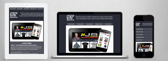
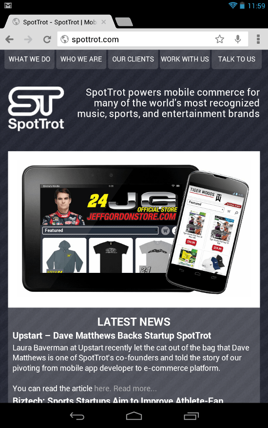
    <p>On the website for my company, <a href="http://spottrot.com/" rel="nofollow external" class="bo">SpotTrot</a> — which is content driven, but offers some interactive elements — we not only serve desktop and mobile interfaces, but a separate tablet one as well.</p>
    <p>We do this without redirecting the user to separate "m-dot" (e.g. <code>m.yourwebsite.com</code> or <code>mobile.yourwebsite.com</code>) or "t-dot" (e.g. <code>t.yourwebsite.com</code> or <code>tablet.yourwesbite.com</code>) subdomains.</p>
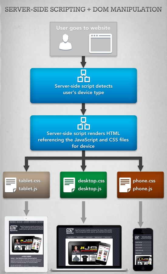
    <p>In other words, we don’t maintain a separate site for mobile and tablet devices — we simply modify the DOM and serve the appropriate JavaScript and CSS files based on the user’s browsing device.</p>
    <p><img src="http://cdn.sixrevisions.com/0332-02_serverside_dom_chart.jpg" width="550" height="903" style="max-width: 100%; height: auto;"></p>
    <h3>Using Server-side Scripting Libraries for Refined Device Recognition</h3>
    <p>The first step in achieving this is to use server-side user agent string parsing to determine the visitor’s device type.</p>
    <p>Parsing user agent strings to serve a custom interface is almost as old as the Web itself. In recent years, it has become the main technique for delivering "m-dot" versions of sites.</p>
    <p>The responsive design philosophy shies away from serving up separate subdomains for mobile devices, but traditional server-side scripting detection can be repurposed to render the same HTML file in multiple ways.</p>
    <p>There are a wide array of libraries that make server-side device detection easier, yet few work as well as <a href="http://blog.mobileesp.com/?page_id=20" rel="nofollow external" class="bo">MobileESP</a>, in my opinion. MobileESP is available in every major Web programming language and detects both device type and capabilities.</p>
    <p>Here is an example of how our website uses the PHP version of MobileESP to categorize devices and serve the appropriate CSS and JavaScript:</p>
    <pre>&lt;?php&#x000A;    <strong>// Create some constants for devices</strong>&#x000A;      class Device&#x000A;      {&#x000A;      const TABLET = 0;&#x000A;      const PHONE = 1;&#x000A;      const DESKTOP = 2;&#x000A;      }&#x000A;    &#x000A;    <strong>  // Initialize MobileESP object</strong>&#x000A;      $uagent_info = new uagent_info();&#x000A;    &#x000A;      // Define the device    &#x000A;      if($uagent_info-&gt;isTierTablet)&#x000A;      {&#x000A;      $device = Device::TABLET;&#x000A;      }&#x000A;      elseif($uagent_info-&gt;isIphone || $uagent_info-&gt;isAndroidPhone || $uagent_info-&gt;isTierRichCss)&#x000A;      {&#x000A;      $device = Device::PHONE;&#x000A;      }&#x000A;      else&#x000A;      {&#x000A;      $device = Device::DESKTOP;&#x000A;      }&#x000A;    ?&gt;&#x000A;      &lt;html&gt;&#x000A;      &lt;head&gt;&#x000A;      ...&#x000A;    <strong>  &lt;!-- Serve up the appropriate CSS and JavaScript for the device --&gt;</strong>&#x000A;      &lt;?php switch($device) : ?&gt;&#x000A;      &lt;?php case Device::TABLET: ?&gt;&#x000A;      &lt;link rel="stylesheet" type="text/css" href="style/tablet.css"/&gt;&#x000A;      &lt;script type="text/javascript" src="js/tablet.js"&gt;&lt;/script&gt;&#x000A;      &lt;?php break; ?&gt;&#x000A;      &lt;?php case Device::PHONE: ?&gt;&#x000A;      &lt;link rel="stylesheet" type="text/css" href="style/phone.css"/&gt;&#x000A;      &lt;script type="text/javascript" src="js/phone.js"&gt;&lt;/script&gt;&#x000A;      &lt;?php break; ?&gt;&#x000A;      &lt;?php default: ?&gt;&#x000A;      &lt;link rel="stylesheet" type="text/css" href="style/desktop.css"/&gt;&#x000A;      &lt;script type="text/javascript" src="js/desktop.js"&gt;&lt;/script&gt;&#x000A;      &lt;?php break; ?&gt;&#x000A;      &lt;?php endswitch; ?&gt;&#x000A;      &lt;/head&gt;&#x000A;      ...&#x000A;      &lt;/html&gt;&#x000A;     </pre>
    <h3>CSS Media Queries vs. DOM Manipulation</h3>
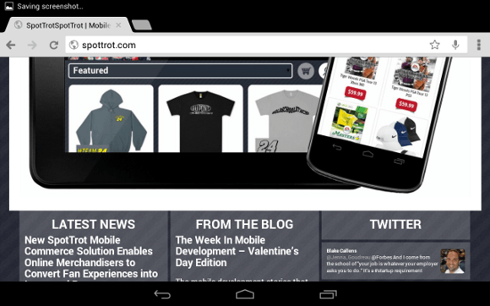
    <p>While desktop and mobile phone interfaces can follow more traditional design rules, the tablet space has a much higher degree of variation and requires more forethought. Tablet screen sizes commonly vary between 7 to 10 inches, while phones usually hover around 4 inches. Therefore, retina displays on tablets make a larger impact on the amount of pixels on screen. For our website, this means that the single column text display does not always work for tablets and needs to be switched to the three-column display also used on the desktop version of the site.</p>
    <p><img src="http://cdn.sixrevisions.com/0332-03_tablet_retina.png" width="550" height="344" style="max-width: 100%; height: auto;"></p>
    <p>This can be accomplished through <a href="http://www.w3.org/TR/css3-mediaqueries/" rel="nofollow external" class="bo">CSS media queries</a> or <a href="http://en.wikipedia.org/wiki/Document_Object_Model" rel="nofollow external" class="bo">JavaScript DOM manipulation.</a></p>
    <h4>CSS Media Query</h4>
    <p>CSS3 allows for extensive use of conditionals based on the user’s screen characteristics (such as width and orientation). Here is an example of using media queries to design responsive layouts:</p>
    <pre>@media screen and (min-width: [width]px)&#x000A;      {&#x000A;      .class&#x000A;       {&#x000A;        property: value;&#x000A;       }&#x000A;      }&#x000A;    @media screen and (-webkit-min-device-pixel-ratio: 2)&#x000A;    @media screen and (orientation: landscape)&#x000A;    @media screen and (device-aspect-ratio: 16/9)&#x000A;    </pre>
    <h4>DOM Manipulation</h4>
    <p>However, our site uses JavaScript DOM programming through <a href="http://sixrevisions.com/javascript/getting-started-with-jquery/" rel="nofollow external" class="bo">jQuery</a> to switch between the single and triple column view.</p>
    <p>Manipulating the DOM allows complete, real-time control over the layout of a web page. The tablet-specific JavaScript, served up by user agent parsing, contains code that alters the CSS of preexisting HTML div elements.</p>
    <pre><strong>// If the screen is wide enough that we want 3 columns</strong>&#x000A;      if($(window).width() &gt;= 770)&#x000A;      {&#x000A;    <strong>  // Create the indent</strong>&#x000A;      $("#front_items").css(&#x000A;      {&#x000A;      'margin-top': '-5px',&#x000A;      'margin-left': '20px'&#x000A;      });&#x000A;    &#x000A;    <strong>  // Size the columns</strong>&#x000A;      var textWidth = ($("#carousel").width() - 70) / 3;&#x000A;      $(".front_column").css(&#x000A;      {&#x000A;      'width': textWidth + 'px',&#x000A;      'margin-bottom': '0'&#x000A;      });&#x000A;      }&#x000A;    <strong>  // One column interface</strong>&#x000A;      else&#x000A;      {&#x000A;      $("#front_items").css(&#x000A;      {&#x000A;      'margin-top': '0',&#x000A;      'margin-left': '0'&#x000A;      });&#x000A;    &#x000A;      textWidth = $("#carousel").width() + 20;&#x000A;      $(".front_column").css(&#x000A;      {&#x000A;      'width': textWidth + 'px',&#x000A;      'margin-bottom': '5px'&#x000A;      });&#x000A;      }</pre>
    <h3>Downsides of Server-side Scripting + DOM Manipulation</h3>
    <p>Though this technique, in my opinion, allows for far greater control over design and interactivity versus using CSS3/media queries, it’s not without its potential downsides.</p>
    <ul>
    <li>
    <strong>No device or browser detection is flawless.</strong> The best way to maximize proper device detection is to use a regularly updated library like MobileESP.</li>
    <li>
    <strong>This solution will not fully function if the user has disabled JavaScript.</strong> Although the exceptionally few users that have JavaScript disabled are used to websites not fully functioning, solely using device-specific, CSS media queries is the best option if you want to keep some of the benefits without using JavaScript.</li>
    <li>
    <strong>This solution requires the maintenance of separate CSS and JavaScript files for each targeted device</strong> as opposed to a single CSS file that media queries can afford.</li>
    </ul>
    <h3>How it Works on Our Website</h3>
    <p>The navigation menu is the only element on all three versions of the SpotTrot site that has complete variation. So it’s a great talking point to show how this method works in the real-world.</p>
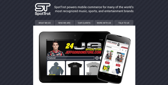
    <p>On the desktop, a horizontal menu sits below the header, matching traditional website layout. This allows the user to interact naturally and leaves the visual design of those elements as the main differentiator.</p>
    <p><img src="http://cdn.sixrevisions.com/0332-04_desktop_nav.png" width="550" height="277" style="max-width: 100%; height: auto;"></p>
    <p>On the tablet, the same horizontal menu is moved above the header. It is then slightly altered, with the corner radius moved to the bottom, to reinforce its positioning at the top of the page. This follows the expected interface of a native mobile application, with all navigation control usually in a bar at the top.</p>
    <p><img src="http://cdn.sixrevisions.com/0332-05_tablet_nav.png" width="550" height="880" style="max-width: 100%; height: auto;"></p>
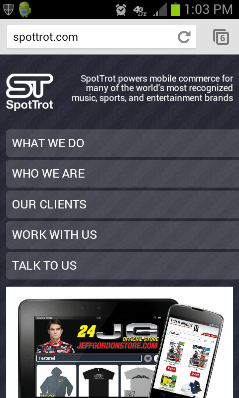
    <p>Finally, the phone version displays the highest amount of interface variation. It would be impossible to fit all of the horizontal navigation buttons on most smartphones, so the design opts for a vertical menu. The buttons automatically fit themselves to the width of the screen to maintain the user’s sense of vertical direction, complementing the single column layout for small screens.</p>
    <p><img src="http://cdn.sixrevisions.com/0332-06_phone_nav.png" width="480" height="800" style="max-width: 100%; height: auto;"></p>
    <h3>Conclusion</h3>
    <p>Within the last few years, web application design and development has been most affected by touchscreens. The shift of computer interaction to a tactile experience is the core factor in the "mobile revolution."</p>
    <p>As touchscreen laptops and desktops are becoming the norm, the interface designs currently implemented on smartphones and tablets will soon be the way all web applications are laid out. </p>
    <p>Learning these techniques and philosophies may be optional right now, but it will ultimately be a central part of any web developer’s job description soon.</p>
    <h3>Related Content</h3>
    <ul>
    <li><a href="http://sixrevisions.com/mobile/methods-mobile-websites/" rel="nofollow external" class="bo">A Comparison of Methods for Building Mobile-Optimized Websites</a></li>
    <li><a href="http://sixrevisions.com/mobile/design-iphone-apps-better/" rel="nofollow external" class="bo">5 Simple Tips for Designing Better iPhone Apps</a></li>
    <li><a href="http://sixrevisions.com/mobile/cross-platform-mobile-apps/" rel="nofollow external" class="bo">10 Solutions for Creating Cross-Platform Mobile Apps</a></li>
    <li>
    <em>Related categories</em>: <a href="http://sixrevisions.com/category/mobile/" rel="nofollow external" class="bo">Mobile</a> and <a href="http://sixrevisions.com/category/web-development/" rel="nofollow external" class="bo">Web Development</a>
    </li>
    </ul>
    <h3>About the Author</h3>
    <p><img src="http://cdn.sixrevisions.com/authors/blake_callens_small.jpg" alt="" width="80" height="80" style="max-width: 100%; height: auto;"><span><strong>Blake Callens</strong> is Lead Engineer for mobile e-commerce provider <a href="http://spottrot.com/" rel="nofollow external" class="bo">SpotTrot.</a> He’s contributes to e-commerce technology, specifically computer vision and natural user interface UX. He was lead architect/co-inventor of Webcam Social Shopper, is a Webby award winner, and is a co-inventor on an e-commerce U.S. patent for virtual dressing rooms. On Twitter: @<a href="https://twitter.com/blakecallens" rel="nofollow external" class="bo">blakecallens.</a></span></p>
    </div>
]]>
</Body>
<Summary>Advertise here with BSA      Mobile does not just mean smartphones anymore. The word has metamorphosed into an all-encompassing term for any computing device not permanently tied to a wall outlet....</Summary>
<Website>http://feedproxy.google.com/~r/SixRevisions/~3/3l3oHDW7mts/</Website>
<TrackingUrl>https://my3.my.umbc.edu/api/v0/pixel/news/26672/guest@my.umbc.edu/8dd15923d8d29d0a575c7b8ee9a66d66/api/pixel</TrackingUrl>
<Tag>css</Tag>
<Tag>database</Tag>
<Tag>design</Tag>
<Tag>development</Tag>
<Tag>html</Tag>
<Tag>javascript</Tag>
<Tag>mobile</Tag>
<Tag>mysql</Tag>
<Tag>sql</Tag>
<Tag>web</Tag>
<Group token="retired-583">Web Developer - Build Group</Group>
<GroupUrl>https://my3.my.umbc.edu/groups/retired-583</GroupUrl>
<AvatarUrl>https://assets3-my.umbc.edu/system/shared/avatars/groups/000/000/583/fc60f5d7abc2e080599bb6dc465db54d/xsmall.png?1363101197</AvatarUrl>
<AvatarUrl size="original">https://assets4-my.umbc.edu/system/shared/avatars/groups/000/000/583/fc60f5d7abc2e080599bb6dc465db54d/original.jpg?1363101197</AvatarUrl>
<AvatarUrl size="xxlarge">https://assets4-my.umbc.edu/system/shared/avatars/groups/000/000/583/fc60f5d7abc2e080599bb6dc465db54d/xxlarge.png?1363101197</AvatarUrl>
<AvatarUrl size="xlarge">https://assets4-my.umbc.edu/system/shared/avatars/groups/000/000/583/fc60f5d7abc2e080599bb6dc465db54d/xlarge.png?1363101197</AvatarUrl>
<AvatarUrl size="large">https://assets3-my.umbc.edu/system/shared/avatars/groups/000/000/583/fc60f5d7abc2e080599bb6dc465db54d/large.png?1363101197</AvatarUrl>
<AvatarUrl size="medium">https://assets3-my.umbc.edu/system/shared/avatars/groups/000/000/583/fc60f5d7abc2e080599bb6dc465db54d/medium.png?1363101197</AvatarUrl>
<AvatarUrl size="small">https://assets4-my.umbc.edu/system/shared/avatars/groups/000/000/583/fc60f5d7abc2e080599bb6dc465db54d/small.png?1363101197</AvatarUrl>
<AvatarUrl size="xsmall">https://assets3-my.umbc.edu/system/shared/avatars/groups/000/000/583/fc60f5d7abc2e080599bb6dc465db54d/xsmall.png?1363101197</AvatarUrl>
<AvatarUrl size="xxsmall">https://assets4-my.umbc.edu/system/shared/avatars/groups/000/000/583/fc60f5d7abc2e080599bb6dc465db54d/xxsmall.png?1363101197</AvatarUrl>
<Sponsor>Web Developer - Build Group</Sponsor>
<PawCount>0</PawCount>
<CommentCount>0</CommentCount>
<CommentsAllowed>true</CommentsAllowed>
<PostedAt>Mon, 25 Mar 2013 06:27:49 -0400</PostedAt>
<EditAt>Mon, 25 Mar 2013 06:27:49 -0400</EditAt>
</NewsItem>

<NewsItem contentIssues="true" id="26674" important="false" status="posted" url="https://my3.my.umbc.edu/posts/26674">
<Title>Social fundraising platform Believe.in launched</Title>
<Body>
<![CDATA[
    <div class="html-content">No cuts to charity donations - and no charges either<div><table border="0"><tbody><tr>
    <td><a href="http://share.feedsportal.com/viral/sendEmail.cfm?lang=en&amp;title=Social+fundraising+platform+Believe.in+launched&amp;link=http%3A%2F%2Fwww.netmagazine.com%2Fnews%2Fsocial-fundraising-platform-believein-launched-132643" rel="nofollow external" class="bo"><img src="http://res3.feedsportal.com/images/emailthis2.gif" style="max-width: 100%; height: auto;"></a></td>
    <td><a href="http://res.feedsportal.com/viral/bookmark.cfm?title=Social+fundraising+platform+Believe.in+launched&amp;link=http%3A%2F%2Fwww.netmagazine.com%2Fnews%2Fsocial-fundraising-platform-believein-launched-132643" rel="nofollow external" class="bo"><img src="http://res3.feedsportal.com/images/bookmark.gif" style="max-width: 100%; height: auto;"></a></td>
    </tr></tbody></table></div>
    <br><br><a href="http://da.feedsportal.com/r/161770920515/u/49/f/502346/c/32632/s/29f5c581/a2.htm" rel="nofollow external" class="bo"><img src="http://da.feedsportal.com/r/161770920515/u/49/f/502346/c/32632/s/29f5c581/a2.img" style="max-width: 100%; height: auto;"></a>
    </div>
]]>
</Body>
<Summary>No cuts to charity donations - and no charges either</Summary>
<Website>http://feedproxy.google.com/~r/net/topstories/~3/zEgJfZbdD1c/story01.htm</Website>
<TrackingUrl>https://my3.my.umbc.edu/api/v0/pixel/news/26674/guest@my.umbc.edu/89abaf6cac2758a3e770d35000fa3694/api/pixel</TrackingUrl>
<Tag>css</Tag>
<Tag>development</Tag>
<Tag>html</Tag>
<Tag>javascript</Tag>
<Tag>mysql</Tag>
<Tag>net</Tag>
<Tag>php</Tag>
<Tag>sql</Tag>
<Tag>web</Tag>
<Group token="retired-583">Web Developer - Build Group</Group>
<GroupUrl>https://my3.my.umbc.edu/groups/retired-583</GroupUrl>
<AvatarUrl>https://assets3-my.umbc.edu/system/shared/avatars/groups/000/000/583/fc60f5d7abc2e080599bb6dc465db54d/xsmall.png?1363101197</AvatarUrl>
<AvatarUrl size="original">https://assets4-my.umbc.edu/system/shared/avatars/groups/000/000/583/fc60f5d7abc2e080599bb6dc465db54d/original.jpg?1363101197</AvatarUrl>
<AvatarUrl size="xxlarge">https://assets4-my.umbc.edu/system/shared/avatars/groups/000/000/583/fc60f5d7abc2e080599bb6dc465db54d/xxlarge.png?1363101197</AvatarUrl>
<AvatarUrl size="xlarge">https://assets4-my.umbc.edu/system/shared/avatars/groups/000/000/583/fc60f5d7abc2e080599bb6dc465db54d/xlarge.png?1363101197</AvatarUrl>
<AvatarUrl size="large">https://assets3-my.umbc.edu/system/shared/avatars/groups/000/000/583/fc60f5d7abc2e080599bb6dc465db54d/large.png?1363101197</AvatarUrl>
<AvatarUrl size="medium">https://assets3-my.umbc.edu/system/shared/avatars/groups/000/000/583/fc60f5d7abc2e080599bb6dc465db54d/medium.png?1363101197</AvatarUrl>
<AvatarUrl size="small">https://assets4-my.umbc.edu/system/shared/avatars/groups/000/000/583/fc60f5d7abc2e080599bb6dc465db54d/small.png?1363101197</AvatarUrl>
<AvatarUrl size="xsmall">https://assets3-my.umbc.edu/system/shared/avatars/groups/000/000/583/fc60f5d7abc2e080599bb6dc465db54d/xsmall.png?1363101197</AvatarUrl>
<AvatarUrl size="xxsmall">https://assets4-my.umbc.edu/system/shared/avatars/groups/000/000/583/fc60f5d7abc2e080599bb6dc465db54d/xxsmall.png?1363101197</AvatarUrl>
<Sponsor>Web Developer - Build Group</Sponsor>
<PawCount>0</PawCount>
<CommentCount>0</CommentCount>
<CommentsAllowed>true</CommentsAllowed>
<PostedAt>Mon, 25 Mar 2013 06:21:38 -0400</PostedAt>
</NewsItem>

<NewsItem contentIssues="true" id="26670" important="false" status="posted" url="https://my3.my.umbc.edu/posts/26670">
<Title>8 Startup Events and News to Watch This Week</Title>
<Body>
<![CDATA[
    <div class="html-content">Google helps Baton Rouge businesses online, StartUp Britain kicks off, Brad Feld gets personal about starting up, Rob Irizarry schools Montana’s entrepreneurs on the science of starting up, avoiding startup mistakes with legal know how, the Hitachi Foundation offers $200k in prizes at Young Entrepreneur Award…this weeks notable news and startup events for young treps.</div>
]]>
</Body>
<Summary>Google helps Baton Rouge businesses online, StartUp Britain kicks off, Brad Feld gets personal about starting up, Rob Irizarry schools Montana’s entrepreneurs on the science of starting up,...</Summary>
<Website>http://feedproxy.google.com/~r/YoungentrepreneurcomBlog/~3/Rnvx_-g3e2U/</Website>
<TrackingUrl>https://my3.my.umbc.edu/api/v0/pixel/news/26670/guest@my.umbc.edu/a5897de3ac329e179bf3cbb4f3e29c71/api/pixel</TrackingUrl>
<Tag>conferences</Tag>
<Tag>entrepreneurship</Tag>
<Tag>google</Tag>
<Tag>networking-events</Tag>
<Tag>startup-news</Tag>
<Group token="entrepreneurship">Alex. Brown Center for Entrepreneurship</Group>
<GroupUrl>https://my3.my.umbc.edu/groups/entrepreneurship</GroupUrl>
<AvatarUrl>https://assets2-my.umbc.edu/system/shared/avatars/groups/000/000/092/53c03b106bdc6e19e4bf0a41b5a37add/xsmall.png?1771000363</AvatarUrl>
<AvatarUrl size="original">https://assets3-my.umbc.edu/system/shared/avatars/groups/000/000/092/53c03b106bdc6e19e4bf0a41b5a37add/original.jpg?1771000363</AvatarUrl>
<AvatarUrl size="xxlarge">https://assets2-my.umbc.edu/system/shared/avatars/groups/000/000/092/53c03b106bdc6e19e4bf0a41b5a37add/xxlarge.png?1771000363</AvatarUrl>
<AvatarUrl size="xlarge">https://assets1-my.umbc.edu/system/shared/avatars/groups/000/000/092/53c03b106bdc6e19e4bf0a41b5a37add/xlarge.png?1771000363</AvatarUrl>
<AvatarUrl size="large">https://assets4-my.umbc.edu/system/shared/avatars/groups/000/000/092/53c03b106bdc6e19e4bf0a41b5a37add/large.png?1771000363</AvatarUrl>
<AvatarUrl size="medium">https://assets1-my.umbc.edu/system/shared/avatars/groups/000/000/092/53c03b106bdc6e19e4bf0a41b5a37add/medium.png?1771000363</AvatarUrl>
<AvatarUrl size="small">https://assets3-my.umbc.edu/system/shared/avatars/groups/000/000/092/53c03b106bdc6e19e4bf0a41b5a37add/small.png?1771000363</AvatarUrl>
<AvatarUrl size="xsmall">https://assets2-my.umbc.edu/system/shared/avatars/groups/000/000/092/53c03b106bdc6e19e4bf0a41b5a37add/xsmall.png?1771000363</AvatarUrl>
<AvatarUrl size="xxsmall">https://assets3-my.umbc.edu/system/shared/avatars/groups/000/000/092/53c03b106bdc6e19e4bf0a41b5a37add/xxsmall.png?1771000363</AvatarUrl>
<Sponsor>The Alex. Brown Center for Entrepreneurship</Sponsor>
<PawCount>0</PawCount>
<CommentCount>0</CommentCount>
<CommentsAllowed>true</CommentsAllowed>
<PostedAt>Mon, 25 Mar 2013 06:00:49 -0400</PostedAt>
<EditAt>Mon, 25 Mar 2013 06:00:49 -0400</EditAt>
</NewsItem>

<NewsItem contentIssues="true" id="26668" important="false" status="posted" url="https://my3.my.umbc.edu/posts/26668">
<Title>&#8220;Being White in Philly&#8221; Causes Controversy</Title>
<Body>
<![CDATA[
    <div class="html-content">
    <p><a href="http://usdemocrazy.net/wp-content/uploads/2013/03/afed158af768090f1b4fc58cc8a0597b.jpg" rel="nofollow external" class="bo"><img alt="" src="http://usdemocrazy.net/wp-content/uploads/2013/03/afed158af768090f1b4fc58cc8a0597b-232x300.jpg" width="232" height="300" style="max-width: 100%; height: auto;"></a></p>
    <p>Is race still a hypersensitive subject for Americans?   It appears so…</p>
    <p>A recent Philadelphia Magazine cover story titled “<a href="http://www.phillymag.com/articles/white-philly/" rel="nofollow external" class="bo">Being White in Philly</a>,” has hit a raw nerve in the city of Brotherly Love.</p>
    <p>The article describes the experiences of many white city residents who live in racially mixed neighborhoods.  The accounts in the article range from pleasant to tumultuous.  One older man describes being the victim of multiple criminal acts committed by black people, while another woman describes taking her daughter to a pool in a black community where they met many nice young black girls.     </p>
    <p>The article also tackles the taboo of white people trying to express feelings about race, which sometimes may be considered politically incorrect.</p>
    <p>Editor of Philadelphia Magazine, and author of the article, Robert Huber, claims  he intended for his work to address problems of race relations in Philadelphia and “push for a better dialogue.”  Whether the dialogue that has been opened is better is questionable, but the article certainly has people talking.</p>
    <p>Black Mayor of Philadelphia, <a href="http://www.nbcbayarea.com/news/national-international/NATL-PHI-White-in-Philly-Sparks-Racial-Debate-198976861.html" rel="nofollow external" class="bo">Michael Nutter</a>, claimed the article perpetrated negative stereotypes that portrayed the African American community as lazy, irresponsible and criminal.  He wrote a <a href="http://media.philly.com/documents/MayorLettertoPCHR.pdf" rel="nofollow external" class="bo">four page letter</a> to the Human Relations Commission calling the article an  ”incitement to extreme reaction,” and then took it a step further by writing:</p>
    <blockquote>
    <p>“I ask that the commission consider specifically whether Philadelphia Magazine and the writer, Bob Huber, are appropriate for rebuke by the commission in light of the potentially inflammatory effect and the reckless endangerment to Philadelphia’s racial relations possibly caused by the essay’s unsubstantiated assertions.”</p>
    </blockquote>
    <p>Nutter’s challenge of Huber’s right to free speech has only brought more attention to the article.  Amendment scholars such as <a href="http://www.wnd.com/2013/03/black-mayor-rips-being-white-in-philly-magazine-story/" rel="nofollow external" class="bo">UCLA law professor Eugene Volokh</a>, have referred to Nutter’s letter as “outright suppression” of speech.  </p>
    <p>While there are some members of the public who agree with Nutter’s views on the article, many others do not.  A sociologist professor at University of Pennsylvania believes the article has provided an opportunity for Philadelphia to openly converse about race issues.  </p>
    <p>Another city resident, <a href="http://www.nbcbayarea.com/news/national-international/NATL-PHI-White-in-Philly-Sparks-Racial-Debate-198976861.html" rel="nofollow external" class="bo">James Brunson stated</a>,</p>
    <blockquote>
    <p>“The more dialogue we have on race and race issues, the more understanding we have of where other people are coming from.” </p>
    </blockquote>
    <p>A public meeting will be held by the Philadelphia Human Relations Commission on April 18th to discuss the article.</p>
    <p>What do you think?  Should people be condemned for expressing feelings of uneasiness about races other then their own?</p>
    </div>
]]>
</Body>
<Summary>Is race still a hypersensitive subject for Americans?   It appears so…   A recent Philadelphia Magazine cover story titled “Being White in Philly,” has hit a raw nerve in the city of Brotherly...</Summary>
<Website>http://usdemocrazy.net/being-white-in-philly-causes-controversy/</Website>
<TrackingUrl>https://my3.my.umbc.edu/api/v0/pixel/news/26668/guest@my.umbc.edu/401ba753b7e72365bef6270d023889c0/api/pixel</TrackingUrl>
<Tag>being-white-in-philly</Tag>
<Tag>democracy</Tag>
<Tag>irc</Tag>
<Tag>michael-nutter</Tag>
<Tag>news</Tag>
<Tag>philadelphia-magazine</Tag>
<Tag>politics</Tag>
<Tag>robert-huber</Tag>
<Tag>umbc</Tag>
<Tag>usdemocrazy</Tag>
<Group token="retired-12">USDemocrazy</Group>
<GroupUrl>https://my3.my.umbc.edu/groups/retired-12</GroupUrl>
<AvatarUrl>https://assets1-my.umbc.edu/system/shared/avatars/groups/000/000/012/f0935e4cd5920aa6c7c996a5ee53a70f/xsmall.png?1279120129</AvatarUrl>
<AvatarUrl size="original">https://assets4-my.umbc.edu/system/shared/avatars/groups/000/000/012/f0935e4cd5920aa6c7c996a5ee53a70f/original.jpg?1279120129</AvatarUrl>
<AvatarUrl size="xxlarge">https://assets3-my.umbc.edu/system/shared/avatars/groups/000/000/012/f0935e4cd5920aa6c7c996a5ee53a70f/xxlarge.png?1279120129</AvatarUrl>
<AvatarUrl size="xlarge">https://assets4-my.umbc.edu/system/shared/avatars/groups/000/000/012/f0935e4cd5920aa6c7c996a5ee53a70f/xlarge.png?1279120129</AvatarUrl>
<AvatarUrl size="large">https://assets4-my.umbc.edu/system/shared/avatars/groups/000/000/012/f0935e4cd5920aa6c7c996a5ee53a70f/large.png?1279120129</AvatarUrl>
<AvatarUrl size="medium">https://assets1-my.umbc.edu/system/shared/avatars/groups/000/000/012/f0935e4cd5920aa6c7c996a5ee53a70f/medium.png?1279120129</AvatarUrl>
<AvatarUrl size="small">https://assets2-my.umbc.edu/system/shared/avatars/groups/000/000/012/f0935e4cd5920aa6c7c996a5ee53a70f/small.png?1279120129</AvatarUrl>
<AvatarUrl size="xsmall">https://assets1-my.umbc.edu/system/shared/avatars/groups/000/000/012/f0935e4cd5920aa6c7c996a5ee53a70f/xsmall.png?1279120129</AvatarUrl>
<AvatarUrl size="xxsmall">https://assets1-my.umbc.edu/system/shared/avatars/groups/000/000/012/f0935e4cd5920aa6c7c996a5ee53a70f/xxsmall.png?1279120129</AvatarUrl>
<Sponsor>USDemocrazy</Sponsor>
<PawCount>11</PawCount>
<CommentCount>2</CommentCount>
<CommentsAllowed>true</CommentsAllowed>
<PostedAt>Mon, 25 Mar 2013 01:15:55 -0400</PostedAt>
</NewsItem>

</News>