<?xml version="1.0"?>
<News hasArchived="true" page="8774" pageCount="10784" pageSize="10" timestamp="Tue, 01 Sep 2026 22:25:39 -0400" url="https://my3.my.umbc.edu/posts.xml?mode=recent&amp;page=8774">
<NewsItem contentIssues="true" id="29874" important="false" status="posted" url="https://my3.my.umbc.edu/posts/29874">
<Title>Gadgetwise Blog: Skullcandy Cuts the Cord, and Offers Better Sound</Title>
<Body>
<![CDATA[
    <div class="html-content">At $180, the Plyr1 wireless gaming headset from Skullcandy is more expensive than rivals, but it does offer a few advantages.<div><table border="0"><tbody><tr><td>
    <a href="http://share.feedsportal.com/share/twitter/?u=http%3A%2F%2Fgadgetwise.blogs.nytimes.com%2F2013%2F05%2F20%2Fskullcandy-cuts-the-cord-and-offers-better-sound%2F%3Fpartner%3Drss%26emc%3Drss&amp;t=Gadgetwise+Blog%3A+Skullcandy+Cuts+the+Cord%2C+and+Offers+Better+Sound" rel="nofollow external" class="bo"><img src="http://res3.feedsportal.com/social/twitter.png" style="max-width: 100%; height: auto;"></a> <a href="http://share.feedsportal.com/share/facebook/?u=http%3A%2F%2Fgadgetwise.blogs.nytimes.com%2F2013%2F05%2F20%2Fskullcandy-cuts-the-cord-and-offers-better-sound%2F%3Fpartner%3Drss%26emc%3Drss&amp;t=Gadgetwise+Blog%3A+Skullcandy+Cuts+the+Cord%2C+and+Offers+Better+Sound" rel="nofollow external" class="bo"><img src="http://res3.feedsportal.com/social/facebook.png" style="max-width: 100%; height: auto;"></a> <a href="http://share.feedsportal.com/share/linkedin/?u=http%3A%2F%2Fgadgetwise.blogs.nytimes.com%2F2013%2F05%2F20%2Fskullcandy-cuts-the-cord-and-offers-better-sound%2F%3Fpartner%3Drss%26emc%3Drss&amp;t=Gadgetwise+Blog%3A+Skullcandy+Cuts+the+Cord%2C+and+Offers+Better+Sound" rel="nofollow external" class="bo"><img src="http://res3.feedsportal.com/social/linkedin.png" style="max-width: 100%; height: auto;"></a> <a href="http://share.feedsportal.com/share/gplus/?u=http%3A%2F%2Fgadgetwise.blogs.nytimes.com%2F2013%2F05%2F20%2Fskullcandy-cuts-the-cord-and-offers-better-sound%2F%3Fpartner%3Drss%26emc%3Drss&amp;t=Gadgetwise+Blog%3A+Skullcandy+Cuts+the+Cord%2C+and+Offers+Better+Sound" rel="nofollow external" class="bo"><img src="http://res3.feedsportal.com/social/googleplus.png" style="max-width: 100%; height: auto;"></a> <a href="http://share.feedsportal.com/share/email/?u=http%3A%2F%2Fgadgetwise.blogs.nytimes.com%2F2013%2F05%2F20%2Fskullcandy-cuts-the-cord-and-offers-better-sound%2F%3Fpartner%3Drss%26emc%3Drss&amp;t=Gadgetwise+Blog%3A+Skullcandy+Cuts+the+Cord%2C+and+Offers+Better+Sound" rel="nofollow external" class="bo"><img src="http://res3.feedsportal.com/social/email.png" style="max-width: 100%; height: auto;"></a>
    </td></tr></tbody></table></div>
    <br><br><a href="http://da.feedsportal.com/r/165664326684/u/0/f/640387/c/34625/s/2c272758/a2.htm" rel="nofollow external" class="bo"><img src="http://da.feedsportal.com/r/165664326684/u/0/f/640387/c/34625/s/2c272758/a2.img" style="max-width: 100%; height: auto;"></a>
    </div>
]]>
</Body>
<Summary>At $180, the Plyr1 wireless gaming headset from Skullcandy is more expensive than rivals, but it does offer a few advantages.     </Summary>
<Website>http://gadgetwise.blogs.nytimes.com/2013/05/20/skullcandy-cuts-the-cord-and-offers-better-sound/?partner=rss&amp;emc=rss</Website>
<TrackingUrl>https://my3.my.umbc.edu/api/v0/pixel/news/29874/guest@my.umbc.edu/b9ddc9881550c36d283479a647c9f153/api/pixel</TrackingUrl>
<Tag>headphones-and-headsets</Tag>
<Tag>headsets-and-accessories</Tag>
<Tag>mobile</Tag>
<Tag>new</Tag>
<Tag>products</Tag>
<Tag>skullcandy</Tag>
<Tag>technology</Tag>
<Tag>york</Tag>
<Group token="retired-583">Web Developer - Build Group</Group>
<GroupUrl>https://my3.my.umbc.edu/groups/retired-583</GroupUrl>
<AvatarUrl>https://assets3-my.umbc.edu/system/shared/avatars/groups/000/000/583/fc60f5d7abc2e080599bb6dc465db54d/xsmall.png?1363101197</AvatarUrl>
<AvatarUrl size="original">https://assets4-my.umbc.edu/system/shared/avatars/groups/000/000/583/fc60f5d7abc2e080599bb6dc465db54d/original.jpg?1363101197</AvatarUrl>
<AvatarUrl size="xxlarge">https://assets4-my.umbc.edu/system/shared/avatars/groups/000/000/583/fc60f5d7abc2e080599bb6dc465db54d/xxlarge.png?1363101197</AvatarUrl>
<AvatarUrl size="xlarge">https://assets4-my.umbc.edu/system/shared/avatars/groups/000/000/583/fc60f5d7abc2e080599bb6dc465db54d/xlarge.png?1363101197</AvatarUrl>
<AvatarUrl size="large">https://assets3-my.umbc.edu/system/shared/avatars/groups/000/000/583/fc60f5d7abc2e080599bb6dc465db54d/large.png?1363101197</AvatarUrl>
<AvatarUrl size="medium">https://assets3-my.umbc.edu/system/shared/avatars/groups/000/000/583/fc60f5d7abc2e080599bb6dc465db54d/medium.png?1363101197</AvatarUrl>
<AvatarUrl size="small">https://assets4-my.umbc.edu/system/shared/avatars/groups/000/000/583/fc60f5d7abc2e080599bb6dc465db54d/small.png?1363101197</AvatarUrl>
<AvatarUrl size="xsmall">https://assets3-my.umbc.edu/system/shared/avatars/groups/000/000/583/fc60f5d7abc2e080599bb6dc465db54d/xsmall.png?1363101197</AvatarUrl>
<AvatarUrl size="xxsmall">https://assets4-my.umbc.edu/system/shared/avatars/groups/000/000/583/fc60f5d7abc2e080599bb6dc465db54d/xxsmall.png?1363101197</AvatarUrl>
<Sponsor>Web Developer - Build Group</Sponsor>
<PawCount>0</PawCount>
<CommentCount>0</CommentCount>
<CommentsAllowed>true</CommentsAllowed>
<PostedAt>Mon, 20 May 2013 06:25:59 -0400</PostedAt>
</NewsItem>

<NewsItem contentIssues="true" id="29808" important="false" status="posted" url="https://my3.my.umbc.edu/posts/29808">
<Title>Content strategy 101, Part 3: put knowledge into action</Title>
<Body>
<![CDATA[
    <div class="html-content">In the third of a four-part series, Sandi Wassmer argues that it pays to plan before embarking on any project<div><table border="0"><tbody><tr><td>
    <a href="http://share.feedsportal.com/share/twitter/?u=http%3A%2F%2Fwww.netmagazine.com%2Ffeatures%2Fcontent-strategy-101-part-3-put-knowledge-action&amp;t=Content+strategy+101%2C+Part+3%3A+put+knowledge+into+action" rel="nofollow external" class="bo"><img src="http://res3.feedsportal.com/social/twitter.png" style="max-width: 100%; height: auto;"></a> <a href="http://share.feedsportal.com/share/facebook/?u=http%3A%2F%2Fwww.netmagazine.com%2Ffeatures%2Fcontent-strategy-101-part-3-put-knowledge-action&amp;t=Content+strategy+101%2C+Part+3%3A+put+knowledge+into+action" rel="nofollow external" class="bo"><img src="http://res3.feedsportal.com/social/facebook.png" style="max-width: 100%; height: auto;"></a> <a href="http://share.feedsportal.com/share/linkedin/?u=http%3A%2F%2Fwww.netmagazine.com%2Ffeatures%2Fcontent-strategy-101-part-3-put-knowledge-action&amp;t=Content+strategy+101%2C+Part+3%3A+put+knowledge+into+action" rel="nofollow external" class="bo"><img src="http://res3.feedsportal.com/social/linkedin.png" style="max-width: 100%; height: auto;"></a> <a href="http://share.feedsportal.com/share/gplus/?u=http%3A%2F%2Fwww.netmagazine.com%2Ffeatures%2Fcontent-strategy-101-part-3-put-knowledge-action&amp;t=Content+strategy+101%2C+Part+3%3A+put+knowledge+into+action" rel="nofollow external" class="bo"><img src="http://res3.feedsportal.com/social/googleplus.png" style="max-width: 100%; height: auto;"></a> <a href="http://share.feedsportal.com/share/email/?u=http%3A%2F%2Fwww.netmagazine.com%2Ffeatures%2Fcontent-strategy-101-part-3-put-knowledge-action&amp;t=Content+strategy+101%2C+Part+3%3A+put+knowledge+into+action" rel="nofollow external" class="bo"><img src="http://res3.feedsportal.com/social/email.png" style="max-width: 100%; height: auto;"></a>
    </td></tr></tbody></table></div>
    <br><br><a href="http://da.feedsportal.com/r/165665204400/u/49/f/502346/c/32632/s/2c26e447/a2.htm" rel="nofollow external" class="bo"><img src="http://da.feedsportal.com/r/165665204400/u/49/f/502346/c/32632/s/2c26e447/a2.img" style="max-width: 100%; height: auto;"></a>
    </div>
]]>
</Body>
<Summary>In the third of a four-part series, Sandi Wassmer argues that it pays to plan before embarking on any project     </Summary>
<Website>http://feedproxy.google.com/~r/net/topstories/~3/pW38eDev8k4/story01.htm</Website>
<TrackingUrl>https://my3.my.umbc.edu/api/v0/pixel/news/29808/guest@my.umbc.edu/8c11848a13c7e961cfccd5f2743ac39c/api/pixel</TrackingUrl>
<Tag>css</Tag>
<Tag>development</Tag>
<Tag>html</Tag>
<Tag>javascript</Tag>
<Tag>mysql</Tag>
<Tag>net</Tag>
<Tag>php</Tag>
<Tag>sql</Tag>
<Tag>web</Tag>
<Group token="retired-583">Web Developer - Build Group</Group>
<GroupUrl>https://my3.my.umbc.edu/groups/retired-583</GroupUrl>
<AvatarUrl>https://assets3-my.umbc.edu/system/shared/avatars/groups/000/000/583/fc60f5d7abc2e080599bb6dc465db54d/xsmall.png?1363101197</AvatarUrl>
<AvatarUrl size="original">https://assets4-my.umbc.edu/system/shared/avatars/groups/000/000/583/fc60f5d7abc2e080599bb6dc465db54d/original.jpg?1363101197</AvatarUrl>
<AvatarUrl size="xxlarge">https://assets4-my.umbc.edu/system/shared/avatars/groups/000/000/583/fc60f5d7abc2e080599bb6dc465db54d/xxlarge.png?1363101197</AvatarUrl>
<AvatarUrl size="xlarge">https://assets4-my.umbc.edu/system/shared/avatars/groups/000/000/583/fc60f5d7abc2e080599bb6dc465db54d/xlarge.png?1363101197</AvatarUrl>
<AvatarUrl size="large">https://assets3-my.umbc.edu/system/shared/avatars/groups/000/000/583/fc60f5d7abc2e080599bb6dc465db54d/large.png?1363101197</AvatarUrl>
<AvatarUrl size="medium">https://assets3-my.umbc.edu/system/shared/avatars/groups/000/000/583/fc60f5d7abc2e080599bb6dc465db54d/medium.png?1363101197</AvatarUrl>
<AvatarUrl size="small">https://assets4-my.umbc.edu/system/shared/avatars/groups/000/000/583/fc60f5d7abc2e080599bb6dc465db54d/small.png?1363101197</AvatarUrl>
<AvatarUrl size="xsmall">https://assets3-my.umbc.edu/system/shared/avatars/groups/000/000/583/fc60f5d7abc2e080599bb6dc465db54d/xsmall.png?1363101197</AvatarUrl>
<AvatarUrl size="xxsmall">https://assets4-my.umbc.edu/system/shared/avatars/groups/000/000/583/fc60f5d7abc2e080599bb6dc465db54d/xxsmall.png?1363101197</AvatarUrl>
<Sponsor>Web Developer - Build Group</Sponsor>
<PawCount>0</PawCount>
<CommentCount>0</CommentCount>
<CommentsAllowed>true</CommentsAllowed>
<PostedAt>Mon, 20 May 2013 06:00:48 -0400</PostedAt>
</NewsItem>

<NewsItem contentIssues="true" id="29807" important="false" status="posted" url="https://my3.my.umbc.edu/posts/29807">
<Title>Giveaway: Free Subscriptions to Depositphotos</Title>
<Body>
<![CDATA[
    <div class="html-content">
    <a href="http://rss.buysellads.com/click.php?z=1259902&amp;k=6989dd4b5220d0b14530453de7387991&amp;a=6835&amp;c=335463033" rel="nofollow external" class="bo"><img src="http://rss.buysellads.com/img.php?z=1259902&amp;k=6989dd4b5220d0b14530453de7387991&amp;a=6835&amp;c=335463033" alt="" style="max-width: 100%; height: auto;"></a><p><a href="http://buysellads.com/buy/sitedetails/pubkey/6989dd4b5220d0b14530453de7387991/zone/1259902" rel="nofollow external" class="bo">Advertise here with BSA</a></p>
    <br><p><a title="Click this to open the Depositphotos home page in a new browser window/tab." href="http://depositphotos.com/" rel="nofollow external" class="bo"><img src="http://cdn.sixrevisions.com/0338-01_giveaway_depositphotos_may2013_thumbnail.jpg" width="550" height="200" alt="Click this to open the Depositphotos home page in a new browser window/tab." style="max-width: 100%; height: auto;"></a></p>
    <p>Up for grabs in this week’s giveaway are <strong>three 30-day subscriptions</strong> to <a href="http://depositphotos.com/" rel="nofollow external" class="bo">Depositphotos</a> — one of the most popular  sites for downloading royalty-free files online. The subscriptions  being given away are  usually worth <strong>$99</strong> each. The subscriptions will  allow the winners to download up to <strong>300  royalty-free</strong> stock photos, illustrations, videos, vector art, etc. Read on  to see how you can be one of our lucky winners!</p>
    <p></p>
    <h3>** Giveaway Period Has Ended **</h3>
    <h3>About Depositphotos</h3>
    <p><a href="http://depositphotos.com/" rel="nofollow external" class="bo"><img src="http://cdn.sixrevisions.com/0338-02_giveaway_depositphotos_may2013_homepage.jpg" width="550" height="404" alt="About Depositphotos" style="max-width: 100%; height: auto;"></a></p>
    <p><a href="http://depositphotos.com/" rel="nofollow external" class="bo">Depositphotos</a> is a  creative online platform that gives its users an opportunity to buy and sell  high-quality stock photos, vector images, and videos.</p>
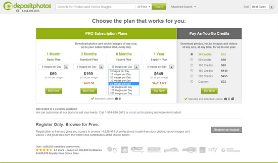
    <p>They have various <a href="http://depositphotos.com/subscribe.html" rel="nofollow external" class="bo">subscription options</a> to make  sure that you’ll find one that’s friendly to your budget.</p>
    <p><a href="http://depositphotos.com/subscribe.html" rel="nofollow external" class="bo"><img src="http://cdn.sixrevisions.com/0338-03_giveaway_depositphotos_may2013_subscriptionplans.jpg" width="550" height="323" alt="subscription options" style="max-width: 100%; height: auto;"></a></p>
    <p>Established in 2009, Depositphotos is a continually growing  company that serves customers from 192 countries. They are proud  to provide their customers with support in 14 languages. The agency’s headquarters is  located in Florida, USA.</p>
    <h3>Do Have a Blog or Own a Website?</h3>
    <p>Depositphotos is currently sponsoring bloggers and site  owners by giving them <strong>free Depositphotos  subscriptions.</strong></p>
    <p><a href="http://depositphotos.com/for-bloggers.html" rel="nofollow external" class="bo"><img src="http://cdn.sixrevisions.com/0338-04_giveaway_depositphotos_may2013_free_subscriptions.jpg" width="550" height="282" style="max-width: 100%; height: auto;"></a></p>
    <p>Read more about their <a href="http://depositphotos.com/for-bloggers.html" rel="nofollow external" class="bo">program for bloggers and site  owners</a> on the Depositphotos website.</p>
    <h3>** Giveaway Period Has Ended **</h3>
    <h3>How to Win</h3>
    <p>For a chance to win a 30-day free subscription to Depositphotos, simply  follow these instructions:</p>
    <p>1) <strong>Go</strong> to the their royalty-free stock library: <a href="http://depositphotos.com/category/" rel="nofollow external" class="bo">http://depositphotos.com/category/</a></p>
    <p>2) <strong>Find</strong> a stock file that you really like</p>
    <p>3) In the <strong>comments section</strong> at the bottom of this post: </p>
    <ol>
    <li>Mention the <strong>URL</strong> of the stock file you found, and </li>
    <li>Discuss <strong>why you like the stock file </strong>or <strong>where you’d use it</strong> if you  won a free subscription</li>
    </ol>
    <h3>Giveaway Details</h3>
    <p>This giveaway ends on <em>Monday, May 27, 2013</em> after which the comments section on this  post will be closed and you will no longer be able to leave a comment. Please  leave a valid email address when filling out the comment form so that we can  contact you if you’ve won. Please only comment once. The winners will be  randomly selected using the same method as previous Six Revisions giveaways.  The winners will be announced on a separate post and you’re advised to <a href="http://feeds2.feedburner.com/SixRevisions" rel="nofollow external" class="bo">subscribe to our RSS feed</a> so  that you can be quickly notified when the winners announcement post has been  published. Please note that comments are moderated and so your comment may not  show up right away. Please also note that comments that do not follow the  instructions on how to participate (described above) may not be published, or  may be removed later on.</p>
    <h3>
    Related Content</h3>
    <ul>
    <li><a href="http://sixrevisions.com/design-showcase-inspiration/webdesigns-photos-backgrounds/" rel="nofollow external" class="bo">30  Beautiful Web Designs That Use Photos as Backgrounds</a></li>
    <li><a href="http://sixrevisions.com/design-showcase-inspiration/using-photos-web-design/" rel="nofollow external" class="bo">Excellent  Examples of Using Photos in Web Design</a></li>
    <li><a href="http://sixrevisions.com/design-showcase-inspiration/30-stunning-urban-hdr-photos-with-creative-commons-licenses/" rel="nofollow external" class="bo">30  Stunning Urban HDR Photos with Creative Commons Licenses</a></li>
    <li>
    <em>Related categories</em>: <a href="http://sixrevisions.com/category/resources/" rel="nofollow external" class="bo">Resources</a> and <a href="http://sixrevisions.com/category/graphics-design/" rel="nofollow external" class="bo">Graphic Design</a>
    </li>
    </ul>
    <h3>About the Author</h3>
    <p><img src="http://images.sixrevisions.com/authors/jacob_gube_small.jpg" alt="" width="80" height="80" style="max-width: 100%; height: auto;"><span><strong>Jacob Gube</strong> is the Founder and Chief Editor of <strong><a href="http://sixrevisions.com/" rel="nofollow external" class="bo">Six Revisions</a></strong>. He’s also a web developer/designer who specializes in front-end development (JavaScript, HTML, CSS) and also a <a href="http://www.amazon.com/gp/product/1847194583?ie=UTF8&amp;tag=sixrevi-20&amp;linkCode=as2&amp;camp=1789&amp;creative=390957&amp;creativeASIN=1847194583" rel="nofollow external" class="bo"><strong>book author</strong></a>. If you’d like to connect with him, head on over to the <a href="http://sixrevisions.com/contact/" rel="nofollow external" class="bo"><strong>contact page</strong></a> and follow him on Twitter: <strong>@<a href="http://twitter.com/sixrevisions" rel="nofollow external" class="bo">sixrevisions</a></strong>.</span></p>
    </div>
]]>
</Body>
<Summary>Advertise here with BSA      Up for grabs in this week’s giveaway are three 30-day subscriptions to Depositphotos — one of the most popular  sites for downloading royalty-free files online. The...</Summary>
<Website>http://feedproxy.google.com/~r/SixRevisions/~3/SIgr0ibOZ-0/</Website>
<TrackingUrl>https://my3.my.umbc.edu/api/v0/pixel/news/29807/guest@my.umbc.edu/69d016c4cee12ebc22931f45b2b6f901/api/pixel</TrackingUrl>
<Tag>contests</Tag>
<Tag>css</Tag>
<Tag>database</Tag>
<Tag>design</Tag>
<Tag>development</Tag>
<Tag>html</Tag>
<Tag>javascript</Tag>
<Tag>mysql</Tag>
<Tag>sql</Tag>
<Tag>web</Tag>
<Group token="retired-583">Web Developer - Build Group</Group>
<GroupUrl>https://my3.my.umbc.edu/groups/retired-583</GroupUrl>
<AvatarUrl>https://assets3-my.umbc.edu/system/shared/avatars/groups/000/000/583/fc60f5d7abc2e080599bb6dc465db54d/xsmall.png?1363101197</AvatarUrl>
<AvatarUrl size="original">https://assets4-my.umbc.edu/system/shared/avatars/groups/000/000/583/fc60f5d7abc2e080599bb6dc465db54d/original.jpg?1363101197</AvatarUrl>
<AvatarUrl size="xxlarge">https://assets4-my.umbc.edu/system/shared/avatars/groups/000/000/583/fc60f5d7abc2e080599bb6dc465db54d/xxlarge.png?1363101197</AvatarUrl>
<AvatarUrl size="xlarge">https://assets4-my.umbc.edu/system/shared/avatars/groups/000/000/583/fc60f5d7abc2e080599bb6dc465db54d/xlarge.png?1363101197</AvatarUrl>
<AvatarUrl size="large">https://assets3-my.umbc.edu/system/shared/avatars/groups/000/000/583/fc60f5d7abc2e080599bb6dc465db54d/large.png?1363101197</AvatarUrl>
<AvatarUrl size="medium">https://assets3-my.umbc.edu/system/shared/avatars/groups/000/000/583/fc60f5d7abc2e080599bb6dc465db54d/medium.png?1363101197</AvatarUrl>
<AvatarUrl size="small">https://assets4-my.umbc.edu/system/shared/avatars/groups/000/000/583/fc60f5d7abc2e080599bb6dc465db54d/small.png?1363101197</AvatarUrl>
<AvatarUrl size="xsmall">https://assets3-my.umbc.edu/system/shared/avatars/groups/000/000/583/fc60f5d7abc2e080599bb6dc465db54d/xsmall.png?1363101197</AvatarUrl>
<AvatarUrl size="xxsmall">https://assets4-my.umbc.edu/system/shared/avatars/groups/000/000/583/fc60f5d7abc2e080599bb6dc465db54d/xxsmall.png?1363101197</AvatarUrl>
<Sponsor>Web Developer - Build Group</Sponsor>
<PawCount>0</PawCount>
<CommentCount>0</CommentCount>
<CommentsAllowed>true</CommentsAllowed>
<PostedAt>Mon, 20 May 2013 06:00:15 -0400</PostedAt>
<EditAt>Mon, 20 May 2013 06:00:15 -0400</EditAt>
</NewsItem>

<NewsItem contentIssues="true" id="29806" important="false" status="posted" url="https://my3.my.umbc.edu/posts/29806">
<Title>Designing the new, fully responsive wired.co.uk article pages</Title>
<Body>
<![CDATA[
    <div class="html-content">
    <p><img alt="thumbnail" src="http://netdna.webdesignerdepot.com/uploads/2013/05/thumbnail18.jpg" width="200" height="160" style="max-width: 100%; height: auto;">Recently, <a href="http://www.condenast.co.uk/" rel="nofollow external" class="bo">Condé Nast Digital</a> undertook a complete redesign of the articles published on wired.co.uk. The aim was to provide a more content-first and immersive experience. These aims were established after <a href="http://views.fromthe7th.com/posts/2013/04/wired-uk-website-launches-new-articles" rel="nofollow external" class="bo">research by our Information Architect.</a></p>
    <p>We started on the path of fulfilling those aims over a year ago with the redesign of the <a href="http://www.gq-magazine.co.uk/" rel="nofollow external" class="bo">GQ.co.uk</a> articles and the introduction of what we call the ‘StickyScrollRead’ component, which allowed the editors to embed media that would be pulled out of the body copy at screen widths wider that 1000px and pinned on screen. That meant the user could continue to read the article and still refer to the peice of media that the copy was about. This proved to be a much more immersive experience and allowed the body copy more room to breath.</p>
    <p>We wanted the Wired article templates to maintain the SSR functionality that had worked so well on GQ but we had also learnt a lot since the GQ designs that we could incorporate into Wired. Design process wise, we had also evolved a lot more too since the GQ articles were designed.</p>
    <p>The templates for the GQ articles were designed entirely with Photoshop, with every different article variant (long form article, short form article, straight to gallery etc..) and every article template with a different embed (short form article with image embed, short form article with video…) being mocked up as a PSD. We ended up with 20 – 30 PSD’s and a wall of printouts that covered the office! It was time consuming, tedious and did not represent the final product as we would ‘tweak’ things during the development process.</p>
    <p>The proposed concept for the Wired article designs was more in depth and advanced than its GQ counterpart and the thought of mocking up 50 – 60 Photoshop files was enough for us to put down our PS lasso tool and explore more accurate and efficient methods of communicating our designs to the development team.</p>
    <p><img src="http://netdna.webdesignerdepot.com/uploads/2013/05/gq.jpg" width="650" alt="Designing the new, fully responsive wired.co.uk article pages" style="max-width: 100%; height: auto;"></p>
    <p><em>The GQ articles that preceded the Wired redesign.</em></p>
    <p> </p>
    <h1>Typography</h1>
    <p>As many of our projects do, we started by looking at how we could represent the brand’s values through its typography. We looked through the printed magazine and identified styles that they use to tell different stories, colors they had used as well as styles for highlighting text and captions.</p>
    <p>We then started to experiment with different type combinations, colors and font sizes through <a href="http://www.typecast.com/" rel="nofollow external" class="bo">Typecast,</a> creating a complete initial style guide for all headings, paragraphs and pull quotes as well as experimenting with side by side comparisons. This would prove to be the groundwork for our typography which we would return to later.</p>
    <p><a href="http://www.typecast.com/" rel="nofollow external" class="bo"><img src="http://netdna.webdesignerdepot.com/uploads/2013/05/typecast.jpg" width="650" alt="Designing the new, fully responsive wired.co.uk article pages" style="max-width: 100%; height: auto;"></a></p>
    <p><em>Building a style guide in Typecast.</em></p>
    <p><img src="http://netdna.webdesignerdepot.com/uploads/2013/05/typography-2.jpg" width="650" alt="Designing the new, fully responsive wired.co.uk article pages" style="max-width: 100%; height: auto;"></p>
    <p><em>The style guide implemented. </em></p>
    <p> </p>
    <h1>Layout</h1>
    <p>We picked an article from the print magazine and found the equivalent article on wired.co.uk. They were exactly the same story but where the magazine article had images of varying sizes, pull quotes spanning columns with the paragraph text wrapping around it and ample additions of white space, the online equivalent had a lead image above one long area of text surrounded by the site housing, shouting at the user to view something else.</p>
    <p><img src="http://netdna.webdesignerdepot.com/uploads/2013/05/branson.jpg" width="650" alt="Designing the new, fully responsive wired.co.uk article pages" style="max-width: 100%; height: auto;"></p>
    <p><em>The old Wired article design.</em></p>
    <p> </p>
    <p>Wired magazine is well known for it’s innovative and bespoke layouts, for which it has won many awards. We wanted to try and replicate the magazine style layouts, with bits cutting into the body copy and not have all the copy area feel so regimented. We knew that the SSR component splits the page into 2 columns, one for the article body and one for the media embeds that get pulled out and pinned but we didn’t want the embeds to feel completely detached from the paragraph text.</p>
    <p>We began to create the same article, using the same copy and images from the website to create a basic version of the SSR template using <a href="http://codepen.io/" rel="nofollow external" class="bo">CodePen.</a> The goal was to experiment with placing full width, keep in line and in content media within the flow of the article to create a more visually striking and engaging  layout. Since designing the GQ article pages we had decided that it would be a more natural reading experience to have the copy on the left and the media in the right column so we switched them around and we also wanted to incorporate the standard ad units such as the double sky and MPU’s within the body copy, rather than give the adverts their own column (like on GQ) that would be redundant when there were no ads or when the ads had scrolled away.</p>
    <p><a href="http://codepen.io/" rel="nofollow external" class="bo"><img src="http://netdna.webdesignerdepot.com/uploads/2013/05/codepen.jpg" width="650" alt="Designing the new, fully responsive wired.co.uk article pages" style="max-width: 100%; height: auto;"></a></p>
    <p><em>Building in Codepen.</em></p>
    <p> </p>
    <h1>v1.1</h1>
    <p>In <a href="http://codepen.io/onlinedesigner2/fullpage/eDHmr" rel="nofollow external" class="bo">the first prototype</a> the article led with a huge, full width landscape image which had much more impact and gave the sense of a magazine feature article. One of my favourite evolutions from the GQ templates was the introduction of the all mighty full-width image. GQ’s template enabled the editors to add ‘Pulled-to-side’ portrait and landscape images but they could sometimes lose their presence as the user’s screen got narrower and the images shrunk and the full width image was our solution.</p>
    <p>The typography styles created in Typecast had not been used yet but there were basic styles assigned to the paragraph, intro text and quotes to help get a sense of hierarchy.</p>
    <p>The SSR had also not been implemented but a column had been created with pull to side images which helped us to experiment with what width to set the pull to side column in relation to the page and basic double sky and MPU units were added to the body copy to see if they would disturb the flow of the text.</p>
    <p>As a first draft, this approach proved far more useful than us experimenting with the same content via Photoshop. This not only allowed us to make some basic layout decisions quickly and iteratively but we could also use it as a base from which the developers could build on to add further functionality to and that’s exactly what they did.</p>
    <p><img src="http://netdna.webdesignerdepot.com/uploads/2013/05/v1.jpg" width="650" alt="Designing the new, fully responsive wired.co.uk article pages" style="max-width: 100%; height: auto;"></p>
    <p><em> Version 1.</em></p>
    <p> </p>
    <h1>v1.2</h1>
    <p>The CodePen proof of concept was passed onto the development team and they added the SSR functionality (so the pulled to side images actually pinned to the screen) as well as allowing us to change the positioning of a piece of media by changing its class before handing it back to the design team for styling.</p>
    <p>At this point, we started to style the article with the font styles that we had previously created in Typecast by simply exporting the CSS directly from the web app. We could now also start experimenting more with different ways to embed content and see what worked well at different widths and for different stories. For example, leading with a full width portrait image was a bad idea as there would be an abundance of white space around the title and would also push the first paragraph too far down the page. We found that the best combinations seemed to be to lead with a pulled to side image and maybe a keep in line landscape as they had the least effect on the flow of the text. We also worked on optimizing the body copy for the most comfortable reading experience by controlling the max-width of the paragraph copy. Instead of adding more padding between the paragraph text and the pulled to side media, we indented the body copy so that the copy was as central on the screen as possible and it also allowed keep in line images to bleed off the screen much like a print layout might do.</p>
    <p><img src="http://netdna.webdesignerdepot.com/uploads/2013/05/v2.jpg" width="650" alt="Designing the new, fully responsive wired.co.uk article pages" style="max-width: 100%; height: auto;"></p>
    <p><em>Prototyping version 2.</em></p>
    <p> </p>
    <p>This collaborative and agile prototyping method helped us to really make informed decisions quickly as we could easily test our designs on any device, screen width or browser and make amends with minimal fuss. We worked with real content as much as possible to make sure that we were not forgetting to style a certain rare class that gets added to only a few paragraphs — I’m looking at you .p1 — that we may otherwise have missed until later in development. We also created multiple article types using the same template to see how it worked when there was just 1 image and some short copy or if it was a review article.</p>
    <p><img src="http://netdna.webdesignerdepot.com/uploads/2013/05/v2-2.jpg" width="650" alt="Designing the new, fully responsive wired.co.uk article pages" style="max-width: 100%; height: auto;"></p>
    <p>Although we always knew that our CodePen templates were only going to be a proof of concept, we really tried to go into as much detail and make as many informed decisions about the design and layout as early on as possible.</p>
    <p> </p>
    <h1>v1.3</h1>
    <p>Once we were happy with the basic style and structure of the template, the developers transferred the code into their own coding environment, splitting up the CSS for each media embed into it’s own SASS file so the design team could easily access and change the CSS for just the ‘blob’ — which is what we ended up calling any add-ons that you could embed within an article… eg. images, video, reviews…etc — that we wanted to edit.</p>
    <p><a href="http://netdna.webdesignerdepot.com/uploads/2013/05/v3.jpg" rel="nofollow external" class="bo"><img src="http://netdna.webdesignerdepot.com/uploads/2013/05/v3.jpg" width="650" alt="Designing the new, fully responsive wired.co.uk article pages" style="max-width: 100%; height: auto;"></a></p>
    <p>This was a huge help as by the time the dev’s had done their stuff and hooked it all up to the back end, the code was too complicated for any of us designers to understand and locate the parts that we wanted to change. This approach was also useful when styling new blobs, like the gallery thumbnails, read next or review ratings, as we would just create a new SCSS file with all the styles for just that individual blob, which made it far easier to update and maintain.</p>
    <p>The ability to access and edit the CSS was a huge help to us designers. It was the first time that we had moved away from the ‘design in Photoshop – deliver PSDs – developers code – designers review’, method of creating a website and it meant that we were able to really fine tune the smallest aspects of our designs.</p>
    <p>In the past, using the old methods, we may of launched the Wired articles at this stage (fully functional with some design tweaks which can be made after launch) but as us designers now had access to the CSS, we were able to spend the last few days adding a few subtle touches that would improve the experience. We added little ‘Enlarge’ icons on the corner of the images to let the user know that by clicking on any of them, you could open them as a full width, gallery image. We user tested articles on different devices to get the optimum body copy width for the best reading experience as well as spent more time fine-tuning the text links, quote styles and image captions, all small details that would together make a big difference.</p>
    <p>This was a far more collaborative project than any other I had previously worked on with designers, information architects, project managers, developers and editors all working together at different stages of the project; adding their bit to a prototype that was constantly growing and developing into the product that it is today.</p>
    <p><a href="http://netdna.webdesignerdepot.com/uploads/2013/05/v3-2.jpg" rel="nofollow external" class="bo"><img src="http://netdna.webdesignerdepot.com/uploads/2013/05/v3-2.jpg" width="650" alt="Designing the new, fully responsive wired.co.uk article pages" style="max-width: 100%; height: auto;"></a></p>
    <p><em>The final, fully responsive article design.</em></p>
    <p> </p>
    <p>Not spending time designing all the styles, layouts and variations at different break points beforehand, meant that we could in a way, design by development. We wouldn’t wait until something was perfect to build it but instead just built something and worked on getting it perfect. This did mean that there were days where we would measure once and cut ten times but it also allowed for constant testing, development and more importantly, discussion on improvements which helped keep everyone engaged and involved with the project.</p>
    <p>We are constantly reviewing and improving the build but we are also very proud of what we have managed to deliver in a pretty short period of time. The Wired articles not only represent beautiful, print style layout at any screen width and on any device but also a shift in the way we at Condé Nast Digital work as a team.</p>
    <p> </p>
    <p><em><strong>What do you think of the wired.co.uk article pages? How does Condé Nast Digital’s design process compare with your own? Let us know in the comments.</strong></em></p>
    <p><br><br>
    </p>
    <table width="100%">
    <tbody>
    <tr>
    <td>
          <a href="http://www.mightydeals.com/deal/magnolia.html?ref=inwidget" rel="nofollow external" class="bo"><strong>Magnolia: 150+ Professional Infographic Elements – only $9!</strong></a>
        </td>
    <td>
          <a href="http://www.mightydeals.com/?ref=inwidget" rel="nofollow external" class="bo"><br>
            <img src="http://mightydeals.com/web/images/widget-logo.png" height="40" width="90" alt="Designing the new, fully responsive wired.co.uk article pages" style="max-width: 100%; height: auto;"><br>
          </a>
        </td>
    </tr>
    </tbody>
    </table>
    <p><br> </p>
    <a href="http://www.webdesignerdepot.com/2013/05/designing-the-new-fully-responsive-wired-co-uk-article-pages/" rel="nofollow external" class="bo">Source</a>
    </div>
]]>
</Body>
<Summary>Recently, Condé Nast Digital undertook a complete redesign of the articles published on wired.co.uk. The aim was to provide a more content-first and immersive experience. These aims were...</Summary>
<Website>http://www.webdesignerdepot.com/2013/05/designing-the-new-fully-responsive-wired-co-uk-article-pages/</Website>
<TrackingUrl>https://my3.my.umbc.edu/api/v0/pixel/news/29806/guest@my.umbc.edu/29468b1241c1fb1033794592c3d87a67/api/pixel</TrackingUrl>
<Tag>art</Tag>
<Tag>conde-nast-digital</Tag>
<Tag>css</Tag>
<Tag>design</Tag>
<Tag>design-inspiration</Tag>
<Tag>development</Tag>
<Tag>gq-articles</Tag>
<Tag>html</Tag>
<Tag>html5</Tag>
<Tag>illustrator</Tag>
<Tag>javascript</Tag>
<Tag>mysql</Tag>
<Tag>oracle</Tag>
<Tag>photoshop</Tag>
<Tag>php</Tag>
<Tag>productivity</Tag>
<Tag>redesigning-wired-co-uk</Tag>
<Tag>responsive-design</Tag>
<Tag>responsive-magazine-design</Tag>
<Tag>sql</Tag>
<Tag>typography</Tag>
<Tag>web-design</Tag>
<Tag>wired-articles</Tag>
<Group token="retired-583">Web Developer - Build Group</Group>
<GroupUrl>https://my3.my.umbc.edu/groups/retired-583</GroupUrl>
<AvatarUrl>https://assets3-my.umbc.edu/system/shared/avatars/groups/000/000/583/fc60f5d7abc2e080599bb6dc465db54d/xsmall.png?1363101197</AvatarUrl>
<AvatarUrl size="original">https://assets4-my.umbc.edu/system/shared/avatars/groups/000/000/583/fc60f5d7abc2e080599bb6dc465db54d/original.jpg?1363101197</AvatarUrl>
<AvatarUrl size="xxlarge">https://assets4-my.umbc.edu/system/shared/avatars/groups/000/000/583/fc60f5d7abc2e080599bb6dc465db54d/xxlarge.png?1363101197</AvatarUrl>
<AvatarUrl size="xlarge">https://assets4-my.umbc.edu/system/shared/avatars/groups/000/000/583/fc60f5d7abc2e080599bb6dc465db54d/xlarge.png?1363101197</AvatarUrl>
<AvatarUrl size="large">https://assets3-my.umbc.edu/system/shared/avatars/groups/000/000/583/fc60f5d7abc2e080599bb6dc465db54d/large.png?1363101197</AvatarUrl>
<AvatarUrl size="medium">https://assets3-my.umbc.edu/system/shared/avatars/groups/000/000/583/fc60f5d7abc2e080599bb6dc465db54d/medium.png?1363101197</AvatarUrl>
<AvatarUrl size="small">https://assets4-my.umbc.edu/system/shared/avatars/groups/000/000/583/fc60f5d7abc2e080599bb6dc465db54d/small.png?1363101197</AvatarUrl>
<AvatarUrl size="xsmall">https://assets3-my.umbc.edu/system/shared/avatars/groups/000/000/583/fc60f5d7abc2e080599bb6dc465db54d/xsmall.png?1363101197</AvatarUrl>
<AvatarUrl size="xxsmall">https://assets4-my.umbc.edu/system/shared/avatars/groups/000/000/583/fc60f5d7abc2e080599bb6dc465db54d/xxsmall.png?1363101197</AvatarUrl>
<Sponsor>Web Developer - Build Group</Sponsor>
<PawCount>0</PawCount>
<CommentCount>0</CommentCount>
<CommentsAllowed>true</CommentsAllowed>
<PostedAt>Mon, 20 May 2013 05:15:54 -0400</PostedAt>
<EditAt>Mon, 20 May 2013 05:15:54 -0400</EditAt>
</NewsItem>

<NewsItem contentIssues="true" id="30257" important="false" status="posted" url="https://my3.my.umbc.edu/posts/30257">
<Title>Designing the new, fully responsive wired.co.uk article pages</Title>
<Body>
<![CDATA[
    <div class="html-content">
    <p><img alt="thumbnail" src="http://netdna.webdesignerdepot.com/uploads/2013/05/thumbnail18.jpg" width="200" height="160" style="max-width: 100%; height: auto;">Recently, <a href="http://www.condenast.co.uk/" rel="nofollow external" class="bo">Condé Nast Digital</a> undertook a complete redesign of the articles published on wired.co.uk. The aim was to provide a more content-first and immersive experience. These aims were established after <a href="http://views.fromthe7th.com/posts/2013/04/wired-uk-website-launches-new-articles" rel="nofollow external" class="bo">research by our Information Architect.</a></p> <p>We started on the path of fulfilling those aims over a year ago with the redesign of the <a href="http://www.gq-magazine.co.uk/" rel="nofollow external" class="bo">GQ.co.uk</a> articles and the introduction of what we call the ‘StickyScrollRead’ component, which allowed the editors to embed media that would be pulled out of the body copy at screen widths wider that 1000px and pinned on screen. That meant the user could continue to read the article and still refer to the peice of media that the copy was about. This proved to be a much more immersive experience and allowed the body copy more room to breath.</p> <p>We wanted the Wired article templates to maintain the SSR functionality that had worked so well on GQ but we had also learnt a lot since the GQ designs that we could incorporate into Wired. Design process wise, we had also evolved a lot more too since the GQ articles were designed.</p> <p>The templates for the GQ articles were designed entirely with Photoshop, with every different article variant (long form article, short form article, straight to gallery etc..) and every article template with a different embed (short form article with image embed, short form article with video…) being mocked up as a PSD. We ended up with 20 – 30 PSD’s and a wall of printouts that covered the office! It was time consuming, tedious and did not represent the final product as we would ‘tweak’ things during the development process.</p> <p>The proposed concept for the Wired article designs was more in depth and advanced than its GQ counterpart and the thought of mocking up 50 – 60 Photoshop files was enough for us to put down our PS lasso tool and explore more accurate and efficient methods of communicating our designs to the development team.</p> <p><img src="http://netdna.webdesignerdepot.com/uploads/2013/05/gq.jpg" width="650" alt="Designing the new, fully responsive wired.co.uk article pages" style="max-width: 100%; height: auto;"></p> <p><em>The GQ articles that preceded the Wired redesign.</em></p> <p> </p> <h1>Typography</h1> <p>As many of our projects do, we started by looking at how we could represent the brand’s values through its typography. We looked through the printed magazine and identified styles that they use to tell different stories, colors they had used as well as styles for highlighting text and captions.</p> <p>We then started to experiment with different type combinations, colors and font sizes through <a href="http://www.typecast.com/" rel="nofollow external" class="bo">Typecast,</a> creating a complete initial style guide for all headings, paragraphs and pull quotes as well as experimenting with side by side comparisons. This would prove to be the groundwork for our typography which we would return to later.</p> <p><a href="http://www.typecast.com/" rel="nofollow external" class="bo"><img src="http://netdna.webdesignerdepot.com/uploads/2013/05/typecast.jpg" width="650" alt="Designing the new, fully responsive wired.co.uk article pages" style="max-width: 100%; height: auto;"></a></p> <p><em>Building a style guide in Typecast.</em></p> <p><img src="http://netdna.webdesignerdepot.com/uploads/2013/05/typography-2.jpg" width="650" alt="Designing the new, fully responsive wired.co.uk article pages" style="max-width: 100%; height: auto;"></p> <p><em>The style guide implemented. </em></p> <p> </p> <h1>Layout</h1> <p>We picked an article from the print magazine and found the equivalent article on wired.co.uk. They were exactly the same story but where the magazine article had images of varying sizes, pull quotes spanning columns with the paragraph text wrapping around it and ample additions of white space, the online equivalent had a lead image above one long area of text surrounded by the site housing, shouting at the user to view something else.</p> <p><img src="http://netdna.webdesignerdepot.com/uploads/2013/05/branson.jpg" width="650" alt="Designing the new, fully responsive wired.co.uk article pages" style="max-width: 100%; height: auto;"></p> <p><em>The old Wired article design.</em></p> <p> </p> <p>Wired magazine is well known for it’s innovative and bespoke layouts, for which it has won many awards. We wanted to try and replicate the magazine style layouts, with bits cutting into the body copy and not have all the copy area feel so regimented. We knew that the SSR component splits the page into 2 columns, one for the article body and one for the media embeds that get pulled out and pinned but we didn’t want the embeds to feel completely detached from the paragraph text.</p> <p>We began to create the same article, using the same copy and images from the website to create a basic version of the SSR template using <a href="http://codepen.io/" rel="nofollow external" class="bo">CodePen.</a> The goal was to experiment with placing full width, keep in line and in content media within the flow of the article to create a more visually striking and engaging  layout. Since designing the GQ article pages we had decided that it would be a more natural reading experience to have the copy on the left and the media in the right column so we switched them around and we also wanted to incorporate the standard ad units such as the double sky and MPU’s within the body copy, rather than give the adverts their own column (like on GQ) that would be redundant when there were no ads or when the ads had scrolled away.</p> <p><a href="http://codepen.io/" rel="nofollow external" class="bo"><img src="http://netdna.webdesignerdepot.com/uploads/2013/05/codepen.jpg" width="650" alt="Designing the new, fully responsive wired.co.uk article pages" style="max-width: 100%; height: auto;"></a></p> <p><em>Building in Codepen.</em></p> <p> </p> <h1>v1.1</h1> <p>In <a href="http://codepen.io/onlinedesigner2/fullpage/eDHmr" rel="nofollow external" class="bo">the first prototype</a> the article led with a huge, full width landscape image which had much more impact and gave the sense of a magazine feature article. One of my favourite evolutions from the GQ templates was the introduction of the all mighty full-width image. GQ’s template enabled the editors to add ‘Pulled-to-side’ portrait and landscape images but they could sometimes lose their presence as the user’s screen got narrower and the images shrunk and the full width image was our solution.</p> <p>The typography styles created in Typecast had not been used yet but there were basic styles assigned to the paragraph, intro text and quotes to help get a sense of hierarchy.</p> <p>The SSR had also not been implemented but a column had been created with pull to side images which helped us to experiment with what width to set the pull to side column in relation to the page and basic double sky and MPU units were added to the body copy to see if they would disturb the flow of the text.</p> <p>As a first draft, this approach proved far more useful than us experimenting with the same content via Photoshop. This not only allowed us to make some basic layout decisions quickly and iteratively but we could also use it as a base from which the developers could build on to add further functionality to and that’s exactly what they did.</p> <p><img src="http://netdna.webdesignerdepot.com/uploads/2013/05/v1.jpg" width="650" alt="Designing the new, fully responsive wired.co.uk article pages" style="max-width: 100%; height: auto;"></p> <p><em> Version 1.</em></p> <p> </p> <h1>v1.2</h1> <p>The CodePen proof of concept was passed onto the development team and they added the SSR functionality (so the pulled to side images actually pinned to the screen) as well as allowing us to change the positioning of a piece of media by changing its class before handing it back to the design team for styling.</p> <p>At this point, we started to style the article with the font styles that we had previously created in Typecast by simply exporting the CSS directly from the web app. We could now also start experimenting more with different ways to embed content and see what worked well at different widths and for different stories. For example, leading with a full width portrait image was a bad idea as there would be an abundance of white space around the title and would also push the first paragraph too far down the page. We found that the best combinations seemed to be to lead with a pulled to side image and maybe a keep in line landscape as they had the least effect on the flow of the text. We also worked on optimizing the body copy for the most comfortable reading experience by controlling the max-width of the paragraph copy. Instead of adding more padding between the paragraph text and the pulled to side media, we indented the body copy so that the copy was as central on the screen as possible and it also allowed keep in line images to bleed off the screen much like a print layout might do.</p> <p><img src="http://netdna.webdesignerdepot.com/uploads/2013/05/v2.jpg" width="650" alt="Designing the new, fully responsive wired.co.uk article pages" style="max-width: 100%; height: auto;"></p> <p><em>Prototyping version 2.</em></p> <p> </p> <p>This collaborative and agile prototyping method helped us to really make informed decisions quickly as we could easily test our designs on any device, screen width or browser and make amends with minimal fuss. We worked with real content as much as possible to make sure that we were not forgetting to style a certain rare class that gets added to only a few paragraphs — I’m looking at you .p1 — that we may otherwise have missed until later in development. We also created multiple article types using the same template to see how it worked when there was just 1 image and some short copy or if it was a review article.</p> <p><img src="http://netdna.webdesignerdepot.com/uploads/2013/05/v2-2.jpg" width="650" alt="Designing the new, fully responsive wired.co.uk article pages" style="max-width: 100%; height: auto;"></p> <p>Although we always knew that our CodePen templates were only going to be a proof of concept, we really tried to go into as much detail and make as many informed decisions about the design and layout as early on as possible.</p> <p> </p> <h1>v1.3</h1> <p>Once we were happy with the basic style and structure of the template, the developers transferred the code into their own coding environment, splitting up the CSS for each media embed into it’s own SASS file so the design team could easily access and change the CSS for just the ‘blob’ — which is what we ended up calling any add-ons that you could embed within an article… eg. images, video, reviews…etc — that we wanted to edit.</p> <p><a href="http://netdna.webdesignerdepot.com/uploads/2013/05/v3.jpg" rel="nofollow external" class="bo"><img src="http://netdna.webdesignerdepot.com/uploads/2013/05/v3.jpg" width="650" alt="Designing the new, fully responsive wired.co.uk article pages" style="max-width: 100%; height: auto;"></a></p> <p>This was a huge help as by the time the dev’s had done their stuff and hooked it all up to the back end, the code was too complicated for any of us designers to understand and locate the parts that we wanted to change. This approach was also useful when styling new blobs, like the gallery thumbnails, read next or review ratings, as we would just create a new SCSS file with all the styles for just that individual blob, which made it far easier to update and maintain.</p> <p>The ability to access and edit the CSS was a huge help to us designers. It was the first time that we had moved away from the ‘design in Photoshop – deliver PSDs – developers code – designers review’, method of creating a website and it meant that we were able to really fine tune the smallest aspects of our designs.</p> <p>In the past, using the old methods, we may of launched the Wired articles at this stage (fully functional with some design tweaks which can be made after launch) but as us designers now had access to the CSS, we were able to spend the last few days adding a few subtle touches that would improve the experience. We added little ‘Enlarge’ icons on the corner of the images to let the user know that by clicking on any of them, you could open them as a full width, gallery image. We user tested articles on different devices to get the optimum body copy width for the best reading experience as well as spent more time fine-tuning the text links, quote styles and image captions, all small details that would together make a big difference.</p> <p>This was a far more collaborative project than any other I had previously worked on with designers, information architects, project managers, developers and editors all working together at different stages of the project; adding their bit to a prototype that was constantly growing and developing into the product that it is today.</p> <p><a href="http://netdna.webdesignerdepot.com/uploads/2013/05/v3-2.jpg" rel="nofollow external" class="bo"><img src="http://netdna.webdesignerdepot.com/uploads/2013/05/v3-2.jpg" width="650" alt="Designing the new, fully responsive wired.co.uk article pages" style="max-width: 100%; height: auto;"></a></p> <p><em>The final, fully responsive article design.</em></p> <p> </p> <p>Not spending time designing all the styles, layouts and variations at different break points beforehand, meant that we could in a way, design by development. We wouldn’t wait until something was perfect to build it but instead just built something and worked on getting it perfect. This did mean that there were days where we would measure once and cut ten times but it also allowed for constant testing, development and more importantly, discussion on improvements which helped keep everyone engaged and involved with the project.</p> <p>We are constantly reviewing and improving the build but we are also very proud of what we have managed to deliver in a pretty short period of time. The Wired articles not only represent beautiful, print style layout at any screen width and on any device but also a shift in the way we at Condé Nast Digital work as a team.</p> <p> </p> <p><em><strong>What do you think of the wired.co.uk article pages? How does Condé Nast Digital’s design process compare with your own? Let us know in the comments.</strong></em></p> <p><br><br> </p>
    <table width="100%"> <tbody>
    <tr> <td> <a href="http://www.mightydeals.com/deal/magnolia.html?ref=inwidget" rel="nofollow external" class="bo"><strong>Magnolia: 150+ Professional Infographic Elements – only $9!</strong></a> </td> <td> <a href="http://www.mightydeals.com/?ref=inwidget" rel="nofollow external" class="bo"><br> <img src="http://mightydeals.com/web/images/widget-logo.png" height="40" width="90" alt="Designing the new, fully responsive wired.co.uk article pages" style="max-width: 100%; height: auto;"><br> </a> </td> </tr> </tbody>
    </table> <p><br> </p> <a href="http://www.webdesignerdepot.com/2013/05/designing-the-new-fully-responsive-wired-co-uk-article-pages/" rel="nofollow external" class="bo">Source</a> <div><table border="0"><tbody><tr><td>
    <a href="http://share.feedsportal.com/share/twitter/?u=http%3A%2F%2Fwww.webdesignerdepot.com%2F2013%2F05%2Fdesigning-the-new-fully-responsive-wired-co-uk-article-pages%2F&amp;t=Designing+the+new%2C+fully+responsive+wired.co.uk+article+pages" rel="nofollow external" class="bo"><img src="http://res3.feedsportal.com/social/twitter.png" style="max-width: 100%; height: auto;"></a> <a href="http://share.feedsportal.com/share/facebook/?u=http%3A%2F%2Fwww.webdesignerdepot.com%2F2013%2F05%2Fdesigning-the-new-fully-responsive-wired-co-uk-article-pages%2F&amp;t=Designing+the+new%2C+fully+responsive+wired.co.uk+article+pages" rel="nofollow external" class="bo"><img src="http://res3.feedsportal.com/social/facebook.png" style="max-width: 100%; height: auto;"></a> <a href="http://share.feedsportal.com/share/linkedin/?u=http%3A%2F%2Fwww.webdesignerdepot.com%2F2013%2F05%2Fdesigning-the-new-fully-responsive-wired-co-uk-article-pages%2F&amp;t=Designing+the+new%2C+fully+responsive+wired.co.uk+article+pages" rel="nofollow external" class="bo"><img src="http://res3.feedsportal.com/social/linkedin.png" style="max-width: 100%; height: auto;"></a> <a href="http://share.feedsportal.com/share/gplus/?u=http%3A%2F%2Fwww.webdesignerdepot.com%2F2013%2F05%2Fdesigning-the-new-fully-responsive-wired-co-uk-article-pages%2F&amp;t=Designing+the+new%2C+fully+responsive+wired.co.uk+article+pages" rel="nofollow external" class="bo"><img src="http://res3.feedsportal.com/social/googleplus.png" style="max-width: 100%; height: auto;"></a> <a href="http://share.feedsportal.com/share/email/?u=http%3A%2F%2Fwww.webdesignerdepot.com%2F2013%2F05%2Fdesigning-the-new-fully-responsive-wired-co-uk-article-pages%2F&amp;t=Designing+the+new%2C+fully+responsive+wired.co.uk+article+pages" rel="nofollow external" class="bo"><img src="http://res3.feedsportal.com/social/email.png" style="max-width: 100%; height: auto;"></a>
    </td></tr></tbody></table></div>
    <br><br><a href="http://da.feedsportal.com/r/165664136492/u/49/f/657673/c/35285/s/2c2664c7/a2.htm" rel="nofollow external" class="bo"><img src="http://da.feedsportal.com/r/165664136492/u/49/f/657673/c/35285/s/2c2664c7/a2.img" style="max-width: 100%; height: auto;"></a>
    </div>
]]>
</Body>
<Summary>Recently, Condé Nast Digital undertook a complete redesign of the articles published on wired.co.uk. The aim was to provide a more content-first and immersive experience. These aims were...</Summary>
<Website>http://rss.feedsportal.com/c/35285/f/657673/s/2c2664c7/l/0L0Swebdesignerdepot0N0C20A130C0A50Cdesigning0Ethe0Enew0Efully0Eresponsive0Ewired0Eco0Euk0Earticle0Epages0C/story01.htm</Website>
<TrackingUrl>https://my3.my.umbc.edu/api/v0/pixel/news/30257/guest@my.umbc.edu/dc0839be378ae52f3122c8e95cd3d432/api/pixel</TrackingUrl>
<Tag>art</Tag>
<Tag>conde-nast-digital</Tag>
<Tag>css</Tag>
<Tag>design</Tag>
<Tag>design-inspiration</Tag>
<Tag>development</Tag>
<Tag>gq-articles</Tag>
<Tag>html</Tag>
<Tag>html5</Tag>
<Tag>illustrator</Tag>
<Tag>javascript</Tag>
<Tag>mysql</Tag>
<Tag>oracle</Tag>
<Tag>photoshop</Tag>
<Tag>php</Tag>
<Tag>productivity</Tag>
<Tag>redesigning-wired-co-uk</Tag>
<Tag>responsive-design</Tag>
<Tag>responsive-magazine-design</Tag>
<Tag>sql</Tag>
<Tag>typography</Tag>
<Tag>web-design</Tag>
<Tag>wired-articles</Tag>
<Group token="retired-583">Web Developer - Build Group</Group>
<GroupUrl>https://my3.my.umbc.edu/groups/retired-583</GroupUrl>
<AvatarUrl>https://assets3-my.umbc.edu/system/shared/avatars/groups/000/000/583/fc60f5d7abc2e080599bb6dc465db54d/xsmall.png?1363101197</AvatarUrl>
<AvatarUrl size="original">https://assets4-my.umbc.edu/system/shared/avatars/groups/000/000/583/fc60f5d7abc2e080599bb6dc465db54d/original.jpg?1363101197</AvatarUrl>
<AvatarUrl size="xxlarge">https://assets4-my.umbc.edu/system/shared/avatars/groups/000/000/583/fc60f5d7abc2e080599bb6dc465db54d/xxlarge.png?1363101197</AvatarUrl>
<AvatarUrl size="xlarge">https://assets4-my.umbc.edu/system/shared/avatars/groups/000/000/583/fc60f5d7abc2e080599bb6dc465db54d/xlarge.png?1363101197</AvatarUrl>
<AvatarUrl size="large">https://assets3-my.umbc.edu/system/shared/avatars/groups/000/000/583/fc60f5d7abc2e080599bb6dc465db54d/large.png?1363101197</AvatarUrl>
<AvatarUrl size="medium">https://assets3-my.umbc.edu/system/shared/avatars/groups/000/000/583/fc60f5d7abc2e080599bb6dc465db54d/medium.png?1363101197</AvatarUrl>
<AvatarUrl size="small">https://assets4-my.umbc.edu/system/shared/avatars/groups/000/000/583/fc60f5d7abc2e080599bb6dc465db54d/small.png?1363101197</AvatarUrl>
<AvatarUrl size="xsmall">https://assets3-my.umbc.edu/system/shared/avatars/groups/000/000/583/fc60f5d7abc2e080599bb6dc465db54d/xsmall.png?1363101197</AvatarUrl>
<AvatarUrl size="xxsmall">https://assets4-my.umbc.edu/system/shared/avatars/groups/000/000/583/fc60f5d7abc2e080599bb6dc465db54d/xxsmall.png?1363101197</AvatarUrl>
<Sponsor>Web Developer - Build Group</Sponsor>
<PawCount>0</PawCount>
<CommentCount>0</CommentCount>
<CommentsAllowed>true</CommentsAllowed>
<PostedAt>Mon, 20 May 2013 05:15:54 -0400</PostedAt>
</NewsItem>

<NewsItem contentIssues="false" id="29804" important="false" status="posted" url="https://my3.my.umbc.edu/posts/29804">
<Title>Unifying touch and mouse: how Pointer Events will make cross-browsers touch support easy</Title>
<Body>
<![CDATA[
    <div class="html-content"><p>I often get questions from developers like, “ with so many touch-enabled devices on phones and tablets, where do I start? ” and “ what is the easiest way to build for touch-input? ” Short answer: “It’s complex.” Surely there’s a more unified way to handle...</p></div>
]]>
</Body>
<Summary>I often get questions from developers like, “ with so many touch-enabled devices on phones and tablets, where do I start? ” and “ what is the easiest way to build for touch-input? ” Short answer:...</Summary>
<Website>http://www.htmlgoodies.com/HTML5/client/unifying-touch-and-mouse-how-pointer-events-will-make-cross-browsers-touch-support-easy.html</Website>
<TrackingUrl>https://my3.my.umbc.edu/api/v0/pixel/news/29804/guest@my.umbc.edu/7a0ef866a4f6820501bb12f6db4959bc/api/pixel</TrackingUrl>
<Tag>html</Tag>
<Tag>htmlgoodies</Tag>
<Tag>learning</Tag>
<Group token="retired-583">Web Developer - Build Group</Group>
<GroupUrl>https://my3.my.umbc.edu/groups/retired-583</GroupUrl>
<AvatarUrl>https://assets3-my.umbc.edu/system/shared/avatars/groups/000/000/583/fc60f5d7abc2e080599bb6dc465db54d/xsmall.png?1363101197</AvatarUrl>
<AvatarUrl size="original">https://assets4-my.umbc.edu/system/shared/avatars/groups/000/000/583/fc60f5d7abc2e080599bb6dc465db54d/original.jpg?1363101197</AvatarUrl>
<AvatarUrl size="xxlarge">https://assets4-my.umbc.edu/system/shared/avatars/groups/000/000/583/fc60f5d7abc2e080599bb6dc465db54d/xxlarge.png?1363101197</AvatarUrl>
<AvatarUrl size="xlarge">https://assets4-my.umbc.edu/system/shared/avatars/groups/000/000/583/fc60f5d7abc2e080599bb6dc465db54d/xlarge.png?1363101197</AvatarUrl>
<AvatarUrl size="large">https://assets3-my.umbc.edu/system/shared/avatars/groups/000/000/583/fc60f5d7abc2e080599bb6dc465db54d/large.png?1363101197</AvatarUrl>
<AvatarUrl size="medium">https://assets3-my.umbc.edu/system/shared/avatars/groups/000/000/583/fc60f5d7abc2e080599bb6dc465db54d/medium.png?1363101197</AvatarUrl>
<AvatarUrl size="small">https://assets4-my.umbc.edu/system/shared/avatars/groups/000/000/583/fc60f5d7abc2e080599bb6dc465db54d/small.png?1363101197</AvatarUrl>
<AvatarUrl size="xsmall">https://assets3-my.umbc.edu/system/shared/avatars/groups/000/000/583/fc60f5d7abc2e080599bb6dc465db54d/xsmall.png?1363101197</AvatarUrl>
<AvatarUrl size="xxsmall">https://assets4-my.umbc.edu/system/shared/avatars/groups/000/000/583/fc60f5d7abc2e080599bb6dc465db54d/xxsmall.png?1363101197</AvatarUrl>
<Sponsor>Web Developer - Build Group</Sponsor>
<PawCount>0</PawCount>
<CommentCount>0</CommentCount>
<CommentsAllowed>true</CommentsAllowed>
<PostedAt>Sun, 19 May 2013 22:13:00 -0400</PostedAt>
</NewsItem>

<NewsItem contentIssues="false" id="29805" important="false" status="posted" url="https://my3.my.umbc.edu/posts/29805">
<Title>Typemock celebrates 8 years of pioneering the automated unit testing solutions business this week.</Title>
<Body>
<![CDATA[
    <div class="html-content"><p>Typemock celebrates 8 years of pioneering the automated unit testing solutions business this week.</p></div>
]]>
</Body>
<Summary>Typemock celebrates 8 years of pioneering the automated unit testing solutions business this week.</Summary>
<Website>http://www.htmlgoodies.com/daily_news/typemock-celebrates-8-years-of-pioneering-the-automated-unit-testing-solutions-business-this-week..html</Website>
<TrackingUrl>https://my3.my.umbc.edu/api/v0/pixel/news/29805/guest@my.umbc.edu/16e1051955c403f5495fb7dec9c6d177/api/pixel</TrackingUrl>
<Tag>html</Tag>
<Tag>htmlgoodies</Tag>
<Tag>learning</Tag>
<Group token="retired-583">Web Developer - Build Group</Group>
<GroupUrl>https://my3.my.umbc.edu/groups/retired-583</GroupUrl>
<AvatarUrl>https://assets3-my.umbc.edu/system/shared/avatars/groups/000/000/583/fc60f5d7abc2e080599bb6dc465db54d/xsmall.png?1363101197</AvatarUrl>
<AvatarUrl size="original">https://assets4-my.umbc.edu/system/shared/avatars/groups/000/000/583/fc60f5d7abc2e080599bb6dc465db54d/original.jpg?1363101197</AvatarUrl>
<AvatarUrl size="xxlarge">https://assets4-my.umbc.edu/system/shared/avatars/groups/000/000/583/fc60f5d7abc2e080599bb6dc465db54d/xxlarge.png?1363101197</AvatarUrl>
<AvatarUrl size="xlarge">https://assets4-my.umbc.edu/system/shared/avatars/groups/000/000/583/fc60f5d7abc2e080599bb6dc465db54d/xlarge.png?1363101197</AvatarUrl>
<AvatarUrl size="large">https://assets3-my.umbc.edu/system/shared/avatars/groups/000/000/583/fc60f5d7abc2e080599bb6dc465db54d/large.png?1363101197</AvatarUrl>
<AvatarUrl size="medium">https://assets3-my.umbc.edu/system/shared/avatars/groups/000/000/583/fc60f5d7abc2e080599bb6dc465db54d/medium.png?1363101197</AvatarUrl>
<AvatarUrl size="small">https://assets4-my.umbc.edu/system/shared/avatars/groups/000/000/583/fc60f5d7abc2e080599bb6dc465db54d/small.png?1363101197</AvatarUrl>
<AvatarUrl size="xsmall">https://assets3-my.umbc.edu/system/shared/avatars/groups/000/000/583/fc60f5d7abc2e080599bb6dc465db54d/xsmall.png?1363101197</AvatarUrl>
<AvatarUrl size="xxsmall">https://assets4-my.umbc.edu/system/shared/avatars/groups/000/000/583/fc60f5d7abc2e080599bb6dc465db54d/xxsmall.png?1363101197</AvatarUrl>
<Sponsor>Web Developer - Build Group</Sponsor>
<PawCount>0</PawCount>
<CommentCount>0</CommentCount>
<CommentsAllowed>true</CommentsAllowed>
<PostedAt>Sun, 19 May 2013 21:51:00 -0400</PostedAt>
</NewsItem>

<NewsItem contentIssues="true" id="29875" important="false" status="posted" url="https://my3.my.umbc.edu/posts/29875">
<Title>Chinese Hackers Resume Attacks on U.S. Targets</Title>
<Body>
<![CDATA[
    <div class="html-content">A cyberunit of the People’s Liberation Army in China appears to have resumed its attacks using different techniques, hitting several of the same victims it has gone after in the past.<div><table border="0"><tbody><tr><td>
    <a href="http://share.feedsportal.com/share/twitter/?u=http%3A%2F%2Fwww.nytimes.com%2F2013%2F05%2F20%2Fworld%2Fasia%2Fchinese-hackers-resume-attacks-on-us-targets.html%3Fpartner%3Drss%26emc%3Drss&amp;t=Chinese+Hackers+Resume+Attacks+on+U.S.+Targets" rel="nofollow external" class="bo"><img src="http://res3.feedsportal.com/social/twitter.png" style="max-width: 100%; height: auto;"></a> <a href="http://share.feedsportal.com/share/facebook/?u=http%3A%2F%2Fwww.nytimes.com%2F2013%2F05%2F20%2Fworld%2Fasia%2Fchinese-hackers-resume-attacks-on-us-targets.html%3Fpartner%3Drss%26emc%3Drss&amp;t=Chinese+Hackers+Resume+Attacks+on+U.S.+Targets" rel="nofollow external" class="bo"><img src="http://res3.feedsportal.com/social/facebook.png" style="max-width: 100%; height: auto;"></a> <a href="http://share.feedsportal.com/share/linkedin/?u=http%3A%2F%2Fwww.nytimes.com%2F2013%2F05%2F20%2Fworld%2Fasia%2Fchinese-hackers-resume-attacks-on-us-targets.html%3Fpartner%3Drss%26emc%3Drss&amp;t=Chinese+Hackers+Resume+Attacks+on+U.S.+Targets" rel="nofollow external" class="bo"><img src="http://res3.feedsportal.com/social/linkedin.png" style="max-width: 100%; height: auto;"></a> <a href="http://share.feedsportal.com/share/gplus/?u=http%3A%2F%2Fwww.nytimes.com%2F2013%2F05%2F20%2Fworld%2Fasia%2Fchinese-hackers-resume-attacks-on-us-targets.html%3Fpartner%3Drss%26emc%3Drss&amp;t=Chinese+Hackers+Resume+Attacks+on+U.S.+Targets" rel="nofollow external" class="bo"><img src="http://res3.feedsportal.com/social/googleplus.png" style="max-width: 100%; height: auto;"></a> <a href="http://share.feedsportal.com/share/email/?u=http%3A%2F%2Fwww.nytimes.com%2F2013%2F05%2F20%2Fworld%2Fasia%2Fchinese-hackers-resume-attacks-on-us-targets.html%3Fpartner%3Drss%26emc%3Drss&amp;t=Chinese+Hackers+Resume+Attacks+on+U.S.+Targets" rel="nofollow external" class="bo"><img src="http://res3.feedsportal.com/social/email.png" style="max-width: 100%; height: auto;"></a>
    </td></tr></tbody></table></div>
    <br><br><a href="http://da.feedsportal.com/r/165665189434/u/0/f/640387/c/34625/s/2c2351f4/kg/342-363/a2.htm" rel="nofollow external" class="bo"><img src="http://da.feedsportal.com/r/165665189434/u/0/f/640387/c/34625/s/2c2351f4/kg/342-363/a2.img" style="max-width: 100%; height: auto;"></a>
    </div>
]]>
</Body>
<Summary>A cyberunit of the People’s Liberation Army in China appears to have resumed its attacks using different techniques, hitting several of the same victims it has gone after in the past.     </Summary>
<Website>http://www.nytimes.com/2013/05/20/world/asia/chinese-hackers-resume-attacks-on-us-targets.html?partner=rss&amp;emc=rss</Website>
<TrackingUrl>https://my3.my.umbc.edu/api/v0/pixel/news/29875/guest@my.umbc.edu/b96190e588388de02965dcbd0fde5735/api/pixel</TrackingUrl>
<Tag>china</Tag>
<Tag>chinese-peoples-liberation-army</Tag>
<Tag>coca-cola-company-ko-nyse</Tag>
<Tag>cyberwarfare</Tag>
<Tag>google-inc-goog-nasdaq</Tag>
<Tag>international-relations</Tag>
<Tag>lockheed-martin-corporation-lmt-nyse</Tag>
<Tag>mandiant-corp</Tag>
<Tag>new</Tag>
<Tag>new-york-times-company-nyt-nyse</Tag>
<Tag>rsa-the-security-division-of-emc-corporation</Tag>
<Tag>schneider-electric-sa</Tag>
<Tag>technology</Tag>
<Tag>united-states</Tag>
<Tag>york</Tag>
<Group token="retired-583">Web Developer - Build Group</Group>
<GroupUrl>https://my3.my.umbc.edu/groups/retired-583</GroupUrl>
<AvatarUrl>https://assets3-my.umbc.edu/system/shared/avatars/groups/000/000/583/fc60f5d7abc2e080599bb6dc465db54d/xsmall.png?1363101197</AvatarUrl>
<AvatarUrl size="original">https://assets4-my.umbc.edu/system/shared/avatars/groups/000/000/583/fc60f5d7abc2e080599bb6dc465db54d/original.jpg?1363101197</AvatarUrl>
<AvatarUrl size="xxlarge">https://assets4-my.umbc.edu/system/shared/avatars/groups/000/000/583/fc60f5d7abc2e080599bb6dc465db54d/xxlarge.png?1363101197</AvatarUrl>
<AvatarUrl size="xlarge">https://assets4-my.umbc.edu/system/shared/avatars/groups/000/000/583/fc60f5d7abc2e080599bb6dc465db54d/xlarge.png?1363101197</AvatarUrl>
<AvatarUrl size="large">https://assets3-my.umbc.edu/system/shared/avatars/groups/000/000/583/fc60f5d7abc2e080599bb6dc465db54d/large.png?1363101197</AvatarUrl>
<AvatarUrl size="medium">https://assets3-my.umbc.edu/system/shared/avatars/groups/000/000/583/fc60f5d7abc2e080599bb6dc465db54d/medium.png?1363101197</AvatarUrl>
<AvatarUrl size="small">https://assets4-my.umbc.edu/system/shared/avatars/groups/000/000/583/fc60f5d7abc2e080599bb6dc465db54d/small.png?1363101197</AvatarUrl>
<AvatarUrl size="xsmall">https://assets3-my.umbc.edu/system/shared/avatars/groups/000/000/583/fc60f5d7abc2e080599bb6dc465db54d/xsmall.png?1363101197</AvatarUrl>
<AvatarUrl size="xxsmall">https://assets4-my.umbc.edu/system/shared/avatars/groups/000/000/583/fc60f5d7abc2e080599bb6dc465db54d/xxsmall.png?1363101197</AvatarUrl>
<Sponsor>Web Developer - Build Group</Sponsor>
<PawCount>0</PawCount>
<CommentCount>0</CommentCount>
<CommentsAllowed>true</CommentsAllowed>
<PostedAt>Sun, 19 May 2013 21:38:24 -0400</PostedAt>
</NewsItem>

<NewsItem contentIssues="true" id="29802" important="false" status="posted" url="https://my3.my.umbc.edu/posts/29802">
<Title>Real People Profiles: Yvette Pappoe</Title>
<Body>
<![CDATA[
    <div class="html-content">
    <br>
    <em><span>We're asking some of the people you might encounter on the UMBC campus, including students, faculty, staff and alumni, to answer a few questions about themselves and their experiences. These are their responses.</span></em><br>
    <span><strong><br></strong></span>
    <div>
    <a href="http://4.bp.blogspot.com/-tCtZA5V6An8/UZl8qsQdU4I/AAAAAAAADBw/KDM5Ia8QzlY/s1600/Yvette+Pappoe.jpg" rel="nofollow external" class="bo"><img src="http://4.bp.blogspot.com/-tCtZA5V6An8/UZl8qsQdU4I/AAAAAAAADBw/KDM5Ia8QzlY/s1600/Yvette+Pappoe.jpg" height="320" width="240" style="max-width: 100%; height: auto;"></a>
    </div>
    <span><strong>Name: </strong></span><span><span>Yvette Pappoe</span></span><br>
    <span><span><strong><br></strong></span></span><span><span><strong>Hometown: </strong></span></span><span><span>Randallstown, MD</span></span><br>
    <span><span><br></span></span><span><span><strong>Major: </strong></span><span>Sociology</span></span><br>
    <span><span><br></span></span>
    <div>
    <div>
    <div>
    <div>
    <div>
    <div>
    <div>
    <div>
    <div>
    <div>
    <strong><span>Q: How long have you been at UMBC?</span></strong>
    </div>
    </div>
    </div>
    </div>
    </div>
    </div>
    </div>
    </div>
    </div>
    <div>
    <div>
    <div>
    <div>
    <div>
    <div>
    <div>
    <div>
    <div>
    <span><br></span>
    </div>
    </div>
    </div>
    </div>
    </div>
    </div>
    </div>
    </div>
    </div>
    <div>
    <div>
    <div>
    <div>
    <div>
    <div>
    <div>
    <div>
    <div>
    <span>A: </span><span><span>Spring '12 - Spring '13</span></span>
    </div>
    </div>
    </div>
    </div>
    </div>
    </div>
    </div>
    </div>
    </div>
    <div>
    <div>
    <div>
    <div>
    <div>
    <div>
    <div>
    <div>
    <div>
    <span><br></span>
    </div>
    </div>
    </div>
    </div>
    </div>
    </div>
    </div>
    </div>
    </div>
    <div>
    <div>
    <div>
    <div>
    <div>
    <div>
    <div>
    <div>
    <div>
    <strong><span>Q: What is your current title (job or student organization position)?</span></strong>
    </div>
    </div>
    </div>
    </div>
    </div>
    </div>
    </div>
    </div>
    </div>
    <div>
    <div>
    <div>
    <div>
    <div>
    <div>
    <div>
    <div>
    <div>
    <span><br></span>
    </div>
    </div>
    </div>
    </div>
    </div>
    </div>
    </div>
    </div>
    </div>
    <div>
    <div>
    <div>
    <div>
    <div>
    <div>
    <div>
    <div>
    <div>
    <span>A: </span><span><span>Director of Outreach and Engagement in the Department of Institutional Development (SGA)</span></span>
    </div>
    </div>
    </div>
    </div>
    </div>
    </div>
    </div>
    </div>
    <div>
    <div>
    <div>
    <div>
    <div>
    <div>
    <div>
    <div>
    <span><br></span>
    </div>
    </div>
    </div>
    </div>
    </div>
    </div>
    </div>
    </div>
    <div>
    <div>
    <div>
    <div>
    <div>
    <div>
    <div>
    <div>
    <span><strong>Q: In 12 words or less, what role(s) do you play on campus?</strong> </span>
    </div>
    </div>
    </div>
    </div>
    </div>
    </div>
    </div>
    </div>
    </div>
    <div>
    <div>
    <div>
    <div>
    <div>
    <div>
    <div>
    <div>
    <div>
    <span><br></span>
    </div>
    </div>
    </div>
    </div>
    </div>
    </div>
    </div>
    </div>
    </div>
    <div>
    <div>
    <div>
    <div>
    <div>
    <div>
    <div>
    <div>
    <div>
    <span>A: </span><span><span>I am a student, a teacher, a role model, and a volunteer.</span></span>
    </div>
    <div>
    <span><span><br></span></span>
    </div>
    </div>
    </div>
    </div>
    </div>
    </div>
    </div>
    </div>
    </div>
    <div>
    <div>
    <div>
    <div>
    <div>
    <div>
    <div>
    <div>
    
    <div>
    <strong><span>Q: What aspect of your UMBC role(s) do you enjoy most?</span></strong>
    </div>
    </div>
    </div>
    </div>
    </div>
    </div>
    </div>
    </div>
    </div>
    <div>
    <div>
    <div>
    <div>
    <div>
    <div>
    <div>
    <div>
    <div>
    <span><br></span>
    </div>
    <div>
    <span>A: </span><span><span>I enjoy UMBC's atmosphere of student leadership, scholarship and agency. I have never felt like my voice mattered at any institution until I came to UMBC. Plus the students and faculty are incredibly smart. </span></span>
    </div>
    </div>
    </div>
    </div>
    </div>
    </div>
    </div>
    </div>
    </div>
    <div>
    <div>
    <div>
    <div>
    <div>
    <div>
    <div>
    <div>
    <div>
    <span><br></span>
    </div>
    </div>
    </div>
    </div>
    </div>
    </div>
    </div>
    </div>
    </div>
    <div>
    <div>
    <div>
    <div>
    <div>
    <div>
    <div>
    <div>
    <div>
    <strong><span>Q: What is the most important or memorable thing you learned in college/have learned at UMBC?</span></strong><br>
    <div>
    <strong></strong>
    </div>
    </div>
    </div>
    </div>
    </div>
    </div>
    </div>
    </div>
    </div>
    <div>
    <div>
    <div>
    <div>
    <div>
    <div>
    <div>
    <div>
    <span><br></span>
    </div>
    <div>
    <span>A: </span><span><span>The power rests in my hands.</span></span>
    </div>
    </div>
    </div>
    </div>
    </div>
    </div>
    </div>
    </div>
    </div>
    <div>
    <div>
    <div>
    <div>
    <div>
    <div>
    <div>
    <div>
    <div>
    <span><br></span>
    </div>
    </div>
    </div>
    </div>
    </div>
    </div>
    </div>
    </div>
    </div>
    <div>
    <div>
    <div>
    <div>
    <div>
    <div>
    <div>
    <div>
    <div>
    <strong><span>Q: Complete this sentence: "I am a big fan of __________"</span></strong>
    </div>
    </div>
    </div>
    </div>
    </div>
    </div>
    </div>
    </div>
    <div>
    <div>
    <div>
    <div>
    <div>
    <div>
    <div>
    <div>
    <span><br></span>
    </div>
    </div>
    </div>
    </div>
    </div>
    </div>
    </div>
    </div>
    <div>
    <div>
    <div>
    <div>
    <div>
    <div>
    <div>
    <div>
    <span>A: </span><span><span>Discourse.</span></span>
    </div>
    <div>
    <span><br></span>
    </div>
    </div>
    </div>
    </div>
    </div>
    </div>
    </div>
    </div>
    </div>
    <div>
    <div>
    <div>
    <div>
    <div>
    <div>
    <div>
    <div>
    <strong><span>Q: Do you have any UMBC stories, little-known facts about UMBC, favorite spots on campus, or anything else you’d like to share?</span></strong>
    </div>
    </div>
    </div>
    </div>
    </div>
    </div>
    </div>
    </div>
    <div>
    <div>
    <div>
    <div>
    <div>
    <div>
    <div>
    <div>
    <span><br></span>
    </div>
    <div>
    <span>A: </span><span><span>I don't know about men, but the Monthly InSTALLments in the women's bathrooms are so informative. </span></span>
    </div>
    <div>
    
    <div>
    <span><br></span>
    </div>
    <div>
    <span><span>BONUS VIDEO QUESTION: What else would you like to share? Ask yourself a question and answer it.</span></span><br>
    <span><span><br></span></span>
    <div>
    <div class="embed-container"><iframe src="https://www.youtube.com/v/DFD-Jm9A24g?version=3&amp;f=user_uploads&amp;c=google-webdrive-0&amp;app=youtube_gdata" frameborder="0" webkitallowfullscreen="webkitAllowFullScreen" mozallowfullscreen="mozallowfullscreen" allowfullscreen="allowFullScreen">[Video]</iframe></div>
    </div>
    <span><span><br></span></span>
    </div>
    </div>
    <div>
    <div>
    <br>
    </div>
    <span><em><a href="http://cocreateumbc.blogspot.com/" rel="nofollow external" class="bo">Co-Create UMBC</a> is a blog for and about UMBC, written by David Hoffman and Craig Berger from the Office of Student Life. Join the <a href="http://my.umbc.edu/groups/co-create" rel="nofollow external" class="bo">Co-Create UMBC group</a> on MyUMBC. Like <a href="https://www.facebook.com/cocreateumbc" rel="nofollow external" class="bo">Co-Create UMBC on Facebook</a>. And follow <a href="https://twitter.com/CoCreateUMBC" rel="nofollow external" class="bo">David</a> and <a href="https://twitter.com/CraigBerger" rel="nofollow external" class="bo">Craig</a> on Twitter.</em></span>
    </div>
    </div>
    </div>
    </div>
    </div>
    </div>
    </div>
    </div>
    </div>
    </div>
]]>
</Body>
<Summary>We're asking some of the people you might encounter on the UMBC campus, including students, faculty, staff and alumni, to answer a few questions about themselves and their experiences. These are...</Summary>
<Website>http://cocreateumbc.blogspot.com/2013/05/real-people-profiles-yvette-pappoe.html</Website>
<TrackingUrl>https://my3.my.umbc.edu/api/v0/pixel/news/29802/guest@my.umbc.edu/dd734838815dd98a2f580479c0907ea3/api/pixel</TrackingUrl>
<Tag>real-people-profiles</Tag>
<Group token="co-create">Co-Create UMBC</Group>
<GroupUrl>https://my3.my.umbc.edu/groups/co-create</GroupUrl>
<AvatarUrl>https://assets4-my.umbc.edu/system/shared/avatars/groups/000/000/002/5b8f025dafb56cb8d3088b7259aadcfb/xsmall.png?1499890363</AvatarUrl>
<AvatarUrl size="original">https://assets2-my.umbc.edu/system/shared/avatars/groups/000/000/002/5b8f025dafb56cb8d3088b7259aadcfb/original.jpg?1499890363</AvatarUrl>
<AvatarUrl size="xxlarge">https://assets1-my.umbc.edu/system/shared/avatars/groups/000/000/002/5b8f025dafb56cb8d3088b7259aadcfb/xxlarge.png?1499890363</AvatarUrl>
<AvatarUrl size="xlarge">https://assets4-my.umbc.edu/system/shared/avatars/groups/000/000/002/5b8f025dafb56cb8d3088b7259aadcfb/xlarge.png?1499890363</AvatarUrl>
<AvatarUrl size="large">https://assets1-my.umbc.edu/system/shared/avatars/groups/000/000/002/5b8f025dafb56cb8d3088b7259aadcfb/large.png?1499890363</AvatarUrl>
<AvatarUrl size="medium">https://assets1-my.umbc.edu/system/shared/avatars/groups/000/000/002/5b8f025dafb56cb8d3088b7259aadcfb/medium.png?1499890363</AvatarUrl>
<AvatarUrl size="small">https://assets2-my.umbc.edu/system/shared/avatars/groups/000/000/002/5b8f025dafb56cb8d3088b7259aadcfb/small.png?1499890363</AvatarUrl>
<AvatarUrl size="xsmall">https://assets4-my.umbc.edu/system/shared/avatars/groups/000/000/002/5b8f025dafb56cb8d3088b7259aadcfb/xsmall.png?1499890363</AvatarUrl>
<AvatarUrl size="xxsmall">https://assets1-my.umbc.edu/system/shared/avatars/groups/000/000/002/5b8f025dafb56cb8d3088b7259aadcfb/xxsmall.png?1499890363</AvatarUrl>
<Sponsor>Co-Create UMBC</Sponsor>
<PawCount>49</PawCount>
<CommentCount>9</CommentCount>
<CommentsAllowed>true</CommentsAllowed>
<PostedAt>Sun, 19 May 2013 21:31:00 -0400</PostedAt>
</NewsItem>

<NewsItem contentIssues="true" id="29876" important="false" status="posted" url="https://my3.my.umbc.edu/posts/29876">
<Title>Yahoo to Buy Tumblr for $1.1 Billion</Title>
<Body>
<![CDATA[
    <div class="html-content">Yahoo’s move aims to make up for years of missing out on the growth of social networks and mobile devices.<div><table border="0"><tbody><tr><td>
    <a href="http://share.feedsportal.com/share/twitter/?u=http%3A%2F%2Fwww.nytimes.com%2F2013%2F05%2F20%2Ftechnology%2Fyahoo-to-buy-tumblr-for-1-1-billion.html%3Fpartner%3Drss%26emc%3Drss&amp;t=Yahoo+to+Buy+Tumblr+for+%241.1+Billion" rel="nofollow external" class="bo"><img src="http://res3.feedsportal.com/social/twitter.png" style="max-width: 100%; height: auto;"></a> <a href="http://share.feedsportal.com/share/facebook/?u=http%3A%2F%2Fwww.nytimes.com%2F2013%2F05%2F20%2Ftechnology%2Fyahoo-to-buy-tumblr-for-1-1-billion.html%3Fpartner%3Drss%26emc%3Drss&amp;t=Yahoo+to+Buy+Tumblr+for+%241.1+Billion" rel="nofollow external" class="bo"><img src="http://res3.feedsportal.com/social/facebook.png" style="max-width: 100%; height: auto;"></a> <a href="http://share.feedsportal.com/share/linkedin/?u=http%3A%2F%2Fwww.nytimes.com%2F2013%2F05%2F20%2Ftechnology%2Fyahoo-to-buy-tumblr-for-1-1-billion.html%3Fpartner%3Drss%26emc%3Drss&amp;t=Yahoo+to+Buy+Tumblr+for+%241.1+Billion" rel="nofollow external" class="bo"><img src="http://res3.feedsportal.com/social/linkedin.png" style="max-width: 100%; height: auto;"></a> <a href="http://share.feedsportal.com/share/gplus/?u=http%3A%2F%2Fwww.nytimes.com%2F2013%2F05%2F20%2Ftechnology%2Fyahoo-to-buy-tumblr-for-1-1-billion.html%3Fpartner%3Drss%26emc%3Drss&amp;t=Yahoo+to+Buy+Tumblr+for+%241.1+Billion" rel="nofollow external" class="bo"><img src="http://res3.feedsportal.com/social/googleplus.png" style="max-width: 100%; height: auto;"></a> <a href="http://share.feedsportal.com/share/email/?u=http%3A%2F%2Fwww.nytimes.com%2F2013%2F05%2F20%2Ftechnology%2Fyahoo-to-buy-tumblr-for-1-1-billion.html%3Fpartner%3Drss%26emc%3Drss&amp;t=Yahoo+to+Buy+Tumblr+for+%241.1+Billion" rel="nofollow external" class="bo"><img src="http://res3.feedsportal.com/social/email.png" style="max-width: 100%; height: auto;"></a>
    </td></tr></tbody></table></div>
    <br><br><a href="http://da.feedsportal.com/r/165664307962/u/0/f/640387/c/34625/s/2c215d80/kg/342-363/a2.htm" rel="nofollow external" class="bo"><img src="http://da.feedsportal.com/r/165664307962/u/0/f/640387/c/34625/s/2c215d80/kg/342-363/a2.img" style="max-width: 100%; height: auto;"></a>
    </div>
]]>
</Body>
<Summary>Yahoo’s move aims to make up for years of missing out on the growth of social networks and mobile devices.     </Summary>
<Website>http://www.nytimes.com/2013/05/20/technology/yahoo-to-buy-tumblr-for-1-1-billion.html?partner=rss&amp;emc=rss</Website>
<TrackingUrl>https://my3.my.umbc.edu/api/v0/pixel/news/29876/guest@my.umbc.edu/ad2861f0ebbed1bef87048b34161d0dd/api/pixel</TrackingUrl>
<Tag>facebook-inc-fb-nasdaq</Tag>
<Tag>google-inc-goog-nasdaq</Tag>
<Tag>mergers-acquisitions-and-divestitures</Tag>
<Tag>microsoft-corporation-msft-nasdaq</Tag>
<Tag>new</Tag>
<Tag>technology</Tag>
<Tag>tumblr</Tag>
<Tag>yahoo-inc-yhoo-nasdaq</Tag>
<Tag>york</Tag>
<Group token="retired-583">Web Developer - Build Group</Group>
<GroupUrl>https://my3.my.umbc.edu/groups/retired-583</GroupUrl>
<AvatarUrl>https://assets3-my.umbc.edu/system/shared/avatars/groups/000/000/583/fc60f5d7abc2e080599bb6dc465db54d/xsmall.png?1363101197</AvatarUrl>
<AvatarUrl size="original">https://assets4-my.umbc.edu/system/shared/avatars/groups/000/000/583/fc60f5d7abc2e080599bb6dc465db54d/original.jpg?1363101197</AvatarUrl>
<AvatarUrl size="xxlarge">https://assets4-my.umbc.edu/system/shared/avatars/groups/000/000/583/fc60f5d7abc2e080599bb6dc465db54d/xxlarge.png?1363101197</AvatarUrl>
<AvatarUrl size="xlarge">https://assets4-my.umbc.edu/system/shared/avatars/groups/000/000/583/fc60f5d7abc2e080599bb6dc465db54d/xlarge.png?1363101197</AvatarUrl>
<AvatarUrl size="large">https://assets3-my.umbc.edu/system/shared/avatars/groups/000/000/583/fc60f5d7abc2e080599bb6dc465db54d/large.png?1363101197</AvatarUrl>
<AvatarUrl size="medium">https://assets3-my.umbc.edu/system/shared/avatars/groups/000/000/583/fc60f5d7abc2e080599bb6dc465db54d/medium.png?1363101197</AvatarUrl>
<AvatarUrl size="small">https://assets4-my.umbc.edu/system/shared/avatars/groups/000/000/583/fc60f5d7abc2e080599bb6dc465db54d/small.png?1363101197</AvatarUrl>
<AvatarUrl size="xsmall">https://assets3-my.umbc.edu/system/shared/avatars/groups/000/000/583/fc60f5d7abc2e080599bb6dc465db54d/xsmall.png?1363101197</AvatarUrl>
<AvatarUrl size="xxsmall">https://assets4-my.umbc.edu/system/shared/avatars/groups/000/000/583/fc60f5d7abc2e080599bb6dc465db54d/xxsmall.png?1363101197</AvatarUrl>
<Sponsor>Web Developer - Build Group</Sponsor>
<PawCount>0</PawCount>
<CommentCount>0</CommentCount>
<CommentsAllowed>true</CommentsAllowed>
<PostedAt>Sun, 19 May 2013 20:26:51 -0400</PostedAt>
</NewsItem>

</News>