<?xml version="1.0"?>
<News hasArchived="true" page="7677" pageCount="10930" pageSize="10" timestamp="Fri, 06 Nov 2026 20:01:09 -0500" url="https://my3.my.umbc.edu/posts.xml?page=7677">
<NewsItem contentIssues="true" id="44580" important="false" status="posted" url="https://my3.my.umbc.edu/posts/44580">
<Title>Dr. Adelman Publishes Article in Antenna</Title>
<Body>
<![CDATA[
    <div class="html-content">Check out Dr. Adelman's article in Antenna!<br><br><a href="http://blog.commarts.wisc.edu/2014/05/12/only-marginally-more-unreal-reconsidering-cnns-coverage-of-malaysia-airlines-370/" rel="nofollow external" class="bo">http://blog.commarts.wisc.edu/2014/05/12/only-marginally-more-unreal-reconsidering-cnns-coverage-of-malaysia-airlines-370/</a><div><div><img src="https://mail.google.com/mail/u/0/images/cleardot.gif" style="max-width: 100%; height: auto;"></div></div>
    </div>
]]>
</Body>
<Summary>Check out Dr. Adelman's article in Antenna!  http://blog.commarts.wisc.edu/2014/05/12/only-marginally-more-unreal-reconsidering-cnns-coverage-of-malaysia-airlines-370/</Summary>
<TrackingUrl>https://my3.my.umbc.edu/api/v0/pixel/news/44580/guest@my.umbc.edu/5786b900a53cca859a6528a59718383e/api/pixel</TrackingUrl>
<Group token="mcs">Media &amp;amp; Communication Studies</Group>
<GroupUrl>https://my3.my.umbc.edu/groups/mcs</GroupUrl>
<AvatarUrl>https://assets4-my.umbc.edu/system/shared/avatars/groups/000/000/491/e2e495edc31bdc4fe9517af2ddcb3202/xsmall.png?1639004057</AvatarUrl>
<AvatarUrl size="original">https://assets1-my.umbc.edu/system/shared/avatars/groups/000/000/491/e2e495edc31bdc4fe9517af2ddcb3202/original.png?1639004057</AvatarUrl>
<AvatarUrl size="xxlarge">https://assets3-my.umbc.edu/system/shared/avatars/groups/000/000/491/e2e495edc31bdc4fe9517af2ddcb3202/xxlarge.png?1639004057</AvatarUrl>
<AvatarUrl size="xlarge">https://assets2-my.umbc.edu/system/shared/avatars/groups/000/000/491/e2e495edc31bdc4fe9517af2ddcb3202/xlarge.png?1639004057</AvatarUrl>
<AvatarUrl size="large">https://assets4-my.umbc.edu/system/shared/avatars/groups/000/000/491/e2e495edc31bdc4fe9517af2ddcb3202/large.png?1639004057</AvatarUrl>
<AvatarUrl size="medium">https://assets3-my.umbc.edu/system/shared/avatars/groups/000/000/491/e2e495edc31bdc4fe9517af2ddcb3202/medium.png?1639004057</AvatarUrl>
<AvatarUrl size="small">https://assets3-my.umbc.edu/system/shared/avatars/groups/000/000/491/e2e495edc31bdc4fe9517af2ddcb3202/small.png?1639004057</AvatarUrl>
<AvatarUrl size="xsmall">https://assets4-my.umbc.edu/system/shared/avatars/groups/000/000/491/e2e495edc31bdc4fe9517af2ddcb3202/xsmall.png?1639004057</AvatarUrl>
<AvatarUrl size="xxsmall">https://assets1-my.umbc.edu/system/shared/avatars/groups/000/000/491/e2e495edc31bdc4fe9517af2ddcb3202/xxsmall.png?1639004057</AvatarUrl>
<Sponsor>Media &amp; Communication Studies</Sponsor>
<ThumbnailUrl size="xxlarge">https://assets3-my.umbc.edu/system/shared/thumbnails/news/000/044/580/bf6ee187db44f2931898bf4d7939092f/xxlarge.jpg?1399913350</ThumbnailUrl>
<ThumbnailUrl size="xlarge">https://assets2-my.umbc.edu/system/shared/thumbnails/news/000/044/580/bf6ee187db44f2931898bf4d7939092f/xlarge.jpg?1399913350</ThumbnailUrl>
<ThumbnailUrl size="large">https://assets3-my.umbc.edu/system/shared/thumbnails/news/000/044/580/bf6ee187db44f2931898bf4d7939092f/large.jpg?1399913350</ThumbnailUrl>
<ThumbnailUrl size="medium">https://assets3-my.umbc.edu/system/shared/thumbnails/news/000/044/580/bf6ee187db44f2931898bf4d7939092f/medium.jpg?1399913350</ThumbnailUrl>
<ThumbnailUrl size="small">https://assets2-my.umbc.edu/system/shared/thumbnails/news/000/044/580/bf6ee187db44f2931898bf4d7939092f/small.jpg?1399913350</ThumbnailUrl>
<ThumbnailUrl size="xsmall">https://assets4-my.umbc.edu/system/shared/thumbnails/news/000/044/580/bf6ee187db44f2931898bf4d7939092f/xsmall.jpg?1399913350</ThumbnailUrl>
<ThumbnailUrl size="xxsmall">https://assets3-my.umbc.edu/system/shared/thumbnails/news/000/044/580/bf6ee187db44f2931898bf4d7939092f/xxsmall.jpg?1399913350</ThumbnailUrl>
<PawCount>0</PawCount>
<CommentCount>0</CommentCount>
<CommentsAllowed>true</CommentsAllowed>
<PostedAt>Mon, 12 May 2014 12:49:30 -0400</PostedAt>
</NewsItem>

<NewsItem contentIssues="true" id="44579" important="false" status="posted" url="https://my3.my.umbc.edu/posts/44579">
<Title>The Beginner&#8217;s Guide to Grids with Zurb Foundation 5</Title>
<Body>
<![CDATA[
    <div class="html-content">
    <p>(Flickr photo by <a href="https://www.flickr.com/photos/heypaul/9314040" rel="nofollow external" class="bo">Hey Paul</a>)</p>
    <p>Most modern websites use a grid to visually organize content into columns and rows, and nearly every front-end framework includes a robust grid system. If you’re totally new to front-end frameworks, I also recommend the course <a href="http://teamtreehouse.com/library/framework-basics" rel="nofollow external" class="bo">Framework Basics</a> on Treehouse. Even if you are familiar, the grid in <a href="http://foundation.zurb.com/" rel="nofollow external" class="bo">Zurb Foundation 5</a> might be a bit overwhelming at first. However, it’s worth learning, because it dramatically reduces the amount of project-specific code that needs to be written.</p>
    <p>The first step is to download Foundation and include it in your project. If you’re a beginner, I recommend <a href="http://foundation.zurb.com/docs/css.html" rel="nofollow external" class="bo">the official Foundation CSS guide</a>, but you can also <a href="http://foundation.zurb.com/docs/sass.html" rel="nofollow external" class="bo">use Foundation with SASS</a> or <a href="http://foundation.zurb.com/docs/applications.html" rel="nofollow external" class="bo">integrate Foundation with a web app</a>.</p>
    <h2>Grid Basics</h2>
    <p>Foundation creates columns and rows by applying CSS classes to HTML elements. This is a simple idea on its own, but Foundation is also a responsive framework that uses a mobile-first approach. That means that Foundation is designed to work on mobile phones, tablets, and larger displays like laptops and desktops, <em>in that order</em>.</p>
    <p>When building websites with Foundation, it’s best to start by thinking about the mobile experience first and then gradually work your way up to desktop sizes. This might seem counter-intuitive, but it’s a smart workflow. Multi-column layouts don’t work well on mobile web browsers because they tend to be on small screens that are taller than they are wide. Cramming a big layout onto a small screen is much more difficult than starting with a simple mobile layout and working up to complex desktop designs.</p>
    <h3>GRid Template</h3>
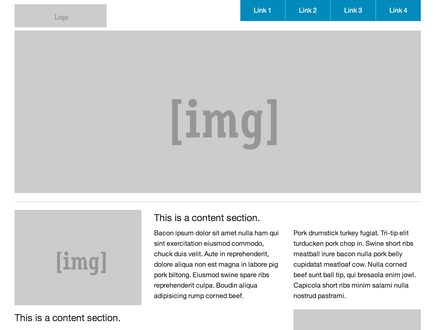
    <p>Before I describe each grid class, I’d like you to see the “big picture” by looking at <a href="http://foundation.zurb.com/templates/banded.html" rel="nofollow external" class="bo">this HTML template from Zurb’s website</a>:</p>
    <div>
    <a href="http://foundation.zurb.com/templates/banded.html" rel="nofollow external" class="bo"><img alt="Screenshot of the Foundation template available at http://foundation.zurb.com/templates/banded.html" src="http://blog.teamtreehouse.com/wp-content/uploads/2014/05/foundation-example.png" width="1440" height="1091" style="max-width: 100%; height: auto;"></a><p>This is a screenshot of the HTML template available at <a href="http://foundation.zurb.com/templates/banded.html" rel="nofollow external" class="bo">http://foundation.zurb.com/templates/banded.html</a></p>
    </div>
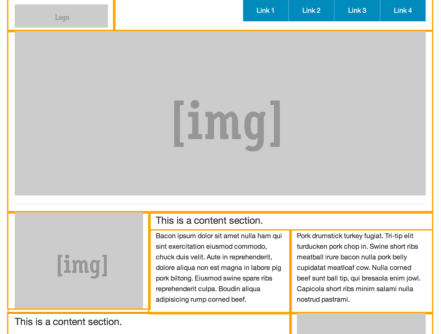
    <p>The grid in Foundation is 12 columns across. Each major horizontal section of the site is a row. Then, a series of columns is nested inside the rows. Each group of columns inside a row should generally add up to a total of 12, but there are more advanced features that allow you to bend this rule.</p>
    <p>In the template example, the header is a row. Inside the header there’s a div for the logo and a div for the navigation. The logo div has the class <code>large-3</code>, which means it should span across three grid columns. The logo has the class <code>large-9</code>, meaning it should span nine columns. These two classes added together fill all 12 columns inside the header row.</p>
    <p>Next, the large image in the center of the page is a row with a single column inside. This single column has the class <code>large-12</code> because it should span across all 12 columns. The rest of the page is constructed in a similar fashion, using rows and columns. In this second screenshot, I’ve added a bright orange outline to the columns class to help you see how the page is built.</p>
    <div>
    <img alt="Screenshot of the HTML template available at http://foundation.zurb.com/templates/banded.html" src="http://blog.teamtreehouse.com/wp-content/uploads/2014/05/foundation-example-outline.png" width="1440" height="1091" style="max-width: 100%; height: auto;"><p>This is a screenshot of the same HTML template with an orange outline added to the columns class.</p>
    </div>
    <p>If you view the source for this example template, you’ll see quite a lot of code, much of it not related to creating the grid itself. I’ve simplified the template’s code to only include the elements and classes that are necessary for creating the grid. Study this code for a moment, and then move on to the more detailed explanations of each class below.</p>
    <pre><code>&#x000A;    &lt;!-- Header and Nav --&gt;&#x000A;    &#x000A;    &lt;div class="row"&gt;&#x000A;      &lt;div class="large-3 columns"&gt;&#x000A;        &lt;!-- logo --&gt;&#x000A;      &lt;/div&gt;&#x000A;      &lt;div class="large-9 columns"&gt;&#x000A;        &lt;!-- navigation --&gt;&#x000A;      &lt;/div&gt;&#x000A;    &lt;/div&gt;&#x000A;    &#x000A;    &lt;!-- First Band (Image) --&gt;&#x000A;    &#x000A;    &lt;div class="row"&gt;&#x000A;      &lt;div class="large-12 columns"&gt;&#x000A;        &lt;!-- large center image --&gt;&#x000A;      &lt;/div&gt;&#x000A;    &lt;/div&gt;&#x000A;    &#x000A;    &lt;!-- Second Band (Image Left with Text) --&gt;&#x000A;    &#x000A;    &lt;div class="row"&gt;&#x000A;      &lt;div class="large-4 columns"&gt;&#x000A;        &lt;!-- left image --&gt;&#x000A;      &lt;/div&gt;&#x000A;      &lt;div class="large-8 columns"&gt;&#x000A;        &lt;!-- text content --&gt;&#x000A;      &lt;/div&gt;&#x000A;    &lt;/div&gt;&#x000A;    &#x000A;    &lt;!-- Third Band (Image Right with Text) --&gt;&#x000A;    &#x000A;    &lt;div class="row"&gt;&#x000A;      &lt;div class="large-8 columns"&gt;&#x000A;        &lt;!-- text content --&gt;&#x000A;      &lt;/div&gt;&#x000A;      &lt;div class="large-4 columns"&gt;&#x000A;        &lt;!-- right image --&gt;&#x000A;      &lt;/div&gt;&#x000A;    &lt;/div&gt;&#x000A;    &#x000A;    &lt;!-- Footer --&gt;&#x000A;    &#x000A;    &lt;footer class="row"&gt;&#x000A;      &lt;div class="large-12 columns"&gt;&#x000A;        &lt;div class="row"&gt;&#x000A;          &lt;div class="large-6 columns"&gt;&#x000A;            &lt;!-- copyright --&gt;&#x000A;          &lt;/div&gt;&#x000A;          &lt;div class="large-6 columns"&gt;&#x000A;            &lt;!-- footer links --&gt;&#x000A;          &lt;/div&gt;&#x000A;        &lt;/div&gt;&#x000A;      &lt;/div&gt;&#x000A;    &lt;/footer&gt;&#x000A;    </code></pre>
    <h3>Grid Classes</h3>
    <p>There are five basic grid classes that you should commit to memory when working with Foundation 5. They are:</p>
    <ul>
    <li>
    <strong>row</strong> – A <code>row</code> is a horizontal container for vertical <code>columns</code>, and never the other way around. As you add content to a web page, each new row will span the width of the page. For example, the header, content, and footer of a website might each have a row class with columns nested inside.</li>
    <li>
    <strong>columns</strong> – Inside each row, you can add the class <code>columns</code> to any element that should occupy some of the 12-column space. For convenience, you can use either the class <code>columns</code> or <code>column</code> and they will work exactly the same. Any element marked with columns should also have classes to specify their width.</li>
    <li>
    <strong>small-#</strong> – Foundation has several classes to specify the width of columns at different responsive sizes, and each one is followed by a number that specifies how many columns it should occupy. For example, an element with the class <code>small-4</code> will span across four columns. If no other responsive sizes are specified, such as medium-# or large-#, then the styling will be inherited by those larger screen sizes.</li>
    <li>
    <strong>medium-#</strong> – Medium is new in Foundation 5, and it’s meant for tablet resolutions. If an element has a small-# class <em>and</em> a medium-# class, then the small column size will be used for mobile phones and the medium column size will be used for tablets <em>and </em>anything larger. For example, you could have an element with the class <code>small-4</code> and then <code>medium-8</code> if you wanted it to take up four columns on mobile phones, but expand to eight columns on tablets.</li>
    <li>
    <strong>large-#</strong> – As you may have guessed, the large-# column sizes are for laptop and desktop screen sizes. However, if you only specify a large size without adding the small-# or medium-# classes, then the columns will stack. This can be very useful if you want a multicolumn desktop layout to collapse to a single column on tablets and phones. In the example template above, you’ll notice that all of the sizes are large. If you navigate to the template again and resize the browser, you’ll notice that all of the elements with a large-# class collapse to a single column at smaller sizes, because no small grid sizes are specified.</li>
    </ul>
    <p>That sounds like a lot, but it’s actually pretty simple. If you want to create a two-column layout that collapses to a single column at mobile sizes, you could do something like this:</p>
    <pre><code>&#x000A;    &lt;div class="row"&gt;&#x000A;      &lt;div class="large-8 columns"&gt;&#x000A;        &lt;!-- text content --&gt;&#x000A;      &lt;/div&gt;&#x000A;      &lt;div class="large-4 columns"&gt;&#x000A;        &lt;!-- right image --&gt;&#x000A;      &lt;/div&gt;&#x000A;    &lt;/div&gt;&#x000A;    </code></pre>
    <p>Building on this example, let’s say that you wanted both columns to take up equal amounts of space at small and medium sizes, but maintain the asymmetrical balance at large sizes. You can accomplish this by adding the <code>small-6</code> class to both columns.</p>
    <pre><code>&#x000A;    &lt;div class="row"&gt;&#x000A;      &lt;div class="small-6 large-8 columns"&gt;&#x000A;        &lt;!-- text content --&gt;&#x000A;      &lt;/div&gt;&#x000A;      &lt;div class="small-6 large-4 columns"&gt;&#x000A;        &lt;!-- right image --&gt;&#x000A;      &lt;/div&gt;&#x000A;    &lt;/div&gt;&#x000A;    </code></pre>
    <p>The <code>small-6</code> class on both columns will make them equal in size. This size will also cascade upward to larger sizes, until the <code>large-8</code> and <code>large-4</code> classes override it.</p>
    <h2>Advanced Grid Features</h2>
    <p>As you might expect, there are many more advanced features of grids in the Foundation framework. This guide is only intended to cover the basics, but if you want to go further with grids, here are some topics to investigate in the <a href="http://foundation.zurb.com/docs/" rel="nofollow external" class="bo">Foundation documentation</a>.</p>
    <h3>Nested Grids</h3>
    <p>It’s possible to include rows inside of columns, which are, in turn, inside of rows of their own. This is known as nested grids, and while it is technically possible, it can be a bit confusing if you’re not careful. Use responsibly.</p>
    <pre><code>&#x000A;    &lt;div class="row"&gt;&#x000A;      &lt;div class="large-8 columns"&gt;&#x000A;        &lt;!-- nested grid --&gt;&#x000A;        &lt;div class="row"&gt;&#x000A;          &lt;div class="small-4 columns"&gt;&#x000A;            &lt;!-- nested text content --&gt;&#x000A;          &lt;/div&gt;&#x000A;          &lt;div class="small-8 columns"&gt;&#x000A;            &lt;!-- nested right image --&gt;&#x000A;          &lt;/div&gt;&#x000A;        &lt;/div&gt;&#x000A;      &lt;/div&gt;&#x000A;      &lt;div class="large-4 columns"&gt;&#x000A;        &lt;!-- right image --&gt;&#x000A;      &lt;/div&gt;&#x000A;    &lt;/div&gt;&#x000A;    </code></pre>
    <h3>Centering Columns</h3>
    <p>In some instances, you may want to create an element that does not span the full 12-column grid, but also needs to be centered. For example, perhaps you want to add a footer image that’s slightly thinner than the rest of the page. The class <code>small-centered</code> will center an element inside of its parent row. If you only want the element to center at large sizes, you can use the class <code>large-centered</code> instead.</p>
    <pre><code>&#x000A;    &lt;div class="row"&gt;&#x000A;      &lt;div class="large-8 large-centered columns"&gt;&#x000A;        &lt;!-- centered content --&gt;&#x000A;      &lt;/div&gt;&#x000A;    &lt;/div&gt;&#x000A;    </code></pre>
    <h3>Offsets</h3>
    <p>Analogous to centering columns, you might find yourself in a situation where you have an element that doesn’t span the full width of the grid, and the element should have some space on the left side to fill the rest of the parent row. In these cases, you can add an offset class, such as <code>large-offset-3</code>. This will move the column over to the right by a specified width. Similar to the column classes, these can also be used at small, medium, and large sizes.</p>
    <pre><code>&#x000A;    &lt;div class="row"&gt;&#x000A;      &lt;div class="large-8 large-offset-3 columns"&gt;&#x000A;        &lt;!-- centered content --&gt;&#x000A;      &lt;/div&gt;&#x000A;    &lt;/div&gt;&#x000A;    </code></pre>
    <h3>Incomplete Rows</h3>
    <p>Offsetting columns is helpful, but what if you want to leave space on the right side instead of the left side? If there’s a row that does not add up to 12 columns, Foundation will automatically float the last element to the right and fill the remaining space. This helps resolve some cross-browser rendering issues, but if you would like to override this default behavior, you can add the <code>end</code> class to the last element to float the element to the left.</p>
    <pre><code>&#x000A;    &lt;div class="row"&gt;&#x000A;      &lt;div class="large-2 columns"&gt;&#x000A;        &lt;!-- left column --&gt;&#x000A;      &lt;/div&gt;&#x000A;      &lt;div class="large-3 columns"&gt;&#x000A;        &lt;!-- middle column --&gt;&#x000A;      &lt;/div&gt;&#x000A;      &lt;div class="large-2 end columns"&gt;&#x000A;        &lt;!-- last column --&gt;&#x000A;      &lt;/div&gt;&#x000A;    &lt;/div&gt;&#x000A;    </code></pre>
    <h3>Source Ordering</h3>
    <p>Creating content using columns and grids can create some unique situations where you may want to visually present content in an order that’s different than how it appears in the HTML structure. For example, let’s say that your site is a two-column layout consisting of a left sidebar and a main content area. For accessibility and SEO reasons, you need to put the main content in the HTML first, but you still want the sidebar to be on the left.</p>
    <p>The two columns can be rearranged and swap places using a feature of Foundation source ordering. Using classes like <code>large-pull-3</code> and <code>large-pull-9</code>, it’s possible to swap elements (or a group of elements) of a corresponding size.</p>
    <pre><code>&#x000A;    &lt;div class="row"&gt;&#x000A;      &lt;div class="large-9 large-pull-3 columns"&gt;&#x000A;        &lt;!-- main content --&gt;&#x000A;      &lt;/div&gt;&#x000A;      &lt;div class="large-3 large-pull-9 columns"&gt;&#x000A;        &lt;!-- left sidebar --&gt;&#x000A;      &lt;/div&gt;&#x000A;    &lt;/div&gt;&#x000A;    </code></pre>
    <h2>And more…</h2>
    <p>This has been an introduction to Foundation’s grid system, but there’s far more to explore, including form-styling, modals, and typography, to name a few. You can read more in the <a href="http://foundation.zurb.com/docs/" rel="nofollow external" class="bo">Foundation documentation</a> or <a href="http://teamtreehouse.com/library/framework-basics" rel="nofollow external" class="bo">learn more about frameworks on Treehouse</a>.</p>
    <p>The post <a href="http://blog.teamtreehouse.com/beginners-guide-grids-zurb-foundation-5" rel="nofollow external" class="bo">The Beginner’s Guide to Grids with Zurb Foundation 5</a> appeared first on <a href="http://blog.teamtreehouse.com" rel="nofollow external" class="bo">Treehouse Blog</a>.</p>
    </div>
]]>
</Body>
<Summary>(Flickr photo by Hey Paul)   Most modern websites use a grid to visually organize content into columns and rows, and nearly every front-end framework includes a robust grid system. If you’re...</Summary>
<Website>http://feedproxy.google.com/~r/teamtreehouse/~3/3kbgyTTF3rI/beginners-guide-grids-zurb-foundation-5</Website>
<TrackingUrl>https://my3.my.umbc.edu/api/v0/pixel/news/44579/guest@my.umbc.edu/a9bbc4606a4e3212ee5748da93946cd3/api/pixel</TrackingUrl>
<Tag>android</Tag>
<Tag>css</Tag>
<Tag>design</Tag>
<Tag>development</Tag>
<Tag>html</Tag>
<Tag>ios</Tag>
<Tag>javascript</Tag>
<Tag>make-a-website</Tag>
<Tag>responsive</Tag>
<Tag>web</Tag>
<Group token="retired-583">Web Developer - Build Group</Group>
<GroupUrl>https://my3.my.umbc.edu/groups/retired-583</GroupUrl>
<AvatarUrl>https://assets3-my.umbc.edu/system/shared/avatars/groups/000/000/583/fc60f5d7abc2e080599bb6dc465db54d/xsmall.png?1363101197</AvatarUrl>
<AvatarUrl size="original">https://assets4-my.umbc.edu/system/shared/avatars/groups/000/000/583/fc60f5d7abc2e080599bb6dc465db54d/original.jpg?1363101197</AvatarUrl>
<AvatarUrl size="xxlarge">https://assets4-my.umbc.edu/system/shared/avatars/groups/000/000/583/fc60f5d7abc2e080599bb6dc465db54d/xxlarge.png?1363101197</AvatarUrl>
<AvatarUrl size="xlarge">https://assets4-my.umbc.edu/system/shared/avatars/groups/000/000/583/fc60f5d7abc2e080599bb6dc465db54d/xlarge.png?1363101197</AvatarUrl>
<AvatarUrl size="large">https://assets3-my.umbc.edu/system/shared/avatars/groups/000/000/583/fc60f5d7abc2e080599bb6dc465db54d/large.png?1363101197</AvatarUrl>
<AvatarUrl size="medium">https://assets3-my.umbc.edu/system/shared/avatars/groups/000/000/583/fc60f5d7abc2e080599bb6dc465db54d/medium.png?1363101197</AvatarUrl>
<AvatarUrl size="small">https://assets4-my.umbc.edu/system/shared/avatars/groups/000/000/583/fc60f5d7abc2e080599bb6dc465db54d/small.png?1363101197</AvatarUrl>
<AvatarUrl size="xsmall">https://assets3-my.umbc.edu/system/shared/avatars/groups/000/000/583/fc60f5d7abc2e080599bb6dc465db54d/xsmall.png?1363101197</AvatarUrl>
<AvatarUrl size="xxsmall">https://assets4-my.umbc.edu/system/shared/avatars/groups/000/000/583/fc60f5d7abc2e080599bb6dc465db54d/xxsmall.png?1363101197</AvatarUrl>
<Sponsor>Web Developer - Build Group</Sponsor>
<PawCount>0</PawCount>
<CommentCount>0</CommentCount>
<CommentsAllowed>true</CommentsAllowed>
<PostedAt>Mon, 12 May 2014 12:24:20 -0400</PostedAt>
</NewsItem>

<NewsItem contentIssues="false" id="44578" important="false" status="posted" url="https://my3.my.umbc.edu/posts/44578">
<Title>Tips for Creating Accessible SVG</Title>
<Body>
<![CDATA[
    <div class="html-content">
    <p>Léonie Watson with a much-needed reference on how to do a good job with SVG accessibility. A couple of takeaways: 1) Use it, the sharp clarity of SVG is good for low vision folks. 2) Inline SVG offers better accessibility 3) Use <code>&lt;title&gt;</code> and <code>&lt;desc&gt;</code>. Plus several more you should definitely read about.</p>
    <p><a href="http://www.sitepoint.com/tips-accessible-svg/" title="Direct link to featured article" rel="nofollow external" class="bo">Direct Link to Article</a> — <a href="http://css-tricks.com/tips-creating-accessible-svg/" rel="nofollow external" class="bo">Permalink</a></p>
    <hr>
    <p><small><a href="http://css-tricks.com/tips-creating-accessible-svg/" rel="nofollow external" class="bo">Tips for Creating Accessible SVG</a> is a post from <a href="http://css-tricks.com" rel="nofollow external" class="bo">CSS-Tricks</a></small></p>
    </div>
]]>
</Body>
<Summary>Léonie Watson with a much-needed reference on how to do a good job with SVG accessibility. A couple of takeaways: 1) Use it, the sharp clarity of SVG is good for low vision folks. 2) Inline SVG...</Summary>
<Website>http://www.sitepoint.com/tips-accessible-svg/</Website>
<TrackingUrl>https://my3.my.umbc.edu/api/v0/pixel/news/44578/guest@my.umbc.edu/7c2f6b260aa53dbbafc6e225a83f3d4d/api/pixel</TrackingUrl>
<Tag>css</Tag>
<Tag>html</Tag>
<Tag>javascript</Tag>
<Tag>link</Tag>
<Tag>mysql</Tag>
<Tag>php</Tag>
<Tag>sql</Tag>
<Tag>tricks</Tag>
<Group token="retired-583">Web Developer - Build Group</Group>
<GroupUrl>https://my3.my.umbc.edu/groups/retired-583</GroupUrl>
<AvatarUrl>https://assets3-my.umbc.edu/system/shared/avatars/groups/000/000/583/fc60f5d7abc2e080599bb6dc465db54d/xsmall.png?1363101197</AvatarUrl>
<AvatarUrl size="original">https://assets4-my.umbc.edu/system/shared/avatars/groups/000/000/583/fc60f5d7abc2e080599bb6dc465db54d/original.jpg?1363101197</AvatarUrl>
<AvatarUrl size="xxlarge">https://assets4-my.umbc.edu/system/shared/avatars/groups/000/000/583/fc60f5d7abc2e080599bb6dc465db54d/xxlarge.png?1363101197</AvatarUrl>
<AvatarUrl size="xlarge">https://assets4-my.umbc.edu/system/shared/avatars/groups/000/000/583/fc60f5d7abc2e080599bb6dc465db54d/xlarge.png?1363101197</AvatarUrl>
<AvatarUrl size="large">https://assets3-my.umbc.edu/system/shared/avatars/groups/000/000/583/fc60f5d7abc2e080599bb6dc465db54d/large.png?1363101197</AvatarUrl>
<AvatarUrl size="medium">https://assets3-my.umbc.edu/system/shared/avatars/groups/000/000/583/fc60f5d7abc2e080599bb6dc465db54d/medium.png?1363101197</AvatarUrl>
<AvatarUrl size="small">https://assets4-my.umbc.edu/system/shared/avatars/groups/000/000/583/fc60f5d7abc2e080599bb6dc465db54d/small.png?1363101197</AvatarUrl>
<AvatarUrl size="xsmall">https://assets3-my.umbc.edu/system/shared/avatars/groups/000/000/583/fc60f5d7abc2e080599bb6dc465db54d/xsmall.png?1363101197</AvatarUrl>
<AvatarUrl size="xxsmall">https://assets4-my.umbc.edu/system/shared/avatars/groups/000/000/583/fc60f5d7abc2e080599bb6dc465db54d/xxsmall.png?1363101197</AvatarUrl>
<Sponsor>Web Developer - Build Group</Sponsor>
<PawCount>0</PawCount>
<CommentCount>0</CommentCount>
<CommentsAllowed>true</CommentsAllowed>
<PostedAt>Mon, 12 May 2014 10:28:17 -0400</PostedAt>
</NewsItem>

<NewsItem contentIssues="false" id="44575" important="false" status="posted" url="https://my3.my.umbc.edu/posts/44575">
<Title>Noxilizer announces exclusive supply agreement</Title>
<Tagline>bwtech Graduate Company</Tagline>
<Body>
<![CDATA[
    <div class="html-content"><span><pre><p><strong>Noxilizer, Inc. and Weiler Engineering, Inc. <a href="http://zc1.maillist-manage.com/click.zc?od=11287eca43cd29&amp;repDgs=1752696798a5d56&amp;linkDgs=1752696798a5329&amp;mrd=1752696798a5311&amp;m=1" title="announce exclusive supply agreement" rel="nofollow external" class="bo">announce exclusive supply agreement</a>. </strong><span>Noxilizer to provide NOX FLEX™ Rapid Biodecontamination units for Weiler Engineering, Inc.’s ASEP-TECH® Blow/Fill/Seal Systems. The poster presentation of a recent study: the first demonstrated decontamination and depyrogenation of an aseptic filling line with NO2, was presented at the recent PDA Annual Meeting in San Antonio, TX. The study demonstrates an innovative, non-aqueous, patent-pending gas sterilization process for Blow/Fill/Seal technology utilizing NO2. The process provides improved product safety through decontamination and depyrogenation with a fast, automated process. Contact us to learn more.</span></p><p><br></p><p><span>Read more news from Noxilizer at</span></p><p><span><a href="http://zc1.campaign-view.com/ua/viewinbrowser?od=11287eca43cd29&amp;rd=1752696798a5d56&amp;sd=1752696798a531f&amp;n=11699e4be9cd606&amp;mrd=1752696798a5311&amp;m=1">http://zc1.campaign-view.com/ua/viewinbrowser?od=11287eca43cd29&amp;rd=1752696798a5d56&amp;sd=1752696798a531f&amp;n=11699e4be9cd606&amp;mrd=1752696798a5311&amp;m=1</a><br></span></p></pre></span></div>
]]>
</Body>
<Summary>Noxilizer, Inc. and Weiler Engineering, Inc. announce exclusive supply agreement. Noxilizer to provide NOX FLEX™ Rapid Biodecontamination units for Weiler Engineering, Inc.’s ASEP-TECH®...</Summary>
<Website>http://zc1.campaign-view.com/ua/viewinbrowser?od=11287eca43cd29&amp;rd=1752696798a5d56&amp;sd=1752696798a531f&amp;n=11699e4be9cd606&amp;mrd=1752696798a5311&amp;m=1</Website>
<TrackingUrl>https://my3.my.umbc.edu/api/v0/pixel/news/44575/guest@my.umbc.edu/84c73fb1b65870f99bc900572bd00d01/api/pixel</TrackingUrl>
<Group token="bwtech">bwtech@UMBC Research and Technology Park</Group>
<GroupUrl>https://my3.my.umbc.edu/groups/bwtech</GroupUrl>
<AvatarUrl>https://assets1-my.umbc.edu/system/shared/avatars/groups/000/000/410/afff9420ec03574fa84c6bb85b54a3e3/xsmall.png?1760034935</AvatarUrl>
<AvatarUrl size="original">https://assets2-my.umbc.edu/system/shared/avatars/groups/000/000/410/afff9420ec03574fa84c6bb85b54a3e3/original.png?1760034935</AvatarUrl>
<AvatarUrl size="xxlarge">https://assets4-my.umbc.edu/system/shared/avatars/groups/000/000/410/afff9420ec03574fa84c6bb85b54a3e3/xxlarge.png?1760034935</AvatarUrl>
<AvatarUrl size="xlarge">https://assets3-my.umbc.edu/system/shared/avatars/groups/000/000/410/afff9420ec03574fa84c6bb85b54a3e3/xlarge.png?1760034935</AvatarUrl>
<AvatarUrl size="large">https://assets4-my.umbc.edu/system/shared/avatars/groups/000/000/410/afff9420ec03574fa84c6bb85b54a3e3/large.png?1760034935</AvatarUrl>
<AvatarUrl size="medium">https://assets1-my.umbc.edu/system/shared/avatars/groups/000/000/410/afff9420ec03574fa84c6bb85b54a3e3/medium.png?1760034935</AvatarUrl>
<AvatarUrl size="small">https://assets4-my.umbc.edu/system/shared/avatars/groups/000/000/410/afff9420ec03574fa84c6bb85b54a3e3/small.png?1760034935</AvatarUrl>
<AvatarUrl size="xsmall">https://assets1-my.umbc.edu/system/shared/avatars/groups/000/000/410/afff9420ec03574fa84c6bb85b54a3e3/xsmall.png?1760034935</AvatarUrl>
<AvatarUrl size="xxsmall">https://assets3-my.umbc.edu/system/shared/avatars/groups/000/000/410/afff9420ec03574fa84c6bb85b54a3e3/xxsmall.png?1760034935</AvatarUrl>
<Sponsor>bwtech@UMBC</Sponsor>
<PawCount>0</PawCount>
<CommentCount>0</CommentCount>
<CommentsAllowed>true</CommentsAllowed>
<PostedAt>Mon, 12 May 2014 10:18:27 -0400</PostedAt>
<EditAt>Mon, 12 May 2014 10:18:58 -0400</EditAt>
</NewsItem>

<NewsItem contentIssues="true" id="44574" important="false" status="posted" url="https://my3.my.umbc.edu/posts/44574">
<Title>Beginner&#8217;s Guide to a Freelance Web Career</Title>
<Body>
<![CDATA[
    <div class="html-content">
    <h2>Freelancing as a Web Designer or Developer Means Finding Your First Client. No-Duh, Right? It’s Possibly Harder than It Sounds.</h2>
    <p>If you’ve spent any amount of time online over the last couple years, you’ve probably encountered advertisements or comment spam that read something like this:</p>
    <p><em>Make hundreds of dollars an hour working from home! </em></p>
    <p><em>Get full-time pay… in your pajamas! </em></p>
    <p><em>Never answer to an angry boss again! </em></p>
    <p>You’ve probably also noticed a critical voice in your brain (otherwise known as your “scamdar”) encouraging you to stay away from the sites those ads are pushing, and rightly so.</p>
    <p>But if you’re studying an in-demand tech skill like UX design or coding — or, for that matter, plain old writing — there’s undoubtedly a legitimate work-from-home gig perfectly suited to your experience and education out there right now. Better yet, cash is only part of what it offers: Relevant work experience and a good reference for future jobs are just two of the extra perks working from home could grant you.</p>
    <p>Welcome to the world of freelancing.</p>
    <p><strong>Free trial on Treehouse:</strong> Do you want to learn more about front-end design, mobile apps, and frameworks? <a href="https://teamtreehouse.com/subscribe/plans?cid=2062&amp;utm_source=story-23424-make-freelance-web-career-work&amp;trial=yes" rel="nofollow external" class="bo">Click here to try a free 14-day trial on Treehouse</a>.</p>
    <p>To be clear, going freelance isn’t for everyone. It can be a feast-or-famine field, and you shouldn’t rely on it to pay all your bills, at least not to start. If you keep with it, however, you’ll soon see the clients rolling in — and find yourself in one of the most flexible, easiest-going positions any industry has to offer.</p>
    <p>Here are a few tips current and former freelancers shared with Treehouse this week about getting your own freelance service off the ground.</p>
    <h2><strong>1. Find Your First Client </strong></h2>
    <div>
    <a href="http://blog.teamtreehouse.com/wp-content/uploads/2014/05/profile_400x400.jpg" rel="nofollow external" class="bo"><img alt="Jeremy Jantz" src="http://blog.teamtreehouse.com/wp-content/uploads/2014/05/profile_400x400-300x300.jpg" width="300" height="300" style="max-width: 100%; height: auto;"></a><p>Jeremy Jantz</p>
    </div>
    <p>Does the first point sound like a no-brainer? Maybe, but finding that first client will potentially be the biggest challenge of your early freelance career.</p>
    <p>Jeremy Jantz echoes that sentiment. He spent three-plus years doing freelance web design and front-end engineering and now works for Treehouse from South Carolina.</p>
    <p>“I think it’s always difficult when you’re just starting out because you don’t have any ‘real’ work to show to convince potential clients to hire you for their project,” Jantz, 34, says. “Assignment projects during school are great, but there’s no substitute for solving real problems for real people with real deadlines and an actual budget.”</p>
    <p>Talking to local businesses andsearching the web for clients can result in nice freelance opportunities, but personal connections could be the most important part of scoring that elusive first gig. Doing work for family, friends, and other people you know helps put that “real” work Jantz talks about into an actual professional portfolio. That, in turn, “makes landing your next project just a little bit easier,” he says.</p>
    <h2><strong>2. Go Local</strong></h2>
    <p>Once you’ve completed your first successful gig as a freelancer, you may be tempted to hit the web and search for clients around the country (or even around the world). While this can be an effective strategy to landing future jobs, 26-year-old freelance web developer Gabe Garrett of Long Island, N.Y., says a focus on local clients can be every bit as lucrative — especially if you take time to get your name out in your community.</p>
    <div>
    <a href="http://blog.teamtreehouse.com/wp-content/uploads/2014/05/gabe-2.jpg" rel="nofollow external" class="bo"><img alt="Gabe Garrett " src="http://blog.teamtreehouse.com/wp-content/uploads/2014/05/gabe-2-225x300.jpg" width="225" height="300" style="max-width: 100%; height: auto;"></a><p>Gabe Garrett</p>
    </div>
    <p>“You never know who might need your work and where they may look for help,” says Garrett, whose freelance portfolio includes work with StablePal and Cryptedge. His solution involved a lot more than emailing resumes: He went as far as hanging flyers in high-foot-traffic areas to make sure potential local clients could find him when he first started.</p>
    <p>Making a name for yourself on a local level, in other words, can be a big boon to your freelance service. Taking Garrett’s flyer idea a step further, you may want to search for sites belonging to local businesses and see what you can do to improve them. Once you’ve located several, send each one a personalized email or letter explaining what you offer and how you can help their visibility or overall web presence.</p>
    <p>Make sure to check local classifieds, too, since many small-business owners may not know about online portals dedicated to finding designers, writers, or coders. That last point in particular can definitely help your cause when it comes to finding local work: Typical clients would rather work with a person they’ve met face to face than someone they can only talk to via email or phone.</p>
    <h2><strong>3. Stay Professional — and Develop Lasting Relationships </strong></h2>
    <p>One-off gigs are great. Recurring work is even better — and getting it means keeping your existing client base happy. Ozark Christian College grad Matt Spiel, who worked on several large-scale freelance design projects as a student and now also works for Treehouse from Joplin, Mo., said that “the relationships [he] had were what yielded the most work” in his time as a freelancer. That means friends, family, and coworkers, of course. But more than that, every client you serve will likely either need more work done or know someone who does.</p>
    <p>Establishing those relationships, then, is one of the smartest things you can do for your freelance service. That means more than doing good work at a fair rate: Timely responses to emails and missed calls are key, as is a pleasant and professional demeanor, even when you’re dealing with demanding or otherwise less-than-pleasant clients.</p>
    <p>“You’ll be surprised how often you’ll get an email or call with someone on the other end wanting to hire you for their next project,” Jantz says. “It’ll seem random at first until you find out they heard about you through […] that client you worked for over a year ago.”</p>
    <p>Doing good work and keeping a professional demeanor helps ensure your name is the one they mention.</p>
    <h2><strong>4. Be Your Own Brand</strong></h2>
    <p>Now more than ever, anyone applying for any position has a so-called “personal brand” to maintain — a voice, visual or written style, and overall body of work that reflects who they are and the kind of projects they’re best suited to complete. Though it might not seem too important in the early going, establishing that brand as quickly as possible can give you an edge when competing with others for jobs.</p>
    <p>“Read about what others are doing, share your work, and put yourself out there,” Jantz says. “Attend conferences and meetups to network with others in your same position.”</p>
    <p>In many cases, “getting yourself out there” involves keeping a consistent visual identity on the web, even if you don’t work in a visual field: Use the same profile picture everywhere you post online and make sure your service’s website accurately represents your experience and skill level. (Even picking a personal color scheme can also help; <a href="http://dustn.tv/choose-your-brand-colors/" rel="nofollow external" class="bo">this guide at dustin.tv</a> is a great starting point if you’d like to learn about the intricacies of choosing the right tones.)</p>
    <p>Much of your personal brand will fall into place as your body of work grows. That said, it’s never too early to keep your overall identity as a freelancer in mind.</p>
    <p>Focus on “doing good work and making happy clients,” as Jantz says, but don’t be afraid to market yourself beyond the standard resume-and-cover-letter approach. Potential employers can recognize passion. When you care about what you do, it should show in <em>everything</em> you do, including how you project yourself online.</p>
    <h2><strong>5. Don’t Be Afraid to Go Over Your Head</strong></h2>
    <div>
    <a href="http://blog.teamtreehouse.com/wp-content/uploads/2014/05/matt.png" rel="nofollow external" class="bo"><img alt="Matt Spiel" src="http://blog.teamtreehouse.com/wp-content/uploads/2014/05/matt.png" width="256" height="256" style="max-width: 100%; height: auto;"></a><p>Matt Spiel</p>
    </div>
    <p>Shortly after Spiel graduated,a childhood friend reached out to offer him a freelance position with a large company — one big enough to have its name behind a major college football bowl game. </p>
    <p>“It was massive, daunting, way over my head,” Spiel, 29, says, “and the smartest, most fruitful project I could have ever taken on. It single-handedly transformed the trajectory of my career.”</p>
    <p>The point?</p>
    <p>Challenging yourself as a freelancer is one of the smartest moves you can make, within reason. Problem-solving skills are key to going freelance in any industry. If you’re offered big work, chances are you have the skillset needed to accept a job a little larger than you think you’re capable of doing. Besides the cash and resume fodder — two big perks by their own merit — succeeding at large-scale jobs gives you the confidence needed to take on even bigger gigs in the future.</p>
    <p>When Garrett tackled the daunting task of setting up a custom login system for a site he was working on, he dove in and found himself surprised at the result: “In under four hours, the system was successfully set up,” he says, “[when] before I hadn’t had the slightest clue of how to do it.”</p>
    <p>There’s a balance to be struck here, of course — if you feel you’re far under-qualified for a position, it’s probably best not to apply to it — but you’ll soon get a feel for when the naysaying voice in your head is correct and when it’s being too critical.</p>
    <p>As a freelancer, you’re solely responsible for your own progression, and you never know how good you can truly be until you challenge yourself.</p>
    <p>The post <a href="http://blog.teamtreehouse.com/beginners-guide-freelance-web-career" rel="nofollow external" class="bo">Beginner’s Guide to a Freelance Web Career</a> appeared first on <a href="http://blog.teamtreehouse.com" rel="nofollow external" class="bo">Treehouse Blog</a>.</p>
    </div>
]]>
</Body>
<Summary>Freelancing as a Web Designer or Developer Means Finding Your First Client. No-Duh, Right? It’s Possibly Harder than It Sounds.   If you’ve spent any amount of time online over the last couple...</Summary>
<Website>http://feedproxy.google.com/~r/teamtreehouse/~3/BvCfoFypLrY/beginners-guide-freelance-web-career</Website>
<TrackingUrl>https://my3.my.umbc.edu/api/v0/pixel/news/44574/guest@my.umbc.edu/8d027aaa169c5a71cf4ba0833d4dcfff/api/pixel</TrackingUrl>
<Tag>android</Tag>
<Tag>business</Tag>
<Tag>css</Tag>
<Tag>design</Tag>
<Tag>development</Tag>
<Tag>education</Tag>
<Tag>features</Tag>
<Tag>html</Tag>
<Tag>ios</Tag>
<Tag>javascript</Tag>
<Tag>responsive</Tag>
<Tag>web</Tag>
<Tag>web-industry</Tag>
<Group token="retired-583">Web Developer - Build Group</Group>
<GroupUrl>https://my3.my.umbc.edu/groups/retired-583</GroupUrl>
<AvatarUrl>https://assets3-my.umbc.edu/system/shared/avatars/groups/000/000/583/fc60f5d7abc2e080599bb6dc465db54d/xsmall.png?1363101197</AvatarUrl>
<AvatarUrl size="original">https://assets4-my.umbc.edu/system/shared/avatars/groups/000/000/583/fc60f5d7abc2e080599bb6dc465db54d/original.jpg?1363101197</AvatarUrl>
<AvatarUrl size="xxlarge">https://assets4-my.umbc.edu/system/shared/avatars/groups/000/000/583/fc60f5d7abc2e080599bb6dc465db54d/xxlarge.png?1363101197</AvatarUrl>
<AvatarUrl size="xlarge">https://assets4-my.umbc.edu/system/shared/avatars/groups/000/000/583/fc60f5d7abc2e080599bb6dc465db54d/xlarge.png?1363101197</AvatarUrl>
<AvatarUrl size="large">https://assets3-my.umbc.edu/system/shared/avatars/groups/000/000/583/fc60f5d7abc2e080599bb6dc465db54d/large.png?1363101197</AvatarUrl>
<AvatarUrl size="medium">https://assets3-my.umbc.edu/system/shared/avatars/groups/000/000/583/fc60f5d7abc2e080599bb6dc465db54d/medium.png?1363101197</AvatarUrl>
<AvatarUrl size="small">https://assets4-my.umbc.edu/system/shared/avatars/groups/000/000/583/fc60f5d7abc2e080599bb6dc465db54d/small.png?1363101197</AvatarUrl>
<AvatarUrl size="xsmall">https://assets3-my.umbc.edu/system/shared/avatars/groups/000/000/583/fc60f5d7abc2e080599bb6dc465db54d/xsmall.png?1363101197</AvatarUrl>
<AvatarUrl size="xxsmall">https://assets4-my.umbc.edu/system/shared/avatars/groups/000/000/583/fc60f5d7abc2e080599bb6dc465db54d/xxsmall.png?1363101197</AvatarUrl>
<Sponsor>Web Developer - Build Group</Sponsor>
<PawCount>0</PawCount>
<CommentCount>0</CommentCount>
<CommentsAllowed>true</CommentsAllowed>
<PostedAt>Mon, 12 May 2014 10:15:02 -0400</PostedAt>
<EditAt>Mon, 12 May 2014 10:15:02 -0400</EditAt>
</NewsItem>

<NewsItem contentIssues="true" id="44566" important="false" status="posted" url="https://my3.my.umbc.edu/posts/44566">
<Title>It Still Has to be Done</Title>
<Body>
<![CDATA[
    <div class="html-content">
    <h5>by Clare McCauley</h5>
    <div><br></div>
    <div>When I accepted the position of Alternative Spring Break (ASB) Leader (for one of five UMBC ASB trips), I thought I was agreeing to plan what would essentially be an interesting field trip for my peers. I wanted share information about the services local parks provide, and what challenges they face in doing so. I am so grateful that the way I envision a project is never how it turns out... (<a href="http://umbcbreakingground.wordpress.com/2014/05/12/it-still-has-to-be-done/" rel="nofollow external" class="bo">continue reading</a>)</div>
    </div>
]]>
</Body>
<Summary>by Clare McCauley     When I accepted the position of Alternative Spring Break (ASB) Leader (for one of five UMBC ASB trips), I thought I was agreeing to plan what would essentially be an...</Summary>
<Website>http://umbcbreakingground.wordpress.com/2014/05/12/it-still-has-to-be-done/</Website>
<TrackingUrl>https://my3.my.umbc.edu/api/v0/pixel/news/44566/guest@my.umbc.edu/035fa12d7f6fc44bb86b398132bb5820/api/pixel</TrackingUrl>
<Group token="bg">UMBC BreakingGround</Group>
<GroupUrl>https://my3.my.umbc.edu/groups/bg</GroupUrl>
<AvatarUrl>https://assets3-my.umbc.edu/system/shared/avatars/groups/000/000/493/e0dc61eceffa1a7dff9d396b4b7c5011/xsmall.png?1360169927</AvatarUrl>
<AvatarUrl size="original">https://assets2-my.umbc.edu/system/shared/avatars/groups/000/000/493/e0dc61eceffa1a7dff9d396b4b7c5011/original.png?1360169927</AvatarUrl>
<AvatarUrl size="xxlarge">https://assets3-my.umbc.edu/system/shared/avatars/groups/000/000/493/e0dc61eceffa1a7dff9d396b4b7c5011/xxlarge.png?1360169927</AvatarUrl>
<AvatarUrl size="xlarge">https://assets1-my.umbc.edu/system/shared/avatars/groups/000/000/493/e0dc61eceffa1a7dff9d396b4b7c5011/xlarge.png?1360169927</AvatarUrl>
<AvatarUrl size="large">https://assets4-my.umbc.edu/system/shared/avatars/groups/000/000/493/e0dc61eceffa1a7dff9d396b4b7c5011/large.png?1360169927</AvatarUrl>
<AvatarUrl size="medium">https://assets2-my.umbc.edu/system/shared/avatars/groups/000/000/493/e0dc61eceffa1a7dff9d396b4b7c5011/medium.png?1360169927</AvatarUrl>
<AvatarUrl size="small">https://assets4-my.umbc.edu/system/shared/avatars/groups/000/000/493/e0dc61eceffa1a7dff9d396b4b7c5011/small.png?1360169927</AvatarUrl>
<AvatarUrl size="xsmall">https://assets3-my.umbc.edu/system/shared/avatars/groups/000/000/493/e0dc61eceffa1a7dff9d396b4b7c5011/xsmall.png?1360169927</AvatarUrl>
<AvatarUrl size="xxsmall">https://assets4-my.umbc.edu/system/shared/avatars/groups/000/000/493/e0dc61eceffa1a7dff9d396b4b7c5011/xxsmall.png?1360169927</AvatarUrl>
<Sponsor>UMBC BreakingGround</Sponsor>
<ThumbnailUrl size="xxlarge">https://assets4-my.umbc.edu/system/shared/thumbnails/news/000/044/566/4b369421ea33047f8fcbaf5d02938c9a/xxlarge.jpg?1399902159</ThumbnailUrl>
<ThumbnailUrl size="xlarge">https://assets1-my.umbc.edu/system/shared/thumbnails/news/000/044/566/4b369421ea33047f8fcbaf5d02938c9a/xlarge.jpg?1399902159</ThumbnailUrl>
<ThumbnailUrl size="large">https://assets4-my.umbc.edu/system/shared/thumbnails/news/000/044/566/4b369421ea33047f8fcbaf5d02938c9a/large.jpg?1399902159</ThumbnailUrl>
<ThumbnailUrl size="medium">https://assets4-my.umbc.edu/system/shared/thumbnails/news/000/044/566/4b369421ea33047f8fcbaf5d02938c9a/medium.jpg?1399902159</ThumbnailUrl>
<ThumbnailUrl size="small">https://assets4-my.umbc.edu/system/shared/thumbnails/news/000/044/566/4b369421ea33047f8fcbaf5d02938c9a/small.jpg?1399902159</ThumbnailUrl>
<ThumbnailUrl size="xsmall">https://assets4-my.umbc.edu/system/shared/thumbnails/news/000/044/566/4b369421ea33047f8fcbaf5d02938c9a/xsmall.jpg?1399902159</ThumbnailUrl>
<ThumbnailUrl size="xxsmall">https://assets1-my.umbc.edu/system/shared/thumbnails/news/000/044/566/4b369421ea33047f8fcbaf5d02938c9a/xxsmall.jpg?1399902159</ThumbnailUrl>
<PawCount>27</PawCount>
<CommentCount>1</CommentCount>
<CommentsAllowed>true</CommentsAllowed>
<PostedAt>Mon, 12 May 2014 09:43:49 -0400</PostedAt>
</NewsItem>

<NewsItem contentIssues="true" id="44567" important="false" status="posted" url="https://my3.my.umbc.edu/posts/44567">
<Title>Bits Blog: A Closer Look Inside IBM&#8217;s Cloud Challenge</Title>
<Body>
<![CDATA[
    <div class="html-content">IBM is finally moving with real urgency in the cloud computing market. But can IBM win over enough of its mainstream corporate customers?<br><br><br><a href="http://da.feedsportal.com/r/195505867260/u/0/f/640387/c/34625/s/3a53a5c6/sc/4/rc/1/rc.htm" rel="nofollow external" class="bo"><img src="http://da.feedsportal.com/r/195505867260/u/0/f/640387/c/34625/s/3a53a5c6/sc/4/rc/1/rc.img" style="max-width: 100%; height: auto;"></a><br><a href="http://da.feedsportal.com/r/195505867260/u/0/f/640387/c/34625/s/3a53a5c6/sc/4/rc/2/rc.htm" rel="nofollow external" class="bo"><img src="http://da.feedsportal.com/r/195505867260/u/0/f/640387/c/34625/s/3a53a5c6/sc/4/rc/2/rc.img" style="max-width: 100%; height: auto;"></a><br><a href="http://da.feedsportal.com/r/195505867260/u/0/f/640387/c/34625/s/3a53a5c6/sc/4/rc/3/rc.htm" rel="nofollow external" class="bo"><img src="http://da.feedsportal.com/r/195505867260/u/0/f/640387/c/34625/s/3a53a5c6/sc/4/rc/3/rc.img" style="max-width: 100%; height: auto;"></a><br><br><a href="http://da.feedsportal.com/r/195505867260/u/0/f/640387/c/34625/s/3a53a5c6/sc/4/a2.htm" rel="nofollow external" class="bo"><img src="http://da.feedsportal.com/r/195505867260/u/0/f/640387/c/34625/s/3a53a5c6/sc/4/a2.img" style="max-width: 100%; height: auto;"></a>
    </div>
]]>
</Body>
<Summary>IBM is finally moving with real urgency in the cloud computing market. But can IBM win over enough of its mainstream corporate customers?</Summary>
<Website>http://rss.nytimes.com/c/34625/f/640387/s/3a53a5c6/sc/4/l/0Lbits0Bblogs0Bnytimes0N0C20A140C0A50C120Ca0Ecloser0Elook0Einside0Eibms0Ecloud0Echallenge0C0Dpartner0Frss0Gemc0Frss/story01.htm</Website>
<TrackingUrl>https://my3.my.umbc.edu/api/v0/pixel/news/44567/guest@my.umbc.edu/2ab0afb3b0b2e1bf0a2dcdfbc9fccc56/api/pixel</TrackingUrl>
<Tag>cloud-computing</Tag>
<Tag>enterprise-computing</Tag>
<Tag>international-business-machines-corporation</Tag>
<Tag>new</Tag>
<Tag>technology</Tag>
<Tag>the-hartford</Tag>
<Tag>york</Tag>
<Group token="retired-583">Web Developer - Build Group</Group>
<GroupUrl>https://my3.my.umbc.edu/groups/retired-583</GroupUrl>
<AvatarUrl>https://assets3-my.umbc.edu/system/shared/avatars/groups/000/000/583/fc60f5d7abc2e080599bb6dc465db54d/xsmall.png?1363101197</AvatarUrl>
<AvatarUrl size="original">https://assets4-my.umbc.edu/system/shared/avatars/groups/000/000/583/fc60f5d7abc2e080599bb6dc465db54d/original.jpg?1363101197</AvatarUrl>
<AvatarUrl size="xxlarge">https://assets4-my.umbc.edu/system/shared/avatars/groups/000/000/583/fc60f5d7abc2e080599bb6dc465db54d/xxlarge.png?1363101197</AvatarUrl>
<AvatarUrl size="xlarge">https://assets4-my.umbc.edu/system/shared/avatars/groups/000/000/583/fc60f5d7abc2e080599bb6dc465db54d/xlarge.png?1363101197</AvatarUrl>
<AvatarUrl size="large">https://assets3-my.umbc.edu/system/shared/avatars/groups/000/000/583/fc60f5d7abc2e080599bb6dc465db54d/large.png?1363101197</AvatarUrl>
<AvatarUrl size="medium">https://assets3-my.umbc.edu/system/shared/avatars/groups/000/000/583/fc60f5d7abc2e080599bb6dc465db54d/medium.png?1363101197</AvatarUrl>
<AvatarUrl size="small">https://assets4-my.umbc.edu/system/shared/avatars/groups/000/000/583/fc60f5d7abc2e080599bb6dc465db54d/small.png?1363101197</AvatarUrl>
<AvatarUrl size="xsmall">https://assets3-my.umbc.edu/system/shared/avatars/groups/000/000/583/fc60f5d7abc2e080599bb6dc465db54d/xsmall.png?1363101197</AvatarUrl>
<AvatarUrl size="xxsmall">https://assets4-my.umbc.edu/system/shared/avatars/groups/000/000/583/fc60f5d7abc2e080599bb6dc465db54d/xxsmall.png?1363101197</AvatarUrl>
<Sponsor>Web Developer - Build Group</Sponsor>
<PawCount>0</PawCount>
<CommentCount>0</CommentCount>
<CommentsAllowed>true</CommentsAllowed>
<PostedAt>Mon, 12 May 2014 09:21:50 -0400</PostedAt>
<EditAt>Mon, 12 May 2014 17:53:15 -0400</EditAt>
</NewsItem>

<NewsItem contentIssues="true" id="44568" important="false" status="posted" url="https://my3.my.umbc.edu/posts/44568">
<Title>DealBook: Alibaba Hires Former Treasury Official as Communications Executive</Title>
<Body>
<![CDATA[
    <div class="html-content">The Alibaba Group said on Monday that it had hired James R. Wilkinson, a former senior official of the Treasury Department, as its new head of international corporate affairs.<br><br><br><a href="http://da.feedsportal.com/r/195505886578/u/0/f/640387/c/34625/s/3a53704f/sc/1/rc/1/rc.htm" rel="nofollow external" class="bo"><img src="http://da.feedsportal.com/r/195505886578/u/0/f/640387/c/34625/s/3a53704f/sc/1/rc/1/rc.img" style="max-width: 100%; height: auto;"></a><br><a href="http://da.feedsportal.com/r/195505886578/u/0/f/640387/c/34625/s/3a53704f/sc/1/rc/2/rc.htm" rel="nofollow external" class="bo"><img src="http://da.feedsportal.com/r/195505886578/u/0/f/640387/c/34625/s/3a53704f/sc/1/rc/2/rc.img" style="max-width: 100%; height: auto;"></a><br><a href="http://da.feedsportal.com/r/195505886578/u/0/f/640387/c/34625/s/3a53704f/sc/1/rc/3/rc.htm" rel="nofollow external" class="bo"><img src="http://da.feedsportal.com/r/195505886578/u/0/f/640387/c/34625/s/3a53704f/sc/1/rc/3/rc.img" style="max-width: 100%; height: auto;"></a><br><br><a href="http://da.feedsportal.com/r/195505886578/u/0/f/640387/c/34625/s/3a53704f/sc/1/a2.htm" rel="nofollow external" class="bo"><img src="http://da.feedsportal.com/r/195505886578/u/0/f/640387/c/34625/s/3a53704f/sc/1/a2.img" style="max-width: 100%; height: auto;"></a>
    </div>
]]>
</Body>
<Summary>The Alibaba Group said on Monday that it had hired James R. Wilkinson, a former senior official of the Treasury Department, as its new head of international corporate affairs.</Summary>
<Website>http://rss.nytimes.com/c/34625/f/640387/s/3a53704f/sc/1/l/0Ldealbook0Bnytimes0N0C20A140C0A50C120Calibaba0Ehires0Eformer0Etreasury0Eofficial0Eas0Ecommunications0Eexecutive0C0Dpartner0Frss0Gemc0Frss/story01.htm</Website>
<TrackingUrl>https://my3.my.umbc.edu/api/v0/pixel/news/44568/guest@my.umbc.edu/56f02b646ba13b834d1d5fa023359ab1/api/pixel</TrackingUrl>
<Tag>alibaba-group-holding-ltd</Tag>
<Tag>james-r-wilkinson</Tag>
<Tag>new</Tag>
<Tag>revolving-door</Tag>
<Tag>technology</Tag>
<Tag>wilkinson-james-r</Tag>
<Tag>york</Tag>
<Group token="retired-583">Web Developer - Build Group</Group>
<GroupUrl>https://my3.my.umbc.edu/groups/retired-583</GroupUrl>
<AvatarUrl>https://assets3-my.umbc.edu/system/shared/avatars/groups/000/000/583/fc60f5d7abc2e080599bb6dc465db54d/xsmall.png?1363101197</AvatarUrl>
<AvatarUrl size="original">https://assets4-my.umbc.edu/system/shared/avatars/groups/000/000/583/fc60f5d7abc2e080599bb6dc465db54d/original.jpg?1363101197</AvatarUrl>
<AvatarUrl size="xxlarge">https://assets4-my.umbc.edu/system/shared/avatars/groups/000/000/583/fc60f5d7abc2e080599bb6dc465db54d/xxlarge.png?1363101197</AvatarUrl>
<AvatarUrl size="xlarge">https://assets4-my.umbc.edu/system/shared/avatars/groups/000/000/583/fc60f5d7abc2e080599bb6dc465db54d/xlarge.png?1363101197</AvatarUrl>
<AvatarUrl size="large">https://assets3-my.umbc.edu/system/shared/avatars/groups/000/000/583/fc60f5d7abc2e080599bb6dc465db54d/large.png?1363101197</AvatarUrl>
<AvatarUrl size="medium">https://assets3-my.umbc.edu/system/shared/avatars/groups/000/000/583/fc60f5d7abc2e080599bb6dc465db54d/medium.png?1363101197</AvatarUrl>
<AvatarUrl size="small">https://assets4-my.umbc.edu/system/shared/avatars/groups/000/000/583/fc60f5d7abc2e080599bb6dc465db54d/small.png?1363101197</AvatarUrl>
<AvatarUrl size="xsmall">https://assets3-my.umbc.edu/system/shared/avatars/groups/000/000/583/fc60f5d7abc2e080599bb6dc465db54d/xsmall.png?1363101197</AvatarUrl>
<AvatarUrl size="xxsmall">https://assets4-my.umbc.edu/system/shared/avatars/groups/000/000/583/fc60f5d7abc2e080599bb6dc465db54d/xxsmall.png?1363101197</AvatarUrl>
<Sponsor>Web Developer - Build Group</Sponsor>
<PawCount>0</PawCount>
<CommentCount>0</CommentCount>
<CommentsAllowed>true</CommentsAllowed>
<PostedAt>Mon, 12 May 2014 09:10:56 -0400</PostedAt>
<EditAt>Mon, 12 May 2014 12:46:49 -0400</EditAt>
</NewsItem>

<NewsItem contentIssues="false" id="44563" important="false" status="posted" url="https://my3.my.umbc.edu/posts/44563">
<Title>Picturefill 2.0: Responsive Images And The Perfect Polyfill</Title>
<Body>
<![CDATA[
    <div class="html-content">
    <p>Not since the early days of web standards have I seen our community rally around a seemingly small issue: responsive images.</p>
    <p>Over the last <a href="http://alistapart.com/article/responsive-web-design/" rel="nofollow external" class="bo">four years</a> (yeah, it’s been about four years), we’ve seen many permutations of images in responsive design. From the lazier days of setting <code>max-width: 100%</code> (the absolute minimum you should be doing) to more full-featured JavaScript implementations, such as Picturefill and Zurb’s <code>data-interchange</code> method, we’ve spent a lot of time spinning our wheels, banging our heads and screaming at the wall. I’m happy to say that our tireless journey is coming to a close. The W3C and browser makers got the hint.</p>
    <h3>The State Of Responsive Images</h3>
    <p>In our search for the holy grail of serving the right image to the user, our attitude towards browser makers until now has largely been, “Forget you — we’ll do it ourselves.” I’m certainly no exception. We were so attentive to responsive images and were exposed to all of the guesswork and trials that are not typically released to the public that we got impatient (rightfully so) and did it with JavaScript.</p>
    <p><strong>The difference between a CSS transition and a responsive image is, of course, how they degrade</strong>. If a CSS transition doesn’t work, who really cares? Your interface might be a little jumpy, but the experience as a whole won’t really suffer because your users will still be able to accomplish their goal and consume the content they need.</p>
    <p>That really isn’t the case with images. How does a new image tag degrade? The <code>img</code> tag is so widely accepted that I couldn’t even find when the W3C recommended it as a standard, other than a small reference in the <a href="http://www.w3.org/TR/html401/struct/objects.html#h-13.2" rel="nofollow external" class="bo">HTML 4.01 specification</a>. Replacing or even expanding on the <code>img</code> tag would be like telling Frank Sinatra to wear a baseball cap instead of a fedora — you’ll get some pushback.</p>
    <h4>Resource Problems</h4>
    <p>As responsive design grew in popularity and as the media through which users consume information became uncontrollable, we slowly realized that <code>img</code> by itself wasn’t going to cut the mustard. We started asking questions like, “What screen size is the user on?” and “What’s the pixel density of the screen?” These questions fuelled our image techniques until we realized that screen size and pixel density have absolutely no relationship to the amount of bandwidth available to serve up a huge high-definition image.</p>
    <p><img src="http://www.smashingmagazine.com/wp-content/uploads/2014/05/02-logo-ricg-opt.png" alt="The RICG began working on the picture element, sharing its work with the W3C along the way." width="500" height="183" style="max-width: 100%; height: auto;"><br><em>The RICG began working on the <code>picture</code> element, sharing its work with the W3C along the way.</em></p>
    <p>The solutions got pretty complex. Talk of the <code>picture</code> element started, and a group called the Responsive Images Community Group (RICG) appeared. The RICG began working on the <code>picture</code> element, sharing its work with the W3C along the way. The result has led us to today and this discussion about all of the progress that’s been made.</p>
    <h4>The Introduction of <code>srcset</code>
    </h4>
    <p>Because most of the responsive-image community was on board with the <code>picture</code> element and looking forward to it because of the great polyfills, such as Picturefill, it went ahead and released a well thought-out and fleshed-out document outlining something called <code>srcset</code>, which is an extension of the standard <code>img</code> tag. Yeah, I know — it feels like it came out of nowhere. It was also super-complicated and overly limiting by restricting you to (implied) pixel values and using a microsyntax that didn’t allow for scalability with media queries in the future. Luckily, the syntax has matured into what we have today, which is a fairly robust recommendation.</p>
    <p>Most recently, Andrew Clark said it best <a href="https://twitter.com/Malarkey/status/458336077934522368" rel="nofollow external" class="bo">when he tweeted</a>, “Looked at the responsive images srcset &amp; sizes attributes for the first time. Blimey it’s complicated.”</p>
    <p>I couldn’t have said it better myself. Let’s look at what we’re dealing with:</p>
    <pre><code>&lt;img alt="dog" src="dog.jpg" srcset="dog-HD.jpg 2x, dog-narrow.jpg 300w, dog-narrow-HD.jpg 600w 2x"&gt;  &#x000A;    </code></pre>
    <p>Three major attributes are in the snippet above: <code>alt</code>, <code>src</code> and <code>srcset</code>. The <code>alt</code> attribute is the same as it’s always been; <code>src</code> is the fallback if <code>srcset</code> isn’t supported; and <code>srcset</code> is obviously the meat and potatoes here.</p>
    <p>We can see three arguments in <code>srcset</code>. The first is the image path. The second gives the browser information about the natural widths of the sources, so that it knows which resource to serve to the user (based on the user’s preferences and cross-referencing with <a href="http://ericportis.com/posts/2014/srcset-sizes/" rel="nofollow external" class="bo">the <code>sizes</code> attribute</a> – I told you it was complicated). The last piece sets the optional pixel ratio (<code>2x</code> in this example specifies the high-definition image).</p>
    <p>One thing I really love about <code>srcset</code> is that the specification states that the browser should contain image-allocation preferences for certain bandwidth situations. This means you don’t have to worry about serving a <code>2x</code> image to a high-definition screen if that device is on a cruddy 3G connection. The user’s preferences should take over, and the browser would choose the appropriate image to serve.</p>
    <h4>Preparing for the <code>picture</code> Element</h4>
    <p>After much complaining about our new weird friend, <code>srcset</code>, the RICG continued working on the <code>picture</code> element, which is finally getting some serious traction with browser makers… well, that is, with Chrome. The proposed syntax for the <code>picture</code> element might look familiar because we saw it largely in the first version of Picturefill, and it’s not unlike how <code>&lt;audio&gt;</code> and <code>&lt;video&gt;</code> are marked up.</p>
    <pre><code>&lt;picture&gt;&#x000A;      &lt;source media="(min-width: 600px)" srcset="large-1.jpg, large-2.jpg 2x"&gt;&#x000A;      &lt;img alt="A fat dog" src="small-1.jpg"&gt;&#x000A;    &lt;/picture&gt;  &#x000A;    </code></pre>
    <p>As you can see, a <code>source</code> tag is in the <code>picture</code> element, along with a normal <code>img</code> tag. Just as we saw with <code>src</code> in <code>srcset</code>, the <code>img</code> is a fallback. In the <code>source</code> tag, we have what looks like a media query, alongside a <code>srcset</code> attribute that contains the same image-source and pixel-density arguments as before. This seems like a nice clean way to popularize responsive images; we’re generally familiar with the syntax, so it should be easily adopted.</p>
    <h4>Browser Support</h4>
    <p>The <code>srcset</code> attribute has been <a href="http://caniuse.com/#search=srcset" rel="nofollow external" class="bo">supported in Chrome</a> since version 34. At the time of writing, it is not supported anywhere else. Mozilla appears to be working on an implementation (fingers crossed). Internet Explorer is nowhere in sight.</p>
    <p>The <code>picture</code> element has even worse support; it isn’t even in Chrome yet. But like Mozilla with <code>srcset</code>, Google is currently working on implementing it. If you can stomach reading through a specification, I highly recommend it. Even though there isn’t much of a plot and the character development is pretty weak, it’s still a pretty good read.</p>
    <p><strong>Picturefill 2.0 was created because native support is reasonably close</strong>. You know we’ll need a rock-solid polyfill to use when the time officially comes, so let’s take a look at it!</p>
    <h3>Introducing Picturefill 2.0</h3>
    <p><a href="http://scottjehl.github.io/picturefill/" rel="nofollow external" class="bo">Picturefill 2.0</a> was recently released as beta, and it’s quite a large jump from version 1. The RICG really aimed to create <strong>a one-stop solution for responsive images</strong>. The challenge was to create a script that allows you, the developer, to use any combination of the solutions currently being standardized, without bloating it to the point that not using it at all would be more lightweight.</p>
    <p>Imagine polyfilling an image that would normally take 2 seconds to load using a JavaScript file that takes 10 seconds to load — it wouldn’t make much sense. Picturefill 2.0 avoids this by following the specification very closely (with some intentional omissions, which we’ll go over in a bit) and letting you use either <code>srcset</code> or <code>picture</code> or a combination of the two.</p>
    <p><a href="http://www.smashingmagazine.com/wp-content/uploads/2014/05/01-devices-opt.jpg" rel="nofollow external" class="bo"><img src="http://www.smashingmagazine.com/wp-content/uploads/2014/05/01-devices-opt-500.jpg" alt="Picturefill is an responsive image approach that mimics the proposed picture element using divs." width="500" height="325" style="max-width: 100%; height: auto;"></a><br><em>Picturefill is an responsive image approach that mimics the proposed picture element using <code>div</code>s. (<a href="http://www.smashingmagazine.com/wp-content/uploads/2014/05/01-devices-opt.jpg" rel="nofollow external" class="bo">Larger version</a>)</em></p>
    <p>While we can’t reliably achieve everything in the specification using JavaScript (such as reasonably detecting bandwidth, which would be a user setting anyway), we can certainly take care of all of the pieces that are meant to be in HTML (i.e. elements and attributes). This version of Picturefill gets us one step closer to not needing Picturefill, which is the ultimate goal of anyone who has ever written a polyfill.</p>
    <p>If you’re currently using version 1.0, I highly recommend upgrading to 2.0. It’s a big step towards a better solution to serving the correct image to the user. Some big changes have been made to the syntax and functionality. Let’s look at what’s new.</p>
    <h4>What’s New in 2.0</h4>
    <p>One thing that makes this polyfill different from others that I’ve seen is that it polyfills a concept, not just an unsupported block of HTML. Picturefill 1.0 used spans and custom attributes to mimic how we thought responsive images should work. For the record, it is a great solution, and I currently use it for many of my projects that haven’t been converted to 2.0.</p>
    <p>In the last year or so, the specification for <code>srcset</code> and <code>picture</code> have matured so much, so we can now actually get to use something close to the real syntax. Picturefill is starting to look like a true polyfill, one we can strip away when real support shows up.</p>
    <h4>Installing and Using the Polyfill</h4>
    <p>If you’ve read this far, then you’ve probably dealt with some form of polyfill in the past. This one isn’t much different. Polyfills are supposed to be set-it-and-forget-it (to steal a line from <a href="https://www.ronco.com/" rel="nofollow external" class="bo">Ronco</a>), but because this is an HTML polyfill, you’ll need either to create the <code>picture</code> element manually or use some form of HTML shiv to do it for you. Luckily, HTML shivs are pretty common and ship with toolkits such as <a href="http://modernizr.com/" rel="nofollow external" class="bo">Modernizr</a>; just verify that <code>picture</code> is supported in whatever shiv you choose.</p>
    <pre><code>&lt;!-- Create the actual picture element if you haven’t already. --&gt;&#x000A;    &lt;script&gt;&#x000A;      document.createElement( "picture" );&#x000A;    &lt;/script&gt;&#x000A;    &#x000A;    &lt;!-- Asynchronously load the polyfill. --&gt;&#x000A;    &lt;script src="picturefill.js" async&gt;&lt;/script&gt;  &#x000A;    </code></pre>
    <p>Other than creating the <code>picture</code> element, you simply have to link to the script. Using the <code>async</code> attribute is also recommended, so that Picturefill doesn’t block your page from loading.</p>
    <h4>Using Picturefill 2.0 With srcset</h4>
    <p>Let’s look at the syntax that provides the best support and that uses <code>srcset</code>. It should look familiar because it has the same attributes that we saw when discussing the specification.</p>
    <pre><code>&lt;img sizes="100vw, (min-width: 40em) 80vw"&#x000A;    srcset="pic-small.png 400w, pic-medium.png 800w, pic-large.png 1200w" alt="Obama"&gt;  &#x000A;    </code></pre>
    <p>The most glaring difference between this snippet and the specification is the absence of a fallback <code>src</code> attribute, which was intentionally removed to prevent images from being downloaded twice in unsupported browsers. And, really, what would be the point of this if images were downloaded twice? Other than that, it’s pretty faithful to the specification, but it will probably evolve over time as the specification fleshes out and the polyfill matures.</p>
    <p>The <code>sizes</code> attribute tells the browser of the image’s size relative to the viewport. This often gets overlooked because <code>srcset</code> is the buzzword now, but this attribute is equally important. If you’d like to learn more, <a href="http://ericportis.com/posts/2014/srcset-sizes/" rel="nofollow external" class="bo">Eric Portis makes a lot of sense</a> of this “blimey complicated mess.”</p>
    <h4>Using Picturefill 2.0 With the <code>picture</code> Element</h4>
    <p>The RICG did such a good job with this second version of Picturefill that the syntax of the <code>picture</code> element should come as no surprise. It matches the specification very closely:</p>
    <pre><code>&lt;picture&gt;&#x000A;      &lt;source srcset="extralarge.jpg, extralarge.jpg 2x" media="(min-width: 1000px)"&gt;&#x000A;      &lt;source srcset="large.jpg, large.jpg 2x" media="(min-width: 800px)"&gt;&#x000A;      &lt;source srcset="medium.jpg"&gt;&#x000A;      &lt;img srcset="medium.jpg" alt="Cambodia Map"&gt;&#x000A;    &lt;/picture&gt;  &#x000A;    </code></pre>
    <p>The biggest change between versions 1.0 and 2.0 is the removal of some traditional HTML (divs and spans) and the addition of newer elements (<code>picture</code> and <code>source</code>). Also, <code>srcset</code> support is built in (heck, why not, right? It’s in the spec!). This is great step forward for this polyfill.</p>
    <p>Use as many or as few of these options as you’d like. In line with the specification, if you don’t want to use the <code>2x</code> option, you don’t have to (and so on). <strong>The difference between this and the official <code>picture</code> element is the <code>img</code> fallback</strong>. You’ll notice here that the <code>img</code> fallback also has a <code>srcset</code> attribute, instead of a normal <code>src</code> (which is widely supported). Again, this is to prevent double-downloading (it’s a real problem). The <code>srcset</code> in the <code>img</code> tag would also cause double-downloading if the browser supports <code>srcset</code> but not <code>picture</code>. This bug should get worked out in the beta version.</p>
    <p>Like many good polyfills, Picturefill 2.0 can be executed programmatically by exposing a global function, <code>picturefill()</code>. This allows you to use it in any ultra-hip JavaScript framework that you’d like. You can read about a few options for targeting specific images <a href="http://scottjehl.github.io/picturefill/#api" rel="nofollow external" class="bo">in the API documentation</a>.</p>
    <h4>Degrading Gracefully</h4>
    <p>Earlier in the article, I alluded to the challenge of degrading the <code>img</code> tag gracefully in unsupported browsers. This was another problem in creating Picturefill 2.0. Because it is a polyfill, the concept of unsupported browsers doesn’t really exist (kind of) — we’re using JavaScript to force it to work.</p>
    <p>The edge case is this: If a browser doesn’t natively support <code>picture</code> or <code>srcset</code> <em>and</em> has JavaScript turned off, then you’ll get a frowny face. I can already feel your eyes rolling, but knowing the limitations of a system is important before you rely on it on a large scale. If a user were to come across a Picturefill’ed image in an unsupported browser with JavaScript turned off, they would see the image’s <code>alt</code> text — a nice little way to reinforce the importance of descriptive and meaningful <code>alt</code> text, isn’t it?</p>
    <p>Alternative text is the fallback because the previous <code>&lt;noscript&gt;</code> solution caused problems with browsers that support <code>picture</code> or <code>srcset</code> but have JavaScript disabled (two images would render). The group also explored adding a <code>src</code> attribute to <code>img</code> (as in the specification), but that results in double-downloading, which defeats the purpose of allocating the appropriate image assets to the user.</p>
    <p>We’ve come a long way with responsive images. We can see the light at the end of the tunnel, but a lot of work still has to be done. And we’d love your help!</p>
    <h3>How To Get Involved</h3>
    <p>If you’d like to get involved and help out with the responsive-images movement, join the <a href="http://www.w3.org/community/respimg/" rel="nofollow external" class="bo">RICG</a> via the W3C. If that’s too much, we’re always looking for people to try out Picturefill’s beta version and submit bugs through the <a href="https://github.com/scottjehl/picturefill/issues" rel="nofollow external" class="bo">issue tracker on GitHub</a>.</p>
    <p>You can also spread the word about great tools like <a href="http://www.sizersoze.org/" rel="nofollow external" class="bo">Sizer Soze</a>, which calculates the performance cost of not using responsive images.</p>
    <h4>Resources and Further Reading</h4>
    <ul>
    <li><a href="http://responsiveimages.org/" rel="nofollow external" class="bo">Responsive Images Community Group</a></li>
    <li>“<a href="http://picture.responsiveimages.org/" rel="nofollow external" class="bo">The <code>picture</code> Element</a>” (specification), RICG</li>
    <li>“<a href="http://www.w3.org/html/wg/drafts/srcset/w3c-srcset/" rel="nofollow external" class="bo">The <code>srcset</code> Attribute</a>” (specification), W3C</li>
    <li>
    <a href="https://twitter.com/respimg" rel="nofollow external" class="bo">@respimg</a>, RICG on Twitter</li>
    </ul>
    <p><em>(al, ml)</em></p>
    <p>The post <a href="http://www.smashingmagazine.com/2014/05/12/picturefill-2-0-responsive-images-and-the-perfect-polyfill/" rel="nofollow external" class="bo">Picturefill 2.0: Responsive Images And The Perfect Polyfill</a> appeared first on <a href="http://www.smashingmagazine.com" rel="nofollow external" class="bo">Smashing Magazine</a>.</p>
    </div>
]]>
</Body>
<Summary>Not since the early days of web standards have I seen our community rally around a seemingly small issue: responsive images.   Over the last four years (yeah, it’s been about four years), we’ve...</Summary>
<Website>http://www.smashingmagazine.com/2014/05/12/picturefill-2-0-responsive-images-and-the-perfect-polyfill/</Website>
<TrackingUrl>https://my3.my.umbc.edu/api/v0/pixel/news/44563/guest@my.umbc.edu/f39867621d0108ab9110a454b2f2e208/api/pixel</TrackingUrl>
<Tag>coding</Tag>
<Tag>css</Tag>
<Tag>design</Tag>
<Tag>development</Tag>
<Tag>html</Tag>
<Tag>html5</Tag>
<Tag>javascript</Tag>
<Tag>mysql</Tag>
<Tag>php</Tag>
<Tag>responsive-web-design</Tag>
<Tag>sql</Tag>
<Tag>web</Tag>
<Group token="retired-583">Web Developer - Build Group</Group>
<GroupUrl>https://my3.my.umbc.edu/groups/retired-583</GroupUrl>
<AvatarUrl>https://assets3-my.umbc.edu/system/shared/avatars/groups/000/000/583/fc60f5d7abc2e080599bb6dc465db54d/xsmall.png?1363101197</AvatarUrl>
<AvatarUrl size="original">https://assets4-my.umbc.edu/system/shared/avatars/groups/000/000/583/fc60f5d7abc2e080599bb6dc465db54d/original.jpg?1363101197</AvatarUrl>
<AvatarUrl size="xxlarge">https://assets4-my.umbc.edu/system/shared/avatars/groups/000/000/583/fc60f5d7abc2e080599bb6dc465db54d/xxlarge.png?1363101197</AvatarUrl>
<AvatarUrl size="xlarge">https://assets4-my.umbc.edu/system/shared/avatars/groups/000/000/583/fc60f5d7abc2e080599bb6dc465db54d/xlarge.png?1363101197</AvatarUrl>
<AvatarUrl size="large">https://assets3-my.umbc.edu/system/shared/avatars/groups/000/000/583/fc60f5d7abc2e080599bb6dc465db54d/large.png?1363101197</AvatarUrl>
<AvatarUrl size="medium">https://assets3-my.umbc.edu/system/shared/avatars/groups/000/000/583/fc60f5d7abc2e080599bb6dc465db54d/medium.png?1363101197</AvatarUrl>
<AvatarUrl size="small">https://assets4-my.umbc.edu/system/shared/avatars/groups/000/000/583/fc60f5d7abc2e080599bb6dc465db54d/small.png?1363101197</AvatarUrl>
<AvatarUrl size="xsmall">https://assets3-my.umbc.edu/system/shared/avatars/groups/000/000/583/fc60f5d7abc2e080599bb6dc465db54d/xsmall.png?1363101197</AvatarUrl>
<AvatarUrl size="xxsmall">https://assets4-my.umbc.edu/system/shared/avatars/groups/000/000/583/fc60f5d7abc2e080599bb6dc465db54d/xxsmall.png?1363101197</AvatarUrl>
<Sponsor>Web Developer - Build Group</Sponsor>
<PawCount>0</PawCount>
<CommentCount>0</CommentCount>
<CommentsAllowed>true</CommentsAllowed>
<PostedAt>Mon, 12 May 2014 07:18:20 -0400</PostedAt>
<EditAt>Mon, 12 May 2014 07:18:20 -0400</EditAt>
</NewsItem>

<NewsItem contentIssues="true" id="44562" important="false" status="posted" url="https://my3.my.umbc.edu/posts/44562">
<Title>An Argument for Transparent Pricing in Web Design</Title>
<Body>
<![CDATA[
    <div class="html-content">
    <p>If you’ve seen a lot of web design agency sites lately, you might have noticed that they all share a few common traits:</p>
    <ul>
    <li>Needlessly <strong>vague wording</strong> (if I have to hear "integrated solutions" or "innovative solutions" one more time, I may break).</li>
    <li>
    <strong>Clean</strong> design.</li>
    <li>Absolutely <strong>no pricing details</strong> whatsoever. Prospective clients are forced to fill out a <a href="http://sixrevisions.com/user-interface/basic-tips-for-designing-a-quote-request-web-form/" title="Basic Tips for Designing a Quote Request Web Form" rel="nofollow external" class="bo">quote request form</a> to get even a general price range.</li>
    </ul>
    <p>The last point is what I’ll be talking about.</p>
    <p></p>
    <p><img src="http://cdn.sixrevisions.com/0421-02_web_design_pricing_quote_request_foundationsix.jpg" width="550" height="550" style="max-width: 100%; height: auto;"><span>Example of a quote request form found on the <a href="http://foundationsix.com/contact/" rel="nofollow external" class="bo">Foundation Six</a> contact page.</span></p>
    <p>Somewhere along the line, someone must’ve told all the web designers in the world that publicly disclosing our prices is a terrible thing to do.</p>
    <p>The thinking goes a little like this. If you market yourself on price, you’ll get clients who only care about price. If you advertise yourself as a service or as in investment then you’ll get clients who will <a href="http://sixrevisions.com/business/earn-more-on-projects/" rel="nofollow external" class="bo">pay whatever it takes</a> to achieve their design goals.</p>
    <p>Makes sense, right? When I founded my web design business, <a href="http://platowebdesign.com/" rel="nofollow external" class="bo">Plato Web Design</a>, I certainly thought so. And, for years, we kept our pricing details under wraps.</p>
    <p>Then, last year, we decided to make a simple change: We started <strong>openly showing our prices</strong> on our site.</p>
    <p>And not in some tucked away pricing page either. We placed our prices right on our site’s home page.</p>
    <p><img src="http://cdn.sixrevisions.com/0421-01_web_design_pricing_platowebdesign.jpg" width="550" height="387" style="max-width: 100%; height: auto;"><span>Transparent pricing displayed on the home page of Plato Web Design.</span></p>
    <p>Our reasoning behind this is pretty simple: Eventually you’re going to have to talk about costs. Why not get it out of the way early?</p>
    <h3>Results</h3>
    <p>Being completely open with our web design prices has led to:</p>
    <ul>
    <li>15% increase in revenue</li>
    <li>20% more returning clients</li>
    <li>An incredibly simplified sales process</li>
    </ul>
    <p>Let me talk about some of the biggest benefits we’ve gotten from transparent pricing.</p>
    <h3>We Save Loads of Time</h3>
    <p>In the past, we spent the <em>majority</em> of our days having fuzzy discussions with prospective clients that, as we’d later find out, didn’t have the budget required for our services.</p>
    <p>With our pricing now openly listed on our website, we entertain far fewer  clients outside of our target market, and we know that the leads we do receive have seen our prices, and are comfortable with them.</p>
    <p>In other words, we’re able to prequalify our leads, saving us a lot of time as well as allowing us to focus on  clients that are more likely to work with us.</p>
    <h3>We Make More Money</h3>
    <p>We improved our <strong>average revenue per client by about 25%</strong> and <strong>total revenue by 15%.</strong></p>
    <p>When you’re pitching to a client that has a vague budget range, you’re forced to play a guessing game: You can either go for the big sale (with lots of services included) and risk scaring them off due to <a href="http://www.merriam-webster.com/dictionary/sticker%20shock" rel="nofollow external" class="bo">sticker shock</a>, or you can go for the lower-priced, but more guaranteed, sale.</p>
    <p>But there’s no need to play this guessing game, because most clients are willing to tell you how much they’re willing to spend.</p>
    <p>Once we’ve gotten a cursory understanding of what a client wants, we come up with a fast ballpark figure and run it by them. Something like: <em>"That’s probably going to run you $4,000-$6,000. Is that comfortable for you?"</em></p>
    <p>If they say "no", we come up with a pared-down solution. If they say "yes", we know we have some leeway to work with.</p>
    <p>When we’re more aware of what clients intend to spend on their site, we’re able to fit our offerings to their budget.</p>
    <h3>We Stopped Scaring Potential Clients Away</h3>
    <p>Good design firms have <a href="http://designinstruct.com/visual-inspiration/web-design-inspiration/design-agency-websites-examples/" title="30 Beautiful Examples of Design Agency/Studio Websites" rel="nofollow external" class="bo">sites that look amazing.</a> And when you put in that much time and effort to make your site look awesome without disclosing your prices, you can give potential customers the wrong idea that you’re way out of their price range, even if you aren’t.</p>
    <h3>We Build Trust Early</h3>
    <p>When you’re upfront and transparent about the costs of your services, something strange happens: Your clients start to thank you for it. Being open with our prices helps <a href="http://sixrevisions.com/project-management/tips-build-trust-clients/" rel="nofollow external" class="bo">earn the trust of our clients.</a></p>
    <p>The art of on-boarding new clients is about building trust and finding a way to make their life easier. Transparent pricing helps do both.</p>
    <p>When we openly disclose our prices, it gives clients the idea that we’ll also be transparent and straightforward with everything else we do.</p>
    <h3>The Bottom Line</h3>
    <p>Being transparent with our prices gives us more qualified leads, generates more revenue, and helps us develop trustworthiness very early in the project cycle.</p>
    <p>It may not be right for every business, but if you’re in web design, I really believe it’s a no-brainer.</p>
    <h3>Related Content</h3>
    <ul>
    <li><a href="http://sixrevisions.com/project-management/pricing-tips-earn-more/" rel="nofollow external" class="bo">7 Pricing Strategies Based on Research Studies</a></li>
    <li><a href="http://sixrevisions.com/web-applications/designing-pricing-plans-for-subscription-based-web-apps/" rel="nofollow external" class="bo">Designing Pricing Plans for Subscription-Based Web Apps</a></li>
    <li><a href="http://sixrevisions.com/project-management/pricing-tips-earn-more/" rel="nofollow external" class="bo">5 Pricing Tips to Earn More on Client Projects</a></li>
    <li>
    <em>Related categories:</em> <a href="http://sixrevisions.com/category/business/" rel="nofollow external" class="bo">Business</a> and <a href="http://sixrevisions.com/category/web_design/" rel="nofollow external" class="bo">Web Design</a>
    </li>
    </ul>
    <h3>About the Author</h3>
    <p><img src="http://cdn.sixrevisions.com/authors/casey_ark_small.jpg" alt="" width="80" height="80" style="max-width: 100%; height: auto;"><span><strong>Casey Ark</strong> is the founder of <a href="http://platowebdesign.com/" rel="nofollow external" class="bo">Plato Web Design</a>, a custom web design agency located in Harrisburg,  PA. He’s also a newspaper columnist. Casey has over 9 years of experience in web design, development and print design.</span></p>
    <p>The post <a href="http://sixrevisions.com/business/transparent-pricing-in-web-design/" rel="nofollow external" class="bo">An Argument for Transparent Pricing in Web Design</a> appeared first on <a href="http://sixrevisions.com" rel="nofollow external" class="bo">Six Revisions</a>.</p>
    </div>
]]>
</Body>
<Summary>If you’ve seen a lot of web design agency sites lately, you might have noticed that they all share a few common traits:     Needlessly vague wording (if I have to hear "integrated solutions" or...</Summary>
<Website>http://feedproxy.google.com/~r/SixRevisions/~3/XzavSHAW0lA/</Website>
<TrackingUrl>https://my3.my.umbc.edu/api/v0/pixel/news/44562/guest@my.umbc.edu/1118d3d870837e38be13b116724eb99a/api/pixel</TrackingUrl>
<Tag>business</Tag>
<Tag>css</Tag>
<Tag>database</Tag>
<Tag>design</Tag>
<Tag>development</Tag>
<Tag>html</Tag>
<Tag>javascript</Tag>
<Tag>mysql</Tag>
<Tag>sql</Tag>
<Tag>web</Tag>
<Group token="retired-583">Web Developer - Build Group</Group>
<GroupUrl>https://my3.my.umbc.edu/groups/retired-583</GroupUrl>
<AvatarUrl>https://assets3-my.umbc.edu/system/shared/avatars/groups/000/000/583/fc60f5d7abc2e080599bb6dc465db54d/xsmall.png?1363101197</AvatarUrl>
<AvatarUrl size="original">https://assets4-my.umbc.edu/system/shared/avatars/groups/000/000/583/fc60f5d7abc2e080599bb6dc465db54d/original.jpg?1363101197</AvatarUrl>
<AvatarUrl size="xxlarge">https://assets4-my.umbc.edu/system/shared/avatars/groups/000/000/583/fc60f5d7abc2e080599bb6dc465db54d/xxlarge.png?1363101197</AvatarUrl>
<AvatarUrl size="xlarge">https://assets4-my.umbc.edu/system/shared/avatars/groups/000/000/583/fc60f5d7abc2e080599bb6dc465db54d/xlarge.png?1363101197</AvatarUrl>
<AvatarUrl size="large">https://assets3-my.umbc.edu/system/shared/avatars/groups/000/000/583/fc60f5d7abc2e080599bb6dc465db54d/large.png?1363101197</AvatarUrl>
<AvatarUrl size="medium">https://assets3-my.umbc.edu/system/shared/avatars/groups/000/000/583/fc60f5d7abc2e080599bb6dc465db54d/medium.png?1363101197</AvatarUrl>
<AvatarUrl size="small">https://assets4-my.umbc.edu/system/shared/avatars/groups/000/000/583/fc60f5d7abc2e080599bb6dc465db54d/small.png?1363101197</AvatarUrl>
<AvatarUrl size="xsmall">https://assets3-my.umbc.edu/system/shared/avatars/groups/000/000/583/fc60f5d7abc2e080599bb6dc465db54d/xsmall.png?1363101197</AvatarUrl>
<AvatarUrl size="xxsmall">https://assets4-my.umbc.edu/system/shared/avatars/groups/000/000/583/fc60f5d7abc2e080599bb6dc465db54d/xxsmall.png?1363101197</AvatarUrl>
<Sponsor>Web Developer - Build Group</Sponsor>
<PawCount>0</PawCount>
<CommentCount>0</CommentCount>
<CommentsAllowed>true</CommentsAllowed>
<PostedAt>Mon, 12 May 2014 06:00:03 -0400</PostedAt>
</NewsItem>

</News>