CSS Shapes the future of the web
 If the recent flat design trend has demonstrated anything, it’s how incredibly limited web designers are when it comes to composition. Now that we’re no longer distracted by bevels, gradients and gloss it’s clear that web designers have one structure to build their designs around: rectangles.
There are of course as many ways of composing groups of rectangles as there are pixels on a screen, but when you take into account the demands of type and the necessity of designing for different resolutions, the layout options start to look distinctly limited.
We all know that all corners aren’t right angles; we all know that lines aren’t always straight. In fact, some of the most exiting design of the last century has broken out of the grid and spun off in arcs and angles, creating tension, drama and excitement. It’s an easy proposition in print design: open up a document in InDesign, select the ellipse tool and draw a circle on the stage, select the type tool and click the circle, now paste in your text; now try the same thing in CSS, go ahead, I’ll make a coffee while I wait…
Of course there are plenty of ways to draw a circle on a web page, but if you float text around one you’ll discover that it’s not really a circle; its bounding box is still rectangular. The only option for creating text that floats to a curve is to insert spaces at the start of each line and line breaks at the end, artificially indenting the text; something that pays havoc with accessibility.
To address the problem, the W3C are developing CSS Shapes. Released on June 20th their first public working draft, CSS Shapes Module Level 1, details the use of non-rectangular shapes in relation to the box model and float behaviour. Currently a work in progress the proposed additions to CSS include the shapes rectangle, inset-rectangle, circle, ellipse and polygon.
In the initial implementation we’re only going to be able to float around shapes. To do that we’ll use the shape-outside property, like so:
<div id='circle'></div>
<p>Nullam quis risus eget urna mollis ornare vel eu leo. Lorem ipsum dolor sit amet, consectetur adipiscing elit. Duis mollis, est non commodo luctus, nisi erat porttitor ligula, eget lacinia odio sem nec elit. Aenean lacinia bibendum nulla sed consectetur. Sed posuere consectetur est at lobortis. Fusce dapibus, tellus ac cursus commodo, tortor mauris condimentum nibh, ut fermentum massa justo sit amet risus.</p>

<style type='text/css'>
#circle {
        shape-outside: circle(-400px,-400px,400px); /* (x, y, radius) */
        float:left;
}
That code will produce a perfect circle 800 x 800 (twice the radius) with its center at 0,0. The text in the paragraph will flow around it something like this:

Even more exciting is the promise that CSS shapes will introduce full Photoshop standard masking: we will eventually be able to create an image and use the image’s alpha channel to define the outer shape.
Although it’s not clear if browser manufacturers will include the ability to manipulate masks via SVG or filters, even a basic implementation is full of tantalizing possibilities; imagine an image split between foreground and background, accompanying text wraps around the foreground and the background is added as a background-image, the potential is amazing.
The basic text wrap around an irregular shape will look something like this:

Browser support
It’s the same old story I’m afraid: there is none. This feature is a proposal only, and simply not implementable at present.
However, the increasing respect for web standards has, in recent years, seen browser manufacturers competing to be the first to implement W3C specifications (rather than their own proprietary technologies) and so the introduction of CSS Shapes is likely to be relatively soon.
Once they are widely supported, CSS Shapes have the potential to herald a new era of web design, one in which designs aren’t restricted to the rectangular box model. The future, is quite literally, just around the corner.
Are you excited about the W3C’s proposed CSS Shapes Module? How would you like to see it develop over time? Let us know in the comments.
Featured image/thumbnail, shape image via Shutterstock.
Source
 ]]>
If the recent flat design trend has demonstrated anything, it’s how incredibly limited web designers are when it comes to composition. Now that we’re no longer distracted by bevels, gradients and...
http://rss.feedsportal.com/c/35285/f/661066/s/2f009ff2/l/0L0Swebdesignerdepot0N0C20A130C0A70Ccss0Eshapes0Ethe0Efuture0Eof0Ethe0Eweb0C/story01.htm
https://my3.my.umbc.edu/api/v0/pixel/news/32997/guest@my.umbc.edu/1d8d7ef503cb14f9dbe8904277f4beec/api/pixel
art
constaining-text-to-a-curve
css
css-box-model
css-shapes
css-shapes-module
design
development
future-of-web-design
html
html5
illustrator
javascript
mysql
oracle
photoshop
php
sql
w3c
Web Developer - Build Group
https://my3.my.umbc.edu/groups/retired-583
https://assets3-my.umbc.edu/system/shared/avatars/groups/000/000/583/fc60f5d7abc2e080599bb6dc465db54d/xsmall.png?1363101197
https://assets4-my.umbc.edu/system/shared/avatars/groups/000/000/583/fc60f5d7abc2e080599bb6dc465db54d/original.jpg?1363101197
https://assets4-my.umbc.edu/system/shared/avatars/groups/000/000/583/fc60f5d7abc2e080599bb6dc465db54d/xxlarge.png?1363101197
https://assets4-my.umbc.edu/system/shared/avatars/groups/000/000/583/fc60f5d7abc2e080599bb6dc465db54d/xlarge.png?1363101197
https://assets3-my.umbc.edu/system/shared/avatars/groups/000/000/583/fc60f5d7abc2e080599bb6dc465db54d/large.png?1363101197
https://assets3-my.umbc.edu/system/shared/avatars/groups/000/000/583/fc60f5d7abc2e080599bb6dc465db54d/medium.png?1363101197
https://assets4-my.umbc.edu/system/shared/avatars/groups/000/000/583/fc60f5d7abc2e080599bb6dc465db54d/small.png?1363101197
https://assets3-my.umbc.edu/system/shared/avatars/groups/000/000/583/fc60f5d7abc2e080599bb6dc465db54d/xsmall.png?1363101197
https://assets4-my.umbc.edu/system/shared/avatars/groups/000/000/583/fc60f5d7abc2e080599bb6dc465db54d/xxsmall.png?1363101197
Web Developer - Build Group
0
0
true
Mon, 22 Jul 2013 10:15:24 -0400
Mon, 22 Jul 2013 10:15:24 -0400
Yahoo to Buy Back Shares From Third Point
Yahoo said it will buy 40 million of its shares owned by the hedge fund Third Point for $29.11 a share, Friday’s closing price, and that three Yahoo directors nominated by Third Point have resigned.
]]>
If the recent flat design trend has demonstrated anything, it’s how incredibly limited web designers are when it comes to composition. Now that we’re no longer distracted by bevels, gradients and...
http://rss.feedsportal.com/c/35285/f/661066/s/2f009ff2/l/0L0Swebdesignerdepot0N0C20A130C0A70Ccss0Eshapes0Ethe0Efuture0Eof0Ethe0Eweb0C/story01.htm
https://my3.my.umbc.edu/api/v0/pixel/news/32997/guest@my.umbc.edu/1d8d7ef503cb14f9dbe8904277f4beec/api/pixel
art
constaining-text-to-a-curve
css
css-box-model
css-shapes
css-shapes-module
design
development
future-of-web-design
html
html5
illustrator
javascript
mysql
oracle
photoshop
php
sql
w3c
Web Developer - Build Group
https://my3.my.umbc.edu/groups/retired-583
https://assets3-my.umbc.edu/system/shared/avatars/groups/000/000/583/fc60f5d7abc2e080599bb6dc465db54d/xsmall.png?1363101197
https://assets4-my.umbc.edu/system/shared/avatars/groups/000/000/583/fc60f5d7abc2e080599bb6dc465db54d/original.jpg?1363101197
https://assets4-my.umbc.edu/system/shared/avatars/groups/000/000/583/fc60f5d7abc2e080599bb6dc465db54d/xxlarge.png?1363101197
https://assets4-my.umbc.edu/system/shared/avatars/groups/000/000/583/fc60f5d7abc2e080599bb6dc465db54d/xlarge.png?1363101197
https://assets3-my.umbc.edu/system/shared/avatars/groups/000/000/583/fc60f5d7abc2e080599bb6dc465db54d/large.png?1363101197
https://assets3-my.umbc.edu/system/shared/avatars/groups/000/000/583/fc60f5d7abc2e080599bb6dc465db54d/medium.png?1363101197
https://assets4-my.umbc.edu/system/shared/avatars/groups/000/000/583/fc60f5d7abc2e080599bb6dc465db54d/small.png?1363101197
https://assets3-my.umbc.edu/system/shared/avatars/groups/000/000/583/fc60f5d7abc2e080599bb6dc465db54d/xsmall.png?1363101197
https://assets4-my.umbc.edu/system/shared/avatars/groups/000/000/583/fc60f5d7abc2e080599bb6dc465db54d/xxsmall.png?1363101197
Web Developer - Build Group
0
0
true
Mon, 22 Jul 2013 10:15:24 -0400
Mon, 22 Jul 2013 10:15:24 -0400
Yahoo to Buy Back Shares From Third Point
Yahoo said it will buy 40 million of its shares owned by the hedge fund Third Point for $29.11 a share, Friday’s closing price, and that three Yahoo directors nominated by Third Point have resigned.
 ]]>
Yahoo said it will buy 40 million of its shares owned by the hedge fund Third Point for $29.11 a share, Friday’s closing price, and that three Yahoo directors nominated by Third Point have...
http://www.nytimes.com/reuters/2013/07/22/technology/22reuters-yahoo-thirdpoint.html?partner=rss&emc=rss
https://my3.my.umbc.edu/api/v0/pixel/news/32999/guest@my.umbc.edu/0bf327b79f1af5b6b86a2a2063315a6c/api/pixel
new
technology
yahoo-inc-yhoo-nasdaq
york
Web Developer - Build Group
https://my3.my.umbc.edu/groups/retired-583
https://assets3-my.umbc.edu/system/shared/avatars/groups/000/000/583/fc60f5d7abc2e080599bb6dc465db54d/xsmall.png?1363101197
https://assets4-my.umbc.edu/system/shared/avatars/groups/000/000/583/fc60f5d7abc2e080599bb6dc465db54d/original.jpg?1363101197
https://assets4-my.umbc.edu/system/shared/avatars/groups/000/000/583/fc60f5d7abc2e080599bb6dc465db54d/xxlarge.png?1363101197
https://assets4-my.umbc.edu/system/shared/avatars/groups/000/000/583/fc60f5d7abc2e080599bb6dc465db54d/xlarge.png?1363101197
https://assets3-my.umbc.edu/system/shared/avatars/groups/000/000/583/fc60f5d7abc2e080599bb6dc465db54d/large.png?1363101197
https://assets3-my.umbc.edu/system/shared/avatars/groups/000/000/583/fc60f5d7abc2e080599bb6dc465db54d/medium.png?1363101197
https://assets4-my.umbc.edu/system/shared/avatars/groups/000/000/583/fc60f5d7abc2e080599bb6dc465db54d/small.png?1363101197
https://assets3-my.umbc.edu/system/shared/avatars/groups/000/000/583/fc60f5d7abc2e080599bb6dc465db54d/xsmall.png?1363101197
https://assets4-my.umbc.edu/system/shared/avatars/groups/000/000/583/fc60f5d7abc2e080599bb6dc465db54d/xxsmall.png?1363101197
Web Developer - Build Group
0
0
true
Mon, 22 Jul 2013 10:09:58 -0400
Del. John A. Olszewski Jr., Public Policy PhD Student, Running for Maryland Senate
UMBC public policy PhD student Del. John A. Olszewski Jr. has announced that he is running for Maryland Senate in what the Baltimore Sun calls “a generational shift in Baltimore County politics.” The Dundalk-area seat he will seek is currently held by Sen. Norman R. Stone Jr., who, at the age of 77, will retire after almost 50 years in office. Olszewski said, “I’m running so I can be an even more aggressive advocate for the residents of District 6.” He noted, “My experience is that people are looking for common sense solutions to everyday problems. I’m not opposed to …
]]>
UMBC public policy PhD student Del. John A. Olszewski Jr. has announced that he is running for Maryland Senate in what the Baltimore Sun calls “a generational shift in Baltimore County politics.”...
https://news.umbc.edu/del-john-a-olszewski-jr-public-policy-phd-student-running-for-maryland-senate/
https://my3.my.umbc.edu/api/v0/pixel/news/110084/guest@my.umbc.edu/bb4f61849f2953d269963fcb077e1be5/api/pixel
cahss
policy-and-society
publicpolicy
UMBC News
https://my3.my.umbc.edu/groups/umbc-news
https://assets2-my.umbc.edu/system/shared/avatars/groups/000/001/944/2c79aeea85b1abb37f8cf9fbcdc382b0/xsmall.png?1632921809
https://assets4-my.umbc.edu/system/shared/avatars/groups/000/001/944/2c79aeea85b1abb37f8cf9fbcdc382b0/original.png?1632921809
https://assets4-my.umbc.edu/system/shared/avatars/groups/000/001/944/2c79aeea85b1abb37f8cf9fbcdc382b0/xxlarge.png?1632921809
https://assets1-my.umbc.edu/system/shared/avatars/groups/000/001/944/2c79aeea85b1abb37f8cf9fbcdc382b0/xlarge.png?1632921809
https://assets1-my.umbc.edu/system/shared/avatars/groups/000/001/944/2c79aeea85b1abb37f8cf9fbcdc382b0/large.png?1632921809
https://assets1-my.umbc.edu/system/shared/avatars/groups/000/001/944/2c79aeea85b1abb37f8cf9fbcdc382b0/medium.png?1632921809
https://assets4-my.umbc.edu/system/shared/avatars/groups/000/001/944/2c79aeea85b1abb37f8cf9fbcdc382b0/small.png?1632921809
https://assets2-my.umbc.edu/system/shared/avatars/groups/000/001/944/2c79aeea85b1abb37f8cf9fbcdc382b0/xsmall.png?1632921809
https://assets4-my.umbc.edu/system/shared/avatars/groups/000/001/944/2c79aeea85b1abb37f8cf9fbcdc382b0/xxsmall.png?1632921809
UMBC News
0
0
false
Mon, 22 Jul 2013 10:06:57 -0400
The Future Beyond Flat Design
]]>
Yahoo said it will buy 40 million of its shares owned by the hedge fund Third Point for $29.11 a share, Friday’s closing price, and that three Yahoo directors nominated by Third Point have...
http://www.nytimes.com/reuters/2013/07/22/technology/22reuters-yahoo-thirdpoint.html?partner=rss&emc=rss
https://my3.my.umbc.edu/api/v0/pixel/news/32999/guest@my.umbc.edu/0bf327b79f1af5b6b86a2a2063315a6c/api/pixel
new
technology
yahoo-inc-yhoo-nasdaq
york
Web Developer - Build Group
https://my3.my.umbc.edu/groups/retired-583
https://assets3-my.umbc.edu/system/shared/avatars/groups/000/000/583/fc60f5d7abc2e080599bb6dc465db54d/xsmall.png?1363101197
https://assets4-my.umbc.edu/system/shared/avatars/groups/000/000/583/fc60f5d7abc2e080599bb6dc465db54d/original.jpg?1363101197
https://assets4-my.umbc.edu/system/shared/avatars/groups/000/000/583/fc60f5d7abc2e080599bb6dc465db54d/xxlarge.png?1363101197
https://assets4-my.umbc.edu/system/shared/avatars/groups/000/000/583/fc60f5d7abc2e080599bb6dc465db54d/xlarge.png?1363101197
https://assets3-my.umbc.edu/system/shared/avatars/groups/000/000/583/fc60f5d7abc2e080599bb6dc465db54d/large.png?1363101197
https://assets3-my.umbc.edu/system/shared/avatars/groups/000/000/583/fc60f5d7abc2e080599bb6dc465db54d/medium.png?1363101197
https://assets4-my.umbc.edu/system/shared/avatars/groups/000/000/583/fc60f5d7abc2e080599bb6dc465db54d/small.png?1363101197
https://assets3-my.umbc.edu/system/shared/avatars/groups/000/000/583/fc60f5d7abc2e080599bb6dc465db54d/xsmall.png?1363101197
https://assets4-my.umbc.edu/system/shared/avatars/groups/000/000/583/fc60f5d7abc2e080599bb6dc465db54d/xxsmall.png?1363101197
Web Developer - Build Group
0
0
true
Mon, 22 Jul 2013 10:09:58 -0400
Del. John A. Olszewski Jr., Public Policy PhD Student, Running for Maryland Senate
UMBC public policy PhD student Del. John A. Olszewski Jr. has announced that he is running for Maryland Senate in what the Baltimore Sun calls “a generational shift in Baltimore County politics.” The Dundalk-area seat he will seek is currently held by Sen. Norman R. Stone Jr., who, at the age of 77, will retire after almost 50 years in office. Olszewski said, “I’m running so I can be an even more aggressive advocate for the residents of District 6.” He noted, “My experience is that people are looking for common sense solutions to everyday problems. I’m not opposed to …
]]>
UMBC public policy PhD student Del. John A. Olszewski Jr. has announced that he is running for Maryland Senate in what the Baltimore Sun calls “a generational shift in Baltimore County politics.”...
https://news.umbc.edu/del-john-a-olszewski-jr-public-policy-phd-student-running-for-maryland-senate/
https://my3.my.umbc.edu/api/v0/pixel/news/110084/guest@my.umbc.edu/bb4f61849f2953d269963fcb077e1be5/api/pixel
cahss
policy-and-society
publicpolicy
UMBC News
https://my3.my.umbc.edu/groups/umbc-news
https://assets2-my.umbc.edu/system/shared/avatars/groups/000/001/944/2c79aeea85b1abb37f8cf9fbcdc382b0/xsmall.png?1632921809
https://assets4-my.umbc.edu/system/shared/avatars/groups/000/001/944/2c79aeea85b1abb37f8cf9fbcdc382b0/original.png?1632921809
https://assets4-my.umbc.edu/system/shared/avatars/groups/000/001/944/2c79aeea85b1abb37f8cf9fbcdc382b0/xxlarge.png?1632921809
https://assets1-my.umbc.edu/system/shared/avatars/groups/000/001/944/2c79aeea85b1abb37f8cf9fbcdc382b0/xlarge.png?1632921809
https://assets1-my.umbc.edu/system/shared/avatars/groups/000/001/944/2c79aeea85b1abb37f8cf9fbcdc382b0/large.png?1632921809
https://assets1-my.umbc.edu/system/shared/avatars/groups/000/001/944/2c79aeea85b1abb37f8cf9fbcdc382b0/medium.png?1632921809
https://assets4-my.umbc.edu/system/shared/avatars/groups/000/001/944/2c79aeea85b1abb37f8cf9fbcdc382b0/small.png?1632921809
https://assets2-my.umbc.edu/system/shared/avatars/groups/000/001/944/2c79aeea85b1abb37f8cf9fbcdc382b0/xsmall.png?1632921809
https://assets4-my.umbc.edu/system/shared/avatars/groups/000/001/944/2c79aeea85b1abb37f8cf9fbcdc382b0/xxsmall.png?1632921809
UMBC News
0
0
false
Mon, 22 Jul 2013 10:06:57 -0400
The Future Beyond Flat Design
The World is Flat
In fine art, the successor to each artistic movement is typically a reaction to the previous movement, like a pendulum swinging back and forth. Similarly, in the relatively short history of web design, several trends or “movements” have come and gone. Most recently flat design has spread like wildfire and largely appears to be a reaction to skeuomorphism, an aesthetic that uses real world metaphors to communicate the functionality of interfaces. This can include the use of textures, shadows, and ornamental design elements.
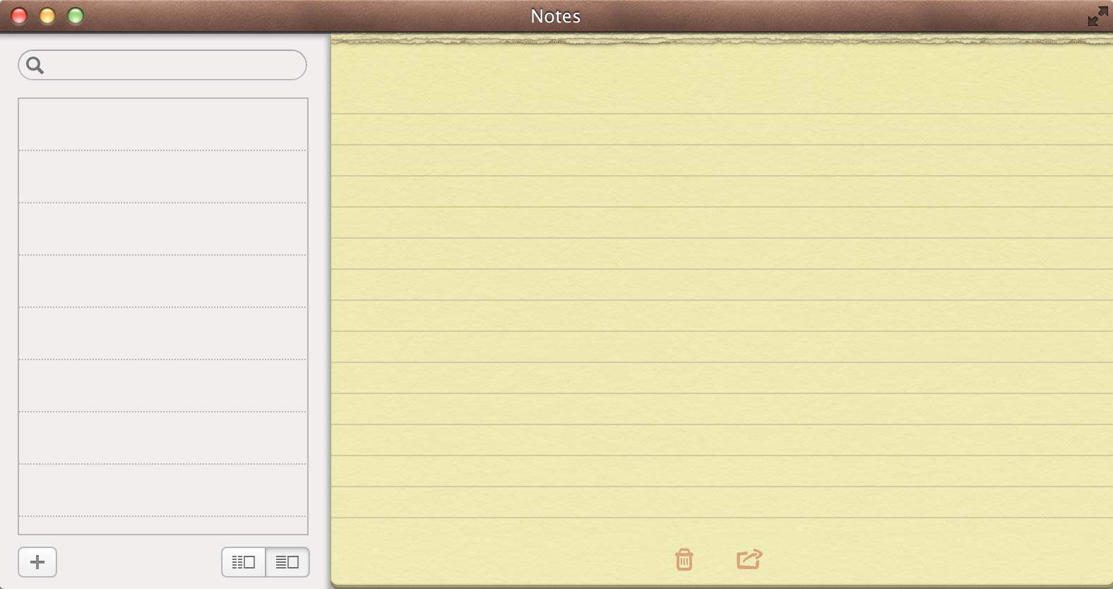
The yellow lined paper in the Notes app on OS X Mountain Lion is an example of skeuomorphism because it borrows visual cues from its real world analog.
By contrast, the hallmarks of flat design include minimalism, few gradients and shadows, and an emphasis on saturated colors and shapes. There have been many articles written about both topics so I don’t feel compelled to specifically add to the conversation there, but I’m definitely interested in exploring what’s next. When you’re trying to keep up with the brisk pace of the web, it’s never too early to start thinking about tomorrow.
Form Follows Function
Louis Sullivan (an American architect) coined the phrase “form follows function” in the late 19th century as a way to surmise the idea that the shape of a building should be informed by its purpose. This idea maps to web design quite well, because websites are also utilitarian; rarely are buildings or websites created for art’s sake. However, the function of a website is most certainly benefited by sound aesthetics. Design helps to make navigation feel obvious and buttons look clickable. Without good form, the function of many websites would be diminished.
Indeed, flat design is strongly influenced by function.
One reason that skeuomorphic designs became popular is because they borrowed affordances from everyday life. Designers were able to rely on users to bring their own prerequisite understanding. The lack of real world metaphors in flat design forces designers to think carefully about the hierarchy of information and the communicative value of the visual composition, which is a good thing. Flat designs also tend to load quickly because they use fewer images, which allows for the creation of experiences that are well suited to an increasingly mobile world. In fact, Microsoft made an advertisement that highlights how Windows 8 provides a unified experience across smartphones, tablets, and desktops.
Flat designs are also beautiful to look at because of the rich diversity of saturated colors that are atypical in the natural world. I’m often reminded of stained glass windows when I look at tile-based interfaces like these.
What’s Next?
Flat design looks nice and it also stands on a strong foundation of functional purpose, so what could influence a change? There might be many reasons, but I think it’s going to come down to refinements driven by the basic elements and principles of art and design, rather than a dramatic revolution. I also think people will simply becoming tired of the same look; the evolution of aesthetic sensibilities is a constant in life.
Nobody can predict the future perfectly, but here are a few of my guesses:
More Shapes
Recently I blogged about the new CSS shapes module because, not only is it cool technology, I think it will also serve as a nice transition from the version of flat design we know today. Composition and shapes play a huge role in the communicative power of flat design, so if designers have easier access to shapes beyond just rectangles, it could accelerate a trend towards different types of shapes. Specifically, acute angles and the directionality of a shape’s points help to guide the eye towards actionable interface elements. More neutral or passive items could feature more obtuse angles or curves. We’ve already seen this manifest in the form of circular profile pictures, like on Treehouse.
More Colors
Flat design has settled around what I would describe as saturated color triads, quads, and pentads, where there are few shades but many hues. Beautiful as this is, users will eventually grow tired of everything looking so similar. Color is great way to communicate visually without compromising everything that’s good about flat interfaces. Similar to shapes, I see this more as a diversification of what’s already present rather than harsh reaction.
If you’re not sure what I mean, head over to Adobe Kuler and start playing with the color wheel. You can also click on the Explore page to find lots of beautiful color schemes.
Big Photographs
Skeuomorphism doesn’t always do a good job of leveraging the power of digital displays, but it does bring a warm human element to the equation. Even with its friendly color palettes, flat design runs the risk of feeling like a Rubik’s Cube: calculated and unnatural.
Photography has always had a place on the web, but now more than ever, it has an opportunity to fill a cold void. This trend has been around for some time, but now it has more of a functional purpose. The website of Treehouse teacher Mat Helme employs edge-to-edge photography, and it gives you a better sense of Mat’s personality. I’ve also recently redesigned my personal website to use full-screen photo backgrounds in an attempt to create a place rather than a bunch of pixels.
Layers
I mentioned earlier that flat design forces designers to more carefully consider composition, which includes the relative size and placement of screen elements. This is difficult for most websites and applications as it is, but the more content and functionality you introduce to increasingly small screen sizes, the more difficult it becomes. You can only simplify so much.
One avenue that deserves more exploration is the usage of layered UI elements. This allows you to show and hide interface elements on the fly, without the need to completely change the screen. This concept has already made its way into numerous mobile apps, but my favorite example is Facebook. They’ve used the increasingly popular design pattern of sliding panels on the sides along with floating panels for real-time chat.

All of this is highly speculative. However, trying to predict the future is not only fun, it’s often times a good way to create new ideas. Where do you think design is going next? Let us know in the comments!
The post The Future Beyond Flat Design appeared first on Treehouse Blog.
]]>
The World is Flat In fine art, the successor to each artistic movement is typically a reaction to the previous movement, like a pendulum swinging back and forth. Similarly, in the relatively...
http://feedproxy.google.com/~r/teamtreehouse/~3/lqoSoj8Wb20/the-future-beyond-flat-design
https://my3.my.umbc.edu/api/v0/pixel/news/32991/guest@my.umbc.edu/91ae097110f90b6a209e45c4180ff3e6/api/pixel
android
css
design
development
html
ios
javascript
make-a-website
responsive
web
Web Developer - Build Group
https://my3.my.umbc.edu/groups/retired-583
https://assets3-my.umbc.edu/system/shared/avatars/groups/000/000/583/fc60f5d7abc2e080599bb6dc465db54d/xsmall.png?1363101197
https://assets4-my.umbc.edu/system/shared/avatars/groups/000/000/583/fc60f5d7abc2e080599bb6dc465db54d/original.jpg?1363101197
https://assets4-my.umbc.edu/system/shared/avatars/groups/000/000/583/fc60f5d7abc2e080599bb6dc465db54d/xxlarge.png?1363101197
https://assets4-my.umbc.edu/system/shared/avatars/groups/000/000/583/fc60f5d7abc2e080599bb6dc465db54d/xlarge.png?1363101197
https://assets3-my.umbc.edu/system/shared/avatars/groups/000/000/583/fc60f5d7abc2e080599bb6dc465db54d/large.png?1363101197
https://assets3-my.umbc.edu/system/shared/avatars/groups/000/000/583/fc60f5d7abc2e080599bb6dc465db54d/medium.png?1363101197
https://assets4-my.umbc.edu/system/shared/avatars/groups/000/000/583/fc60f5d7abc2e080599bb6dc465db54d/small.png?1363101197
https://assets3-my.umbc.edu/system/shared/avatars/groups/000/000/583/fc60f5d7abc2e080599bb6dc465db54d/xsmall.png?1363101197
https://assets4-my.umbc.edu/system/shared/avatars/groups/000/000/583/fc60f5d7abc2e080599bb6dc465db54d/xxsmall.png?1363101197
Web Developer - Build Group
0
0
true
Mon, 22 Jul 2013 09:30:44 -0400
Look Before You Leap Motion
Leap Motion’s low-cost gesture-control device is not as easy to use as you might think.
For the past couple days, I’ve been gesticulating even more than normal—at times, subtly, at other times, wildly—while getting to know the latest in gesture-control technology: the Leap Motion controller.
]]>
Leap Motion’s low-cost gesture-control device is not as easy to use as you might think. For the past couple days, I’ve been gesticulating even more than normal—at times, subtly, at other times,...
http://www.technologyreview.com/news/517331/look-before-you-leap-motion/
https://my3.my.umbc.edu/api/v0/pixel/news/32988/guest@my.umbc.edu/9207f6cc43c45b2026a4b5d4fce5d120/api/pixel
development
internet
mit
technology
web
Web Developer - Build Group
https://my3.my.umbc.edu/groups/retired-583
https://assets3-my.umbc.edu/system/shared/avatars/groups/000/000/583/fc60f5d7abc2e080599bb6dc465db54d/xsmall.png?1363101197
https://assets4-my.umbc.edu/system/shared/avatars/groups/000/000/583/fc60f5d7abc2e080599bb6dc465db54d/original.jpg?1363101197
https://assets4-my.umbc.edu/system/shared/avatars/groups/000/000/583/fc60f5d7abc2e080599bb6dc465db54d/xxlarge.png?1363101197
https://assets4-my.umbc.edu/system/shared/avatars/groups/000/000/583/fc60f5d7abc2e080599bb6dc465db54d/xlarge.png?1363101197
https://assets3-my.umbc.edu/system/shared/avatars/groups/000/000/583/fc60f5d7abc2e080599bb6dc465db54d/large.png?1363101197
https://assets3-my.umbc.edu/system/shared/avatars/groups/000/000/583/fc60f5d7abc2e080599bb6dc465db54d/medium.png?1363101197
https://assets4-my.umbc.edu/system/shared/avatars/groups/000/000/583/fc60f5d7abc2e080599bb6dc465db54d/small.png?1363101197
https://assets3-my.umbc.edu/system/shared/avatars/groups/000/000/583/fc60f5d7abc2e080599bb6dc465db54d/xsmall.png?1363101197
https://assets4-my.umbc.edu/system/shared/avatars/groups/000/000/583/fc60f5d7abc2e080599bb6dc465db54d/xxsmall.png?1363101197
Web Developer - Build Group
0
0
true
Mon, 22 Jul 2013 08:00:00 -0400
Simple Responsive Images With CSS Background Images
Editor’s Note: This article features just one of the many solutions for responsive images. We suggest that you review different approaches before choosing a particular responsive image solution, including these ones: How To Avoid Duplicate Downloads In Responsive Images and Choosing A Responsive Image Solution.
With all the talk of new HTML5 standards such as the srcset attribute and <picture> element, as well as server-side techniques such as Responsive Web Design + Server Side Components (RESS), you'd be forgiven for concluding that simple, static websites can’t support responsive images today. That conclusion might be premature, however. In fact, there’s an easy, straightforward way to deliver responsive images that’s supported by all of today’s Web browsers: CSS background images.
However, the approach has some limitations, and it doesn’t work in all cases. But if your requirements aren’t complicated, and if you’re willing to make an extra effort to ensure your images are accessible, CSS background images may be all you need.
In this article we’ll look at the CSS background approach in several steps:
- First, we’ll review the goals and requirements for responsive images.
- Then we’ll see how CSS media queries can help identify important characteristics of our users’ devices.
- We’ll explore the key CSS
background-image property that lets us respond to those characteristics.
- We’ll look at a strategy for optimizing the individual images that make up a responsive set.
- We’ll examine the limitations of this approach; in many cases there are simple techniques to overcome them.
- And finally, we’ll describe the problems with this approach for which there are no workarounds.
Note: This approach requires explicit control of your website’s style sheets as well as its HTML markup. If your website relies on a content management system (CMS), you might not have enough control over those aspects of the website.
The Need For Responsive Images
Responsive images are an important component of responsive Web design (RWD), a design strategy developed by Ethan Marcotte to cope with the amazing popularity of mobile devices for viewing the Web. Ethan recognized that the previous best practice — developing separate websites for different types of devices — simply couldn’t cope with the astonishing variety of devices Web users might employ to access the websites we build.
RWD takes a completely different approach: create a single website but let that website recognize and respond to its context. If the user has a desktop browser with a wide screen, for example, allow the website content to spread across multiple columns. On a smartphone, however, rearrange the content to confine it to a single column.
In many cases, that’s where responsive design stops — simple adjustments to layout and presentation. If that’s all we consider, however, we’re not honoring the goal of responsive design, and we’re selling our users short.
Truly responding to users’ context requires a design that considers all aspects of the experience, and that often includes images. For a real life example, consider a website such as contfont.net. That single page website has one main image and a typical set of HTML, style sheets, fonts, and JavaScript files.
| Resource |
Type |
Compressed Size |
| Main page |
HTML |
6 KB |
| Style sheet |
CSS |
10 KB |
| Fonts |
Web Font |
221 KB |
| Scripts |
JavaScript |
21 KB |
| Supporting images |
Image |
48 KB |
| Main site image |
Image |
?? |
The website looks gorgeous on computers with super–high-resolution displays because it includes a high-resolution version of the main image. Delivering that image file doesn’t come cheap, though; its 1940 × 1229 pixels make the image 446 KB in size after compression.
The website could use that same image file for all users without compromising the visual experience. Web browsers on smaller devices such as smartphones would resize it to fit the display. While that approach would preserve the visual appeal of the website, the overall user experience would suffer significantly.

On an iPhone, a 290 × 183 pixel image that is 18 KB in size looks identical to the 452 KB, 1940 × 1229 pixel image on the MacBook Pro. Larger view.
What does that mean for a user browsing to the website on, say, an earlier generation smartphone? For that user, a 290 × 183 pixel image that is 18 KB in size looks identical to the larger version. Without a responsive image approach, the website would force the user to download an extra 429 KB of data that is completely wasted. This excess is not just academic; it has a substantial effect on the website’s load time. The smartphone user may be accessing the website over a typical 3G connection at 2 Mb/s. Failing to deliver a responsive image increases the load time from 1.3 seconds to 3 full seconds, significantly more than doubling it!

The full size image takes 3.0 seconds to load over a 3G network, compared to 1.3 seconds for a responsive image. Larger view.
The primary goal for a responsive image approach is simple: deliver only the pixels that the user’s device can actually use.
Identifying The User’s Context
If our websites are going to respond to our users’ context, we need a way to identify that context. Today, CSS offers the most effective way to distinguish different devices. CSS gives us the answers to two critical questions: what is the size of the user’s display? And does the display support Retina-style images?
The CSS tool that gives us this information is a media query. Media queries define a set of CSS style properties that apply only to devices with specific qualities. Originally, media queries were limited to media types. The CSS specification defines a large number of them including, for example braille (for braille tactile feedback devices), speech (for speech synthesizers), tty (for devices with only monospaced fonts, such as teletypes) and tv (for television-type devices with low resolution and no scrolling). Currently, the only two media types that most browsers support are print (for printed, paged material) and screen (for computer screens).
CSS3 expanded the use of media queries, however, by allowing style sheets to specify specific features of devices as well as the media type. And in the case of screen devices, the features can include many characteristics of the display, including its width, orientation, resolution and pixel ratio. Those features provide just the information we need to select an appropriate responsive image.
Here’s how media queries can help us solve the dilemma of the previous section. As an example, a 15-inch MacBook Pro has a screen width of 1440 pixels (ignoring for the moment the Retina display option). To identify styles that apply to screens of this size (and larger), we can write our style sheet as:
    @media only screen and (min-width: 1440px) {
    	/* styles for MacBook Pro-sized screens and larger */
    }
Any styles defined in that block will only apply when the user accesses the Web page using a device with a screen size of 1440 pixels. There’s a catch, though. The media screen size doesn’t apply to the device’s hardware; rather, it applies to the Web browser’s viewport. The viewport is the size of the browser window after subtracting any browser chrome, such as toolbars.
Unless the user is browsing in full screen mode, the browser window will actually be somewhat less than 1440 pixels in width. For this more common case, therefore, we might want to rewrite the style sheet a bit. Perhaps 1200 pixels is more realistic.
    @media only screen and (min-width: 1200px) {
    	/* styles for wide screens */
    }
The media query has two parts. The first part, only screen, indicates that the styles shouldn’t apply to printed copies of the page or other non-standard devices. (The only keyword doesn’t actually affect the media query; it’s there strictly for really old browsers that don’t support media features. Because those browsers don’t understand the only syntax, they’ll simply ignore the entire block of styles.) The second part of the query, min-width: 1200px, gives the minimum screen width at which the styles will be applied. The and that joins those parts means that both must be true for the styles to apply.
We can use a similar technique to define styles for portrait-mode smartphones.
    @media only screen and (max-width: 320px) {
    	/* styles for narrow screens */
    }
In this case we can go ahead and use the actual device screen size in the query. Web browsers on smart phones are always full-screen width.
The min-width and max-width feature specifications make it easy to determine the width of the user’s device. Unfortunately, identifying a Retina display isn’t quite as straightforward. Different browsers use different syntaxes for this feature, so we must resort to vendor prefixes. To make things slightly worse, many versions of Firefox had a bug in their syntax, so we need to use both a fixed and a “broken” syntax for Mozilla browsers. As of now, the recommended query for Retina-quality displays looks like the following.
    @media
    only screen and (-webkit-min-device-pixel-ratio: 2),
    only screen and (min--moz-device-pixel-ratio: 2),
    only screen and (-moz-min-device-pixel-ratio: 2),
    only screen and (-o-min-device-pixel-ratio: 2/1),
    only screen and (min-device-pixel-ratio: 2),
    only screen and (min-resolution: 192dpi),
    only screen and (min-resolution: 2dppx) {
    	/* styles for Retina-type displays */
    }
Eventually browsers will all support the standard dots per pixel notation (dppx) and we can drop the vendor prefixes from our style sheets.
The CSS Background-Image Property
If CSS can reliably identify a user’s context, you might think it would be easy to support responsive images. One approach that might seem logical would be to set display: none for those images we don’t wish to download. Here’s an attempt based strictly on screen size. (We’re omitting Retina considerations for brevity.)
    <!DOCTYPE html>
    <html lang="en">
    	<head>
    		<meta charset="utf-8">
    		<title></title>
    		<style>
    		img.smallscreen { display: none; }
    		@media only screen and (max-width: 320px) {
    			img {
    				display: none;
    			}
    			img.smallscreen {
    				display: inline;
    			}
    		}
    		</style>
    	</head>
    	<body>
    		<img src="largeimage.jpg">
    		<img class="smallscreen" src="smallimage.jpg>
    	</body>
    </html>
The code above will display the correct image based on the screen size; however, the display: none property won’t actually prevent browsers from downloading the hidden images. Smartphone browsers will download the large image even though it’s never displayed. Unfortunately, this obvious approach doesn’t accomplish the main goal for responsive images.
The problem occurs because browsers handle the HTML separately from the CSS. The HTML markup requests two image files, so the browser dutifully fetches both. Afterwards, it parses the CSS styles only to discover that one of the images is not displayed, but by then it's too late.
Our CSS media queries will only work if we can use them strictly for CSS properties and not HTML content. That may seem impossible, but it turns out that there is a sneaky way to only use CSS for imagery — the background-image property. Here’s how we do that:
- In the HTML markup, don’t include references to any image files. Instead simply use empty
<div> or <span> elements.
- Place an image in the empty
<div> or <span> by setting its background-image property.
- Use media queries to substitute the appropriate responsive images, depending on screen size and resolution.
Using these rules, we can modify the above example so that responsive images actually work correctly.
    <!DOCTYPE html>
    <html lang="en">
    	<head>
    		<meta charset="utf-8">
    		<title></title>
    		<style>
    		#image {
    			background-image: url(largeimage.jpg);
    		}
    		@media only screen and (max-width: 320px) {
    			#image {
    				background-image: url(smallimage.jpg);
    			}
    		}
    		</style>
    	</head>
    	<body>
    		<div id="image"></div>
    	</body>
    </html>
That, in a nutshell, is how to support responsive images with CSS background images. Any real application will require a bit more code (for example, we need some way to indicate the image size). The additional code, however, is standard CSS without any tricks.
Creating The Responsive Images
With an understanding of how to use responsive images, the next step is actually creating the image variations. The original source image should have the highest resolution possible, at least as high as the most detailed image your website will deliver. (In the case of contfont.net, the source image is 3888 × 2592 pixels.) Your graphics program of choice should be able to resize that source image to fit your website's breakpoints.
As long as you’re working in your graphics program, be sure to optimize even the high-resolution images as much as possible, for example, by using the lowest quality setting feasible for the image. Even users on high-resolution displays will appreciate the faster page load time. If the image is in JPEG format, you can also enable the progressive option when you export it. This option lets the browser display a low-fidelity version of the image quickly while it continues to download the full image.
When it comes to the breakpoints themselves, you shouldn’t fall into the temptation of using the same breakpoints for your images as you’re using for the website’s layout. It’s rarely the case that the best layout breakpoints are also the best image breakpoints. Instead, optimize your image breakpoints for the image. Here’s a strategy I like for finding the optimum image sizes.
First determine the smallest resolution image that is practical for your website to deliver. In the case of contfont.net, the smallest practical viewport size is 320 pixels, corresponding to a non-Retina iPhone in portrait orientation. (Devices with smaller viewports exist, and are likely to exist in the future — smart watches, anyone? — but those devices aren’t likely to visit the website.) On the contfont.net website, a viewport size of 320 pixels leaves 290 pixels for the image width, so the lowest resolution image we need is 290 × 183 pixels. Have your graphics program resize the source image to that size.
Next create a simple test page for that image. Here’s the markup I use:
    <!DOCTYPE html>
    <html lang="en">
    	<head>
    		<meta charset="utf-8">
    		<title></title>
    	</head>
    	<body>
    		<img src="test.jpg" width="100%">
    		<p>Window size: <span id="size"></span> pixels</p>
    		<script>
    		window.onresize = function() {
    			document.getElementById("size").innerHTML = window.innerWidth;
    		};
    		</script>
    	</body>
    </html>
This page displays the test image and the current window size. Open it in your browser, and resize the browser window so that its width is about the size of your smallest breakpoint. Because the test image matches this width, it should look fine.
Now slowly resize your browser window by increasing its width. As the width grows, the browser will automatically interpolate and resize the image. As the amount of interpolation increases, the image quality suffers and, at some point, the image will look unacceptably poor. Note the screen width when that point occurs, as that screen width is your first breakpoint.

Resize your browser window until the width at which the image looks unacceptably poor. That screen width will be your breakpoint. Larger view.
When you’ve found the first breakpoint, use your graphics program to create a new test image at that size from the original source. Repeat the process with the new test image to find the next breakpoint, and continue until you’ve reached the maximum viewport width your website will support.
At this point you’ll have your image breakpoints and a set of images to match. For Retina displays, create additional images at double resolution. Here’s the full list of images for the contfont.net website:
| Image File |
Resolution |
Size (Uncompressed) |
candc290.jpg |
290 × 183 |
19,378 Bytes |
candc290@2x.jpg |
290 × 183 (Retina) |
56,277 Bytes |
candc538.jpg |
538 × 341 |
52,914 Bytes |
candc538@2x.jpg |
538 × 341 (Retina) |
159,867 Bytes |
candc970.jpg |
970 × 614 |
132,766 Bytes |
candc970@2x.jpg |
970 × 614 (Retina) |
451,939 Bytes |
You can use this approach separately for each image on your website, as there’s no reason that all images have to use the same breakpoints. If your website has a lot of images, however, it might be more efficient to find some common breakpoints using a few of the website’s images and then repeat those breakpoints for all of the images on the website.
Overcoming Limitations
In the simplest cases, the steps above are all it takes to support responsive images. Of course, websites are rarely that simple, and, indeed, there are several steps we can take to improve the approach.
Making Images Accessible
The standard <img> tag supports an alt attribute that provides an alternative, textual description of the image. That description is important for accessible websites, as users with screen readers rely on the alt content to describe the image. CSS background images don’t have an <img> tag and thus no alt attribute, but we can still make them accessible to vision-impaired users. To do that, we add two additional attributes to our markup.
<div id="image" role="img" aria-label="Textual Description"></div>
The first extra attribute, role, lets screen readers know that the <div> is serving the role of an <img> tag, even though it’s not explicit in the markup. The second attribute, aria-label serves the same purpose as an alt attribute in an <img>. With those two additions, screen readers can announce to their users that the element is an image, and they will read the alternate text description that you’ve provided for that image.
Scaling Images in the Browser
There’s another helpful property of the <img> tag that our simple approach doesn’t support: automatic sizing and scaling by the browser. With a standard <img>, we can simply set the width as a percentage of the containing element and the browser automatically calculates the width and scales the height proportionally. For example, consider the fragment below displaying the image file image.jpg which has natural dimensions of 600 × 300 pixels.
    <div style="width: 400px">
    	<img src="image.jpg">
    </div>
The browser automatically fits the image into the containing <div>, reducing its width from 600 to 400 pixels. It also preserves the image’s aspect ratio, scaling the image height from 300 to 200 pixels at the same time. The result is an undistorted image that fits perfectly on the page.
Thanks to an approach first described by Grady Kuhnline, we can achieve the same effect with a CSS background image for modern browsers. (Warning: The approach this subsection describes does not work in Internet Explorer version 8 and below, as those browsers don’t support the necessary CSS properties.)
The easiest part to tackle is scaling the width. As with the <img> tag we can set our element within a <div> of fixed width; we just have to explicitly indicate that the background should fill that <div>. The HTML markup doesn’t look very different.
    <div style="width: 400px">
    	<span id="image"></span>
    </div>
We have to combine several CSS properties to set the width; let’s take them one at a time:
- Set the
display property of the #image element to inline-block. Without this property, CSS will display the <span> element as inline and we won’t be able to give it a width or (in a minute) a height.
- Set the
width of that element to 100% so that our image fills the containing <div>.
- Set the
font-size and line-height properties to 0 so that any contents within the span don’t factor into its size.
- Set the
vertical-align property to middle to vertically center the image element in the containing <div>.
- Set the
background-size property to 100% so our image fills the image element.
- Set the
background-position property to 50% 50% to align the background image within the image element.
- Set the
background-repeat property to no-repeat to prevent the browser from tiling the image horizontally or vertically.
The resulting CSS sets the styles for the image element (the <span> element with an id of "image").
    #image {
    	display: inline-block;
    	width: 100%;
    	font-size: 0;
    	line-height: 0;
    	vertical-align: middle;
    	background-size: 100%;
    	background-position: 50% 50%;
    	background-repeat: no-repeat;
    	background-image: url(image.jpg);
    }
Those steps take care of giving the image a width, but we haven’t yet tackled the height. Nothing in the above markup or styles tells the browser the height of the image element. As a result, it will default to its natural height which is, alas, zero, as there is no actual content in the <span>. Fortunately, we can fix that with a few minor additions.
First we need to add an extra <span> element to our markup. This extra element is placed within the image element.
    <div style="width: 400px">
    	<span id="image">
    		<span id="image-inner">
    		</span>
    	</span>
    </div>
Now we define a few style properties for this inner <span>.
- Set its
display property to block so it will have a height and width.
- Set its
height to 0 since it doesn’t have any actual content.
- Add a
padding-top property specifying a percentage equal to the height-to-width ratio of the image.
That last step is the key. Even though the <span> inherits no height from its content, padding-top forces the element to take up vertical space. Furthermore, the padding-top property accepts percentage values where the percentage is relative to the element’s width. Our image is 970 × 614 pixels, so the percentage value we use is (614 ÷ 970) × 100%, or 63.3%. Now the browser will ensure that our image maintains its aspect ratio as it’s scaled up or down.
    #image-inner {
    	display: block;
    	height: 0;
    	padding-top: 63.3%;
    }
All Together Now
To see how all these components fit together, here is the code for the contfont.net website we’ve used as an example. First is the HTML markup that includes the main website image.
    <div class="hero">
    	<span id="cafe" role="img" aria-label="Coffee and croissant.">
    		<span class="inner">
    		</span>
    	</span>
    </div>
The style sheet defines properties that make the image scale proportionally.
    .hero #cafe {
    	width: 100%;
    	display: inline-block;
    	vertical-align: middle;
    	font: 0/0 serif;
    	text-shadow: none;
    	color: transparent;
    	background-size: 100%;
    	background-position: 50% 50%;
    	background-repeat: no-repeat;
    }
    .hero #cafe .inner {
    	padding-top: 63.35%; /* height/width of image */
    	display: block;
    	height: 0;
    }
And finally, a set of media queries pick the appropriate image file based on the user’s context. (The example below omits vendor prefixes for brevity.)
    /* default screen, non-retina */
    .hero #cafe {
    	background-image: url("../img/candc970.jpg");
    }

    @media only screen {
    	/* Small screen, non-retina */
    	.hero #cafe {
    		background-image: url("../img/candc290.jpg");
    	}
    }
    @media
    only screen and (min-resolution: 2dppx) {
    	/* Small screen, retina */
    	.hero #cafe {
    		background-image: url("../img/candc290@2x.jpg");
    	}
    }
    @media only screen and (min-width: 321px) {
    	/* Medium screen, non-retina */
    	.hero #cafe {
    		background-image: url("../img/candc538.jpg");
    	}
    }
    @media
    only screen and (min-resolution: 2dppx) and (min-width: 321px) {
    	/* Medium screen, retina */
    	.hero #cafe {
    		background-image: url("../img/candc538@2x.jpg");
    	}
    }
    @media
    only screen and (min-resolution: 2dppx) and (min-width: 539px) {
    	/* Large screen, retina */
    	.hero #cafe {
    		background-image: url("../img/candc970@2x.jpg");
    	}
    }
Potential Problems
CSS background images are a convenient way to deliver responsive images today, but the approach isn’t perfect. At a basic level, it violates one of the fundamental philosophies of modern Web standards — separating content from presentation. Advanced versions of the approach also suffer from browser compatibility concerns, and the approach doesn’t address some of the deeper problems with responsive images in general.
Separation of Style and Content
CSS was developed specifically to separate style from content. On the modern web, HTML pages provide all of a website’s content, while style sheets only affect the presentation of that content. Style sheets should not define the content itself. Of course, the separation between style and content has already been breached somewhat with the CSS content-before and content-after properties, but those properties are typically used to enhance the presentation (for example, by adding an icon to an element).
Specifying primary website images with CSS is a different level entirely. By specifying primary content with CSS rather than HTML, we make our websites harder to troubleshoot, we make them more difficult to maintain and we create barriers for systems that might try to parse our websites automatically.
Unfortunately, there really is no getting around this problem. If strict separation of style and content is important to you, then you’ll have to consider alternative approaches for responsive images.
Browser Support for Scaled Images
As noted above, the enhancements we added to he basic approach for scaled images won’t work in Internet Explorer version 8 and below. Standardized approaches such as srcset may be backwards compatible with such browsers, but, of course, srcset itself isn’t available on any mainstream browser today.
If you need to support IE8 right now, you might consider creating a separate style sheet for IE8 that specifies fixed image sizes rather than scaling the images. Of course you’ll want to include that style sheet within an IE conditional comment so that other browsers won’t see it.
The Real Problem of User Context
Perhaps the most fundamental problem with this approach is a problem with responsive images in general. We’re using screen width and pixel density to determine user context, but it’s not clear that such an approach is always appropriate. Consider, for example, a notebook user accessing the Web via a smartphone’s Wi-Fi hotspot.
That user’s Web browser will show all the characteristics of a high-density, wide-screen device, and a responsive website will delivery large, high-resolution images. Anything less will look poor on our user’s display, but these images may take a long time to load over a wireless network. They could significantly increase the website’s load time, and they may ultimately cost our user real money on their wireless bill. Given the choice, they might prefer lower resolution imagery.
It turns out that this problem is a really hard one to solve. Smart people in the Web community are definitely discussing it, but so far there has been little consensus on an practical solution. For now, CSS-based context discovery is the best technique available.
Acknowledgements
A special thanks to Grady Kuhnline for first describing how to style images that can scale proportionally. Also, the contfont.net website that this article uses as an example is available for reference on github.
(cp)
© Stephen Thomas for Smashing Magazine, 2013.
]]>
Editor’s Note: This article features just one of the many solutions for responsive images. We suggest that you review different approaches before choosing a particular responsive image...
http://www.smashingmagazine.com/2013/07/22/simple-responsive-images-with-css-background-images/
https://my3.my.umbc.edu/api/v0/pixel/news/32985/guest@my.umbc.edu/aa8e9de37307269bde0cc19230ecc349/api/pixel
css
design
development
html
javascript
mobile
mysql
php
sql
web
Web Developer - Build Group
https://my3.my.umbc.edu/groups/retired-583
https://assets3-my.umbc.edu/system/shared/avatars/groups/000/000/583/fc60f5d7abc2e080599bb6dc465db54d/xsmall.png?1363101197
https://assets4-my.umbc.edu/system/shared/avatars/groups/000/000/583/fc60f5d7abc2e080599bb6dc465db54d/original.jpg?1363101197
https://assets4-my.umbc.edu/system/shared/avatars/groups/000/000/583/fc60f5d7abc2e080599bb6dc465db54d/xxlarge.png?1363101197
https://assets4-my.umbc.edu/system/shared/avatars/groups/000/000/583/fc60f5d7abc2e080599bb6dc465db54d/xlarge.png?1363101197
https://assets3-my.umbc.edu/system/shared/avatars/groups/000/000/583/fc60f5d7abc2e080599bb6dc465db54d/large.png?1363101197
https://assets3-my.umbc.edu/system/shared/avatars/groups/000/000/583/fc60f5d7abc2e080599bb6dc465db54d/medium.png?1363101197
https://assets4-my.umbc.edu/system/shared/avatars/groups/000/000/583/fc60f5d7abc2e080599bb6dc465db54d/small.png?1363101197
https://assets3-my.umbc.edu/system/shared/avatars/groups/000/000/583/fc60f5d7abc2e080599bb6dc465db54d/xsmall.png?1363101197
https://assets4-my.umbc.edu/system/shared/avatars/groups/000/000/583/fc60f5d7abc2e080599bb6dc465db54d/xxsmall.png?1363101197
Web Developer - Build Group
0
0
true
Mon, 22 Jul 2013 07:48:16 -0400
Mon, 22 Jul 2013 07:48:16 -0400
Trent Walton on the need for healthy argument
Designer, speaker and one third of Paravel, Trent Walton chats with Martin Cooper about how to survive amid a fast-moving industry
 ]]>
Designer, speaker and one third of Paravel, Trent Walton chats with Martin Cooper about how to survive amid a fast-moving industry
http://feedproxy.google.com/~r/net/topstories/~3/XYIW7KwxuMY/story01.htm
https://my3.my.umbc.edu/api/v0/pixel/news/32994/guest@my.umbc.edu/8b80c8f03640789f2eb54ce436a690d0/api/pixel
css
development
html
javascript
mysql
net
php
sql
web
Web Developer - Build Group
https://my3.my.umbc.edu/groups/retired-583
https://assets3-my.umbc.edu/system/shared/avatars/groups/000/000/583/fc60f5d7abc2e080599bb6dc465db54d/xsmall.png?1363101197
https://assets4-my.umbc.edu/system/shared/avatars/groups/000/000/583/fc60f5d7abc2e080599bb6dc465db54d/original.jpg?1363101197
https://assets4-my.umbc.edu/system/shared/avatars/groups/000/000/583/fc60f5d7abc2e080599bb6dc465db54d/xxlarge.png?1363101197
https://assets4-my.umbc.edu/system/shared/avatars/groups/000/000/583/fc60f5d7abc2e080599bb6dc465db54d/xlarge.png?1363101197
https://assets3-my.umbc.edu/system/shared/avatars/groups/000/000/583/fc60f5d7abc2e080599bb6dc465db54d/large.png?1363101197
https://assets3-my.umbc.edu/system/shared/avatars/groups/000/000/583/fc60f5d7abc2e080599bb6dc465db54d/medium.png?1363101197
https://assets4-my.umbc.edu/system/shared/avatars/groups/000/000/583/fc60f5d7abc2e080599bb6dc465db54d/small.png?1363101197
https://assets3-my.umbc.edu/system/shared/avatars/groups/000/000/583/fc60f5d7abc2e080599bb6dc465db54d/xsmall.png?1363101197
https://assets4-my.umbc.edu/system/shared/avatars/groups/000/000/583/fc60f5d7abc2e080599bb6dc465db54d/xxsmall.png?1363101197
Web Developer - Build Group
0
0
true
Mon, 22 Jul 2013 07:04:48 -0400
The Most Powerful Word Known to Mankind
]]>
Designer, speaker and one third of Paravel, Trent Walton chats with Martin Cooper about how to survive amid a fast-moving industry
http://feedproxy.google.com/~r/net/topstories/~3/XYIW7KwxuMY/story01.htm
https://my3.my.umbc.edu/api/v0/pixel/news/32994/guest@my.umbc.edu/8b80c8f03640789f2eb54ce436a690d0/api/pixel
css
development
html
javascript
mysql
net
php
sql
web
Web Developer - Build Group
https://my3.my.umbc.edu/groups/retired-583
https://assets3-my.umbc.edu/system/shared/avatars/groups/000/000/583/fc60f5d7abc2e080599bb6dc465db54d/xsmall.png?1363101197
https://assets4-my.umbc.edu/system/shared/avatars/groups/000/000/583/fc60f5d7abc2e080599bb6dc465db54d/original.jpg?1363101197
https://assets4-my.umbc.edu/system/shared/avatars/groups/000/000/583/fc60f5d7abc2e080599bb6dc465db54d/xxlarge.png?1363101197
https://assets4-my.umbc.edu/system/shared/avatars/groups/000/000/583/fc60f5d7abc2e080599bb6dc465db54d/xlarge.png?1363101197
https://assets3-my.umbc.edu/system/shared/avatars/groups/000/000/583/fc60f5d7abc2e080599bb6dc465db54d/large.png?1363101197
https://assets3-my.umbc.edu/system/shared/avatars/groups/000/000/583/fc60f5d7abc2e080599bb6dc465db54d/medium.png?1363101197
https://assets4-my.umbc.edu/system/shared/avatars/groups/000/000/583/fc60f5d7abc2e080599bb6dc465db54d/small.png?1363101197
https://assets3-my.umbc.edu/system/shared/avatars/groups/000/000/583/fc60f5d7abc2e080599bb6dc465db54d/xsmall.png?1363101197
https://assets4-my.umbc.edu/system/shared/avatars/groups/000/000/583/fc60f5d7abc2e080599bb6dc465db54d/xxsmall.png?1363101197
Web Developer - Build Group
0
0
true
Mon, 22 Jul 2013 07:04:48 -0400
The Most Powerful Word Known to Mankind

"Nathan," my boss says to me, "we need to get this feature in before we launch the product."
"Don’t worry, it’s fairly simple and shouldn’t take long," I reply.
The request had been lobbed at me out of nowhere. The request seemed pretty straightforward, and apparently it was mission-critical.
If only I’d realized it was actually a grenade threatening to destroy our product release plans.
You’ve probably been in that same narrative before.
These seemingly small and simple requests can quickly become complex, dangerous, and an absolute nightmare.
As the product manager, I should have — and could have — avoided this nightmare by using the most powerful word known to mankind:
No.
Why I Had to Learn to Say No
It had all started so well, we knew what we had to do and started to burndown the stories in the sprint.
(By the way, we use the Scrum software development method. If a term in this article isn’t familiar, check out this Scrum glossary of terms.)
Further requests came in, which wasn’t unusual, and they were quickly accepted without proper investigation.
Oops. Big mistake.
All of a sudden, the release had become bloated and it became much bigger than we had ever anticipated.
There were early signs of the release going off track, with the sprint burndown lagging, the story points increasing significantly, and an unusually large amount of questions being asked about the new stories.
Worst of all, I had started to look like an ass.
The scope had crept, clarity was absent, and I was losing control of this project.
We were hemorrhaging big time.
The bleeding had to stop.
My mindset switched over.
I had caused this mess. So I was going to fix it.
The only way to fix this was to use that amazingly simple but powerfully potent word.
Here’s how I did it, and how you too can get to No.
Stop the Bleeding
Just say No. Don’t use fluffy, doublespeak language. Just say it.
No.
Deny new requests until you have the time and resources to properly look into them. Also, bear in mind that there will be future releases, so you can responsibly delay some ideas into the next release.
This sounds so easy, but it takes some getting used to. It takes a change in thinking.
For example, as a product manager, I’m often under intense pressure from the CEO or the client or my boss or a decision-maker. Saying No to these folks seems to be a career-limiting move.
No is your strongest tool for stopping the bleeding. It will let you reset and it will get you back in sync.
Flip the Problem
I explained why new requests were being rejected. We were close to the release date, and we just didn’t have enough time.
This, too, sounds quite easy; it was a good and honest reason for being unable to accommodate a request.
Yet it’s easy to forget that non-technical folk see what we do as black magic.
Don’t bother with the technical reasons for why the request is difficult to accommodate. Rather, highlight the consequences of adding extra work, such as a delayed release, increased costs, cranky and pissed-off software engineers, and so forth.
If you’re really pushed, make a point that every decision has its consequences.
"We can do what you asked. It just means [TheOtherFeatureYouAskedFor] has to go. Which is more important?"
The ball’s now in their court.
Appeal to Higher Objectives
If a feature request doesn’t progress you towards your business goals, or if it isn’t inline with your product strategy, why are you going to do it?
These types of scope-augmenting requests are often hastily made and not well-formed. They often shouldn’t be in the product until they’ve been better developed.
(Read more about creating good project scopes.)
Learn to say "No, it doesn’t help us get to our goals and it will have to wait for now."If the entire team is heading towards the same objectives, this will also help you gain broader support from other project members.
You Own the Backlog
One of the best tools for product managers is the sprint backlog. And you need to be all over it if you’re a manager.
If the product backlog is mysteriously growing, you’re in big trouble, and you need to step up, get all totalitarian and dictatorial, and let the offenders know the sprint backlog is your domain.
You must own it, and no one else can add to it regardless of how simple the task seems.
This might require a cultural change in your team, and be prepared for some push back, but you must get it done.
If you can’t control your backlog, you’re fighting a losing battle.
Final Thoughts
Hindsight is a wonderful thing. Watch out for seemingly simple requests that are actually grenades in disguise.
I’m now much more proactive about saying No. And if you too want to sidestep the problems I’ve faced, you must also learn how to use No, the most powerful word known to mankind.
Related Content
About the Author
 Nathan Conyngham is a customer advocate focusing on project, product and expectation management. He’s an avid believer that the best results are achieved by focusing on the customer, having clarity of purpose and executing well. Get in touch with Nathan via his personal blog or on Twitter @nathanconyngham.
The post The Most Powerful Word Known to Mankind appeared first on Six Revisions.
]]>
"Nathan," my boss says to me, "we need to get this feature in before we launch the product." "Don’t worry, it’s fairly simple and shouldn’t take long," I reply. The request had been lobbed at...
http://feedproxy.google.com/~r/SixRevisions/~3/Yg7RgQBtI6I/
https://my3.my.umbc.edu/api/v0/pixel/news/32982/guest@my.umbc.edu/30e300b6e6ecc8a7327ded3ccb725af1/api/pixel
css
database
design
development
html
javascript
mysql
project-management
sql
web
Web Developer - Build Group
https://my3.my.umbc.edu/groups/retired-583
https://assets3-my.umbc.edu/system/shared/avatars/groups/000/000/583/fc60f5d7abc2e080599bb6dc465db54d/xsmall.png?1363101197
https://assets4-my.umbc.edu/system/shared/avatars/groups/000/000/583/fc60f5d7abc2e080599bb6dc465db54d/original.jpg?1363101197
https://assets4-my.umbc.edu/system/shared/avatars/groups/000/000/583/fc60f5d7abc2e080599bb6dc465db54d/xxlarge.png?1363101197
https://assets4-my.umbc.edu/system/shared/avatars/groups/000/000/583/fc60f5d7abc2e080599bb6dc465db54d/xlarge.png?1363101197
https://assets3-my.umbc.edu/system/shared/avatars/groups/000/000/583/fc60f5d7abc2e080599bb6dc465db54d/large.png?1363101197
https://assets3-my.umbc.edu/system/shared/avatars/groups/000/000/583/fc60f5d7abc2e080599bb6dc465db54d/medium.png?1363101197
https://assets4-my.umbc.edu/system/shared/avatars/groups/000/000/583/fc60f5d7abc2e080599bb6dc465db54d/small.png?1363101197
https://assets3-my.umbc.edu/system/shared/avatars/groups/000/000/583/fc60f5d7abc2e080599bb6dc465db54d/xsmall.png?1363101197
https://assets4-my.umbc.edu/system/shared/avatars/groups/000/000/583/fc60f5d7abc2e080599bb6dc465db54d/xxsmall.png?1363101197
Web Developer - Build Group
0
0
true
Mon, 22 Jul 2013 06:00:36 -0400
Mon, 22 Jul 2013 06:00:36 -0400
4 tools for automatic CSS testing
Introduce some automated CSS testing into your workflow for more time making and less time checking. Simon Madine explains how to get started
 ]]>
Introduce some automated CSS testing into your workflow for more time making and less time checking. Simon Madine explains how to get started
http://feedproxy.google.com/~r/net/topstories/~3/LAK9BIc5-AI/story01.htm
https://my3.my.umbc.edu/api/v0/pixel/news/32983/guest@my.umbc.edu/fcceee3f5b3b2a4a8c4df80dbce5070f/api/pixel
css
development
html
javascript
mysql
net
php
sql
web
Web Developer - Build Group
https://my3.my.umbc.edu/groups/retired-583
https://assets3-my.umbc.edu/system/shared/avatars/groups/000/000/583/fc60f5d7abc2e080599bb6dc465db54d/xsmall.png?1363101197
https://assets4-my.umbc.edu/system/shared/avatars/groups/000/000/583/fc60f5d7abc2e080599bb6dc465db54d/original.jpg?1363101197
https://assets4-my.umbc.edu/system/shared/avatars/groups/000/000/583/fc60f5d7abc2e080599bb6dc465db54d/xxlarge.png?1363101197
https://assets4-my.umbc.edu/system/shared/avatars/groups/000/000/583/fc60f5d7abc2e080599bb6dc465db54d/xlarge.png?1363101197
https://assets3-my.umbc.edu/system/shared/avatars/groups/000/000/583/fc60f5d7abc2e080599bb6dc465db54d/large.png?1363101197
https://assets3-my.umbc.edu/system/shared/avatars/groups/000/000/583/fc60f5d7abc2e080599bb6dc465db54d/medium.png?1363101197
https://assets4-my.umbc.edu/system/shared/avatars/groups/000/000/583/fc60f5d7abc2e080599bb6dc465db54d/small.png?1363101197
https://assets3-my.umbc.edu/system/shared/avatars/groups/000/000/583/fc60f5d7abc2e080599bb6dc465db54d/xsmall.png?1363101197
https://assets4-my.umbc.edu/system/shared/avatars/groups/000/000/583/fc60f5d7abc2e080599bb6dc465db54d/xxsmall.png?1363101197
Web Developer - Build Group
0
0
true
Mon, 22 Jul 2013 06:00:26 -0400
What’s wrong with being creative?
]]>
Introduce some automated CSS testing into your workflow for more time making and less time checking. Simon Madine explains how to get started
http://feedproxy.google.com/~r/net/topstories/~3/LAK9BIc5-AI/story01.htm
https://my3.my.umbc.edu/api/v0/pixel/news/32983/guest@my.umbc.edu/fcceee3f5b3b2a4a8c4df80dbce5070f/api/pixel
css
development
html
javascript
mysql
net
php
sql
web
Web Developer - Build Group
https://my3.my.umbc.edu/groups/retired-583
https://assets3-my.umbc.edu/system/shared/avatars/groups/000/000/583/fc60f5d7abc2e080599bb6dc465db54d/xsmall.png?1363101197
https://assets4-my.umbc.edu/system/shared/avatars/groups/000/000/583/fc60f5d7abc2e080599bb6dc465db54d/original.jpg?1363101197
https://assets4-my.umbc.edu/system/shared/avatars/groups/000/000/583/fc60f5d7abc2e080599bb6dc465db54d/xxlarge.png?1363101197
https://assets4-my.umbc.edu/system/shared/avatars/groups/000/000/583/fc60f5d7abc2e080599bb6dc465db54d/xlarge.png?1363101197
https://assets3-my.umbc.edu/system/shared/avatars/groups/000/000/583/fc60f5d7abc2e080599bb6dc465db54d/large.png?1363101197
https://assets3-my.umbc.edu/system/shared/avatars/groups/000/000/583/fc60f5d7abc2e080599bb6dc465db54d/medium.png?1363101197
https://assets4-my.umbc.edu/system/shared/avatars/groups/000/000/583/fc60f5d7abc2e080599bb6dc465db54d/small.png?1363101197
https://assets3-my.umbc.edu/system/shared/avatars/groups/000/000/583/fc60f5d7abc2e080599bb6dc465db54d/xsmall.png?1363101197
https://assets4-my.umbc.edu/system/shared/avatars/groups/000/000/583/fc60f5d7abc2e080599bb6dc465db54d/xxsmall.png?1363101197
Web Developer - Build Group
0
0
true
Mon, 22 Jul 2013 06:00:26 -0400
What’s wrong with being creative?
 The web is full of people discussing the finer points of the design field. Many who are focused on figuring out exactly what design is, and even what design isn’t. Many points have been made, and just about as many have been contested.
This is a good thing. The more we dissect and explore the boundaries of our field, the better grasp we gain on our craft. So I tend to be very open to these discussions. I like to see them unfold and see what they uncover or reinforce about the industry. But recently on Twitter, I happened upon one such discussion that I felt obligated to challenge.
“Creatives” is a horrible term to describe who designers are. Might as well be “Mutants.” We need to drop this label from our vocabulary. — Jared M. Spool (@jmspool) April 20, 2013
Immediately I was drawn back to a discussion we had on the Dead Wings blog years earlier that tackled a query that hangs out in this same area. Is there creativity in design? To me, if there is creativity in the field that you are working in, and not just in the field but required to make the most of efforts put forth in the field, then designers fit under the moniker of creatives.
So I am going to take a look at why term not only applies, but is quite fitting, while simultaneously trying to get to the bottom of why there are those who dislike this seemingly appropriate label.
Breaking down the basics
Creativity is the act of being creative, which is a bit basic, but provides some context. It also essentially says that it is the act of going beyond the accepted boundaries and rules to create something new and meaningful. This definition is very important, but the why, we will get to later. Just in those two lines of the word’s meaning, we can begin to at least see why these connections might be drawn to those in the design field.
We can easily see how creativity is, or rather should be, part of our design process. As it is the act of being creative, and given that in design we are all about providing solutions to people’s problems, we need only look around at the numerous examples of design works being used and embraced to see the creativity at play. It is a hard fact to deny, that when designers look to solve the client’s problems, we tend to try and push for creative solutions that will both function for and appeal to the audience.
So it is hard to argue that creativity has no role in the gameplay. But what about the term itself that is under fire here: creatives. Not really a word as far as being recognized by those manning the dictionaries, but certainly one that has become a very common part of our daily vernacular. Creative, in the non-noun labelling sense of the word means resulting from originality of thought or expression. Which could loosely be used to define what we do in the design field. We seek workable solutions for our clients’ needs and craft a presentation for their content, all from a place of originality and expressive functionality.
Are we not creative?
So when we get down to it, there are ways that the definition begins to fit. Admittedly, creative is an umbrella term, and certainly we as designers fit beneath it. Now this is not to say that the word perfectly encapsulates all that we as designers do. Most adjectives don’t. But to say that this is a terrible term to apply to designers, and that we should abandon it altogether, seems a bit off and unnecessary. Again, this is not meant to be the end all of descriptors, but one that does belong in the mix.
If we were to look at it in scientific terms of classification, Creative wouldn’t be our Species, it would more be our Phylum, Class or Family. Something in the higher ranges. Meaning there are other terms between ‘creative’ and ‘designer’ that will classify us better or more succinctly, sure. But still it’s applicable. Designers are still creatives. That umbrella’s reach is quite wide, and I am not sure what members of the community have against our field being beneath it.
Is it a matter of value?
When I tried to switch my perspective and come at this from an angle I believed closer to theirs, I had a hard time landing on any reason that this term would offend and turn them off to its continued use to describe designers. Admittedly, I myself, have used and embraced the term on a number of occasions. However, as a creative consultant, writer, and filmmaker to go along with my designer title, such umbrella terminology works well for me. But still I tried to see the problematic nature of the word, and all I can think of is that it equates to value.
Perhaps I am wrong, but it seems as though it is because the term creative could potentially insinuate that it is somehow a less skillful profession and no longer about our developed skills and know-how when we add the creative element to the title. Again, this is merely an estimation, but one that I can sort of understand. Design is a field that takes precision and expertise. So when you begin talking about how imagination is key and creativity runs the game, it can feel like you are devaluing the contribution of skill and field knowledge that really elevate the designs and give them resonance.
Yes, design is a very complex field that requires a large knowledge base and skillset. There are numerous rules that apply to the field, and the sheer volume of techniques and processes that are used can be overwhelming at times. But just like the definition states, creativity is “the act of going beyond the accepted boundaries and rules to create something new and meaningful”. As designers we are constantly doing this. Not only do we learn the rules to work within their confines, but we learn them so as to break them when we have to. So we are constantly going outside of the accepted boundaries to get to the design.
We are actively proving the definition of creativity through our work, which means that it does figure: it is part of our process. But certainly, adding a creative element to the skilful execution of our designs only steps things up a notch or two on the impress output scale? After all, we are doing more than just solving problems and presenting content, we are doing so in creatively interactive and engaging ways. So it shouldn’t take anything away or hurt the perception of those working in the field, but instead help it.
Is it too wide a net?
Now there were some hints that this term is simply too wide a net to cast over the masses. It doesn’t do enough to single out the contributions of designers in the pool. But is it supposed to? When did this term become the be all in identifiers? When did we vote that ‘creative’ would be the only term that could be used to describe designers? We didn’t. Because we don’t do that kind of thing. Those who use the term creative tend to use it for anyone who works in a creative field, which we do.
There was also mention of how the term is derogatory of developers whose work can also be done creatively. Not sure how it is derogatory, because once again, it’s an umbrella term that any creative career path can be covered by. So using it does not exclude any particular group except for those who are not working creatively. Now if we are talking back in terms of value, the word can impact that perception, and can have a pejorative context should the user intend it; but overall, the term is quite complimentary. So this argument didn’t connect with me either.
A rose by any other name would be exclusive?
@jmspool “Creative” is also not exclusive license to designers. — Mark J. Reeves (@circa1977) April 20, 2013
Then I think I found the true heart of the matter when looking at the wide net reach of the term, and that was presented in the reply above. It seems that for some, it boils down to us being able to use the term to describe those exclusively in the field. Since it would seem we can mostly agree that there is an element of creativity at work here, otherwise the term would not have been so embraced and applied to designers, we are comfortable with the idea of it. But there are issues with the encompassing nature of the term. Why do we have to have a term that’s exclusive to designers, beyond the one we have?
If this is where the entire crux of the argument lay, then I have a hard time seeing the relevance of the argument. Perhaps it is because I never saw the term ‘creative’ as one that was supposed to be in any way exclusive. It was a blanket term used to describe people who worked creatively, or in creative fields. If we are wanting to find a term that is exclusive to our genus or species that describes what we do fully, then we should just lean on the one that already does so. Because if we are looking for that exclusive term, we already have one. It’s ‘designer’.
Where do you stand on the design community using this term openly as a descriptive partner? Do you think that designers should distance themselves from the term ‘creative’, or embrace it? Let us know in the comments.
Featured image/thumbnail, identity image via Shutterstock.
Source
 ]]>
The web is full of people discussing the finer points of the design field. Many who are focused on figuring out exactly what design is, and even what design isn’t. Many points have been made, and...
http://rss.feedsportal.com/c/35285/f/661066/s/2efd3b14/l/0L0Swebdesignerdepot0N0C20A130C0A70Cwhats0Ewrong0Ewith0Ebeing0Ecreative0C/story01.htm
https://my3.my.umbc.edu/api/v0/pixel/news/32981/guest@my.umbc.edu/bfb0365e0727e62f7d29c1e1fde9e221/api/pixel
art
css
design
development
html
html5
illustrator
javascript
mysql
oracle
photoshop
php
sql
web-design
Web Developer - Build Group
https://my3.my.umbc.edu/groups/retired-583
https://assets3-my.umbc.edu/system/shared/avatars/groups/000/000/583/fc60f5d7abc2e080599bb6dc465db54d/xsmall.png?1363101197
https://assets4-my.umbc.edu/system/shared/avatars/groups/000/000/583/fc60f5d7abc2e080599bb6dc465db54d/original.jpg?1363101197
https://assets4-my.umbc.edu/system/shared/avatars/groups/000/000/583/fc60f5d7abc2e080599bb6dc465db54d/xxlarge.png?1363101197
https://assets4-my.umbc.edu/system/shared/avatars/groups/000/000/583/fc60f5d7abc2e080599bb6dc465db54d/xlarge.png?1363101197
https://assets3-my.umbc.edu/system/shared/avatars/groups/000/000/583/fc60f5d7abc2e080599bb6dc465db54d/large.png?1363101197
https://assets3-my.umbc.edu/system/shared/avatars/groups/000/000/583/fc60f5d7abc2e080599bb6dc465db54d/medium.png?1363101197
https://assets4-my.umbc.edu/system/shared/avatars/groups/000/000/583/fc60f5d7abc2e080599bb6dc465db54d/small.png?1363101197
https://assets3-my.umbc.edu/system/shared/avatars/groups/000/000/583/fc60f5d7abc2e080599bb6dc465db54d/xsmall.png?1363101197
https://assets4-my.umbc.edu/system/shared/avatars/groups/000/000/583/fc60f5d7abc2e080599bb6dc465db54d/xxsmall.png?1363101197
Web Developer - Build Group
0
0
true
Mon, 22 Jul 2013 05:15:23 -0400
Mon, 22 Jul 2013 05:15:23 -0400
]]>
The web is full of people discussing the finer points of the design field. Many who are focused on figuring out exactly what design is, and even what design isn’t. Many points have been made, and...
http://rss.feedsportal.com/c/35285/f/661066/s/2efd3b14/l/0L0Swebdesignerdepot0N0C20A130C0A70Cwhats0Ewrong0Ewith0Ebeing0Ecreative0C/story01.htm
https://my3.my.umbc.edu/api/v0/pixel/news/32981/guest@my.umbc.edu/bfb0365e0727e62f7d29c1e1fde9e221/api/pixel
art
css
design
development
html
html5
illustrator
javascript
mysql
oracle
photoshop
php
sql
web-design
Web Developer - Build Group
https://my3.my.umbc.edu/groups/retired-583
https://assets3-my.umbc.edu/system/shared/avatars/groups/000/000/583/fc60f5d7abc2e080599bb6dc465db54d/xsmall.png?1363101197
https://assets4-my.umbc.edu/system/shared/avatars/groups/000/000/583/fc60f5d7abc2e080599bb6dc465db54d/original.jpg?1363101197
https://assets4-my.umbc.edu/system/shared/avatars/groups/000/000/583/fc60f5d7abc2e080599bb6dc465db54d/xxlarge.png?1363101197
https://assets4-my.umbc.edu/system/shared/avatars/groups/000/000/583/fc60f5d7abc2e080599bb6dc465db54d/xlarge.png?1363101197
https://assets3-my.umbc.edu/system/shared/avatars/groups/000/000/583/fc60f5d7abc2e080599bb6dc465db54d/large.png?1363101197
https://assets3-my.umbc.edu/system/shared/avatars/groups/000/000/583/fc60f5d7abc2e080599bb6dc465db54d/medium.png?1363101197
https://assets4-my.umbc.edu/system/shared/avatars/groups/000/000/583/fc60f5d7abc2e080599bb6dc465db54d/small.png?1363101197
https://assets3-my.umbc.edu/system/shared/avatars/groups/000/000/583/fc60f5d7abc2e080599bb6dc465db54d/xsmall.png?1363101197
https://assets4-my.umbc.edu/system/shared/avatars/groups/000/000/583/fc60f5d7abc2e080599bb6dc465db54d/xxsmall.png?1363101197
Web Developer - Build Group
0
0
true
Mon, 22 Jul 2013 05:15:23 -0400
Mon, 22 Jul 2013 05:15:23 -0400