<?xml version="1.0"?>
<News hasArchived="true" page="8544" pageCount="10723" pageSize="10" timestamp="Tue, 14 Jul 2026 05:30:08 -0400" url="https://my3.my.umbc.edu/posts.xml?page=8544">
<NewsItem contentIssues="true" id="32320" important="false" status="posted" url="https://my3.my.umbc.edu/posts/32320">
<Title>Gadgetwise Blog: Q&amp;A: Avoiding Mobile Malware</Title>
<Body>
<![CDATA[
    <div class="html-content">Google’s Android system, the dominant mobile operating system, tends to have more problems with malicious software. But common sense can help avert them.<div><table border="0"><tbody><tr><td>
    <a href="http://share.feedsportal.com/share/twitter/?u=http%3A%2F%2Fgadgetwise.blogs.nytimes.com%2F2013%2F07%2F08%2Fqa-avoiding-mobile-malware%2F%3Fpartner%3Drss%26emc%3Drss&amp;t=Gadgetwise+Blog%3A+Q%26A%3A+Avoiding+Mobile+Malware" rel="nofollow external" class="bo"><img src="http://res3.feedsportal.com/social/twitter.png" style="max-width: 100%; height: auto;"></a> <a href="http://share.feedsportal.com/share/facebook/?u=http%3A%2F%2Fgadgetwise.blogs.nytimes.com%2F2013%2F07%2F08%2Fqa-avoiding-mobile-malware%2F%3Fpartner%3Drss%26emc%3Drss&amp;t=Gadgetwise+Blog%3A+Q%26A%3A+Avoiding+Mobile+Malware" rel="nofollow external" class="bo"><img src="http://res3.feedsportal.com/social/facebook.png" style="max-width: 100%; height: auto;"></a> <a href="http://share.feedsportal.com/share/linkedin/?u=http%3A%2F%2Fgadgetwise.blogs.nytimes.com%2F2013%2F07%2F08%2Fqa-avoiding-mobile-malware%2F%3Fpartner%3Drss%26emc%3Drss&amp;t=Gadgetwise+Blog%3A+Q%26A%3A+Avoiding+Mobile+Malware" rel="nofollow external" class="bo"><img src="http://res3.feedsportal.com/social/linkedin.png" style="max-width: 100%; height: auto;"></a> <a href="http://share.feedsportal.com/share/gplus/?u=http%3A%2F%2Fgadgetwise.blogs.nytimes.com%2F2013%2F07%2F08%2Fqa-avoiding-mobile-malware%2F%3Fpartner%3Drss%26emc%3Drss&amp;t=Gadgetwise+Blog%3A+Q%26A%3A+Avoiding+Mobile+Malware" rel="nofollow external" class="bo"><img src="http://res3.feedsportal.com/social/googleplus.png" style="max-width: 100%; height: auto;"></a> <a href="http://share.feedsportal.com/share/email/?u=http%3A%2F%2Fgadgetwise.blogs.nytimes.com%2F2013%2F07%2F08%2Fqa-avoiding-mobile-malware%2F%3Fpartner%3Drss%26emc%3Drss&amp;t=Gadgetwise+Blog%3A+Q%26A%3A+Avoiding+Mobile+Malware" rel="nofollow external" class="bo"><img src="http://res3.feedsportal.com/social/email.png" style="max-width: 100%; height: auto;"></a>
    </td></tr></tbody></table></div>
    <br><br><a href="http://da.feedsportal.com/r/165665804202/u/0/f/640387/c/34625/s/2e5ac248/kg/342-363/a2.htm" rel="nofollow external" class="bo"><img src="http://da.feedsportal.com/r/165665804202/u/0/f/640387/c/34625/s/2e5ac248/kg/342-363/a2.img" style="max-width: 100%; height: auto;"></a>
    </div>
]]>
</Body>
<Summary>Google’s Android system, the dominant mobile operating system, tends to have more problems with malicious software. But common sense can help avert them.     </Summary>
<Website>http://gadgetwise.blogs.nytimes.com/2013/07/08/qa-avoiding-mobile-malware/?partner=rss&amp;emc=rss</Website>
<TrackingUrl>https://my3.my.umbc.edu/api/v0/pixel/news/32320/guest@my.umbc.edu/077592e2b2d93e1dd6760799712e1645/api/pixel</TrackingUrl>
<Tag>amazon-com-inc</Tag>
<Tag>android-operating-system</Tag>
<Tag>apple-inc</Tag>
<Tag>computer-malware</Tag>
<Tag>computer-security</Tag>
<Tag>computers-and-the-internet</Tag>
<Tag>google-inc</Tag>
<Tag>google-phone</Tag>
<Tag>lookout-inc</Tag>
<Tag>mobile-applications</Tag>
<Tag>new</Tag>
<Tag>q-and-a</Tag>
<Tag>technology</Tag>
<Tag>york</Tag>
<Group token="retired-583">Web Developer - Build Group</Group>
<GroupUrl>https://my3.my.umbc.edu/groups/retired-583</GroupUrl>
<AvatarUrl>https://assets3-my.umbc.edu/system/shared/avatars/groups/000/000/583/fc60f5d7abc2e080599bb6dc465db54d/xsmall.png?1363101197</AvatarUrl>
<AvatarUrl size="original">https://assets4-my.umbc.edu/system/shared/avatars/groups/000/000/583/fc60f5d7abc2e080599bb6dc465db54d/original.jpg?1363101197</AvatarUrl>
<AvatarUrl size="xxlarge">https://assets4-my.umbc.edu/system/shared/avatars/groups/000/000/583/fc60f5d7abc2e080599bb6dc465db54d/xxlarge.png?1363101197</AvatarUrl>
<AvatarUrl size="xlarge">https://assets4-my.umbc.edu/system/shared/avatars/groups/000/000/583/fc60f5d7abc2e080599bb6dc465db54d/xlarge.png?1363101197</AvatarUrl>
<AvatarUrl size="large">https://assets3-my.umbc.edu/system/shared/avatars/groups/000/000/583/fc60f5d7abc2e080599bb6dc465db54d/large.png?1363101197</AvatarUrl>
<AvatarUrl size="medium">https://assets3-my.umbc.edu/system/shared/avatars/groups/000/000/583/fc60f5d7abc2e080599bb6dc465db54d/medium.png?1363101197</AvatarUrl>
<AvatarUrl size="small">https://assets4-my.umbc.edu/system/shared/avatars/groups/000/000/583/fc60f5d7abc2e080599bb6dc465db54d/small.png?1363101197</AvatarUrl>
<AvatarUrl size="xsmall">https://assets3-my.umbc.edu/system/shared/avatars/groups/000/000/583/fc60f5d7abc2e080599bb6dc465db54d/xsmall.png?1363101197</AvatarUrl>
<AvatarUrl size="xxsmall">https://assets4-my.umbc.edu/system/shared/avatars/groups/000/000/583/fc60f5d7abc2e080599bb6dc465db54d/xxsmall.png?1363101197</AvatarUrl>
<Sponsor>Web Developer - Build Group</Sponsor>
<PawCount>0</PawCount>
<CommentCount>0</CommentCount>
<CommentsAllowed>true</CommentsAllowed>
<PostedAt>Mon, 08 Jul 2013 06:00:05 -0400</PostedAt>
</NewsItem>

<NewsItem contentIssues="true" id="32319" important="false" status="posted" url="https://my3.my.umbc.edu/posts/32319">
<Title>Choosing A Responsive Image Solution</Title>
<Body>
<![CDATA[
    <div class="html-content">
    <table width="650">
    <tbody>
    <tr>
    <td>
    <div>
    <img src="http://statisches.auslieferung.commindo-media-ressourcen.de/advertisement.gif" alt="" style="max-width: 100%; height: auto;"><br><a href="http://auslieferung.commindo-media-ressourcen.de/random.php?mode=target&amp;collection=smashing-rss&amp;position=1" rel="nofollow external" class="bo"><img src="http://auslieferung.commindo-media-ressourcen.de/random.php?mode=image&amp;collection=smashing-rss&amp;position=1" alt="" style="max-width: 100%; height: auto;"></a> <a href="http://auslieferung.commindo-media-ressourcen.de/random.php?mode=target&amp;collection=smashing-rss&amp;position=2" rel="nofollow external" class="bo"><img src="http://auslieferung.commindo-media-ressourcen.de/random.php?mode=image&amp;collection=smashing-rss&amp;position=2" alt="" style="max-width: 100%; height: auto;"></a> <a href="http://auslieferung.commindo-media-ressourcen.de/random.php?mode=target&amp;collection=smashing-rss&amp;position=3" rel="nofollow external" class="bo"><img src="http://auslieferung.commindo-media-ressourcen.de/random.php?mode=image&amp;collection=smashing-rss&amp;position=3" alt="" style="max-width: 100%; height: auto;"></a>
    </div>
    </td>
    </tr>
    </tbody>
    </table>
    <p>If you code websites, it’s a good bet that at least one of your clients has asked about or requested a mobile-friendly website. If you go the responsive design route (whereby your website is flexible enough to adjust visually from mobile to desktop widths), then you’ll need a strategy to make images flexible, too — a responsive image solution.</p>
    <p>The basics are fairly simple to learn, but once you’ve mastered them, you’ll find that scaling images is only the beginning — you might also have performance and art direction conundrums to solve. You’ll be faced with a wide field of responsive image solutions to choose from, each with its own strengths and weaknesses — and none of them is perfect! This article leads you through the basics, and then arms you with the information you’ll need to <strong>pick the best responsive image solution for your situation</strong>.</p>
    <h3>The Basics</h3>
    <p>Styling foreground images to adjust to the width of their container is very easy. In your style sheet, perhaps in your normalize or reset style sheet, you’d add the following code:</p>
    <pre><code>img {&#x000A;        max-width: 100%;&#x000A;    }</code>&#x000A;    </pre>
    <p>In most cases, that tiny style rule will do the trick! Once it’s in place, if the container around the image becomes narrower than the width of the image, then the image will scale down to match the width of its container. Setting the <code>max-width</code> to <code>100%</code> also <strong>ensures that the image does not scale larger than its actual size</strong>, which would significantly reduce the image’s quality. If you’re still stuck providing support for IE 6 or 7, you’ll want to add a <code>width: 100%</code> style rule targeted only to those browsers, because they don’t understand <code>max-width</code>.</p>
    <p>High-resolution “Retina” images can make this basic implementation a bit tricky. Let’s say you want your 150 × 150-pixel logo to display at double the usual pixel density, and the image is small enough that having two separate versions wouldn’t be a problem. So, you create a 300 × 300-pixel version of the logo and plug it in — and now it’s huge! Your first inclination is probably to try something like this in CSS:</p>
    <pre><code>img.sitelogo {&#x000A;        max-width: 150px;&#x000A;    }</code>&#x000A;    </pre>
    <p>Unfortunately, this doesn’t work as expected — the logo image will now refuse to scale nicely with the other images on the page.</p>
    <p>To limit the maximum width of an adaptive image, you’d have to <strong>limit the maximum width of the image’s container</strong>, rather than of the image itself! Let’s say you’ve wrapped your logo image in a module with a class of <code>branding</code>. Here is the style that will do the trick:</p>
    <pre><code>.branding {&#x000A;        max-width: 150px;&#x000A;    }</code>&#x000A;    </pre>
    <p>So, now we have scalable responsive images in our website’s fluid layout. Mission accomplished. Time to go find out what this strange “outdoors” place has to offer to a sun-starved developer, right? </p>
    <p>Not so fast! We still have two main challenges to overcome.</p>
    <h3>The Performance Problem</h3>
    <p>With the responsive image solution outlined above, all devices are fed the same images. Small icons and logos might not be too bad, but the problem compounds quickly as the images get larger and heftier. Retina images exacerbate the problem — you don’t want to send a big Retina image to a device that isn’t capable of displaying its full detail!</p>
    <p>Think about it. Should we really be sending a 990 × 300-pixel 100 KB image meant for desktop viewers to a mobile phone? Sure, the mobile visitor might be on their local coffee shop’s Wi-Fi connection — however, they might be on the road trying to get crucial information from your website, with one shaky bar of wireless service. Every mobile user who gives up when your page takes too long to load is a potential customer lost!</p>
    <p>Many mobile websites that are just as big or bigger than their desktop counterparts can be found in the wild today. <a href="http://twitter.com/guypod" rel="nofollow external" class="bo">Guy Podjarny</a> ran some tests a year apart, and there hasn’t been much improvement: <a href="http://www.guypo.com/mobile/performance-implications-of-responsive-design-book-contribution/" rel="nofollow external" class="bo">in 2011</a>, 86% of websites were the same size or larger, and <a href="http://www.guypo.com/uncategorized/real-world-rwd-performance-take-2/" rel="nofollow external" class="bo">in 2012</a> that number went down to 72%, but the overall sizes of websites increased. Dave Rupert also captured the problem beautifully in his article “<a href="http://alistapart.com/article/mo-pixels-mo-problems" rel="nofollow external" class="bo">Mo’ Pixels Mo’ Problems</a>.”</p>
    <h4>Complicating It Further: Browser Preloading</h4>
    <p>When I first began wrestling with performance issues on responsive websites, my initial thought was to put all of the image variations on the page, and set up some CSS classes with media queries that would hide big images and show small images at small widths, and vice versa at desktop widths. It seemed logical: shouldn’t the browser only download the visible images?</p>
    <p>The problem is that browsers are too quick for us! In order to provide the fastest loading time possible, <strong>browsers preload all of the images that they can identify</strong> in the source code before any CSS or JavaScript is processed. So, this approach would actually penalize mobile visitors <em>more</em>, by forcing them to download <em>all</em> of an image’s variants!</p>
    <p>Because of this preloading, most solutions require either a back-end solution (to preempt the preloading) or special markup and JavaScript.</p>
    <h4>Bandwidth Detection</h4>
    <p>The last piece of the performance puzzle is network speed. We know that we want to feed only the large images to devices that are on a speedy network, but how do we determine that? A few techniques are out there to estimate network speed, but they aren’t foolproof yet.</p>
    <p>The W3C has been working on a <a href="http://www.w3.org/TR/netinfo-api/" rel="nofollow external" class="bo">Network Information API</a>, which could be very helpful in future, but currently it’s supported by only a handful of devices (and not the big ones, unfortunately). It is currently implemented in a few responsive image solutions, but I don’t expect it to be widely adopted until it’s more widely supported. <a href="http://mobile.smashingmagazine.com/2013/01/09/bandwidth-media-queries-we-dont-need-em/" rel="nofollow external" class="bo">Network measurements are difficult</a> and as Yoav Weiss states in his Smashing Magazine’s article, reliable “bandwidth media queries” don’t seem to be something that can be accurately implemented in the near future.</p>
    <p><a href="https://github.com/adamdbradley/foresight.js" rel="nofollow external" class="bo">Foresight.js</a> by <a href="https://twitter.com/adamdbradley" rel="nofollow external" class="bo">Adam Bradley</a> uses JavaScript to test how long the browser takes to download a 50K image, then stores that information and uses it to make bandwidth decisions. It does have a few small drawbacks: it does add a 50K image download to your page, and it can block download of other images on your page until the test image download is complete.  Many of the responsive image solutions that currently implement bandwidth detection use a variation or adaptation of Foresight.js.</p>
    <h3>The “Art Direction” Problem</h3>
    <p>Let’s say you’ve got a beautiful wide image on your home page. It shows a wide bucolic expanse of fields and forest, blue sky and fluffy clouds above, and a happy family having a picnic on the grass.</p>
    <p>Now scale it down to 300 pixels wide, mobile-style. At this scale, our vacationing family looks more like the ants at the picnic!</p>
    <p><a href="http://www.flickr.com/photos/tingy/32067554/in/photostream/" rel="nofollow external" class="bo"><img src="http://media.smashingmagazine.com/wp-content/uploads/2013/05/picnic_without_art_direction_mini.jpg" alt="" width="500" height="544" style="max-width: 100%; height: auto;"></a><br>
    <em>Detail is lost when this large image is scaled down. (Image: <a href="http://www.flickr.com/photos/tingy/32067554/in/photostream/" rel="nofollow external" class="bo">Mark McQuitty</a>)</em></p>
    <p>Herein lies what we call the “art direction” problem. Some images just don’t scale well; fine detail is lost, and dramatic impact is reduced. In the case of our hero image, it would be much nicer visually if the mobile version of the photo was zoomed in, cropped and focused on our happy family. To solve this problem, we need a responsive image solution that enables you either to specify different versions of the image for different situations or to adjust the image on the fly.</p>
    <p><a href="http://www.flickr.com/photos/tingy/32407984/in/photostream/" rel="nofollow external" class="bo"><img src="http://media.smashingmagazine.com/wp-content/uploads/2013/05/picnic_with_art_direction_mini.jpg" alt="" width="500" height="544" style="max-width: 100%; height: auto;"></a><br>
    <em>Sometimes a different crop or zoom of the image is desirable for narrow widths. (Images: <a href="http://www.flickr.com/photos/tingy/32407984/in/photostream/" rel="nofollow external" class="bo">Mark McQuitty</a>)</em></p>
    <h3>Choosing Your Solution</h3>
    <p>Luckily, the web development and design community has no shortage of creative, smart people who have been working to solve these problems. Of course, the flip side of that coin is that it’s easy to get overwhelmed by the sheer number of responsive image solutions out there. How do you decide which is best for you?</p>
    <p>Choosing between them can be an extremely complicated matter, because so many factors come into play. No current solution is perfect for every situation; each was <strong>designed to solve a particular set of problems</strong>. To decide, you’ll need to weigh each solution against your project’s particular needs. Chris Coyier has done a great job of <a href="http://css-tricks.com/which-responsive-images-solution-should-you-use/" rel="nofollow external" class="bo">summarizing the deciding factors</a> (including a spreadsheet to track them all, although some newer solutions aren’t mentioned).</p>
    <p>Here are some factors to consider:</p>
    <ul>
    <li>Do you need to solve the art direction problem (i.e. different image ratios, crops and sizes for different widths)?</li>
    <li>Do you have a huge website or a CMS on which going back to add special markup to every image is not feasible?</li>
    <li>Are all images present upon the page loading, or are some images loaded dynamically via JavaScript?</li>
    <li>Do you want to test for the user’s bandwidth to determine whether their connection is fast enough to handle high-resolution images?</li>
    <li>Does the solution require a platform that is unavailable to you (such as jQuery or PHP)?</li>
    <li>Is a third-party solution acceptable, or do you need to keep the solution hosted in-house?</li>
    </ul>
    <p>With this in mind, let’s look at some responsive image solutions that have been out there for a while and that are widely used within the developer community.</p>
    <p><strong>Please note:</strong> The list of solutions below is by no means comprehensive. They are the ones either that I’ve found most useful personally or that have proven track records for reliability. Have a favorite solution of your own that’s not here? Let us know in the comments!</p>
    <h3>Tried And True Responsive Image Solutions</h3>
    <h4>Picturefill</h4>
    <p>The Web is truly worldwide, and we have to confront the fact that not everyone has access to fiberoptic connections and 4G networks. <a href="http://twitter.com/scottjehl" rel="nofollow external" class="bo">Scott Jehl</a> encountered this digital divide first-hand while travelling and working his way through Southeast Asia, and he is a strong advocate of mobile-first and responsive websites that don’t put an undue burden on mobile users. His <a href="https://github.com/scottjehl/picturefill" rel="nofollow external" class="bo">Picturefill</a> script is a polyfill for the proposed <code>&lt;picture&gt;</code> element — JavaScript code that mimics the picture API, enabling us to use it on our websites today. The future is now, baby!</p>
    <p><img src="http://media.smashingmagazine.com/wp-content/uploads/2013/05/solution_picturefill_mini.jpg" alt="" width="500" height="350" style="max-width: 100%; height: auto;"></p>
    <p>Picturefill does not require jQuery, but obviously it does require the <code>picturefill.js</code> script to be included somewhere in the page. Picturefill also <strong>requires some special markup</strong>, with divs to represent the image variations, differentiated by <code>data-media</code> attributes that act just like media queries in CSS. You may also optionally put an image in conditional comments for browsers that don’t support media queries (I’m looking at you, IE 8), and a fallback in a <code>&lt;noscript&gt;</code> tag for browsers that don’t have JavaScript enabled (I’m looking at you, BlackBerry).</p>
    <p>Here’s an example of a typical Picturefill setup:</p>
    <pre><code>&lt;div data-picture data-alt="Descriptive alt tag"&gt;&#x000A;        &lt;span data-src="images/myimage_sm.jpg"&gt;&lt;/span&gt;&#x000A;        &lt;span data-src="images/myimage_lg.jpg" data-media="(min-width: 600px)"&gt;&lt;/span&gt;&#x000A;    &#x000A;        &lt;!--[if (lt IE 10) &amp; (!IEMobile)]&gt;&#x000A;        &lt;span data-src="images/myimage_sm.jpg"&gt;&lt;/span&gt;&#x000A;        &lt;![endif]--&gt;&#x000A;    &#x000A;        &lt;!-- Fallback content for non-JS browsers. --&gt;&#x000A;        &lt;noscript&gt;&#x000A;            &lt;img src="images/myimage_sm.jpg" alt="Descriptive alt tag" /&gt;&#x000A;        &lt;/noscript&gt;&#x000A;    &lt;/div&gt;</code>&#x000A;    </pre>
    <p>That’s all you need to display adaptive images at page-loading time using Picturefill. Drop in the script, configure the markup, and everything just works. You can also call Picturefill programmatically if you need to add images to the page on the fly.</p>
    <p>Picturefill requires a lot of custom markup, so it might not be the best choice for those who cannot alter their website’s source code for any reason. It also doesn’t do any bandwidth detection. If bandwidth detection is important to your project, then have a look at this next solution.</p>
    <h4>HiSRC</h4>
    <p><a href="https://github.com/teleject/hisrc" rel="nofollow external" class="bo">HiSRC</a>, by <a href="http://twitter.com/1marc" rel="nofollow external" class="bo">Marc Grabanski</a> and <a href="http://twitter.com/teleject" rel="nofollow external" class="bo">Christopher Schmitt</a>, is a jQuery plugin that enables you to create low-, medium- and high-resolution versions of an image, and the script will show the appropriate one based on Retina-readiness and network speed.</p>
    <p><a href="https://github.com/teleject/hisrc" rel="nofollow external" class="bo"><img src="http://media.smashingmagazine.com/wp-content/uploads/2013/05/solution_hisrc_mini.jpg" alt="" width="500" height="350" style="max-width: 100%; height: auto;"></a></p>
    <p>To set it up, first make sure that jQuery and the HiSRC script is included somewhere on the page.</p>
    <p>In your HTML code, first add a regular image tag to the page, and set the source to be the low-resolution (or smallest) version of the image. Add a class to the image or its wrapper (like <code>.hisrc</code>) to specify which images HiSRC should process. Then, add some special markup to your image tag: <code>data-1x</code> and <code>data-2x</code> attributes, pointing to the medium- and high-resolution versions, respectively. For example:</p>
    <pre><code>&lt;img src="<a href="http://placekitten.com/200/100">http://placekitten.com/200/100</a>" data-1x="<a href="http://placekitten.com/400/200">http://placekitten.com/400/200</a>" data-2x="<a href="http://placekitten.com/800/400">http://placekitten.com/800/400</a>" class="hisrc" /&gt;</code>&#x000A;    </pre>
    <p>Then, after the DOM has loaded, just call the function on the image class that you’re using, like so:</p>
    <pre><code>$(document).ready(function(){&#x000A;      $(".hisrc").hisrc();&#x000A;    });</code>&#x000A;    </pre>
    <p>In practice, the browser will first load the image source — i.e. the mobile version of the image. Then, the script checks to see whether the visitor is using mobile bandwidth (such as 3G). If so, it leaves the mobile-first image in place. If the connection is speedy and the browser supports a Retina image, then the <code>@2x</code> version is delivered. If the connection is speedy but Retina is not supported, then the <code>@1x</code> version is delivered.</p>
    <p>You might have noticed that the low-resolution image always loads, even if the script later decides that the user’s device is a good candidate for high resolution. Even though this is technically a double-download, it only penalizes those on speedy connections. I’m willing to accept that compromise!</p>
    <p>HiSRC can handle images that are added to the page dynamically. It also allows for multiple images, so you can specify different crops and sizes to beat the art-direction problem.</p>
    <p>As for weaknesses, HiSRC does require jQuery, so it won’t be useful unless you’re using that library. It also requires custom markup in the HTML, so it might not be the best choice if you have a huge website with a lot of legacy images or a CMS in which the output of the image tag can’t be altered. If that’s your situation, read on!</p>
    <h4>Adaptive Images</h4>
    <p>Unlike the previous two scripts, <a href="http://adaptive-images.com/" rel="nofollow external" class="bo">Adaptive Images</a>, by <a href="http://twitter.com/MattWilcox" rel="nofollow external" class="bo">Matt Wilcox</a>, is mostly a server-side solution. It requires a tiny bit of JavaScript, but the real work is done via the Apache 2 Web server, PHP 5.x and the GD library.</p>
    <p>To install it on your Web server, you’ll need to alter or add an <code>.htaccess</code> file, upload some PHP files to your website’s root directory, add some JavaScript to your pages (which will add a cookie to record the user’s screen resolution), and configure some breakpoint variables in the PHP files to match your website’s media queries.</p>
    <p><a href="http://adaptive-images.com/" rel="nofollow external" class="bo"><img src="http://media.smashingmagazine.com/wp-content/uploads/2013/05/solution_adaptiveimages_mini.jpg" alt="" width="500" height="350" style="max-width: 100%; height: auto;"></a></p>
    <p>The installation instructions are quite verbose — a bit too lengthy for the scope of this article. For more information, visit the official website and click the “Details” link at the top.</p>
    <p>The best feature of Adaptive Images is that it <strong>requires no custom markup on any of your images</strong>. Once you’ve installed and configured it correctly, you’re all set! The PHP script will intercept any request for an image and will resize it on the fly as needed to your specified breakpoint sizes and serve it on your pages automatically.</p>
    <p>The PHP has a lot of configurable options, such as image quality, breakpoints, caching, and even a sharpening filter to apply to the generated scaled images.</p>
    <p>It has a few limitations:</p>
    <ul>
    <li>Because it requires the combination of Apache and PHP, Adaptive Images might not match up with your website’s platform or be available on your Web host’s server.</li>
    <li>It relies on the Web server’s ability to intercept any requests for images (via the <code>.htaccess</code> file). So, if your images are hosted elsewhere, such as on a content delivery network, then it won’t work.</li>
    <li>It doesn’t detect bandwidth.</li>
    <li>It’s not meant to solve the art direction problem, because it only rescales the original images. It can’t crop or create different aspect ratios from the original image.</li>
    </ul>
    <p>You may have noticed that all of the solutions thus far require JavaScript, and often some detailed configuration. If you’re looking for one that doesn’t require JavaScript and that is fairly simple to implement, then have a look at this next one.</p>
    <h4>Sencha.io Src</h4>
    <p>Previously known as TinySrc, <a href="http://www.sencha.com/products/io/" rel="nofollow external" class="bo">Sencha.io Src</a> is a third-party solution that acts as a proxy for images, so you don’t need to configure anything on your server. Just point your image at Sencha’s servers (with or without some options specified), and Sencha will process it and send back a resized version as needed.</p>
    <p><a href="http://www.sencha.com/products/io/" rel="nofollow external" class="bo"><img src="http://media.smashingmagazine.com/wp-content/uploads/2013/05/solution_senchaio_mini.jpg" alt="" width="500" height="350" style="max-width: 100%; height: auto;"></a></p>
    <p>Let’s say you have a big image:</p>
    <pre><code>&lt;img src="<a href="http://www.your-domain.com/path/to/image.jpg">http://www.your-domain.com/path/to/image.jpg</a>" alt="My large image" /&gt;</code>&#x000A;    </pre>
    <p>At its simplest, you’d just prefix the <code>src</code> attribute with <code><a href="http://src.sencha.io/">http://src.sencha.io/</a></code>, like so:</p>
    <pre><code>&lt;img src="<a href="http://src.sencha.io/http://www.your-domain.com/path/to/image.jpg">http://src.sencha.io/http://www.your-domain.com/path/to/image.jpg</a>" alt="My large image" /&gt;</code>&#x000A;    </pre>
    <p>By default, Sencha.io will resize your image to fit the width of the device’s screen, using the user-agent string for detection. Phones might be sent a 320-pixel-wide image, tablets a 768-pixel-wide image, etc.</p>
    <p>You can also configure the Sencha.io prefix string to return particular measurements, orientations, percentage sizes or any number of complex calculations.</p>
    <p>Sencha.io is a free service for individual users and can be a very convenient adaptive image solution. However, you’re adding a third-party dependency, with the possibility of downtime and problems beyond your control. Weigh these risks carefully.</p>
    <h3>Responsive Image Solutions To Watch</h3>
    <p>The solutions outlined till now are usable today, but they’re not the only fish in the sea. Some newer solutions show a lot of promise, and I’m keeping a sharp eye on them to see how they evolve with current Web technology. Below are two in particular that you might want to watch.</p>
    <h4>Capturing/Mobify.js 2.0</h4>
    <p><a href="http://www.mobify.com/mobifyjs/v2/docs/capturing/" rel="nofollow external" class="bo">Capturing</a> is a new feature of the in-development Mobify.js 2.0, which proposes to give you access to (or to “capture”) the HTML source markup <strong>before it is parsed or rendered by the browser</strong>. Accessing the source code at this stage enables you to swap an image’s <code>src</code> attribute before the browser downloads it.  You can even craft a fallback to one of the other solutions, such as Picturefill, in case something fails.</p>
    <p><a href="http://www.mobify.com/mobifyjs/v2/docs/capturing/" rel="nofollow external" class="bo"><img src="http://media.smashingmagazine.com/wp-content/uploads/2013/05/solution_mobifyjs_mini.jpg" alt="" width="500" height="350" style="max-width: 100%; height: auto;"></a></p>
    <p>Since this technique directly circumvents native browser preloading, it is a bit controversial in web performance circles.  If misused, it could actually create performance problems on a site instead of alleviating them!</p>
    <p>The other thing holding me back from running to this solution with open arms is its cross-browser support. Capturing won’t work in any version of IE lower than 10, so IE 8 and 9 users will be left out in the cold. I’ll keep watching, though — down the road a ways, when IE 8 and 9 finally fade into the sunset, this solution might be more viable!</p>
    <p>If you’re interested in finding out more about Capturing, the Mozilla team goes into more detail in its blog post, “<a href="https://hacks.mozilla.org/2013/03/capturing-improving-performance-of-the-adaptive-web/" rel="nofollow external" class="bo">Capturing: Improving Performance of the Adaptive Web</a>.”</p>
    <h4>ReSRC.it</h4>
    <p><a href="http://www.resrc.it/" rel="nofollow external" class="bo">ReSRC.it</a> is another third-party solution (currently in beta) that delivers responsive images from the cloud. It seems to be very similar in implementation to Sencha.io Src, but adds image filters and bandwidth detection and doesn’t rely on user-agent detection or cookies.</p>
    <p><a href="http://www.resrc.it/" rel="nofollow external" class="bo"><img src="http://media.smashingmagazine.com/wp-content/uploads/2013/05/solution_resrcit_mini.jpg" alt="" width="500" height="350" style="max-width: 100%; height: auto;"></a></p>
    <p>To get started, you first need to sign up for a free beta account.</p>
    <p>Then, suppose you have an image like this:</p>
    <pre><code>&lt;img src="<a href="http://path/to/image.jpg">http://path/to/image.jpg</a>" alt="My large image" /&gt;</code>&#x000A;    </pre>
    <p>You would prefix the image source’s URL with a path to one of ReSRC.it’s servers (it currently has two servers, one for the US and one for the UK):</p>
    <pre><code>&lt;img src="<a href="http://app.resrc.it/http://www.your-domain.com/path/to/image.jpg">http://app.resrc.it/http://www.your-domain.com/path/to/image.jpg</a>" alt="My large image" /&gt;</code>&#x000A;    </pre>
    <p>ReSRC.it allows you to add parameters to the requested URL to perform operations on the image, such as rotating, cropping and flipping. This allows for quite a bit of flexibility and potentially addresses the art-direction problem. The parameters are processed in order from left to right and can be strung together.</p>
    <p>Here’s an example of an image that’s being flipped horizontally, resized to 300-pixels wide, with the resulting image optimized to an 80%-quality JPEG:</p>
    <pre><code>&lt;img src="<a href="http://app.resrc.it/F=H/s=w300/o=80/http://www.your-domain.com/path/to/image.jpg">http://app.resrc.it/F=H/s=w300/o=80/http://www.your-domain.com/path/to/image.jpg</a>" alt="My large image" /&gt;</code>&#x000A;    </pre>
    <p>ReSRC.it can be a very flexible solution to the Art Direction problem;  however, since image sizes are controlled by URL parameters, ReSRC.it needs to be paired with something like Picturefill in order to create a fully responsive solution.</p>
    <p>Because ReSRC.it is currently in beta, it may not be the best solution to try out on a big website. It looks like the vendor will be offering various account levels once it’s out of beta (free, pro and enterprise), so it’s not clear how much of the functionality will continue to be free once it launches. Although one never knows — sometimes, being an early adopter and beta tester has its rewards!</p>
    <h3>Test, Test, Test!</h3>
    <p>After you’ve chosen and implemented a responsive image solution, testing the performance of your website is absolutely necessary to making sure that the solution is working well. Below are a few useful online testing tools to help you.</p>
    <h4>YSlow</h4>
    <p>Created by Yahoo, <a href="http://developer.yahoo.com/yslow/" rel="nofollow external" class="bo">YSlow</a> is a client-side tool that analyzes your website against 23 testable rules that Yahoo has determined can adversely affect Web page performance. YSlow awards your website a grade for each rule, explaining each one and suggesting how to improve your website’s performance. YSlow is available for Firefox, Chrome, Safari and Opera (as well as by a few other means, such as the command line).</p>
    <h4>WebPageTest</h4>
    <p>The online tool <a href="http://webpagetest.org" rel="nofollow external" class="bo">WebPageTest</a> is an open-source project maintained by Google. You enter your website’s URL, perform a speed test from a chosen location, and specify which browser to use. Advanced settings allow you to perform multi-step transactions, pick a network speed (cable, DSL, FiOS, etc.), disable JavaScript, block ads and make other requests, and more. The results come in the form of tables, charts, screenshots, a performance review and a lot of great data to dig into!</p>
    <p>The Yottaa blog has an article detailing <a href="http://www.yottaa.com/blog/bid/261916/Test-Results-Performance-Benefits-of-Responsive-Image-Loading" rel="nofollow external" class="bo">how they used WebPageTest to test out their website both with and without responsive image loading</a> — check it out!</p>
    <h3>Conclusion</h3>
    <p>If you read Smashing Magazine, you’re probably already on board with creating the best possible website experience for your audience. So, the next time you craft a beautiful, usable experience for mobile visitors, try out one of these responsive image solutions and take your website the extra mile. Your mobile visitors will thank you!</p>
    <h4>Delve Deeper</h4>
    <ul>
    <li>Jeremy Keith took some wonderful notes on Scott Jehl’s presentation “<a href="http://adactio.com/journal/6052/" rel="nofollow external" class="bo">Responsive and Responsible</a>” at An Event Apart in Atlanta.</li>
    <li>Jordan Moore has written a great article that goes deeper into <a href="http://coding.smashingmagazine.com/2013/03/11/responsible-web-design/" rel="nofollow external" class="bo">responsible considerations for responsive design</a>.</li>
    <li>Feeling confused and frustrated? It’s OK; we’re all figuring out this responsive design thing together! Josh Long exhorts us all to band together and share our experiences in “<a href="http://blog.teamtreehouse.com/i-have-no-idea-what-im-doing-with-responsive-web-design" rel="nofollow external" class="bo">I Have No Idea What I’m Doing With Responsive Web Design</a>.”</li>
    <li>Want to take it further? Get involved! Join forces with the folks in the <a href="http://responsiveimages.org" rel="nofollow external" class="bo">Responsive Images Community Group</a>. You can also <a href="http://twitter.com/respimg" rel="nofollow external" class="bo">follow them on Twitter</a>.</li>
    </ul>
    <p><em>(al)</em></p>
    <hr>
    <p><small>© Sherri Alexander for <a href="http://www.smashingmagazine.com" rel="nofollow external" class="bo">Smashing Magazine</a>, 2013.</small></p>
    </div>
]]>
</Body>
<Summary>        If you code websites, it’s a good bet that at least one of your clients has asked about or requested a mobile-friendly website. If you go the responsive design route (whereby your website...</Summary>
<Website>http://www.smashingmagazine.com/2013/07/08/choosing-a-responsive-image-solution/</Website>
<TrackingUrl>https://my3.my.umbc.edu/api/v0/pixel/news/32319/guest@my.umbc.edu/446a86e03bf3c9810bd211d2ccc4c183/api/pixel</TrackingUrl>
<Tag>css</Tag>
<Tag>design</Tag>
<Tag>development</Tag>
<Tag>html</Tag>
<Tag>javascript</Tag>
<Tag>mobile</Tag>
<Tag>mysql</Tag>
<Tag>php</Tag>
<Tag>sql</Tag>
<Tag>web</Tag>
<Group token="retired-583">Web Developer - Build Group</Group>
<GroupUrl>https://my3.my.umbc.edu/groups/retired-583</GroupUrl>
<AvatarUrl>https://assets3-my.umbc.edu/system/shared/avatars/groups/000/000/583/fc60f5d7abc2e080599bb6dc465db54d/xsmall.png?1363101197</AvatarUrl>
<AvatarUrl size="original">https://assets4-my.umbc.edu/system/shared/avatars/groups/000/000/583/fc60f5d7abc2e080599bb6dc465db54d/original.jpg?1363101197</AvatarUrl>
<AvatarUrl size="xxlarge">https://assets4-my.umbc.edu/system/shared/avatars/groups/000/000/583/fc60f5d7abc2e080599bb6dc465db54d/xxlarge.png?1363101197</AvatarUrl>
<AvatarUrl size="xlarge">https://assets4-my.umbc.edu/system/shared/avatars/groups/000/000/583/fc60f5d7abc2e080599bb6dc465db54d/xlarge.png?1363101197</AvatarUrl>
<AvatarUrl size="large">https://assets3-my.umbc.edu/system/shared/avatars/groups/000/000/583/fc60f5d7abc2e080599bb6dc465db54d/large.png?1363101197</AvatarUrl>
<AvatarUrl size="medium">https://assets3-my.umbc.edu/system/shared/avatars/groups/000/000/583/fc60f5d7abc2e080599bb6dc465db54d/medium.png?1363101197</AvatarUrl>
<AvatarUrl size="small">https://assets4-my.umbc.edu/system/shared/avatars/groups/000/000/583/fc60f5d7abc2e080599bb6dc465db54d/small.png?1363101197</AvatarUrl>
<AvatarUrl size="xsmall">https://assets3-my.umbc.edu/system/shared/avatars/groups/000/000/583/fc60f5d7abc2e080599bb6dc465db54d/xsmall.png?1363101197</AvatarUrl>
<AvatarUrl size="xxsmall">https://assets4-my.umbc.edu/system/shared/avatars/groups/000/000/583/fc60f5d7abc2e080599bb6dc465db54d/xxsmall.png?1363101197</AvatarUrl>
<Sponsor>Web Developer - Build Group</Sponsor>
<PawCount>0</PawCount>
<CommentCount>0</CommentCount>
<CommentsAllowed>true</CommentsAllowed>
<PostedAt>Mon, 08 Jul 2013 05:56:02 -0400</PostedAt>
</NewsItem>

<NewsItem contentIssues="true" id="32318" important="false" status="posted" url="https://my3.my.umbc.edu/posts/32318">
<Title>The how and why of minimalism</Title>
<Body>
<![CDATA[
    <div class="html-content">
    <p><img alt="Thumbnail" src="http://netdna.webdesignerdepot.com/uploads/2013/04/thumbnail22.jpg" width="200" height="160" style="max-width: 100%; height: auto;">If done correctly, minimalist design is one of the best and most effective approaches to creating beautiful websites. Not only is the target audience subjected to less clutter and noise, but you can use colors, textures, and fonts to create a very simple yet very memorable experience for the person viewing your site.</p> <p>Of course, switching to a minimalist design will mean that you only have a select few pages of information, but the result is desirable on multiple levels. Creating a mobile-friendly site will become loads easier, your audience will find your content easier to read, and your site will look more professional.</p> <p>Read on to learn more about why minimalism works, and how to apply this beautiful approach to your designs.</p> <h1>Why it works</h1> <h2>Less is more</h2> <p>This famous saying by Ludwig Mies van der Rohe is the ultimate representation of minimalism. These three words of wisdom really get the message across, while being concise and to-the point.</p> <p>Likewise, a de-cluttered website can get your point across more efficiently. Many designers/developers use this ideology and “prune” their content, effectively cutting away useless, less visited, and unimportant pages, leaving sites left with higher quality content.</p> <p>Not only will your website look clean, it will also be higher-quality and more refined.</p> <h2>Subconsciously sensible </h2> <p>Subconsciously we are growing more and more defensive to clutter and distractions. Every day, we receive dozens, if not hundreds, of business advertisements through spam, mail, newspaper inserts, internet ads, radio and TV commercials and more. This surge in advertising has caused people to learn how to avoid annoying ads.</p> <p>Flipping channels during commercial breaks or clicking the “Back” button from an ad-filled website has never been easier. As web designers, we should keep in mind that not only is extra ad clutter on our websites distracting to users, it is also bad for SEO.</p> <h2>Responsive</h2> <p>All good minimalist websites have a unique wireframe and a really good grid system. If utilized correctly, both of these can translate to a painless and easy transition to the responsive and mobile world.</p> <p>With less content, fewer blocks and design elements, and a whole lot of whitespace, it won’t be hard to move things around for mobile device screens.   </p> <p>Furthermore, mobile users tend to have less patience. They are busy people who are either on-the-go, limited by data plans, working a hectic schedule, or all of the above. Getting concise, clear, and useful information as fast as possible is usually their expectation, so why not give it to them?</p> <h2>Lighter is better</h2> <p>Having only a few pages with a minimal amount of text will mean a lighter website. Not only can this make the task of updating, and maintenance easier, it will also speed up your site.</p> <p>The less content, widgets, and design elements you use, the less data has to be transferred, making a faster, lighter, and hence more enjoyable, user experience. And it helps with the data limits issues for mobile devices.</p> <p> </p> <h1>How to convert to minimalism</h1> <p>It’s no secret that implementing a minimalist style is much easier if you already have a pretty good foundation of design itself. A solid understanding of grids and layouts, and an expertise and finesse in applying that understanding can go a long way when designing minimalist websites, however a lack of these things should not stop you from learning this beautiful style.</p> <p>If you are interested in adopting a minimalist approach for your designs, there are a few simple guidelines to follow.</p> <p>First of all, you must minimize your content. Throw away as much as you possibly can. If you can remove it and it doesn’t significantly undermine the main message you are trying to get across, it’s probably junk.</p> <p>One good piece of advice for those attached to their content is: Temporarily hide the content for 30 days. Don’t go back and read that content or remind yourself about it. After 30 days if your life is not in a state of absolute crisis, you are free to throw the content away. </p> <p>One way to go about getting rid of and/or simplifying content is to review the usual culprits of lower-quality content:</p> <ul> <li>Second and third level navigation pages : you realistically shouldn’t need more than 4 or 5 pages (unless we’re talking about an e-commerce site or some sort of technical site). </li> <li>Recent feeds, Popular feeds, Comment feeds, Facebook and Twitter feeds: Anything that ends with “feeds” is almost definitely unnecessary. Help your readers focus on what’s important.</li> <li>Any sort of counters: Social ‘like’ counters for your main page, ‘Total visits’ counters…really? No need to become anti-Social Media, but a few simple buttons should suffice.  </li> <li>Extra graphics: One small to medium sized graphic element per page is enough. Keep in mind, however, your graphic should neither overwhelm your content nor take too much attention away from it.  </li> </ul> <p>Finally, when your content is minimized and you have stripped your site to the bare minimum, you must style it. Remember, minimalism is not about looking plain or boring, it’s about focusing your attention on the essentials. Having an attention-grabbing and consistent layout is key. The proper colors, typography, textures, and whitespace are also essential to your minimalist goals. </p> <p> </p> <h1>Textures, colors, and fonts</h1> <p>Converting to minimalism doesn’t have to be a chore. Think of it as a way to give your site a fresh look with new textures, interesting colors, and captivating fonts. After all, with less content to worry about, you’ll have more time to tone and master the look and feel that will attract an audience, and keep them.</p> <h2>Textures</h2> <p>Using textures in web design is the greatest thing since sliced bread. When used in conjunction with appropriate colors, fonts, and a simple layout, textures can really make your website shine.</p> <p>If you are completely new to textures, it would definitely be worth your time to read up on how to create them in Adobe Photoshop, how to apply them, and the different types of textures. </p> <h2>Colors</h2> <p>Similarly, colors present an invaluable medium to present your website. Take caution, though, as colors and their associations can vary from culture to culture. Yellow, for example, may represent mourning when used in Egypt, while it may represent courage when used in Japan. With minimalist type designs, or any design really, having only 2 or 3 colors on your website is a good idea as this provides a consistent and simple experience for the user. </p> <h2>Fonts</h2> <p>Finally, good fonts are truly vital when using a minimalist design.</p> <p>Of course you don’t have to splurge on dozens of fonts; you could consider creating your very own fonts. Some designers even go to the extreme of having the typography become the sole visual effect of their website. While this is an interesting trend, it can be harder to pull off as it requires a complete mastery of typography.  </p> <p> </p> <h1>Summary</h1> <p>This article has only scratched the surface when it comes to the principle of minimalism and its uses and benefits in respect to web design. I hope it has caused interest for those who are still not applying some of these techniques.</p> <p>Although minimalism doesn’t work for all websites, the principles of discarding low-quality and or less valuable features of your website can be useful for all web designers and developers. Less really is more.</p> <p> </p> <p><em><strong>Do you take a minimal approach to design? Do you find minimal sites cold? Let us know in the comments.</strong></em></p> <p><em>Featured image/thumbnail, <a href="http://www.shutterstock.com/pic-129033884/stock-photo-card-background.html" rel="nofollow external" class="bo">minimalism image</a> via Shutterstock.</em></p> <p><br><br> </p>
    <table width="100%"> <tbody>
    <tr> <td> <a href="http://www.mightydeals.com/deal/nexa-slab-fonts.html?ref=inwidget" rel="nofollow external" class="bo"><strong>Nexa Slab Font (24 styles) – only $9!</strong></a> </td> <td> <a href="http://www.mightydeals.com/?ref=inwidget" rel="nofollow external" class="bo"><br> <img src="http://mightydeals.com/web/images/widget-logo.png" height="40" width="90" alt="The how and why of minimalism" style="max-width: 100%; height: auto;"><br> </a> </td> </tr> </tbody>
    </table> <p><br> </p> <a href="http://www.webdesignerdepot.com/2013/07/the-how-and-why-of-minimalism/" rel="nofollow external" class="bo">Source</a> <div><table border="0"><tbody><tr><td>
    <a href="http://share.feedsportal.com/share/twitter/?u=http%3A%2F%2Fwww.webdesignerdepot.com%2F2013%2F07%2Fthe-how-and-why-of-minimalism%2F&amp;t=The+how+and+why+of+minimalism" rel="nofollow external" class="bo"><img src="http://res3.feedsportal.com/social/twitter.png" style="max-width: 100%; height: auto;"></a> <a href="http://share.feedsportal.com/share/facebook/?u=http%3A%2F%2Fwww.webdesignerdepot.com%2F2013%2F07%2Fthe-how-and-why-of-minimalism%2F&amp;t=The+how+and+why+of+minimalism" rel="nofollow external" class="bo"><img src="http://res3.feedsportal.com/social/facebook.png" style="max-width: 100%; height: auto;"></a> <a href="http://share.feedsportal.com/share/linkedin/?u=http%3A%2F%2Fwww.webdesignerdepot.com%2F2013%2F07%2Fthe-how-and-why-of-minimalism%2F&amp;t=The+how+and+why+of+minimalism" rel="nofollow external" class="bo"><img src="http://res3.feedsportal.com/social/linkedin.png" style="max-width: 100%; height: auto;"></a> <a href="http://share.feedsportal.com/share/gplus/?u=http%3A%2F%2Fwww.webdesignerdepot.com%2F2013%2F07%2Fthe-how-and-why-of-minimalism%2F&amp;t=The+how+and+why+of+minimalism" rel="nofollow external" class="bo"><img src="http://res3.feedsportal.com/social/googleplus.png" style="max-width: 100%; height: auto;"></a> <a href="http://share.feedsportal.com/share/email/?u=http%3A%2F%2Fwww.webdesignerdepot.com%2F2013%2F07%2Fthe-how-and-why-of-minimalism%2F&amp;t=The+how+and+why+of+minimalism" rel="nofollow external" class="bo"><img src="http://res3.feedsportal.com/social/email.png" style="max-width: 100%; height: auto;"></a>
    </td></tr></tbody></table></div>
    <br><br><a href="http://da.feedsportal.com/r/165665955079/u/49/f/661066/c/35285/s/2e5a3a42/a2.htm" rel="nofollow external" class="bo"><img src="http://da.feedsportal.com/r/165665955079/u/49/f/661066/c/35285/s/2e5a3a42/a2.img" style="max-width: 100%; height: auto;"></a>
    </div>
]]>
</Body>
<Summary>If done correctly, minimalist design is one of the best and most effective approaches to creating beautiful websites. Not only is the target audience subjected to less clutter and noise, but you...</Summary>
<Website>http://rss.feedsportal.com/c/35285/f/661066/s/2e5a3a42/l/0L0Swebdesignerdepot0N0C20A130C0A70Cthe0Ehow0Eand0Ewhy0Eof0Eminimalism0C/story01.htm</Website>
<TrackingUrl>https://my3.my.umbc.edu/api/v0/pixel/news/32318/guest@my.umbc.edu/0a5f9a8f9f26e67278dc599057cf1a15/api/pixel</TrackingUrl>
<Tag>art</Tag>
<Tag>css</Tag>
<Tag>design</Tag>
<Tag>development</Tag>
<Tag>how-to-be-minimalist</Tag>
<Tag>html</Tag>
<Tag>html5</Tag>
<Tag>illustrator</Tag>
<Tag>javascript</Tag>
<Tag>less-is-more</Tag>
<Tag>minimal-websites</Tag>
<Tag>minimalism</Tag>
<Tag>minimalist</Tag>
<Tag>minimalist-websites</Tag>
<Tag>mysql</Tag>
<Tag>oracle</Tag>
<Tag>photoshop</Tag>
<Tag>php</Tag>
<Tag>sql</Tag>
<Tag>web-design</Tag>
<Group token="retired-583">Web Developer - Build Group</Group>
<GroupUrl>https://my3.my.umbc.edu/groups/retired-583</GroupUrl>
<AvatarUrl>https://assets3-my.umbc.edu/system/shared/avatars/groups/000/000/583/fc60f5d7abc2e080599bb6dc465db54d/xsmall.png?1363101197</AvatarUrl>
<AvatarUrl size="original">https://assets4-my.umbc.edu/system/shared/avatars/groups/000/000/583/fc60f5d7abc2e080599bb6dc465db54d/original.jpg?1363101197</AvatarUrl>
<AvatarUrl size="xxlarge">https://assets4-my.umbc.edu/system/shared/avatars/groups/000/000/583/fc60f5d7abc2e080599bb6dc465db54d/xxlarge.png?1363101197</AvatarUrl>
<AvatarUrl size="xlarge">https://assets4-my.umbc.edu/system/shared/avatars/groups/000/000/583/fc60f5d7abc2e080599bb6dc465db54d/xlarge.png?1363101197</AvatarUrl>
<AvatarUrl size="large">https://assets3-my.umbc.edu/system/shared/avatars/groups/000/000/583/fc60f5d7abc2e080599bb6dc465db54d/large.png?1363101197</AvatarUrl>
<AvatarUrl size="medium">https://assets3-my.umbc.edu/system/shared/avatars/groups/000/000/583/fc60f5d7abc2e080599bb6dc465db54d/medium.png?1363101197</AvatarUrl>
<AvatarUrl size="small">https://assets4-my.umbc.edu/system/shared/avatars/groups/000/000/583/fc60f5d7abc2e080599bb6dc465db54d/small.png?1363101197</AvatarUrl>
<AvatarUrl size="xsmall">https://assets3-my.umbc.edu/system/shared/avatars/groups/000/000/583/fc60f5d7abc2e080599bb6dc465db54d/xsmall.png?1363101197</AvatarUrl>
<AvatarUrl size="xxsmall">https://assets4-my.umbc.edu/system/shared/avatars/groups/000/000/583/fc60f5d7abc2e080599bb6dc465db54d/xxsmall.png?1363101197</AvatarUrl>
<Sponsor>Web Developer - Build Group</Sponsor>
<PawCount>0</PawCount>
<CommentCount>0</CommentCount>
<CommentsAllowed>true</CommentsAllowed>
<PostedAt>Mon, 08 Jul 2013 05:15:30 -0400</PostedAt>
<EditAt>Mon, 08 Jul 2013 05:15:30 -0400</EditAt>
</NewsItem>

<NewsItem contentIssues="true" id="32416" important="false" status="posted" url="https://my3.my.umbc.edu/posts/32416">
<Title>The how and why of minimalism</Title>
<Body>
<![CDATA[
    <div class="html-content">
    <p><img alt="Thumbnail" src="http://netdna.webdesignerdepot.com/uploads/2013/04/thumbnail22.jpg" width="200" height="160" style="max-width: 100%; height: auto;">If done correctly, minimalist design is one of the best and most effective approaches to creating beautiful websites. Not only is the target audience subjected to less clutter and noise, but you can use colors, textures, and fonts to create a very simple yet very memorable experience for the person viewing your site.</p>
    <p>Of course, switching to a minimalist design will mean that you only have a select few pages of information, but the result is desirable on multiple levels. Creating a mobile-friendly site will become loads easier, your audience will find your content easier to read, and your site will look more professional.</p>
    <p>Read on to learn more about why minimalism works, and how to apply this beautiful approach to your designs.</p>
    <h1>Why it works</h1>
    <h2>Less is more</h2>
    <p>This famous saying by Ludwig Mies van der Rohe is the ultimate representation of minimalism. These three words of wisdom really get the message across, while being concise and to-the point.</p>
    <p>Likewise, a de-cluttered website can get your point across more efficiently. Many designers/developers use this ideology and “prune” their content, effectively cutting away useless, less visited, and unimportant pages, leaving sites left with higher quality content.</p>
    <p>Not only will your website look clean, it will also be higher-quality and more refined.</p>
    <h2>Subconsciously sensible </h2>
    <p>Subconsciously we are growing more and more defensive to clutter and distractions. Every day, we receive dozens, if not hundreds, of business advertisements through spam, mail, newspaper inserts, internet ads, radio and TV commercials and more. This surge in advertising has caused people to learn how to avoid annoying ads.</p>
    <p>Flipping channels during commercial breaks or clicking the “Back” button from an ad-filled website has never been easier. As web designers, we should keep in mind that not only is extra ad clutter on our websites distracting to users, it is also bad for SEO.</p>
    <h2>Responsive</h2>
    <p>All good minimalist websites have a unique wireframe and a really good grid system. If utilized correctly, both of these can translate to a painless and easy transition to the responsive and mobile world.</p>
    <p>With less content, fewer blocks and design elements, and a whole lot of whitespace, it won’t be hard to move things around for mobile device screens.   </p>
    <p>Furthermore, mobile users tend to have less patience. They are busy people who are either on-the-go, limited by data plans, working a hectic schedule, or all of the above. Getting concise, clear, and useful information as fast as possible is usually their expectation, so why not give it to them?</p>
    <h2>Lighter is better</h2>
    <p>Having only a few pages with a minimal amount of text will mean a lighter website. Not only can this make the task of updating, and maintenance easier, it will also speed up your site.</p>
    <p>The less content, widgets, and design elements you use, the less data has to be transferred, making a faster, lighter, and hence more enjoyable, user experience. And it helps with the data limits issues for mobile devices.</p>
    <p> </p>
    <h1>How to convert to minimalism</h1>
    <p>It’s no secret that implementing a minimalist style is much easier if you already have a pretty good foundation of design itself. A solid understanding of grids and layouts, and an expertise and finesse in applying that understanding can go a long way when designing minimalist websites, however a lack of these things should not stop you from learning this beautiful style.</p>
    <p>If you are interested in adopting a minimalist approach for your designs, there are a few simple guidelines to follow.</p>
    <p>First of all, you must minimize your content. Throw away as much as you possibly can. If you can remove it and it doesn’t significantly undermine the main message you are trying to get across, it’s probably junk.</p>
    <p>One good piece of advice for those attached to their content is: Temporarily hide the content for 30 days. Don’t go back and read that content or remind yourself about it. After 30 days if your life is not in a state of absolute crisis, you are free to throw the content away. </p>
    <p>One way to go about getting rid of and/or simplifying content is to review the usual culprits of lower-quality content:</p>
    <ul>
    <li>Second and third level navigation pages : you realistically shouldn’t need more than 4 or 5 pages (unless we’re talking about an e-commerce site or some sort of technical site). </li>
    <li>Recent feeds, Popular feeds, Comment feeds, Facebook and Twitter feeds: Anything that ends with “feeds” is almost definitely unnecessary. Help your readers focus on what’s important.</li>
    <li>Any sort of counters: Social ‘like’ counters for your main page, ‘Total visits’ counters…really? No need to become anti-Social Media, but a few simple buttons should suffice.  </li>
    <li>Extra graphics: One small to medium sized graphic element per page is enough. Keep in mind, however, your graphic should neither overwhelm your content nor take too much attention away from it.  </li>
    </ul>
    <p>Finally, when your content is minimized and you have stripped your site to the bare minimum, you must style it. Remember, minimalism is not about looking plain or boring, it’s about focusing your attention on the essentials. Having an attention-grabbing and consistent layout is key. The proper colors, typography, textures, and whitespace are also essential to your minimalist goals. </p>
    <p> </p>
    <h1>Textures, colors, and fonts</h1>
    <p>Converting to minimalism doesn’t have to be a chore. Think of it as a way to give your site a fresh look with new textures, interesting colors, and captivating fonts. After all, with less content to worry about, you’ll have more time to tone and master the look and feel that will attract an audience, and keep them.</p>
    <h2>Textures</h2>
    <p>Using textures in web design is the greatest thing since sliced bread. When used in conjunction with appropriate colors, fonts, and a simple layout, textures can really make your website shine.</p>
    <p>If you are completely new to textures, it would definitely be worth your time to read up on how to create them in Adobe Photoshop, how to apply them, and the different types of textures. </p>
    <h2>Colors</h2>
    <p>Similarly, colors present an invaluable medium to present your website. Take caution, though, as colors and their associations can vary from culture to culture. Yellow, for example, may represent mourning when used in Egypt, while it may represent courage when used in Japan. With minimalist type designs, or any design really, having only 2 or 3 colors on your website is a good idea as this provides a consistent and simple experience for the user. </p>
    <h2>Fonts</h2>
    <p>Finally, good fonts are truly vital when using a minimalist design.</p>
    <p>Of course you don’t have to splurge on dozens of fonts; you could consider creating your very own fonts. Some designers even go to the extreme of having the typography become the sole visual effect of their website. While this is an interesting trend, it can be harder to pull off as it requires a complete mastery of typography.  </p>
    <p> </p>
    <h1>Summary</h1>
    <p>This article has only scratched the surface when it comes to the principle of minimalism and its uses and benefits in respect to web design. I hope it has caused interest for those who are still not applying some of these techniques.</p>
    <p>Although minimalism doesn’t work for all websites, the principles of discarding low-quality and or less valuable features of your website can be useful for all web designers and developers. Less really is more.</p>
    <p> </p>
    <p><em><strong>Do you take a minimal approach to design? Do you find minimal sites cold? Let us know in the comments.</strong></em></p>
    <p><em>Featured image/thumbnail, <a href="http://www.shutterstock.com/pic-129033884/stock-photo-card-background.html" rel="nofollow external" class="bo">minimalism image</a> via Shutterstock.</em></p>
    <p><br><br>
    </p>
    <table width="100%">
    <tbody>
    <tr>
    <td>
          <a href="http://www.mightydeals.com/deal/veneer-font.html?ref=inwidget" rel="nofollow external" class="bo"><strong>Top-Selling Vintage Veneer Font Family – only $9!</strong></a>
        </td>
    <td>
          <a href="http://www.mightydeals.com/?ref=inwidget" rel="nofollow external" class="bo"><br>
            <img src="http://mightydeals.com/web/images/widget-logo.png" height="40" width="90" alt="The how and why of minimalism" style="max-width: 100%; height: auto;"><br>
          </a>
        </td>
    </tr>
    </tbody>
    </table>
    <p><br> </p>
    <a href="http://www.webdesignerdepot.com/2013/07/the-how-and-why-of-minimalism/" rel="nofollow external" class="bo">Source</a>
    </div>
]]>
</Body>
<Summary>If done correctly, minimalist design is one of the best and most effective approaches to creating beautiful websites. Not only is the target audience subjected to less clutter and noise, but you...</Summary>
<Website>http://www.webdesignerdepot.com/2013/07/the-how-and-why-of-minimalism/</Website>
<TrackingUrl>https://my3.my.umbc.edu/api/v0/pixel/news/32416/guest@my.umbc.edu/93cc1b4a458ca8ba5eb866eebd6ffffe/api/pixel</TrackingUrl>
<Tag>art</Tag>
<Tag>css</Tag>
<Tag>design</Tag>
<Tag>development</Tag>
<Tag>how-to-be-minimalist</Tag>
<Tag>html</Tag>
<Tag>html5</Tag>
<Tag>illustrator</Tag>
<Tag>javascript</Tag>
<Tag>less-is-more</Tag>
<Tag>minimal-websites</Tag>
<Tag>minimalism</Tag>
<Tag>minimalist</Tag>
<Tag>minimalist-websites</Tag>
<Tag>mysql</Tag>
<Tag>oracle</Tag>
<Tag>photoshop</Tag>
<Tag>php</Tag>
<Tag>sql</Tag>
<Tag>web-design</Tag>
<Group token="retired-583">Web Developer - Build Group</Group>
<GroupUrl>https://my3.my.umbc.edu/groups/retired-583</GroupUrl>
<AvatarUrl>https://assets3-my.umbc.edu/system/shared/avatars/groups/000/000/583/fc60f5d7abc2e080599bb6dc465db54d/xsmall.png?1363101197</AvatarUrl>
<AvatarUrl size="original">https://assets4-my.umbc.edu/system/shared/avatars/groups/000/000/583/fc60f5d7abc2e080599bb6dc465db54d/original.jpg?1363101197</AvatarUrl>
<AvatarUrl size="xxlarge">https://assets4-my.umbc.edu/system/shared/avatars/groups/000/000/583/fc60f5d7abc2e080599bb6dc465db54d/xxlarge.png?1363101197</AvatarUrl>
<AvatarUrl size="xlarge">https://assets4-my.umbc.edu/system/shared/avatars/groups/000/000/583/fc60f5d7abc2e080599bb6dc465db54d/xlarge.png?1363101197</AvatarUrl>
<AvatarUrl size="large">https://assets3-my.umbc.edu/system/shared/avatars/groups/000/000/583/fc60f5d7abc2e080599bb6dc465db54d/large.png?1363101197</AvatarUrl>
<AvatarUrl size="medium">https://assets3-my.umbc.edu/system/shared/avatars/groups/000/000/583/fc60f5d7abc2e080599bb6dc465db54d/medium.png?1363101197</AvatarUrl>
<AvatarUrl size="small">https://assets4-my.umbc.edu/system/shared/avatars/groups/000/000/583/fc60f5d7abc2e080599bb6dc465db54d/small.png?1363101197</AvatarUrl>
<AvatarUrl size="xsmall">https://assets3-my.umbc.edu/system/shared/avatars/groups/000/000/583/fc60f5d7abc2e080599bb6dc465db54d/xsmall.png?1363101197</AvatarUrl>
<AvatarUrl size="xxsmall">https://assets4-my.umbc.edu/system/shared/avatars/groups/000/000/583/fc60f5d7abc2e080599bb6dc465db54d/xxsmall.png?1363101197</AvatarUrl>
<Sponsor>Web Developer - Build Group</Sponsor>
<PawCount>0</PawCount>
<CommentCount>0</CommentCount>
<CommentsAllowed>true</CommentsAllowed>
<PostedAt>Mon, 08 Jul 2013 05:15:30 -0400</PostedAt>
<EditAt>Mon, 08 Jul 2013 05:15:30 -0400</EditAt>
</NewsItem>

<NewsItem contentIssues="true" id="32317" important="false" status="posted" url="https://my3.my.umbc.edu/posts/32317">
<Title>Improve Your Web Design Projects with a Good Project Scope</Title>
<Body>
<![CDATA[
    <div class="html-content">
    <p><img src="http://cdn.sixrevisions.com/0355-01_project_scope_thumbnail.png" width="550" height="200" alt="Improve Your Web Design Projects with a Good Project Scope" style="max-width: 100%; height: auto;"></p>
    <p>The first few things you do after a potential client contacts you about a web design project are the most important. In fact, these initial steps can spell the difference between a good or bad project.</p>
    <p>There’s plenty of information out there on how to <a href="http://sixrevisions.com/project-management/how-to-fire-bad-clients/" rel="nofollow external" class="bo">identify bad clients</a> and <a href="http://sixrevisions.com/project-management/how-to-handle-difficult-client-situations/" rel="nofollow external" class="bo">manage difficult situations</a>. You may even have your own client horror stories of your own.</p>
    <p>While it’s true that bad client situations sometimes can’t be avoided — it’s an inherent part of working with other people, after all — many of these situations are just simply the result of lack of communication and understanding.</p>
    <p></p>
    <p>Fortunately, if you create a good, thorough <strong>project scope statement</strong>, it will surely improve communication with your clients as well as eliminate many website production problems.</p>
    <h3>The Importance Project Scope</h3>
    <p>One of the important initial project tasks we need to do is defining the <a href="http://en.wikipedia.org/wiki/Scope_%28project_management%29" rel="nofollow external" class="bo">project scope.</a></p>
    <p>A poorly crafted project scope statement results in miscommunication and wasted project time.</p>
    <p>Project scope, in essence, defines what the deliverables for the project are going to be.</p>
    <p>A good project scope should clearly and unambiguously state the client’s expectations, and it should describe how you have agreed to meet those expectations.</p>
    <h3>Evidence of Bad Project Scope</h3>
    <p>When something is added to a project’s scope, we call it <strong>scope creep</strong>.</p>
    <p>Too much scope creep results in lots of unnecessary work.</p>
    <p>Many web designers and developers are  too casual about project scope. They fail to get the whole scope of the project before they start working on it, and this can mean lots of reworking and retooling all throughout the span of the project.</p>
    <p><img src="http://cdn.sixrevisions.com/0355-02_scope_creep_fueledbycoffee.jpg" width="550" height="850" style="max-width: 100%; height: auto;"><span>"Introducing ‘Feature Creep’, the nefarious designer arch-enemy." Source: <a href="http://blog.fueledbycoffee.com/post/4932268825/introducing-feature-creep-the-nefarious" rel="nofollow external" class="bo">blog.fueledbycoffee.com</a></span></p>
    <p>A lot of scope creep means the project scope wasn’t properly defined and clearly stated at the beginning of the project.</p>
    <h3>Common Mistakes Made When Defining Project Scope</h3>
    <p>Here are three common mistakes web designers make when they define scope:</p>
    <p><strong>Not getting the agreement in writing.</strong></p>
    <p>Scope should be included in a written agreement between you and the client. Scope should be reviewed and signed by both parties before you start the project.</p>
    <p><strong>Not asking enough questions.</strong></p>
    <p>Often, scope is incomplete and the web designer/developer didn’t ask the client for enough information to really understand the project requirements.</p>
    <p><strong>Making too many assumptions.</strong></p>
    <p>Assumptions are like guesses; sometimes they’re right, but often they’re wrong. A good project scope statement eliminates any assumptions.</p>
    <p>The best way to develop a good project scope is to ask the right questions. </p>
    <h3>8 Key Questions That Will Help You Define Project Scope</h3>
    <p>Here are some questions you can ask your clients during initial discussions that will help you produce a solid project scope.</p>
    <p><strong>Question #1: What type of website will I be building for you?</strong></p>
    <p>A <a href="http://sixrevisions.com/content-strategy/designing-landing-pages/" title="Designing Landing Pages That Work" rel="nofollow external" class="bo">landing page</a>, a blog, and an <a href="http://sixrevisions.com/project-management/tips-for-creating-an-excellent-e-commerce-website/" title="Tips for Creating an Excellent E-Commerce Website" rel="nofollow external" class="bo">e-commerce site</a>  all need good web design but your strategy, production process, planning process, project requirements, project time, techniques, and so forth will change depending on the type of site you’re creating.</p>
    <p><strong>Question #2: When do you need to have this website completed?</strong></p>
    <p>Misunderstandings about the deadline can be a big source of client unhappiness. Make sure you have enough time to do the work they want you to do.</p>
    <p><strong>Question #3: What is your budget for the project?</strong></p>
    <p>This question tells you what the client can afford to spend on this project, as well as if they are a serious prospect for your web design business.</p>
    <p>Budget  affects the size and features that will be defined in the project scope.</p>
    <p><strong>Determine the Constraints of the Project</strong></p>
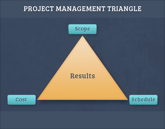
    <p>The three questions above will help you determine the three primary constraints — <strong>scope, schedule, and cost</strong> — of the <a href="http://en.wikipedia.org/wiki/Project_management_triangle" rel="nofollow external" class="bo">project management triangle</a> model that will cooperatively determine the quality of the results.</p>
    <p><img src="http://cdn.sixrevisions.com/0355-03_project_management_triangle.png" width="550" height="430" style="max-width: 100%; height: auto;"></p>
    <p>Here are the not-so-obvious questions that you might forget to ask:</p>
    <p><strong>Question #4: Who is the typical user of your website?</strong></p>
    <p>A website that works well for one audience will not necessarily work well for another audience. The target audience will significantly influence the <a href="http://sixrevisions.com/project-management/website-architecture/" title="The Secret to Building Large Websites: Website Architecture" rel="nofollow external" class="bo">website’s architecture</a>.</p>
    <p><strong>Question #5: What goals do you want to achieve with this project?</strong></p>
    <p>Is the client trying to use the website for sales, to generate publicity, or to build an online community?</p>
    <p>Website goals make a big difference in how you will proceed with the website’s design.</p>
    <p><strong>Question #6: What types of content will be used in this website?</strong></p>
    <p><a href="http://sixrevisions.com/category/content-strategy/" title="Content Strategy Archives - Six Revisions" rel="nofollow external" class="bo">Content strategy</a> should not be an afterthought. Content strategy should be an <a href="http://sixrevisions.com/content-strategy/web-design-process/" rel="nofollow external" class="bo">integral part of your web design process</a>.</p>
    <p>If your client hasn’t planned for their website’s content yet, at the very least, you should get them thinking about it right at the start of the project.</p>
    <p>This question also clarifies who’s going to be in charge of content, and you should document this area of responsibility in your project agreement.</p>
    <p><strong>Question #7: Can you show me examples of websites you like and don’t like?</strong></p>
    <p>Examples can speak volumes. Pay close attention to <em>why</em> the client likes some sites while disliking others.</p>
    <p><strong>Question #8: What’s the  message you’re trying to convey with your website?</strong></p>
    <p>The website’s message needs to be clearly communicated through the site’s look-and-feel.</p>
    <p>The answer to this question also affects the website features that you need to implement.</p>
    <p><strong>Ask More Questions as Needed!</strong></p>
    <p>Of course, the list of eight questions above is just a starting place to help you define project scope; they cover the fundamentals that you absolutely <em>must</em> know before beginning the project.</p>
    <p>If you still feel like you don’t fully understand what the client wants after asking these questions, you need to ask more questions until you’re confident that you comprehend their desired outcomes in full.</p>
    <h3>Don’t Forget About Negative Scope</h3>
    <p>What’s negative scope? In a project’s scope, <strong>negative scope</strong> are items that won’t be a part of the project.</p>
    <p>Discussing and documenting negative scope items can eliminate a lot of confusion and misunderstandings.</p>
    <p>Negative scope could include these things:</p>
    <ul>
    <li>
    <strong>Items you and client discussed</strong>, but have decided not to include as deliverables in the project.</li>
    <li>
    <strong>Items that are often done for projects of this sort</strong>, but that the client didn’t want.</li>
    <li>Other elements of websites that aren’t going to be part of your project agreement but that <strong>you anticipate the client might need</strong>, such as web hosting, social media marketing, SEO, and so forth.</li>
    </ul>
    <p>By specifically bringing up negative scope items, you reduce the likelihood of the client assuming that these items are included in the project and of them claiming that the negative scope items were part of your agreement.</p>
    <p>Negative scope brings more clarity to your project scope agreement, which is what we want.</p>
    <h3>Documenting the Project Scope</h3>
    <p>Even if you asked all the right questions, you could still get into trouble if you don’t have a good record of the discussions that you and the client agreed upon.</p>
    <p>Maybe you discussed the project in a series of phone conversations with the client. Maybe you met with the client in person.</p>
    <p>Do you rely solely on your memory of what you and the client agreed on? If you do, you’re taking a huge risk.</p>
    <p>Our memories can be faulty. Our recollection of conversations can be different from that of the client’s.</p>
    <p>The best way to eliminate disagreements about project scope is to get it in writing and to get the client to sign off on it.</p>
    <p>Fortunately, there are some good tools and resources out there to help you document project scope well.</p>
    <p>There are, for example, project scope document templates that can be found on the Web. Here’s one example of a project scope template that you can <a href="http://www.pmdocuments.com/project-initiation-documents/preliminary-project-scope-statement/" rel="nofollow external" class="bo">download on another website</a>:</p>
    <p><img src="http://cdn.sixrevisions.com/0355-04_project_scope_template.jpg" width="550" height="585" style="max-width: 100%; height: auto;"></p>
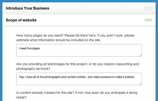
    <p>You could also check out my web app, <a href="https://www.getosmosis.com/blog/show/introducing--new-feature-work-agreements" rel="nofollow external" class="bo">Osmosis</a>, which incorporates project scope into the work agreement.</p>
    <p><img src="http://cdn.sixrevisions.com/0355-05_project_scope_tool_osmosis.jpg" width="550" height="353" style="max-width: 100%; height: auto;"></p>
    <p>Find more tips on freelance web design contracts <a href="http://sixrevisions.com/project-management/tips-freelancer-design-contracts/" title="6 Good Tips for Your Freelance Design Contracts" rel="nofollow external" class="bo">here</a>. </p>
    <p>Once you have the client’s acknowledgement on the work agreement, keep the information with your project files.</p>
    <h3>How Do You Deal with Project Scope?</h3>
    <p><strong><em>How do you define your web design project scope? What are some key questions you ask your clients that help you define the project scope?</em></strong> Share your experiences in the comments below.</p>
    <h3>Related Content</h3>
    <ul>
    <li><a href="http://sixrevisions.com/project-management/avoiding-unscoped-work-from-unreasonable-clients/" rel="nofollow external" class="bo">Avoiding Unscoped Work from Unreasonable Clients</a></li>
    <li><a href="http://sixrevisions.com/project-management/tips-build-trust-clients/" rel="nofollow external" class="bo">Tips for Building Trust with Your Clients</a></li>
    <li><a href="http://sixrevisions.com/project-management/client-vs-designer-four-lessons-to-win-the-battle/" rel="nofollow external" class="bo">Client vs. Designer: Four Lessons to Win the Battle</a></li>
    <li>
    <em>Related categories</em>: <a href="http://sixrevisions.com/category/project-management/" rel="nofollow external" class="bo">Project Management</a> and <a href="http://sixrevisions.com/category/productivity/" rel="nofollow external" class="bo">Productivity</a>
    </li>
    </ul>
    <h3>About the Author</h3>
    <p><img src="http://cdn.sixrevisions.com/authors/dominic_stpierre_small.jpg" alt="" width="80" height="80" style="max-width: 100%; height: auto;"><span><strong>Dominic St-Pierre</strong> is the owner and founder of <a href="https://www.getosmosis.com/" rel="nofollow external" class="bo">Osmosis</a>, an innovative web-based tool to help web designers, web developers, and other freelancers gather project requirements and create proposals. He has over thirteen years of experience as a web developer and entrepreneur. Connect with him on Twitter at <a href="https://twitter.com/getosmosis" rel="nofollow external" class="bo">@getosmosis</a>.</span></p>
    <p>The post <a href="http://sixrevisions.com/project-management/web-design-project-scope/" rel="nofollow external" class="bo">Improve Your Web Design Projects with a Good Project Scope</a> appeared first on <a href="http://sixrevisions.com" rel="nofollow external" class="bo">Six Revisions</a>.</p>
    </div>
]]>
</Body>
<Summary>The first few things you do after a potential client contacts you about a web design project are the most important. In fact, these initial steps can spell the difference between a good or bad...</Summary>
<Website>http://feedproxy.google.com/~r/SixRevisions/~3/e80W1TUFS_w/</Website>
<TrackingUrl>https://my3.my.umbc.edu/api/v0/pixel/news/32317/guest@my.umbc.edu/fd922bff5d17ab3688695406e1ae171f/api/pixel</TrackingUrl>
<Tag>css</Tag>
<Tag>database</Tag>
<Tag>design</Tag>
<Tag>development</Tag>
<Tag>html</Tag>
<Tag>javascript</Tag>
<Tag>mysql</Tag>
<Tag>project-management</Tag>
<Tag>sql</Tag>
<Tag>web</Tag>
<Group token="retired-583">Web Developer - Build Group</Group>
<GroupUrl>https://my3.my.umbc.edu/groups/retired-583</GroupUrl>
<AvatarUrl>https://assets3-my.umbc.edu/system/shared/avatars/groups/000/000/583/fc60f5d7abc2e080599bb6dc465db54d/xsmall.png?1363101197</AvatarUrl>
<AvatarUrl size="original">https://assets4-my.umbc.edu/system/shared/avatars/groups/000/000/583/fc60f5d7abc2e080599bb6dc465db54d/original.jpg?1363101197</AvatarUrl>
<AvatarUrl size="xxlarge">https://assets4-my.umbc.edu/system/shared/avatars/groups/000/000/583/fc60f5d7abc2e080599bb6dc465db54d/xxlarge.png?1363101197</AvatarUrl>
<AvatarUrl size="xlarge">https://assets4-my.umbc.edu/system/shared/avatars/groups/000/000/583/fc60f5d7abc2e080599bb6dc465db54d/xlarge.png?1363101197</AvatarUrl>
<AvatarUrl size="large">https://assets3-my.umbc.edu/system/shared/avatars/groups/000/000/583/fc60f5d7abc2e080599bb6dc465db54d/large.png?1363101197</AvatarUrl>
<AvatarUrl size="medium">https://assets3-my.umbc.edu/system/shared/avatars/groups/000/000/583/fc60f5d7abc2e080599bb6dc465db54d/medium.png?1363101197</AvatarUrl>
<AvatarUrl size="small">https://assets4-my.umbc.edu/system/shared/avatars/groups/000/000/583/fc60f5d7abc2e080599bb6dc465db54d/small.png?1363101197</AvatarUrl>
<AvatarUrl size="xsmall">https://assets3-my.umbc.edu/system/shared/avatars/groups/000/000/583/fc60f5d7abc2e080599bb6dc465db54d/xsmall.png?1363101197</AvatarUrl>
<AvatarUrl size="xxsmall">https://assets4-my.umbc.edu/system/shared/avatars/groups/000/000/583/fc60f5d7abc2e080599bb6dc465db54d/xxsmall.png?1363101197</AvatarUrl>
<Sponsor>Web Developer - Build Group</Sponsor>
<PawCount>0</PawCount>
<CommentCount>0</CommentCount>
<CommentsAllowed>true</CommentsAllowed>
<PostedAt>Mon, 08 Jul 2013 04:00:52 -0400</PostedAt>
</NewsItem>

<NewsItem contentIssues="true" id="32307" important="false" status="posted" url="https://my3.my.umbc.edu/posts/32307">
<Title>What are the Transcript Processing Fees?</Title>
<Body>
<![CDATA[
    <div class="html-content"><div>    <p>
            Page
                <strong>added</strong> by
                        <a href="https://wiki.umbc.edu/display/~sdawson" rel="nofollow external" class="bo">Susan Dawson</a>
                </p>
            <div>
            <h2>Tell Me</h2>
    <p>You can select from a variety of options, each with their own fees.   The options and transcript processing fees for each are:</p>
    <p><span>Regular Service – Official Mailed                           $8.00    Per Recipient</span></p>
    <p><span>Regular Service-   Official Pick up                          $8.00    Per Recipient</span></p>
    <p><span>Fax transcript (</span><span>US fax numbers </span><span>ONLY)                 $8.00    Plus $15.00 ($23.00)    </span></p>
    <p><span>PDF                                                                        $8.00                  </span></p>
    <p><span> </span><strong><span>Expedited Fees:</span></strong></p>
    <p><span>Domestic Federal Express to Main 48 states        $16.50   Per Recipient</span></p>
    <p><span>Domestic Federal Express to Alaska or Hawaii     $19.50   Per Recipient</span></p>
    <p><span>International Federal Express                                $35.50   Per Recipient</span></p>
    <span> </span><p><span> </span> </p>
    <span> </span><p><span> </span> </p>
    <span> </span><p><span><strong>Direct all mail/communication to</strong>:</span> </p>
    <span> </span><p><span>Angela Blair</span></p>
    <span> </span><p><span>Academic Program Specialist</span></p>
    <span> </span><p><span>Transcript Processor</span></p>
    <p> </p>
    <h2>Rate this Article</h2>
    <p>


    <strong>Was this helpful?</strong>
    <a href="https://apps-my.umbc.edu/apps/rt-track/script.php?u=http://wiki.umbc.edu%2Fpages%2Fviewpage.action%3FpageId%3D37879839&amp;q=0&amp;v=1&amp;s=faq&amp;l=transcript+fees+processing" rel="nofollow external" class="bo">Yes</a>
     | <a href="https://docs.google.com/a/umbc.edu/spreadsheet/viewform?formkey=dEpyOEZxa29QY05BaVpBVzZSYmRMM0E6MA&amp;entry_15=http%3A%2F%2Fwiki.umbc.edu%2Fpages%2Fviewpage.action%3FpageId%3D37879839" rel="nofollow external" class="bo">No</a>
     | <a href="https://docs.google.com/a/umbc.edu/spreadsheet/viewform?formkey=dEpyOEZxa29QY05BaVpBVzZSYmRMM0E6MA&amp;entry_15=http%3A%2F%2Fwiki.umbc.edu%2Fpages%2Fviewpage.action%3FpageId%3D37879839" rel="nofollow external" class="bo">Correct or Suggest an Article</a>
     | <a href="https://apps-my.umbc.edu/apps/rt-track/script.php?u=http://wiki.umbc.edu%2Fpages%2Fviewpage.action%3FpageId%3D37879839&amp;q=0&amp;v=0&amp;s=faq&amp;l=transcript+fees+processing" rel="nofollow external" class="bo">Request Help</a></p>
    <p><a href="http://my.umbc.edu/help/request" rel="nofollow external" class="bo"><img src="https://wiki.umbc.edu/download/attachments/29853066/RequestHelpicon.png?version=1&amp;modificationDate=1335472984000&amp;api=v2" style="max-width: 100%; height: auto;"></a></p>
    <p> </p>
        </div>
            <div>
           <a href="https://wiki.umbc.edu/pages/viewpage.action?pageId=37879839" rel="nofollow external" class="bo">View Online</a>
                      </div>
    </div></div>
]]>
</Body>
<Summary>Page             added by                     Susan Dawson                                  Tell Me  You can select from a variety of options, each with their own fees.   The options...</Summary>
<Website>https://wiki.umbc.edu/pages/viewpage.action?pageId=37879839</Website>
<TrackingUrl>https://my3.my.umbc.edu/api/v0/pixel/news/32307/guest@my.umbc.edu/df3bd192b22b4a2fb4fa7509d35b2c99/api/pixel</TrackingUrl>
<Tag>faq</Tag>
<Tag>fees</Tag>
<Tag>processing</Tag>
<Tag>transcript</Tag>
<Group token="retired-428">UMBC FAQ</Group>
<GroupUrl>https://my3.my.umbc.edu/groups/retired-428</GroupUrl>
<AvatarUrl>https://assets4-my.umbc.edu/images/avatars/group/1/xsmall.png?1783943832</AvatarUrl>
<AvatarUrl size="original">https://assets4-my.umbc.edu/images/avatars/group/1/original.png?1783943832</AvatarUrl>
<AvatarUrl size="xxlarge">https://assets1-my.umbc.edu/images/avatars/group/1/xxlarge.png?1783943832</AvatarUrl>
<AvatarUrl size="xlarge">https://assets4-my.umbc.edu/images/avatars/group/1/xlarge.png?1783943832</AvatarUrl>
<AvatarUrl size="large">https://assets2-my.umbc.edu/images/avatars/group/1/large.png?1783943832</AvatarUrl>
<AvatarUrl size="medium">https://assets2-my.umbc.edu/images/avatars/group/1/medium.png?1783943832</AvatarUrl>
<AvatarUrl size="small">https://assets4-my.umbc.edu/images/avatars/group/1/small.png?1783943832</AvatarUrl>
<AvatarUrl size="xsmall">https://assets4-my.umbc.edu/images/avatars/group/1/xsmall.png?1783943832</AvatarUrl>
<AvatarUrl size="xxsmall">https://assets4-my.umbc.edu/images/avatars/group/1/xxsmall.png?1783943832</AvatarUrl>
<Sponsor>UMBC FAQ</Sponsor>
<PawCount>0</PawCount>
<CommentCount>0</CommentCount>
<CommentsAllowed>true</CommentsAllowed>
<PostedAt>Sun, 07 Jul 2013 22:18:13 -0400</PostedAt>
</NewsItem>

<NewsItem contentIssues="true" id="32308" important="false" status="posted" url="https://my3.my.umbc.edu/posts/32308">
<Title>Can someone else pick up my transcript for me?</Title>
<Body>
<![CDATA[
    <div class="html-content"><div>    <p>
            Page
                <strong>added</strong> by
                        <a href="https://wiki.umbc.edu/display/~sdawson" rel="nofollow external" class="bo">Susan Dawson</a>
                </p>
            <div>
            <h2>Tell Me</h2>
    <p><span>In order to allow someone else to pick up your transcript for you, you must send an authorization via your umbc email account.   In the email, please include your order number, name, birthdate or student Id., and the name of the person that will pick up your transcript.</span></p>
    <p> </p>
    <h2>Rate this Article</h2>
    <p>


    <strong>Was this helpful?</strong>
    <a href="https://apps-my.umbc.edu/apps/rt-track/script.php?u=http://wiki.umbc.edu%2Fpages%2Fviewpage.action%3FpageId%3D37879837&amp;q=0&amp;v=1&amp;s=faq&amp;l=transcript" rel="nofollow external" class="bo">Yes</a>
     | <a href="https://docs.google.com/a/umbc.edu/spreadsheet/viewform?formkey=dEpyOEZxa29QY05BaVpBVzZSYmRMM0E6MA&amp;entry_15=http%3A%2F%2Fwiki.umbc.edu%2Fpages%2Fviewpage.action%3FpageId%3D37879837" rel="nofollow external" class="bo">No</a>
     | <a href="https://docs.google.com/a/umbc.edu/spreadsheet/viewform?formkey=dEpyOEZxa29QY05BaVpBVzZSYmRMM0E6MA&amp;entry_15=http%3A%2F%2Fwiki.umbc.edu%2Fpages%2Fviewpage.action%3FpageId%3D37879837" rel="nofollow external" class="bo">Correct or Suggest an Article</a>
     | <a href="https://apps-my.umbc.edu/apps/rt-track/script.php?u=http://wiki.umbc.edu%2Fpages%2Fviewpage.action%3FpageId%3D37879837&amp;q=0&amp;v=0&amp;s=faq&amp;l=transcript" rel="nofollow external" class="bo">Request Help</a></p>
    <p><a href="http://my.umbc.edu/help/request" rel="nofollow external" class="bo"><img src="https://wiki.umbc.edu/download/attachments/29853066/RequestHelpicon.png?version=1&amp;modificationDate=1335472984000&amp;api=v2" style="max-width: 100%; height: auto;"></a></p>
        </div>
            <div>
           <a href="https://wiki.umbc.edu/pages/viewpage.action?pageId=37879837" rel="nofollow external" class="bo">View Online</a>
                      </div>
    </div></div>
]]>
</Body>
<Summary>Page             added by                     Susan Dawson                                  Tell Me  In order to allow someone else to pick up your transcript for you, you must send an...</Summary>
<Website>https://wiki.umbc.edu/pages/viewpage.action?pageId=37879837</Website>
<TrackingUrl>https://my3.my.umbc.edu/api/v0/pixel/news/32308/guest@my.umbc.edu/5cfdddfd8456f6add4a831051acd821f/api/pixel</TrackingUrl>
<Tag>faq</Tag>
<Tag>transcript</Tag>
<Group token="retired-428">UMBC FAQ</Group>
<GroupUrl>https://my3.my.umbc.edu/groups/retired-428</GroupUrl>
<AvatarUrl>https://assets4-my.umbc.edu/images/avatars/group/1/xsmall.png?1783943832</AvatarUrl>
<AvatarUrl size="original">https://assets4-my.umbc.edu/images/avatars/group/1/original.png?1783943832</AvatarUrl>
<AvatarUrl size="xxlarge">https://assets1-my.umbc.edu/images/avatars/group/1/xxlarge.png?1783943832</AvatarUrl>
<AvatarUrl size="xlarge">https://assets4-my.umbc.edu/images/avatars/group/1/xlarge.png?1783943832</AvatarUrl>
<AvatarUrl size="large">https://assets2-my.umbc.edu/images/avatars/group/1/large.png?1783943832</AvatarUrl>
<AvatarUrl size="medium">https://assets2-my.umbc.edu/images/avatars/group/1/medium.png?1783943832</AvatarUrl>
<AvatarUrl size="small">https://assets4-my.umbc.edu/images/avatars/group/1/small.png?1783943832</AvatarUrl>
<AvatarUrl size="xsmall">https://assets4-my.umbc.edu/images/avatars/group/1/xsmall.png?1783943832</AvatarUrl>
<AvatarUrl size="xxsmall">https://assets4-my.umbc.edu/images/avatars/group/1/xxsmall.png?1783943832</AvatarUrl>
<Sponsor>UMBC FAQ</Sponsor>
<PawCount>0</PawCount>
<CommentCount>0</CommentCount>
<CommentsAllowed>true</CommentsAllowed>
<PostedAt>Sun, 07 Jul 2013 22:13:20 -0400</PostedAt>
</NewsItem>

<NewsItem contentIssues="false" id="32309" important="false" status="posted" url="https://my3.my.umbc.edu/posts/32309">
<Title>delete8</Title>
<Body>
<![CDATA[
    <div class="html-content"><div>    <p>
            Page
                <strong>edited</strong> by
                        <a href="https://wiki.umbc.edu/display/~sdawson" rel="nofollow external" class="bo">Susan Dawson</a>
                </p>
            <div>
            <p> </p>
    <p> </p>
        </div>
            <div>
           <a href="https://wiki.umbc.edu/display/faq/delete8" rel="nofollow external" class="bo">View Online</a>
                  ·
           <a href="https://wiki.umbc.edu/pages/diffpagesbyversion.action?pageId=37355978&amp;revisedVersion=3&amp;originalVersion=2" rel="nofollow external" class="bo">View Changes Online</a>       
                      </div>
    </div></div>
]]>
</Body>
<Summary>Page
            edited by
                    Susan Dawson


       View Online
              ·
       View Changes Online</Summary>
<Website>https://wiki.umbc.edu/display/faq/delete8</Website>
<TrackingUrl>https://my3.my.umbc.edu/api/v0/pixel/news/32309/guest@my.umbc.edu/1aa8d1d8a819b2ffd44935a0da694a80/api/pixel</TrackingUrl>
<Tag>faq</Tag>
<Group token="retired-428">UMBC FAQ</Group>
<GroupUrl>https://my3.my.umbc.edu/groups/retired-428</GroupUrl>
<AvatarUrl>https://assets4-my.umbc.edu/images/avatars/group/1/xsmall.png?1783943832</AvatarUrl>
<AvatarUrl size="original">https://assets4-my.umbc.edu/images/avatars/group/1/original.png?1783943832</AvatarUrl>
<AvatarUrl size="xxlarge">https://assets1-my.umbc.edu/images/avatars/group/1/xxlarge.png?1783943832</AvatarUrl>
<AvatarUrl size="xlarge">https://assets4-my.umbc.edu/images/avatars/group/1/xlarge.png?1783943832</AvatarUrl>
<AvatarUrl size="large">https://assets2-my.umbc.edu/images/avatars/group/1/large.png?1783943832</AvatarUrl>
<AvatarUrl size="medium">https://assets2-my.umbc.edu/images/avatars/group/1/medium.png?1783943832</AvatarUrl>
<AvatarUrl size="small">https://assets4-my.umbc.edu/images/avatars/group/1/small.png?1783943832</AvatarUrl>
<AvatarUrl size="xsmall">https://assets4-my.umbc.edu/images/avatars/group/1/xsmall.png?1783943832</AvatarUrl>
<AvatarUrl size="xxsmall">https://assets4-my.umbc.edu/images/avatars/group/1/xxsmall.png?1783943832</AvatarUrl>
<Sponsor>UMBC FAQ</Sponsor>
<PawCount>0</PawCount>
<CommentCount>0</CommentCount>
<CommentsAllowed>true</CommentsAllowed>
<PostedAt>Sun, 07 Jul 2013 22:11:22 -0400</PostedAt>
</NewsItem>

<NewsItem contentIssues="false" id="32310" important="false" status="posted" url="https://my3.my.umbc.edu/posts/32310">
<Title>delete7</Title>
<Body>
<![CDATA[
    <div class="html-content"><div>    <p>
            Page
                <strong>edited</strong> by
                        <a href="https://wiki.umbc.edu/display/~sdawson" rel="nofollow external" class="bo">Susan Dawson</a>
                </p>
            
            <div>
           <a href="https://wiki.umbc.edu/display/faq/delete7" rel="nofollow external" class="bo">View Online</a>
                  ·
           <a href="https://wiki.umbc.edu/pages/diffpagesbyversion.action?pageId=37355966&amp;revisedVersion=2&amp;originalVersion=1" rel="nofollow external" class="bo">View Changes Online</a>       
                      </div>
    </div></div>
]]>
</Body>
<Summary>Page
            edited by
                    Susan Dawson


       View Online
              ·
       View Changes Online</Summary>
<Website>https://wiki.umbc.edu/display/faq/delete7</Website>
<TrackingUrl>https://my3.my.umbc.edu/api/v0/pixel/news/32310/guest@my.umbc.edu/174841c52f8e06379c1e98f71e97f8fa/api/pixel</TrackingUrl>
<Tag>faq</Tag>
<Group token="retired-428">UMBC FAQ</Group>
<GroupUrl>https://my3.my.umbc.edu/groups/retired-428</GroupUrl>
<AvatarUrl>https://assets4-my.umbc.edu/images/avatars/group/1/xsmall.png?1783943832</AvatarUrl>
<AvatarUrl size="original">https://assets4-my.umbc.edu/images/avatars/group/1/original.png?1783943832</AvatarUrl>
<AvatarUrl size="xxlarge">https://assets1-my.umbc.edu/images/avatars/group/1/xxlarge.png?1783943832</AvatarUrl>
<AvatarUrl size="xlarge">https://assets4-my.umbc.edu/images/avatars/group/1/xlarge.png?1783943832</AvatarUrl>
<AvatarUrl size="large">https://assets2-my.umbc.edu/images/avatars/group/1/large.png?1783943832</AvatarUrl>
<AvatarUrl size="medium">https://assets2-my.umbc.edu/images/avatars/group/1/medium.png?1783943832</AvatarUrl>
<AvatarUrl size="small">https://assets4-my.umbc.edu/images/avatars/group/1/small.png?1783943832</AvatarUrl>
<AvatarUrl size="xsmall">https://assets4-my.umbc.edu/images/avatars/group/1/xsmall.png?1783943832</AvatarUrl>
<AvatarUrl size="xxsmall">https://assets4-my.umbc.edu/images/avatars/group/1/xxsmall.png?1783943832</AvatarUrl>
<Sponsor>UMBC FAQ</Sponsor>
<PawCount>0</PawCount>
<CommentCount>0</CommentCount>
<CommentsAllowed>true</CommentsAllowed>
<PostedAt>Sun, 07 Jul 2013 22:10:19 -0400</PostedAt>
</NewsItem>

<NewsItem contentIssues="false" id="32311" important="false" status="posted" url="https://my3.my.umbc.edu/posts/32311">
<Title>delete6</Title>
<Body>
<![CDATA[
    <div class="html-content"><div>    <p>
            Page
                <strong>edited</strong> by
                        <a href="https://wiki.umbc.edu/display/~sdawson" rel="nofollow external" class="bo">Susan Dawson</a>
                </p>
            
            <div>
           <a href="https://wiki.umbc.edu/display/faq/delete6" rel="nofollow external" class="bo">View Online</a>
                  ·
           <a href="https://wiki.umbc.edu/pages/diffpagesbyversion.action?pageId=37355964&amp;revisedVersion=3&amp;originalVersion=2" rel="nofollow external" class="bo">View Changes Online</a>       
                      </div>
    </div></div>
]]>
</Body>
<Summary>Page
            edited by
                    Susan Dawson


       View Online
              ·
       View Changes Online</Summary>
<Website>https://wiki.umbc.edu/display/faq/delete6</Website>
<TrackingUrl>https://my3.my.umbc.edu/api/v0/pixel/news/32311/guest@my.umbc.edu/66195f2804570d882b62f04102ca98a1/api/pixel</TrackingUrl>
<Tag>faq</Tag>
<Group token="retired-428">UMBC FAQ</Group>
<GroupUrl>https://my3.my.umbc.edu/groups/retired-428</GroupUrl>
<AvatarUrl>https://assets4-my.umbc.edu/images/avatars/group/1/xsmall.png?1783943832</AvatarUrl>
<AvatarUrl size="original">https://assets4-my.umbc.edu/images/avatars/group/1/original.png?1783943832</AvatarUrl>
<AvatarUrl size="xxlarge">https://assets1-my.umbc.edu/images/avatars/group/1/xxlarge.png?1783943832</AvatarUrl>
<AvatarUrl size="xlarge">https://assets4-my.umbc.edu/images/avatars/group/1/xlarge.png?1783943832</AvatarUrl>
<AvatarUrl size="large">https://assets2-my.umbc.edu/images/avatars/group/1/large.png?1783943832</AvatarUrl>
<AvatarUrl size="medium">https://assets2-my.umbc.edu/images/avatars/group/1/medium.png?1783943832</AvatarUrl>
<AvatarUrl size="small">https://assets4-my.umbc.edu/images/avatars/group/1/small.png?1783943832</AvatarUrl>
<AvatarUrl size="xsmall">https://assets4-my.umbc.edu/images/avatars/group/1/xsmall.png?1783943832</AvatarUrl>
<AvatarUrl size="xxsmall">https://assets4-my.umbc.edu/images/avatars/group/1/xxsmall.png?1783943832</AvatarUrl>
<Sponsor>UMBC FAQ</Sponsor>
<PawCount>0</PawCount>
<CommentCount>0</CommentCount>
<CommentsAllowed>true</CommentsAllowed>
<PostedAt>Sun, 07 Jul 2013 22:09:53 -0400</PostedAt>
</NewsItem>

</News>