<?xml version="1.0"?>
<News hasArchived="true" page="8633" pageCount="10722" pageSize="10" timestamp="Sat, 11 Jul 2026 01:13:22 -0400" url="https://my3.my.umbc.edu/posts.xml?page=8633">
<NewsItem contentIssues="true" id="31176" important="false" status="posted" url="https://my3.my.umbc.edu/posts/31176">
<Title>Gadgetwise Blog: A Homing Beacon for Your Key Chain</Title>
<Body>
<![CDATA[
    <div class="html-content">Stick-N-Find, a Bluetooth beacon that is used with a phone, lets you home in keys or other easily lost objects.<div><table border="0"><tbody><tr><td>
    <a href="http://share.feedsportal.com/share/twitter/?u=http%3A%2F%2Fgadgetwise.blogs.nytimes.com%2F2013%2F06%2F12%2Fa-homing-beacon-for-your-keychain%2F%3Fpartner%3Drss%26emc%3Drss&amp;t=Gadgetwise+Blog%3A+A+Homing+Beacon+for+Your+Key+Chain" rel="nofollow external" class="bo"><img src="http://res3.feedsportal.com/social/twitter.png" style="max-width: 100%; height: auto;"></a> <a href="http://share.feedsportal.com/share/facebook/?u=http%3A%2F%2Fgadgetwise.blogs.nytimes.com%2F2013%2F06%2F12%2Fa-homing-beacon-for-your-keychain%2F%3Fpartner%3Drss%26emc%3Drss&amp;t=Gadgetwise+Blog%3A+A+Homing+Beacon+for+Your+Key+Chain" rel="nofollow external" class="bo"><img src="http://res3.feedsportal.com/social/facebook.png" style="max-width: 100%; height: auto;"></a> <a href="http://share.feedsportal.com/share/linkedin/?u=http%3A%2F%2Fgadgetwise.blogs.nytimes.com%2F2013%2F06%2F12%2Fa-homing-beacon-for-your-keychain%2F%3Fpartner%3Drss%26emc%3Drss&amp;t=Gadgetwise+Blog%3A+A+Homing+Beacon+for+Your+Key+Chain" rel="nofollow external" class="bo"><img src="http://res3.feedsportal.com/social/linkedin.png" style="max-width: 100%; height: auto;"></a> <a href="http://share.feedsportal.com/share/gplus/?u=http%3A%2F%2Fgadgetwise.blogs.nytimes.com%2F2013%2F06%2F12%2Fa-homing-beacon-for-your-keychain%2F%3Fpartner%3Drss%26emc%3Drss&amp;t=Gadgetwise+Blog%3A+A+Homing+Beacon+for+Your+Key+Chain" rel="nofollow external" class="bo"><img src="http://res3.feedsportal.com/social/googleplus.png" style="max-width: 100%; height: auto;"></a> <a href="http://share.feedsportal.com/share/email/?u=http%3A%2F%2Fgadgetwise.blogs.nytimes.com%2F2013%2F06%2F12%2Fa-homing-beacon-for-your-keychain%2F%3Fpartner%3Drss%26emc%3Drss&amp;t=Gadgetwise+Blog%3A+A+Homing+Beacon+for+Your+Key+Chain" rel="nofollow external" class="bo"><img src="http://res3.feedsportal.com/social/email.png" style="max-width: 100%; height: auto;"></a>
    </td></tr></tbody></table></div>
    <br><br><a href="http://da.feedsportal.com/r/165664924151/u/0/f/640387/c/34625/s/2d306ea5/a2.htm" rel="nofollow external" class="bo"><img src="http://da.feedsportal.com/r/165664924151/u/0/f/640387/c/34625/s/2d306ea5/a2.img" style="max-width: 100%; height: auto;"></a>
    </div>
]]>
</Body>
<Summary>Stick-N-Find, a Bluetooth beacon that is used with a phone, lets you home in keys or other easily lost objects.     </Summary>
<Website>http://gadgetwise.blogs.nytimes.com/2013/06/12/a-homing-beacon-for-your-keychain/?partner=rss&amp;emc=rss</Website>
<TrackingUrl>https://my3.my.umbc.edu/api/v0/pixel/news/31176/guest@my.umbc.edu/56fad5294296fda682bcf2f6eea8bc22/api/pixel</TrackingUrl>
<Tag>bluetooth-wireless-technology</Tag>
<Tag>mobile-applications</Tag>
<Tag>new</Tag>
<Tag>technology</Tag>
<Tag>wireless-communications</Tag>
<Tag>york</Tag>
<Group token="retired-583">Web Developer - Build Group</Group>
<GroupUrl>https://my3.my.umbc.edu/groups/retired-583</GroupUrl>
<AvatarUrl>https://assets3-my.umbc.edu/system/shared/avatars/groups/000/000/583/fc60f5d7abc2e080599bb6dc465db54d/xsmall.png?1363101197</AvatarUrl>
<AvatarUrl size="original">https://assets4-my.umbc.edu/system/shared/avatars/groups/000/000/583/fc60f5d7abc2e080599bb6dc465db54d/original.jpg?1363101197</AvatarUrl>
<AvatarUrl size="xxlarge">https://assets4-my.umbc.edu/system/shared/avatars/groups/000/000/583/fc60f5d7abc2e080599bb6dc465db54d/xxlarge.png?1363101197</AvatarUrl>
<AvatarUrl size="xlarge">https://assets4-my.umbc.edu/system/shared/avatars/groups/000/000/583/fc60f5d7abc2e080599bb6dc465db54d/xlarge.png?1363101197</AvatarUrl>
<AvatarUrl size="large">https://assets3-my.umbc.edu/system/shared/avatars/groups/000/000/583/fc60f5d7abc2e080599bb6dc465db54d/large.png?1363101197</AvatarUrl>
<AvatarUrl size="medium">https://assets3-my.umbc.edu/system/shared/avatars/groups/000/000/583/fc60f5d7abc2e080599bb6dc465db54d/medium.png?1363101197</AvatarUrl>
<AvatarUrl size="small">https://assets4-my.umbc.edu/system/shared/avatars/groups/000/000/583/fc60f5d7abc2e080599bb6dc465db54d/small.png?1363101197</AvatarUrl>
<AvatarUrl size="xsmall">https://assets3-my.umbc.edu/system/shared/avatars/groups/000/000/583/fc60f5d7abc2e080599bb6dc465db54d/xsmall.png?1363101197</AvatarUrl>
<AvatarUrl size="xxsmall">https://assets4-my.umbc.edu/system/shared/avatars/groups/000/000/583/fc60f5d7abc2e080599bb6dc465db54d/xxsmall.png?1363101197</AvatarUrl>
<Sponsor>Web Developer - Build Group</Sponsor>
<PawCount>0</PawCount>
<CommentCount>0</CommentCount>
<CommentsAllowed>true</CommentsAllowed>
<PostedAt>Wed, 12 Jun 2013 09:00:51 -0400</PostedAt>
<EditAt>Wed, 12 Jun 2013 16:52:57 -0400</EditAt>
</NewsItem>

<NewsItem contentIssues="true" id="31171" important="false" status="posted" url="https://my3.my.umbc.edu/posts/31171">
<Title>PHP Object Oriented Programming</Title>
<Body>
<![CDATA[
    <div class="html-content">Object-oriented programming is an approach of programming where objects and classes are used. Now-a-days Java and C++ are mostly used for object-oriented programming. There was limited scope of object oriented programming in PHP 4, but in PHP 5, the object model was rewritten for better performance and more features. Now PHP 5 has a full object model.</div>
]]>
</Body>
<Summary>Object-oriented programming is an approach of programming where objects and classes are used. Now-a-days Java and C++ are mostly used for object-oriented programming. There was limited scope of...</Summary>
<Website>http://feedproxy.google.com/~r/w3resource/~3/LjAZAmj8wL8/php-object-oriented-programming.php</Website>
<TrackingUrl>https://my3.my.umbc.edu/api/v0/pixel/news/31171/guest@my.umbc.edu/b2e4f2de6ed303a463c10be57924acdf/api/pixel</TrackingUrl>
<Tag>backend</Tag>
<Tag>css</Tag>
<Tag>frontend</Tag>
<Tag>html</Tag>
<Tag>html5</Tag>
<Tag>javascript</Tag>
<Tag>nosql</Tag>
<Tag>sql</Tag>
<Tag>xhtml</Tag>
<Tag>xml</Tag>
<Group token="retired-583">Web Developer - Build Group</Group>
<GroupUrl>https://my3.my.umbc.edu/groups/retired-583</GroupUrl>
<AvatarUrl>https://assets3-my.umbc.edu/system/shared/avatars/groups/000/000/583/fc60f5d7abc2e080599bb6dc465db54d/xsmall.png?1363101197</AvatarUrl>
<AvatarUrl size="original">https://assets4-my.umbc.edu/system/shared/avatars/groups/000/000/583/fc60f5d7abc2e080599bb6dc465db54d/original.jpg?1363101197</AvatarUrl>
<AvatarUrl size="xxlarge">https://assets4-my.umbc.edu/system/shared/avatars/groups/000/000/583/fc60f5d7abc2e080599bb6dc465db54d/xxlarge.png?1363101197</AvatarUrl>
<AvatarUrl size="xlarge">https://assets4-my.umbc.edu/system/shared/avatars/groups/000/000/583/fc60f5d7abc2e080599bb6dc465db54d/xlarge.png?1363101197</AvatarUrl>
<AvatarUrl size="large">https://assets3-my.umbc.edu/system/shared/avatars/groups/000/000/583/fc60f5d7abc2e080599bb6dc465db54d/large.png?1363101197</AvatarUrl>
<AvatarUrl size="medium">https://assets3-my.umbc.edu/system/shared/avatars/groups/000/000/583/fc60f5d7abc2e080599bb6dc465db54d/medium.png?1363101197</AvatarUrl>
<AvatarUrl size="small">https://assets4-my.umbc.edu/system/shared/avatars/groups/000/000/583/fc60f5d7abc2e080599bb6dc465db54d/small.png?1363101197</AvatarUrl>
<AvatarUrl size="xsmall">https://assets3-my.umbc.edu/system/shared/avatars/groups/000/000/583/fc60f5d7abc2e080599bb6dc465db54d/xsmall.png?1363101197</AvatarUrl>
<AvatarUrl size="xxsmall">https://assets4-my.umbc.edu/system/shared/avatars/groups/000/000/583/fc60f5d7abc2e080599bb6dc465db54d/xxsmall.png?1363101197</AvatarUrl>
<Sponsor>Web Developer - Build Group</Sponsor>
<PawCount>0</PawCount>
<CommentCount>0</CommentCount>
<CommentsAllowed>true</CommentsAllowed>
<PostedAt>Wed, 12 Jun 2013 08:46:48 -0400</PostedAt>
<EditAt>Thu, 15 May 2014 09:16:23 -0400</EditAt>
</NewsItem>

<NewsItem contentIssues="true" id="123259" important="false" status="posted" url="https://my3.my.umbc.edu/posts/123259">
<Title>30 Days/30 Scholarships: Q&amp;A with Collin Wojciechowski</Title>
<Body>
<![CDATA[
    <div class="html-content">
    <img width="150" height="150" src="https://umbc.edu/wp-content/uploads/2013/06/wojciechowskicollin-150x150.jpg" alt="" style="max-width: 100%; height: auto;"><p><a href="http://umbcgiving.files.wordpress.com/2013/06/wojciechowskicollin.jpg" rel="nofollow external" class="bo"><img alt="Wojciechowski,Collin" src="http://umbcgiving.files.wordpress.com/2013/06/wojciechowskicollin.jpg" width="322" height="153" style="max-width: 100%; height: auto;"></a>In his junior year at UMBC, <strong>Collin Wojciechowski ’13</strong>, political science, represented nearly 180,000 students within the University System of Maryland (USM) as their sole student representative on the Board of Regents. Wojciechowski advocated against “doomsday” budget cuts and tuition increases and successfully lobbied to overhaul the USM policy for assessing student fees, making students an active part of the discussion.</p>
    <p>Without the aid of scholarships, he would never have been able to serve his fellow students in this way. We sat down with the newly graduated Sondheim Scholar to talk a little bit about the part scholarships have played in his life.</p>
    <p><a href="https://givecorps.com/en/umbc/projects/463-annual-giving-causes-30-days-30-scholarships" rel="nofollow external" class="bo">Help UMBC students do AMAZING things. Make a gift to the 30 Days/30 Scholarships campaign today!</a></p>
    <p><strong><a href="https://givecorps.com/en/umbc/projects/463-annual-giving-causes-30-days-30-scholarships" rel="nofollow external" class="bo"><img alt="30for30_small" src="http://umbcgiving.files.wordpress.com/2013/06/30for30_small.jpg?w=300" width="275" height="275" style="max-width: 100%; height: auto;"></a>Q:</strong>  <em>How important was it to your college career to have the support of scholarships?</em></p>
    <p><strong>A: </strong> Being the son of a firemen and a public school teacher and the oldest of three brothers who all aspire to seek higher education, having the support of a scholarship was extremely important to my college career.</p>
    <p><strong>Q:</strong>  <em>Can you tell us a little about what it meant to you to be able to serve as the student regent, and then to continue working with legislators?</em></p>
    <p><strong>A:</strong>  If I did not have a scholarship, I would not have been able to be the USM Student Regent; it’s as simple as that. I only had the time and ability to serve at that post because I did not have to work a side job to pay for college.</p>
    <p>Being the Student Regent was one of the most meaningful experiences of my life. Representing students through such trying times as merger debate and the doomsday budget was the thrill of a lifetime. To then be able to take what I had learned on the Board and use it to represent Dr. Hrabowski in Annapolis was a dream. I have never had more fun then the Session I spent advocating for UMBC before legislators.</p>
    <p><strong>Q:</strong> <em> Has that work given you added insight into education funding, and if so, can you talk a little about the significance of alumni support of education in Maryland?</em></p>
    <p><strong>A:</strong>  Having been a member of the Advancement Committee of the USM Board of Regents, which oversees alumni giving, I feel I have a unique perspective on the significance that alumni support plays in higher education in Maryland. While our state, specifically Governor Martin O’Malley, has done tremendous things for public universities in terms of funding, student support and financial aid always need assistance. As students and their families continue to face economic difficulty it is up to the alumni base to ensure UMBC is a place welcoming to everyone.</p>
    <p><a href="http://www.umbc.edu/classof2013/" rel="nofollow external" class="bo">Read more about Collin and his UMBC experiences on the Class of 2013 site.</a></p>
    </div>
]]>
</Body>
<Summary>In his junior year at UMBC, Collin Wojciechowski ’13, political science, represented nearly 180,000 students within the University System of Maryland (USM) as their sole student representative on...</Summary>
<Website>https://umbc.edu/stories/30-days30-scholarships-qa-with-collin-wojciechowski-13/</Website>
<TrackingUrl>https://my3.my.umbc.edu/api/v0/pixel/news/123259/guest@my.umbc.edu/f10597ea5e44c6ff0bebf156eea2cc2e/api/pixel</TrackingUrl>
<Tag>impact</Tag>
<Group token="umbc-news-magazine">UMBC News &amp;amp; Magazine</Group>
<GroupUrl>https://my3.my.umbc.edu/groups/umbc-news-magazine</GroupUrl>
<AvatarUrl>https://assets1-my.umbc.edu/system/shared/avatars/groups/000/001/943/24435aa6207c452e7bc15cc74b42c7bb/xsmall.png?1748556657</AvatarUrl>
<AvatarUrl size="original">https://assets1-my.umbc.edu/system/shared/avatars/groups/000/001/943/24435aa6207c452e7bc15cc74b42c7bb/original.png?1748556657</AvatarUrl>
<AvatarUrl size="xxlarge">https://assets2-my.umbc.edu/system/shared/avatars/groups/000/001/943/24435aa6207c452e7bc15cc74b42c7bb/xxlarge.png?1748556657</AvatarUrl>
<AvatarUrl size="xlarge">https://assets2-my.umbc.edu/system/shared/avatars/groups/000/001/943/24435aa6207c452e7bc15cc74b42c7bb/xlarge.png?1748556657</AvatarUrl>
<AvatarUrl size="large">https://assets3-my.umbc.edu/system/shared/avatars/groups/000/001/943/24435aa6207c452e7bc15cc74b42c7bb/large.png?1748556657</AvatarUrl>
<AvatarUrl size="medium">https://assets1-my.umbc.edu/system/shared/avatars/groups/000/001/943/24435aa6207c452e7bc15cc74b42c7bb/medium.png?1748556657</AvatarUrl>
<AvatarUrl size="small">https://assets2-my.umbc.edu/system/shared/avatars/groups/000/001/943/24435aa6207c452e7bc15cc74b42c7bb/small.png?1748556657</AvatarUrl>
<AvatarUrl size="xsmall">https://assets1-my.umbc.edu/system/shared/avatars/groups/000/001/943/24435aa6207c452e7bc15cc74b42c7bb/xsmall.png?1748556657</AvatarUrl>
<AvatarUrl size="xxsmall">https://assets2-my.umbc.edu/system/shared/avatars/groups/000/001/943/24435aa6207c452e7bc15cc74b42c7bb/xxsmall.png?1748556657</AvatarUrl>
<Sponsor>UMBC News &amp; Magazine</Sponsor>
<PawCount>0</PawCount>
<CommentCount>0</CommentCount>
<CommentsAllowed>false</CommentsAllowed>
<PostedAt>Wed, 12 Jun 2013 07:40:46 -0400</PostedAt>
</NewsItem>

<NewsItem contentIssues="true" id="31169" important="false" status="posted" url="https://my3.my.umbc.edu/posts/31169">
<Title>Bits Blog: Google, Facebook and Microsoft Ask to Reveal U.S. Data Requests</Title>
<Body>
<![CDATA[
    <div class="html-content">The technology companies asked the government for permission to reveal details about the classified requests they get for the personal information of foreign users, Claire Cain Miller reports in The New York Times.<div><table border="0"><tbody><tr><td>
    <a href="http://share.feedsportal.com/share/twitter/?u=http%3A%2F%2Fbits.blogs.nytimes.com%2F2013%2F06%2F12%2Fdaily-report-google-facebook-and-microsoft-ask-to-reveal-u-s-data-requests%2F%3Fpartner%3Drss%26emc%3Drss&amp;t=Bits+Blog%3A+Google%2C+Facebook+and+Microsoft+Ask+to+Reveal+U.S.+Data+Requests" rel="nofollow external" class="bo"><img src="http://res3.feedsportal.com/social/twitter.png" style="max-width: 100%; height: auto;"></a> <a href="http://share.feedsportal.com/share/facebook/?u=http%3A%2F%2Fbits.blogs.nytimes.com%2F2013%2F06%2F12%2Fdaily-report-google-facebook-and-microsoft-ask-to-reveal-u-s-data-requests%2F%3Fpartner%3Drss%26emc%3Drss&amp;t=Bits+Blog%3A+Google%2C+Facebook+and+Microsoft+Ask+to+Reveal+U.S.+Data+Requests" rel="nofollow external" class="bo"><img src="http://res3.feedsportal.com/social/facebook.png" style="max-width: 100%; height: auto;"></a> <a href="http://share.feedsportal.com/share/linkedin/?u=http%3A%2F%2Fbits.blogs.nytimes.com%2F2013%2F06%2F12%2Fdaily-report-google-facebook-and-microsoft-ask-to-reveal-u-s-data-requests%2F%3Fpartner%3Drss%26emc%3Drss&amp;t=Bits+Blog%3A+Google%2C+Facebook+and+Microsoft+Ask+to+Reveal+U.S.+Data+Requests" rel="nofollow external" class="bo"><img src="http://res3.feedsportal.com/social/linkedin.png" style="max-width: 100%; height: auto;"></a> <a href="http://share.feedsportal.com/share/gplus/?u=http%3A%2F%2Fbits.blogs.nytimes.com%2F2013%2F06%2F12%2Fdaily-report-google-facebook-and-microsoft-ask-to-reveal-u-s-data-requests%2F%3Fpartner%3Drss%26emc%3Drss&amp;t=Bits+Blog%3A+Google%2C+Facebook+and+Microsoft+Ask+to+Reveal+U.S.+Data+Requests" rel="nofollow external" class="bo"><img src="http://res3.feedsportal.com/social/googleplus.png" style="max-width: 100%; height: auto;"></a> <a href="http://share.feedsportal.com/share/email/?u=http%3A%2F%2Fbits.blogs.nytimes.com%2F2013%2F06%2F12%2Fdaily-report-google-facebook-and-microsoft-ask-to-reveal-u-s-data-requests%2F%3Fpartner%3Drss%26emc%3Drss&amp;t=Bits+Blog%3A+Google%2C+Facebook+and+Microsoft+Ask+to+Reveal+U.S.+Data+Requests" rel="nofollow external" class="bo"><img src="http://res3.feedsportal.com/social/email.png" style="max-width: 100%; height: auto;"></a>
    </td></tr></tbody></table></div>
    <br><br><a href="http://da.feedsportal.com/r/165665000603/u/0/f/640387/c/34625/s/2d2f0a2b/kg/342-363/a2.htm" rel="nofollow external" class="bo"><img src="http://da.feedsportal.com/r/165665000603/u/0/f/640387/c/34625/s/2d2f0a2b/kg/342-363/a2.img" style="max-width: 100%; height: auto;"></a>
    </div>
]]>
</Body>
<Summary>The technology companies asked the government for permission to reveal details about the classified requests they get for the personal information of foreign users, Claire Cain Miller reports in...</Summary>
<Website>http://bits.blogs.nytimes.com/2013/06/12/daily-report-google-facebook-and-microsoft-ask-to-reveal-u-s-data-requests/?partner=rss&amp;emc=rss</Website>
<TrackingUrl>https://my3.my.umbc.edu/api/v0/pixel/news/31169/guest@my.umbc.edu/8d3a678672ecf38f382d55d9850d0f32/api/pixel</TrackingUrl>
<Tag>computers-and-the-internet</Tag>
<Tag>facebook-inc</Tag>
<Tag>facebook-inc-fb-nasdaq</Tag>
<Tag>federal-bureau-of-investigation</Tag>
<Tag>foreign-intelligence-surveillance-act-fisa</Tag>
<Tag>google-inc</Tag>
<Tag>google-inc-goog-nasdaq</Tag>
<Tag>microsoft-corporation</Tag>
<Tag>microsoft-corporation-msft-nasdaq</Tag>
<Tag>national-security-agency</Tag>
<Tag>new</Tag>
<Tag>surveillance-of-citizens-by-government</Tag>
<Tag>technology</Tag>
<Tag>united-states</Tag>
<Tag>york</Tag>
<Group token="retired-583">Web Developer - Build Group</Group>
<GroupUrl>https://my3.my.umbc.edu/groups/retired-583</GroupUrl>
<AvatarUrl>https://assets3-my.umbc.edu/system/shared/avatars/groups/000/000/583/fc60f5d7abc2e080599bb6dc465db54d/xsmall.png?1363101197</AvatarUrl>
<AvatarUrl size="original">https://assets4-my.umbc.edu/system/shared/avatars/groups/000/000/583/fc60f5d7abc2e080599bb6dc465db54d/original.jpg?1363101197</AvatarUrl>
<AvatarUrl size="xxlarge">https://assets4-my.umbc.edu/system/shared/avatars/groups/000/000/583/fc60f5d7abc2e080599bb6dc465db54d/xxlarge.png?1363101197</AvatarUrl>
<AvatarUrl size="xlarge">https://assets4-my.umbc.edu/system/shared/avatars/groups/000/000/583/fc60f5d7abc2e080599bb6dc465db54d/xlarge.png?1363101197</AvatarUrl>
<AvatarUrl size="large">https://assets3-my.umbc.edu/system/shared/avatars/groups/000/000/583/fc60f5d7abc2e080599bb6dc465db54d/large.png?1363101197</AvatarUrl>
<AvatarUrl size="medium">https://assets3-my.umbc.edu/system/shared/avatars/groups/000/000/583/fc60f5d7abc2e080599bb6dc465db54d/medium.png?1363101197</AvatarUrl>
<AvatarUrl size="small">https://assets4-my.umbc.edu/system/shared/avatars/groups/000/000/583/fc60f5d7abc2e080599bb6dc465db54d/small.png?1363101197</AvatarUrl>
<AvatarUrl size="xsmall">https://assets3-my.umbc.edu/system/shared/avatars/groups/000/000/583/fc60f5d7abc2e080599bb6dc465db54d/xsmall.png?1363101197</AvatarUrl>
<AvatarUrl size="xxsmall">https://assets4-my.umbc.edu/system/shared/avatars/groups/000/000/583/fc60f5d7abc2e080599bb6dc465db54d/xxsmall.png?1363101197</AvatarUrl>
<Sponsor>Web Developer - Build Group</Sponsor>
<PawCount>0</PawCount>
<CommentCount>0</CommentCount>
<CommentsAllowed>true</CommentsAllowed>
<PostedAt>Wed, 12 Jun 2013 07:00:09 -0400</PostedAt>
<EditAt>Wed, 12 Jun 2013 07:00:09 -0400</EditAt>
</NewsItem>

<NewsItem contentIssues="true" id="31166" important="false" status="posted" url="https://my3.my.umbc.edu/posts/31166">
<Title>Facing The Challenge: Building A Responsive Web Application</Title>
<Body>
<![CDATA[
    <div class="html-content">
    <table width="650">
    <tbody>
    <tr>
    <td>
    <div>
    <img src="http://statisches.auslieferung.commindo-media-ressourcen.de/advertisement.gif" alt="" style="max-width: 100%; height: auto;"><br><a href="http://auslieferung.commindo-media-ressourcen.de/random.php?mode=target&amp;collection=smashing-rss&amp;position=1" rel="nofollow external" class="bo"><img src="http://auslieferung.commindo-media-ressourcen.de/random.php?mode=image&amp;collection=smashing-rss&amp;position=1" alt="" style="max-width: 100%; height: auto;"></a> <a href="http://auslieferung.commindo-media-ressourcen.de/random.php?mode=target&amp;collection=smashing-rss&amp;position=2" rel="nofollow external" class="bo"><img src="http://auslieferung.commindo-media-ressourcen.de/random.php?mode=image&amp;collection=smashing-rss&amp;position=2" alt="" style="max-width: 100%; height: auto;"></a> <a href="http://auslieferung.commindo-media-ressourcen.de/random.php?mode=target&amp;collection=smashing-rss&amp;position=3" rel="nofollow external" class="bo"><img src="http://auslieferung.commindo-media-ressourcen.de/random.php?mode=image&amp;collection=smashing-rss&amp;position=3" alt="" style="max-width: 100%; height: auto;"></a>
    </div>
    </td>
    </tr>
    </tbody>
    </table>
    <p>We are talking and reading a lot about responsive Web design (RWD) these days, but very little attention is given to Web applications. Admittedly, RWD still has to be ironed out. But many of us believe it to be a strong concept, and it is here to stay. So, why don’t we extend this topic to HTML5-powered applications? Because responsive Web applications (RWAs) are both a huge opportunity and a big challenge, I wanted to dive in.</p>
    <p>Building a RWA is more feasible than you might think. In this article, we will explore ideas and solutions. In the first part, we will set up some important concepts. We will build on these in the second part to actually develop a RWA, and then explore how scalable and portable this approach is.</p>
    <h3>Part 1: Becoming Responsible</h3>
    <h4>Some Lessons Learned</h4>
    <p>It’s not easy to admit, but recently it has become more and more apparent that we don’t know many things about users of our websites. Varying screen sizes, device features and input mechanisms are pretty much RWD’s reasons for existence.</p>
    <p>From the lessons we’ve learned so far, we mustn’t assume too much. For instance, a small screen is not necessarily a touch device. A mobile device could be over 1280 pixels wide. And a desktop could have a slow connection. We just don’t know. And that’s fine. This means we can <strong>focus on these things separately without making assumptions</strong>: that’s what responsiveness is all about.</p>
    <h3>Progressive Enhancement</h3>
    <p>The “JavaScript-enabled” debate is so ’90s. We need to optimize for accessibility and indexability (i.e. SEO) anyway. Claiming that JavaScript is required for Web apps and, thus, that there is no real need to pre-render HTML is fair (because SEO is usually not or less important for apps). But because we are going responsive, we will inherently pay a lot attention to mobile and, thus, to performance as well. This is why we are betting heavily on progressive enhancement.</p>
    <h3>Responsive Web Design</h3>
    <p>RWD has mostly to do with not knowing the screen’s width. We have multiple tools to work with, such as media queries, relative units and responsive images. No matter how wonderful RWD is conceptually, some technical issues still need to be solved.</p>
    <p><a href="http://www.flickr.com/photos/69797234@N06/7203485148/" rel="nofollow external" class="bo"><img src="http://media.smashingmagazine.com/wp-content/uploads/2013/05/start-image_mini.jpg" alt="start-image_mini" width="500" height="281" style="max-width: 100%; height: auto;"></a><br><em>Not many big websites have gone truly responsive since <a href="http://www.bostonglobe.com/" rel="nofollow external" class="bo">The Boston Globe</a>. (Image credits: <a href="http://www.flickr.com/photos/69797234@N06/7203485148/" rel="nofollow external" class="bo">Antoine Lefeuvre</a>)</em></p>
    <h4>Client-Side Solutions</h4>
    <p>In the end, RWD is mostly about client-side solutions. Assuming that the server basically sends the same initial document and resources (images, CSS and JavaScript) to every device, any responsive measures will be taken on the client, such as:</p>
    <ul>
    <li>applying specific styles through media queries;</li>
    <li>using (i.e. polyfilling) <code>&lt;picture&gt;</code> or <code>@srcset</code> to get responsive images;</li>
    <li>loading additional content.</li>
    </ul>
    <p>Some of the issues surrounding RWD today are the following:</p>
    <ul>
    <li>Responsive images haven’t been standardized.</li>
    <li>Devices still load the CSS behind media queries that they never use.</li>
    <li>We lack (browser-supported) responsive layout systems (think flexbox, grid, regions, template).</li>
    <li>We lack element queries.</li>
    </ul>
    <h4>Server-Side Solutions: Responsive Content</h4>
    <p>Imagine that these challenges (such as images not being responsive and CSS loading unnecessarily) were solved on all devices and in all browsers, and that we didn’t have to resort to hacks or polyfills in the client. This would transfer some of the load from the client to the server (for instance, the CMS would have more control over responsive images).</p>
    <p>But we would still face the issue of responsive <em>content</em>. Although many believe that the constraints of mobile help us to focus, to write better content and to build better designs, sometimes it’s simply not enough. This is where server-side solutions such as <a href="http://www.lukew.com/ff/entry.asp?1392" rel="nofollow external" class="bo">RESS</a> and <a href="http://tools.ietf.org/html/draft-grigorik-http-client-hints-00" rel="nofollow external" class="bo">HTTP Client Hints</a> come in. Basically, by <strong>knowing the device’s constraints and features up front</strong>, we can serve a different and optimized template to it.</p>
    <p>Assuming we want to COPE, DRY and KISS and stuff, I think it comes down to where you want to draw the line here: the more important that performance and content tailored to each device is, the more necessary server-side assistance becomes. But we also have to bet on user-agent detection and on content negation. I’d say that this is a big threshold, but your mileage may vary. In any case, I can see content-focused websites getting there sooner than Web apps.</p>
    <p>Having said that, I am focusing on RWAs in this article without resorting to server-side solutions.</p>
    <h3>Responsive Behavior</h3>
    <p>RWD is clearly about layout and <em>design</em>, but we will also have to focus on responsive <em>behavior</em>. It is what makes applications different from websites. Fluid grids and responsive images are great, but once we start talking about Web applications, we also have to be responsive in loading modules according to screen size or device capability (i.e. pretty much media queries for JavaScript).</p>
    <p>For instance, an application might require GPS to be usable. Or it might contain a large interactive table that just doesn’t cut it on a small screen. And we simply can’t set <code>display: none</code> on all of these things, nor can we build everything twice.</p>
    <p>We clearly need more.</p>
    <h3>Part 2: Building RWAs</h3>
    <p>To quickly recap, our fundamental concepts are:</p>
    <ul>
    <li>progressive enhancement,</li>
    <li>responsive design,</li>
    <li>responsive behavior.</li>
    </ul>
    <p>Fully armed, we will now look into a way to build responsive, context-aware applications. We’ll do this by declaratively specifying modules, conditions for loading modules, and extended modules or variants, based on feature detection and media queries. Then, we’ll dig deeper into the mechanics of dependency injection to see how all of this can be implemented.</p>
    <h3>Declarative Module Injection</h3>
    <p>We’ll start off by applying the concepts of progressive enhancement and mobile first, and create a common set of HTML, CSS and JavaScript for all devices. Later, we’ll progressively enhance the application based on content, screen size, device features, etc. <strong>The foundation is always plain HTML.</strong> Consider this fragment:</p>
    <pre><code>&#x000A;    &lt;div data-module="myModule"&gt;&#x000A;        &lt;p&gt;Pre-rendered content&lt;/p&gt;&#x000A;    &lt;/div&gt;&#x000A;    </code></pre>
    <p>Let’s assume we have some logic to query the <code>data-module</code> attribute in our document, to load up the referenced application module (<code>myModule</code>) and then to attach it to that element. Basically, we would be adding behavior that targets a particular fragment in the document.</p>
    <p>This is our first step in making a Web application responsive: progressive module injection. Also, note that we could easily attach multiple modules to a single page in this way.</p>
    <h3>Conditional Module Injection</h3>
    <p>Sometimes we want to load a module only if a certain condition is met — for instance, when the device has a particular feature, such as touch or GPS:</p>
    <pre><code>&#x000A;    &lt;div data-module="find/my/dog" data-condition="gps"&gt;&#x000A;        &lt;p&gt;Pre-rendered fallback content if GPS is unavailable.&lt;/p&gt;&#x000A;    &lt;/div&gt;&#x000A;    </code></pre>
    <p>This will load the <code>find/my/dog</code> module only if the geolocation API is available.</p>
    <p><strong>Note:</strong> For the smallest footprint possible, we’ll simply use our own feature detection for now. (Really, we’re just checking for <code>'geolocation' in navigator</code>.) Later, we might need more robust detection and so delegate this task to a tool such as Modernizr or Has.js (and possibly PhoneGap in hybrid mode).</p>
    <h3>Extended Module Injection</h3>
    <p>What if we want to load variants of a module based on media queries? Take this syntax:</p>
    <pre><code>&#x000A;    &lt;div data-module="myModule" data-variant="large"&gt;&#x000A;        &lt;p&gt;Pre-rendered content&lt;/p&gt;&#x000A;    &lt;/div&gt;&#x000A;    </code></pre>
    <p>This will load <code>myModule</code> on small screens and <code>myModule/large</code> on large screens.</p>
    <p>For brevity, this single attribute contains the condition <em>and</em> the location of the variant (by convention). Programmatically, you could go mobile first and have the latter extend from the former (or separated modules, or even the other way around). This can be decided case by case.</p>
    <h4>Media Queries</h4>
    <p>Of course, we couldn’t call this responsive if it wasn’t actually driven by media queries. Consider this CSS:</p>
    <pre><code>&#x000A;    @media all and (min-width: 45em) {&#x000A;    	body:after {&#x000A;    		content: 'large';&#x000A;    		display: none;&#x000A;    	}&#x000A;    }&#x000A;    </code></pre>
    <p>Then, from JavaScript <a href="http://adactio.com/journal/5429/" rel="nofollow external" class="bo">this value can be read</a>:</p>
    <pre><code>&#x000A;    var size = window.getComputedStyle(document.body,':after').getPropertyValue('content');&#x000A;    </code></pre>
    <p>And this is why we can decide to load the <code>myModule/large</code> module from the last example if <code>size === "large"</code>, and load <code>myModule</code> otherwise. Being able to conditionally <em>not</em> load a module at all is useful, too:</p>
    <pre><code>&#x000A;    &lt;div data-module="myModule" data-condition="!small"&gt;&#x000A;        &lt;p&gt;Pre-rendered content&lt;/p&gt;&#x000A;    &lt;/div&gt;&#x000A;    </code></pre>
    <p>There might be cases for media queries inside module declarations:</p>
    <pre><code>&#x000A;    &lt;div data-module="myModule" data-matchMedia="min-width: 800px"&gt;&#x000A;        &lt;p&gt;Pre-rendered content&lt;/p&gt;&#x000A;    &lt;/div&gt;&#x000A;    </code></pre>
    <p>Here we can use the <code>window.matchMedia()</code> API (a <a href="https://github.com/paulirish/matchMedia.js/" rel="nofollow external" class="bo">polyfill</a> is available). I normally wouldn’t recommend doing this because it’s not very maintainable. Following breakpoints as set in CSS seems logical (because page layout probably dictates which modules to show or hide anyway). But obviously it depends on the situation. Targeted <a href="http://ianstormtaylor.com/media-queries-are-a-hack/" rel="nofollow external" class="bo">element queries</a> may also prove useful:</p>
    <pre><code>&#x000A;    &lt;div data-module="myModule" data-matchMediaElement="(min-width: 600px)"&gt;&lt;/div&gt;&#x000A;    </code></pre>
    <p>Please note that the names of the attributes used here represent only an example, a basic implementation. They’re supposed to clarify the idea. In a real-world scenario, it might be wise to, for example, namespace the attributes, to allow for multiple modules and/or conditions, and so on.</p>
    <h4>Device Orientation</h4>
    <p>Take special care with device orientation. We don’t want to load a different module when the device is rotated. So, the module itself should be responsive, and the page’s layout might need to accommodate for this.</p>
    <h3>Connecting The Dots</h3>
    <p>The concept of responsive behavior allows for a great deal of flexibility in how applications are designed and built. We will now look into where those “modules” come in, how they relate to application structure, and how this module injection might actually work.</p>
    <h4>Applications and Modules</h4>
    <p>We can think of a client-side application as <strong>a group of application modules that are built with low-level modules</strong>. As an example, we might have <code>User</code> and <code>Message</code> models and a <code>MessageDetail</code> view to compose an <code>Inbox</code> application module, which is part of an entire email client application. The details of implementation, such as the module format to be used (for example, AMD, CommonJS or the “revealing module” pattern), are not important here. Also, defining things this way doesn’t mean we can’t have a bunch of mini-apps on a single page. On the other hand, I have found this approach to scale well to applications of any size.</p>
    <h4>A Common Scenario</h4>
    <p>An approach I see a lot is to put something like <code>&lt;div id="container"&gt;</code> in the HTML, and then load a bunch of JavaScript that uses that element as a hook to append layouts or views. For a single application on a single page, this works fine, but in my experience it doesn’t scale well:</p>
    <ul>
    <li>Application modules are not very reusable because they rely on a particular element to be present.</li>
    <li>When multiple applications or application modules are to be instantiated on a single page, they all need their own particular element, further increasing complexity.</li>
    </ul>
    <p>To solve these issues, instead of letting application modules control themselves, what about making them more reusable by <em>providing</em> the element they should attach to? Additionally, we don’t need to know which modules must be loaded up front; we will do that dynamically. Let’s see how things come together using powerful patterns such as Dependency Injection (DI) and Inversion of Control (IOC).</p>
    <h4>Dependency Injection</h4>
    <p>You might have wondered how <code>myModule</code> actually gets loaded and instantiated.</p>
    <p>Loading the dependency is pretty easy. For instance, take the string from the <code>data-module</code> attribute (<code>myModule</code>), and have a module loader fetch the <code>myModule.js</code> script.</p>
    <p>Let’s assume <strong>we are using AMD or CommonJS</strong> (either of which I highly recommended) and that the module exports something (say, its public API). Let’s also assume that this is some kind of constructor that can be instantiated. We don’t know how to instantiate it because we don’t know exactly what it is up front. Should we instantiate it using <code>new</code>? What arguments should be passed? Is it a native JavaScript constructor function or a Backbone view or something completely different? Can we make sure the module attaches itself to the DOM element that we provide it with?</p>
    <p><strong>We have a couple of possible approaches here.</strong> A simple one is to always expect the same exported value — such as a Backbone view. It’s simple but might be enough. It would come down to this (using AMD and a Backbone view):</p>
    <pre><code>&#x000A;    var moduleNode = document.querySelector('[data-module]'),&#x000A;        moduleName = node.getAttribute('data-module');&#x000A;    &#x000A;    require([moduleName], function(MyBackBoneView) {&#x000A;        new MyBackBoneView({&#x000A;            el: moduleNode&#x000A;        });&#x000A;    })&#x000A;    </code></pre>
    <p>That’s the gist of it. It works fine, but there are even better ways to apply this pattern of dependency injection.</p>
    <h4>IOC Containers</h4>
    <p>Let’s take a library such as the excellent wire.js library by <a href="http://cujojs.com" rel="nofollow external" class="bo">cujoJS</a>. An important concept in wire.js is “wire specs,” which essentially are IOC containers. It performs the actual instantiation of the application modules based on a declarative specification. Going this route, the <code>data-module</code> should reference a wire spec (instead of a module) that describes what module to load and how to instantiate it, allowing for practically any type of module. Now, all we need to do is pass the reference to the spec and the <code>viewNode</code> to <code>wire.js</code>. We can simply define this:</p>
    <pre><code>&#x000A;    wire([specName, { viewNode: moduleNode }]);&#x000A;    </code></pre>
    <p>Much better. We let wire.js do all of the hard work. Besides, wire has a ton of other features.</p>
    <p>In summary, we can say that our declarative composition in HTML (<code>&lt;div data-module=""&gt;</code>) is parsed by the composer, and consults the advisor about whether the module should be loaded (<code>data-condition</code>) and which module to load (<code>data-module</code> or <code>data-variant</code>), so that the dependency injector (DI, wire.js) can load and apply the correct spec and application module:</p>
    <p><a href="http://media.smashingmagazine.com/wp-content/uploads/2013/05/declarative-composition1.png" rel="nofollow external" class="bo"><img src="http://media.smashingmagazine.com/wp-content/uploads/2013/05/declarative-composition1.png" alt="Declarative Composition" width="534" height="142" style="max-width: 100%; height: auto;"></a></p>
    <p>Detections for screen size and device features that are used to build responsive applications are sometimes implemented deep inside application logic. This responsibility should be laid elsewhere, decoupled more from the particular applications. We are already doing our (responsive) layout composition with HTML and CSS, so responsive applications fit in naturally. You could <strong>think of the HTML as an IOC container to compose applications</strong>.</p>
    <p>You might not like to put (even) more information in the HTML. And honestly, I don’t like it at all. But it’s the price to pay for optimized performance when scaling up. Otherwise, we would have to make another request to find out whether and which module to load, which defeats the purpose.</p>
    <h3>Wrapping Up</h3>
    <p>I think the combination of declarative application composition, responsive module loading and module extension opens up a boatload of options. It gives you a lot of freedom to implement application modules the way you want, while supporting a high level of performance, maintainability and software design.</p>
    <h4>Performance and Build</h4>
    <p>Sometimes RWD actually <em>decreases</em> the performance of a website when implemented superficially (such as by simply adding some media queries or extra JavaScript). But for RWA, performance is actually what drives the responsive injection of modules or variants of modules. In the spirit of mobile first, load only what is required (and enhance from there).</p>
    <p>Looking at the build process to minify and optimize applications, we can see that the challenge lies in finding the right approach to <strong>optimize either for a single application or for reusable application modules</strong> across multiple pages or contexts. In the former case, concatenating all resources into a single JavaScript file is probably best. In the latter case, concatenating resources into a separate shared core file and then packaging application modules into separate files is a sound approach.</p>
    <h4>A Scalable Approach</h4>
    <p>Responsive behavior and complete RWAs are powerful in a lot of scenarios, and they can be implemented using various patterns. We have only scratched the surface. But technically and conceptually, the approach is highly scalable. Let’s look at some example scenarios and patterns:</p>
    <ul>
    <li>Sprinkle bits of behavior onto static content websites.</li>
    <li>Serve widgets in a portal-like environment (think a dashboard, iGoogle or Netvibes). Load a single widget on a small screen, and enable more as screen resolution allows.</li>
    <li>Compose context-aware applications in HTML using reusable and responsive application modules.</li>
    </ul>
    <p>In general, the point is to maximize portability and reach by building on proven concepts to run applications on multiple platforms and environments.</p>
    <h4>Future-Proof and Portable</h4>
    <p>Some of the major advantages of building applications in HTML5 is that they’re future-proof and portable. Write HTML5 today and your efforts won’t be obsolete tomorrow. The list of platforms and environments where HTML5-powered applications run keeps growing rapidly:</p>
    <ul>
    <li>As regular Web applications in <strong>browsers</strong>;</li>
    <li>As hybrid applications on <strong>mobile platforms</strong>, powered by Apache Cordova (see note below):
    <ul>
    <li>iOS,</li>
    <li>Android,</li>
    <li>Windows Phone,</li>
    <li>BlackBerry;</li>
    </ul>
    </li>
    <li>As <strong>Open Web Apps</strong> (OWA), currently only in Firefox OS;</li>
    <li>As <strong>desktop applications</strong> (such as those packaged by the Sencha Desktop Packager):
    <ul>
    <li>Windows,</li>
    <li>OS X,</li>
    <li>Linux.</li>
    </ul>
    </li>
    </ul>
    <p><strong>Note:</strong> Tools such as Adobe PhoneGap Build, IBM Worklight and Telerik’s Icenium all use Apache Cordova APIs to access native device functionality.</p>
    <h4>Demo</h4>
    <p>You might want to dive into some code or see things in action. That’s why I created a <a href="https://github.com/webpro/responsive-web-apps" rel="nofollow external" class="bo">responsive Web apps</a> repository on GitHub, which also serves as a <a href="http://webpro.github.io/responsive-web-apps/" rel="nofollow external" class="bo">working demo</a>.</p>
    <h3>Conclusion</h3>
    <p>Honestly, not many big websites (let alone true Web applications) have gone truly responsive since <a href="http://www.bostonglobe.com/" rel="nofollow external" class="bo">The Boston Globe</a>. However, looking at deciding factors such as cost, distribution, reach, portability and auto-updating, RWAs are both a huge opportunity and a big challenge. It’s only a matter of time before they become much more mainstream.</p>
    <p>We are still looking for ways to get there, and we’ve covered just one approach to building RWAs here. In any case, declarative composition for responsive applications is quite powerful and could serve as a solid starting point.</p>
    <p><em>(al) (ea)</em></p>
    <hr>
    <p><small>© Lars Kappert for <a href="http://www.smashingmagazine.com" rel="nofollow external" class="bo">Smashing Magazine</a>, 2013.</small></p>
    </div>
]]>
</Body>
<Summary>        We are talking and reading a lot about responsive Web design (RWD) these days, but very little attention is given to Web applications. Admittedly, RWD still has to be ironed out. But many...</Summary>
<Website>http://www.smashingmagazine.com/2013/06/12/facing-the-challenge-building-a-responsive-web-application/</Website>
<TrackingUrl>https://my3.my.umbc.edu/api/v0/pixel/news/31166/guest@my.umbc.edu/6ef083db96f00ca5117eb0a71c2badf1/api/pixel</TrackingUrl>
<Tag>css</Tag>
<Tag>design</Tag>
<Tag>development</Tag>
<Tag>html</Tag>
<Tag>javascript</Tag>
<Tag>mobile</Tag>
<Tag>mysql</Tag>
<Tag>php</Tag>
<Tag>sql</Tag>
<Tag>web</Tag>
<Group token="retired-583">Web Developer - Build Group</Group>
<GroupUrl>https://my3.my.umbc.edu/groups/retired-583</GroupUrl>
<AvatarUrl>https://assets3-my.umbc.edu/system/shared/avatars/groups/000/000/583/fc60f5d7abc2e080599bb6dc465db54d/xsmall.png?1363101197</AvatarUrl>
<AvatarUrl size="original">https://assets4-my.umbc.edu/system/shared/avatars/groups/000/000/583/fc60f5d7abc2e080599bb6dc465db54d/original.jpg?1363101197</AvatarUrl>
<AvatarUrl size="xxlarge">https://assets4-my.umbc.edu/system/shared/avatars/groups/000/000/583/fc60f5d7abc2e080599bb6dc465db54d/xxlarge.png?1363101197</AvatarUrl>
<AvatarUrl size="xlarge">https://assets4-my.umbc.edu/system/shared/avatars/groups/000/000/583/fc60f5d7abc2e080599bb6dc465db54d/xlarge.png?1363101197</AvatarUrl>
<AvatarUrl size="large">https://assets3-my.umbc.edu/system/shared/avatars/groups/000/000/583/fc60f5d7abc2e080599bb6dc465db54d/large.png?1363101197</AvatarUrl>
<AvatarUrl size="medium">https://assets3-my.umbc.edu/system/shared/avatars/groups/000/000/583/fc60f5d7abc2e080599bb6dc465db54d/medium.png?1363101197</AvatarUrl>
<AvatarUrl size="small">https://assets4-my.umbc.edu/system/shared/avatars/groups/000/000/583/fc60f5d7abc2e080599bb6dc465db54d/small.png?1363101197</AvatarUrl>
<AvatarUrl size="xsmall">https://assets3-my.umbc.edu/system/shared/avatars/groups/000/000/583/fc60f5d7abc2e080599bb6dc465db54d/xsmall.png?1363101197</AvatarUrl>
<AvatarUrl size="xxsmall">https://assets4-my.umbc.edu/system/shared/avatars/groups/000/000/583/fc60f5d7abc2e080599bb6dc465db54d/xxsmall.png?1363101197</AvatarUrl>
<Sponsor>Web Developer - Build Group</Sponsor>
<PawCount>0</PawCount>
<CommentCount>0</CommentCount>
<CommentsAllowed>true</CommentsAllowed>
<PostedAt>Wed, 12 Jun 2013 06:47:53 -0400</PostedAt>
</NewsItem>

<NewsItem contentIssues="true" id="31183" important="false" status="posted" url="https://my3.my.umbc.edu/posts/31183">
<Title>Voice-Activated In-Car Systems Are Called Risky</Title>
<Body>
<![CDATA[
    <div class="html-content">Significant cognitive distraction was seen by researchers who analyzed subjects trying to juggle driving with high-tech in-car systems.<div><table border="0"><tbody><tr><td>
    <a href="http://share.feedsportal.com/share/twitter/?u=http%3A%2F%2Fwww.nytimes.com%2F2013%2F06%2F13%2Fbusiness%2Fvoice-activated-in-car-systems-are-called-risky.html%3Fpartner%3Drss%26emc%3Drss&amp;t=Voice-Activated+In-Car+Systems+Are+Called+Risky" rel="nofollow external" class="bo"><img src="http://res3.feedsportal.com/social/twitter.png" style="max-width: 100%; height: auto;"></a> <a href="http://share.feedsportal.com/share/facebook/?u=http%3A%2F%2Fwww.nytimes.com%2F2013%2F06%2F13%2Fbusiness%2Fvoice-activated-in-car-systems-are-called-risky.html%3Fpartner%3Drss%26emc%3Drss&amp;t=Voice-Activated+In-Car+Systems+Are+Called+Risky" rel="nofollow external" class="bo"><img src="http://res3.feedsportal.com/social/facebook.png" style="max-width: 100%; height: auto;"></a> <a href="http://share.feedsportal.com/share/linkedin/?u=http%3A%2F%2Fwww.nytimes.com%2F2013%2F06%2F13%2Fbusiness%2Fvoice-activated-in-car-systems-are-called-risky.html%3Fpartner%3Drss%26emc%3Drss&amp;t=Voice-Activated+In-Car+Systems+Are+Called+Risky" rel="nofollow external" class="bo"><img src="http://res3.feedsportal.com/social/linkedin.png" style="max-width: 100%; height: auto;"></a> <a href="http://share.feedsportal.com/share/gplus/?u=http%3A%2F%2Fwww.nytimes.com%2F2013%2F06%2F13%2Fbusiness%2Fvoice-activated-in-car-systems-are-called-risky.html%3Fpartner%3Drss%26emc%3Drss&amp;t=Voice-Activated+In-Car+Systems+Are+Called+Risky" rel="nofollow external" class="bo"><img src="http://res3.feedsportal.com/social/googleplus.png" style="max-width: 100%; height: auto;"></a> <a href="http://share.feedsportal.com/share/email/?u=http%3A%2F%2Fwww.nytimes.com%2F2013%2F06%2F13%2Fbusiness%2Fvoice-activated-in-car-systems-are-called-risky.html%3Fpartner%3Drss%26emc%3Drss&amp;t=Voice-Activated+In-Car+Systems+Are+Called+Risky" rel="nofollow external" class="bo"><img src="http://res3.feedsportal.com/social/email.png" style="max-width: 100%; height: auto;"></a>
    </td></tr></tbody></table></div>
    <br><br><a href="http://da.feedsportal.com/r/165665503979/u/0/f/640387/c/34625/s/2d30c609/a2.htm" rel="nofollow external" class="bo"><img src="http://da.feedsportal.com/r/165665503979/u/0/f/640387/c/34625/s/2d30c609/a2.img" style="max-width: 100%; height: auto;"></a>
    </div>
]]>
</Body>
<Summary>Significant cognitive distraction was seen by researchers who analyzed subjects trying to juggle driving with high-tech in-car systems.     </Summary>
<Website>http://www.nytimes.com/2013/06/13/business/voice-activated-in-car-systems-are-called-risky.html?partner=rss&amp;emc=rss</Website>
<TrackingUrl>https://my3.my.umbc.edu/api/v0/pixel/news/31183/guest@my.umbc.edu/27acbc8bce775a399098194711ba9e3c/api/pixel</TrackingUrl>
<Tag>aaa-foundation-for-traffic-safety</Tag>
<Tag>automobile-safety-features-and-defects</Tag>
<Tag>automobiles</Tag>
<Tag>facebook-inc-fb-nasdaq</Tag>
<Tag>new</Tag>
<Tag>technology</Tag>
<Tag>voice-recognition-systems</Tag>
<Tag>york</Tag>
<Group token="retired-583">Web Developer - Build Group</Group>
<GroupUrl>https://my3.my.umbc.edu/groups/retired-583</GroupUrl>
<AvatarUrl>https://assets3-my.umbc.edu/system/shared/avatars/groups/000/000/583/fc60f5d7abc2e080599bb6dc465db54d/xsmall.png?1363101197</AvatarUrl>
<AvatarUrl size="original">https://assets4-my.umbc.edu/system/shared/avatars/groups/000/000/583/fc60f5d7abc2e080599bb6dc465db54d/original.jpg?1363101197</AvatarUrl>
<AvatarUrl size="xxlarge">https://assets4-my.umbc.edu/system/shared/avatars/groups/000/000/583/fc60f5d7abc2e080599bb6dc465db54d/xxlarge.png?1363101197</AvatarUrl>
<AvatarUrl size="xlarge">https://assets4-my.umbc.edu/system/shared/avatars/groups/000/000/583/fc60f5d7abc2e080599bb6dc465db54d/xlarge.png?1363101197</AvatarUrl>
<AvatarUrl size="large">https://assets3-my.umbc.edu/system/shared/avatars/groups/000/000/583/fc60f5d7abc2e080599bb6dc465db54d/large.png?1363101197</AvatarUrl>
<AvatarUrl size="medium">https://assets3-my.umbc.edu/system/shared/avatars/groups/000/000/583/fc60f5d7abc2e080599bb6dc465db54d/medium.png?1363101197</AvatarUrl>
<AvatarUrl size="small">https://assets4-my.umbc.edu/system/shared/avatars/groups/000/000/583/fc60f5d7abc2e080599bb6dc465db54d/small.png?1363101197</AvatarUrl>
<AvatarUrl size="xsmall">https://assets3-my.umbc.edu/system/shared/avatars/groups/000/000/583/fc60f5d7abc2e080599bb6dc465db54d/xsmall.png?1363101197</AvatarUrl>
<AvatarUrl size="xxsmall">https://assets4-my.umbc.edu/system/shared/avatars/groups/000/000/583/fc60f5d7abc2e080599bb6dc465db54d/xxsmall.png?1363101197</AvatarUrl>
<Sponsor>Web Developer - Build Group</Sponsor>
<PawCount>0</PawCount>
<CommentCount>0</CommentCount>
<CommentsAllowed>true</CommentsAllowed>
<PostedAt>Wed, 12 Jun 2013 06:03:31 -0400</PostedAt>
<EditAt>Thu, 13 Jun 2013 21:11:15 -0400</EditAt>
</NewsItem>

<NewsItem contentIssues="true" id="31168" important="false" status="posted" url="https://my3.my.umbc.edu/posts/31168">
<Title>Colour theming with Sass and Compass</Title>
<Body>
<![CDATA[
    <div class="html-content">Ben Frain demonstrates some nifty features of Sass and Compass that make colour manipulation quick and simple<div><table border="0"><tbody><tr><td>
    <a href="http://share.feedsportal.com/share/twitter/?u=http%3A%2F%2Fwww.netmagazine.com%2Ftutorials%2Fcolour-theming-sass-and-compass&amp;t=Colour+theming+with+Sass+and+Compass" rel="nofollow external" class="bo"><img src="http://res3.feedsportal.com/social/twitter.png" style="max-width: 100%; height: auto;"></a> <a href="http://share.feedsportal.com/share/facebook/?u=http%3A%2F%2Fwww.netmagazine.com%2Ftutorials%2Fcolour-theming-sass-and-compass&amp;t=Colour+theming+with+Sass+and+Compass" rel="nofollow external" class="bo"><img src="http://res3.feedsportal.com/social/facebook.png" style="max-width: 100%; height: auto;"></a> <a href="http://share.feedsportal.com/share/linkedin/?u=http%3A%2F%2Fwww.netmagazine.com%2Ftutorials%2Fcolour-theming-sass-and-compass&amp;t=Colour+theming+with+Sass+and+Compass" rel="nofollow external" class="bo"><img src="http://res3.feedsportal.com/social/linkedin.png" style="max-width: 100%; height: auto;"></a> <a href="http://share.feedsportal.com/share/gplus/?u=http%3A%2F%2Fwww.netmagazine.com%2Ftutorials%2Fcolour-theming-sass-and-compass&amp;t=Colour+theming+with+Sass+and+Compass" rel="nofollow external" class="bo"><img src="http://res3.feedsportal.com/social/googleplus.png" style="max-width: 100%; height: auto;"></a> <a href="http://share.feedsportal.com/share/email/?u=http%3A%2F%2Fwww.netmagazine.com%2Ftutorials%2Fcolour-theming-sass-and-compass&amp;t=Colour+theming+with+Sass+and+Compass" rel="nofollow external" class="bo"><img src="http://res3.feedsportal.com/social/email.png" style="max-width: 100%; height: auto;"></a>
    </td></tr></tbody></table></div>
    <br><br><a href="http://da.feedsportal.com/r/165664920016/u/49/f/502346/c/32632/s/2d2ee7b2/a2.htm" rel="nofollow external" class="bo"><img src="http://da.feedsportal.com/r/165664920016/u/49/f/502346/c/32632/s/2d2ee7b2/a2.img" style="max-width: 100%; height: auto;"></a>
    </div>
]]>
</Body>
<Summary>Ben Frain demonstrates some nifty features of Sass and Compass that make colour manipulation quick and simple     </Summary>
<Website>http://feedproxy.google.com/~r/net/topstories/~3/RNw7bMn8iUg/story01.htm</Website>
<TrackingUrl>https://my3.my.umbc.edu/api/v0/pixel/news/31168/guest@my.umbc.edu/09b1c3a98ce900b1bb3746d3ef3f4c8d/api/pixel</TrackingUrl>
<Tag>css</Tag>
<Tag>development</Tag>
<Tag>html</Tag>
<Tag>javascript</Tag>
<Tag>mysql</Tag>
<Tag>net</Tag>
<Tag>php</Tag>
<Tag>sql</Tag>
<Tag>web</Tag>
<Group token="retired-583">Web Developer - Build Group</Group>
<GroupUrl>https://my3.my.umbc.edu/groups/retired-583</GroupUrl>
<AvatarUrl>https://assets3-my.umbc.edu/system/shared/avatars/groups/000/000/583/fc60f5d7abc2e080599bb6dc465db54d/xsmall.png?1363101197</AvatarUrl>
<AvatarUrl size="original">https://assets4-my.umbc.edu/system/shared/avatars/groups/000/000/583/fc60f5d7abc2e080599bb6dc465db54d/original.jpg?1363101197</AvatarUrl>
<AvatarUrl size="xxlarge">https://assets4-my.umbc.edu/system/shared/avatars/groups/000/000/583/fc60f5d7abc2e080599bb6dc465db54d/xxlarge.png?1363101197</AvatarUrl>
<AvatarUrl size="xlarge">https://assets4-my.umbc.edu/system/shared/avatars/groups/000/000/583/fc60f5d7abc2e080599bb6dc465db54d/xlarge.png?1363101197</AvatarUrl>
<AvatarUrl size="large">https://assets3-my.umbc.edu/system/shared/avatars/groups/000/000/583/fc60f5d7abc2e080599bb6dc465db54d/large.png?1363101197</AvatarUrl>
<AvatarUrl size="medium">https://assets3-my.umbc.edu/system/shared/avatars/groups/000/000/583/fc60f5d7abc2e080599bb6dc465db54d/medium.png?1363101197</AvatarUrl>
<AvatarUrl size="small">https://assets4-my.umbc.edu/system/shared/avatars/groups/000/000/583/fc60f5d7abc2e080599bb6dc465db54d/small.png?1363101197</AvatarUrl>
<AvatarUrl size="xsmall">https://assets3-my.umbc.edu/system/shared/avatars/groups/000/000/583/fc60f5d7abc2e080599bb6dc465db54d/xsmall.png?1363101197</AvatarUrl>
<AvatarUrl size="xxsmall">https://assets4-my.umbc.edu/system/shared/avatars/groups/000/000/583/fc60f5d7abc2e080599bb6dc465db54d/xxsmall.png?1363101197</AvatarUrl>
<Sponsor>Web Developer - Build Group</Sponsor>
<PawCount>0</PawCount>
<CommentCount>0</CommentCount>
<CommentsAllowed>true</CommentsAllowed>
<PostedAt>Wed, 12 Jun 2013 06:02:32 -0400</PostedAt>
</NewsItem>

<NewsItem contentIssues="true" id="31165" important="false" status="posted" url="https://my3.my.umbc.edu/posts/31165">
<Title>Are Your Web Graphics Print-Ready?</Title>
<Body>
<![CDATA[
    <div class="html-content">
    <p><a href="http://sixrevisions.com/graphics-design/print-ready-graphics/" rel="nofollow external" class="bo"><img src="http://cdn.sixrevisions.com/0347-01_printready_thumbnail.jpg" width="550" height="200" alt="Is Your Web Graphics Print-Ready?" style="max-width: 100%; height: auto;"></a></p>
    <p>As a web designer, masters of the digital realm, you might have never faced the situation where your designs are going to be sent to a print shop.</p>
    <p>Or perhaps you’re an Internet business owner in a place right now where you need printed materials for an event (a conference, a meet-up, billboard advertising, and so forth). You might be an online retailer, a SaaS company, a web development agency, etc.</p>
    <p><strong>What happens when you’ve only got web graphics at hand?</strong> Graphics designed to be displayed on electronic devices like computer monitors and smartphones.</p>
    <p></p>
    <p>When prepping graphics that you intend to have printed, there are several vital factors you must consider.</p>
    <p>I’ll discuss the most important factors in this <strong>beginner-level guide to preparing your designs for printing.</strong></p>
    <h3>Color Model: RGB vs. PMS vs. CMYK</h3>
    <p>Web and print don’t reproduce color in the same way. Let’s discuss the differences.</p>
    <h4>RGB Color Model</h4>
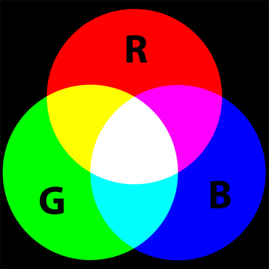
    <p>Web graphics operate using the <strong>RGB color model</strong> where each color is created using a combination of red, green and blue pixels.</p>
    <p>The RGB color model is designed specifically for electronic devices such as your computer monitor or your tablet device or your TV.</p>
    <p><img src="http://cdn.sixrevisions.com/0347-05_rgb_color_model.jpg" width="550" height="550" style="max-width: 100%; height: auto;"></p>
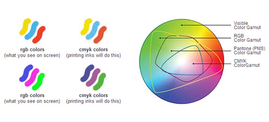
    <p>Print, on the other hand, tends to involve either <strong>PMS</strong> or <strong>CMYK (four-color process).</strong></p>
    <h4>PMS (Pantone Color Matching System)</h4>
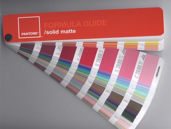
    <p>PMS (Pantone Color Matching System) uses <strong>pre-mixed inks</strong> with established color values.</p>
    <p>PMS is a proprietary color system by the New-Jersey-based corporation, Pantone Inc.</p>
    <p><img src="http://cdn.sixrevisions.com/0347-06_pms_pantone.jpg" width="550" height="416" style="max-width: 100%; height: auto;"><span>Image source: <a href="http://en.wikipedia.org/wiki/File:PantoneFormulaGuide-solidMatte-2005edition.png" rel="nofollow external" class="bo">Parhamr</a></span></p>
    <p>Using the Pantone system guarantees that you get the exact colors you want because of the standardized inks.</p>
    <h4>CMYK Color Model</h4>
    <p><strong>CMYK</strong> (also known as <em>four-color process)</em> uses a combination of cyan, magenta, yellow and black inks to reproduce different colors.</p>
    <p><img src="http://cdn.sixrevisions.com/0347-07_cmyk_color_model.jpg" width="550" height="550" style="max-width: 100%; height: auto;"><span>Image source: <a href="http://en.wikipedia.org/wiki/File:CMYK_color_swatches.svg" rel="nofollow external" class="bo">Quark67</a></span></p>
    <h4>The Ideal Color Situation to Be In</h4>
    <p>The ideal situation would be that a graphics specialist such as a logo designer has professionally designed your graphics assets.</p>
    <p>Your logo, for instance, should have been provided to you in two different versions: One specifically designed for Web use, and one specifically for print use. Two different logo designs for two distinctly different display environments.</p>
    <p>However if you’re reading this guide, chances are  that you don’t have the files you need.</p>
    <p>So what do you need to do?</p>
    <h4>Convert RGB to CMYK or PMS</h4>
    <p>So what do you do when you only have web graphics for printing?</p>
    <p>Web graphics are saved to the RGB color model and won’t work properly for your printer. What will happen is the colors might not turn out to be accurate when your printer uses the PMS or CMYK to print your web graphics.</p>
    <p>So it’s important to <strong>convert and re-save your graphics </strong>to either the CMYK color model or PMS for printing. This is a simple process most of the time — you just need your graphics software. But the results aren’t guaranteed to be accurate.</p>
    <p>The choice is up to you whether you choose CMYK or PMS, but there’s no print shop that will be able to print files using the RGB color model.</p>
    <p><img src="http://cdn.sixrevisions.com/0347-08_color_conversion_photoshop.jpg" width="534" height="394" style="max-width: 100%; height: auto;"></p>
    <h4>Testing</h4>
    <p>After converting your RGB artwork to a print-ready color system, it’s recommended that you test the output by printing just a small amount of your artwork before going into full production to ensure that the color system conversion was accurate (or accurate enough for your needs).</p>
    <h4>More Reading About Color Conversion</h4>
    <p>Here are some guides and resources that will be helpful in color conversion:</p>
    <h5><a href="http://www.ne14design.co.uk/articles/convert_RGB_to_CMYK.htm" rel="nofollow external" class="bo">How to Convert RGB to CMYK in Photoshop</a></h5>
    <p><a href="http://www.ne14design.co.uk/articles/convert_RGB_to_CMYK.htm" rel="nofollow external" class="bo"><img src="http://cdn.sixrevisions.com/0347-09_convert_rgb.jpg" width="500" height="566" style="max-width: 100%; height: auto;"></a></p>
    <h5><a href="http://graphicfusiondesign.com/blog/design/converting-cmykrgb-pantone-illustrator-pantone-matching-photoshop/" rel="nofollow external" class="bo">Converting CMYK/RGB to Pantone in Illustrator and Photoshop</a></h5>
    <p><a href="http://graphicfusiondesign.com/blog/design/converting-cmykrgb-pantone-illustrator-pantone-matching-photoshop/" rel="nofollow external" class="bo"><img src="http://cdn.sixrevisions.com/0347-10_cmyk_conversion.jpg" width="550" height="291" style="max-width: 100%; height: auto;"></a></p>
    <h5><a href="http://www.lcipaper.com/kb/the-ultimate-color-conversion-chart-pms-cmyk-rgb-hex.html" rel="nofollow external" class="bo">The Ultimate Color Conversion Chart</a></h5>
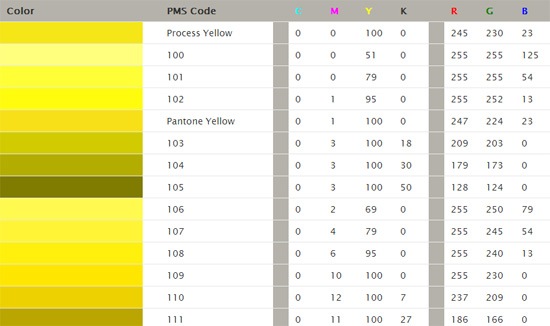
    <p><a href="http://www.lcipaper.com/kb/the-ultimate-color-conversion-chart-pms-cmyk-rgb-hex.html" rel="nofollow external" class="bo"><img src="http://cdn.sixrevisions.com/0347-11_conversion_chart.jpg" width="550" height="326" style="max-width: 100%; height: auto;"></a></p>
    <h5><a href="http://www.printingforless.com/rgb-cmyk.html" rel="nofollow external" class="bo">Important Information About RGB and CMYK</a></h5>
    <p><a href="http://www.printingforless.com/rgb-cmyk.html" rel="nofollow external" class="bo"><img src="http://cdn.sixrevisions.com/0347-12_important_info_rgb.jpg" width="550" height="250" style="max-width: 100%; height: auto;"></a></p>
    <h3>Image Resolution and Scalability</h3>
    <p>A problem that’s likely to come up when dealing with web graphics is their resolution and ability to be resized without loss of quality. This poses an issue when you want your web graphics to be printed on bigger mediums like billboards or magazine covers.</p>
    <p>Image resolution refers to the amount of details an image has.</p>
    <p>Image resolution for digital images are measured using spatial resolution units, and the poplar unit of measurements are in <strong>pixels per inch (ppi)</strong> or <strong>dots per inch (dpi).</strong></p>
    <p>The more pixels or dots there are in a given square inch, the more detail the image has, i.e., the higher its resolution.</p>
    <p><img src="http://cdn.sixrevisions.com/0347-04_image_resolution.jpg" width="518" height="329" alt="Is Your Web Graphics Print-Ready?" style="max-width: 100%; height: auto;"></p>
    <p>Images on the Web are typically compressed to a lower resolution — typically <strong>72dpi</strong> — so that they download faster and because most screens don’t need/can’t take advantage of a higher resolution.</p>
    <p>Lower-res graphics may look fine on your computer monitor, but that same image will look different when printed.</p>
    <h4>The Problem: Pixelation</h4>
    <p>The biggest issue you might encounter with image resolution is <strong>pixelation.</strong> <a href="http://en.wikipedia.org/wiki/Pixelation" rel="nofollow external" class="bo">Pixelation</a> occurs when you scale an image up and it doesn’t have sufficient enough resolution that it makes the image too blurry.</p>
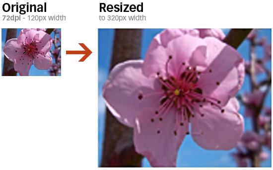
    <p>Look at the difference between a web-resolution image being scaled up in dimension below.</p>
    <p><img src="http://cdn.sixrevisions.com/0347-02_image_resolution_scale.jpg" width="550" height="342" style="max-width: 100%; height: auto;"></p>
    <p>Notice the pixelation occurring as a result of us trying to enlarge the image when it doesn’t have sufficient enough detail.</p>
    <p>For this reason, it’s vital to <strong>use the highest resolution images possible</strong> — at least <strong>300dpi</strong> — when creating print-ready graphics.</p>
    <p>If you don’t have access to the original file that was used to create your web graphics — which should be in PSD or vector file format (EPS, AI, etc.) — it may be necessary to recreate it.</p>
    <p>With a vector file format, you can scale the design up to whatever size you require without any loss of quality.</p>
    <h3>Monochrome-Friendliness</h3>
    <p>The Web offers very few restrictions when it comes to color representation.</p>
    <p>Print, on the other hand, comes with certain limitations.</p>
    <p>When using PMS printing, each new color means an additional cost, making multicolored web graphics less practical with this method.</p>
    <p>And, although four-color process can be used to reproduce most multicolored web graphics, one- or two-color PMS printing is often a more cost-effective option.</p>
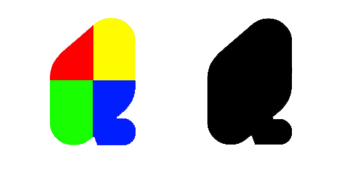
    <p>For this reason (among others), many logo designers will first design a logo using only black and white. If the logo maintains the same visual impact in its simplest, monochromatic form, you’ll have a much easier time when you recreate it using one-color printing.</p>
    <p>While the object below is certainly distinctive when it’s multicolored, it’s not terribly interesting to look at in black and white.</p>
    <p><img src="http://cdn.sixrevisions.com/0347-03_multicolor_vs_blackwhite.jpg" width="500" height="250" style="max-width: 100%; height: auto;"></p>
    <h3>Problematic Colors</h3>
    <p>Just as PMS printing presents certain design limitations, four-color process also comes with complications to consider — specifically, it can be difficult to accurately reproduce some colors (including <strong>orange</strong> and <strong>navy blue</strong>) with the CMYK color model.</p>
    <p>If you intend to print your logo using four-color process and it contains any orange or navy blue elements, you may want to replace them with another color — or, alternatively, have those areas spot printed with the proper PMS colors.</p>
    <p><strong>Check with your printer</strong> if you think your artwork may contain colors that present a problem for CMYK printing.</p>
    <h3>File Format</h3>
    <p>Popular image formats for web use include JPG and PNG — formats designed for computer monitors but don’t always work as well for printing.</p>
    <p>In general, your high-res, print-ready artwork should be in the most "raw" format possible.</p>
    <p>The most common formats for this purpose are:</p>
    <ul>
    <li>PSD (Photoshop)</li>
    <li>AI (Illustrator)</li>
    <li>EPS (a standard vector file)</li>
    <li>PDF (viewable using Acrobat)</li>
    </ul>
    <h3>Fonts</h3>
    <p>Just because your artwork opens fine on your computer doesn’t necessarily mean it will work for a commercial printer.</p>
    <p>When high-quality image files such as PSDs incorporate fonts, you’ll need the proper font files to view them correctly — files that your printer might not have immediate access to, especially if you’re using uncommon fonts.</p>
    <p>Be sure to include any necessary font files when sending your artwork to a printer.</p>
    <p>On a Mac, these files can be found in <em>System/Library/Fonts</em>.</p>
    <p>In Windows, check the <em>Fonts</em> folder inside your main Windows directory.</p>
    <p>Most printers will let you include  font files in a ZIP along with your artwork files.</p>
    <p>Alternatively, you can convert fonts to outlines in <a href="http://help.adobe.com/en_US/illustrator/cs/using/WS714a382cdf7d304e7e07d0100196cbc5f-63d0a.html#WS18156339-458C-45e1-8CD0-DD7931678BBE" rel="nofollow external" class="bo">Illustrator</a> or <a href="http://help.adobe.com/en_US/indesign/cs/using/WSa285fff53dea4f8617383751001ea8cb3f-6befa.html#WSa285fff53dea4f8617383751001ea8cb3f-6be6a" rel="nofollow external" class="bo">InDesign</a> so that you won’t need to include additional files.</p>
    <h3>Conclusion</h3>
    <p>The best way to ensure that your logo looks great in print as well as on the Web is to design it with both mediums in mind from the very beginning. However, if you’re stuck in a bind, there are ways to make the best out of the situation.</p>
    <p>For more information related to ensuring your graphics is suitable for print, be sure to check out this <a href="http://www.companyfolders.com/blog/print-ready-checklist" rel="nofollow external" class="bo">print-ready checklist</a> that I made.</p>
    <h3>Related Content</h3>
    <ul>
    <li><a href="http://sixrevisions.com/graphics-design/5-branding-basics-every-logo-designer-should-know/" rel="nofollow external" class="bo">5 Branding Basics Every Logo Designer Should Know</a></li>
    <li><a href="http://sixrevisions.com/resources/30-excellent-resources-for-graphic-design-freebies/" rel="nofollow external" class="bo">30 Excellent Resources for Graphic Design Freebies</a></li>
    <li><a href="http://sixrevisions.com/design-showcase-inspiration/blue-logo-designs/" rel="nofollow external" class="bo">50 Beautifully Blue Logo Designs</a></li>
    <li>
    <em>Related categories</em>: <a href="http://sixrevisions.com/category/graphics-design/" rel="nofollow external" class="bo">Graphic Design</a> and <a href="http://sixrevisions.com/category/resources/" rel="nofollow external" class="bo">Resources</a>
    </li>
    </ul>
    <h3>About the Author</h3>
    <p><img src="http://cdn.sixrevisions.com/authors/vladimir_gendelman_small.jpg" alt="" width="80" height="80" style="max-width: 100%; height: auto;"><strong>Vladimir Gendelman</strong> is the founder and CEO of <a href="http://www.companyfolders.com/" rel="nofollow external" class="bo">Company Folders, Inc.</a> With years of web and print design experience, he leads a team of talented graphic artists and marketing specialists who help businesses put forth the best image possible. You can follow him on <a href="https://plus.google.com/104441514357046328957" rel="nofollow external" class="bo">Google+</a> and <a href="https://twitter.com/vgendelman" rel="nofollow external" class="bo">Twitter.</a></p>
    <p>The post <a href="http://sixrevisions.com/graphics-design/print-ready-graphics/" rel="nofollow external" class="bo">Are Your Web Graphics Print-Ready?</a> appeared first on <a href="http://sixrevisions.com" rel="nofollow external" class="bo">Six Revisions</a>.</p>
    </div>
]]>
</Body>
<Summary>As a web designer, masters of the digital realm, you might have never faced the situation where your designs are going to be sent to a print shop.   Or perhaps you’re an Internet business owner in...</Summary>
<Website>http://feedproxy.google.com/~r/SixRevisions/~3/i8wqzrHIyV4/</Website>
<TrackingUrl>https://my3.my.umbc.edu/api/v0/pixel/news/31165/guest@my.umbc.edu/92dd7c86a32588384b4b89d8964a0ab2/api/pixel</TrackingUrl>
<Tag>css</Tag>
<Tag>database</Tag>
<Tag>design</Tag>
<Tag>development</Tag>
<Tag>graphic-design</Tag>
<Tag>html</Tag>
<Tag>javascript</Tag>
<Tag>mysql</Tag>
<Tag>sql</Tag>
<Tag>web</Tag>
<Group token="retired-583">Web Developer - Build Group</Group>
<GroupUrl>https://my3.my.umbc.edu/groups/retired-583</GroupUrl>
<AvatarUrl>https://assets3-my.umbc.edu/system/shared/avatars/groups/000/000/583/fc60f5d7abc2e080599bb6dc465db54d/xsmall.png?1363101197</AvatarUrl>
<AvatarUrl size="original">https://assets4-my.umbc.edu/system/shared/avatars/groups/000/000/583/fc60f5d7abc2e080599bb6dc465db54d/original.jpg?1363101197</AvatarUrl>
<AvatarUrl size="xxlarge">https://assets4-my.umbc.edu/system/shared/avatars/groups/000/000/583/fc60f5d7abc2e080599bb6dc465db54d/xxlarge.png?1363101197</AvatarUrl>
<AvatarUrl size="xlarge">https://assets4-my.umbc.edu/system/shared/avatars/groups/000/000/583/fc60f5d7abc2e080599bb6dc465db54d/xlarge.png?1363101197</AvatarUrl>
<AvatarUrl size="large">https://assets3-my.umbc.edu/system/shared/avatars/groups/000/000/583/fc60f5d7abc2e080599bb6dc465db54d/large.png?1363101197</AvatarUrl>
<AvatarUrl size="medium">https://assets3-my.umbc.edu/system/shared/avatars/groups/000/000/583/fc60f5d7abc2e080599bb6dc465db54d/medium.png?1363101197</AvatarUrl>
<AvatarUrl size="small">https://assets4-my.umbc.edu/system/shared/avatars/groups/000/000/583/fc60f5d7abc2e080599bb6dc465db54d/small.png?1363101197</AvatarUrl>
<AvatarUrl size="xsmall">https://assets3-my.umbc.edu/system/shared/avatars/groups/000/000/583/fc60f5d7abc2e080599bb6dc465db54d/xsmall.png?1363101197</AvatarUrl>
<AvatarUrl size="xxsmall">https://assets4-my.umbc.edu/system/shared/avatars/groups/000/000/583/fc60f5d7abc2e080599bb6dc465db54d/xxsmall.png?1363101197</AvatarUrl>
<Sponsor>Web Developer - Build Group</Sponsor>
<PawCount>0</PawCount>
<CommentCount>0</CommentCount>
<CommentsAllowed>true</CommentsAllowed>
<PostedAt>Wed, 12 Jun 2013 06:00:31 -0400</PostedAt>
<EditAt>Wed, 12 Jun 2013 06:00:31 -0400</EditAt>
</NewsItem>

<NewsItem contentIssues="true" id="31164" important="false" status="posted" url="https://my3.my.umbc.edu/posts/31164">
<Title>Using the Foundation framework</Title>
<Body>
<![CDATA[
    <div class="html-content">
    <p><img alt="thumbnail" src="http://netdna.webdesignerdepot.com/uploads/2013/05/thumbnail37.jpg" width="200" height="160" style="max-width: 100%; height: auto;">A couple of weeks ago the famous <a href="http://foundation.zurb.com/" rel="nofollow external" class="bo">Foundation framework</a> released its fourth version. If you have never heard of Foundation we’re going to guide you through using this responsive framework.</p> <p>Since version 3 of Foundation was built from the ground up using SASS — a CSS pre-processor that helps in the writing of more efficient CSS — this new version is also mobile-friendly and provides a lot of features in its grid that you don’t get from other frameworks.</p> <p>Let’s dive into Foundation and see why it’s so popular…</p> <h1>The grid</h1> <p>Foundation uses a 12 column nestable grid that will adapt to any size screen, if you have already used grids this should all be very familiar to you. All the divs in Foundation use box-sizing: border-box so that the borders and padding do not affect the element’s width and height, making the math a little bit easier for us. But the amazing thing about the Foundation grid is that you actually get 2 grids, a big grid for when the screen is bigger than 768px in width and a smaller grid that you can control just as simply. To that end Foundation uses the small-# and large-# classes, like so:</p> <pre>&lt;div class="row"&gt; &lt;div class="small-3 large-4 columns"&gt;Lorem Ipsum&lt;/div&gt; &lt;div class="small-3 large-4 columns"&gt;Lorem Ipsum&lt;/div&gt; &lt;div class="small-6 large-4 columns"&gt;Lorem Ipsum&lt;/div&gt; &lt;/div&gt;</pre> <p>In this code we created a row in which there are 3 divs that are the exact same width when the browser is wider than 768px but when it’s smaller, as you can see by that small class in the divs, the last one will occupy half the screen while the other two will occupy 25% each, this gives you immense control of how our website will look on all screens.</p> <p>Foundation also allows you to offset a column, by which I mean that you can have a row with 2 columns that are only 3 columns wide but you can offset the second one that it floats to the right and to do that we use the large-offset class or the small-offset class:</p> <pre>&lt;div class="row"&gt; &lt;div class="large-3 columns"&gt;&lt;/div&gt; &lt;div class="large-3 large-offset-6 columns"&gt;3, offset 6&lt;/div&gt; &lt;/div&gt; </pre> <p> </p> <h1>Block grid</h1> <p>The block grid is just a nice little extra, it is a way for you to split the content of a list within the grid, it’s useful for when you wish this particular part of your website to stay evenly spaced no matter what the size of the browser. This type of grid uses the small-block-grid and the large-block-grid classes, if you only set the first one the grid will keep the desired spacing no matter what the viewport is but if you only use the large-block-grid class when the viewport reaches the breakpoint of 768px the grid items will stack on top of each other, you can always take more control by using both of these classes, like so:</p> <pre>&lt;ul class="small-block-grid-2 large-block-grid-4"&gt; &lt;li&gt;&lt;img src="image1.png"&gt;&lt;/li&gt; &lt;li&gt;&lt;img src="image2.png"&gt;&lt;/li&gt; &lt;li&gt;&lt;img src="image3.png"&gt;&lt;/li&gt; &lt;li&gt;&lt;img src="image4.png"&gt;&lt;/li&gt; &lt;/ul&gt; </pre> <p>Using this, the images will be evenly spaced no matter the size. When the viewport is bigger than 768px they will only occupy one row, and when it’s smaller than that they will occupy two rows with 2 images each.</p> <p> </p> <h1>The main navigation</h1> <p>Now that we’ve covered the grid in Foundation and how it gives you plenty of control in all environments, we will talk about something we’ll nearly always use on our sites: a top navigation bar. And of course this navigation can also be flexible with little to no work using this framework. To create a simple responsive navigation using Foundation you use:</p> <pre>&lt;nav class="top-bar"&gt; &lt;ul class="title-area"&gt; &lt;li class="name"&gt; &lt;h1&gt;&lt;a href="/"&gt;Website Title&lt;/a&gt;&lt;/h1&gt; &lt;/li&gt; &lt;li class="toggle-topbar menu-icon"&gt;&lt;a href="#"&gt;&lt;span&gt;Menu&lt;/span&gt;&lt;/a&gt;&lt;/li&gt; &lt;/ul&gt; &lt;ul class="right"&gt; &lt;li&gt;&lt;a href="#"&gt;Item 1&lt;/a&gt;&lt;/li&gt; &lt;li&gt;&lt;a href="#"&gt;Item 2&lt;/a&gt;&lt;/li&gt; &lt;li&gt;&lt;a href="#"&gt;Item 3&lt;/a&gt;&lt;/li&gt; &lt;li&gt;&lt;a href="#"&gt;Item 4&lt;/a&gt;&lt;/li&gt; &lt;/ul&gt; &lt;/nav&gt; </pre> <p>This bit of HTML creates a simple navigation bar that has the title of the website on the left and then on the right it has four menu items. Also note that when the viewport is smaller than 768px this menu will be replaced by a list icon making this menu responsive. If you want this grid to have its position fixed as you scroll down the page you just need to wrap it in a div with a class of <em>fixed.</em> To add dropdowns to your navigation you just need to add something like this to the place where you want your dropdown:</p> <pre>&lt;li class="has-dropdown"&gt;&lt;a href="#"&gt;Dropdown Level 2c&lt;/a&gt; &lt;ul class="dropdown"&gt; &lt;li&gt;&lt;label&gt;Dropdown Menu&lt;/label&gt;&lt;/li&gt; &lt;li&gt;&lt;a href="#"&gt;Sub menu Item 1&lt;/a&gt;&lt;/li&gt; &lt;li&gt;&lt;a href="#"&gt;Sub menu Item 1&lt;/a&gt;&lt;/li&gt; &lt;li&gt;&lt;a href="#"&gt;Sub menu Item 3&lt;/a&gt;&lt;/li&gt; &lt;/ul&gt; &lt;/li&gt; </pre> <p>There is also the ability to add a divider to your list item adding a little grey vertical line, to do that you just need to place a list item with the class of <em>divider</em> between the two list items you wish to divide.</p> <p> </p> <h1>Buttons</h1> <p>No framework would be complete without some predefined buttons and Foundation actually has more than one style of button predefined, it has the default one that uses a blue color and then it adds the success, alert and secondary styles. By adding the class of <em>radius</em> you give this button a little bit of border-radius and by giving it the class of <em>round</em> you make the button almost entirely round. You can also add the class <em>disabled</em> to the button and there are 4 size classes to make the button as big as you need it.</p> <pre>&lt;!-- Size Classes --&gt; &lt;a href="#" class="button"&gt;Default Button&lt;/a&gt; &lt;a href="#" class="tiny button"&gt;Tiny Button&lt;/a&gt; &lt;a href="#" class="small button"&gt;Small Button&lt;/a&gt; &lt;a href="#" class="large button"&gt;Large Button&lt;/a&gt; &lt;!-- Color Classes --&gt; &lt;a href="#" class="button secondary"&gt;Secondary Button&lt;/a&gt; &lt;a href="#" class="button success"&gt;Success Button&lt;/a&gt; &lt;a href="#" class="button alert"&gt;Alert Button&lt;/a&gt; &lt;!-- Radius Classes --&gt; &lt;a href="#" class="button radius"&gt;Radius Button&lt;/a&gt; &lt;a href="#" class="button round"&gt;Round Button&lt;/a&gt; &lt;!-- Disabled Class --&gt; &lt;a href="#" class="button disabled"&gt;Disabled Button&lt;/a&gt; </pre> <p>To create a simple dropdown button you only need to add the dropdown class after the last class, like so:</p> <pre>&lt;a href="#" class="button dropdown"&gt;Dropdown Button&lt;/a&gt; </pre> <p> </p> <h1>Typography</h1> <p>The typography in Foundation uses Helvetica Neue and it also uses em’s instead of pixels to make it easier to adapt your type across all platforms and breakpoints. Using the headers is pretty self explanatory; you just need an h1 and the text you wish inside it, but there are also some other classes that can come in handy when dealing with typography in Foundation.</p> <pre>&lt;!-- subheader --&gt; &lt;h1 class="subheader"&gt;h1.subheader&lt;/h1&gt; &lt;!-- Segment header, the text inside the small tag will act like a sub header --&gt; &lt;h1&gt;h1. &lt;small&gt;Smaller&lt;/small&gt;&lt;/h1&gt; &lt;!-- Use .circle or .square to change the style of the bullets in unordered lists --&gt; &lt;ul class="disc"&gt; &lt;li&gt;List item&lt;/li&gt; &lt;/uL&gt; &lt;ul class="square"&gt; &lt;li&gt;List item&lt;/li&gt; &lt;/uL&gt; &lt;!-- create an inline list--&gt; &lt;ul class="inline-list"&gt; &lt;li&gt;&lt;a href="#"&gt;Link 1&lt;/a&gt;&lt;/li&gt; &lt;li&gt;&lt;a href="#"&gt;Link 2&lt;/a&gt;&lt;/li&gt; &lt;/ul&gt; </pre> <p>As you can see, when it comes to typography, Foundation provides us with some basic help and then some additional classes to meet all our needs.</p> <p> </p> <h1>Other components</h1> <p>If this demonstration of the Foundation framework has whet your appetite to learn more and start building with Foundation you should really take a look at the documentation because Foundation also offers additional CSS components such as:</p> <ul> <li>Alert Boxes</li> <li>Panels</li> <li>Pricing Tables</li> <li>Progress Bars</li> <li>Tables</li> <li>Thumbnails</li> <li>Flex Video</li> </ul> <p>And also some helper JavaScript such as:</p> <ul> <li>Clearing</li> <li>Dropdown</li> <li>Joyride</li> <li>Magellan</li> <li>Orbit</li> <li>Reveal</li> <li>Section</li> <li>Tooltips</li> </ul> <p>As you can see, there’s a lot of Foundation to explore and I strongly advise you to look at all of its CSS and JavaScript properties.</p> <p> </p> <h1>Conclusion</h1> <p>We covered just enough in this article to see how Foundation can help building faster and more responsive websites, using its grid you get a lot more control over the structure of your website than when using a normal flexible grid and Foundation also gives you plenty of helpers to create your website. I hope this article has given you the push to learn and use Foundation for your next project.</p> <p> </p> <p><em><strong>Have you used Foundation for a project? What features did you find the most useful? Let us know in the comments.</strong></em></p> <p><br><br> </p>
    <table width="100%"> <tbody>
    <tr> <td> <a href="http://www.mightydeals.com/deal/photographypla-overlays-bundle.html?ref=inwidget" rel="nofollow external" class="bo"><strong>250+ Creative Photo Overlays to Enhance Your Images – only $29!</strong></a> </td> <td> <a href="http://www.mightydeals.com/?ref=inwidget" rel="nofollow external" class="bo"><br> <img src="http://mightydeals.com/web/images/widget-logo.png" height="40" width="90" alt="Using the Foundation framework" style="max-width: 100%; height: auto;"><br> </a> </td> </tr> </tbody>
    </table> <p><br> </p> <a href="http://www.webdesignerdepot.com/2013/06/using-the-foundation-framework/" rel="nofollow external" class="bo">Source</a> <div><table border="0"><tbody><tr><td>
    <a href="http://share.feedsportal.com/share/twitter/?u=http%3A%2F%2Fwww.webdesignerdepot.com%2F2013%2F06%2Fusing-the-foundation-framework%2F&amp;t=Using+the+Foundation+framework" rel="nofollow external" class="bo"><img src="http://res3.feedsportal.com/social/twitter.png" style="max-width: 100%; height: auto;"></a> <a href="http://share.feedsportal.com/share/facebook/?u=http%3A%2F%2Fwww.webdesignerdepot.com%2F2013%2F06%2Fusing-the-foundation-framework%2F&amp;t=Using+the+Foundation+framework" rel="nofollow external" class="bo"><img src="http://res3.feedsportal.com/social/facebook.png" style="max-width: 100%; height: auto;"></a> <a href="http://share.feedsportal.com/share/linkedin/?u=http%3A%2F%2Fwww.webdesignerdepot.com%2F2013%2F06%2Fusing-the-foundation-framework%2F&amp;t=Using+the+Foundation+framework" rel="nofollow external" class="bo"><img src="http://res3.feedsportal.com/social/linkedin.png" style="max-width: 100%; height: auto;"></a> <a href="http://share.feedsportal.com/share/gplus/?u=http%3A%2F%2Fwww.webdesignerdepot.com%2F2013%2F06%2Fusing-the-foundation-framework%2F&amp;t=Using+the+Foundation+framework" rel="nofollow external" class="bo"><img src="http://res3.feedsportal.com/social/googleplus.png" style="max-width: 100%; height: auto;"></a> <a href="http://share.feedsportal.com/share/email/?u=http%3A%2F%2Fwww.webdesignerdepot.com%2F2013%2F06%2Fusing-the-foundation-framework%2F&amp;t=Using+the+Foundation+framework" rel="nofollow external" class="bo"><img src="http://res3.feedsportal.com/social/email.png" style="max-width: 100%; height: auto;"></a>
    </td></tr></tbody></table></div>
    <br><br><a href="http://da.feedsportal.com/r/165664997235/u/49/f/661066/c/35285/s/2d2d3eb3/a2.htm" rel="nofollow external" class="bo"><img src="http://da.feedsportal.com/r/165664997235/u/49/f/661066/c/35285/s/2d2d3eb3/a2.img" style="max-width: 100%; height: auto;"></a>
    </div>
]]>
</Body>
<Summary>A couple of weeks ago the famous Foundation framework released its fourth version. If you have never heard of Foundation we’re going to guide you through using this responsive framework.   Since...</Summary>
<Website>http://rss.feedsportal.com/c/35285/f/661066/s/2d2d3eb3/l/0L0Swebdesignerdepot0N0C20A130C0A60Cusing0Ethe0Efoundation0Eframework0C/story01.htm</Website>
<TrackingUrl>https://my3.my.umbc.edu/api/v0/pixel/news/31164/guest@my.umbc.edu/8a10389d93c4e4ba59cc2c01d7278b38/api/pixel</TrackingUrl>
<Tag>art</Tag>
<Tag>building-a-responsive-site</Tag>
<Tag>code</Tag>
<Tag>css</Tag>
<Tag>design</Tag>
<Tag>development</Tag>
<Tag>frameworks</Tag>
<Tag>html</Tag>
<Tag>html5</Tag>
<Tag>illustrator</Tag>
<Tag>introduction-to-foundation</Tag>
<Tag>javascript</Tag>
<Tag>mysql</Tag>
<Tag>oracle</Tag>
<Tag>photoshop</Tag>
<Tag>php</Tag>
<Tag>quick-responsive-design-solutions</Tag>
<Tag>responsive-frameworks</Tag>
<Tag>responsive-web-design</Tag>
<Tag>sql</Tag>
<Tag>using-foundation</Tag>
<Group token="retired-583">Web Developer - Build Group</Group>
<GroupUrl>https://my3.my.umbc.edu/groups/retired-583</GroupUrl>
<AvatarUrl>https://assets3-my.umbc.edu/system/shared/avatars/groups/000/000/583/fc60f5d7abc2e080599bb6dc465db54d/xsmall.png?1363101197</AvatarUrl>
<AvatarUrl size="original">https://assets4-my.umbc.edu/system/shared/avatars/groups/000/000/583/fc60f5d7abc2e080599bb6dc465db54d/original.jpg?1363101197</AvatarUrl>
<AvatarUrl size="xxlarge">https://assets4-my.umbc.edu/system/shared/avatars/groups/000/000/583/fc60f5d7abc2e080599bb6dc465db54d/xxlarge.png?1363101197</AvatarUrl>
<AvatarUrl size="xlarge">https://assets4-my.umbc.edu/system/shared/avatars/groups/000/000/583/fc60f5d7abc2e080599bb6dc465db54d/xlarge.png?1363101197</AvatarUrl>
<AvatarUrl size="large">https://assets3-my.umbc.edu/system/shared/avatars/groups/000/000/583/fc60f5d7abc2e080599bb6dc465db54d/large.png?1363101197</AvatarUrl>
<AvatarUrl size="medium">https://assets3-my.umbc.edu/system/shared/avatars/groups/000/000/583/fc60f5d7abc2e080599bb6dc465db54d/medium.png?1363101197</AvatarUrl>
<AvatarUrl size="small">https://assets4-my.umbc.edu/system/shared/avatars/groups/000/000/583/fc60f5d7abc2e080599bb6dc465db54d/small.png?1363101197</AvatarUrl>
<AvatarUrl size="xsmall">https://assets3-my.umbc.edu/system/shared/avatars/groups/000/000/583/fc60f5d7abc2e080599bb6dc465db54d/xsmall.png?1363101197</AvatarUrl>
<AvatarUrl size="xxsmall">https://assets4-my.umbc.edu/system/shared/avatars/groups/000/000/583/fc60f5d7abc2e080599bb6dc465db54d/xxsmall.png?1363101197</AvatarUrl>
<Sponsor>Web Developer - Build Group</Sponsor>
<PawCount>0</PawCount>
<CommentCount>0</CommentCount>
<CommentsAllowed>true</CommentsAllowed>
<PostedAt>Wed, 12 Jun 2013 05:15:04 -0400</PostedAt>
<EditAt>Wed, 12 Jun 2013 05:15:04 -0400</EditAt>
</NewsItem>

<NewsItem contentIssues="true" id="31163" important="false" status="posted" url="https://my3.my.umbc.edu/posts/31163">
<Title>30 Days/30 Scholarships: Q&amp;A with Collin Wojciechowski</Title>
<Body>
<![CDATA[
    <div class="html-content">
    <p><a href="http://umbcgiving.files.wordpress.com/2013/06/wojciechowskicollin.jpg" rel="nofollow external" class="bo"><img alt="Wojciechowski,Collin" src="http://umbcgiving.files.wordpress.com/2013/06/wojciechowskicollin.jpg?w=640" style="max-width: 100%; height: auto;"></a>In his junior year at UMBC, <strong>Collin Wojciechowski ’13</strong>, political science, represented nearly 180,000 students within the University System of Maryland (USM) as their sole student representative on the Board of Regents. Wojciechowski advocated against “doomsday” budget cuts and tuition increases and successfully lobbied to overhaul the USM policy for assessing student fees, making students an active part of the discussion.</p>
    <p>Without the aid of scholarships, he would never have been able to serve his fellow students in this way. We sat down with the newly graduated Sondheim Scholar to talk a little bit about the part scholarships have played in his life.</p>
    <p><a href="https://givecorps.com/en/umbc/projects/463-annual-giving-causes-30-days-30-scholarships" rel="nofollow external" class="bo">Help UMBC students do AMAZING things. Make a gift to the 30 Days/30 Scholarships campaign today!</a></p>
    <p><strong><a href="https://givecorps.com/en/umbc/projects/463-annual-giving-causes-30-days-30-scholarships" rel="nofollow external" class="bo"><img alt="30for30_small" src="http://umbcgiving.files.wordpress.com/2013/06/30for30_small.jpg?w=275&amp;h=275" width="275" height="275" style="max-width: 100%; height: auto;"></a>Q:</strong>  <em>How important was it to your college career to have the support of scholarships?</em></p>
    <p><strong>A: </strong> Being the son of a firemen and a public school teacher and the oldest of three brothers who all aspire to seek higher education, having the support of a scholarship was extremely important to my college career.</p>
    <p><strong>Q:</strong>  <em>Can you tell us a little about what it meant to you to be able to serve as the student regent, and then to continue working with legislators?</em></p>
    <p><strong>A:</strong>  If I did not have a scholarship, I would not have been able to be the USM Student Regent; it’s as simple as that. I only had the time and ability to serve at that post because I did not have to work a side job to pay for college.</p>
    <p>Being the Student Regent was one of the most meaningful experiences of my life. Representing students through such trying times as merger debate and the doomsday budget was the thrill of a lifetime. To then be able to take what I had learned on the Board and use it to represent Dr. Hrabowski in Annapolis was a dream. I have never had more fun then the Session I spent advocating for UMBC before legislators.</p>
    <p><strong>Q:</strong> <em> Has that work given you added insight into education funding, and if so, can you talk a little about the significance of alumni support of education in Maryland?</em></p>
    <p><strong>A:</strong>  Having been a member of the Advancement Committee of the USM Board of Regents, which oversees alumni giving, I feel I have a unique perspective on the significance that alumni support plays in higher education in Maryland. While our state, specifically Governor Martin O’Malley, has done tremendous things for public universities in terms of funding, student support and financial aid always need assistance. As students and their families continue to face economic difficulty it is up to the alumni base to ensure UMBC is a place welcoming to everyone.</p>
    <p><a href="http://www.umbc.edu/classof2013/" rel="nofollow external" class="bo">Read more about Collin and his UMBC experiences on the Class of 2013 site.</a></p>
    <br>   </div>
]]>
</Body>
<Summary>In his junior year at UMBC, Collin Wojciechowski ’13, political science, represented nearly 180,000 students within the University System of Maryland (USM) as their sole student representative on...</Summary>
<Website>http://umbcgiving.wordpress.com/2013/06/12/30-days30-scholarships-qa-with-collin-wojciechowski-13/</Website>
<TrackingUrl>https://my3.my.umbc.edu/api/v0/pixel/news/31163/guest@my.umbc.edu/95524b60a36e0c0be6e085f4ef81a9a1/api/pixel</TrackingUrl>
<Tag>uncategorized</Tag>
<Group token="retired-548">UMBC Giving</Group>
<GroupUrl>https://my3.my.umbc.edu/groups/retired-548</GroupUrl>
<AvatarUrl>https://assets3-my.umbc.edu/images/avatars/group/11/xsmall.png?1783534523</AvatarUrl>
<AvatarUrl size="original">https://assets4-my.umbc.edu/images/avatars/group/11/original.png?1783534523</AvatarUrl>
<AvatarUrl size="xxlarge">https://assets4-my.umbc.edu/images/avatars/group/11/xxlarge.png?1783534523</AvatarUrl>
<AvatarUrl size="xlarge">https://assets1-my.umbc.edu/images/avatars/group/11/xlarge.png?1783534523</AvatarUrl>
<AvatarUrl size="large">https://assets1-my.umbc.edu/images/avatars/group/11/large.png?1783534523</AvatarUrl>
<AvatarUrl size="medium">https://assets3-my.umbc.edu/images/avatars/group/11/medium.png?1783534523</AvatarUrl>
<AvatarUrl size="small">https://assets1-my.umbc.edu/images/avatars/group/11/small.png?1783534523</AvatarUrl>
<AvatarUrl size="xsmall">https://assets3-my.umbc.edu/images/avatars/group/11/xsmall.png?1783534523</AvatarUrl>
<AvatarUrl size="xxsmall">https://assets3-my.umbc.edu/images/avatars/group/11/xxsmall.png?1783534523</AvatarUrl>
<Sponsor>UMBC Giving</Sponsor>
<PawCount>0</PawCount>
<CommentCount>0</CommentCount>
<CommentsAllowed>false</CommentsAllowed>
<PostedAt>Wed, 12 Jun 2013 03:40:46 -0400</PostedAt>
<EditAt>Wed, 12 Jun 2013 03:40:46 -0400</EditAt>
</NewsItem>

</News>