<?xml version="1.0"?>
<News hasArchived="true" page="8665" pageCount="10720" pageSize="10" timestamp="Fri, 10 Jul 2026 00:50:51 -0400" url="https://my3.my.umbc.edu/posts.xml?page=8665">
<NewsItem contentIssues="true" id="30701" important="false" status="posted" url="https://my3.my.umbc.edu/posts/30701">
<Title>Gadgetwise Blog: Q&amp;A: Exploring New Subscription Plans for Flickr</Title>
<Body>
<![CDATA[
    <div class="html-content">Flickr’s recent upgrade has discontinued the creation of new Flickr Pro accounts but adds three other options for free and paid photo sharing.<div><table border="0"><tbody><tr><td>
    <a href="http://share.feedsportal.com/share/twitter/?u=http%3A%2F%2Fgadgetwise.blogs.nytimes.com%2F2013%2F06%2F03%2Fqa-exploring-new-plans-for-flickr%2F%3Fpartner%3Drss%26emc%3Drss&amp;t=Gadgetwise+Blog%3A+Q%26A%3A+Exploring+New+Subscription+Plans+for+Flickr" rel="nofollow external" class="bo"><img src="http://res3.feedsportal.com/social/twitter.png" style="max-width: 100%; height: auto;"></a> <a href="http://share.feedsportal.com/share/facebook/?u=http%3A%2F%2Fgadgetwise.blogs.nytimes.com%2F2013%2F06%2F03%2Fqa-exploring-new-plans-for-flickr%2F%3Fpartner%3Drss%26emc%3Drss&amp;t=Gadgetwise+Blog%3A+Q%26A%3A+Exploring+New+Subscription+Plans+for+Flickr" rel="nofollow external" class="bo"><img src="http://res3.feedsportal.com/social/facebook.png" style="max-width: 100%; height: auto;"></a> <a href="http://share.feedsportal.com/share/linkedin/?u=http%3A%2F%2Fgadgetwise.blogs.nytimes.com%2F2013%2F06%2F03%2Fqa-exploring-new-plans-for-flickr%2F%3Fpartner%3Drss%26emc%3Drss&amp;t=Gadgetwise+Blog%3A+Q%26A%3A+Exploring+New+Subscription+Plans+for+Flickr" rel="nofollow external" class="bo"><img src="http://res3.feedsportal.com/social/linkedin.png" style="max-width: 100%; height: auto;"></a> <a href="http://share.feedsportal.com/share/gplus/?u=http%3A%2F%2Fgadgetwise.blogs.nytimes.com%2F2013%2F06%2F03%2Fqa-exploring-new-plans-for-flickr%2F%3Fpartner%3Drss%26emc%3Drss&amp;t=Gadgetwise+Blog%3A+Q%26A%3A+Exploring+New+Subscription+Plans+for+Flickr" rel="nofollow external" class="bo"><img src="http://res3.feedsportal.com/social/googleplus.png" style="max-width: 100%; height: auto;"></a> <a href="http://share.feedsportal.com/share/email/?u=http%3A%2F%2Fgadgetwise.blogs.nytimes.com%2F2013%2F06%2F03%2Fqa-exploring-new-plans-for-flickr%2F%3Fpartner%3Drss%26emc%3Drss&amp;t=Gadgetwise+Blog%3A+Q%26A%3A+Exploring+New+Subscription+Plans+for+Flickr" rel="nofollow external" class="bo"><img src="http://res3.feedsportal.com/social/email.png" style="max-width: 100%; height: auto;"></a>
    </td></tr></tbody></table></div>
    <br><br><a href="http://da.feedsportal.com/r/165664790656/u/0/f/640387/c/34625/s/2cc60815/kg/342-363/a2.htm" rel="nofollow external" class="bo"><img src="http://da.feedsportal.com/r/165664790656/u/0/f/640387/c/34625/s/2cc60815/kg/342-363/a2.img" style="max-width: 100%; height: auto;"></a>
    </div>
]]>
</Body>
<Summary>Flickr’s recent upgrade has discontinued the creation of new Flickr Pro accounts but adds three other options for free and paid photo sharing.     </Summary>
<Website>http://gadgetwise.blogs.nytimes.com/2013/06/03/qa-exploring-new-plans-for-flickr/?partner=rss&amp;emc=rss</Website>
<TrackingUrl>https://my3.my.umbc.edu/api/v0/pixel/news/30701/guest@my.umbc.edu/b11361eb9d1d906bf4d08b89e4ebfe93/api/pixel</TrackingUrl>
<Tag>flickr</Tag>
<Tag>new</Tag>
<Tag>q-and-a</Tag>
<Tag>storage</Tag>
<Tag>technology</Tag>
<Tag>york</Tag>
<Group token="retired-583">Web Developer - Build Group</Group>
<GroupUrl>https://my3.my.umbc.edu/groups/retired-583</GroupUrl>
<AvatarUrl>https://assets3-my.umbc.edu/system/shared/avatars/groups/000/000/583/fc60f5d7abc2e080599bb6dc465db54d/xsmall.png?1363101197</AvatarUrl>
<AvatarUrl size="original">https://assets4-my.umbc.edu/system/shared/avatars/groups/000/000/583/fc60f5d7abc2e080599bb6dc465db54d/original.jpg?1363101197</AvatarUrl>
<AvatarUrl size="xxlarge">https://assets4-my.umbc.edu/system/shared/avatars/groups/000/000/583/fc60f5d7abc2e080599bb6dc465db54d/xxlarge.png?1363101197</AvatarUrl>
<AvatarUrl size="xlarge">https://assets4-my.umbc.edu/system/shared/avatars/groups/000/000/583/fc60f5d7abc2e080599bb6dc465db54d/xlarge.png?1363101197</AvatarUrl>
<AvatarUrl size="large">https://assets3-my.umbc.edu/system/shared/avatars/groups/000/000/583/fc60f5d7abc2e080599bb6dc465db54d/large.png?1363101197</AvatarUrl>
<AvatarUrl size="medium">https://assets3-my.umbc.edu/system/shared/avatars/groups/000/000/583/fc60f5d7abc2e080599bb6dc465db54d/medium.png?1363101197</AvatarUrl>
<AvatarUrl size="small">https://assets4-my.umbc.edu/system/shared/avatars/groups/000/000/583/fc60f5d7abc2e080599bb6dc465db54d/small.png?1363101197</AvatarUrl>
<AvatarUrl size="xsmall">https://assets3-my.umbc.edu/system/shared/avatars/groups/000/000/583/fc60f5d7abc2e080599bb6dc465db54d/xsmall.png?1363101197</AvatarUrl>
<AvatarUrl size="xxsmall">https://assets4-my.umbc.edu/system/shared/avatars/groups/000/000/583/fc60f5d7abc2e080599bb6dc465db54d/xxsmall.png?1363101197</AvatarUrl>
<Sponsor>Web Developer - Build Group</Sponsor>
<PawCount>0</PawCount>
<CommentCount>0</CommentCount>
<CommentsAllowed>true</CommentsAllowed>
<PostedAt>Mon, 03 Jun 2013 09:00:16 -0400</PostedAt>
</NewsItem>

<NewsItem contentIssues="true" id="30708" important="false" status="posted" url="https://my3.my.umbc.edu/posts/30708">
<Title>.net Awards 2013: the winners!</Title>
<Body>
<![CDATA[
    <div class="html-content">The winners of the 2013 .net Awards were announced on Friday 31 May at The Grand Connaught Rooms in Covent Garden<div><table border="0"><tbody><tr><td>
    <a href="http://share.feedsportal.com/share/twitter/?u=http%3A%2F%2Fwww.netmagazine.com%2Fnews%2Fnet-awards-2013-winners-132784&amp;t=.net+Awards+2013%3A+the+winners%21" rel="nofollow external" class="bo"><img src="http://res3.feedsportal.com/social/twitter.png" style="max-width: 100%; height: auto;"></a> <a href="http://share.feedsportal.com/share/facebook/?u=http%3A%2F%2Fwww.netmagazine.com%2Fnews%2Fnet-awards-2013-winners-132784&amp;t=.net+Awards+2013%3A+the+winners%21" rel="nofollow external" class="bo"><img src="http://res3.feedsportal.com/social/facebook.png" style="max-width: 100%; height: auto;"></a> <a href="http://share.feedsportal.com/share/linkedin/?u=http%3A%2F%2Fwww.netmagazine.com%2Fnews%2Fnet-awards-2013-winners-132784&amp;t=.net+Awards+2013%3A+the+winners%21" rel="nofollow external" class="bo"><img src="http://res3.feedsportal.com/social/linkedin.png" style="max-width: 100%; height: auto;"></a> <a href="http://share.feedsportal.com/share/gplus/?u=http%3A%2F%2Fwww.netmagazine.com%2Fnews%2Fnet-awards-2013-winners-132784&amp;t=.net+Awards+2013%3A+the+winners%21" rel="nofollow external" class="bo"><img src="http://res3.feedsportal.com/social/googleplus.png" style="max-width: 100%; height: auto;"></a> <a href="http://share.feedsportal.com/share/email/?u=http%3A%2F%2Fwww.netmagazine.com%2Fnews%2Fnet-awards-2013-winners-132784&amp;t=.net+Awards+2013%3A+the+winners%21" rel="nofollow external" class="bo"><img src="http://res3.feedsportal.com/social/email.png" style="max-width: 100%; height: auto;"></a>
    </td></tr></tbody></table></div>
    <br><br><a href="http://da.feedsportal.com/r/165664610076/u/49/f/502346/c/32632/s/2cc73490/a2.htm" rel="nofollow external" class="bo"><img src="http://da.feedsportal.com/r/165664610076/u/49/f/502346/c/32632/s/2cc73490/a2.img" style="max-width: 100%; height: auto;"></a>
    </div>
]]>
</Body>
<Summary>The winners of the 2013 .net Awards were announced on Friday 31 May at The Grand Connaught Rooms in Covent Garden     </Summary>
<Website>http://feedproxy.google.com/~r/net/topstories/~3/AJBZhnuu-gA/story01.htm</Website>
<TrackingUrl>https://my3.my.umbc.edu/api/v0/pixel/news/30708/guest@my.umbc.edu/f8862a34f0335e112806a3a120883ca4/api/pixel</TrackingUrl>
<Tag>css</Tag>
<Tag>development</Tag>
<Tag>html</Tag>
<Tag>javascript</Tag>
<Tag>mysql</Tag>
<Tag>net</Tag>
<Tag>php</Tag>
<Tag>sql</Tag>
<Tag>web</Tag>
<Group token="retired-583">Web Developer - Build Group</Group>
<GroupUrl>https://my3.my.umbc.edu/groups/retired-583</GroupUrl>
<AvatarUrl>https://assets3-my.umbc.edu/system/shared/avatars/groups/000/000/583/fc60f5d7abc2e080599bb6dc465db54d/xsmall.png?1363101197</AvatarUrl>
<AvatarUrl size="original">https://assets4-my.umbc.edu/system/shared/avatars/groups/000/000/583/fc60f5d7abc2e080599bb6dc465db54d/original.jpg?1363101197</AvatarUrl>
<AvatarUrl size="xxlarge">https://assets4-my.umbc.edu/system/shared/avatars/groups/000/000/583/fc60f5d7abc2e080599bb6dc465db54d/xxlarge.png?1363101197</AvatarUrl>
<AvatarUrl size="xlarge">https://assets4-my.umbc.edu/system/shared/avatars/groups/000/000/583/fc60f5d7abc2e080599bb6dc465db54d/xlarge.png?1363101197</AvatarUrl>
<AvatarUrl size="large">https://assets3-my.umbc.edu/system/shared/avatars/groups/000/000/583/fc60f5d7abc2e080599bb6dc465db54d/large.png?1363101197</AvatarUrl>
<AvatarUrl size="medium">https://assets3-my.umbc.edu/system/shared/avatars/groups/000/000/583/fc60f5d7abc2e080599bb6dc465db54d/medium.png?1363101197</AvatarUrl>
<AvatarUrl size="small">https://assets4-my.umbc.edu/system/shared/avatars/groups/000/000/583/fc60f5d7abc2e080599bb6dc465db54d/small.png?1363101197</AvatarUrl>
<AvatarUrl size="xsmall">https://assets3-my.umbc.edu/system/shared/avatars/groups/000/000/583/fc60f5d7abc2e080599bb6dc465db54d/xsmall.png?1363101197</AvatarUrl>
<AvatarUrl size="xxsmall">https://assets4-my.umbc.edu/system/shared/avatars/groups/000/000/583/fc60f5d7abc2e080599bb6dc465db54d/xxsmall.png?1363101197</AvatarUrl>
<Sponsor>Web Developer - Build Group</Sponsor>
<PawCount>0</PawCount>
<CommentCount>0</CommentCount>
<CommentsAllowed>true</CommentsAllowed>
<PostedAt>Mon, 03 Jun 2013 08:03:10 -0400</PostedAt>
</NewsItem>

<NewsItem contentIssues="true" id="30695" important="false" status="posted" url="https://my3.my.umbc.edu/posts/30695">
<Title>Uptime: a myth?</Title>
<Body>
<![CDATA[
    <div class="html-content">The holy grail of website hosting is 100 per cent uptime. Paul Redpath asks if a promise of 100 per cent uptime is realistic and if service providers can actually guarantee what they offer<div><table border="0"><tbody><tr><td>
    <a href="http://share.feedsportal.com/share/twitter/?u=http%3A%2F%2Fwww.netmagazine.com%2Fopinions%2Fuptime-myth&amp;t=Uptime%3A+a+myth%3F" rel="nofollow external" class="bo"><img src="http://res3.feedsportal.com/social/twitter.png" style="max-width: 100%; height: auto;"></a> <a href="http://share.feedsportal.com/share/facebook/?u=http%3A%2F%2Fwww.netmagazine.com%2Fopinions%2Fuptime-myth&amp;t=Uptime%3A+a+myth%3F" rel="nofollow external" class="bo"><img src="http://res3.feedsportal.com/social/facebook.png" style="max-width: 100%; height: auto;"></a> <a href="http://share.feedsportal.com/share/linkedin/?u=http%3A%2F%2Fwww.netmagazine.com%2Fopinions%2Fuptime-myth&amp;t=Uptime%3A+a+myth%3F" rel="nofollow external" class="bo"><img src="http://res3.feedsportal.com/social/linkedin.png" style="max-width: 100%; height: auto;"></a> <a href="http://share.feedsportal.com/share/gplus/?u=http%3A%2F%2Fwww.netmagazine.com%2Fopinions%2Fuptime-myth&amp;t=Uptime%3A+a+myth%3F" rel="nofollow external" class="bo"><img src="http://res3.feedsportal.com/social/googleplus.png" style="max-width: 100%; height: auto;"></a> <a href="http://share.feedsportal.com/share/email/?u=http%3A%2F%2Fwww.netmagazine.com%2Fopinions%2Fuptime-myth&amp;t=Uptime%3A+a+myth%3F" rel="nofollow external" class="bo"><img src="http://res3.feedsportal.com/social/email.png" style="max-width: 100%; height: auto;"></a>
    </td></tr></tbody></table></div>
    <br><br><a href="http://da.feedsportal.com/r/165664785924/u/49/f/502346/c/32632/s/2cc468b3/a2.htm" rel="nofollow external" class="bo"><img src="http://da.feedsportal.com/r/165664785924/u/49/f/502346/c/32632/s/2cc468b3/a2.img" style="max-width: 100%; height: auto;"></a>
    </div>
]]>
</Body>
<Summary>The holy grail of website hosting is 100 per cent uptime. Paul Redpath asks if a promise of 100 per cent uptime is realistic and if service providers can actually guarantee what they offer     </Summary>
<Website>http://feedproxy.google.com/~r/net/topstories/~3/aHVBYmsWqRE/story01.htm</Website>
<TrackingUrl>https://my3.my.umbc.edu/api/v0/pixel/news/30695/guest@my.umbc.edu/d534a5a6e7bde106fea38ef7e9492388/api/pixel</TrackingUrl>
<Tag>css</Tag>
<Tag>development</Tag>
<Tag>html</Tag>
<Tag>javascript</Tag>
<Tag>mysql</Tag>
<Tag>net</Tag>
<Tag>php</Tag>
<Tag>sql</Tag>
<Tag>web</Tag>
<Group token="retired-583">Web Developer - Build Group</Group>
<GroupUrl>https://my3.my.umbc.edu/groups/retired-583</GroupUrl>
<AvatarUrl>https://assets3-my.umbc.edu/system/shared/avatars/groups/000/000/583/fc60f5d7abc2e080599bb6dc465db54d/xsmall.png?1363101197</AvatarUrl>
<AvatarUrl size="original">https://assets4-my.umbc.edu/system/shared/avatars/groups/000/000/583/fc60f5d7abc2e080599bb6dc465db54d/original.jpg?1363101197</AvatarUrl>
<AvatarUrl size="xxlarge">https://assets4-my.umbc.edu/system/shared/avatars/groups/000/000/583/fc60f5d7abc2e080599bb6dc465db54d/xxlarge.png?1363101197</AvatarUrl>
<AvatarUrl size="xlarge">https://assets4-my.umbc.edu/system/shared/avatars/groups/000/000/583/fc60f5d7abc2e080599bb6dc465db54d/xlarge.png?1363101197</AvatarUrl>
<AvatarUrl size="large">https://assets3-my.umbc.edu/system/shared/avatars/groups/000/000/583/fc60f5d7abc2e080599bb6dc465db54d/large.png?1363101197</AvatarUrl>
<AvatarUrl size="medium">https://assets3-my.umbc.edu/system/shared/avatars/groups/000/000/583/fc60f5d7abc2e080599bb6dc465db54d/medium.png?1363101197</AvatarUrl>
<AvatarUrl size="small">https://assets4-my.umbc.edu/system/shared/avatars/groups/000/000/583/fc60f5d7abc2e080599bb6dc465db54d/small.png?1363101197</AvatarUrl>
<AvatarUrl size="xsmall">https://assets3-my.umbc.edu/system/shared/avatars/groups/000/000/583/fc60f5d7abc2e080599bb6dc465db54d/xsmall.png?1363101197</AvatarUrl>
<AvatarUrl size="xxsmall">https://assets4-my.umbc.edu/system/shared/avatars/groups/000/000/583/fc60f5d7abc2e080599bb6dc465db54d/xxsmall.png?1363101197</AvatarUrl>
<Sponsor>Web Developer - Build Group</Sponsor>
<PawCount>0</PawCount>
<CommentCount>0</CommentCount>
<CommentsAllowed>true</CommentsAllowed>
<PostedAt>Mon, 03 Jun 2013 06:11:13 -0400</PostedAt>
</NewsItem>

<NewsItem contentIssues="true" id="30693" important="false" status="posted" url="https://my3.my.umbc.edu/posts/30693">
<Title>What Your Website&#8217;s Design Says About You</Title>
<Body>
<![CDATA[
    <div class="html-content">
    <p><a href="http://sixrevisions.com/web_design/what-your-website-design-says/" rel="nofollow external" class="bo"><img src="http://cdn.sixrevisions.com/0342-01_what_your_website_design_says_thumbnail.jpg" width="550" height="200" alt="What Your Website's Design Says About You" style="max-width: 100%; height: auto;"></a></p>
    <p>As web designers, we know that <a href="http://sixrevisions.com/user-interface/creating-a-user-interface-that-speaks-your-users-language/" rel="nofollow external" class="bo">our work speaks to our users.</a></p>
    <p>It’s that reason why we go about our work so deliberately; we choose <a href="http://sixrevisions.com/web_design/a-look-into-color-theory-in-web-design/" title="A Look into Color Theory in Web Design" rel="nofollow external" class="bo">colors</a>, <a href="http://sixrevisions.com/web_design/a-basic-look-at-typography-in-web-design/" title="A Basic Look at Typography in Web Design" rel="nofollow external" class="bo">fonts</a>, the type of <a href="http://sixrevisions.com/web_design/a-guide-on-layout-types-in-web-design/" title="A Guide on Layout Types in Web Design" rel="nofollow external" class="bo">web layout</a> we’re going to use, and even <a href="http://sixrevisions.com/css/css-tips/css-tip-2-structural-naming-convention-in-css/" title="Structural Naming Convention in CSS" rel="nofollow external" class="bo">the way we write CSS</a>, all in a very purposeful manner.</p>
    <p>As we craft our designs, we also realize that the result will say something about us, the designer. And these things that our designs are saying are not always good.</p>
    <p></p>
    <p>So whenever you’re building a website design, ask yourself this: <strong>What is it saying about me?</strong></p>
    <h3>Modal Window Ads = Money Matters More than UX and Content</h3>
    <p>So many sites have opted for <a href="http://sixrevisions.com/css/semantic-css3-lightboxes/" title="Semantic CSS3 Lightboxes" rel="nofollow external" class="bo">modal window/lightbox</a> ads, which seems to be the <a href="http://uxmovement.com/forms/why-modal-windows-have-killed-popup-windows/" rel="nofollow external" class="bo">modern form of pop-up window ads.</a></p>
    <p>And — just like their predecessor, the pop-up window ads — modal window ads are very annoying.</p>
    <p>Modal window advertisement is a very intrusive strategy that <strong>unpleasantly interrupts</strong> and affects the <a href="http://sixrevisions.com/web_design/overview-user-experience-webdesigners/" title="Quick Overview of User Experience for Web Designers" rel="nofollow external" class="bo">user experience.</a></p>
    <p><img src="http://cdn.sixrevisions.com/0342-05_modal_window_ad_example.jpg" width="550" height="296" style="max-width: 100%; height: auto;"></p>
    <p>If your users have to work hard to get to the content they’ve come to your site to read, you’re doing it wrong.</p>
    <p>Your design should say to the user that the primary priority is her experience, and also that <a href="http://sixrevisions.com/content-strategy/components-of-high-quality-blog-posts/" title="Components of High-Quality Blog Posts" rel="nofollow external" class="bo">your content is the most important aspect of your site.</a></p>
    <p>By interrupting, delaying, and otherwise making your users jump through hoops to get to your content, you’re telling them that they rank below the greater priority of monetizing your site.</p>
    <p>In the same vein, anything that forces users to sign up, log in, put in their email, etc. just so they can access your content, should be reconsidered.</p>
    <p>Imagine that you’re in this scenario: You’re desperately looking for a new web host for your startup because your current web host isn’t scaling to your needs. It just keeps crashing-and-burning, which tells you that you’ve outgrown your current solution (congratulations on your startup’s growth, by the way).</p>
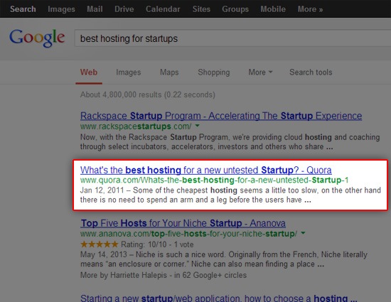
    <p>Like most tech entrepreneurs, your initial problem-solving action is to Google search for the new web host for your startup.</p>
    <p>You happen to come across a timely thread on Quora, a site you know is frequented by smart tech entrepreneurs like yourself.</p>
    <p><img src="http://cdn.sixrevisions.com/0342-02_google_search_result_quora.jpg" width="550" height="425" style="max-width: 100%; height: auto;"></p>
    <p>You get very excited because, within seconds, you’re off to a good start! You ask yourself, "No way, it <em>can’t be</em> this easy, can it?"</p>
    <p>You decide to check the Quora thread out.</p>
    <p>Yep, it turns out that it’s really <em>not</em> that easy (even though it should be).</p>
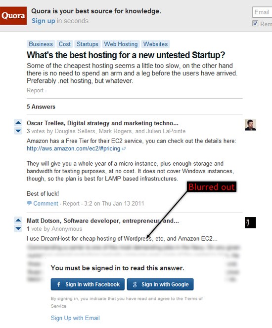
    <p>Sadly, you realize that the web page requires you to connect your Facebook account or else you won’t be able to see all the content that you’ve gone to the site for.</p>
    <p><img src="http://cdn.sixrevisions.com/0342-03_quora_facebook.jpg" width="550" height="455" style="max-width: 100%; height: auto;"></p>
    <p>If you choose not to sign in with your Facebook or Google account, only the first answer thread is shown.</p>
    <p>The rest of the thread is <em>frustratingly</em> blurred out. What a slap in the face.</p>
    <p><img src="http://cdn.sixrevisions.com/0342-04_quora_blurred_out.jpg" width="550" height="665" style="max-width: 100%; height: auto;"></p>
    <p>If that was your first time on the site — and the first thing they do to you is purposefully obscure the content you came for — wouldn’t that leave a terrible impression on you?</p>
    <p>Getting our users the content they ask for as quickly as possible should be our first priority as web designers. Anything that works against that goal should be cut out from our designs.</p>
    <p>There are plenty of other less obtrusive ways to display ads. There are design strategies, for example, that give users a choice of whether they want to interact with an ad or not — or at least a choice of quickly skipping/ignoring them — such as <a href="http://sixrevisions.com/design-showcase-inspiration/banner-ads-examples/" rel="nofollow external" class="bo">banner ads</a> on the sidebar.</p>
    <h3>Lack of Web Accessibility = Not All People Matter to You</h3>
    <p>Web accessibility needs to be <a href="http://sixrevisions.com/usabilityaccessibility/user-testing-web-accessibility/" title="User Testing for Web Accessibility" rel="nofollow external" class="bo">more widely embraced</a> by the web design industry.</p>
    <p>We need to focus our scope of web design innovation on <em>all</em> users, not just the users with expensive touch-screen smartphones.</p>
    <p>Web accessibility goes beyond just those with disabilities. People on older mobile devices or those with poor internet connectivity — the average global internet speed <a href="http://www.ispreview.co.uk/index.php/2013/04/average-world-broadband-speeds-top-2-9mbps-as-uk-scores-6-5mbps.html" rel="nofollow external" class="bo">is only 2.9Mbps</a>, less than half of U.S. average speed — also need to be included.</p>
    <p>Unless you want your website’s design to give off the impression that certain users matter to you more than others, then you want to have it crafted with good web accessibility features. Most <a href="http://sixrevisions.com/usabilityaccessibility/10-simple-web-accessibility-tips-you-can-do-today/" title="10 Simple Web Accessibility Tips You Can Do Today" rel="nofollow external" class="bo">web accessibility site features are relatively easy to implement and are already a part of good web design best practices.</a></p>
    <p>While there are many of us who would exclude users of a certain browser (like deliberately choosing <a href="http://sixrevisions.com/web-development/farewell-ie6/" title="Farewell IE6" rel="nofollow external" class="bo">not to support Internet Explorer 6</a> anymore) it’s not fair to punish users for something they aren’t able to control (such as color blindness).</p>
    <h3>Insufficient White Space = Readability of Content Doesn’t Matter</h3>
    <p>One thing that I see a lot of around the Internet (outside of <a href="http://sixrevisions.com/web_design/16-best-web-design-galleries-for-inspiration/" title="16 Best Web Design Galleries for Inspiration" rel="nofollow external" class="bo">web design galleries</a>, of course) is the lack of sufficient <a href="http://en.wikipedia.org/wiki/White_space_(visual_arts)" title="White space (visual arts) - en.wikipedia.org" rel="nofollow external" class="bo">white space</a> around content and images.</p>
    <p>White space is a powerful design tool. White space can spell the difference between making your content presentation <strong>pleasurable and easier to read</strong> or <strong>cramped and visually uncomfortable.</strong></p>
    <p>With content being king, we should take the (often very little) time to ensure that it gets the best form of delivery possible.</p>
    <p>For the purpose of illustration, look at how hard it is to read the block of text below:</p>
    <p><img src="http://cdn.sixrevisions.com/0342-06_ui_bad_whitespace.jpg" width="550" height="448" style="max-width: 100%; height: auto;"></p>
    <p>It’s hard to read because of poor letter-spacing, line-height, padding/gutters, and margin property values. These are very easy issues to fix, if your <a href="http://sixrevisions.com/css/css-typography-01/" title="CSS Typography: The Basics" rel="nofollow external" class="bo">CSS typography knowledge is up to speed.</a></p>
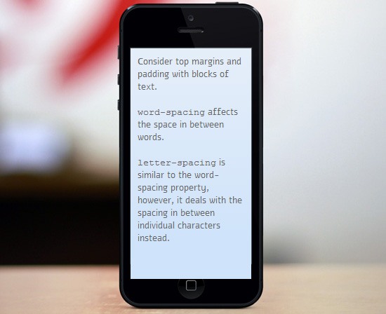
    <p>Within seconds, and with just a tad bit of padding, margin, and line-height property value adjustments, the same block of text becomes <strong>better</strong> in terms of legibility. The text is more pleasurable to read:</p>
    <p><img src="http://cdn.sixrevisions.com/0342-07_ui_good_whitespace.jpg" width="550" height="448" style="max-width: 100%; height: auto;"></p>
    <p>Your content is worth reading. Ensure that your message isn’t lost because of poor white spacing.</p>
    <p>Here’s a list of articles and guides to read. They all discuss the strategic use of white space in web design:</p>
    <ul>
    <li><a href="http://sixrevisions.com/web_design/negative-space-in-webpage-layouts-a-guide/" rel="nofollow external" class="bo">Negative Space in Webpage Layouts: A Guide</a></li>
    <li><a href="http://sixrevisions.com/web_design/the-art-of-distinction-in-web-design/" rel="nofollow external" class="bo">The Art of Distinction in Web Design</a></li>
    <li><a href="http://sixrevisions.com/web_design/gestalt-principles-applied-in-design/" rel="nofollow external" class="bo">Gestalt Principles Applied in Design</a></li>
    <li><a href="http://sixrevisions.com/graphics-design/visual-weight-designs/" rel="nofollow external" class="bo">Working with Visual Weight in Your Designs</a></li>
    <li><a href="http://sixrevisions.com/web_design/proxority-principle/" rel="nofollow external" class="bo">The Proxority Principle in Web Design</a></li>
    </ul>
    <h3>Useful 404 Error Pages = You Care About Keeping Users on the Site</h3>
    <p>Mistakes in entering the correct URL are made often.</p>
    <p>Some inbound links to your content may no longer exist, or may have been moved.</p>
    <p>Sometimes, certain web pages on your site just stop working because of technical issues.</p>
    <p>For events like these, we need to create and design a <a href="http://sixrevisions.com/design-showcase-inspiration/beautiful-and-useful-404-error-pages-for-inspiration/" rel="nofollow external" class="bo">useful 404 error page</a> — a page that doesn’t just restate what the user already knows (which is that they’ve lost their way).</p>
    <p>Some basic tips for designing <em>useful</em> error pages:</p>
    <ul>
    <li>Have a <strong>search form</strong> for users in case they want to try and find the web page</li>
    <li>Provide a way of <strong>contacting you</strong> for help</li>
    <li>
    <strong>Auto-suggest web pages</strong> that closely relate to the content they’re looking for</li>
    <li>Link to other <strong>web pages that list your content</strong> (e.g., Archive page, sitemap, help/support pages, etc.)</li>
    </ul>
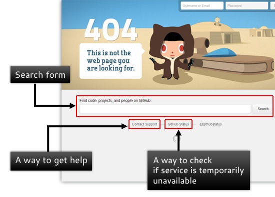
    <p>This is <a href="https://github.com/im_lost_on_this_site" rel="nofollow external" class="bo">GitHub’s 404 error page</a> (a good example of a <em>useful</em> 404 error page):</p>
    <p><img src="http://cdn.sixrevisions.com/0342-09_ui_useful_error_page.jpg" width="550" height="395" style="max-width: 100%; height: auto;"></p>
    <p>What makes GitHub’s error page <em>useful</em>?</p>
    <ul>
    <li>It has a search form that users can use to potentially navigate their way to the correct web page</li>
    <li>It has a link that allows website visitors to get assistance</li>
    <li>It has a link to a status page in case the visitor wants to see whether or not the site is just temporarily having issues</li>
    </ul>
    <p>If you don’t take steps to help users find the content they seek, then you’re just telling them that they should just go to another website to find it.</p>
    <h3>Poor Background/Foreground Contrast = Aesthetics Mean More than Legibility</h3>
    <p>Not providing enough color contrast between the background and the foreground is bad news for many users with low vision. What it says to your site visitors is that you have fallen prey to <em>form over function</em> mentality — that you care more about how the site and design looks over the actual content of the site itself.</p>
    <p>Here’s an example of what poor color contrast does to legibility:</p>
    <p><img src="http://cdn.sixrevisions.com/0342-10_poor_contrast_example.jpg" width="550" height="385" style="max-width: 100%; height: auto;"></p>
    <p>With just a few minor CSS tweaks — in this case, just changing the color property values of the &lt;h1&gt; and &lt;p&gt; elements — you can make the reading experience a bit better:</p>
    <p><img src="http://cdn.sixrevisions.com/0342-11_better_contrast_example.jpg" width="550" height="385" style="max-width: 100%; height: auto;"></p>
    <p>While there are tools like <a href="http://www.readability.com/" rel="nofollow external" class="bo">Readability</a> that will help your users take care of these issues for you, it’s your responsibility as a web designer to provide that easy reading experience to begin with.</p>
    <p><img src="http://cdn.sixrevisions.com/0342-12_readability_easy_reading.jpg" width="550" height="404" style="max-width: 100%; height: auto;"></p>
    <p>Take as much care as you can in creating a comfortable, visually pleasing content presentation. This encourages site visitors to consume whatever content you’re offering.</p>
    <p>If you’re concerned that your website’s design lacks enough color contrast, these articles are worth a read:</p>
    <ul>
    <li><a href="http://sixrevisions.com/usabilityaccessibility/14-brilliant-tools-for-evaluating-your-designs-colors/" rel="nofollow external" class="bo">14 Brilliant Tools for Evaluating Your Design’s Colors</a></li>
    <li><a href="http://sixrevisions.com/web-standards/accessibility_testtools/" rel="nofollow external" class="bo">10 Tools for Evaluating Web Design Accessibility</a></li>
    <li><a href="http://sixrevisions.com/css/colors-webdesign/" rel="nofollow external" class="bo">A Guide to CSS Colors in Web Design</a></li>
    </ul>
    <h3>No Engagement Features = Not Interested in What Users Have to Say</h3>
    <p>Providing methods for your users to be able to contact you says that you care deeply about their experience on your site.</p>
    <p>You’re saying that you value their feedback, whether it’s <a href="http://sixrevisions.com/project-management/6-quick-tips-for-receiving-critiques-gracefully/" title="6 Quick Tips for Receiving Critiques Gracefully" rel="nofollow external" class="bo">negative</a> or positive.</p>
    <p>Be it a commenting system, <a href="http://sixrevisions.com/wordpress/free-contact-form-plugins/" title="20 Free Contact Form Plugins for WordPress" rel="nofollow external" class="bo">contact form</a>, email, social networks, your <a href="http://sixrevisions.com/user-interface/website-help-systems/" title="Effective Website Help Systems: Tips and Examples" rel="nofollow external" class="bo">help and support forums</a>, a <a href="http://sixrevisions.com/tools/10-free-website-chat-widgets-to-make-your-site-interactive/" title="10 Free Website Chat Widgets to Make Your Site Interactive" rel="nofollow external" class="bo">live chat widget</a> — having these user engagement tools will show that you want to hear from them.</p>
    <p><img src="http://cdn.sixrevisions.com/0342-13_facebook_engagement.jpg" width="550" height="473" style="max-width: 100%; height: auto;"></p>
    <p>If you’re not providing them with opportunities of contacting you, then you’re effectively telling people that you don’t care about what they have to say.</p>
    <p><a href="http://sixrevisions.com/tools/10-excellent-feedback-tools-for-web-designers/" title="10 Excellent Feedback Tools for Web Designers" rel="nofollow external" class="bo">User feedback</a> is critical for fine-tuning and developing the UI and UX of your website, so keep your lines of communication open.</p>
    <h3>What Do You Say?</h3>
    <p>It’s your turn. <strong>What do <em>you</em> have to say about this article?</strong> Share it with us in the comments section below!</p>
    <h3>Related Content</h3>
    <ul>
    <li><a href="http://sixrevisions.com/user-interface/10-important-ui-design-considerations-for-web-apps/" rel="nofollow external" class="bo">10 Important UI Design Considerations for Web Apps</a></li>
    <li><a href="http://sixrevisions.com/user-interface/ux-design-mistakes/" rel="nofollow external" class="bo">Lessons We Learned from Our Biggest UX and Design Mistakes</a></li>
    <li><a href="http://sixrevisions.com/web_design/elements-clean-web-design/" rel="nofollow external" class="bo">The Elements of a Clean Web Design</a></li>
    <li>
    <em>Related categories</em>: <a href="http://sixrevisions.com/category/web_design/" rel="nofollow external" class="bo">Web Design</a> and <a href="http://sixrevisions.com/category/user-experience-ux/" rel="nofollow external" class="bo">UX</a>
    </li>
    </ul>
    <h3>About the Author</h3>
    <p><img src="http://cdn.sixrevisions.com/authors/artem_minayev_small.jpg" alt="" width="80" height="80" style="max-width: 100%; height: auto;"><span><strong>Artem Minayev</strong> is a brand manager for <a href="http://www.webhostinghub.com/" rel="nofollow external" class="bo">Web Hosting Hub</a>, which is a web hosting service for personal and small-business websites. Follow the company on Twitter <a href="https://twitter.com/webhostinghub" rel="nofollow external" class="bo">@webhostinghub</a> and <a href="https://plus.google.com/100699836350835346064/about" rel="nofollow external" class="bo">Google+</a>.</span></p>
    <p>The post <a href="http://sixrevisions.com/web_design/what-your-website-design-says/" rel="nofollow external" class="bo">What Your Website’s Design Says About You</a> appeared first on <a href="http://sixrevisions.com" rel="nofollow external" class="bo">Six Revisions</a>.</p>
    </div>
]]>
</Body>
<Summary>As web designers, we know that our work speaks to our users.   It’s that reason why we go about our work so deliberately; we choose colors, fonts, the type of web layout we’re going to use, and...</Summary>
<Website>http://feedproxy.google.com/~r/SixRevisions/~3/rrzFyR5QWKo/</Website>
<TrackingUrl>https://my3.my.umbc.edu/api/v0/pixel/news/30693/guest@my.umbc.edu/2eeb1e8d02ef80387c5787cae44dfda4/api/pixel</TrackingUrl>
<Tag>css</Tag>
<Tag>database</Tag>
<Tag>design</Tag>
<Tag>development</Tag>
<Tag>html</Tag>
<Tag>javascript</Tag>
<Tag>mysql</Tag>
<Tag>sql</Tag>
<Tag>web</Tag>
<Tag>web-design</Tag>
<Group token="retired-583">Web Developer - Build Group</Group>
<GroupUrl>https://my3.my.umbc.edu/groups/retired-583</GroupUrl>
<AvatarUrl>https://assets3-my.umbc.edu/system/shared/avatars/groups/000/000/583/fc60f5d7abc2e080599bb6dc465db54d/xsmall.png?1363101197</AvatarUrl>
<AvatarUrl size="original">https://assets4-my.umbc.edu/system/shared/avatars/groups/000/000/583/fc60f5d7abc2e080599bb6dc465db54d/original.jpg?1363101197</AvatarUrl>
<AvatarUrl size="xxlarge">https://assets4-my.umbc.edu/system/shared/avatars/groups/000/000/583/fc60f5d7abc2e080599bb6dc465db54d/xxlarge.png?1363101197</AvatarUrl>
<AvatarUrl size="xlarge">https://assets4-my.umbc.edu/system/shared/avatars/groups/000/000/583/fc60f5d7abc2e080599bb6dc465db54d/xlarge.png?1363101197</AvatarUrl>
<AvatarUrl size="large">https://assets3-my.umbc.edu/system/shared/avatars/groups/000/000/583/fc60f5d7abc2e080599bb6dc465db54d/large.png?1363101197</AvatarUrl>
<AvatarUrl size="medium">https://assets3-my.umbc.edu/system/shared/avatars/groups/000/000/583/fc60f5d7abc2e080599bb6dc465db54d/medium.png?1363101197</AvatarUrl>
<AvatarUrl size="small">https://assets4-my.umbc.edu/system/shared/avatars/groups/000/000/583/fc60f5d7abc2e080599bb6dc465db54d/small.png?1363101197</AvatarUrl>
<AvatarUrl size="xsmall">https://assets3-my.umbc.edu/system/shared/avatars/groups/000/000/583/fc60f5d7abc2e080599bb6dc465db54d/xsmall.png?1363101197</AvatarUrl>
<AvatarUrl size="xxsmall">https://assets4-my.umbc.edu/system/shared/avatars/groups/000/000/583/fc60f5d7abc2e080599bb6dc465db54d/xxsmall.png?1363101197</AvatarUrl>
<Sponsor>Web Developer - Build Group</Sponsor>
<PawCount>0</PawCount>
<CommentCount>0</CommentCount>
<CommentsAllowed>true</CommentsAllowed>
<PostedAt>Mon, 03 Jun 2013 06:00:51 -0400</PostedAt>
<EditAt>Mon, 03 Jun 2013 06:00:51 -0400</EditAt>
</NewsItem>

<NewsItem contentIssues="true" id="30692" important="false" status="posted" url="https://my3.my.umbc.edu/posts/30692">
<Title>Perfection in a portfolio; a web design showcase</Title>
<Body>
<![CDATA[
    <div class="html-content">
    <p><img alt="thumbnail" src="http://netdna.webdesignerdepot.com/uploads/2013/05/thumbnail35.jpg" width="200" height="160" style="max-width: 100%; height: auto;">Web design is a subtle science that is lost to most who are not in the field. The amount of choices that go into building the perfect presentation for the content the client has to offer are so vast, that often the best way to demonstrate the full scope of this spectrum is to showcase a particular type of focused site. Through the multitude of examples one can begin to see how thematically similar yet still so different and complex these designs are.</p>
    <p>Today, we intend to do just that. By showcasing a handful of portfolio websites, we can see how the depth of design choices and techniques can really separate these examples all built to showcase the work of an artist or designer. Even with their common mission, and even at times structural parallels, they still stand apart and each in their own unique ways encapsulate what a portfolio should be.</p>
    <h1>Oven Bits</h1>
    <p><a href="http://ovenbits.com/work" rel="nofollow external" class="bo">Oven Bits</a> is the home and portfolio of the creative web and mobile design agency of the same name. The portfolio adheres brilliantly to the first rule of any portfolio design. To compliment and highlight the work being showcased without in any way stealing focus from it.</p>
    <p><a href="http://ovenbits.com/work" rel="nofollow external" class="bo"><img src="http://netdna.webdesignerdepot.com/uploads/2013/05/ovenbits.jpg" width="650" alt="Perfection in a portfolio; a web design showcase" style="max-width: 100%; height: auto;"></a></p>
    <p> </p>
    <h1>Robbie Leonardi</h1>
    <p><a href="http://www.rleonardi.com/" rel="nofollow external" class="bo">Robbie Leonardi</a>‘s portfolio is a bright and bold example of how an illustrator and front end web developer can showcase their skills more potently through the colorful and over-sized presentation of the work they have done for their clients, than strictly with the examples of the work itself. However,  there are some issues with the site not fitting completely in my laptop browser window which cut off the info for each piece.</p>
    <p><a href="http://www.rleonardi.com/" rel="nofollow external" class="bo"><img src="http://netdna.webdesignerdepot.com/uploads/2013/05/rleonardi.jpg" width="650" alt="Perfection in a portfolio; a web design showcase" style="max-width: 100%; height: auto;"></a></p>
    <p> </p>
    <h1>Bec Winnel</h1>
    <p><a href="http://becwinnel.com/gallery/" rel="nofollow external" class="bo">Bec Winnel</a>‘s portfolio is breathtakingly subtle in its presentation. It perfectly incorporates the artist’s work into the design, furthering how well the design compliments the tone and technique of the artist herself. The soft, delicate nature of the paintings translates flawlessly through the design.</p>
    <p><a href="http://becwinnel.com/gallery/" rel="nofollow external" class="bo"><img src="http://netdna.webdesignerdepot.com/uploads/2013/05/becwinnel.jpg" width="650" alt="Perfection in a portfolio; a web design showcase" style="max-width: 100%; height: auto;"></a></p>
    <p> </p>
    <h1>Kris Kuksi</h1>
    <p><a href="http://www.kuksi.com/artworks/" rel="nofollow external" class="bo">Kris Kuksi</a> has a portfolio which is classically styled and textured to accentuate the diverse and intricate nature of the artist’s own creative voice. It does so with such lightness, that the design, while so complimentary and well done, really does fade from the radar as the works stand out. Quite literally in some instances, as the portfolio pieces open in full screen giving total focus to each piece being highlighted.</p>
    <p><a href="http://www.kuksi.com/artworks/" rel="nofollow external" class="bo"><img src="http://netdna.webdesignerdepot.com/uploads/2013/05/kuksi.jpg" width="650" alt="Perfection in a portfolio; a web design showcase" style="max-width: 100%; height: auto;"></a></p>
    <p> </p>
    <h1>Jeremi Chenier</h1>
    <p>The portfolio of graphic designer <a href="http://www.jeremitotal.com/" rel="nofollow external" class="bo">Jeremi Chenier</a> puts a minimalistic approach to work, with fantastic execution showcasing his bold and colorful gallery of designs. This stark contrast between the simplistic nature of the site and the depth and richness of his work creates a powerful presentation.</p>
    <p><a href="http://www.jeremitotal.com/" rel="nofollow external" class="bo"><img src="http://netdna.webdesignerdepot.com/uploads/2013/05/jeremitotal.jpg" width="650" alt="Perfection in a portfolio; a web design showcase" style="max-width: 100%; height: auto;"></a></p>
    <p> </p>
    <h1>Dimitris Theocharis</h1>
    <p><a href="http://www.dimitristheocharis.com/" rel="nofollow external" class="bo">Dimitris Theocharis</a>‘ photography portfolio is the epitome of minimalism in web design from the lightweight navigation down to the images that don’t resize, but instead scroll along a single plane. All the focus is strictly and tightly placed squarely on the work of the artist. The unassuming, pale color scheme allows the deep colors of the images to really pop.</p>
    <p><a href="http://www.dimitristheocharis.com/" rel="nofollow external" class="bo"><img src="http://netdna.webdesignerdepot.com/uploads/2013/05/theocharis.jpg" width="650" alt="Perfection in a portfolio; a web design showcase" style="max-width: 100%; height: auto;"></a></p>
    <p> </p>
    <h1>Alex Rodriguez</h1>
    <p><a href="http://www.itsajackal.com/paintings.htm" rel="nofollow external" class="bo">Alex Rodriguez</a>‘s digital home for the painter’s traditional art is crafted with the same attitude and muted tones that fill the artist’s work. The textures even manage to help feed and carry the melancholy that exudes from the painter’s vivid and daring gallery.</p>
    <p><a href="http://www.itsajackal.com/paintings.htm" rel="nofollow external" class="bo"><img src="http://netdna.webdesignerdepot.com/uploads/2013/05/itsajackal.jpg" width="650" alt="Perfection in a portfolio; a web design showcase" style="max-width: 100%; height: auto;"></a></p>
    <p> </p>
    <h1>Charlotte Tang</h1>
    <p><a href="http://charlottetang.com/" rel="nofollow external" class="bo">Charlotte Tang</a> has the portfolio one would expect a self-proclaimed interactive design ninja extraordinaire to have. This clean, and oh so sharp  design doesn’t rely on JavaScript loaded delivery of the individual portfolio pieces. Instead, each piece is given its own page with closeups and info to really allow the user to interact and engage with various elements from each piece.</p>
    <p><a href="http://charlottetang.com/" rel="nofollow external" class="bo"><img src="http://netdna.webdesignerdepot.com/uploads/2013/05/charlottetang.jpg" width="650" alt="Perfection in a portfolio; a web design showcase" style="max-width: 100%; height: auto;"></a></p>
    <p> </p>
    <h1>Nicolas Tarier</h1>
    <p>The portfolio of photographer <a href="http://www.nicolastarierphotography.com/" rel="nofollow external" class="bo">Nicolas Tarier</a> is large and bold, removing almost all instances of whitespace from the design to give the work and user complete and unfettered access to one another. The large single loaded image displays work brilliantly to place focus onto the work itself.</p>
    <p><a href="http://www.nicolastarierphotography.com/" rel="nofollow external" class="bo"><img src="http://netdna.webdesignerdepot.com/uploads/2013/05/nicolastarier.jpg" width="650" alt="Perfection in a portfolio; a web design showcase" style="max-width: 100%; height: auto;"></a></p>
    <p> </p>
    <h1>My Poor Brain</h1>
    <p><a href="http://www.mypoorbrain.com/" rel="nofollow external" class="bo">My Poor Brain</a> is the digital home and portfolio of London based Graphic Designer and Illustrator, Tim. The design, much like the work and man behind it, relies on no bells and whistles to highlight the work. It speaks for itself, and the design simply steps aside and allows that to happen. It is straightforward and places the onus of the presentation on the work,  just as it should.</p>
    <p><a href="http://www.mypoorbrain.com/" rel="nofollow external" class="bo"><img src="http://netdna.webdesignerdepot.com/uploads/2013/05/mypoorbrain.jpg" width="650" alt="Perfection in a portfolio; a web design showcase" style="max-width: 100%; height: auto;"></a></p>
    <p> </p>
    <h1>Malet &amp; Co.</h1>
    <p>The portfolio for the Illustration Agency  <a href="http://www.malet.co/" rel="nofollow external" class="bo">Malet &amp; Co.</a> pours whitespace all throughout the design to let the work pop right up off of the background. The pages that deliver each of the pieces keeps the minimalism firmly in place so that at no time does the user’s focus break from the illustrations presented.</p>
    <p><a href="http://www.malet.co/" rel="nofollow external" class="bo"><img src="http://netdna.webdesignerdepot.com/uploads/2013/05/malet.jpg" width="650" alt="Perfection in a portfolio; a web design showcase" style="max-width: 100%; height: auto;"></a></p>
    <p> </p>
    <h1>Mark Ryden</h1>
    <p><a href="http://www.markryden.com/paintings/index.html" rel="nofollow external" class="bo">Mark Ryden</a>‘s portfolio is as bells-bare and frills-free as they come, but when one has an established name and reputation backing it, the work speaks volumes on its own. Any elements beyond the navigation would simply get in the way. The emotive and often solemn work has a much greater impact against the sparse surroundings.</p>
    <p><a href="http://www.markryden.com/paintings/index.html" rel="nofollow external" class="bo"><img src="http://netdna.webdesignerdepot.com/uploads/2013/05/markryden.jpg" width="650" alt="Perfection in a portfolio; a web design showcase" style="max-width: 100%; height: auto;"></a></p>
    <p> </p>
    <h1>Stefan Glerum</h1>
    <p><a href="http://www.stefanglerum.com/" rel="nofollow external" class="bo">Stefan Glerum</a>‘s porfolio is another fine example of the site design stepping aside and allowing the illustrative works being featured to boldly shine free of its grip. The audacious pieces each reside on their own individual pages where they can be further explored and examined in detail.</p>
    <p><a href="http://www.stefanglerum.com/" rel="nofollow external" class="bo"><img src="http://netdna.webdesignerdepot.com/uploads/2013/05/stefanglerum.jpg" width="650" alt="Perfection in a portfolio; a web design showcase" style="max-width: 100%; height: auto;"></a></p>
    <p> </p>
    <h1>Jesse Willmon</h1>
    <p><a href="http://www.jessewillmon.com/web_index.php" rel="nofollow external" class="bo">Jesse Willmon</a>‘s design and illustration portfolio is one of the more unique design presentations that we have seen throughout the showcase. Unique enough to earn a place in the post, even if the project navigation extends far below most of the project images featured in the portfolio. The playful nature of the site wonderfully compliments the designer’s own style and voice.</p>
    <p><a href="http://www.jessewillmon.com/web_index.php" rel="nofollow external" class="bo"><img src="http://netdna.webdesignerdepot.com/uploads/2013/05/jessewillmon.jpg" width="650" alt="Perfection in a portfolio; a web design showcase" style="max-width: 100%; height: auto;"></a></p>
    <p> </p>
    <h1>Lapin</h1>
    <p>The portfolio of French illustrator and artist <a href="http://www.lesillustrationsdelapin.com/" rel="nofollow external" class="bo">Lapin</a> is as clean and sharply designed and organized as the artist’s intricate illustrations. A perfect companion to the style and spirited tone of the artist’s work, as the design subtly serves up its offerings to the user.</p>
    <p><a href="http://www.lesillustrationsdelapin.com/" rel="nofollow external" class="bo"><img src="http://netdna.webdesignerdepot.com/uploads/2013/05/lapin.jpg" width="650" alt="Perfection in a portfolio; a web design showcase" style="max-width: 100%; height: auto;"></a></p>
    <p> </p>
    <p><em><strong>Which of these portfolios did you find most inspiring? Does yours belong here? Let us know in the comments.</strong></em></p>
    <p><br><br>
    </p>
    <table width="100%">
    <tbody>
    <tr>
    <td>
          <a href="http://www.mightydeals.com/deal/otama-font-family.html?ref=inwidget" rel="nofollow external" class="bo"><strong>OTAMA Font Family (with 20+ Font Styles) – from $37!</strong></a>
        </td>
    <td>
          <a href="http://www.mightydeals.com/?ref=inwidget" rel="nofollow external" class="bo"><br>
            <img src="http://mightydeals.com/web/images/widget-logo.png" height="40" width="90" alt="Perfection in a portfolio; a web design showcase" style="max-width: 100%; height: auto;"><br>
          </a>
        </td>
    </tr>
    </tbody>
    </table>
    <p><br> </p>
    <a href="http://www.webdesignerdepot.com/2013/06/perfection-in-a-portfolio-a-web-design-showcase/" rel="nofollow external" class="bo">Source</a>
    </div>
]]>
</Body>
<Summary>Web design is a subtle science that is lost to most who are not in the field. The amount of choices that go into building the perfect presentation for the content the client has to offer are so...</Summary>
<Website>http://www.webdesignerdepot.com/2013/06/perfection-in-a-portfolio-a-web-design-showcase/</Website>
<TrackingUrl>https://my3.my.umbc.edu/api/v0/pixel/news/30692/guest@my.umbc.edu/5684b30f891731b07138c2b6c40ae844/api/pixel</TrackingUrl>
<Tag>art</Tag>
<Tag>best-online-portfolios</Tag>
<Tag>cool-web-portfolios</Tag>
<Tag>css</Tag>
<Tag>design</Tag>
<Tag>development</Tag>
<Tag>hot-portfolios</Tag>
<Tag>how-to-design-a-portfolio</Tag>
<Tag>html</Tag>
<Tag>html5</Tag>
<Tag>illustrator</Tag>
<Tag>inspiration</Tag>
<Tag>inspiring-portfolios</Tag>
<Tag>javascript</Tag>
<Tag>mysql</Tag>
<Tag>oracle</Tag>
<Tag>photoshop</Tag>
<Tag>php</Tag>
<Tag>portfolios</Tag>
<Tag>sql</Tag>
<Tag>web-design</Tag>
<Group token="retired-583">Web Developer - Build Group</Group>
<GroupUrl>https://my3.my.umbc.edu/groups/retired-583</GroupUrl>
<AvatarUrl>https://assets3-my.umbc.edu/system/shared/avatars/groups/000/000/583/fc60f5d7abc2e080599bb6dc465db54d/xsmall.png?1363101197</AvatarUrl>
<AvatarUrl size="original">https://assets4-my.umbc.edu/system/shared/avatars/groups/000/000/583/fc60f5d7abc2e080599bb6dc465db54d/original.jpg?1363101197</AvatarUrl>
<AvatarUrl size="xxlarge">https://assets4-my.umbc.edu/system/shared/avatars/groups/000/000/583/fc60f5d7abc2e080599bb6dc465db54d/xxlarge.png?1363101197</AvatarUrl>
<AvatarUrl size="xlarge">https://assets4-my.umbc.edu/system/shared/avatars/groups/000/000/583/fc60f5d7abc2e080599bb6dc465db54d/xlarge.png?1363101197</AvatarUrl>
<AvatarUrl size="large">https://assets3-my.umbc.edu/system/shared/avatars/groups/000/000/583/fc60f5d7abc2e080599bb6dc465db54d/large.png?1363101197</AvatarUrl>
<AvatarUrl size="medium">https://assets3-my.umbc.edu/system/shared/avatars/groups/000/000/583/fc60f5d7abc2e080599bb6dc465db54d/medium.png?1363101197</AvatarUrl>
<AvatarUrl size="small">https://assets4-my.umbc.edu/system/shared/avatars/groups/000/000/583/fc60f5d7abc2e080599bb6dc465db54d/small.png?1363101197</AvatarUrl>
<AvatarUrl size="xsmall">https://assets3-my.umbc.edu/system/shared/avatars/groups/000/000/583/fc60f5d7abc2e080599bb6dc465db54d/xsmall.png?1363101197</AvatarUrl>
<AvatarUrl size="xxsmall">https://assets4-my.umbc.edu/system/shared/avatars/groups/000/000/583/fc60f5d7abc2e080599bb6dc465db54d/xxsmall.png?1363101197</AvatarUrl>
<Sponsor>Web Developer - Build Group</Sponsor>
<PawCount>0</PawCount>
<CommentCount>0</CommentCount>
<CommentsAllowed>true</CommentsAllowed>
<PostedAt>Mon, 03 Jun 2013 05:15:39 -0400</PostedAt>
<EditAt>Mon, 03 Jun 2013 05:15:39 -0400</EditAt>
</NewsItem>

<NewsItem contentIssues="true" id="31125" important="false" status="posted" url="https://my3.my.umbc.edu/posts/31125">
<Title>Perfection in a portfolio; a web design showcase</Title>
<Body>
<![CDATA[
    <div class="html-content">
    <p><img alt="thumbnail" src="http://netdna.webdesignerdepot.com/uploads/2013/05/thumbnail35.jpg" width="200" height="160" style="max-width: 100%; height: auto;">Web design is a subtle science that is lost to most who are not in the field. The amount of choices that go into building the perfect presentation for the content the client has to offer are so vast, that often the best way to demonstrate the full scope of this spectrum is to showcase a particular type of focused site. Through the multitude of examples one can begin to see how thematically similar yet still so different and complex these designs are.</p> <p>Today, we intend to do just that. By showcasing a handful of portfolio websites, we can see how the depth of design choices and techniques can really separate these examples all built to showcase the work of an artist or designer. Even with their common mission, and even at times structural parallels, they still stand apart and each in their own unique ways encapsulate what a portfolio should be.</p> <h1>Oven Bits</h1> <p><a href="http://ovenbits.com/work" rel="nofollow external" class="bo">Oven Bits</a> is the home and portfolio of the creative web and mobile design agency of the same name. The portfolio adheres brilliantly to the first rule of any portfolio design. To compliment and highlight the work being showcased without in any way stealing focus from it.</p> <p><a href="http://ovenbits.com/work" rel="nofollow external" class="bo"><img src="http://netdna.webdesignerdepot.com/uploads/2013/05/ovenbits.jpg" width="650" alt="Perfection in a portfolio; a web design showcase" style="max-width: 100%; height: auto;"></a></p> <p> </p> <h1>Robbie Leonardi</h1> <p><a href="http://www.rleonardi.com/" rel="nofollow external" class="bo">Robbie Leonardi</a>‘s portfolio is a bright and bold example of how an illustrator and front end web developer can showcase their skills more potently through the colorful and over-sized presentation of the work they have done for their clients, than strictly with the examples of the work itself. However,  there are some issues with the site not fitting completely in my laptop browser window which cut off the info for each piece.</p> <p><a href="http://www.rleonardi.com/" rel="nofollow external" class="bo"><img src="http://netdna.webdesignerdepot.com/uploads/2013/05/rleonardi.jpg" width="650" alt="Perfection in a portfolio; a web design showcase" style="max-width: 100%; height: auto;"></a></p> <p> </p> <h1>Bec Winnel</h1> <p><a href="http://becwinnel.com/gallery/" rel="nofollow external" class="bo">Bec Winnel</a>‘s portfolio is breathtakingly subtle in its presentation. It perfectly incorporates the artist’s work into the design, furthering how well the design compliments the tone and technique of the artist herself. The soft, delicate nature of the paintings translates flawlessly through the design.</p> <p><a href="http://becwinnel.com/gallery/" rel="nofollow external" class="bo"><img src="http://netdna.webdesignerdepot.com/uploads/2013/05/becwinnel.jpg" width="650" alt="Perfection in a portfolio; a web design showcase" style="max-width: 100%; height: auto;"></a></p> <p> </p> <h1>Kris Kuksi</h1> <p><a href="http://www.kuksi.com/artworks/" rel="nofollow external" class="bo">Kris Kuksi</a> has a portfolio which is classically styled and textured to accentuate the diverse and intricate nature of the artist’s own creative voice. It does so with such lightness, that the design, while so complimentary and well done, really does fade from the radar as the works stand out. Quite literally in some instances, as the portfolio pieces open in full screen giving total focus to each piece being highlighted.</p> <p><a href="http://www.kuksi.com/artworks/" rel="nofollow external" class="bo"><img src="http://netdna.webdesignerdepot.com/uploads/2013/05/kuksi.jpg" width="650" alt="Perfection in a portfolio; a web design showcase" style="max-width: 100%; height: auto;"></a></p> <p> </p> <h1>Jeremi Chenier</h1> <p>The portfolio of graphic designer <a href="http://www.jeremitotal.com/" rel="nofollow external" class="bo">Jeremi Chenier</a> puts a minimalistic approach to work, with fantastic execution showcasing his bold and colorful gallery of designs. This stark contrast between the simplistic nature of the site and the depth and richness of his work creates a powerful presentation.</p> <p><a href="http://www.jeremitotal.com/" rel="nofollow external" class="bo"><img src="http://netdna.webdesignerdepot.com/uploads/2013/05/jeremitotal.jpg" width="650" alt="Perfection in a portfolio; a web design showcase" style="max-width: 100%; height: auto;"></a></p> <p> </p> <h1>Dimitris Theocharis</h1> <p><a href="http://www.dimitristheocharis.com/" rel="nofollow external" class="bo">Dimitris Theocharis</a>‘ photography portfolio is the epitome of minimalism in web design from the lightweight navigation down to the images that don’t resize, but instead scroll along a single plane. All the focus is strictly and tightly placed squarely on the work of the artist. The unassuming, pale color scheme allows the deep colors of the images to really pop.</p> <p><a href="http://www.dimitristheocharis.com/" rel="nofollow external" class="bo"><img src="http://netdna.webdesignerdepot.com/uploads/2013/05/theocharis.jpg" width="650" alt="Perfection in a portfolio; a web design showcase" style="max-width: 100%; height: auto;"></a></p> <p> </p> <h1>Alex Rodriguez</h1> <p><a href="http://www.itsajackal.com/paintings.htm" rel="nofollow external" class="bo">Alex Rodriguez</a>‘s digital home for the painter’s traditional art is crafted with the same attitude and muted tones that fill the artist’s work. The textures even manage to help feed and carry the melancholy that exudes from the painter’s vivid and daring gallery.</p> <p><a href="http://www.itsajackal.com/paintings.htm" rel="nofollow external" class="bo"><img src="http://netdna.webdesignerdepot.com/uploads/2013/05/itsajackal.jpg" width="650" alt="Perfection in a portfolio; a web design showcase" style="max-width: 100%; height: auto;"></a></p> <p> </p> <h1>Charlotte Tang</h1> <p><a href="http://charlottetang.com/" rel="nofollow external" class="bo">Charlotte Tang</a> has the portfolio one would expect a self-proclaimed interactive design ninja extraordinaire to have. This clean, and oh so sharp  design doesn’t rely on JavaScript loaded delivery of the individual portfolio pieces. Instead, each piece is given its own page with closeups and info to really allow the user to interact and engage with various elements from each piece.</p> <p><a href="http://charlottetang.com/" rel="nofollow external" class="bo"><img src="http://netdna.webdesignerdepot.com/uploads/2013/05/charlottetang.jpg" width="650" alt="Perfection in a portfolio; a web design showcase" style="max-width: 100%; height: auto;"></a></p> <p> </p> <h1>Nicolas Tarier</h1> <p>The portfolio of photographer <a href="http://www.nicolastarierphotography.com/" rel="nofollow external" class="bo">Nicolas Tarier</a> is large and bold, removing almost all instances of whitespace from the design to give the work and user complete and unfettered access to one another. The large single loaded image displays work brilliantly to place focus onto the work itself.</p> <p><a href="http://www.nicolastarierphotography.com/" rel="nofollow external" class="bo"><img src="http://netdna.webdesignerdepot.com/uploads/2013/05/nicolastarier.jpg" width="650" alt="Perfection in a portfolio; a web design showcase" style="max-width: 100%; height: auto;"></a></p> <p> </p> <h1>My Poor Brain</h1> <p><a href="http://www.mypoorbrain.com/" rel="nofollow external" class="bo">My Poor Brain</a> is the digital home and portfolio of London based Graphic Designer and Illustrator, Tim. The design, much like the work and man behind it, relies on no bells and whistles to highlight the work. It speaks for itself, and the design simply steps aside and allows that to happen. It is straightforward and places the onus of the presentation on the work,  just as it should.</p> <p><a href="http://www.mypoorbrain.com/" rel="nofollow external" class="bo"><img src="http://netdna.webdesignerdepot.com/uploads/2013/05/mypoorbrain.jpg" width="650" alt="Perfection in a portfolio; a web design showcase" style="max-width: 100%; height: auto;"></a></p> <p> </p> <h1>Malet &amp; Co.</h1> <p>The portfolio for the Illustration Agency  <a href="http://www.malet.co/" rel="nofollow external" class="bo">Malet &amp; Co.</a> pours whitespace all throughout the design to let the work pop right up off of the background. The pages that deliver each of the pieces keeps the minimalism firmly in place so that at no time does the user’s focus break from the illustrations presented.</p> <p><a href="http://www.malet.co/" rel="nofollow external" class="bo"><img src="http://netdna.webdesignerdepot.com/uploads/2013/05/malet.jpg" width="650" alt="Perfection in a portfolio; a web design showcase" style="max-width: 100%; height: auto;"></a></p> <p> </p> <h1>Mark Ryden</h1> <p><a href="http://www.markryden.com/paintings/index.html" rel="nofollow external" class="bo">Mark Ryden</a>‘s portfolio is as bells-bare and frills-free as they come, but when one has an established name and reputation backing it, the work speaks volumes on its own. Any elements beyond the navigation would simply get in the way. The emotive and often solemn work has a much greater impact against the sparse surroundings.</p> <p><a href="http://www.markryden.com/paintings/index.html" rel="nofollow external" class="bo"><img src="http://netdna.webdesignerdepot.com/uploads/2013/05/markryden.jpg" width="650" alt="Perfection in a portfolio; a web design showcase" style="max-width: 100%; height: auto;"></a></p> <p> </p> <h1>Stefan Glerum</h1> <p><a href="http://www.stefanglerum.com/" rel="nofollow external" class="bo">Stefan Glerum</a>‘s porfolio is another fine example of the site design stepping aside and allowing the illustrative works being featured to boldly shine free of its grip. The audacious pieces each reside on their own individual pages where they can be further explored and examined in detail.</p> <p><a href="http://www.stefanglerum.com/" rel="nofollow external" class="bo"><img src="http://netdna.webdesignerdepot.com/uploads/2013/05/stefanglerum.jpg" width="650" alt="Perfection in a portfolio; a web design showcase" style="max-width: 100%; height: auto;"></a></p> <p> </p> <h1>Jesse Willmon</h1> <p><a href="http://www.jessewillmon.com/web_index.php" rel="nofollow external" class="bo">Jesse Willmon</a>‘s design and illustration portfolio is one of the more unique design presentations that we have seen throughout the showcase. Unique enough to earn a place in the post, even if the project navigation extends far below most of the project images featured in the portfolio. The playful nature of the site wonderfully compliments the designer’s own style and voice.</p> <p><a href="http://www.jessewillmon.com/web_index.php" rel="nofollow external" class="bo"><img src="http://netdna.webdesignerdepot.com/uploads/2013/05/jessewillmon.jpg" width="650" alt="Perfection in a portfolio; a web design showcase" style="max-width: 100%; height: auto;"></a></p> <p> </p> <h1>Lapin</h1> <p>The portfolio of French illustrator and artist <a href="http://www.lesillustrationsdelapin.com/" rel="nofollow external" class="bo">Lapin</a> is as clean and sharply designed and organized as the artist’s intricate illustrations. A perfect companion to the style and spirited tone of the artist’s work, as the design subtly serves up its offerings to the user.</p> <p><a href="http://www.lesillustrationsdelapin.com/" rel="nofollow external" class="bo"><img src="http://netdna.webdesignerdepot.com/uploads/2013/05/lapin.jpg" width="650" alt="Perfection in a portfolio; a web design showcase" style="max-width: 100%; height: auto;"></a></p> <p> </p> <p><em><strong>Which of these portfolios did you find most inspiring? Does yours belong here? Let us know in the comments.</strong></em></p> <p><br><br> </p>
    <table width="100%"> <tbody>
    <tr> <td> <a href="http://www.mightydeals.com/deal/otama-font-family.html?ref=inwidget" rel="nofollow external" class="bo"><strong>OTAMA Font Family (with 20+ Font Styles) – from $37!</strong></a> </td> <td> <a href="http://www.mightydeals.com/?ref=inwidget" rel="nofollow external" class="bo"><br> <img src="http://mightydeals.com/web/images/widget-logo.png" height="40" width="90" alt="Perfection in a portfolio; a web design showcase" style="max-width: 100%; height: auto;"><br> </a> </td> </tr> </tbody>
    </table> <p><br> </p> <a href="http://www.webdesignerdepot.com/2013/06/perfection-in-a-portfolio-a-web-design-showcase/" rel="nofollow external" class="bo">Source</a> <br><br><a href="http://da.feedsportal.com/r/165665677594/u/49/f/661066/c/35285/s/2cc3925b/a2.htm" rel="nofollow external" class="bo"><img src="http://da.feedsportal.com/r/165665677594/u/49/f/661066/c/35285/s/2cc3925b/a2.img" style="max-width: 100%; height: auto;"></a>
    </div>
]]>
</Body>
<Summary>Web design is a subtle science that is lost to most who are not in the field. The amount of choices that go into building the perfect presentation for the content the client has to offer are so...</Summary>
<Website>http://rss.feedsportal.com/c/35285/f/661066/s/2cc3925b/l/0L0Swebdesignerdepot0N0C20A130C0A60Cperfection0Ein0Ea0Eportfolio0Ea0Eweb0Edesign0Eshowcase0C/story01.htm</Website>
<TrackingUrl>https://my3.my.umbc.edu/api/v0/pixel/news/31125/guest@my.umbc.edu/59205c11c18ddcbad25c89c4489d42d6/api/pixel</TrackingUrl>
<Tag>art</Tag>
<Tag>best-online-portfolios</Tag>
<Tag>cool-web-portfolios</Tag>
<Tag>css</Tag>
<Tag>design</Tag>
<Tag>development</Tag>
<Tag>hot-portfolios</Tag>
<Tag>how-to-design-a-portfolio</Tag>
<Tag>html</Tag>
<Tag>html5</Tag>
<Tag>illustrator</Tag>
<Tag>inspiration</Tag>
<Tag>inspiring-portfolios</Tag>
<Tag>javascript</Tag>
<Tag>mysql</Tag>
<Tag>oracle</Tag>
<Tag>photoshop</Tag>
<Tag>php</Tag>
<Tag>portfolios</Tag>
<Tag>sql</Tag>
<Tag>web-design</Tag>
<Group token="retired-583">Web Developer - Build Group</Group>
<GroupUrl>https://my3.my.umbc.edu/groups/retired-583</GroupUrl>
<AvatarUrl>https://assets3-my.umbc.edu/system/shared/avatars/groups/000/000/583/fc60f5d7abc2e080599bb6dc465db54d/xsmall.png?1363101197</AvatarUrl>
<AvatarUrl size="original">https://assets4-my.umbc.edu/system/shared/avatars/groups/000/000/583/fc60f5d7abc2e080599bb6dc465db54d/original.jpg?1363101197</AvatarUrl>
<AvatarUrl size="xxlarge">https://assets4-my.umbc.edu/system/shared/avatars/groups/000/000/583/fc60f5d7abc2e080599bb6dc465db54d/xxlarge.png?1363101197</AvatarUrl>
<AvatarUrl size="xlarge">https://assets4-my.umbc.edu/system/shared/avatars/groups/000/000/583/fc60f5d7abc2e080599bb6dc465db54d/xlarge.png?1363101197</AvatarUrl>
<AvatarUrl size="large">https://assets3-my.umbc.edu/system/shared/avatars/groups/000/000/583/fc60f5d7abc2e080599bb6dc465db54d/large.png?1363101197</AvatarUrl>
<AvatarUrl size="medium">https://assets3-my.umbc.edu/system/shared/avatars/groups/000/000/583/fc60f5d7abc2e080599bb6dc465db54d/medium.png?1363101197</AvatarUrl>
<AvatarUrl size="small">https://assets4-my.umbc.edu/system/shared/avatars/groups/000/000/583/fc60f5d7abc2e080599bb6dc465db54d/small.png?1363101197</AvatarUrl>
<AvatarUrl size="xsmall">https://assets3-my.umbc.edu/system/shared/avatars/groups/000/000/583/fc60f5d7abc2e080599bb6dc465db54d/xsmall.png?1363101197</AvatarUrl>
<AvatarUrl size="xxsmall">https://assets4-my.umbc.edu/system/shared/avatars/groups/000/000/583/fc60f5d7abc2e080599bb6dc465db54d/xxsmall.png?1363101197</AvatarUrl>
<Sponsor>Web Developer - Build Group</Sponsor>
<PawCount>0</PawCount>
<CommentCount>0</CommentCount>
<CommentsAllowed>true</CommentsAllowed>
<PostedAt>Mon, 03 Jun 2013 05:15:39 -0400</PostedAt>
</NewsItem>

<NewsItem contentIssues="true" id="30691" important="false" status="posted" url="https://my3.my.umbc.edu/posts/30691">
<Title>Our Clean Up Week: Keep Calm And Stay Tuned (With 15% Off Smashing Products!)</Title>
<Body>
<![CDATA[
    <div class="html-content">
    <table width="650">
    <tbody>
    <tr>
    <td>
    <div>
    <img src="http://statisches.auslieferung.commindo-media-ressourcen.de/advertisement.gif" alt="" style="max-width: 100%; height: auto;"><br><a href="http://auslieferung.commindo-media-ressourcen.de/random.php?mode=target&amp;collection=smashing-rss&amp;position=1" rel="nofollow external" class="bo"><img src="http://auslieferung.commindo-media-ressourcen.de/random.php?mode=image&amp;collection=smashing-rss&amp;position=1" alt="" style="max-width: 100%; height: auto;"></a> <a href="http://auslieferung.commindo-media-ressourcen.de/random.php?mode=target&amp;collection=smashing-rss&amp;position=2" rel="nofollow external" class="bo"><img src="http://auslieferung.commindo-media-ressourcen.de/random.php?mode=image&amp;collection=smashing-rss&amp;position=2" alt="" style="max-width: 100%; height: auto;"></a> <a href="http://auslieferung.commindo-media-ressourcen.de/random.php?mode=target&amp;collection=smashing-rss&amp;position=3" rel="nofollow external" class="bo"><img src="http://auslieferung.commindo-media-ressourcen.de/random.php?mode=image&amp;collection=smashing-rss&amp;position=3" alt="" style="max-width: 100%; height: auto;"></a>
    </div>
    </td>
    </tr>
    </tbody>
    </table>
    <p>This week at Smashing Magazine, we’ve decided to reflect on and analyze performance, navigation, code base, style guides, content, customer support, our tools and our internal processes — basically <em>everything</em>. That’s why Smashing Magazine will be unusually quiet for the rest of this week.</p>
    <p><a href="http://shop.smashingmagazine.com/" rel="nofollow external" class="bo"><img src="http://media.smashingmagazine.com/wp-content/uploads/2013/05/clea-up-week.png" width="500" height="380" alt="Our Clean-Up Week: When Slow Is Good, And Offline Is Better" style="max-width: 100%; height: auto;"></a><br><em>Smashing Magazine is getting all polished up just for you!</em></p>
    <p>We’ll be using this week to reflect each and every crack in Smashing Magazine that has been nagging at us. No distractions, (almost) no emails, tweets or Facebook updates, no Skype calls — just 60 hours of focused, uninterrupted work.</p>
    <p>While we’re (kind of) away this week, we’d be more than happy to leave you with a <strong>15% discount on all of our lovely Smashing products</strong> — whether it’s a Smashing Book, an eBook, the entire <a href="https://shop.smashingmagazine.com/smashing-library-complete.html?pk_campaign=Library%20from%20eBook%20Tab&amp;pk_kwd=image" title="Smashing Library" rel="nofollow external" class="bo">Smashing Library</a>, or even a <a href="https://shop.smashingmagazine.com/workshops/?pk_campaign=from-discount-week-posting&amp;pk_kwd=workshops" title="Smashing Workshop" rel="nofollow external" class="bo">Smashing Workshop</a>. If you’ve ever thought about picking one of these up, now is the time to do it. We’d like to express a sincere thank you for all of your support, and for following us throughout the years!</p>
    <h3>Special Prices For Special Smashing Readers</h3>
    <p>The total value of all of the eBooks in the Smashing Library is around $270. While you would already save more than $170 with the regular price, the special discount this week will save you <em>another</em> $15 — but only from the 3rd until the 9th of June! Of course, more excellent eBooks are in the pipeline, including our long-awaited <a href="https://shop.smashingmagazine.com/smashing-book-4.html?pk_campaign=from-discount-week-posting&amp;pk_kwd=sb4" title="Smashing Book 4" rel="nofollow external" class="bo">Smashing Book 4</a>, which will be released in a few months. Now is the best time to take advantage of this offer because the Smashing Book 4 will also be discounted by 15%, and you will get it with <em>free worldwide shipping</em>, too! This special offer is valid for a very limited time and won’t come again.</p>
    <p><a href="https://shop.smashingmagazine.com/?pk_campaign=from-discount-week-posting&amp;pk_kwd=front-page" rel="nofollow external" class="bo"><img src="http://media.smashingmagazine.com/wp-content/uploads/2013/05/smashing-clean-up-week.png" width="500" height="380" alt="" style="max-width: 100%; height: auto;"></a><br><em>We’re offering <a href="https://shop.smashingmagazine.com/?pk_campaign=from-discount-week-posting&amp;pk_kwd=front-page" rel="nofollow external" class="bo">15% off all Smashing products</a> from 03. – 09. June 2013.</em></p>
    <p>Our eBooks cover a wide range of Web design-related topics:</p>
    <ul>
    <li>Front-end development (CSS, HTML5, JavaScript),</li>
    <li>Responsive Web design,</li>
    <li>Mobile,</li>
    <li>UX design,</li>
    <li>Photoshop, Illustrator and Fireworks,</li>
    <li>WordPress,</li>
    <li>Web app development,</li>
    <li>and much — <em>much</em> — more!</li>
    </ul>
    <p>The Smashing Library is not the usual sort of library where you borrow a book and have to bring it back after four weeks. Our eBooks are lent <strong>DRM-free</strong>, available in MOBI, EPUB and PDF formats. They do not expire and may be downloaded repeatedly. All of the books released while you are a subscriber are yours. You don’t need to return anything — everything is just <em>yours</em>!</p>
    <h4>Printed Books</h4>
    <ul>
    <li><a href="https://shop.smashingmagazine.com/smashing-book-4.html?pk_campaign=from-discount-week-posting&amp;pk_kwd=sb4" rel="nofollow external" class="bo">The Smashing Book #4</a></li>
    <li><a href="https://shop.smashingmagazine.com/smashing-book-3-printed-and-or-ebook.html?pk_campaign=from-discount-week-posting&amp;pk_kwd=sb3" rel="nofollow external" class="bo">The Smashing Book #3</a></li>
    <li><a href="https://shop.smashingmagazine.com/the-mobile-book.html?pk_campaign=from-discount-week-posting&amp;pk_kwd=mobile-book" rel="nofollow external" class="bo">The Mobile Book</a></li>
    </ul>
    
    <div>
    <div><a href="https://shop.smashingmagazine.com/smashing-library-complete.html?pk_campaign=Library%20from%20eBook%20Tab&amp;pk_kwd=image" rel="nofollow external" class="bo"><img alt="Library Image" src="https://mshop.smashingmagazine.com/media/catalog/product/s/h/shop-bild-smashing-library.png" width="100%" style="max-width: 100%; height: auto;"></a></div>
    <div>
    <h4>The Smashing Library Comes With These Features:</h4>
    <ul>
    <li>Vote on upcoming Smashing eBooks and topics for the library.</li>
    <li>Enjoy reading two to three new Smashing eBooks a month, about topics chosen by the library’s community.</li>
    <li>Get all Smashing eBooks ever published and our <strong>editorial flagships</strong>: the <em>Mobile Book</em> and the <em>Smashing Book</em> series!</li>
    <li>The eBooks come DRM-free, will not expire and may be downloaded repeatedly.</li>
    <li>The cost is only $8.25 per month, and you’ll be billed $99 once a year. Every eBook released while you are a subscriber is included.</li>
    </ul>
    <p><a href="https://shop.smashingmagazine.com/checkout/cart/add?product=411&amp;qty=1&amp;pk_campaign=Library%20from%20eBook%20Tab&amp;pk_kwd=Add-to-Cart%20Button" rel="nofollow external" class="bo">Sign up!</a></p>
    </div>
    </div>
    <p>Corporate and educational customers can take advantage of special licenses, too! <a href="mailto:marketing@smashingmagazine.com;%20subject=Smashing-Library-License" rel="nofollow external" class="bo">Get in touch</a> with our chief marketing guy, Stephan. Please don’t forget to state the type of company or institution you represent (e.g. educational, corporate, etc.) and its size (i.e. number of students or employees), and include a link to your website.</p>
    <h3>Thank You For Your Support!</h3>
    <p>We’ll be back next week with fresh new content — keep calm and stay tuned!</p>
    <p><em>Best Regards,</em></p>
    <p><em>The Smashing Team</em></p>
    <hr>
    <p><small>© The Smashing Editorial for <a href="http://www.smashingmagazine.com" rel="nofollow external" class="bo">Smashing Magazine</a>, 2013.</small></p>
    </div>
]]>
</Body>
<Summary>        This week at Smashing Magazine, we’ve decided to reflect on and analyze performance, navigation, code base, style guides, content, customer support, our tools and our internal processes —...</Summary>
<Website>http://www.smashingmagazine.com/2013/06/03/smashingmags-clean-up-week/</Website>
<TrackingUrl>https://my3.my.umbc.edu/api/v0/pixel/news/30691/guest@my.umbc.edu/caf8665e5d34e9571dbfbcbae69f1e03/api/pixel</TrackingUrl>
<Tag>css</Tag>
<Tag>design</Tag>
<Tag>development</Tag>
<Tag>events</Tag>
<Tag>html</Tag>
<Tag>javascript</Tag>
<Tag>mysql</Tag>
<Tag>php</Tag>
<Tag>sql</Tag>
<Tag>web</Tag>
<Group token="retired-583">Web Developer - Build Group</Group>
<GroupUrl>https://my3.my.umbc.edu/groups/retired-583</GroupUrl>
<AvatarUrl>https://assets3-my.umbc.edu/system/shared/avatars/groups/000/000/583/fc60f5d7abc2e080599bb6dc465db54d/xsmall.png?1363101197</AvatarUrl>
<AvatarUrl size="original">https://assets4-my.umbc.edu/system/shared/avatars/groups/000/000/583/fc60f5d7abc2e080599bb6dc465db54d/original.jpg?1363101197</AvatarUrl>
<AvatarUrl size="xxlarge">https://assets4-my.umbc.edu/system/shared/avatars/groups/000/000/583/fc60f5d7abc2e080599bb6dc465db54d/xxlarge.png?1363101197</AvatarUrl>
<AvatarUrl size="xlarge">https://assets4-my.umbc.edu/system/shared/avatars/groups/000/000/583/fc60f5d7abc2e080599bb6dc465db54d/xlarge.png?1363101197</AvatarUrl>
<AvatarUrl size="large">https://assets3-my.umbc.edu/system/shared/avatars/groups/000/000/583/fc60f5d7abc2e080599bb6dc465db54d/large.png?1363101197</AvatarUrl>
<AvatarUrl size="medium">https://assets3-my.umbc.edu/system/shared/avatars/groups/000/000/583/fc60f5d7abc2e080599bb6dc465db54d/medium.png?1363101197</AvatarUrl>
<AvatarUrl size="small">https://assets4-my.umbc.edu/system/shared/avatars/groups/000/000/583/fc60f5d7abc2e080599bb6dc465db54d/small.png?1363101197</AvatarUrl>
<AvatarUrl size="xsmall">https://assets3-my.umbc.edu/system/shared/avatars/groups/000/000/583/fc60f5d7abc2e080599bb6dc465db54d/xsmall.png?1363101197</AvatarUrl>
<AvatarUrl size="xxsmall">https://assets4-my.umbc.edu/system/shared/avatars/groups/000/000/583/fc60f5d7abc2e080599bb6dc465db54d/xxsmall.png?1363101197</AvatarUrl>
<Sponsor>Web Developer - Build Group</Sponsor>
<PawCount>0</PawCount>
<CommentCount>0</CommentCount>
<CommentsAllowed>true</CommentsAllowed>
<PostedAt>Mon, 03 Jun 2013 04:13:12 -0400</PostedAt>
<EditAt>Mon, 03 Jun 2013 04:13:12 -0400</EditAt>
</NewsItem>

<NewsItem contentIssues="true" id="30690" important="false" status="posted" url="https://my3.my.umbc.edu/posts/30690">
<Title>Pure CSS</Title>
<Body>
<![CDATA[
    <div class="html-content">This tutorial is an introduction to the Pure, a set of responsive CSS modules build by YUI team. We will discuss what is the basic idea behind creation of this, what are the different components and finally how to implement it on your web projects.</div>
]]>
</Body>
<Summary>This tutorial is an introduction to the Pure, a set of responsive CSS modules build by YUI team. We will discuss what is the basic idea behind creation of this, what are the different components...</Summary>
<Website>http://feedproxy.google.com/~r/w3resource/~3/gL9DkpqLxXo/</Website>
<TrackingUrl>https://my3.my.umbc.edu/api/v0/pixel/news/30690/guest@my.umbc.edu/dd1dd57fb588ff4600a09b295f185bdf/api/pixel</TrackingUrl>
<Tag>backend</Tag>
<Tag>css</Tag>
<Tag>frontend</Tag>
<Tag>html</Tag>
<Tag>html5</Tag>
<Tag>javascript</Tag>
<Tag>nosql</Tag>
<Tag>sql</Tag>
<Tag>xhtml</Tag>
<Tag>xml</Tag>
<Group token="retired-583">Web Developer - Build Group</Group>
<GroupUrl>https://my3.my.umbc.edu/groups/retired-583</GroupUrl>
<AvatarUrl>https://assets3-my.umbc.edu/system/shared/avatars/groups/000/000/583/fc60f5d7abc2e080599bb6dc465db54d/xsmall.png?1363101197</AvatarUrl>
<AvatarUrl size="original">https://assets4-my.umbc.edu/system/shared/avatars/groups/000/000/583/fc60f5d7abc2e080599bb6dc465db54d/original.jpg?1363101197</AvatarUrl>
<AvatarUrl size="xxlarge">https://assets4-my.umbc.edu/system/shared/avatars/groups/000/000/583/fc60f5d7abc2e080599bb6dc465db54d/xxlarge.png?1363101197</AvatarUrl>
<AvatarUrl size="xlarge">https://assets4-my.umbc.edu/system/shared/avatars/groups/000/000/583/fc60f5d7abc2e080599bb6dc465db54d/xlarge.png?1363101197</AvatarUrl>
<AvatarUrl size="large">https://assets3-my.umbc.edu/system/shared/avatars/groups/000/000/583/fc60f5d7abc2e080599bb6dc465db54d/large.png?1363101197</AvatarUrl>
<AvatarUrl size="medium">https://assets3-my.umbc.edu/system/shared/avatars/groups/000/000/583/fc60f5d7abc2e080599bb6dc465db54d/medium.png?1363101197</AvatarUrl>
<AvatarUrl size="small">https://assets4-my.umbc.edu/system/shared/avatars/groups/000/000/583/fc60f5d7abc2e080599bb6dc465db54d/small.png?1363101197</AvatarUrl>
<AvatarUrl size="xsmall">https://assets3-my.umbc.edu/system/shared/avatars/groups/000/000/583/fc60f5d7abc2e080599bb6dc465db54d/xsmall.png?1363101197</AvatarUrl>
<AvatarUrl size="xxsmall">https://assets4-my.umbc.edu/system/shared/avatars/groups/000/000/583/fc60f5d7abc2e080599bb6dc465db54d/xxsmall.png?1363101197</AvatarUrl>
<Sponsor>Web Developer - Build Group</Sponsor>
<PawCount>0</PawCount>
<CommentCount>0</CommentCount>
<CommentsAllowed>true</CommentsAllowed>
<PostedAt>Mon, 03 Jun 2013 04:00:38 -0400</PostedAt>
<EditAt>Thu, 15 May 2014 09:16:23 -0400</EditAt>
</NewsItem>

<NewsItem contentIssues="true" id="30689" important="false" status="posted" url="https://my3.my.umbc.edu/posts/30689">
<Title>Clown Car Technique: Solving Adaptive Images In Responsive Web Design</Title>
<Body>
<![CDATA[
    <div class="html-content">
    <table width="650">
    <tbody>
    <tr>
    <td>
    <div>
    <img src="http://statisches.auslieferung.commindo-media-ressourcen.de/advertisement.gif" alt="" style="max-width: 100%; height: auto;"><br><a href="http://auslieferung.commindo-media-ressourcen.de/random.php?mode=target&amp;collection=smashing-rss&amp;position=1" rel="nofollow external" class="bo"><img src="http://auslieferung.commindo-media-ressourcen.de/random.php?mode=image&amp;collection=smashing-rss&amp;position=1" alt="" style="max-width: 100%; height: auto;"></a> <a href="http://auslieferung.commindo-media-ressourcen.de/random.php?mode=target&amp;collection=smashing-rss&amp;position=2" rel="nofollow external" class="bo"><img src="http://auslieferung.commindo-media-ressourcen.de/random.php?mode=image&amp;collection=smashing-rss&amp;position=2" alt="" style="max-width: 100%; height: auto;"></a> <a href="http://auslieferung.commindo-media-ressourcen.de/random.php?mode=target&amp;collection=smashing-rss&amp;position=3" rel="nofollow external" class="bo"><img src="http://auslieferung.commindo-media-ressourcen.de/random.php?mode=image&amp;collection=smashing-rss&amp;position=3" alt="" style="max-width: 100%; height: auto;"></a>
    </div>
    </td>
    </tr>
    </tbody>
    </table>
    <p>Adaptive images are the current hot topic in conversations about adaptive and responsive Web design. Why? Because no one likes any of the solutions thus far. New elements and attributes are being discussed as a solution for what is, for most of us, a big headache: to provide every user with one image optimized for their display size and resolution, without wasting time, memory or bandwidth with a client-side solution.</p>
    <p>We have foreground and background images. We have large and small displays. We have regular and high-resolution displays. We have high-bandwidth and low-bandwidth connections. We have portrait and landscape orientations.</p>
    <p>Some people waste bandwidth (and memory) by sending high-resolution images to all devices. Others send regular-resolution images to all devices, with the images looking less crisp on high-resolution displays.</p>
    <p>What we really want to do is find the holy grail: the one solution that sends the image with the most appropriate size and resolution based on the browser and device making the request that can also be made accessible.</p>
    <p>The “clown car” technique is the closest thing we’ve got to a holy grail: leveraging well-supported media queries, the SVG format and the <code>&lt;object&gt;</code> element to serve responsive images with a single request. The solution isn’t perfect yet, but it’s getting close.</p>
    <h3>Background Images And Media Queries</h3>
    <p>We’ve solved adaptive background images. Media queries make it simple to tailor the size and resolution of images to a device’s pixel ratio, viewport size and even screen orientation.</p>
    <p>By using media queries with our background image styles, we can ensure that only the images that are needed are downloaded from the server. We can limit downloads to the assets that are most appropriate, saving bandwidth, memory and HTTP requests.</p>
    <p>Unfortunately, there has been no solution for foreground images — until now. The technology has been available for a long time. The clown car technique is just a new technique that leverages existing technology.</p>
    <h3>Proposed Solutions With New Technology</h3>
    <h4>New Elements and Attributes</h4>
    <p>With inline or “content” images, getting the browser to download and display only the appropriate foreground image is a bit more difficult. Most people believe that there is no mechanism for the <code>&lt;img&gt;</code> tag to cause an image of the right size and resolution to be downloaded. To that end, <a href="https://github.com/scottjehl/picturefill" rel="nofollow external" class="bo">polyfills</a> have been created and <a href="http://sencha.com/products.io" rel="nofollow external" class="bo">services</a> have been established.</p>
    <p>The <a href="http://www.w3.org/TR/html-picture-element/#the-picture-element" rel="nofollow external" class="bo"><code>&lt;picture&gt;</code> element</a> — which leverages the semantics of the HTML5 <code>&lt;video&gt;</code> element, with its support of media queries to swap in different source files — was proposed:</p>
    <pre><code>&#x000A;    &lt;<strong>picture</strong> alt="responsive image"&gt; &#x000A;         &lt;source src="large.jpg" media="(min-width:1600px),&#x000A;         (min-resolution: 136dpi) and (min-width:800px)"&gt;&#x000A;         &lt;source src="medium.jpg" media="(min-width:800px),&#x000A;         (min-resolution: 136dpi) and (min-width:400px)"&gt;&#x000A;         &lt;source src="small.jpg"&gt;&#x000A;      &lt;!-- fallback --&gt;&#x000A;      &lt;img src="small.jpg" alt="responsive image"&gt;&#x000A;    &lt;/picture&gt;&#x000A;    </code></pre>
    <p>Another method, using a <a href="http://www.w3.org/html/wg/drafts/srcset/w3c-srcset/" rel="nofollow external" class="bo"><code>srcset</code> attribute</a> on the <code>&lt;img&gt;</code> element, has also been proposed. The above <code>&lt;picture&gt;</code> element would be written as this:</p>
    <pre><code>&#x000A;    &lt;img&#x000A;        alt="responsive image"&#x000A;        src="small.jpg" &#x000A;        srcset="large.jpg 1600w, &#x000A;              large.jpg 800w 1.95x, &#x000A;              medium.jpg 800w, &#x000A;              medium.jpg 400w 1.95x"&gt;&#x000A;    </code></pre>
    <p>Both solutions have benefits and drawbacks. Picking one is hard — but we don’t have to anymore. The two solutions have been joined into what’s called “<a href="http://www.w3.org/community/respimg/2012/06/18/florians-compromise/" rel="nofollow external" class="bo">Florian’s Compromise</a>.” However, the <a href="http://www.brucelawson.co.uk/2013/responsive-images-intrerim-report/" rel="nofollow external" class="bo">traction isn’t quite there</a> yet.</p>
    <p>Google has proposed <a href="https://docs.google.com/presentation/d/1y_A6VOZy9bD2i0VLHv9ZWr0W3hZJvlTNCDA0itjI0yM/edit?pli=1#slide=id.p19" rel="nofollow external" class="bo">client hints</a> as part of HTTP headers, to enable the right image to be served server-side.</p>
    <h4>SVG as an Out-of-the-Box Solution</h4>
    <p>Many people don’t realize that we already have the technology to create and serve responsive images.</p>
    <p>SVG has supported media queries for a long time, and <a href="http://caniuse.com/#search=svg" rel="nofollow external" class="bo">browsers have supported SVG</a> for… well, long enough, too. Most browsers support media queries in SVG (you can <a href="http://jeremie.patonnier.net/experiences/svg/media-queries/test.html" rel="nofollow external" class="bo">test your own browser</a>). When it comes to responsive images, the only browsers in the mobile space that don’t support SVG are old versions of the Android browser (Android support for SVG began with Android 3.0).</p>
    <p>We can leverage browser support for SVG <em>and</em> SVG support for both media queries and raster images to create responsive images, using media queries in SVG to serve up the right image.</p>
    <p>My original experiment should theoretically work, and it does work in Internet Explorer (IE) 10 and Opera. When you mark up the HTML, you add a single call to an SVG file.</p>
    <pre><code>&#x000A;    &lt;img src="<strong>awesomefile.svg</strong>" alt="responsive image"&gt;&#x000A;    </code></pre>
    <p>Now, isn’t that code simple?</p>
    <p>SVGs support raster images included with the <code>&lt;image&gt;</code> element and with the CSS <code>background-image</code> property. In our responsive SVG, we would include all of the images that we might need to serve and then show only the appropriate image based on media queries.</p>
    <h4>Download a Single Raster Image</h4>
    <p>My first attempt at SVG used <code>&lt;image&gt;</code> with media queries, hiding them with <code>display: none</code>.</p>
    <p>While the SVG works perfectly in terms of responsiveness, it has several problems. Unfortunately, setting <code>display: none</code> on an <code>&lt;image&gt;</code> in SVG, similar to <code>&lt;img&gt;</code> in HTML, does not prevent the resource from being downloaded. If you <a href="http://estelle.github.io/clowncar/local.svg" rel="nofollow external" class="bo">open the <code>&lt;image&gt;</code> SVG in your browser</a>, all four PNGs will be retrieved from the server, making four HTTP requests, wasting bandwidth and memory.</p>
    <p>We know from CSS background images that downloading only the images that are needed is indeed possible. Similarly, to prevent the SVG from downloading all of the included images, we would use CSS background images instead of foreground images in our SVG file:</p>
    <pre><code>&#x000A;    &lt;svg xmlns="<a href="http://www.w3.org/2000/svg">http://www.w3.org/2000/svg</a>" &#x000A;       <strong>viewBox</strong>="0 0 300 329" <strong>preserveAspectRatio</strong>="xMidYMid meet"&gt;&#x000A;    &#x000A;    &lt;title&gt;Clown Car Technique&lt;/title&gt;&#x000A;    &#x000A;    &lt;style&gt;&#x000A;    svg {&#x000A;    	background-size: 100% 100%;&#x000A;    	background-repeat: no-repeat;&#x000A;    }&#x000A;    &#x000A;    @media screen and (max-width: 400px) {&#x000A;    	svg {&#x000A;    		background-image: url(images/small.png");&#x000A;    	}&#x000A;    }&#x000A;    &#x000A;    @media screen and (min-width: 401px) and (max-width: 700px) {&#x000A;    	svg {&#x000A;    		background-image: url(images/medium.png);&#x000A;    	}&#x000A;    }&#x000A;    &#x000A;    @media screen and (min-width: 701px) and (max-width: 1000px) {&#x000A;    	svg {&#x000A;    		background-image: url(images/big.png);&#x000A;    	}&#x000A;    }&#x000A;    &#x000A;    @media screen and (min-width: 1001px) {&#x000A;    	svg {&#x000A;    		background-image: url(images/huge.png);&#x000A;    	}&#x000A;    }&#x000A;    &lt;/style&gt;&#x000A;    &lt;/svg&gt;&#x000A;    </code></pre>
    <p>The above can be included directly as an inline &lt;svg&gt;, or embedded with the <code>&lt;img&gt; <strong>src</strong></code>  attribute or <code>&lt;object&gt; <strong>data</strong></code> attribute.</p>
    <p>If you’re familiar with media queries and CSS, most of the code above should make sense. The clown car technique uses the same media queries that you would use elsewhere on your adaptive website.</p>
    <p>To preserve the aspect ratio of the containing element and ensure that is scales uniformly, we include the <code><strong>viewbox</strong></code> and <code><strong>preserveAspectRatio</strong></code> attributes.</p>
    <p>The value of the <code>viewbox</code> attribute is a list of four space- or comma-separated numbers: <code>min-x</code>, <code>min-y</code>, <code>width</code> and <code>height</code>. By defining the width and height of our viewbox, we define the aspect ratio of the SVG image. The values we set for the <a href="https://developer.mozilla.org/en-US/docs/SVG/Attribute/preserveAspectRatio" rel="nofollow external" class="bo"><code>preserveAspectRatio</code></a> attribute — 300 × 329 — preserve the aspect ratio defined in <code>viewbox</code>.</p>
    <p>Issues with including the above include 1) Chrome and Safari not maintaining the aspect ratio when <a href="http://estelle.github.io/clowncar/inlinesvg.html" rel="nofollow external" class="bo"><code>&lt;svg&gt;</code> is included</a> inline: instead, defaulting the <code>&lt;svg&gt;</code> to 100% width and height. A <a href="https://code.google.com/p/chromium/issues/detail?id=231622" rel="nofollow external" class="bo">bug has been submitted</a>. 2) Webkit and Firefox not allowing the inclusion of raster images or scripts in SVGs embedded via the <code>&lt;img&gt;</code> element, and 3) No SVG support in IE &lt;=8 and Android &lt;=2.3.3.</p>
    <p>When you <a href="http://estelle.github.io/clowncar/jpeg/jpeg/svg.svg" rel="nofollow external" class="bo">open the SVG file with just background images</a> defined, the raster image will take up the entire viewport. While the <code>&lt;image&gt;</code> version might look better as a standalone file because it is maintaining its aspect ratio and the <code>background-image</code> version is filling up the viewport, when you include the SVG as a separate document pulled into the HTML, the aspect ratio is preserved by default.  The <code>background-size</code> of <code>contain</code>, <code>cover</code> or <code>100%</code> all work: choose the one that works best for your requirements.</p>
    <p>The CSS <code>background-image</code> property solves the HTTP request problem. <a href="http://estelle.github.io/clowncar/object/bgonly.svg" rel="nofollow external" class="bo">Open the SVG file with just PNG background images</a> (or the <a href="http://estelle.github.io/clowncar/jpeg/jpeg/svg.svg" rel="nofollow external" class="bo">JPEG version</a> ) and look at the “Network” tab in your developer tools, and you’ll see that the SVG has made only two HTTP requests, rather than five. If your monitor is large, then the browser would have downloaded a small SVG file (676 bytes) and <code>huge.png</code> or <code>huge.jpg</code>.</p>
    <p>Our first problem — that all of the different sizes of images are downloaded, even those that aren’t needed — has been resolved. This <code>background-image</code> version downloads only the image required, thereby addressing the concerns about multiple HTTP requests and wasted bandwidth.</p>
    <p>The magic happens when we include SVG in a flexible layout. You’ll notice that the first time you resize the image, the browser might flicker white as it requests the next required PNG — because it doesn’t automatically download all assets. Rather, it downloads only the asset it needs. Simply declare either the width or the height of the container (<code>&lt;img&gt;</code>, <code>&lt;svg&gt;</code> or <code>&lt;object&gt;</code>) with CSS within your layout media queries, and the SVG will only pull in the single raster image it needs.</p>
    <p>We still have the SVG file itself, which requires an HTTP request when not embedded inline with <code>&lt;svg&gt;</code>. We’ll solve that issue third.</p>
    <h3>Content Security Issues</h3>
    <p>In Opera or in Windows 9 or 10, open the <a href="http://estelle.github.io/clowncar/imagetag/" rel="nofollow external" class="bo">HTML file containing an SVG raster image</a> that is linked to with the <code>&lt;img&gt;</code> tag. Note in the “Resources” panel of the developer tools that only one JPEG or PNG is being downloaded. Resize your browser. Note that the <code>&lt;img&gt;</code> is responsive. Additional JPEGs or PNGs (we could also have used GIF or WebP) are downloaded only when needed.</p>
    <p>If you opened the <a href="http://estelle.github.io/clowncar/imagetag/" rel="nofollow external" class="bo">HTML file containing an SVG raster image</a> in Firefox or WebKit, you would likely have seen no image. The SVG works in all modern browsers, but the <code>&lt;img&gt;</code> that calls in an SVG pulling in raster images works only in Opera and IE 9+. We’ll first cover how it works in IE and Opera, then we’ll cover the issues with WebKit and Firefox.</p>
    <p>The code is simple:</p>
    <pre><code>&#x000A;    &lt;img src="awesomefile.svg" alt="responsive image"&gt;&#x000A;    </code></pre>
    <p>When you include the SVG in your HTML <code>&lt;img&gt;</code> with a flexible width, such as 70% of the viewport, then as you grow and shrink the container by changing the window’s size or the CSS, the image will respond accordingly.</p>
    <p>The <code>width</code> media query in the SVG is based on the parent element in which the SVG is contained — the <code>&lt;img&gt;</code>, in this case — not the viewport’s width.</p>
    <p>As the window grows and shrinks, the image displayed by the SVG changes. In the SVG file, the images are defined as being 100% of the height and width of the parent, which, in the case above, when we opened the SVG directly, was the viewport. Now, the container is the <code>&lt;img&gt;</code> element. Because we included the <code>viewbox</code> and <code>preserveAspectRatio</code> attributes, as long as at least one length is defined, the SVG will grow or shrink to fit that length, maintaining the declared aspect ratio in the SVG, whatever the image’s size.</p>
    <p>These foreground images work perfectly in Opera and IE 9+ (the versions found on mobile devices). In Chrome and Safari, if you open the SVG file first, thereby caching it, then the HTML file that contains the foreground SVG image might work as well.</p>
    <p>While we saw earlier that the browser can indeed render the SVG, if the SVG is included in our document via the <code>&lt;img&gt;</code> tag, then this particular type of SVG will fail to render.</p>
    <p>Why? To prevent cross-domain scripting attacks, some browsers have content security policies in place to keep SVG from importing media or scripts, in case they’re malicious in nature.</p>
    <p>Blocking SVGs from importing scripts and images does make sense: To prevent cross-domain scripting attacks, you don’t want a file to pull potentially malicious content. So, SVG is supported, but in the case of WebKit and FireFox, it is just being prevented from pulling in external raster images. I’ve submitted a <a href="https://code.google.com/p/chromium/issues/detail?id=234082" rel="nofollow external" class="bo">Chrome bug report</a> to get the ban on importing raster images in SVG lifted.</p>
    <p>In Firefox, the responsive SVG also works on its own. Firefox fully supports SVG. However, for security reasons, Firefox blocks the importing of external raster images, even if those images are on the same domain. The rationale is that allowing visitors to upload images and then displaying those images and scripts as part of an SVG constitutes a security risk. I would argue that if a website uses unsecured user-generated content, they’re already doing it wrong.</p>
    <p>For right now, this simple line…</p>
    <pre><code>&#x000A;    &lt;img src="awesomefile.svg" alt="responsive image"&gt; &#x000A;    </code></pre>
    <p>… is blocked in some browsers and, therefore, isn’t a viable solution.</p>
    <p>All browsers support SVG media queries. They all support SVG as foreground or content images. They all support SVG as background images. The support just isn’t identical because of browser security policies.</p>
    <p>All browsers do support the <code>&lt;object&gt;</code> tag. Without changing browser security policies, <code>&lt;img&gt;</code> alone won’t work yet. We can leverage the <code>&lt;object&gt;</code> tag.</p>
    <h4>With the &lt;object&gt; Tag</h4>
    <p>The <code>&lt;object&gt;</code> element allows an external resource to be treated as an image. It can take care of the browser security drawbacks we see with <code>&lt;img&gt;</code>, disallowing the importing of images or scripts into an <code>&lt;img&gt;</code> file. The <code>&lt;object&gt;</code> element allows both.</p>
    <p>The code isn’t that much more complex:</p>
    <pre><code>&#x000A;    &lt;object data="awesomefile.svg" type="image/svg+xml"&gt;&lt;/object&gt;&#x000A;    </code></pre>
    <p>By default, the <code>&lt;object&gt;</code> will be as wide as the parent element. However, as with images, we can declare a width or height with the <code>width</code> or <code>height</code> attribute or with the CSS <code>width</code> or <code>height</code> property. For the clown car technique to maintain the declared aspect ratio, simply declare just one length value.</p>
    <p>Because of the <code>viewbox</code> and <code>preserveAspectRatio</code> declarations in our SVG file, the <code>&lt;object&gt;</code> will by default maintain the declared aspect ratio. You can overwrite this with HTML or CSS attributes.</p>
    <p>As noted earlier, the media queries in the SVG match the SVG’s container, not the viewport. The matched media queries in the SVG file will reflect the parent of the <code>&lt;object&gt;</code> tag, rather than the viewport.</p>
    <p>If you look at an <a href="http://estelle.github.io/clowncar/object/bgonly.html" rel="nofollow external" class="bo">SVG being pulled in as the <code>&lt;object&gt;</code> data</a>, you’ll see that it works in all browsers that support SVG.</p>
    <h4>With the &lt;svg&gt; Tag</h4>
    <p>Instead of including an external SVG file, you can also <a href="http://estelle.github.io/clowncar/inlinesvg.html" rel="nofollow external" class="bo">include the svg as inline content with the &lt;svg&gt; tag</a>. The benefit is no additional http request for an external .svg file.</p>
    <p>Unfortunately, Chrome and Safari render the SVG as a full screen block display element and appear to not support the <code>preserveAspectRatio</code> attribute when included this way (they do support <code>preserveAspectRatio</code> when the SVG is included via the <code>&lt;object&gt;</code> tag).</p>
    <p>The other drawback is that, unlike  <code>&lt;object&gt;</code>, we can’t include fallback content for browsers that don’t support SVG. Instead we would need to include <code>background-image</code>, with <code>height</code> and <code>width</code> on the <code>&lt;svg&gt;</code> for browsers that don’t support SVG.</p>
    <h4>Fallback for IE</h4>
    <p>The <code>&lt;object&gt;</code> element is supported in all browsers, even mobile browsers. But this technique works only if the browser supports SVG as well. Therefore, it doesn’t work in IE 8 and below or in Android 2.3 and below. There is a fallback for these older browsers. Also, we are making two HTTP requests to pull in the correct image — one for the SVG file and one for the raster image that we want to show — there is a solution for this, too.</p>
    <p>What makes <code>&lt;object&gt;</code> more interesting than <code>&lt;img&gt; </code>or  <code>&lt;svg&gt; </code>is that it is a non-empty element that can include fallback content when a browser fails to support the &lt;object&gt;’s data type. If you want, you can include an <code>&lt;img&gt;</code> tag nested in <code>&lt;object&gt;</code> for browsers that don’t support the SVG.</p>
    <p>For IE 8 and below, we’ll include our medium-sized raster image because they’re generally displayed on monitors at a normal DPI:</p>
    <pre><code>&#x000A;    &lt;object data="awesomefile.svg" type="image/svg+xml"&gt; &#x000A;      &lt;img src="medium.png" alt="responsive image"&gt;&#x000A;    &lt;/object&gt;&#x000A;    </code></pre>
    <p>Unfortunately, content nested within <code>&lt;object&gt;</code> is downloaded even when the object is rendered and the nested content is not needed or rendered. This adds a download of the medium-sized image whether or not it is needed.</p>
    <p>To handle this issue, we can use conditional comments for IE.</p>
    <pre><code>&#x000A;    &lt;object data="awesomefile.svg" type="image/svg+xml"&gt;&#x000A;      &lt;!--[if lte IE 8]&gt;&#x000A;      &lt;img src="medium.png" alt="Fallback for IE"&gt;&#x000A;      &lt;![endif]--&gt;&#x000A;    &lt;/object&gt;&#x000A;    </code></pre>
    <h3>A Single HTTP Request</h3>
    <p>We’ve narrowed the SVG to download a single raster image. The &lt;object&gt; method  downloads both the raster  image and the SVG file. We have two HTTP requests instead of one. To prevent additional HTTP requests, we can create an SVG data URI, instead of calling in an external SVG file.</p>
    <pre><code>&#x000A;    &lt;object data="data:image/svg+xml,&lt;svg viewBox='0 0 300 329' preserveAspectRatio='xMidYMid meet' xmlns='<a href="http://www.w3.org/2000/svg'&gt;&lt;title&gt;Clown">http://www.w3.org/2000/svg'&gt;&lt;title&gt;Clown</a> Car Technique&lt;/title&gt;&lt;style&gt;svg{background-size:100% 100%;background-repeat:no-repeat;}@media screen and (max-width: 400px){svg{background-image:url(images/small.png);}}@media screen and (min-width: 401px) and (max-width:700px){svg{ background-image:url(images/medium.png);}}@media screen and (min-width: 701px) and (max-width:1000px){svg{background-image:url(images/big.png);}}@media screen and (min-width:1001px){svg{background-image:url(images/huge.png);}}&lt;/style&gt;&lt;/svg&gt;" type="image/svg+xml"&gt;&#x000A;      &lt;!--[if lte IE 8]&gt;&#x000A;          &lt;img src="images/medium.png" alt="Fallback for IE"&gt;&#x000A;      &lt;![endif]--&gt;&#x000A;    &lt;/object&gt;&#x000A;    </code></pre>
    <p>The code above looks messy, but it’s simply <code>data:image/svg+xml</code>, followed by the contents of the SVG file, minified. It is the same code we would include had we used the content <code>&lt;svg&gt;,</code> but this method supports the <code>preserveAspectRatio</code> attribute of the SVG.</p>
    <p>It works in all browsers that support SVG, except IE. While this is frustrating, it’s actually because Microsoft is trying to follow the specification to the letter. The specification states that the data URI must be escaped. So, to make all browsers, including IE 9 and 10, support the data URI, we escape it:</p>
    <pre><code>&#x000A;    &lt;object data="data:image/svg+xml,%3Csvg%20viewBox='0%200%20300%20329'%20preserveAspectRatio='xMidYMid%20meet'%20xmlns='<a href="http://www.w3.org/2000/svg'%3E%3Ctitle%3EClown%20Car%20Technique%3C/title%3E%3Cstyle%3Esvg%7Bbackground-size:100%25%20100%25;background-repeat:no-repeat;%7D@media%20screen%20and%20(max-width:400px)%7Bsvg%7Bbackground-image:url(images/small.png);%7D%7D@media%20screen%20and%20(min-width:401px)%7Bsvg%7Bbackground-image:url(images/medium.png);%7D%7D@media%20screen%20and%20(min-width:701px)%7Bsvg%7Bbackground-image:url(images/big.png);%7D%7D@media%20screen%20and%20(min-width:1001px)%7Bsvg%7Bbackground-image:url(images/huge.png);%7D%7D%3C/style%3E%3C/svg%3E">http://www.w3.org/2000/svg'%3E%3Ctitle%3EClown%20Car%20Technique%3C/title%3E%3Cstyle%3Esvg%7Bbackground-size:100%25%20100%25;background-repeat:no-repeat;%7D@media%20screen%20and%20(max-width:400px)%7Bsvg%7Bbackground-image:url(images/small.png);%7D%7D@media%20screen%20and%20(min-width:401px)%7Bsvg%7Bbackground-image:url(images/medium.png);%7D%7D@media%20screen%20and%20(min-width:701px)%7Bsvg%7Bbackground-image:url(images/big.png);%7D%7D@media%20screen%20and%20(min-width:1001px)%7Bsvg%7Bbackground-image:url(images/huge.png);%7D%7D%3C/style%3E%3C/svg%3E</a>"&#x000A;    type="image/svg+xml"&gt;&#x000A;      &lt;!--[if lte IE 8]&gt;&#x000A;        &lt;img src="images/medium.png" alt="Fallback for IE"&gt;&#x000A;      &lt;![endif]--&gt;&#x000A;    &lt;/object&gt;&#x000A;    </code></pre>
    <p>The markup is ugly, but it works!</p>
    <p>Open up <a href="http://estelle.github.io/clowncar/singlerequest.html" rel="nofollow external" class="bo">our first page</a> and <a href="http://estelle.github.io/clowncar/index2.html" rel="nofollow external" class="bo">our second page</a>, and then open up the developer tools to inspect the HTTP requests. You’ll notice two HTTP requests: the HTML file, and the PNG that the SVG pulls in. The inspector will show an entry for the SVG file as well. But notice that no HTTP request is being made: the status of the SVG is “success,” and the size over the network is 0 bytes, with the size of the data URI SVG coming in at under 600 bytes.</p>
    <h3>Landscape Vs. Portrait</h3>
    <p>Generally, content images are either landscape or portrait: faces are portrait, groups of people, products and sunsets are landscape. Some people object strongly to the clown car technique because they believe that images don’t change according to orientation. That isn’t necessarily true.</p>
    <p>The magic of this technique is that the rendered image changes based on the size of the container. You could set your landscape foreground image to 33% or 240 pixels or whatever else, and your portrait object’s width to 25% or 180 pixels or whatever else. The object’s size is determined by the CSS for your HTML. The raster image served is based on the media queries that match the object’s size.</p>
    <p>The aspect ratio remains the same, but you can control which raster image is served by changing the proportions of the SVG container, matching the media queries in the HTML’s CSS with the media queries in the SVG’s CSS.</p>
    <p>If you do prefer to serve landscape foreground images when in landscape mode and portrait when in portrait mode, don’t use the <code>preserveAspectRatio</code> attribute. Instead, declare absolute heights and widths in your CSS for each breakpoint design size.</p>
    <h3>Other Benefits</h3>
    <p>Another benefit of the clown car technique is that all of the logic remains in the SVG file. Similar to how we separate content from presentation from behavior, this method enables us to separate image logic from content. The <code>&lt;img&gt;</code> or <code>&lt;object&gt;</code> element is part of the content, but the logic that makes it all work can be made separate from the content layer: The logic is in the SVG image, instead of polluting the CSS and HTML. This benefit may make some choose the non-data-URI version of the <code>&lt;object&gt;</code> method, in-spite of the extra http request, because it is so easy and clean.</p>
    <p>The technique enables us to neatly organize our images, separating behavior from presentation from content from images. I envision the structure of responsive image files to be something like this:</p>
    <pre><code>&#x000A;    images/&#x000A;    	clowns/&#x000A;    		small.png&#x000A;    		medium.png&#x000A;    		large.png&#x000A;    		svg.svg&#x000A;    	cars/&#x000A;    		small.png&#x000A;    		medium.png&#x000A;    		large.png&#x000A;    		svg.svg&#x000A;    	techniques/&#x000A;    		small.png&#x000A;    		medium.png&#x000A;    		large.png&#x000A;    		svg.svg&#x000A;    </code></pre>
    <p>All of our assets for a single image live in a single separate directory. The image file names are consistent, while the folder names vary. We can have responsive foreground images without littering our HTML with extra unused code, thus making image management and updating a breeze.</p>
    <h3>Drawbacks Of The Clown Car Technique</h3>
    <p>We’ve covered the pros of the technique. The technique is still nascent, so I haven’t figured out all of the problems. I am working on solutions to some of the issues that have been found, and I assume new issues will arise.</p>
    <p>I am mostly concerned with the ways in which images that arise from the clown car technique fail to behave like regular PNGs, JPEGs and GIFs. The main issues I have noticed are loading order, fallback for Android 2.3.3 and below, accessibility, and the ability to right-click on the image.</p>
    <h4>Page Layout</h4>
    <p>According to John Wilkins, the clown car technique requires the CSS layout to fully render before images start to load. I have not had a chance to compare the loading of regular foreground images versus the <code>&lt;object&gt;</code> element with SVG pulling in raster images, so I cannot comment on the impact of this issue yet.</p>
    <h4>Android 2.3 and Below</h4>
    <p>Android 2.3 and below does not support SVG. I have found three possible solutions, which I have yet to flesh out.</p>
    <p><strong><code>&lt;SVG&gt;</code> with <code>background-image</code></strong></p>
    <p>We can use <code>&lt;svg&gt;</code> as inline content instead of <code>&lt;object&gt;</code>. While  IE 8 and below and Android 2.3 and below do not support SVG, with CSS these browsers can give <code>&lt;svg&gt;</code> layout with <code>height</code> and <code>width</code>, and then declare the raster image as the <code>background-image</code> value.</p>
    <p>As our goal is to create responsive foreground images without the use of CSS background images, this backward-compatibility hack doesn’t suit our purposes. If this is our solution, why not just use CSS background images instead of the Clown Car Technique for all browsers and devices?</p>
    <p><strong>Conditional Comments</strong></p>
    <p>The first is to include conditional comments to include a medium-sized fallback for IE 8 and below, and a small-sized fallback for all browsers that ignore conditional comments (including IE 10):</p>
    <pre><code>&#x000A;        &lt;!--[if lte IE 8]&gt;&#x000A;          &lt;img src="images/medium.png" alt="Fallback for IE"&gt;&#x000A;        &lt;![endif]--&gt;&#x000A;        &lt;!--[if !IE]&gt; --&gt;&#x000A;          &lt;img src="images/small.png" alt="fallback"/&gt;&#x000A;        &lt;!-- &lt;![endif]--&gt;&#x000A;    </code></pre>
    <p>This fallback will show the small PNG to all Android phones. Unfortunately, all browsers other than IE 9 and below will download <code>small.png</code>, even though the image will not be shown. In trying to solve for old Android, we are downloading the small PNG to most devices unnecessarily.</p>
    <p><strong>JavaScript Feature Detection</strong></p>
    <p>The other solution is feature detection with JavaScript — i.e. test for SVG support. Include a <code>.no-svg</code> class in the <code>&lt;html&gt;</code> element if the browser doesn’t support SVG. Using a WebKit-prefixed media query to exclude non-WebKit browsers, targeting as follows:</p>
    <pre><code>&#x000A;    .no-svg object[type*="svg"] {&#x000A;        width: 300px; &#x000A;        height: 329px; &#x000A;        background-image: url(small.png);&#x000A;    }&#x000A;    </code></pre>
    <p>The properties above add dimensions and a background image to the <code>&lt;object&gt;</code> object. Again, I haven’t tested this yet, and it’s not accessible, which brings us to the next topic.</p>
    <h4>Accessibility</h4>
    <p>The benefit of <code>&lt;img&gt;</code> is that a simple <code>alt</code> attribute can make it accessible. The <code>&lt;object&gt;</code> element does not have an <code>alt</code> attribute. Ideas to make clown car images accessible include the following:</p>
    <ul>
    <li>Add a <code>&lt;title&gt;</code> and <code>&lt;desc&gt;</code> to the SVG file.</li>
    <li>Add ARIA <code>role="img"</code> and other ARIA attributes, such as <code>aria-label</code> and <code>aria-labeled-by</code>.</li>
    <li>Include <code>tab-index="0"</code> to enable the <code>&lt;object&gt;</code> to gain focus without changing tab order.</li>
    <li>Add <code>alt</code> attributes to the fallback images.</li>
    <li>Add alternative text between the opening and closing <code>&lt;object&gt;</code> tags.</li>
    </ul>
    <p>Mac OS X’s Universal Access’s VoiceOver reads the content of the SVG’s <code>&lt;title&gt;</code> and value of the   <code>aria-label</code> attribute on the <code>&lt;object&gt;</code> when the <code>&lt;object&gt;</code> includes <code>tabindex="0"</code>.  Testing of the <a href="http://estelle.github.io/clowncar/accessibiltytest.html" rel="nofollow external" class="bo">accessibility testing page</a> still needs to  be done with actual screen readers.</p>
    <h4>Right-Click to Save</h4>
    <p>When you right-click on an image in a desktop browser, you’ll get a menu enabling you to save the image. On some phones, a lingering touch on an image will prompt a save. This does not work with <code>&lt;object&gt;</code> or with background images, which is what our SVG is made of.</p>
    <p>This “drawback” might be a feature for people who are wary of their images being stolen. In the brief time that I have contemplated this issue, I have yet to come up with a native way to resolve this issue. It is likely resolvable with JavaScript.</p>
    <p>If the inability to right-click to save is your main argument against this technique, then recall that while users can right-click on WebP images in browsers that support WebP (only Chrome and Opera), they can’t do much with those images because native applications don’t support this new format. But this needn’t prevent us from moving forward with these bandwidth-saving techniques and features.</p>
    <h3>Why “Clown Car”?</h3>
    <p>With help from <a title="Christopher Schmitt: Designing Web and Mobile Graphics" href="http://dwmgbook.com/" rel="nofollow external" class="bo">Christopher Schmitt</a> and <a href="http://precisemoves.com/" rel="nofollow external" class="bo">Amie Gregory</a>, I’ve named this technique “clown car” because it includes many large images (the clowns) in a single tiny SVG image file (the car).</p>
    <p>We need to use the non-semantic <code>&lt;object&gt;</code> element as we encourage browser vendors to support raster images in SVG as an <code>&lt;img&gt;</code> source either via CORS or CSP.</p>
    <p>The clown car technique is a solution we can use now. Detractors argue that <code>&lt;picture&gt;</code> and/or <code>srcset</code> are the answer without convincing me that the clown car technique isn’t the right answer. Some argue that the lack of support in Android is its downfall, forgetting that Android 2.3.3 and IE 8 don’t support <code>&lt;picture&gt;</code> or <code>srcset</code> either.</p>
    <p>I believe the <code>&lt;object&gt;</code> element can be made accessible. While the lack of semantics is a drawback, I will be satisfied using this technique once accessibility is assured. Testing accessibility is my next priority. While I would like to see this element work with the simpler and more semantic <code>&lt;img&gt;</code> tag, once the accessibility issue is resolved, this technique will be production-ready.</p>
    <p><em>(al)</em></p>
    <hr>
    <p><small>© Estelle Weyl for <a href="http://www.smashingmagazine.com" rel="nofollow external" class="bo">Smashing Magazine</a>, 2013.</small></p>
    </div>
]]>
</Body>
<Summary>        Adaptive images are the current hot topic in conversations about adaptive and responsive Web design. Why? Because no one likes any of the solutions thus far. New elements and attributes...</Summary>
<Website>http://www.smashingmagazine.com/2013/06/03/clown-car-technique-solving-adaptive-images-in-responsive-web-design/</Website>
<TrackingUrl>https://my3.my.umbc.edu/api/v0/pixel/news/30689/guest@my.umbc.edu/6a433b29650b82bddf10c53568556ecb/api/pixel</TrackingUrl>
<Tag>coding</Tag>
<Tag>css</Tag>
<Tag>design</Tag>
<Tag>development</Tag>
<Tag>html</Tag>
<Tag>javascript</Tag>
<Tag>mysql</Tag>
<Tag>php</Tag>
<Tag>sql</Tag>
<Tag>web</Tag>
<Group token="retired-583">Web Developer - Build Group</Group>
<GroupUrl>https://my3.my.umbc.edu/groups/retired-583</GroupUrl>
<AvatarUrl>https://assets3-my.umbc.edu/system/shared/avatars/groups/000/000/583/fc60f5d7abc2e080599bb6dc465db54d/xsmall.png?1363101197</AvatarUrl>
<AvatarUrl size="original">https://assets4-my.umbc.edu/system/shared/avatars/groups/000/000/583/fc60f5d7abc2e080599bb6dc465db54d/original.jpg?1363101197</AvatarUrl>
<AvatarUrl size="xxlarge">https://assets4-my.umbc.edu/system/shared/avatars/groups/000/000/583/fc60f5d7abc2e080599bb6dc465db54d/xxlarge.png?1363101197</AvatarUrl>
<AvatarUrl size="xlarge">https://assets4-my.umbc.edu/system/shared/avatars/groups/000/000/583/fc60f5d7abc2e080599bb6dc465db54d/xlarge.png?1363101197</AvatarUrl>
<AvatarUrl size="large">https://assets3-my.umbc.edu/system/shared/avatars/groups/000/000/583/fc60f5d7abc2e080599bb6dc465db54d/large.png?1363101197</AvatarUrl>
<AvatarUrl size="medium">https://assets3-my.umbc.edu/system/shared/avatars/groups/000/000/583/fc60f5d7abc2e080599bb6dc465db54d/medium.png?1363101197</AvatarUrl>
<AvatarUrl size="small">https://assets4-my.umbc.edu/system/shared/avatars/groups/000/000/583/fc60f5d7abc2e080599bb6dc465db54d/small.png?1363101197</AvatarUrl>
<AvatarUrl size="xsmall">https://assets3-my.umbc.edu/system/shared/avatars/groups/000/000/583/fc60f5d7abc2e080599bb6dc465db54d/xsmall.png?1363101197</AvatarUrl>
<AvatarUrl size="xxsmall">https://assets4-my.umbc.edu/system/shared/avatars/groups/000/000/583/fc60f5d7abc2e080599bb6dc465db54d/xxsmall.png?1363101197</AvatarUrl>
<Sponsor>Web Developer - Build Group</Sponsor>
<PawCount>0</PawCount>
<CommentCount>0</CommentCount>
<CommentsAllowed>true</CommentsAllowed>
<PostedAt>Mon, 03 Jun 2013 03:06:52 -0400</PostedAt>
</NewsItem>

<NewsItem contentIssues="false" id="32765" important="false" status="posted" url="https://my3.my.umbc.edu/posts/32765">
<Title>APA's CEO Calls for Integrating Mental Health Care with Physical Health Care</Title>
<Body>
<![CDATA[
    <div class="html-content">Outlines APA’s partnerships at White House’s National Conference on Mental Health</div>
]]>
</Body>
<Summary>Outlines APA’s partnerships at White House’s National Conference on Mental Health</Summary>
<Website>http://www.apa.org/news/press/releases/2013/06/mental-physical.aspx</Website>
<TrackingUrl>https://my3.my.umbc.edu/api/v0/pixel/news/32765/guest@my.umbc.edu/ee325f1e6fa21caa144878cd9c724e2f/api/pixel</TrackingUrl>
<Group token="retired-230">Psychology Student Association @ USG</Group>
<GroupUrl>https://my3.my.umbc.edu/groups/retired-230</GroupUrl>
<AvatarUrl>https://assets4-my.umbc.edu/system/shared/avatars/groups/000/000/230/b64bd4b2d025a7635eabf84b086f65fe/xsmall.png?1359246046</AvatarUrl>
<AvatarUrl size="original">https://assets4-my.umbc.edu/system/shared/avatars/groups/000/000/230/b64bd4b2d025a7635eabf84b086f65fe/original.jpg?1359246046</AvatarUrl>
<AvatarUrl size="xxlarge">https://assets1-my.umbc.edu/system/shared/avatars/groups/000/000/230/b64bd4b2d025a7635eabf84b086f65fe/xxlarge.png?1359246046</AvatarUrl>
<AvatarUrl size="xlarge">https://assets3-my.umbc.edu/system/shared/avatars/groups/000/000/230/b64bd4b2d025a7635eabf84b086f65fe/xlarge.png?1359246046</AvatarUrl>
<AvatarUrl size="large">https://assets3-my.umbc.edu/system/shared/avatars/groups/000/000/230/b64bd4b2d025a7635eabf84b086f65fe/large.png?1359246046</AvatarUrl>
<AvatarUrl size="medium">https://assets2-my.umbc.edu/system/shared/avatars/groups/000/000/230/b64bd4b2d025a7635eabf84b086f65fe/medium.png?1359246046</AvatarUrl>
<AvatarUrl size="small">https://assets2-my.umbc.edu/system/shared/avatars/groups/000/000/230/b64bd4b2d025a7635eabf84b086f65fe/small.png?1359246046</AvatarUrl>
<AvatarUrl size="xsmall">https://assets4-my.umbc.edu/system/shared/avatars/groups/000/000/230/b64bd4b2d025a7635eabf84b086f65fe/xsmall.png?1359246046</AvatarUrl>
<AvatarUrl size="xxsmall">https://assets2-my.umbc.edu/system/shared/avatars/groups/000/000/230/b64bd4b2d025a7635eabf84b086f65fe/xxsmall.png?1359246046</AvatarUrl>
<Sponsor>Psychology Student Association @ USG</Sponsor>
<PawCount>0</PawCount>
<CommentCount>0</CommentCount>
<CommentsAllowed>true</CommentsAllowed>
<PostedAt>Mon, 03 Jun 2013 01:00:00 -0400</PostedAt>
</NewsItem>

</News>