Do’s and don’ts of typography
 As so much of the content available on the web is text it’s essential for web designers to understand the basic principles of good typography. Having such knowledge allows designers to communicate more effectively, enabling them to create better designs and websites that are easier to use.
For more experienced designers setting text may come naturally but for those who are just starting out I’ve decided to put together a list of the basic do’s and don’ts. Not only will this list teach you the fundamentals but you can also use it as a check list to work through on future projects. Here goes:
DO establish a typographic hierarchy
A typographic hierarchy can be established by using a variety of methods such as size, weight, color, and contrast. Its purpose is to give pages structure and guide the user through the content. Without a clear hierarchy the text becomes much harder to scan and therefore generally harder to read. Just take a look at the examples below. On the left the text is one size and one weight so it’s hard to differentiate between headings and body text. Meanwhile, on the right, we have the same content but with a clear typographic hierarchy, so it’s much easier to distinguish between the different elements.
Here I’ve only used size and weight to establish my hierarchy but for even better results you can try to experiment with color and contrast as well.

DON’T make the text too small
Not everybody has 20-20 vision so it’s important to make sure that your body text is big enough for people to read comfortably. Personally I would recommend no smaller than a size of 14pt.

DO choose an appropriate font for the body text
Another important factor when it comes to your body text is legibility. Although a typeface like Satisfy might suit a design with a hand-made aesthetic, using a typeface such as this for your body text will have a negative impact on your users. This is because it’s much harder to read than your average serif or sans-serif. Look at the examples below and you will notice how much harder your brain has to work in order to make out the words on the left compared to those on the right.

DON’T use too many different fonts on one page
Services like Typekit and Google Fonts may give you access to thousands of fonts but it doesn’t mean that you have to use them all. As you can see from the example below, unless it’s done really well, using multiple fonts can be very distracting. This is why I usually recommend using no more than 2 or 3.

DO give your text room to breathe
A lack of white space between each line can affect readability because it makes it difficult for the eye to track from one line to the next. However, this problem can easily be solved by increasing your line-heights, but be careful not to overdo it, too much space can also affect readability in a negative way.

DON’T make continuous use of all caps
People aren’t used to reading large chunks of text set in all caps and because of this it’s actually harder for people to read. Not only that but people often associate all caps with shouting or aggression and when it comes to marketing copy it can come across quite spammy. Due to this it’s important to think about how and when you’re going to use all caps and to make sure that you use it in moderation.

DO try and limit paragraphs to 40-60 characters per line
If a line is too long the reader gradually begins to lose focus and can often have trouble reading from one line to the next. If a line is too short it causes the reader’s eye to travel back too often, which disrupts their rhythm. This can also make them start reading the next line too soon, causing them to miss words from the previous line. This is why the optimal line length for body text is said to be around 40-60 characters per line.

DON’T use large amounts of centered text
Centered text is difficult to read because the edges of the text block are uneven which makes it harder to scan because each line has a different starting point. Centered text blocks are also difficult to align to other objects on the page and are often considered to look quite amateurish. This is why, like all caps, it’s best to use centered text in moderation, opting for left aligned text as standard instead.

DO make sure there is enough contrast between your text and the background
Contrast is another aspect of typography that can affect readability. If there’s not enough contrast between the text and the background, the content can become illegible.

Do you have anything to add? What tips would you give new designers just starting out? Let us know in the comments.
Source
 ]]>
As so much of the content available on the web is text it’s essential for web designers to understand the basic principles of good typography. Having such knowledge allows designers to communicate...
http://rss.feedsportal.com/c/35285/f/657673/s/2c424356/l/0L0Swebdesignerdepot0N0C20A130C0A50Cdos0Eand0Edonts0Eof0Etypography0C/story01.htm
https://my3.my.umbc.edu/api/v0/pixel/news/30252/guest@my.umbc.edu/0a0b2c15944745f4d96d18195e50ef11/api/pixel
appropriate-font
art
basic-typography
css
design
development
graphic-design
html
html5
illustrator
javascript
learning-typography
mysql
number-of-fonts-on-a-page
oracle
photoshop
php
sql
starting-out-with-typography
text-size-on-websites
typographic-hierarchy
typography
web-design
Web Developer - Build Group
https://my3.my.umbc.edu/groups/retired-583
https://assets3-my.umbc.edu/system/shared/avatars/groups/000/000/583/fc60f5d7abc2e080599bb6dc465db54d/xsmall.png?1363101197
https://assets4-my.umbc.edu/system/shared/avatars/groups/000/000/583/fc60f5d7abc2e080599bb6dc465db54d/original.jpg?1363101197
https://assets4-my.umbc.edu/system/shared/avatars/groups/000/000/583/fc60f5d7abc2e080599bb6dc465db54d/xxlarge.png?1363101197
https://assets4-my.umbc.edu/system/shared/avatars/groups/000/000/583/fc60f5d7abc2e080599bb6dc465db54d/xlarge.png?1363101197
https://assets3-my.umbc.edu/system/shared/avatars/groups/000/000/583/fc60f5d7abc2e080599bb6dc465db54d/large.png?1363101197
https://assets3-my.umbc.edu/system/shared/avatars/groups/000/000/583/fc60f5d7abc2e080599bb6dc465db54d/medium.png?1363101197
https://assets4-my.umbc.edu/system/shared/avatars/groups/000/000/583/fc60f5d7abc2e080599bb6dc465db54d/small.png?1363101197
https://assets3-my.umbc.edu/system/shared/avatars/groups/000/000/583/fc60f5d7abc2e080599bb6dc465db54d/xsmall.png?1363101197
https://assets4-my.umbc.edu/system/shared/avatars/groups/000/000/583/fc60f5d7abc2e080599bb6dc465db54d/xxsmall.png?1363101197
Web Developer - Build Group
0
0
true
Wed, 22 May 2013 10:15:12 -0400
DealBook: Sony Pondering Spinoff Proposal From a Big Investor
Sony is considering a proposal from the American hedge fund Third Point to spin off part of its entertainment business but emphasized the discussions were preliminary.
]]>
As so much of the content available on the web is text it’s essential for web designers to understand the basic principles of good typography. Having such knowledge allows designers to communicate...
http://rss.feedsportal.com/c/35285/f/657673/s/2c424356/l/0L0Swebdesignerdepot0N0C20A130C0A50Cdos0Eand0Edonts0Eof0Etypography0C/story01.htm
https://my3.my.umbc.edu/api/v0/pixel/news/30252/guest@my.umbc.edu/0a0b2c15944745f4d96d18195e50ef11/api/pixel
appropriate-font
art
basic-typography
css
design
development
graphic-design
html
html5
illustrator
javascript
learning-typography
mysql
number-of-fonts-on-a-page
oracle
photoshop
php
sql
starting-out-with-typography
text-size-on-websites
typographic-hierarchy
typography
web-design
Web Developer - Build Group
https://my3.my.umbc.edu/groups/retired-583
https://assets3-my.umbc.edu/system/shared/avatars/groups/000/000/583/fc60f5d7abc2e080599bb6dc465db54d/xsmall.png?1363101197
https://assets4-my.umbc.edu/system/shared/avatars/groups/000/000/583/fc60f5d7abc2e080599bb6dc465db54d/original.jpg?1363101197
https://assets4-my.umbc.edu/system/shared/avatars/groups/000/000/583/fc60f5d7abc2e080599bb6dc465db54d/xxlarge.png?1363101197
https://assets4-my.umbc.edu/system/shared/avatars/groups/000/000/583/fc60f5d7abc2e080599bb6dc465db54d/xlarge.png?1363101197
https://assets3-my.umbc.edu/system/shared/avatars/groups/000/000/583/fc60f5d7abc2e080599bb6dc465db54d/large.png?1363101197
https://assets3-my.umbc.edu/system/shared/avatars/groups/000/000/583/fc60f5d7abc2e080599bb6dc465db54d/medium.png?1363101197
https://assets4-my.umbc.edu/system/shared/avatars/groups/000/000/583/fc60f5d7abc2e080599bb6dc465db54d/small.png?1363101197
https://assets3-my.umbc.edu/system/shared/avatars/groups/000/000/583/fc60f5d7abc2e080599bb6dc465db54d/xsmall.png?1363101197
https://assets4-my.umbc.edu/system/shared/avatars/groups/000/000/583/fc60f5d7abc2e080599bb6dc465db54d/xxsmall.png?1363101197
Web Developer - Build Group
0
0
true
Wed, 22 May 2013 10:15:12 -0400
DealBook: Sony Pondering Spinoff Proposal From a Big Investor
Sony is considering a proposal from the American hedge fund Third Point to spin off part of its entertainment business but emphasized the discussions were preliminary.
 ]]>
Sony is considering a proposal from the American hedge fund Third Point to spin off part of its entertainment business but emphasized the discussions were preliminary.
http://dealbook.nytimes.com/2013/05/22/sony-board-considers-breakup/?partner=rss&emc=rss
https://my3.my.umbc.edu/api/v0/pixel/news/30165/guest@my.umbc.edu/739a5c79c14672ca6e8361f128a19dde/api/pixel
financial-services
hedge-funds
japan
loeb-daniel-s
mergers-and-acquisitions
new
sony-corporation
technology
top-headline-1
york
Web Developer - Build Group
https://my3.my.umbc.edu/groups/retired-583
https://assets3-my.umbc.edu/system/shared/avatars/groups/000/000/583/fc60f5d7abc2e080599bb6dc465db54d/xsmall.png?1363101197
https://assets4-my.umbc.edu/system/shared/avatars/groups/000/000/583/fc60f5d7abc2e080599bb6dc465db54d/original.jpg?1363101197
https://assets4-my.umbc.edu/system/shared/avatars/groups/000/000/583/fc60f5d7abc2e080599bb6dc465db54d/xxlarge.png?1363101197
https://assets4-my.umbc.edu/system/shared/avatars/groups/000/000/583/fc60f5d7abc2e080599bb6dc465db54d/xlarge.png?1363101197
https://assets3-my.umbc.edu/system/shared/avatars/groups/000/000/583/fc60f5d7abc2e080599bb6dc465db54d/large.png?1363101197
https://assets3-my.umbc.edu/system/shared/avatars/groups/000/000/583/fc60f5d7abc2e080599bb6dc465db54d/medium.png?1363101197
https://assets4-my.umbc.edu/system/shared/avatars/groups/000/000/583/fc60f5d7abc2e080599bb6dc465db54d/small.png?1363101197
https://assets3-my.umbc.edu/system/shared/avatars/groups/000/000/583/fc60f5d7abc2e080599bb6dc465db54d/xsmall.png?1363101197
https://assets4-my.umbc.edu/system/shared/avatars/groups/000/000/583/fc60f5d7abc2e080599bb6dc465db54d/xxsmall.png?1363101197
Web Developer - Build Group
0
0
true
Wed, 22 May 2013 09:42:11 -0400
Thu, 23 May 2013 12:28:41 -0400
Developing over the YouTube API with JSON
]]>
Sony is considering a proposal from the American hedge fund Third Point to spin off part of its entertainment business but emphasized the discussions were preliminary.
http://dealbook.nytimes.com/2013/05/22/sony-board-considers-breakup/?partner=rss&emc=rss
https://my3.my.umbc.edu/api/v0/pixel/news/30165/guest@my.umbc.edu/739a5c79c14672ca6e8361f128a19dde/api/pixel
financial-services
hedge-funds
japan
loeb-daniel-s
mergers-and-acquisitions
new
sony-corporation
technology
top-headline-1
york
Web Developer - Build Group
https://my3.my.umbc.edu/groups/retired-583
https://assets3-my.umbc.edu/system/shared/avatars/groups/000/000/583/fc60f5d7abc2e080599bb6dc465db54d/xsmall.png?1363101197
https://assets4-my.umbc.edu/system/shared/avatars/groups/000/000/583/fc60f5d7abc2e080599bb6dc465db54d/original.jpg?1363101197
https://assets4-my.umbc.edu/system/shared/avatars/groups/000/000/583/fc60f5d7abc2e080599bb6dc465db54d/xxlarge.png?1363101197
https://assets4-my.umbc.edu/system/shared/avatars/groups/000/000/583/fc60f5d7abc2e080599bb6dc465db54d/xlarge.png?1363101197
https://assets3-my.umbc.edu/system/shared/avatars/groups/000/000/583/fc60f5d7abc2e080599bb6dc465db54d/large.png?1363101197
https://assets3-my.umbc.edu/system/shared/avatars/groups/000/000/583/fc60f5d7abc2e080599bb6dc465db54d/medium.png?1363101197
https://assets4-my.umbc.edu/system/shared/avatars/groups/000/000/583/fc60f5d7abc2e080599bb6dc465db54d/small.png?1363101197
https://assets3-my.umbc.edu/system/shared/avatars/groups/000/000/583/fc60f5d7abc2e080599bb6dc465db54d/xsmall.png?1363101197
https://assets4-my.umbc.edu/system/shared/avatars/groups/000/000/583/fc60f5d7abc2e080599bb6dc465db54d/xxsmall.png?1363101197
Web Developer - Build Group
0
0
true
Wed, 22 May 2013 09:42:11 -0400
Thu, 23 May 2013 12:28:41 -0400
Developing over the YouTube API with JSON
The process to understand API development is generally complicated but should become easier with practice. Social networks like Twitter and YouTube offer XML/RSS/JSON feeds without the requirement of an API key. However, other smaller networking websites like Instagram and Etsy will require developers to sign up for a new API key before allowing them to make requests from the server.
In this tutorial I want to demonstrate a really simple HTML/CSS/JS web application building over the YouTube API. This demo will list a number of YouTube channels which you may click and pull out all the latest videos, plus their related metadata such as views and comments. All of this dynamic page content will be handled via jQuery so you do not need to host anything on a web server. Check out my sample demo to get an idea of what we are building.
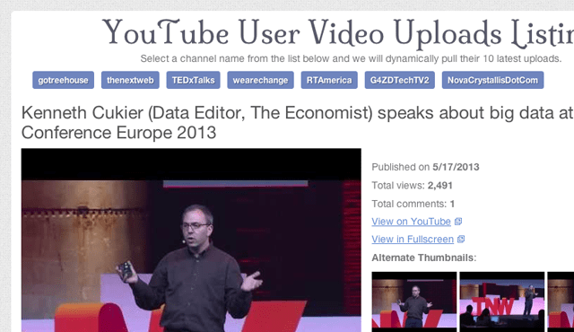
Live Demo – Download Source Code
Getting Started
I will skip a lot of the boring HTML so that we can focus more deeply on the YouTube response and how we handle this in JavaScript. The most important HTML section you should recognize is the navigation along with the inner videos content div. I have used specific IDs so that we can target each element and check whenever the user clicks a link, then display that content inside #videos.
    <nav id="usersnav">
          <ul>
            <li><a href="#gotreehouse">gotreehouse</a></li>
            <li><a href="#thenextweb">thenextweb</a></li>
            <li><a href="#TEDxTalks">TEDxTalks</a></li>
            <li><a href="#wearechange">wearechange</a></li>
            <li><a href="#RTAmerica">RTAmerica</a></li>
            <li><a href="#G4ZDTechTV2">G4ZDTechTV2</a></li>
            <li><a href="#NovaCrystallisDotCom">NovaCrystallisDotCom</a></li>
          </ul>
        </nav>

        <div id="videos">
          <!-- vids go here -->
        </div>
In order for the whole process to work we will need a copy of the latest jQuery library. My demo includes this file from within the ./js/ directory so you won’t need to re-download anything. Also I have kept my custom-written jQuery codes inside the index file instead of moving them to an external JS script. It would obviously be easier to do so when you are running this on a live website, but for my demo it is quicker to study these codes from within the same page.
Pulling Results with jQuery
The first step is to define a set of variables which we need in the script. Then we can handle a click event from the user which is interfacing with any of the navigation links. Each of the anchor elements is using an HREF value containing a hash symbol plus username we need. It is important that we stop this default href from loading by using e.preventDefault() and then pull the value out so we can get the YouTube feed results.
$(function(){
      $('#usersnav ul li a').on('click', function(e){
        e.preventDefault();
        var htmlString  = '<ul id="videoslisting">';
        var channelname = $(this).attr('href').substring(1);
        var ytapiurl    = 'http://gdata.youtube.com/feeds/api/users/'+channelname+'/uploads?alt=json&max-results=10';
The handy JavaScript substring() method will create a new string variable starting from the character marker 1(marker 0 is the first character). This removes our hash symbol so that we can now place the username into a generic API call which looks like this: http://gdata.youtube.com/feeds/api/users/CHANNELNAME/uploads?alt=json&max-results=10
The user’s channel name can be accessed to query YouTube and pull out their latest uploads. I am referencing a max results value of 10 and since we are not using pagination. I have not included any other callback methods, either. JSON is the response type we need so that way it’ll be easier parsing all this content inside jQuery.
Building a Loop
PHP and Rails and other programming languages often use logic loops to iterate through data patterns. While loops, for loops, do loops, and other common ideas are not as strict when you would compare them with JavaScript. However the methods for .parseJSON() and jQuery.each() offer the perfect system for looping through all of these results.
    $.getJSON(ytapiurl, function(data) {
          $.each(data.feed.entry, function(i, item) {
            var title    = item['title']['$t'];
            var videoid  = item['id']['$t'];

            var pubdate  = item['published']['$t'];
            var fulldate = new Date(pubdate).toLocaleDateString();

            var thumbimg = item['media$group']['media$thumbnail'][0]['url'];
            var tinyimg1 = item['media$group']['media$thumbnail'][1]['url'];
            var tinyimg2 = item['media$group']['media$thumbnail'][2]['url'];
            var tinyimg3 = item['media$group']['media$thumbnail'][3]['url'];

            var vlink    = item['media$group']['media$content'][0]['url'];
            var ytlink   = item['media$group']['media$player'][0]['url'];
            var numviews = item['yt$statistics']['viewCount'];
            var numcomms = item['gd$comments']['gd$feedLink']['countHint'];

            htmlString +='<li class="clearfix"><h2>' + title + '</h2>';
            htmlString +='<div class="videothumb"><a href="' + ytlink + '" target="_blank"><img src="' + thumbimg + '" width="480" height="360"></a></div>';
            htmlString +='<div class="meta"><p>Published on <strong>' + fulldate + '</strong></p><p>Total views: <strong>' + commafy(numviews) + '</strong></p><p>Total comments: <strong>'+ numcomms +'</strong></p><p><a href="'+ ytlink +'" class="external" target="_blank">View on YouTube</a></p><p><a href="'+ vlink +'" class="external" target="_blank">View in Fullscreen</a></p><p><strong>Alternate Thumbnails</strong>:<br><img src="'+ tinyimg1 +'"> <img src="' + tinyimg2 + '"> <img src="'+ tinyimg3 +'"></p></div></li>';
          }); // end each loop

          $('#videos').html(htmlString + "</ul>");
        }); // end json parsing
This code block seems very large but the majority of the content is generating variable names. YouTube will return a lot more information than we need so it would be foolish to create an array containing all the keys. Instead we should make new variables strictly for the content which will be used inside the layout, and then we create a final HTML string to return to the browser.
Each variable block will contain an important section of the final display. We will need the video title, original publishing date, the full-size thumbnail along with each of the 3 mini-thumbs, direct video URL, view count, and also the comments count. The HTML is displayed using an unordered list of items which finishes by applying the HTML content into the #videos container. This is easily accomplished by using the jQuery .html() method.
Parsing & Formatting Numbers
One other final point I’d like to bring up is the ability to parse through each view counter. Return data for videos which have over 1000 views will not include the comma between each set of 3 numbers. I found an excellent solution on Stack Overflow written using pure JavaScript. The function name is commafy() which is wrapped around each of the view count numbers. This will check if the digits are higher than 4 and automatically place a comma where it should be.
These codes are wonderful to use in any number of JavaScript solutions. The questions and solutions on Stack Overflow are always helpful with these kinds of matters. I think it is worth noting that you could write a much simpler function using jQuery or handling this method inside the .each() loop. But if everything is kept inside a separate file then you may not worry as much about the syntax or number of lines.
Live Demo – Download Source Code
Final Thoughts
Many developers who are not familiar with JSON should hit Google and read a few articles on the subject. It is basically JavaScript code which is written in a certain way so that the syntax can be read as data-value pairs. YouTube can present JSON data from their server and using jQuery it is possible to organize this data into the page dynamically. I hope this tutorial may prove useful to anybody who has been interested in developing over YouTube’s API, or any API for that matter. Feel free to download a copy of my demo and see if you can implement a similar method elsewhere in your own projects.
The post Developing over the YouTube API with JSON appeared first on Treehouse Blog.
]]>
The process to understand API development is generally complicated but should become easier with practice. Social networks like Twitter and YouTube offer XML/RSS/JSON feeds without the requirement...
http://feedproxy.google.com/~r/teamtreehouse/~3/VPWVo-md2YI/developing-over-the-youtube-api-with-json
https://my3.my.umbc.edu/api/v0/pixel/news/30138/guest@my.umbc.edu/3227edc96348c9f874ab7fc6c5d19154/api/pixel
android
css
design
development
html
ios
javascript
jquery
learn-to-code
responsive
web
Web Developer - Build Group
https://my3.my.umbc.edu/groups/retired-583
https://assets3-my.umbc.edu/system/shared/avatars/groups/000/000/583/fc60f5d7abc2e080599bb6dc465db54d/xsmall.png?1363101197
https://assets4-my.umbc.edu/system/shared/avatars/groups/000/000/583/fc60f5d7abc2e080599bb6dc465db54d/original.jpg?1363101197
https://assets4-my.umbc.edu/system/shared/avatars/groups/000/000/583/fc60f5d7abc2e080599bb6dc465db54d/xxlarge.png?1363101197
https://assets4-my.umbc.edu/system/shared/avatars/groups/000/000/583/fc60f5d7abc2e080599bb6dc465db54d/xlarge.png?1363101197
https://assets3-my.umbc.edu/system/shared/avatars/groups/000/000/583/fc60f5d7abc2e080599bb6dc465db54d/large.png?1363101197
https://assets3-my.umbc.edu/system/shared/avatars/groups/000/000/583/fc60f5d7abc2e080599bb6dc465db54d/medium.png?1363101197
https://assets4-my.umbc.edu/system/shared/avatars/groups/000/000/583/fc60f5d7abc2e080599bb6dc465db54d/small.png?1363101197
https://assets3-my.umbc.edu/system/shared/avatars/groups/000/000/583/fc60f5d7abc2e080599bb6dc465db54d/xsmall.png?1363101197
https://assets4-my.umbc.edu/system/shared/avatars/groups/000/000/583/fc60f5d7abc2e080599bb6dc465db54d/xxsmall.png?1363101197
Web Developer - Build Group
0
0
true
Wed, 22 May 2013 09:30:31 -0400
Questions to Ask Yourself This Summer
from UMBC Extra Credit
Almost all students will have some downtime in the summer months. Here are some suggestions for using that time effectively.
Here are FIVE key questions to contemplate along with some resources for further exploration.
Check out this article from UMBC Extra Credit to keep reading.
]]>
Almost all students will have some downtime in the summer months. Here are some suggestions for using that time effectively. Here are FIVE key questions to contemplate along with some...
http://my.umbc.edu/groups/credit/news/29803
https://my3.my.umbc.edu/api/v0/pixel/news/30136/guest@my.umbc.edu/bf6bc9d9f3d5894ace395628b9adacad/api/pixel
College of Engineering & Information Technology Advising
https://my3.my.umbc.edu/groups/coeitadvising
https://assets3-my.umbc.edu/system/shared/avatars/groups/000/000/564/6207e48bc2612a0b21c093b4a46a3be8/xsmall.png?1778247417
https://assets2-my.umbc.edu/system/shared/avatars/groups/000/000/564/6207e48bc2612a0b21c093b4a46a3be8/original.png?1778247417
https://assets3-my.umbc.edu/system/shared/avatars/groups/000/000/564/6207e48bc2612a0b21c093b4a46a3be8/xxlarge.png?1778247417
https://assets3-my.umbc.edu/system/shared/avatars/groups/000/000/564/6207e48bc2612a0b21c093b4a46a3be8/xlarge.png?1778247417
https://assets2-my.umbc.edu/system/shared/avatars/groups/000/000/564/6207e48bc2612a0b21c093b4a46a3be8/large.png?1778247417
https://assets4-my.umbc.edu/system/shared/avatars/groups/000/000/564/6207e48bc2612a0b21c093b4a46a3be8/medium.png?1778247417
https://assets3-my.umbc.edu/system/shared/avatars/groups/000/000/564/6207e48bc2612a0b21c093b4a46a3be8/small.png?1778247417
https://assets3-my.umbc.edu/system/shared/avatars/groups/000/000/564/6207e48bc2612a0b21c093b4a46a3be8/xsmall.png?1778247417
https://assets1-my.umbc.edu/system/shared/avatars/groups/000/000/564/6207e48bc2612a0b21c093b4a46a3be8/xxsmall.png?1778247417
Engineering & Computer Science Advising
0
0
false
Wed, 22 May 2013 09:27:39 -0400
Wed, 22 May 2013 09:29:40 -0400
Designing CSS Layouts With Flexbox Is As Easy As Pie
Flexible box layout (or flexbox) is a new box model optimized for UI layout. As one of the first CSS modules designed for actual layout (floats were really meant mostly for things such as wrapping text around images), it makes a lot of tasks much easier, or even possible at all. Flexbox’s repertoire includes the simple centering of elements (both horizontally and vertically), the expansion and contraction of elements to fill available space, and source-code independent layout, among others abilities.
Flexbox has lived a storied existence. It started as a feature of Mozilla’s XUL, where it was used to lay out application UI, such as the toolbars in Firefox, and it has since been rewritten multiple times. The specification has only recently reached stability, and we have fairly complete support across the latest versions of the leading browsers.
There are, however, some caveats. The specification changed between the implementation in Internet Explorer (IE) and the release of IE 10, so you will need to use a slightly different syntax. Chrome currently still requires the -webkit- prefix, and Firefox and Safari are still on the much older syntax. Firefox has updated to the latest specification, but that implementation is currently behind a runtime flag until it is considered stable and bug-free enough to be turned on by default. Until then, Firefox still requires the old syntax.
When you specify that an element will use the flexbox model, its children are laid out along either the horizontal or vertical axis, depending on the direction specified. The widths of these children expand or contract to fill the available space, based on the flexible length they are assigned.
Example: Horizontal And Vertical Centering (Or The Holy Grail Of Web Design)
Being able to center an element on the page is perhaps the number one wish among Web designers — yes, probably even higher than gaining the highly prized parent selector or putting IE 6 out of its misery (OK, maybe a close second then). With flexbox, this is trivially easy. Let’s start with a basic HTML template, with a heading that we want to center. Eventually, once we’ve added all the styling, it will end up looking like this vertically and horizontally centered demo.
    <!DOCTYPE html>
    <html lang="en">
    <head>
       <meta charset="utf-8"/>
       <title>Centering an Element on the Page</title>
    </head>
    <body>
       <h1>OMG, I’m centered</h1>
    </body>
    </html>
Nothing special here, not even a wrapper div. The magic all happens in the CSS:
    html {
       height: 100%;
    }

    body {
       display: -webkit-box;   /* OLD: Safari,  iOS, Android browser, older WebKit browsers.  */
       display: -moz-box;   /* OLD: Firefox (buggy) */
       display: -ms-flexbox;   /* MID: IE 10 */
       display: -webkit-flex;    /* NEW, Chrome 21+ */
       display: flex;       /* NEW: Opera 12.1, Firefox 22+ */

       -webkit-box-align: center; -moz-box-align: center; /* OLD… */
       -ms-flex-align: center; /* You know the drill now… */
       -webkit-align-items: center;
       align-items: center;

        -webkit-box-pack: center; -moz-box-pack: center;
       -ms-flex-pack: center;
       -webkit-justify-content: center;
       justify-content: center;

       margin: 0;
       height: 100%;
       width: 100% /* needed for Firefox */
    }

    h1 {
       display: -webkit-box; display: -moz-box;
       display: -ms-flexbox;
       display: -webkit-flex;
       display: flex;

       -webkit-box-align: center; -moz-box-align: center;
       -ms-flex-align: center;
       -webkit-align-items: center;
       align-items: center;

       height: 10rem;
    }
I’ve included all of the different prefixed versions in the CSS above, from the very oldest, which is still needed, to the modern and hopefully final syntax. This might look confusing, but the different syntaxes map fairly well to each other, and I’ve included tables at the end of this article to show the exact mappings.
This is not exactly all of the CSS needed for our example, because I’ve stripped out the extra styling that you probably already know how to use in order to save space.
Let’s look at the CSS that is needed to center the heading on the page. First, we set the html and body elements to have 100% height and remove any margins. This will make the container of our h1 take up the full height of the browser’s window. Firefox also needs a width specified on the body to force it to behave. Now, we just need to center everything.
Enabling Flexbox
Because the body element contains the heading that we want to center, we will set its display value to flex:
    body {
       display: flex;
    }
This switches the body element to use the flexbox layout, rather than the regular block layout. All of its children in the flow of the document (i.e. not absolutely positioned elements) will now become flex items.
The syntax used by IE 10 is display: -ms-flexbox, while older Firefox and WebKit browsers use display: -prefix-box (where prefix is either moz or webkit). You can see the tables at the end of this article to see the mappings of the various versions.
What do we gain now that our elements have been to yoga class and become all flexible? They gain untold powers: they can flex their size and position relative to the available space; they can be laid out either horizontally or vertically; and they can even achieve source-order independence. (Two holy grails in one specification? We’re doing well.)
Centering Horizontally
Next, we want to horizontally center our h1 element. No big deal, you might say; but it is somewhat easier than playing around with auto margins. We just need to tell the flexbox to center its flex items. By default, flex items are laid out horizontally, so setting the justify-content property will align the items along the main axis:
    body {
       display: flex;
       justify-content: center;
    }
For IE 10, the property is called flex-pack, while for older browsers it is box-pack (again, with the appropriate prefixes). The other possible values are flex-start, flex-end, space-between and space-around. These are start, end, justify and distribute, respectively, in IE 10 and the old specification (distribute is, however, not supported in the old specification). The flex-start value aligns to the left (or to the right with right-to-left text), flex-end aligns to the right, space-between evenly distributes the elements along the axis, and space-around evenly distributes along the axis, with half-sized spaces at the start and end of the line.
To explicitly set the axis that the element is aligned along, you can do this with the flex-flow property. The default is row, which will give us the same result that we’ve just achieved. To align along the vertical axis, we can use flex-flow: column. If we add this to our example, you will notice that the element is vertically centered but loses the horizontal centering. Reversing the order by appending -reverse to the row or column values is also possible (flex-flow: row-reverse or flex-flow: column-reverse), but that won’t do much in our example because we have only one item.
There are some differences here in the various versions of the specification, which are highlighted at the end of this article. Another caveat to bear in mind is that flex-flow directions are writing-mode sensitive. That is, when using writing-mode: vertical-rl to switch to vertical text layout (as used traditionally in China, Japan and Korea), flex-flow: row will align the items vertically, and column will align them horizontally.
Centering Vertically
Centering vertically is as easy as centering horizontally. We just need to use the appropriate property to align along the “cross-axis.” The what? The cross-axis is basically the axis perpendicular to the main one. So, if flex items are aligned horizontally, then the cross-axis would be vertical, and vice versa. We set this with the align-items property (flex-align in IE 10, and box-align for older browsers):
    body {
       /* Remember to use the other versions for IE 10 and older browsers! */
       display: flex;
       justify-content: center;
       align-items: center;
    }
This is all there is to centering elements with flexbox! We can also use the flex-start (start) and flex-end (end) values, as well as baseline and stretch. Let’s have another look at the finished example:

Simple horizontal and vertical centering using flexbox. Larger view.
You might notice that the text is also center-aligned vertically inside the h1 element. This could have been done with margins or a line height, but we used flexbox again to show that it works with anonymous boxes (in this case, the line of text inside the h1 element). No matter how high the h1 element gets, the text will always be in the center:
    h1 {
       /* Remember to use the other versions for IE 10 and older browsers! */
       display: flex;
       align-items: center;
       height: 10rem;
    }
Flexible Sizes
If centering elements was all flexbox could do, it’d be pretty darn cool. But there is more. Let’s see how flex items can expand and contract to fit the available space within a flexbox element. Point your browser to this next example.

An interactive slideshow built using flexbox. Larger view.
The HTML and CSS for this example are similar to the previous one’s. We’re enabling flexbox and centering the elements on the page in the same way. In addition, we want to make the title (inside the header element) remain consistent in size, while the five boxes (the section elements) adjust in size to fill the width of the window. To do this, we use the new flex property:
    section {
       /* removed other styles to save space */
       -prefix-box-flex: 1; /* old spec webkit, moz */
       flex: 1;
       height: 250px;
    }
What we’ve just done here is to make each section element take up 1 flex unit. Because we haven’t set any explicit width, each of the five boxes will be the same width. The header element will take up a set width (277 pixels) because it is not flexible. We divide the remaining width inside the body element by 5 to calculate the width of each of the section elements. Now, if we resize the browser window, the section elements will grow or shrink.
In this example, we’ve set a consistent height, but this could be set to be flexible, too, in exactly the same way. We probably wouldn’t always want all elements to be the same size, so let’s make one bigger. On hover, we’ve set the element to take up 2 flex units:
    section:hover {
       -prefix-box-flex: 2;
       flex: 2;
       cursor: pointer;
    }
Now the available space is divided by 6 rather than 5, and the hovered element gets twice the base amount. Note that an element with 2 flex units does not necessarily become twice as wide as one with 1 unit. It just gets twice the share of the available space added to its “preferred width.” In our examples, the “preferred width” is 0 (the default).
Source-Order Independence
For our last party trick, we’ll study how to achieve source-order independence in our layouts. When clicking on a box, we will tell that element to move to the left of all the other boxes, directly after the title. All we have to do is set the order with the order property. By default, all flex items are in the 0 position. Because they’re in the same position, they follow the source order. Click on your favorite person in the updated example to see their order change.

An interactive slideshow with flex-order. Larger view.
To make our chosen element move to the first position, we just have to set a lower number. I chose -1. We also need to set the header to -1 so that the selected section element doesn’t get moved before it:
    header {
       -prefix-box-ordinal-group: 1; /* old spec; must be positive */
       -ms-flex-order: -1; /* IE 10 syntax */
       order: -1; /* new syntax */
    }

    section[aria-pressed="true"] {
       /* Set order lower than 0 so it moves before other section elements,
          except old spec, where it must be positive.
     */
       -prefix-box-ordinal-group: 1;
       -ms-flex-order: -1;
       order: -1;

       -prefix-box-flex: 3;
       flex: 3;
       max-width: 370px; /* Stops it from getting too wide. */
    }
In the old specification, the property for setting the order (box-ordinal-group) accepts only a positive integer. Therefore, I’ve set the order to 2 for each section element (code not shown) and updated it to 1 for the active element. If you are wondering what aria-pressed="true" means in the example above, it is a WAI-ARIA attribute/value that I add via JavaScript when the user clicks on one of the sections.
This relays accessibility hints to the underlying system and to assistive technology to tell the user that that element is pressed and, thus, active. If you’d like more information on WAI-ARIA, check out “Introduction to WAI-ARIA” by Gez Lemon. Because I’m adding the attribute after the user clicks, this example requires a simple JavaScript file in order to work, but flexbox itself doesn’t require it; it’s just there to handle the user interaction.
Hopefully, this has given you some inspiration and enough introductory knowledge of flexbox to enable you to experiment with your own designs.
Syntax Changes
As you will have noticed throughout this article, the syntax has changed a number of times since it was first implemented. To aid backward- and forward-porting between the different versions, we’ve included tables below, which map the changes between the specifications.
Specification versions
| Specification |
IE |
Opera |
Firefox |
Chrome |
Safari |
| Standard |
11? |
12.10+ * |
Behind flag |
21+ (-webkit-) |
| Mid |
10 (-ms-) |
| Old |
3+ (-moz-) |
<21 (-webkit-) |
3+ (-webkit-) |
* Opera will soon switch to WebKit. It will then require the -webkit- prefix if it has not been dropped by that time.
Enabling flexbox: setting an element to be a flex container
| Specification |
Property name |
Block-level flex |
Inline-level flex |
| Standard |
display |
flex |
inline-flex |
| Mid |
display |
flexbox |
inline-flexbox |
| Old |
display |
box |
inline-box |
Axis alignment: specifying alignment of items along the main flexbox axis
| Specification |
Property name |
start |
center |
end |
justify |
distribute |
| Standard |
justify-content |
flex-start |
center |
flex-end |
space-between |
space-around |
| Mid |
flex-pack |
start |
center |
end |
justify |
distribute |
| Old |
box-pack |
start |
center |
end |
justify |
N/A |
Cross-axis alignment: specifying alignment of items along the cross-axis
| Specification |
Property name |
start |
center |
end |
baseline |
stretch |
| Standard |
align-items |
flex-start |
center |
flex-end |
baseline |
stretch |
| Mid |
flex-align |
start |
center |
end |
baseline |
stretch |
| Old |
box-align |
start |
center |
end |
baseline |
stretch |
Individual cross-axis alignment: override to align individual items along the cross-axis
| Specification |
Property name |
auto |
start |
center |
end |
baseline |
stretch |
| Standard |
align-self |
auto |
flex-start |
center |
flex-end |
baseline |
stretch |
| Mid |
flex-item-align |
auto |
start |
center |
end |
baseline |
stretch |
| Old |
N/A |
Flex line alignment: specifying alignment of flex lines along the cross-axis
| Specification |
Property name |
start |
center |
end |
justify |
distribute |
stretch |
| Standard |
align-content |
flex-start |
center |
flex-end |
space-between |
space-around |
stretch |
| Mid |
flex-line-pack |
start |
center |
end |
justify |
distribute |
stretch |
| Old |
N/A |
This takes effect only when there are multiple flex lines, which is the case when flex items are allowed to wrap using the flex-wrap property and there isn’t enough space for all flex items to display on one line. This will align each line, rather than each item.
Display order: specifying the order of flex items
| Specification |
Property name |
Value |
| Standard |
order |
|
| Mid |
flex-order |
<number> |
| Old |
box-ordinal-group |
<integer> |
Flexibility: specifying how the size of items flex
| Specification |
Property name |
Value |
| Standard |
flex |
none | [ <flex-grow> <flex-shrink>? || <flex-basis>] |
| Mid |
flex |
none | [ [ <pos-flex> <neg-flex>? ] || <preferred-size> ] |
| Old |
box-flex |
<number> |
The flex property is more or less unchanged between the new standard and the draft supported by Microsoft. The main difference is that it has been converted to a shorthand in the new version, with separate properties: flex-grow, flex-shrink and flex-basis. The values may be used in the same way in the shorthand. However, the default value for flex-shrink (previously called negative flex) is now 1. This means that items do not shrink by default. Previously, negative free space would be distributed using the flex-shrink ratio, but now it is distributed in proportion to flex-basis multiplied by the flex-shrink ratio.
Direction: specifying the direction of the main flexbox axis
| Specification |
Property name |
Horizontal |
Reversed horizontal |
Vertical |
Reversed vertical |
| Standard |
flex-direction |
row |
row-reverse |
column |
column-reverse |
| Mid |
flex-direction |
row |
row-reverse |
column |
column-reverse |
| Old |
box-orient
box-direction
|
horizontal
normal
|
horizontal
reverse
|
vertical
normal
|
vertical
reverse
|
In the old version of the specification, the box-direction property needs to be set to reverse to get the same behavior as row-reverse or column-reverse in the later version of the specification. This can be omitted if you want the same behavior as row or column because normal is the initial value.
When setting the direction to reverse, the main flexbox axis is flipped. This means that when using a left-to-right writing system, the items will display from right to left when row-reverse is specified. Similarly, column-reverse will lay out flex items from bottom to top, instead of top to bottom.
The old version of the specification also has writing mode-independent values for box-orient. When using a left-to-write writing system, horizontal may be substituted for inline-axis, and vertical may be substituted for block-axis. If you are using a top-to-bottom writing system, such as those traditional in East Asia, then these values would be flipped.
Wrapping: specifying whether and how flex items wrap along the cross-axis
| Specification |
Property name |
No wrapping |
Wrapping |
Reversed wrap |
| Standard |
flex-wrap |
nowrap |
wrap |
wrap-reverse |
| Mid |
flex-wrap |
nowrap |
wrap |
wrap-reverse |
| Old |
box-lines |
single |
multiple |
N/A |
The wrap-reverse value flips the start and end of the cross-axis, so that if flex items are laid out horizontally, instead of items wrapping onto a new line below, they will wrap onto a new line above.
At the time of writing, Firefox does not support the flex-wrap or older box-lines property. It also doesn’t support the shorthand.
The current specification has a flex-flow shorthand, which controls both wrapping and direction. The behavior is the same as the one in the version of the specification implemented by IE 10. It is also currently not supported by Firefox, so I would recommend to avoid using it when specifying only the flex-direction value.
Conclusion
Well, that’s a (flex-)wrap. In this article, I’ve introduced some of the myriad of possibilities afforded by flexbox. Be it source-order independence, flexible sizing or just the humble centering of elements, I’m sure you can find ways to employ flexbox in your websites and applications. The syntax has settled down (finally!), and implementations are here. All major browsers now support flexbox in at least their latest versions.
While some browsers use an older syntax, Firefox looks like it is close to updating, and IE 11 uses the latest version in leaked Windows Blue builds. There is currently no word on Safari, but it is a no-brainer considering that Chrome had the latest syntax before the Blink-WebKit split. For the time being, use the tables above to map the various syntaxes, and get your flex on.
Layout in CSS is only getting more powerful, and flexbox is one of the first steps out of the quagmire we’ve found ourselves in over the years, first with table-based layouts, then float-based layouts. IE 10 already supports an early draft of the Grid layout specification, which is great for page layout, and Regions and Exclusions will revolutionize how we handle content flow and layout.
Flexbox can be used today if you only need to support relatively modern browsers or can provide a fallback, and in the not too distant future, all sorts of options will be available, so that we can use the best tool for the job. Flexbox is shaping up to be a mighty fine tool.
Further Reading
(al)
© David Storey for Smashing Magazine, 2013.
]]>
Flexible box layout (or flexbox) is a new box model optimized for UI layout. As one of the first CSS modules designed for actual layout (floats were really meant mostly for things such as...
http://www.smashingmagazine.com/2013/05/22/centering-elements-with-flexbox-is-as-easy-as-pie/
https://my3.my.umbc.edu/api/v0/pixel/news/30135/guest@my.umbc.edu/760dca6dcb1e2b7000b3e4c089ed2a5a/api/pixel
coding
css
design
development
html
javascript
mysql
php
sql
web
Web Developer - Build Group
https://my3.my.umbc.edu/groups/retired-583
https://assets3-my.umbc.edu/system/shared/avatars/groups/000/000/583/fc60f5d7abc2e080599bb6dc465db54d/xsmall.png?1363101197
https://assets4-my.umbc.edu/system/shared/avatars/groups/000/000/583/fc60f5d7abc2e080599bb6dc465db54d/original.jpg?1363101197
https://assets4-my.umbc.edu/system/shared/avatars/groups/000/000/583/fc60f5d7abc2e080599bb6dc465db54d/xxlarge.png?1363101197
https://assets4-my.umbc.edu/system/shared/avatars/groups/000/000/583/fc60f5d7abc2e080599bb6dc465db54d/xlarge.png?1363101197
https://assets3-my.umbc.edu/system/shared/avatars/groups/000/000/583/fc60f5d7abc2e080599bb6dc465db54d/large.png?1363101197
https://assets3-my.umbc.edu/system/shared/avatars/groups/000/000/583/fc60f5d7abc2e080599bb6dc465db54d/medium.png?1363101197
https://assets4-my.umbc.edu/system/shared/avatars/groups/000/000/583/fc60f5d7abc2e080599bb6dc465db54d/small.png?1363101197
https://assets3-my.umbc.edu/system/shared/avatars/groups/000/000/583/fc60f5d7abc2e080599bb6dc465db54d/xsmall.png?1363101197
https://assets4-my.umbc.edu/system/shared/avatars/groups/000/000/583/fc60f5d7abc2e080599bb6dc465db54d/xxsmall.png?1363101197
Web Developer - Build Group
0
0
true
Wed, 22 May 2013 08:31:23 -0400
Wed, 22 May 2013 08:31:23 -0400
Gadgetwise Blog: Q&A: Paying Extra for Phone Freedom
Skipping the carrier subsidy and paying full price for an unlocked smartphone may cost more up front, but frees up those who want to buy inexpensive local service plans when traveling internationally.
 ]]>
Skipping the carrier subsidy and paying full price for an unlocked smartphone may cost more up front, but frees up those who want to buy inexpensive local service plans when traveling...
http://gadgetwise.blogs.nytimes.com/2013/05/22/qa-paying-extra-for-phone-freedom/?partner=rss&emc=rss
https://my3.my.umbc.edu/api/v0/pixel/news/30133/guest@my.umbc.edu/29f6605d268488c291cc1512509f4918/api/pixel
cellular-telephones
new
q-and-a
smartphones
technology
wireless-communications
york
Web Developer - Build Group
https://my3.my.umbc.edu/groups/retired-583
https://assets3-my.umbc.edu/system/shared/avatars/groups/000/000/583/fc60f5d7abc2e080599bb6dc465db54d/xsmall.png?1363101197
https://assets4-my.umbc.edu/system/shared/avatars/groups/000/000/583/fc60f5d7abc2e080599bb6dc465db54d/original.jpg?1363101197
https://assets4-my.umbc.edu/system/shared/avatars/groups/000/000/583/fc60f5d7abc2e080599bb6dc465db54d/xxlarge.png?1363101197
https://assets4-my.umbc.edu/system/shared/avatars/groups/000/000/583/fc60f5d7abc2e080599bb6dc465db54d/xlarge.png?1363101197
https://assets3-my.umbc.edu/system/shared/avatars/groups/000/000/583/fc60f5d7abc2e080599bb6dc465db54d/large.png?1363101197
https://assets3-my.umbc.edu/system/shared/avatars/groups/000/000/583/fc60f5d7abc2e080599bb6dc465db54d/medium.png?1363101197
https://assets4-my.umbc.edu/system/shared/avatars/groups/000/000/583/fc60f5d7abc2e080599bb6dc465db54d/small.png?1363101197
https://assets3-my.umbc.edu/system/shared/avatars/groups/000/000/583/fc60f5d7abc2e080599bb6dc465db54d/xsmall.png?1363101197
https://assets4-my.umbc.edu/system/shared/avatars/groups/000/000/583/fc60f5d7abc2e080599bb6dc465db54d/xxsmall.png?1363101197
Web Developer - Build Group
0
0
true
Wed, 22 May 2013 07:17:08 -0400
Big Mouth: Play your cards right
That’s a nice internet reputation you’ve got there, observes Gary Marshall. It’d be a real shame if something happened to it…
]]>
Skipping the carrier subsidy and paying full price for an unlocked smartphone may cost more up front, but frees up those who want to buy inexpensive local service plans when traveling...
http://gadgetwise.blogs.nytimes.com/2013/05/22/qa-paying-extra-for-phone-freedom/?partner=rss&emc=rss
https://my3.my.umbc.edu/api/v0/pixel/news/30133/guest@my.umbc.edu/29f6605d268488c291cc1512509f4918/api/pixel
cellular-telephones
new
q-and-a
smartphones
technology
wireless-communications
york
Web Developer - Build Group
https://my3.my.umbc.edu/groups/retired-583
https://assets3-my.umbc.edu/system/shared/avatars/groups/000/000/583/fc60f5d7abc2e080599bb6dc465db54d/xsmall.png?1363101197
https://assets4-my.umbc.edu/system/shared/avatars/groups/000/000/583/fc60f5d7abc2e080599bb6dc465db54d/original.jpg?1363101197
https://assets4-my.umbc.edu/system/shared/avatars/groups/000/000/583/fc60f5d7abc2e080599bb6dc465db54d/xxlarge.png?1363101197
https://assets4-my.umbc.edu/system/shared/avatars/groups/000/000/583/fc60f5d7abc2e080599bb6dc465db54d/xlarge.png?1363101197
https://assets3-my.umbc.edu/system/shared/avatars/groups/000/000/583/fc60f5d7abc2e080599bb6dc465db54d/large.png?1363101197
https://assets3-my.umbc.edu/system/shared/avatars/groups/000/000/583/fc60f5d7abc2e080599bb6dc465db54d/medium.png?1363101197
https://assets4-my.umbc.edu/system/shared/avatars/groups/000/000/583/fc60f5d7abc2e080599bb6dc465db54d/small.png?1363101197
https://assets3-my.umbc.edu/system/shared/avatars/groups/000/000/583/fc60f5d7abc2e080599bb6dc465db54d/xsmall.png?1363101197
https://assets4-my.umbc.edu/system/shared/avatars/groups/000/000/583/fc60f5d7abc2e080599bb6dc465db54d/xxsmall.png?1363101197
Web Developer - Build Group
0
0
true
Wed, 22 May 2013 07:17:08 -0400
Big Mouth: Play your cards right
That’s a nice internet reputation you’ve got there, observes Gary Marshall. It’d be a real shame if something happened to it…
 ]]>
That’s a nice internet reputation you’ve got there, observes Gary Marshall. It’d be a real shame if something happened to it…
http://feedproxy.google.com/~r/net/topstories/~3/QXNzZBe37oM/story01.htm
https://my3.my.umbc.edu/api/v0/pixel/news/30156/guest@my.umbc.edu/7c361e3684deec5622cfec70be8b4f03/api/pixel
css
development
html
javascript
mysql
net
php
sql
web
Web Developer - Build Group
https://my3.my.umbc.edu/groups/retired-583
https://assets3-my.umbc.edu/system/shared/avatars/groups/000/000/583/fc60f5d7abc2e080599bb6dc465db54d/xsmall.png?1363101197
https://assets4-my.umbc.edu/system/shared/avatars/groups/000/000/583/fc60f5d7abc2e080599bb6dc465db54d/original.jpg?1363101197
https://assets4-my.umbc.edu/system/shared/avatars/groups/000/000/583/fc60f5d7abc2e080599bb6dc465db54d/xxlarge.png?1363101197
https://assets4-my.umbc.edu/system/shared/avatars/groups/000/000/583/fc60f5d7abc2e080599bb6dc465db54d/xlarge.png?1363101197
https://assets3-my.umbc.edu/system/shared/avatars/groups/000/000/583/fc60f5d7abc2e080599bb6dc465db54d/large.png?1363101197
https://assets3-my.umbc.edu/system/shared/avatars/groups/000/000/583/fc60f5d7abc2e080599bb6dc465db54d/medium.png?1363101197
https://assets4-my.umbc.edu/system/shared/avatars/groups/000/000/583/fc60f5d7abc2e080599bb6dc465db54d/small.png?1363101197
https://assets3-my.umbc.edu/system/shared/avatars/groups/000/000/583/fc60f5d7abc2e080599bb6dc465db54d/xsmall.png?1363101197
https://assets4-my.umbc.edu/system/shared/avatars/groups/000/000/583/fc60f5d7abc2e080599bb6dc465db54d/xxsmall.png?1363101197
Web Developer - Build Group
0
0
true
Wed, 22 May 2013 06:26:16 -0400
The designer’s secret weapon: an account handler
]]>
That’s a nice internet reputation you’ve got there, observes Gary Marshall. It’d be a real shame if something happened to it…
http://feedproxy.google.com/~r/net/topstories/~3/QXNzZBe37oM/story01.htm
https://my3.my.umbc.edu/api/v0/pixel/news/30156/guest@my.umbc.edu/7c361e3684deec5622cfec70be8b4f03/api/pixel
css
development
html
javascript
mysql
net
php
sql
web
Web Developer - Build Group
https://my3.my.umbc.edu/groups/retired-583
https://assets3-my.umbc.edu/system/shared/avatars/groups/000/000/583/fc60f5d7abc2e080599bb6dc465db54d/xsmall.png?1363101197
https://assets4-my.umbc.edu/system/shared/avatars/groups/000/000/583/fc60f5d7abc2e080599bb6dc465db54d/original.jpg?1363101197
https://assets4-my.umbc.edu/system/shared/avatars/groups/000/000/583/fc60f5d7abc2e080599bb6dc465db54d/xxlarge.png?1363101197
https://assets4-my.umbc.edu/system/shared/avatars/groups/000/000/583/fc60f5d7abc2e080599bb6dc465db54d/xlarge.png?1363101197
https://assets3-my.umbc.edu/system/shared/avatars/groups/000/000/583/fc60f5d7abc2e080599bb6dc465db54d/large.png?1363101197
https://assets3-my.umbc.edu/system/shared/avatars/groups/000/000/583/fc60f5d7abc2e080599bb6dc465db54d/medium.png?1363101197
https://assets4-my.umbc.edu/system/shared/avatars/groups/000/000/583/fc60f5d7abc2e080599bb6dc465db54d/small.png?1363101197
https://assets3-my.umbc.edu/system/shared/avatars/groups/000/000/583/fc60f5d7abc2e080599bb6dc465db54d/xsmall.png?1363101197
https://assets4-my.umbc.edu/system/shared/avatars/groups/000/000/583/fc60f5d7abc2e080599bb6dc465db54d/xxsmall.png?1363101197
Web Developer - Build Group
0
0
true
Wed, 22 May 2013 06:26:16 -0400
The designer’s secret weapon: an account handler
 I’m a lucky person. Every day I get to do what I love, which is helping clients work out what their web project is going to look like.
As any good account handler or project manager will tell you, their primary role is to make sure that a project goes as smoothly as possible. This can mean managing people on both sides of the fence, and keeping everyone happy is no mean feat.
I’m a big believer that getting a project off to a strong start is integral to the success of that project, and for me that means helping the design team hit the ground running, and making sure they can begin doing what they do best as soon as possible.
I’ve read plenty of material recently describing account handlers as having a negative effect on the creative process of a project. These criticisms range from the account handler not allowing the designer access to the client throughout the project, through to making the designer jump through hoops on the whim of a client. Whilst I’m sure these aforementioned criticisms occur every day in the industry, I want to discuss how I believe an account handler can make a designer’s job in a typical web agency so much easier.
1. Planning
For me, the initial stage of a project is one of the most exciting parts of a new website project. It’s the time you get to speak to the client and really get to understand what they want to get out of working with you and your company. However, clients can sometimes be unsure of what they want, and if there’s a big team working on the project at the client’s end, it’s easy to get mixed messages and issues like design by committee becomes a genuine concern.
Whilst it can be beneficial, at times, for the project’s lead designer to be part of these initial discussions, I don’t feel that’s the best use of a designer’s time. This is especially relevant in agencies where a designer might be juggling several projects at once, and their time is even more valuable than usual. I would hate to think of the impact including the design team on all initial meetings would have on the productivity of an agency!
I believe the ability to extract and define a clear set of high level project objectives is one of the main signs of a strong account handler, and putting some of the elements mentioned below in front of the lead designer in an internal kick-off meeting can get things off to a great start and increase the designer’s confidence in yourself and the client:
- In the client’s words, define what the company does.
- What is the ultimate goal for the website, and how will it benefit your business?
- What are the objectives of the website?
- Describe a typical user of your new website.
It constantly surprises me how often clients struggle to answer these questions, and I don’t feel a designer’s time is best spent helping a client come up with those answers. I want my designer to feel motivated by the task at hand, not be fatigued by helping the client work out the finer details of the project.
2. Assets
If you’ve briefed the team on the project and had that all-important kick-off meeting, it’s more than likely time to begin the project’s wireframing stage. By the time these stages begin, it’s important that an account handler has collected a number of project assets, which could/should include:
- A signed off website sitemap.
- A signed off project specification which details features and functionality. This may be absent in the case of an agile process being implemented, but some idea of the intended functionality is always helpful.
- Brand guidelines and the files associated with this such as logos, typefaces and colour palettes.
- The content for the website, to allow for accurate wireframes and visuals. This is even more important in a responsive design project, as Steve Fisher and Alaine Mackenzie recently wrote about. This can range from text through to video content.
- Whilst not being vital, I also provide a project planning document which the client has filled in. This details things like objectives and goals in the client’s own words, which means the team will always have access to a client-orientated brief throughout the process.
Nothing will dampen the enthusiasm for a project quite like the absence of vital materials like the ones listed above. This is the point in the project where it should be all systems go, and having to chase for assets at this stage can really kill momentum.
3. Embracing change
Plans change, and it’s how you adapt to these inevitable revisions that will decide the overall outcome of the project. However, it’s also important that your process is set up to protect a designer and keep their work streamlined. If your designer is complaining that all they’re doing is revision after revision, then something has fallen down in the project process and it’s the designer’s workload that is going to feel the effects of that. If we have successfully:
- Taken ample time in the planning stage to understand the project’s objectives.
- Agreed the project’s core features.
- Produced a set of signed off wireframes.
Then change, especially to visuals, should be minimal. It’s also important however, to be open to change and accept the possibility that even though we have gone through a lengthy planning stage, additional value can still be brought to the project in the shape of revisions. I treat a project plan/specification as a detailed guide, but refusing to budge even a little from what has been agreed can have a detrimental affect on the project.
Filtering a list of additions or changes from the client, before they get to the design team, can ensure team members stay focussed and do not begin to grow tired of constant tweaks and changes.
4. Rejecting change
We’ve spoken about the need to sometimes embrace change, and how that can be of a benefit to the project, however there will be times in most projects where a client may request something that sits outside of the agreed specification. This may also have a knock-on effect to deadlines, possibly affecting the rest of the project team.
How we approach revisions in general, very much depends on the account handler’s knowledge of what the designer’s role involves. I’ve heard stories of account handlers needing clarification on what a client was referring to when they mentioned a ‘URL’, I imagine this makes it a challenge to appropriately filter revisions. If, however, you have an understanding of the design and development process, you will know that even the smallest requests can cause hours of work to be undone.
It’s an account handler’s job to process, filter and sometimes reject change, in the interest of the project. This, in my opinion, is one of the most important responsibilities that an account handler has, and it’s a vital that we protect the project and its team from unnecessary work where possible.
5. Working collaboratively
Let me start by saying an account handler should never dictate. The designers are the creative part of the team for a reason. I do see it important to give steer where necessary though, and you should have an opportunity to do this in your internal progress meetings, or just by catching up with the team whilst they’re working.
How much steer you provide will depend on your knowledge of a) the project and b) the ‘industry’ itself. Taking the time to read up on and understand latest industry practises such as responsive design, UI/UX and the discussion around designing in the browser can give you a great platform on which to positively influence a project.
If you have an opinion on how certain things might look or work, mention it. If the designer dismisses this or suggests a route they think is more suitable, go with it. You’ll get a chance to provide full feedback before the client sees anything, and you can review things when the designer is happy to share their work.
It’s important you provide a designer with the freedom to do what they do best. This can only result in an increase in trust between between yourself and the designer and in turn, they should value your input from project to project.
Summary
To work efficiently, a project team needs more than just a middleman who will pass things from A to B. Take your chances to positively influence the project and continually put yourself in the shoes of your teammates and clients.
A strong working relationship with your design team is key to a successful project, and I believe the steps I’ve detailed here can only improve the chances of them producing the best work possible.
Do you work as an account manager, are you a designer working with an account manager? What benefits does the relationship deliver to clients? Let us know in the comments.
Featured image/thumbnail, steering image via Shutterstock.
Source
]]>
I’m a lucky person. Every day I get to do what I love, which is helping clients work out what their web project is going to look like. As any good account handler or project manager will tell...
http://www.webdesignerdepot.com/2013/05/the-designers-secret-weapon-an-account-handler/
https://my3.my.umbc.edu/api/v0/pixel/news/30131/guest@my.umbc.edu/b147f66af34bdb077c76a9915cf7fc81/api/pixel
art
business
client-questions
css
design
design-by-committee
design-process
designing-in-the-browser
development
html
html5
illustrator
javascript
mysql
oracle
photoshop
php
planning-websites
productivity
responsive-design
sql
ui
ux
web-design
web-project
Web Developer - Build Group
https://my3.my.umbc.edu/groups/retired-583
https://assets3-my.umbc.edu/system/shared/avatars/groups/000/000/583/fc60f5d7abc2e080599bb6dc465db54d/xsmall.png?1363101197
https://assets4-my.umbc.edu/system/shared/avatars/groups/000/000/583/fc60f5d7abc2e080599bb6dc465db54d/original.jpg?1363101197
https://assets4-my.umbc.edu/system/shared/avatars/groups/000/000/583/fc60f5d7abc2e080599bb6dc465db54d/xxlarge.png?1363101197
https://assets4-my.umbc.edu/system/shared/avatars/groups/000/000/583/fc60f5d7abc2e080599bb6dc465db54d/xlarge.png?1363101197
https://assets3-my.umbc.edu/system/shared/avatars/groups/000/000/583/fc60f5d7abc2e080599bb6dc465db54d/large.png?1363101197
https://assets3-my.umbc.edu/system/shared/avatars/groups/000/000/583/fc60f5d7abc2e080599bb6dc465db54d/medium.png?1363101197
https://assets4-my.umbc.edu/system/shared/avatars/groups/000/000/583/fc60f5d7abc2e080599bb6dc465db54d/small.png?1363101197
https://assets3-my.umbc.edu/system/shared/avatars/groups/000/000/583/fc60f5d7abc2e080599bb6dc465db54d/xsmall.png?1363101197
https://assets4-my.umbc.edu/system/shared/avatars/groups/000/000/583/fc60f5d7abc2e080599bb6dc465db54d/xxsmall.png?1363101197
Web Developer - Build Group
0
0
true
Wed, 22 May 2013 05:15:32 -0400
Wed, 22 May 2013 05:15:32 -0400
The designer’s secret weapon: an account handler
I’m a lucky person. Every day I get to do what I love, which is helping clients work out what their web project is going to look like.
As any good account handler or project manager will tell you, their primary role is to make sure that a project goes as smoothly as possible. This can mean managing people on both sides of the fence, and keeping everyone happy is no mean feat.
I’m a big believer that getting a project off to a strong start is integral to the success of that project, and for me that means helping the design team hit the ground running, and making sure they can begin doing what they do best as soon as possible.
I’ve read plenty of material recently describing account handlers as having a negative effect on the creative process of a project. These criticisms range from the account handler not allowing the designer access to the client throughout the project, through to making the designer jump through hoops on the whim of a client. Whilst I’m sure these aforementioned criticisms occur every day in the industry, I want to discuss how I believe an account handler can make a designer’s job in a typical web agency so much easier.
1. Planning
For me, the initial stage of a project is one of the most exciting parts of a new website project. It’s the time you get to speak to the client and really get to understand what they want to get out of working with you and your company. However, clients can sometimes be unsure of what they want, and if there’s a big team working on the project at the client’s end, it’s easy to get mixed messages and issues like design by committee becomes a genuine concern.
Whilst it can be beneficial, at times, for the project’s lead designer to be part of these initial discussions, I don’t feel that’s the best use of a designer’s time. This is especially relevant in agencies where a designer might be juggling several projects at once, and their time is even more valuable than usual. I would hate to think of the impact including the design team on all initial meetings would have on the productivity of an agency!
I believe the ability to extract and define a clear set of high level project objectives is one of the main signs of a strong account handler, and putting some of the elements mentioned below in front of the lead designer in an internal kick-off meeting can get things off to a great start and increase the designer’s confidence in yourself and the client:
- In the client’s words, define what the company does.
- What is the ultimate goal for the website, and how will it benefit your business?
- What are the objectives of the website?
- Describe a typical user of your new website.
It constantly surprises me how often clients struggle to answer these questions, and I don’t feel a designer’s time is best spent helping a client come up with those answers. I want my designer to feel motivated by the task at hand, not be fatigued by helping the client work out the finer details of the project.
2. Assets
If you’ve briefed the team on the project and had that all-important kick-off meeting, it’s more than likely time to begin the project’s wireframing stage. By the time these stages begin, it’s important that an account handler has collected a number of project assets, which could/should include:
- A signed off website sitemap.
- A signed off project specification which details features and functionality. This may be absent in the case of an agile process being implemented, but some idea of the intended functionality is always helpful.
- Brand guidelines and the files associated with this such as logos, typefaces and colour palettes.
- The content for the website, to allow for accurate wireframes and visuals. This is even more important in a responsive design project, as Steve Fisher and Alaine Mackenzie recently wrote about. This can range from text through to video content.
- Whilst not being vital, I also provide a project planning document which the client has filled in. This details things like objectives and goals in the client’s own words, which means the team will always have access to a client-orientated brief throughout the process.
Nothing will dampen the enthusiasm for a project quite like the absence of vital materials like the ones listed above. This is the point in the project where it should be all systems go, and having to chase for assets at this stage can really kill momentum.
3. Embracing change
Plans change, and it’s how you adapt to these inevitable revisions that will decide the overall outcome of the project. However, it’s also important that your process is set up to protect a designer and keep their work streamlined. If your designer is complaining that all they’re doing is revision after revision, then something has fallen down in the project process and it’s the designer’s workload that is going to feel the effects of that. If we have successfully:
- Taken ample time in the planning stage to understand the project’s objectives.
- Agreed the project’s core features.
- Produced a set of signed off wireframes.
Then change, especially to visuals, should be minimal. It’s also important however, to be open to change and accept the possibility that even though we have gone through a lengthy planning stage, additional value can still be brought to the project in the shape of revisions. I treat a project plan/specification as a detailed guide, but refusing to budge even a little from what has been agreed can have a detrimental affect on the project.
Filtering a list of additions or changes from the client, before they get to the design team, can ensure team members stay focussed and do not begin to grow tired of constant tweaks and changes.
4. Rejecting change
We’ve spoken about the need to sometimes embrace change, and how that can be of a benefit to the project, however there will be times in most projects where a client may request something that sits outside of the agreed specification. This may also have a knock-on effect to deadlines, possibly affecting the rest of the project team.
How we approach revisions in general, very much depends on the account handler’s knowledge of what the designer’s role involves. I’ve heard stories of account handlers needing clarification on what a client was referring to when they mentioned a ‘URL’, I imagine this makes it a challenge to appropriately filter revisions. If, however, you have an understanding of the design and development process, you will know that even the smallest requests can cause hours of work to be undone.
It’s an account handler’s job to process, filter and sometimes reject change, in the interest of the project. This, in my opinion, is one of the most important responsibilities that an account handler has, and it’s a vital that we protect the project and its team from unnecessary work where possible.
5. Working collaboratively
Let me start by saying an account handler should never dictate. The designers are the creative part of the team for a reason. I do see it important to give steer where necessary though, and you should have an opportunity to do this in your internal progress meetings, or just by catching up with the team whilst they’re working.
How much steer you provide will depend on your knowledge of a) the project and b) the ‘industry’ itself. Taking the time to read up on and understand latest industry practises such as responsive design, UI/UX and the discussion around designing in the browser can give you a great platform on which to positively influence a project.
If you have an opinion on how certain things might look or work, mention it. If the designer dismisses this or suggests a route they think is more suitable, go with it. You’ll get a chance to provide full feedback before the client sees anything, and you can review things when the designer is happy to share their work.
It’s important you provide a designer with the freedom to do what they do best. This can only result in an increase in trust between between yourself and the designer and in turn, they should value your input from project to project.
Summary
To work efficiently, a project team needs more than just a middleman who will pass things from A to B. Take your chances to positively influence the project and continually put yourself in the shoes of your teammates and clients.
A strong working relationship with your design team is key to a successful project, and I believe the steps I’ve detailed here can only improve the chances of them producing the best work possible.
Do you work as an account manager, are you a designer working with an account manager? What benefits does the relationship deliver to clients? Let us know in the comments.
Featured image/thumbnail, steering image via Shutterstock.
Source
 ]]>
I’m a lucky person. Every day I get to do what I love, which is helping clients work out what their web project is going to look like. As any good account handler or project manager will tell...
http://rss.feedsportal.com/c/35285/f/657673/s/2c3eab01/l/0L0Swebdesignerdepot0N0C20A130C0A50Cthe0Edesigners0Esecret0Eweapon0Ean0Eaccount0Ehandler0C/story01.htm
https://my3.my.umbc.edu/api/v0/pixel/news/30253/guest@my.umbc.edu/abf988c897f9178bf08125ddd74eb95e/api/pixel
art
business
client-questions
css
design
design-by-committee
design-process
designing-in-the-browser
development
html
html5
illustrator
javascript
mysql
oracle
photoshop
php
planning-websites
productivity
responsive-design
sql
ui
ux
web-design
web-project
Web Developer - Build Group
https://my3.my.umbc.edu/groups/retired-583
https://assets3-my.umbc.edu/system/shared/avatars/groups/000/000/583/fc60f5d7abc2e080599bb6dc465db54d/xsmall.png?1363101197
https://assets4-my.umbc.edu/system/shared/avatars/groups/000/000/583/fc60f5d7abc2e080599bb6dc465db54d/original.jpg?1363101197
https://assets4-my.umbc.edu/system/shared/avatars/groups/000/000/583/fc60f5d7abc2e080599bb6dc465db54d/xxlarge.png?1363101197
https://assets4-my.umbc.edu/system/shared/avatars/groups/000/000/583/fc60f5d7abc2e080599bb6dc465db54d/xlarge.png?1363101197
https://assets3-my.umbc.edu/system/shared/avatars/groups/000/000/583/fc60f5d7abc2e080599bb6dc465db54d/large.png?1363101197
https://assets3-my.umbc.edu/system/shared/avatars/groups/000/000/583/fc60f5d7abc2e080599bb6dc465db54d/medium.png?1363101197
https://assets4-my.umbc.edu/system/shared/avatars/groups/000/000/583/fc60f5d7abc2e080599bb6dc465db54d/small.png?1363101197
https://assets3-my.umbc.edu/system/shared/avatars/groups/000/000/583/fc60f5d7abc2e080599bb6dc465db54d/xsmall.png?1363101197
https://assets4-my.umbc.edu/system/shared/avatars/groups/000/000/583/fc60f5d7abc2e080599bb6dc465db54d/xxsmall.png?1363101197
Web Developer - Build Group
0
0
true
Wed, 22 May 2013 05:15:32 -0400
Six Top-Flight Retrievers Head to Tar Heel State for NCAA East Preliminaries
BALTIMORE � Six of the top UMBC track and field athletes will head to Greensboro, N.C. for the NCAA East Region Preliminaries which begin Thursday at North Carolina A&T's Irwin Bell Track at Aggie Stadium. The three-day meet will kick off with the men's discus at 10:00 a.m. on Thursday and run through Saturday evening.
]]>
BALTIMORE � Six of the top UMBC track and field athletes will head to Greensboro, N.C. for the NCAA East Region Preliminaries which begin Thursday at North Carolina A&T's Irwin Bell Track at...
http://www.umbcretrievers.com/release.asp?RELEASE_ID=8022
https://my3.my.umbc.edu/api/v0/pixel/news/30161/guest@my.umbc.edu/f9a06403f1be65718485b994562a1b52/api/pixel
UMBC Athletics
https://my3.my.umbc.edu/groups/athletics
https://assets2-my.umbc.edu/system/shared/avatars/groups/000/000/009/69595c9b99f609d75fbb8232d9bd73d3/xsmall.png?1709304849
https://assets4-my.umbc.edu/system/shared/avatars/groups/000/000/009/69595c9b99f609d75fbb8232d9bd73d3/original.jpg?1709304849
https://assets3-my.umbc.edu/system/shared/avatars/groups/000/000/009/69595c9b99f609d75fbb8232d9bd73d3/xxlarge.png?1709304849
https://assets3-my.umbc.edu/system/shared/avatars/groups/000/000/009/69595c9b99f609d75fbb8232d9bd73d3/xlarge.png?1709304849
https://assets4-my.umbc.edu/system/shared/avatars/groups/000/000/009/69595c9b99f609d75fbb8232d9bd73d3/large.png?1709304849
https://assets4-my.umbc.edu/system/shared/avatars/groups/000/000/009/69595c9b99f609d75fbb8232d9bd73d3/medium.png?1709304849
https://assets1-my.umbc.edu/system/shared/avatars/groups/000/000/009/69595c9b99f609d75fbb8232d9bd73d3/small.png?1709304849
https://assets2-my.umbc.edu/system/shared/avatars/groups/000/000/009/69595c9b99f609d75fbb8232d9bd73d3/xsmall.png?1709304849
https://assets3-my.umbc.edu/system/shared/avatars/groups/000/000/009/69595c9b99f609d75fbb8232d9bd73d3/xxsmall.png?1709304849
UMBC Athletics
1
0
true
Wed, 22 May 2013 01:00:00 -0400
]]>
I’m a lucky person. Every day I get to do what I love, which is helping clients work out what their web project is going to look like. As any good account handler or project manager will tell...
http://rss.feedsportal.com/c/35285/f/657673/s/2c3eab01/l/0L0Swebdesignerdepot0N0C20A130C0A50Cthe0Edesigners0Esecret0Eweapon0Ean0Eaccount0Ehandler0C/story01.htm
https://my3.my.umbc.edu/api/v0/pixel/news/30253/guest@my.umbc.edu/abf988c897f9178bf08125ddd74eb95e/api/pixel
art
business
client-questions
css
design
design-by-committee
design-process
designing-in-the-browser
development
html
html5
illustrator
javascript
mysql
oracle
photoshop
php
planning-websites
productivity
responsive-design
sql
ui
ux
web-design
web-project
Web Developer - Build Group
https://my3.my.umbc.edu/groups/retired-583
https://assets3-my.umbc.edu/system/shared/avatars/groups/000/000/583/fc60f5d7abc2e080599bb6dc465db54d/xsmall.png?1363101197
https://assets4-my.umbc.edu/system/shared/avatars/groups/000/000/583/fc60f5d7abc2e080599bb6dc465db54d/original.jpg?1363101197
https://assets4-my.umbc.edu/system/shared/avatars/groups/000/000/583/fc60f5d7abc2e080599bb6dc465db54d/xxlarge.png?1363101197
https://assets4-my.umbc.edu/system/shared/avatars/groups/000/000/583/fc60f5d7abc2e080599bb6dc465db54d/xlarge.png?1363101197
https://assets3-my.umbc.edu/system/shared/avatars/groups/000/000/583/fc60f5d7abc2e080599bb6dc465db54d/large.png?1363101197
https://assets3-my.umbc.edu/system/shared/avatars/groups/000/000/583/fc60f5d7abc2e080599bb6dc465db54d/medium.png?1363101197
https://assets4-my.umbc.edu/system/shared/avatars/groups/000/000/583/fc60f5d7abc2e080599bb6dc465db54d/small.png?1363101197
https://assets3-my.umbc.edu/system/shared/avatars/groups/000/000/583/fc60f5d7abc2e080599bb6dc465db54d/xsmall.png?1363101197
https://assets4-my.umbc.edu/system/shared/avatars/groups/000/000/583/fc60f5d7abc2e080599bb6dc465db54d/xxsmall.png?1363101197
Web Developer - Build Group
0
0
true
Wed, 22 May 2013 05:15:32 -0400
Six Top-Flight Retrievers Head to Tar Heel State for NCAA East Preliminaries
BALTIMORE � Six of the top UMBC track and field athletes will head to Greensboro, N.C. for the NCAA East Region Preliminaries which begin Thursday at North Carolina A&T's Irwin Bell Track at Aggie Stadium. The three-day meet will kick off with the men's discus at 10:00 a.m. on Thursday and run through Saturday evening.
]]>
BALTIMORE � Six of the top UMBC track and field athletes will head to Greensboro, N.C. for the NCAA East Region Preliminaries which begin Thursday at North Carolina A&T's Irwin Bell Track at...
http://www.umbcretrievers.com/release.asp?RELEASE_ID=8022
https://my3.my.umbc.edu/api/v0/pixel/news/30161/guest@my.umbc.edu/f9a06403f1be65718485b994562a1b52/api/pixel
UMBC Athletics
https://my3.my.umbc.edu/groups/athletics
https://assets2-my.umbc.edu/system/shared/avatars/groups/000/000/009/69595c9b99f609d75fbb8232d9bd73d3/xsmall.png?1709304849
https://assets4-my.umbc.edu/system/shared/avatars/groups/000/000/009/69595c9b99f609d75fbb8232d9bd73d3/original.jpg?1709304849
https://assets3-my.umbc.edu/system/shared/avatars/groups/000/000/009/69595c9b99f609d75fbb8232d9bd73d3/xxlarge.png?1709304849
https://assets3-my.umbc.edu/system/shared/avatars/groups/000/000/009/69595c9b99f609d75fbb8232d9bd73d3/xlarge.png?1709304849
https://assets4-my.umbc.edu/system/shared/avatars/groups/000/000/009/69595c9b99f609d75fbb8232d9bd73d3/large.png?1709304849
https://assets4-my.umbc.edu/system/shared/avatars/groups/000/000/009/69595c9b99f609d75fbb8232d9bd73d3/medium.png?1709304849
https://assets1-my.umbc.edu/system/shared/avatars/groups/000/000/009/69595c9b99f609d75fbb8232d9bd73d3/small.png?1709304849
https://assets2-my.umbc.edu/system/shared/avatars/groups/000/000/009/69595c9b99f609d75fbb8232d9bd73d3/xsmall.png?1709304849
https://assets3-my.umbc.edu/system/shared/avatars/groups/000/000/009/69595c9b99f609d75fbb8232d9bd73d3/xxsmall.png?1709304849
UMBC Athletics
1
0
true
Wed, 22 May 2013 01:00:00 -0400


