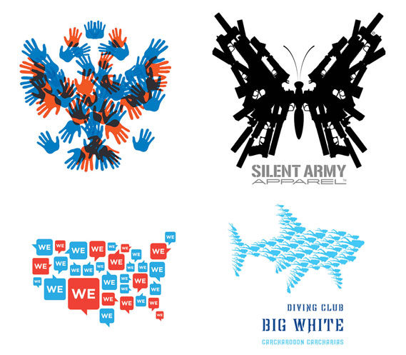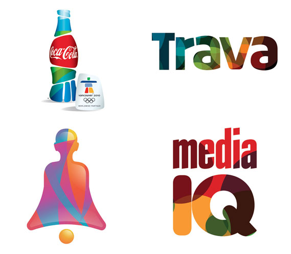
Creative Review has a really great article talking about Logo design in 2010. I love the way that they have separated out different ‘trends’, it makes you more appreciative for the logo designs within their own trend.

They state ‘Transparency in logo design has become a bona fide design tool, like type or colour, not a trend. It’s too ubiquitous anymore to be considered a direction: it just is.’. I’m really interested in when this happened. You see re-branding happening pretty often nowadays, and if you pay attention you do see transparency and negative space being highly utilized.

If you look at the examples they give of innovative logos, you’ll notice that it is not longer a play on words, but more a play on space, texture, shapes, and your own mind. Advertisers and designers are counting on you to sort of fill in the blanks they have left us. They are creating puzzles within design, and allowing us to come to our own conclusions. Advertising and design is no longer an in your face approach, and it ponders the question: What’s next?
Find/Post by Katie